A Guide to App Store Screenshot Requirements
Master app store screenshot requirements for Apple and Google Play. Learn sizes, policies, and ASO tips to create visuals that boost conversions.
App store screenshot requirements are the exact rules Apple and Google set for the images you upload. These are not just suggestions. They cover everything from pixel dimensions and file formats to the content itself. Getting these technical and content guidelines wrong is one of the fastest ways to get your app submission rejected, which can seriously delay a launch or an important update.
Honestly, nailing these rules is the first real step toward boosting your app store growth and conversions.
Your Quick Guide to Screenshot Specifications
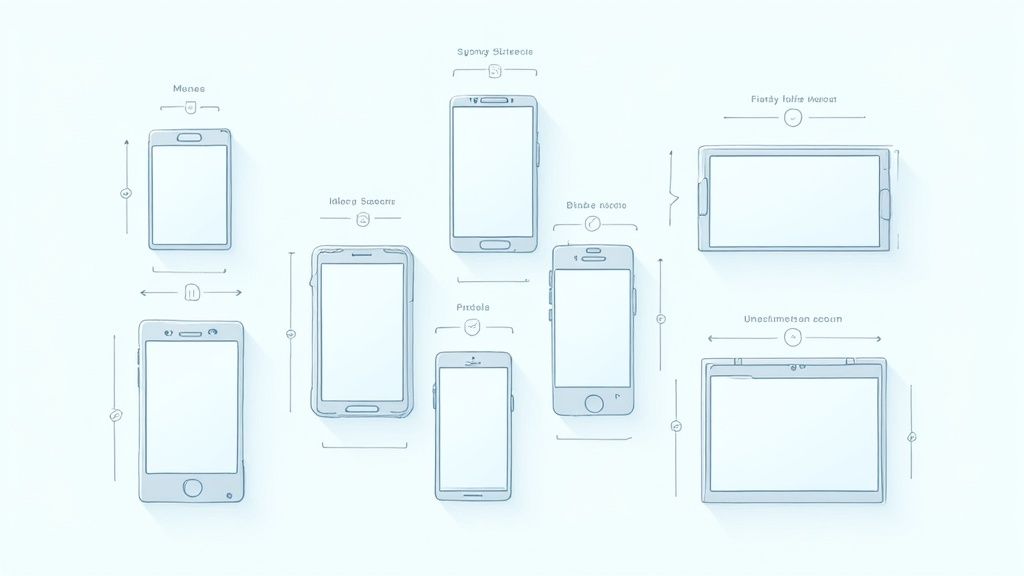
Before we get into the deep end of ASO strategies, you have to master the basics for both the Apple App Store and Google Play. While their goal is the same, giving users a clear preview of your app, their specific requirements for dimensions, file types, and the number of uploads are surprisingly different. Understanding these core differences from the start will save you from common submission headaches and make your entire design process smoother.
This graphic breaks down the key technical specs you need to know for each store, side by side.
As you can see, Apple is much stricter about needing exact dimensions for specific devices. Google Play, on the other hand, gives you a bit more breathing room on resolution as long as you stick to the correct aspect ratio.
Core Requirements for Each Platform
Getting the fundamentals right is non negotiable. It's frustrating, but a tiny mistake in file format or size can bring your entire submission to a halt.
Here's the breakdown:
- Apple App Store: You can upload up to 10 screenshots for each language you support. They must be flattened JPEG or PNG files in the RGB color space, and they cannot have any transparency (no alpha channels).
- Google Play Store: You get up to 8 screenshots for each device type your app supports (phone, tablets, Wear OS, etc.). Google accepts JPEG or 24-bit PNG files and cares more about the aspect ratio than the exact pixel count.
To make sure your screenshots hit the precise resolution and size marks every time, a good online image resizer can be a real lifesaver in your workflow.
Quick Reference: Apple App Store vs. Google Play
When you're juggling multiple app submissions, it's easy to mix up the rules. I've put together this quick reference table to help you keep the most critical requirements straight. Think of it as your cheat sheet for avoiding simple, preventable rejections.
| Requirement | Apple App Store | Google Play Store |
|---|---|---|
| Max Screenshots | 10 per localization | 8 per device type |
| Min Screenshots | 1 | 2 |
| File Formats | JPEG, PNG (no transparency) | JPEG, 24-bit PNG |
| Dimension Rules | Strict, device-specific pixel sizes | Flexible, aspect ratio-based |
| Orientation | Portrait or Landscape | Portrait or Landscape |
This table covers the essentials at a glance, but remember that device-specific dimensions, especially for Apple, are where things get tricky. Always double check the latest requirements before you finalize your assets.
One of the most common traps developers fall into is forgetting to create screenshots for the very latest iPhone or iPad models. The pixel dimensions are always changing. Mastering these specs is the foundation for creating app store screenshots that not only get approved but actually drive downloads on both iOS and Android.
Why Screenshot Rules Keep Changing (And How It Helps You)
Knowing the current app store screenshot specs is one thing, but understanding why they're changing gives you a serious advantage. For years, developers were stuck in a maze of ever growing requirements. The flood of new phones and tablets, each with its own screen size, turned the simple task of uploading visuals into a painful, time consuming chore.
Every new iPhone or Android device meant exporting yet another set of perfectly sized screenshots. This whole mess was a direct reaction to device fragmentation. The app stores needed a way to guarantee every user saw a crisp, properly fitted preview, no matter what device they were on. The problem was, this put an unsustainable burden on developers.
Recognizing this friction, both Apple and Google have finally started to shift their thinking. They're moving toward a smarter, more streamlined submission process with a simple goal: cut down the developer workload while keeping the user experience top notch. The new focus is all about simplification and letting the stores handle the heavy lifting.
The Big Shift: From Manual Resizing to Automation
The old way forced developers to be manual resizing machines, painstakingly creating dozens of assets just for a single app update. It was not just tedious, it was a recipe for errors. One wrong dimension could get your entire submission rejected, leading to frustrating delays.
Now, the philosophy is changing. The app stores are starting to take on the burden of resizing and adapting visuals themselves. Instead of demanding a separate file for every conceivable screen size, platforms like Apple are now asking for just one or two high resolution source images. Their systems then take those master files and automatically scale them to fit older or smaller devices.
This is a fundamental shift in responsibility. The app stores are now using their own tech to solve the fragmentation problem, freeing you up to focus on what actually matters: creating a compelling visual story that shows off your app's value.
This move simplifies your workflow, slashes production time, and dramatically cuts the risk of rejection over technical specs. It turns compliance from a pixel perfect headache into a more creative, strategic design challenge.
Apple's Game-Changer for iOS 18
A perfect example of this trend is Apple's recent announcement for the App Store. This update is a huge step toward simplifying submissions for the entire iOS ecosystem, directly tackling the biggest headache developers have faced for years: the sheer number of required assets.
Starting with iOS 18 and macOS 15, Apple will only require one set of screenshots to cover both iPhone and iPad. This is a massive change from needing multiple sizes for each device family. Unveiled at WWDC, this update is expected to slash the number of required screenshots per app by up to 70%, from as many as 70 down to just 10–20 for each language. Analysts figure this will save developers an average of 10–12 hours per app update, which adds up to a global time savings of over 1 million hours a year for the dev community. You can read up on all the details about these important App Store screenshot changes and see how they'll impact your workflow.
This is not just a minor update, it's a new direction. By understanding this trend, you can get ahead of the curve, adapt your design process, and build a more efficient system for managing your app store visuals for the long haul.
Mastering Apple App Store Specifications
Getting your app through the submission process smoothly starts with nailing Apple's technical rules. While Apple has made a real effort to simplify requirements over the years, you still have to get the specific dimensions, file formats, and device categories right. It’s the difference between a professional looking app and one that faces unnecessary rejections.
Think of these app store screenshot requirements as the foundation for your product page, not as annoying limitations. Get them right, and you're already on your way to building a store listing that converts.
This is a good reminder that a one size fits all approach just does not fly.
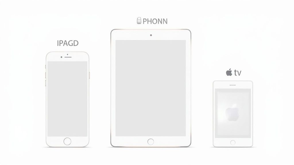
Visuals for an Apple TV, an iPad, and an iPhone each need to be designed with their unique screen real estate in mind.
Core Technical Rules for All Apple Devices
Before we get into specific pixel counts, let's cover the universal rules. These apply to every single screenshot you upload to App Store Connect, and ignoring them is a common source of headaches.
- File Format: Your screenshots must be flattened JPEG or PNG files. No other formats are accepted.
- Color Space: Keep it simple, all images must use the RGB color space.
- Transparency: Apple is strict on this one. You cannot use alpha channels in your PNG files, so make sure your images are fully opaque.
- Screenshot Limit: You can upload up to 10 screenshots for each localization you support.
These are not just suggestions, they're non negotiable. A single file with the wrong format can halt your entire app update, so it's critical to get these details right from the very start.
iPhone and iPad Screenshot Dimensions
For a long time, managing screenshot sizes was a nightmare for developers. The sheer number of device models meant an explosion in the number of required assets. Back in 2015, you might have only needed 3–4 different sizes. Fast forward to 2020, and some developers were juggling as many as 70 unique screenshots for a single app that supported all devices and languages. The team at SplitMetrics wrote a great ASO guide that digs into this trend if you're curious.
Thankfully, things have improved. Apple now only requires a couple of primary sizes, and their system handles scaling them down for smaller devices automatically.
For any new app, you absolutely must provide screenshots for the 6.7-inch iPhone and the 12.9-inch iPad Pro. With just those two sizes, you’ve covered the vast majority of the iOS and iPadOS ecosystem.
While this makes life much easier, you can still provide optional sizes for other key devices to ensure a perfect fit everywhere. Here’s a quick breakdown of the most important dimensions you'll need.
Apple Device Screenshot Dimension Requirements
This table outlines the essential pixel dimensions for the most common Apple devices. Focusing on the "Required" entries will get your app approved, but adding the optional sizes can give users on those devices a better tailored visual experience.
| Device Category | Screen Size (Inches) | Required Dimensions (Pixels) |
|---|---|---|
| iPhone (Required) | 6.7" | 1290 x 2796 (Portrait) |
| iPhone (Optional) | 6.5" | 1284 x 2778 (Portrait) |
| iPhone (Optional) | 5.5" | 1242 x 2208 (Portrait) |
| iPad (Required) | 12.9" | 2048 x 2732 (Portrait) |
| iPad (Optional) | 11" | 1668 x 2388 (Portrait) |
As you can see, the list is much more manageable now. Submitting the two required sizes ensures your app is displayed correctly across nearly all modern iPhones and iPads.
Requirements for Apple Watch and Apple TV
If your app extends beyond phones and tablets, you'll need to create assets for those platforms, too. Do not treat these as an afterthought.
Apple Watch
Screenshots for watchOS have to be pixel perfect. The required size depends on the specific Apple Watch model you're targeting. For instance, the Apple Watch Series 9 and later require images at 396 x 484 pixels.
Apple TV
For tvOS apps, you need to think big. Screenshots must be either 1920 x 1080 pixels (HD) or 3840 x 2160 pixels (4K) to look crisp on a television. These visuals are your best chance to convey the immersive, lean back experience your app offers.
Navigating Google Play Store Guidelines
If you're coming from the Apple world, Google Play's approach to screenshots might feel like a breath of fresh air. Instead of Apple's rigid, device specific pixel requirements, Google gives developers a lot more flexibility. This is by design, it has to be, to support the thousands of different Android devices out there. But "flexible" does not mean "no rules."
Google's system is built around aspect ratios, not exact pixel dimensions. This is great news for developers. It means you do not have to generate a dozen different image sizes. As long as you stick to the right proportions, Google Play will handle the rest, making sure your listing looks good on everything from a small phone to a huge tablet.
Core Technical Requirements for Google Play
Before you can even think about ASO, you have to get the basics right. Google has a few non negotiable specs for any screenshot you upload. Mess these up, and you'll hit an upload error and delay your launch.
Here’s the checklist you need to follow:
- Screenshot Count: You need at least 2 screenshots, but you can upload up to 8 for each device type (that means phone, 7-inch tablet, and 10-inch tablet).
- File Format: Your files must be either JPEG or 24-bit PNG. Unlike Apple, you do not have to worry about alpha channels or transparency.
- Aspect Ratio: This one is key. Your screenshots have to fall between a 2:1 and 1:2 aspect ratio. The sweet spot for most apps is 9:16 for portrait or 16:9 for landscape.
- Dimensions: Each side of your image has to be between 320 px and 3840 px. While that's a massive range, a standard 1080 x 1920 px resolution is a safe and reliable choice that will look crisp on most modern devices.
Get these four things right, and you're well on your way.
Understanding the Mandatory Feature Graphic
Here’s where Google Play really differs from the App Store: the Feature Graphic. This is a mandatory promotional image that essentially acts as the cover art for your app listing. It’s your billboard.
This is often the very first thing a potential user sees, especially if your app gets featured or if they tap to watch your promo video. It's your single best chance to grab their attention with bold branding, a quick tagline, and a glimpse into what your app is all about.
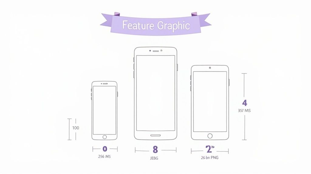
The image above from Google's own documentation clearly shows the "safe area." Anything outside this zone risks getting cropped, so keep your most important content dead center.
To pass Google's review, your Feature Graphic must meet these two simple specs:
- Dimensions: Exactly 1024 x 500 pixels. No more, no less.
- Format: A JPEG or 24-bit PNG.
Pro Tip: I cannot stress this enough: keep your logos and critical text inside that central safe area. This guarantees your core message is always visible, whether someone is viewing your store page on a tiny phone or a widescreen tablet. Do not let a poorly placed logo get cut in half.
Mastering Google's guidelines is all about respecting the aspect ratios and nailing that Feature Graphic. Do that, and you'll have a store listing that’s not just compliant, but also effective at turning casual browsers into loyal users.
Designing Screenshots That Boost Conversions
Getting the technical requirements right is just the price of entry. If you really want to move the needle, your screenshots need to do more than just meet the specs. They have to be powerful marketing tools that convince users to hit "Install." This is where you stop thinking like a developer and start thinking like a marketer, turning simple visuals into a compelling story that drives app store growth.
The best screenshots grab attention instantly, communicate your app's value proposition, and nudge the user toward the install button. They combine striking colors, clean layouts, and punchy captions to explain what your app does in a matter of seconds.
Tell a Cohesive Visual Story
Your screenshot gallery should not feel like a random collection of features. It needs to tell a story. Think of it as walking a potential user from the problem they have to the solution your app provides. Each image has to build on the last one, creating a logical flow that's easy to follow and hard to ignore.
For a practical example, a fitness app might structure its story like this:
- Screenshot 1 (The Hook): "Track Your Workouts in Seconds." Show the main logging screen, clean and simple.
- Screenshot 2 (The Benefit): "Visualize Your Progress." Display a vibrant chart showing weekly gains.
- Screenshot 3 (The Social Proof): "Join Challenges with Friends." Feature an interface with friend activity.
- Screenshot 4 (The Differentiator): "Custom Meal Plans Included." Highlight a unique feature others lack.
This flow is an actionable insight into creating a high-converting narrative. You're guiding users through your app's core value, turning passive scrolling into active interest.
The Power of the First Impression
You've got about seven seconds. That's how long the average user spends scanning an app page before making a decision. This makes your first few screenshots absolutely critical. The impact is huge. Some analyses show the first images are responsible for up to 90% of user engagement.
A report I came across showed that apps optimizing their first three screenshots can see a conversion rate bump of 20% to 35%. That's not a small number.
Your first screenshot is your headline. It has to be strong enough to make someone stop scrolling and pay attention. Use a bold caption and your most impactful visual to make that immediate connection.
Think of that first image as the cover of a book. It needs to be intriguing enough to make someone want to see what's inside. For more ideas, you might find our guide on creating https://screenshotwhale.com/blog/high-converting-images-for-app-store helpful.
Actionable Design Best Practices
Ready to turn your screenshots into conversion machines? Put these proven strategies to work. They're all about clarity, persuasion, and brand consistency, making sure your visuals work as hard as your code.
Use Compelling Captions: Do not just show a screen, explain its benefit. Use short, punchy text overlays to highlight the value of each feature. A good rule of thumb is to keep captions to a single, readable line.
Emphasize a Single Benefit Per Screenshot: Do not cram everything into one image. It just creates noise. Dedicate each screenshot to a single core feature or benefit. This keeps the message clean, focused, and easy for users to digest in a split second.
Maintain Brand Consistency: Use your brand's colors, fonts, and tone of voice across every screenshot. A consistent visual identity builds trust and makes your app look far more professional and polished. It reinforces who you are from the very first glance.
Creating an Efficient Screenshot Workflow
Let's be honest: manually creating screenshots for every single device and language is a nightmare. It's a huge bottleneck that slows down app updates and can derail a launch. If you want to save time and keep your brand consistent across the App Store and Google Play, you need a smart, scalable workflow.
A solid process lets you focus on high-impact ASO strategies instead of getting bogged down in repetitive design tasks.
The foundation of any good system is a template. Seriously, do not skip this. Using tools like Figma or a dedicated site editor, you can build master templates with your layouts, text styles, and device frames already set up. For instance, a site editor might let you pick a layout, upload a raw screenshot, type your caption, and automatically apply your brand's vibrant color palette and font style. This ensures brand consistency while cutting creation time dramatically.
Automating Screenshot Generation
Ready to take it to the next level? Specialized automation tools can crank out dozens of localized screenshots in just a few minutes. These platforms hook directly into your design files or have their own editors, pulling in your raw app screens and dropping them right into your branded templates.
This gets rid of all that tedious manual work. No more resizing and exporting for every single dimension. It’s a game changer.
Tools like this give you a central hub to manage all your designs, captions, and device frames for both iOS and Android in one place.
By automating the most mind numbing parts of the job, you can slash the time spent on screenshot production by up to 80%. This frees up your team to think about creative strategy and A/B testing instead of just exporting files all day.
Streamlining Your Asset Pipeline
An efficient workflow is more than just making the images, it’s also about what you do with them afterward. To really get your process humming, you need to organize and manage your final assets so they’re easy for everyone to find and use. Adopting some solid digital asset management best practices will make sure nothing gets lost in the shuffle.
Here are a few tips to build a better pipeline:
- Get Your Naming Straight: Use a clear, consistent file naming system. Something like
feature-login-iphone6.7-en-v2.1.pngtells you the feature, device, language, and version at a glance. - Use a Central Library: Do not just save things to your desktop. Store all your final screenshots in a shared cloud folder or a proper digital asset management tool so the whole team can get what they need.
- Write It Down: Create a simple guide that outlines the steps for creating, localizing, and uploading screenshots. This ensures everyone follows the same playbook. If you need a refresher on the upload part, check out our guide on how to upload screenshots correctly.
Common Questions About App Screenshots
When you're trying to get your app live, the fine print in the App Store and Google Play guidelines can feel like a minefield. Getting bogged down in screenshot rules is the last thing you want.
Let's clear up some of the most common questions I hear from developers so you can get back to building.
Can I Use the Same Screenshots for iPhone and iPad?
Yes, you can, and it's a huge time saver. Apple updated their system so you can now upload a single, larger set of screenshots, typically the 6.5-inch or 6.7-inch iPhone size, and the App Store will automatically scale them down for smaller iPhones and even iPads.
But a word of caution from experience: always double check how they look on smaller screens. UI elements and text that are perfectly clear on a big iPhone can become unreadable when scaled down. Your goal is a great user experience for everyone, not just a faster submission.
What Happens If I Put Prices in My Screenshots?
This is a classic rookie mistake, and a fast track to rejection. Both Apple and Google have strict policies against including prices, discounts like "50% Off," or any time sensitive promotional text in your screenshots.
Their logic is simple: that information can go out of date, creating a misleading experience for users. Stick to showcasing your app's permanent features and long term value. It's not just a rule, it's good practice.
How Important Is Localizing My Screenshots?
It's absolutely critical if you have any global ambitions. Seriously. We're talking about a potential conversion lift of over 30% in international markets. It's one of the highest impact things you can do.
When users in Germany or Japan see screenshots with captions in their native language and culturally relevant imagery, the app feels like it was made for them. It builds instant trust and demolishes a huge barrier to downloading. Do not skip this step.
Ready to create stunning, high-converting screenshots in minutes? ScreenshotWhale provides professionally designed templates and an AI-powered translation engine to help you generate compliant, on-brand visuals for any device or market. Start building your perfect screenshots today.