10 Mobile App Design Best Practices to Boost App Store Growth
Discover 10 mobile app design best practices to boost app store growth. Learn UI/UX principles, ASO, and how to create screenshots that convert.
In a crowded marketplace, a successful mobile app is more than just visually appealing. It requires a thoughtful fusion of usability, performance, and strategic design that captivates users from their first tap and keeps them coming back. Excellent design directly impacts user retention, app store rankings, and ultimately, your revenue. Getting the fundamentals right is no longer optional; it's the baseline for survival and growth.
This guide moves beyond generic advice to explore 10 essential mobile app design best practices. We'll provide actionable insights to help you build an app that not only looks great but performs exceptionally. You will learn how to simplify navigation, optimize for performance, ensure accessibility, and design high-converting app store screenshots that capture attention. These principles are your roadmap to launching a user-centric application that stands out on both the App Store and Google Play. We will cover specific techniques for implementing a mobile-first approach, creating intuitive interactions, and personalizing the user experience. By mastering these concepts, you can build a product that delights users, boosts conversions, and achieves long-term success.
1. Mobile-First Design Approach
A mobile-first design approach is a core strategy in modern app development that flips the traditional design process on its head. Instead of designing for a large desktop screen and then trying to shrink it down, you start with the smallest screen first: the mobile phone. This methodology forces you to prioritize the most essential content and features, ensuring a clean, focused, and high-performing user experience from the outset.
Popularized by industry leader Luke Wroblewski, this approach addresses the constraints of mobile, like limited screen real estate and touch-based inputs, as foundational design pillars rather than afterthoughts. For product managers and indie developers, this means building an app that is inherently optimized for the majority of users. Apps like Instagram and Spotify are prime examples; their core functionality is perfectly tailored for mobile, creating a seamless experience that feels natural and intuitive on a phone.
How to Implement a Mobile-First Strategy
Adopting this practice ensures your app is lean and user-centric. Here are a few actionable steps to integrate this into your workflow:
- Prioritize Ruthlessly: Identify the single most important action a user needs to perform. On a small screen, every pixel counts. This focus clarifies your app's purpose and improves usability.
- Design for Touch: Ensure buttons and interactive elements are large enough for fingertip interaction, typically at least 44x44 pixels, to avoid user frustration.
- Embrace Progressive Enhancement: Once the core mobile experience is solid, you can progressively add more complex features and layout adjustments for larger tablet and desktop screens.
- Test on Real Devices: While emulators are useful, nothing beats testing on actual hardware. This helps you understand real-world performance, ergonomics, and how the app feels in a user's hand. This is a critical step in refining mobile app design best practices for your project.
2. Simplified Navigation and Information Architecture
Simplified navigation is the art of organizing an app's content and features in a way that feels intuitive and effortless for the user. A well-designed information architecture acts as a clear roadmap, guiding users to their destination without friction. On a compact mobile screen, this means using established patterns like bottom tab bars or clear hamburger menus to prevent cognitive overload and make core functions immediately accessible.

This principle is heavily promoted by Apple's Human Interface Guidelines and Google's Material Design, making it a non-negotiable standard. Apps like Instagram and Twitter/X master this by placing their five most critical actions in a persistent bottom tab bar, always within the user's thumb-reach. This thoughtful organization is a key pillar of what user experience design is, ensuring users can navigate complex apps with ease and confidence, which directly impacts retention and engagement.
How to Implement Simplified Navigation
A logical and predictable navigation system is fundamental to a positive user experience. Here are actionable tips to structure your app’s flow:
- Limit Primary Options: Stick to a maximum of 3-5 primary navigation items in a tab bar. This forces you to prioritize what is truly essential for the user.
- Design for the Thumb Zone: Place the most frequently used actions and navigation controls at the bottom of the screen where they are easiest to tap.
- Use Clear Icons and Labels: Pair recognizable icons with concise text labels. Never assume an icon's meaning is universal; explicit labels remove all ambiguity.
- Prioritize Search: For content-heavy apps, making a search bar a prominent part of the primary navigation can be more effective than trying to categorize everything.
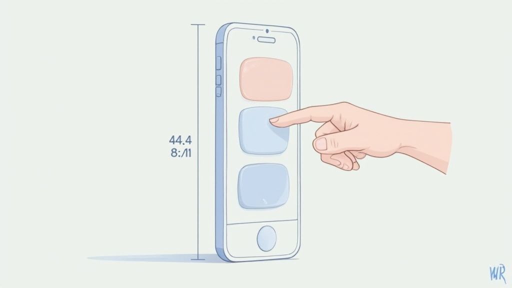
3. Touch-Friendly Interface Elements
Designing for mobile is fundamentally about designing for touch. A touch-friendly interface ensures that users can interact with your app effortlessly and accurately, preventing the frustration of mistaps. This practice involves creating buttons, links, and other interactive elements that are large enough and sufficiently spaced to be easily and reliably tapped by a fingertip.
This principle is a cornerstone of both Apple's Human Interface Guidelines and Google's Material Design, informed by research from groups like the MIT Touch Lab. Successful apps like PayPal and Uber excel at this; their clear, well-sized buttons for crucial actions like "Send Money" or "Confirm Ride" make the user experience smooth and error-free. Getting this right is a critical part of mobile app design best practices that directly impacts user satisfaction and retention.
How to Implement a Touch-Friendly Interface
A well-designed touch interface feels intuitive and responsive. Here are key steps to ensure your app’s elements are easy to interact with:
- Respect Platform Guidelines: Adhere to minimum touch target sizes. For iOS, aim for at least 44x44 pixels, and for Android, use a minimum of 48x48 density-independent pixels (dp).
- Ensure Adequate Spacing: Maintain a minimum of 8dp of space between touch targets. This small buffer dramatically reduces the chance of users accidentally tapping the wrong element.
- Provide Immediate Feedback: Users need confirmation that a touch was registered. Use visual cues like a button changing color or state, or subtle haptic feedback on supported devices.
- Consider Gesture Alternatives: For secondary actions, incorporate intuitive gestures like long-press or swipe. This keeps the primary interface clean while still providing powerful functionality for users.
4. Responsive Design and Adaptive Layouts
Responsive design is an indispensable practice that ensures your mobile app provides an optimal viewing and interaction experience across a wide range of devices. By using flexible grids and layouts, your app's interface automatically adjusts to fit any screen size or orientation, from a small smartphone to a large tablet. This adaptability is key to reaching a broader audience without compromising usability.
Pioneered for the web by Ethan Marcotte, this concept is now a cornerstone of native and hybrid app development. Frameworks like Tailwind CSS and platform-specific tools like SwiftUI and Jetpack Compose make implementation more accessible. Pinterest is a great example; its masonry grid layout elegantly reflows content to fit perfectly on any screen, ensuring a consistent and engaging user experience whether on a phone or a tablet.
How to Implement Responsive and Adaptive Layouts
Building a responsive interface ensures your app feels polished and professional on every device. Here are actionable tips to integrate this into your development process:
- Use Flexible Layouts and Units: Design with relative units like percentages,
em, orreminstead of fixed pixels. This allows UI elements to scale proportionally based on screen size, preventing broken layouts. - Define Breakpoints for Key Devices: Identify common screen sizes (e.g., small phone, large phone, tablet) and use media queries or platform-specific tools to create layout variations that optimize the user experience at each breakpoint.
- Optimize for Both Orientations: Always test your design in both portrait and landscape modes. The user experience should remain intuitive and functional when a user rotates their device.
- Test on Real Devices: An emulator can only show you so much. Testing on actual hardware is crucial to identify and fix layout issues, ensuring your implementation of mobile app design best practices works perfectly in the real world.
5. Gestures and Intuitive Interactions
Gestures are the unspoken language of mobile interfaces, allowing users to interact with an app through natural, intuitive movements like swiping, pinching, and tapping. This approach leverages the tactile nature of touchscreen devices to create a more fluid and engaging user experience. By replacing traditional buttons with gestures, designers can declutter the interface, making navigation faster and content more immersive. This is a fundamental aspect of modern mobile app design best practices.
Pioneered by platforms like Apple's iOS and popularized by apps such as Tinder with its iconic swipe mechanic, intuitive gestures make an app feel responsive and alive. For developers and product managers, mastering gestures means building an experience that feels second nature to users. Great examples include Slack’s swipe-to-reply function or the pinch-to-zoom in Apple Photos, which are so common they require no explanation.
How to Implement Intuitive Gestures
Integrating gestures effectively requires a balance between innovation and convention. The goal is to enhance usability, not to confuse the user.
- Stick to Standard Gestures: Use common, well-documented gestures that users already understand (e.g., swipe for navigation, pinch for zoom). Avoid inventing new gestures for basic actions.
- Provide Visual Cues: Don't make users guess. If a gesture is not obvious, provide subtle visual hints or a brief tutorial during onboarding to guide them.
- Offer Haptic Feedback: Use gentle vibrations to confirm that a gesture has been successfully registered. This physical feedback makes interactions feel more tangible and satisfying.
- Ensure Responsiveness: Gestures must feel immediate and responsive. Test sensitivity thoroughly on real devices to eliminate lag and ensure the interaction feels smooth and natural. For more insights on this topic, you can learn more about mobile app UI design.
6. Readable Typography and Content Hierarchy
Readable typography is the bedrock of a positive user experience, ensuring that users can effortlessly consume information on a small screen. This practice goes beyond just picking a nice font; it involves creating a clear visual hierarchy that guides the user's eye through the content. By strategically using font sizes, weights, and spacing, you make the interface intuitive, scannable, and comfortable to read at arm's length.
Pioneered by typographic design standards and reinforced by accessibility guidelines like WCAG, this principle is crucial for user retention. Apps like Medium and the Apple News app are masters of this, using clean fonts and a strong hierarchy to make long-form reading a pleasure on mobile. This focus on legibility is a non-negotiable part of effective mobile app design best practices, as it directly impacts how easily users can understand and interact with your app's content.
How to Implement Readable Typography
A strong typographic system makes your app feel professional and user-friendly. Here are actionable steps to build one for your project:
- Establish a Clear Scale: Use distinct font sizes for different levels of information, like headings, subheadings, and body text. A common practice is to start with a base font size (e.g., 16px for body text) and build a scale around it.
- Prioritize Legibility: Choose fonts designed for screen use. For optimal performance and a native feel, consider using system fonts like San Francisco for iOS and Roboto for Android. Ensure a line height of around 1.5x the font size for body text.
- Ensure Sufficient Contrast: Text must stand out against its background. Adhere to the WCAG recommendation of a minimum contrast ratio of 4.5:1 for normal text to accommodate users with visual impairments.
- Control Line Length: For comfortable reading, aim for a line length of 40 to 60 characters. This prevents eye strain and helps users track from one line to the next without getting lost.
7. Performance Optimization and Loading States
Performance optimization is a critical mobile app design best practice that directly impacts user retention and satisfaction. In a world of variable network conditions and limited patience, an app must load quickly and operate smoothly. This involves minimizing data transfer, optimizing assets, and providing clear feedback to the user during loading processes, transforming potential moments of frustration into a seamless experience.
Pioneered by performance-focused companies like Google, this practice ensures an app feels responsive even before all content is available. Apps like LinkedIn and Facebook are excellent examples; they use skeleton screens that mimic the final layout, giving the perception of speed. This prevents users from staring at a blank screen or a generic spinner, which can make an app feel slow and lead to abandonment.
How to Implement Performance and Loading Best Practices
A fast, responsive app is a non-negotiable expectation for modern users. Here are key steps to integrate this into your development and design workflow:
- Implement Smart Loading States: Use skeleton screens that show a placeholder preview of the content layout. This is psychologically more effective than a loading spinner, as it manages expectations and makes wait times feel shorter.
- Optimize All Assets: Large, uncompressed images are a primary cause of slow load times. To ensure your app loads quickly and provides a smooth visual experience, exploring effective image optimization strategies for app speed is essential. Aim to compress images without noticeable quality loss.
- Use Lazy Loading: Load content and features only when the user needs them. For example, in an infinite scroll feed, load the next batch of posts just before the user scrolls to the bottom of the current set.
- Test on Slow Networks: Don't just test your app on a high-speed Wi-Fi connection. Simulate slower 3G or 4G networks to understand the real-world user experience and identify performance bottlenecks. This is a crucial step in refining your mobile app design best practices.
8. Accessibility and Inclusive Design
Accessibility and inclusive design are foundational principles that ensure your mobile app is usable by everyone, including people with disabilities. This approach involves creating an experience that caters to diverse user needs, such as those related to vision, hearing, motor skills, and cognitive abilities. Integrating accessibility from the start isn't just a legal requirement in many regions; it's a core component of great UX that expands your potential user base and reflects a commitment to inclusivity.
Pioneered by organizations like the W3C through its Web Content Accessibility Guidelines (WCAG), this practice is expertly demonstrated by major tech companies. Apple and Google build robust accessibility features like VoiceOver and TalkBack directly into their operating systems, providing a seamless experience for users of assistive technologies. Apps that prioritize these features not only comply with standards but also create a more welcoming and functional environment for all.
How to Implement Inclusive Design
Building an accessible app from day one is more efficient and effective than retrofitting features later. Here are actionable steps to make your app more inclusive:
- Maintain Color Contrast: Ensure text and interactive elements have a color contrast ratio of at least 4.5:1 against their background. This is crucial for users with low vision.
- Support Assistive Technologies: Use semantic HTML and ARIA labels so screen readers can interpret and narrate content correctly. This is one of the most vital mobile app design best practices for visual accessibility.
- Design for Various Inputs: Don’t rely solely on color to convey information. Use text labels, icons, and patterns to ensure clarity. All functionality should be accessible via keyboard or other alternative inputs.
- Test with Real Users: Involve people with disabilities in your testing process. This provides invaluable feedback on how your app performs with actual assistive technologies. For a comprehensive approach, consult this ultimate accessibility checklist.
9. Smart Use of White Space and Visual Hierarchy
White space, or negative space, is the unmarked area between elements in a design. Far from being empty, it is an active and powerful tool. Its strategic use reduces cognitive load, improves readability, and creates a clean, sophisticated user interface. When combined with a strong visual hierarchy, it guides the user’s eye to the most important content and actions, making the experience feel intuitive and effortless.
This principle is a cornerstone of minimalist design, popularized by figures like Dieter Rams and embraced by Apple's design philosophy. Apps like Calm and Headspace masterfully use white space to evoke a sense of tranquility and focus. By giving elements breathing room, they make the app feel less cluttered and more premium, which directly impacts user perception and retention. Proper hierarchy ensures that a call-to-action button, for instance, stands out from descriptive text.
How to Implement White Space and Hierarchy
Integrating these principles will dramatically improve your app's clarity and usability. Here are actionable steps for applying these mobile app design best practices:
- Establish a Spacing System: Use a consistent grid, like an 8-point grid system, to define margins, padding, and the space between elements. This creates a rhythmic and visually harmonious layout.
- Group Related Items: Apply the law of proximity by placing related content closer together. The surrounding white space will visually separate these groups, making the interface easier to scan and understand.
- Create Hierarchy with Scale and Color: Make important elements, like primary buttons or headlines, larger or more vibrant in color. Less critical items should be smaller or use more muted tones.
- Give CTAs Room to Breathe: Ensure your primary calls-to-action are surrounded by ample negative space. This separation draws the user's attention and makes the desired action obvious, boosting conversion rates.
10. Context-Aware and Personalized Experiences
Creating a context-aware and personalized experience means designing your app to adapt to a user's specific situation, preferences, and behavior. By leveraging data like location, usage patterns, and past choices, your app can deliver highly relevant content and functionality. This moves beyond a one-size-fits-all approach, making the user feel like the app was built just for them, which significantly boosts engagement and satisfaction.
This practice transforms the user experience from static to dynamic. Powerhouses like Netflix and Spotify have mastered this, using sophisticated algorithms to suggest content that aligns with individual tastes. Similarly, Google Maps offers real-time, location-based suggestions, anticipating user needs. For developers, implementing personalization is a key differentiator and one of the most effective mobile app design best practices for building a loyal user base. This deep level of personalization is a powerful tool for improving user retention, as it makes the app more valuable over time.
How to Implement Personalization and Context-Awareness
Integrating this strategy requires a thoughtful approach that balances utility with user privacy. Here are actionable steps to get started:
- Be Transparent About Data Use: Clearly explain what data you are collecting and why. Provide users with easy-to-understand privacy controls and a straightforward way to opt out of personalization features.
- Leverage User Inputs and Behavior: Start by personalizing based on explicit user preferences and in-app actions. Use this data to tailor recommendations, notifications, and content, ensuring it remains relevant.
- Balance Automation with Control: While machine learning can drive powerful predictions, always allow users to fine-tune their preferences. Giving users control builds trust and improves the accuracy of future recommendations.
- Comply with Regulations: Adhere strictly to privacy laws like GDPR and CCPA. Ensuring compliance is not just a legal requirement; it's fundamental to building a trustworthy relationship with your users. To learn more about how this can impact your app's success, you can read about mobile app retention strategies on screenshotwhale.com.
How to Create High-Converting App Store Screenshots
Even the best app will struggle if its app store page fails to convert visitors into users. Your screenshots are the most powerful visual asset for convincing potential users to download. They must quickly communicate your app’s value and showcase its user-friendly design. A sloppy or confusing set of screenshots can cripple your conversion rates and stall app store growth.
The key is to create a visual narrative that highlights core features and benefits. Use vibrant, branded backgrounds to make your screenshots pop. Overlay concise, bold text captions on each image to explain the feature being shown. For example, a fitness app might have a screenshot with the caption "Track Your Progress" over a beautiful chart of workout history. This combination of visuals and text is far more effective than a raw, unedited screenshot. Tools like ScreenshotWhale can help you use professional templates to ensure every screenshot is polished, on-brand, and optimized for both the iOS and Android stores, directly boosting your app store conversions.
Turn Your App Design into App Store Success
We have explored the foundational pillars of exceptional mobile app design, from embracing a mobile-first approach and simplifying navigation to optimizing for performance and ensuring accessibility. Each practice, whether it is crafting touch-friendly interfaces or leveraging personalized experiences, contributes to a cohesive and user-centric final product. Mastering these principles is not merely a technical exercise; it is the art of building a digital experience that feels intuitive, engaging, and indispensable to your audience.
The journey from a brilliant concept to a successful app involves meticulous attention to detail. Applying these mobile app design best practices ensures your application is not just functional but also delightful to use. A well-designed app respects the user's time with fast loading states, guides their eye with a clear visual hierarchy, and makes interactions feel effortless through intuitive gestures. This commitment to quality builds user trust, encourages positive reviews, and significantly boosts retention rates.
From In-App Excellence to App Store Dominance
However, the world's best-designed app can fail if it never gets discovered. Your design work must extend beyond the application itself and onto your digital storefront: your app store product page. This is where your marketing and design efforts converge. High-converting screenshots for the iOS App Store and Google Play are your most powerful visual pitch, serving as a direct reflection of the in-app experience you have so carefully crafted. They must instantly communicate your app’s core value proposition and entice users to tap the "Install" button.
Think of your screenshots as the cover of a book. They need to be compelling, on-brand, and informative, showcasing your app's key features in a visually appealing format. This is a critical step where many otherwise great apps falter. A polished and persuasive store presence is a non-negotiable component of a successful launch and a powerful engine for sustainable user acquisition. By pairing a stellar in-app user experience with a professionally designed store listing, you create a seamless and compelling journey from discovery to download and beyond. This holistic approach is what transforms a good app into a chart-topping success.
Ready to translate your excellent app design into compelling App Store visuals? ScreenshotWhale provides a suite of professionally designed, fully customizable templates to help you create stunning, high-converting screenshots for both the App Store and Google Play in minutes. Elevate your store presence and turn browsers into loyal users today at ScreenshotWhale.