mobile app ui design: Master clean, intuitive interfaces
Discover mobile app ui design principles to craft intuitive interfaces that boost usability, conversions, and user satisfaction.
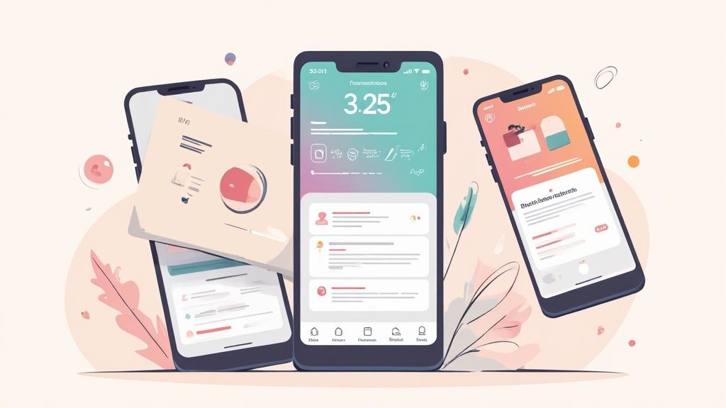
Mobile app UI design is all about crafting the visual experience of an application. It covers everything from the buttons and icons you tap to the spacing and fonts you read. A solid UI makes an app more than just functional. It makes it beautiful, intuitive, and a genuine pleasure to use. This has a massive impact on whether users trust you enough to hit that download button.
The Impact of Great Mobile App UI Design
In today's crowded app stores, your UI is your first handshake. It is the first impression that decides whether someone sticks around or bounces. It goes way beyond just looking pretty. A thoughtful, intuitive interface builds instant trust and subtly guides people to where you want them to go, turning a quick look into a long term user relationship.
This first impression is almost entirely visual. With over 6.3 billion smartphone users around the globe and 88% of mobile time spent inside apps, the stakes could not be higher. In the U.S., the average person checks their phone 262 times a day, giving you hundreds of micro chances to either delight or frustrate them. It is no wonder that studies show 94% of first impressions are design related, and 75% of people simply trust an app more if it looks good.
Why Your UI is a Growth Engine
A powerful UI is one of your best tools for climbing the app store charts and boosting conversions. When people find your app easy to use and nice to look at, they are far more likely to leave positive reviews, tell their friends, and keep coming back. That positive feedback loop is exactly what you need to get noticed on both the iOS and Android stores.
Ultimately, the true test of a great UI is its real world impact on user perception and how users rate an app. A frictionless experience directly translates into better engagement metrics, which the app store algorithms absolutely love.
This is never more obvious than on your product page. Your app store screenshots are a direct window into your UI. They are not just pictures; they are your number one sales pitch.
High quality screenshots showing off a clean, engaging UI can dramatically increase download rates. They instantly communicate your app's value and ease of use before a user even installs it.
Good UI design is not just about surface level aesthetics; it is about building a foundation for success. The table below breaks down how core UI principles directly influence user behavior and, ultimately, your app's bottom line.
How Core UI Principles Drive App Success
| UI Principle | Description | Impact on App Success |
|---|---|---|
| Clarity | The design is easy to understand, and interactive elements are obvious. Users know what to do without thinking. | Builds immediate trust and reduces user frustration, leading to longer sessions and better retention rates. |
| Consistency | Visual elements (colors, fonts, icons) and interaction patterns are uniform throughout the app. | Creates a predictable and reliable experience, which makes the app feel more professional and trustworthy. |
| Feedback | The interface provides clear responses to user actions, like a button changing color when tapped. | Reassures users that the app is working correctly, increasing their confidence and engagement. |
| Hierarchy | Important information and actions are visually prioritized to guide the user's attention. | Helps users achieve their goals faster, improving satisfaction and driving higher conversion rates for key actions. |
Each of these principles works together to create an experience that feels effortless and rewarding, which is the secret to winning over users from the very first tap.
Setting the Stage for Success
At the end of the day, a strong UI reduces friction, boosts satisfaction, and builds a sense of reliability. This foundation is non negotiable for any app with commercial ambitions. When your design is intuitive, it helps people get things done quickly. That is the very definition of a positive user experience. The principles we'll explore are all about creating interfaces that not only work brilliantly in the wild but also look incredible in your app store showcase.
Fundamental Principles of High-Converting UI
Alright, let's move past the theory. A mobile app that actually converts is built on a handful of core principles. These are not abstract, artsy rules; they are the practical foundation that makes an app feel intuitive, trustworthy, and fast. Get these right, and you create an experience that naturally guides people toward your goals.
Think of it as the unspoken conversation between your app and the person using it. When that conversation is clear and predictable, users feel confident and in control. That feeling is what separates an app that gets deleted in five minutes from one that becomes a daily habit.
It is also the secret sauce for creating killer app store screenshots. When people see a clean, logical design in your previews, they instantly assume your app is high quality and easy to use.
Lead the Eye with Visual Hierarchy
Visual hierarchy is basically a tour guide for the user's eye. It tells them what to look at first, second, and third. Without it, the screen is just a confusing mess of buttons and text, leaving users wondering where to even start.
A strong hierarchy uses simple cues like size, color, and placement to create a clear path. Your main call to action button, for instance, should be the most obvious thing on the screen. Make it bigger, give it a contrasting color, and put it right where a thumb can easily tap it.
This single principle is a conversion powerhouse. By making the most important action the most visually obvious choice, you eliminate guesswork and guide people toward signing up or making a purchase.
Build Trust Through Consistency
Consistency is what makes an app feel familiar and reliable. It is about using the same design patterns, icons, and language throughout the entire experience. Think of it like road signs. A stop sign always looks like a stop sign, so you know exactly what to do without thinking twice.
When your app is consistent, people only have to learn how to use it once. That knowledge then applies everywhere else, which dramatically reduces their cognitive load (the mental effort needed to use your app).
A consistent UI builds subconscious trust. Users feel the app is professional and well built, making them far more comfortable engaging with it and, eventually, spending money.
This predictability is everything for long term retention. Inconsistency, on the other hand, just creates confusion and frustration. This is a fast track to getting uninstalled.
Provide Clear Feedback and Confirmation
Every tap, swipe, or action a user takes should trigger an immediate and obvious reaction from the interface. We call this feedback. When someone taps a button, it should visually change, maybe it lights up or shows a subtle animation, to confirm the tap was registered.
This instant confirmation is critical for a smooth experience. It reassures users that the app is working and their input was received. Without it, people get anxious and start tapping again, assuming the app is frozen.
Good feedback can come in many forms:
- Visual cues: A loading spinner after submitting a form.
- Haptic feedback: A slight vibration when a toggle is switched.
- Audio cues: A gentle chime when a message sends successfully.
These small interactions create a responsive, satisfying dialogue between the user and the app.
Aim for Absolute Clarity
If you only remember one principle, make it this one: clarity. Every single element on the screen must have a clear purpose. Use simple, direct language, no jargon or clever icons that make people guess what they do.
Clarity means making things obvious. A button needs to look like a button. A link should look like a link. The most important information should be front and center, with secondary details tucked away but still easy to find.
This principle directly fuels your app store growth. Screenshots that show off a clean, uncluttered interface are far more persuasive. They make an unspoken promise of a user friendly experience before the download even begins, making it an easy "yes" for people browsing both the Android and iOS stores.
Designing for iOS and Android Ecosystems
To really win over users, your app needs to feel at home on their device, not like a clunky visitor from another planet. This is all about respecting the distinct design languages of the two mobile giants: Apple's Human Interface Guidelines (HIG) for iOS and Google's Material You for Android. A common mistake is to build a generic, one size fits all UI, but that just ends up feeling awkward and unprofessional on both platforms.
It is not just about looks; it is about meeting expectations that have been baked into users for years. An Android user instinctively reaches for a certain type of navigation drawer, while an iOS user just knows how a tab bar should behave. Getting these little details right is a huge step toward earning great app store reviews, building loyalty, and ultimately, getting more downloads.
Understanding the Core Philosophies
At their heart, iOS and Android design systems are chasing different goals.
Apple’s HIG is all about clarity, deference, and depth. This means the UI should be clean, almost invisible, letting the user’s content take center stage. It uses subtle layers and blurs to create a sense of physical space you can almost feel.
On the other hand, Google's Material You is built on personalization, boldness, and motion. It is more expressive, with colors that dynamically adapt to the user's wallpaper, funky shapes, and animations that give you feedback and a little bit of joy. It is a much more vibrant and customizable take on mobile UI.
The decision to align with platform specific guidelines is not just a design choice, it is a strategic business decision. A native feeling app is perceived as higher quality, more trustworthy, and easier to use, which directly impacts user retention and willingness to make in app purchases.
Making this effort pays off big time. Studies show that every $1 invested in UX can bring back around $100. That's a staggering 9,900% ROI, mostly driven by users who stick around longer and engage more. This is even more true now that both Google and Apple are leaning into personalization, custom illustrations, and slick animations to help apps build a stronger brand identity.
iOS Human Interface Guidelines vs Android Material You
So, what does this all mean in practice? The best way to understand the difference is to see them side by side. Each platform has its own way of handling fundamental UI components, and knowing the "why" behind each choice helps you create an experience that feels intuitive and trustworthy.
Here’s a breakdown comparing the core philosophies of Apple’s Human Interface Guidelines (HIG) and Google’s Material You.
| Design Element | Apple iOS (HIG) | Google Android (Material You) |
|---|---|---|
| Overall Philosophy | Clarity & Deference: The UI gets out of the way so content is the hero. Focus on legibility and intuitive structure. | Personalization & Expression: The UI is bold and adaptive, reflecting the user's personal style through dynamic color and shape. |
| Navigation | Primarily uses a bottom tab bar for top level navigation. Keeps primary destinations consistently visible. | More flexible. Uses navigation drawers ("hamburger menus"), bottom bars, and top tabs depending on the context. |
| Button Styles | Favors minimalist, text based buttons or clean, contained buttons with soft, rounded corners. | Often uses prominent, pill shaped buttons with distinct shadows and dynamic color fills that react to touch. |
| Typography | San Francisco (SF Pro): A proprietary font family designed for maximum legibility across all Apple devices. | Roboto: A geometric yet friendly font that pairs well with the expressive, customizable nature of the system. |
| Alerts & Dialogs | Uses centered modal alerts that pause the user's workflow and require a direct action to dismiss. | Offers more variety, including subtle "toasts" for quick feedback and detailed dialogs for critical actions. |
| Visual Depth | Creates a sense of 3D space using layers, blurs, and translucency. The UI feels multi dimensional. | Relies on shadows, bold color, and motion to establish hierarchy and provide interaction feedback. |
| Customization | Limited user customization. The focus is on a consistent, curated experience defined by Apple. | Highly customizable. The system's color palette can adapt to the user's wallpaper, creating a unique, personal feel. |
By tailoring these elements, you are not just changing a button's shape. You are speaking your user's native language. This removes friction and makes them feel instantly comfortable, which is key to creating a great first impression.
Key Design Differences in Practice
Let’s dig a bit deeper into how these philosophies change the actual UI elements you build. Getting these right is fundamental for creating app store screenshots that connect with your target audience on each store. For a deeper look, our guide to iOS app store optimization also covers how this kind of visual consistency helps build user trust.
Here are some of the most important differences you’ll run into:
Navigation Patterns: iOS almost always uses a bottom tab bar for the main sections of an app. This keeps the most important destinations in sight at all times. Android is way more flexible, giving you options like a navigation drawer (the "hamburger menu"), a bottom bar, or even tabs at the top of a screen.
Button Styles: Apple's design language leans toward simple, text only buttons or clean, contained buttons with rounded corners. Material You, in contrast, goes for more noticeable pill shaped buttons that often have clear shadows and fill with color when you tap them.
Typography: iOS uses its own font family, San Francisco (SF), which was meticulously designed to be perfectly readable on every Apple device. Android’s default is Roboto, a font that feels both geometric and friendly, a perfect match for Material You's expressive vibe.
Alerts and Dialogs: When an iOS app needs your attention, it usually shows a centered modal window that stops everything until you make a choice. Android has more tools in the toolbox, from little "toasts" (temporary pop ups for quick info) to more detailed dialog boxes for bigger decisions.
By respecting these small but crucial details, you build an experience that feels right. You remove friction and help users feel at home, and that attention to detail is what separates a pretty good app from a truly great one.
A Modern Mobile UI Design Workflow
A great mobile app UI does not just happen by magic. It is born from a deliberate, step by step process that turns a rough idea into a polished, intuitive product. When you follow a solid workflow, every design choice is intentional and grounded in what users actually need, leading to an app that not only looks good but converts.
Think of it like building a house. You would not start hammering nails without a blueprint, and you would not draw the blueprint without knowing who is going to live there. Each stage builds on the last, helping you catch costly mistakes early and ensuring the final result is both beautiful and functional.
Ultimately, a strong workflow is your secret weapon for creating those killer app store screenshots that scream "high quality experience."
From Research to Reality
The journey from a vague concept to a pixel perfect design is not random; it follows a clear path where things get more detailed and refined at each step. The infographic below gives you a bird's eye view of this process, starting with user research, moving into basic wireframes, and finishing with detailed mockups.
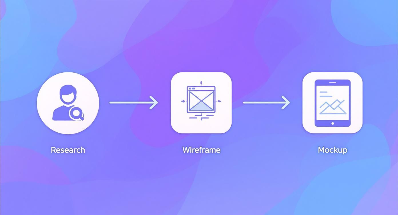
This flow shows how each step logically informs the next, making sure you are not just designing in a vacuum. Let’s break down what really happens at each of these critical stages.
Stage 1: User Research and Personas
Before you draw a single line, you have to know who you are designing for. This is not about guessing. It means doing real user research. This could be running surveys, conducting interviews, and sizing up the competition to uncover your audience's true pain points, goals, and habits.
From all that data, you create user personas. These are essentially fictional character profiles that represent your ideal users. For a fitness app, you might create "Active Alex," a 28 year old professional who needs quick, effective workouts to fit into a packed schedule. Alex becomes your north star, guiding every design decision to ensure you are solving real problems for real people.
Stage 2: Wireframes and Prototypes
With a clear picture of your user, it is time to start sketching out the app's skeleton with low fidelity wireframes. Think of these as basic, black and white blueprints for each screen. The goal here is to map out the structure, layout, and user flow without getting bogged down by colors, fonts, or images. It is all about function over form at this point.
Next, you bring those static wireframes to life by building interactive prototypes. Using tools like Figma or Adobe XD, you link the screens together to create a clickable, tappable version of the app. This is huge because it lets you test the navigation and overall flow long before a single line of code gets written.
Prototyping is where you catch 90% of usability issues. It is far cheaper and faster to fix a confusing button in a Figma prototype than it is to change it once the app is already in development.
Getting these prototypes in front of actual users is where the magic happens. You can watch where people get stuck, see what they find intuitive, and gather the feedback you need to refine the experience. This back and forth process is the key to a truly successful mobile app UI.
Stage 3: High-Fidelity Mockups and Design Systems
Once you have nailed down the user flow, it is time to add the visual polish with high fidelity mockups. This is where you bring in the color palette, typography, icons, and spacing to create a pixel perfect preview of the final product. These mockups are exactly what you’ll use to create your eye catching app store screenshots.
To keep everything consistent as the app evolves, you will also build a design system. This is a central library of reusable components, like buttons, forms, and navigation bars, along with clear rules on how and when to use them.
A design system is a game changer for a few reasons:
- Ensures Consistency: Every screen and feature feels like it belongs to the same cohesive product.
- Increases Efficiency: Designers and developers can build new features much faster by pulling from a library of pre made parts.
- Scales with Your App: As you add more to your app, the design system keeps everything organized and on brand.
This final stage ends with a developer handoff, where you deliver the polished mockups and the design system documentation. A well executed workflow does not just create a better user experience. It makes the entire development process smoother for everyone involved.
Creating App Store Screenshots That Drive Downloads
Think of your app store page as the most important ad you'll ever run. And in that ad, your screenshots are the headline act. A great mobile UI is something to be shown off, not just passively displayed. The best screenshots do not just show what your app does; they tell a story, turning static images into a visual pitch that focuses on benefits, not just a list of features. It is your one real shot to stop a user mid scroll and convince them you are worth their time.
The goal here is simple: create a polished, professional look that builds instant trust, whether you are on the Apple App Store or Google Play. Just uploading raw screen captures is a huge missed opportunity. You have to put on your marketer hat and build a visual argument that makes people want to learn more.
From Raw Screens to A Conversion Story
Those first two or three screenshots carry almost all the weight. They’re often the only ones a user will see without swiping. That means they have to land your app's core value proposition, instantly. Forget showing a login screen; show the amazing thing a user gets to do after they log in.
Let’s say you have a mindfulness app. Instead of a screenshot of the home screen, you could use a screenshot editor to build something much more powerful. You would start with a clean template, pop your screen capture into a slick device mockup, and top it off with a bold, benefit driven caption.
A great screenshot does not say "Meditation Timer." It says "Find Your Calm in 5 Minutes." This small shift in focus from feature to benefit makes a massive difference in how users perceive your app's value.
This storytelling approach walks the user through your app's best parts, creating a cohesive pitch for why they should hit that "Download" button.
Essential Elements of High-Converting Screenshots
To make your visuals really pop, you need to combine a few key elements. Modern tools like ScreenshotWhale are built around these principles, offering templates and editors that make it easy to get it right.
Here are the core components for building screenshots that actually work:
- Benefit-Oriented Captions: Use big, easy to read text that spells out what the user will accomplish. Keep it short, sweet, and punchy.
- Device Mockups: Placing your screens inside a realistic device frame (like an iPhone 16 Pro or Google Pixel) makes them look professional and real.
- Consistent Branding: Stick to your brand’s colors, fonts, and overall style across every screenshot. This creates a unified look that builds trust.
- Social Proof: If you have it, flaunt it. Including star ratings or testimonials can work wonders for credibility. A caption like "Loved by 100,000+ Meditators" is incredibly persuasive.
When you mix these elements together, you end up with a set of visuals that are not just informative. They are emotionally resonant. They tap into a user's desire to experience the app for themselves.
Tools for Efficient Screenshot Creation
Crafting these polished visuals does not have to be a slow, manual grind in a complicated design tool. Platforms built specifically for this job can seriously speed up your workflow while making sure you stick to best practices. A dedicated editor lets you quickly try out different captions, backgrounds, and device mockups to see what connects with your audience.
For example, using an editor, you can A/B test a screenshot with a vibrant gradient background against one with a solid color to see which drives more downloads. This kind of rapid, data driven iteration is key to maximizing conversions on the app stores. For a deeper dive into creating visuals that perform, check out our guide on app store screenshot best practices.
Of course, beautiful screenshots are just one piece of the puzzle. To make sure your wonderfully designed app actually finds its audience, understanding effective mobile app marketing strategies is just as critical. A great app with a killer store page and a smart marketing plan is a powerful combination for growth.
Future Trends in Mobile App UI Design
The world of mobile app UI design never sits still. It is constantly being reshaped by new technologies that change how we interact with our phones. We are moving away from the flat, static interfaces of the past and into a world of dynamic, intelligent, and immersive experiences. These apps feel less like tools and more like helpful companions.
Staying on top of these shifts is the only way to build an app that feels modern and genuinely connects with users. We’re seeing trends like split screen functionality, augmented reality (AR), and voice user interfaces (VUI) completely redefine what is possible. Split screens make multitasking a breeze, while AR is finally breaking out of gaming to revolutionize shopping and education.
Voice is another big one. The global VUI market is projected to hit a staggering $92.41 billion by 2030 as more apps let us get things done completely hands free.
Augmented Reality and Immersive Interfaces
Augmented Reality (AR) is no longer just for social media filters. It is becoming a serious UI tool. Instead of just tapping on a 2D screen, users can now interact with digital information layered right on top of the real world. Think of a furniture app that lets you drop a virtual sofa into your living room to see how it fits, or a navigation app that projects turn by turn arrows onto the actual street in front of you.
This shift makes for a much more intuitive and contextual experience. The UI becomes part of the user's immediate environment, delivering information exactly when and where it’s needed most. As AR hardware gets better and more common, this trend is only going to accelerate.
The Rise of Voice and AI
Voice User Interfaces (VUI) are also moving beyond simple smart speaker commands and into the very fabric of our mobile apps. Building in voice navigation allows for hands free operation, which is a game changer for accessibility and for anyone trying to multitask. It will not be long before you can manage your entire workflow in a project management app just by talking to it.
AI is the engine making all of this, and deeper personalization, possible. The interfaces of tomorrow will adapt in real time to your behavior, preferences, and context. An e commerce app might dynamically rearrange its layout to show you products you’re most likely to buy based on your browsing history, the time of day, or even your physical location.
The future of mobile UI is not about static screens; it is about adaptive systems that anticipate what you need. AI will make interfaces feel more like personalized, predictive assistants that make every interaction seamless.
New Aesthetic and Interaction Paradigms
It’s not just about the underlying tech. The look and feel of our apps is evolving, too. While minimalism is not going anywhere, new styles are cropping up to add more depth, personality, and tactile feedback to our screens.
- Neomorphism: This style plays with soft shadows and highlights to create a subtle, 3D look, making UI elements feel like they’re extruded from the background. It gives interfaces a tangible quality you can almost feel.
- Advanced Micro-interactions: Those small, purposeful animations are getting richer and more detailed. Imagine a button that does not just change color but ripples and gives a little haptic buzz, making the interaction far more satisfying.
- Dynamic Color Systems: Taking a cue from Google's Material You, more apps will start adopting color palettes that adapt to a user's wallpaper, the time of day, or even their mood. This creates a deeply personal and cohesive visual experience.
Keeping these shifts in mind is crucial as you plan your next project. It is also smart to see how these design innovations fit into the bigger picture. You can explore our insights on mobile app marketing trends to connect the dots between great design and a winning growth strategy.
Common Questions About Mobile App UI Design
Diving into mobile app UI design, you are bound to run into a few practical questions. It happens on every project. Getting straight answers to these common hurdles is key to keeping things moving. Let's clear up a few of the most frequent ones I hear.
What Is The Difference Between UI And UX Design?
This one comes up all the time. Think of it this way: User Interface (UI) is what you see and touch. It’s the app's visual personality. This includes the buttons, the colors, the typography, the spacing. It’s all about the look and feel on the screen.
User Experience (UX) is the bigger picture. It is the entire journey a person has with your app. Is it intuitive? Does the navigation make sense? Do they feel accomplished or frustrated after using it?
UI is the saddle, stirrups, and reins of a horse. UX is the feeling of actually being able to ride that horse.
One is about the tools; the other is about the experience those tools create. You cannot have a great product without both working together.
How Much Does Professional Mobile App UI Design Cost?
This is the classic "it depends" question, but I can give you some real world context. The cost swings wildly based on the app's complexity, the designer's experience and location, and how much work is involved. A simple app with just a handful of screens might run you a few thousand dollars.
But for a more complex app, one with custom animations, intricate user flows, and a full blown design system, you’re looking at a range from $15,000 to over $50,000. It is easy to get sticker shock, but try to see it as a core investment. Great UI is not just decoration; it’s what drives user retention and pays for itself over the long run.
What Are The Best Tools For Mobile UI Designers?
Today, the design world pretty much orbits around three major players: Figma, Sketch, and Adobe XD. Honestly, you cannot go wrong with any of them, but the best choice often comes down to your team’s workflow.
- Figma: This is the king of real time collaboration. Since it’s web based, your team can jump in from any operating system, which is a massive plus for remote or mixed platform teams.
- Sketch: A long time favorite for Mac users, Sketch is a powerhouse vector tool that set the standard for modern UI design for years. It is robust and has a massive library of plugins.
- Adobe XD: If your team is already living in the Adobe Creative Cloud, XD is a no brainer. Its seamless integration with tools like Photoshop and Illustrator makes for a really smooth workflow.
Ready to create stunning visuals that drive downloads? ScreenshotWhale provides professionally designed templates and a simple editor to produce high-converting app store screenshots for iOS and Android in minutes. Start creating for free.