How to Create High-Converting App Store Screenshots
Discover how to design a high-converting app store screenshot that drives downloads. Learn proven tips for layout, copy, and testing for iOS and Android.
Your app store screenshots are your most powerful visual sales pitch. Period. They communicate your app's core value faster than any description, often making or breaking the download decision in just a few seconds. This guide provides actionable insights on creating efficient, high-converting screenshots for both Android and iOS to boost your app store growth.
Why Your Screenshots Are a Conversion Powerhouse
Let's be real: most people scan, they don't read. When someone lands on your app’s page, you have a tiny window to grab their attention and convince them your app is worth their time. Your icon and title got them there, but it's the screenshots that will persuade them to tap "Get."
Visuals are processed by the brain much faster than text. A well-crafted app store screenshot can instantly show a key benefit, highlight a beautiful UI, and create an immediate emotional connection. Forget long paragraphs listing features; your images tell a story, showing potential users exactly how your app will solve their problems.
Take a look at this example. It's not just a random collection of screens; it's a curated visual narrative.
Each image builds on the last, telling a story that's easy to digest at a glance. This is how you turn a simple product page into a machine for converting visitors into users and boosting app store growth.
More Than Just Pictures: They Are Ranking Factors
For years, we thought of screenshots purely as conversion assets. That has changed. They have now become a direct factor in app discovery and search ranking, which makes them absolutely critical to your growth strategy.
A major algorithm update from Apple fundamentally changed the game. The App Store now actually reads the text in your screenshots, especially the captions, and folds it into your app's keyword metadata. What does this mean for you? Apps with clear, keyword-rich text in their screenshots can see a serious ranking boost, even for terms you have not explicitly targeted elsewhere.
Investing in high-quality, strategically designed screenshots is no longer just a nice-to-have for conversion. It's a fundamental requirement for getting discovered and growing your app in a ridiculously crowded market.
Building Your Visual Sales Pitch
Think of your screenshot gallery as a mini presentation. Each image is a slide designed to highlight a major selling point or crush a potential objection. The first screenshot has to hook them, the second needs to build interest, and the rest should create desire and drive them to download.
To nail this, you need to combine a few key elements:
- A Compelling Narrative: Tell a story across your gallery. Start with your main value proposition, then dive into specific, tangible benefits.
- Benefit-Driven Copy: Do not just say "Task Manager." Say "Organize Your Entire Life." Focus on the outcome for the user, not the feature itself.
- High-Quality Design: Stick to clean layouts, vibrant colors that pop, and readable fonts that align with your brand identity. It needs to look professional.
This is a core principle of effective app marketing, and you can dig deeper into these strategies in our guide to conversion rate optimization techniques.
When you start treating your screenshots as the essential marketing assets they are, you transform your product page from a simple listing into a high-performing conversion engine.
Designing Screenshots That Stop the Scroll
Effective app store screenshots do more than just show off your app's interface. They have to grab attention and tell a compelling story in just a few seconds. This is where we get into the practical, hands-on design tactics that actually boost conversions and fuel your app's growth. Let's break down how to create visuals that make people stop scrolling and hit that download button.
Building a Strong Visual Hierarchy
Visual hierarchy is all about controlling where someone's eyes go first. A killer screenshot guides the user instantly to the most important message. You pull this off by making one single element the hero of the image.
Nine times out of ten, that hero element is a powerful, benefit-driven headline. Just look at apps like Duolingo ("The fun, free way to learn a language") or Headspace ("Meditation and sleep made simple"). They are not just listing features; they are promising an outcome.
To build a hierarchy that works:
- Headline First: Your headline needs to be the largest, boldest text on the screen. It is the first thing anyone should read.
- Visual Context Second: The actual UI you show should directly support that headline. It is the proof that your app delivers on the benefit you just promised.
- Background Last: The background color or graphic is there to make everything else pop. Use vibrant, on-brand colors that draw the eye without creating a cluttered mess.
Crafting a Compelling Visual Narrative
Your screenshots should never feel like a random collection of app screens. Instead, they need to tell a story across the entire gallery, taking the user on a quick journey from curiosity to conversion. Each image is like a chapter.
The first screenshot is your hook. It has to nail your app's single most important value proposition. For a fitness app, that might be "Reach Your Fitness Goals Faster." For a productivity app, maybe it is "Organize Your Life in Minutes."
From there, the next screenshots should build on that initial promise, revealing more key benefits.
- Screenshot 1 (The Hook): State your primary value proposition.
- Screenshot 2 (The Interest): Show off a core feature that delivers on that promise.
- Screenshot 3 (The Desire): Highlight another major benefit or add some social proof, like "Join 10 Million Users."
- Screenshot 4+ (The Action): Keep showing features that solve real user problems, reinforcing why they need to download your app.
This narrative flow turns passive scrollers into genuinely interested users who get exactly what your app can do for them.
The Power of Professional Device Mockups
Just uploading a raw screen capture often looks amateurish. By placing your UI inside a device mockup, like an iPhone 16 Pro or a Google Pixel, you instantly add a layer of polish and credibility. It helps users picture your app running on their own phone, making the whole experience feel more tangible.
Using device mockups makes your app look more legitimate and trustworthy. It’s a small detail that signals a high-quality product, which can significantly influence a user's decision to download.
That said, the choice to use a mockup depends on your goal. If you are trying to show off a beautiful, immersive UI, a full-screen screenshot without a device frame might actually be more effective. A site editor tool makes this simple. You can upload your raw screen, select a device frame from a library, and instantly see how it looks.
For teams trying to streamline the creation of all these visual assets, utilizing a Screenshot API can automate the whole process, generating mockups across different devices and languages. It's a great way to ensure consistency and save a ton of development time.
Choosing Fonts and Colors That Convert
Every design choice you make should be intentional. The fonts and colors you pick have a direct impact on how readable your screenshots are and the emotional response they trigger.
- Fonts: Stick with clean, legible sans-serif fonts like Helvetica, Roboto, or Montserrat. The text absolutely must be easy to read on a small mobile screen. Make sure there’s high contrast between your text and the background; white text on a dark, vibrant background is a classic combo that just works.
- Colors: Your color palette should feel true to your brand while also being eye-catching. Bright, vibrant colors are great for standing out in crowded search results, but they should never make your text difficult to read. A good rule of thumb is to stick with 2-3 primary colors to keep a clean, consistent look across your entire gallery.
When you nail these design fundamentals, you create a set of screenshots that do not just look great, but actively work to turn visitors into loyal users.
Writing Screenshot Copy That Sells
Your stunning visuals did their job. They stopped the scroll. Now, the text layered on top of your app store screenshot has just a few seconds to convince someone to download. This is where great copy turns a casual viewer into a loyal user. It's an art form built on speed and impact.
Great screenshot copy shifts the focus from what your app does to what the user achieves with it. It’s the difference between a dry feature list and a benefit-driven promise. Nobody gets excited about "syncs across devices," but "Pick up where you left off, anywhere" speaks directly to a real-life need.
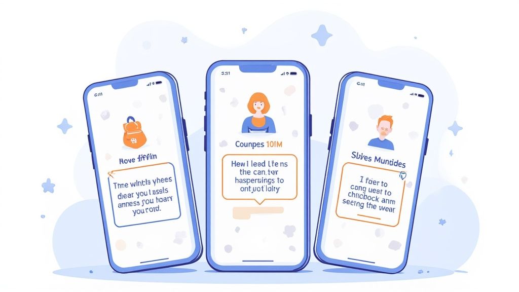
This simple change in perspective is what separates an average app listing from one that consistently converts. Your copy should feel like a solution, not a technical manual.
From Features to Benefits
The most common mistake developers make is simply describing features. Your users do not really care about the "advanced algorithm"; they care that they can "Find the perfect match in minutes." The trick is to translate every feature into a tangible, real-world outcome for the person on the other side of the screen.
Let's practice this mental shift with a few examples:
- Feature: "Encrypted data storage" becomes Benefit: "Your data is always safe and secure."
- Feature: "Customizable workout plans" becomes Benefit: "A fitness plan built just for you."
- Feature: "One-click checkout" becomes Benefit: "Buy your favorites in a single tap."
See how the benefit-driven copy is shorter, more direct, and focuses entirely on the user's experience? This approach makes your app's value instantly clear and far more persuasive.
Crafting Scannable and Punchy Headlines
On a small mobile screen, you have zero room for fluff. Your headlines need to be incredibly concise and easy to scan. A user should be able to glance at your screenshots and understand your app's core value without any effort.
To get this right, stick to a few core principles:
- Start with an Action Verb: Use strong, active verbs like "Create," "Discover," "Track," "Learn," or "Connect." These words grab attention and imply immediate value.
- Keep It Short: Aim for 3 to 7 words per headline. Anything longer is tough to read quickly and just clutters up your beautiful design.
- Use Emotional Language: Tap into your user's desires. Words like "effortlessly," "instantly," or "finally" can create a powerful sense of relief and excitement.
A great app store screenshot headline is like a perfect tweet. It’s short, punchy, and delivers a complete, compelling message in a tiny package. Get straight to the point and make every word count.
Weaving in Social Proof for Instant Credibility
One of the most powerful tools in your copywriting toolbox is social proof. When people see that others trust and love your app, it dramatically lowers their hesitation to download. You can build this trust directly into your screenshot design.
This does not have to be complicated. A simple headline on one of your later screenshots can do all the work. For example:
- "Join 10 million happy users"
- "Featured in Wired and TechCrunch"
- "The #1 Fitness App in the US"
Placing this kind of validation right in your screenshot gallery provides immediate, powerful proof that your app is legitimate and well-regarded. It acts as a final nudge for users who are on the fence, reassuring them that they are making a good choice by clicking that "Get" button. This small detail can have a massive impact on your conversion rates.
Going Global with Localized Screenshots
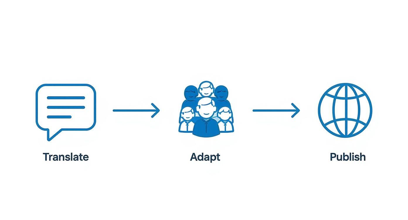
If your app is available worldwide but your screenshots are only in English, you are leaving a massive amount of growth on the table. Unlocking international markets starts with localization, and it’s a lot more than just running your text through a translator.
Real localization is about cultural adaptation. It’s about making someone in Tokyo, Berlin, or São Paulo feel like your app was built just for them. It’s about creating a sense of familiarity that a one-size-fits-all approach can never match.
Why Cultural Adaptation Matters More Than Translation
Just translating the text on your screenshots is the bare minimum. To actually connect with users, you have to adapt the entire visual story. Imagine an e-commerce app showing off winter coats in its Brazilian App Store gallery right in the middle of their summer. It’s an instant disconnect.
You have to dig deeper. Think about areas like:
- Imagery and Content: A food delivery app in Japan needs to showcase sushi and ramen, not pizza and burgers. Feature models, products, and scenarios that feel local and authentic.
- Color Schemes: Colors mean different things around the world. Blue might signal trust in the West, but it could carry a completely different vibe somewhere else. A little research goes a long way.
- User Scenarios: People use apps differently depending on their culture. A social app might do better highlighting group features in collectivist societies, while focusing more on individual expression in others.
Localization is not just about being understood; it's about making users feel seen. When a user in another country sees screenshots that reflect their culture, it breaks down barriers and makes the decision to download feel natural and effortless.
This kind of attention to detail pays off big time. In fact, properly localized app store listings have been shown to boost install rates by up to 48% in multilingual markets. It’s a powerful reminder of how critical culturally tailored visuals are for global success, as detailed in this breakdown of app store statistics.
Creating an Efficient Localization Workflow
The thought of managing dozens of unique screenshot sets for different languages can feel overwhelming, but it is totally manageable with a smart workflow. Whether you are doing it yourself or using a dedicated tool, the process boils down to a few core stages.
First, you need a solid "base" template. Your master version with the core design, headlines, and visuals locked in. From there, you can spin up localized variants.
A good workflow looks something like this:
- Prioritize Your Markets: Do not try to localize for every country at once. Dive into your analytics and start with your top non-English speaking markets.
- Gather Cultural Insights: This is the crucial part. Work with native speakers or localization experts. Find out which holidays matter, what visual styles are trending, and what the local currency and date formats are.
- Adapt and Translate: Now you can swap out images, tweak colors, and translate the copy. For example, a site editor might allow you to duplicate your English template, enter the translated text, and adjust the layout for a new language in minutes.
- Get a Native Review: Before you upload anything to App Store Connect or the Google Play Console, have a native speaker give the final screenshots a once-over. They’ll catch any awkward phrasing or cultural missteps you might have missed.
For teams trying to scale this, modern tools are a game-changer. Our guide on how to auto-translate device mockups shows how automation can help you generate dozens of localized screenshot sets in minutes, not days.
By building an efficient workflow, you turn localization from a painful chore into one of your most powerful engines for global growth.
Testing and Optimizing Your Way to More Downloads
You’ve designed some stunning visuals and written killer copy, but the job is not quite done. The most successful apps do not guess what works. They use data to know for sure. This is where A/B testing your app store screenshot gallery becomes your secret weapon for boosting conversions.
Think of optimization not as a one-time task, but as a continuous cycle. By systematically testing different elements, you can make decisions based on real user behavior, not just intuition. This is how you find the path to sustained growth and higher conversions on the app stores.
Setting Up Your First Experiment
The heart of any good test is a clear hypothesis. Do not let the term intimidate you; it's just a simple, testable question you want to answer. You are not just throwing ideas at the wall here. You are isolating variables to see what truly moves the needle.
Start with a focused question that pits one element against another. Something like:
- Hypothesis 1 (Color): "Will a vibrant blue background convert better than our current green one?"
- Hypothesis 2 (Copy): "Do benefit-focused headlines outperform feature-focused ones for our audience?"
- Hypothesis 3 (Layout): "Will placing our social proof screenshot second in the gallery increase downloads?"
These simple questions give your tests direction and make the results easy to actually understand and act on.
Using Google Play Experiments
For anyone shipping on Android, the Google Play Console offers a powerful, built-in tool called Store Listing Experiments. It lets you A/B test almost any part of your store listing, including your icon, description, and, most importantly for us, your screenshots.
Here’s a peek at what the experiment setup looks like inside the console.

This dashboard is your command center for running controlled tests. You can set one up to show your current screenshot set (the "Control" version) to 50% of visitors and a new, experimental set (the "Variant") to the other 50%.
After a week or two, Google will tell you which one performed better and by how much. For iOS folks, Apple’s Product Page Optimization feature offers a similar capability.
What Variables Should You Test?
While you can test nearly anything, some changes tend to have a much bigger impact than others. To get the most bang for your buck, start with high-impact tests first.
Here are a few proven elements to start experimenting with:
- Background Colors: Pit a bold, vibrant color against a more minimalist or branded background.
- Headline Copy: Test benefit-driven headlines ("Get fit faster") against feature descriptions ("Track your workouts").
- Screenshot Order: Does leading with a social proof image work better than leading with your main feature?
- Device Mockups: Compare screenshots wrapped in a polished device frame against frameless, full-screen UI shots.
- Overall Style: Test a completely new design template against your current one to see if a fresh look resonates better.
The golden rule of A/B testing is to only change one variable at a time. If you change the background color and the headline in the same test, you’ll have no idea which change was responsible for the results. Your data will be useless.
Analyzing Your Results and Making Decisions
Once your test has run its course and gathered enough data, it’s time to see what you’ve learned. The platform will usually flag a clear winner, but it's crucial to make sure your findings are solid.
This is where you need to determine statistical significance to confirm the performance difference was not just random chance.
If your variant shows a clear lift, say, an 8% increase in installs with 95% confidence, that’s a win. Go ahead and roll it out to 100% of your users.
That winning variant now becomes your new "control" version. From there, you just form a new hypothesis and start the process all over again. This iterative cycle of testing, learning, and improving is how you steadily climb the ranks and maximize your downloads over time.
Common Questions About App Store Screenshots
Even with a killer strategy, you’re going to run into specific questions when you are in the trenches creating that perfect screenshot gallery. Nailing these details can be the difference between flat growth and a spike in your conversion rates.
Let's cut through the noise with some quick, practical answers to the questions I hear most from developers and marketers.
How Often Should I Update My Screenshots?
The obvious answer? Update them whenever you push a major UI redesign or a big new feature. But the smart answer is to get ahead of that. I tell people to aim for a visual refresh every six months or so, even if your app's core function is the same.
Why? It signals to users (and the App Store algorithms) that your app is alive and actively maintained. It’s also the perfect excuse to:
- Add some seasonal flair for holidays or big events.
- Showcase a recent award or a killer press mention.
- Test out new messaging or a completely different value proposition.
- Stay current with design trends so your page does not look dated.
Stop thinking of your screenshots as static assets. They’re a living, breathing part of your marketing that should adapt.
Should I Use an App Preview Video Instead of Screenshots?
Do not think "either/or." Think "both." An App Preview video is fantastic for showing off your app's flow, demonstrating dynamic features, and making an immediate emotional connection. A great video can easily bump conversions by over 20%.
But here's the reality: a lot of users just do not watch videos. They’re impatient, scrolling straight to the images to get the gist in seconds. Your screenshots have to be strong enough to tell the whole story on their own.
The winning combo is to lead with a compelling video and follow it up with a polished gallery of benefit-driven screenshots. The video hooks them, and the images close the deal by reinforcing your key messages.
This two-pronged approach covers your bases, grabbing the attention of both the watchers and the scanners.
What Are the Most Common Screenshot Mistakes to Avoid?
Sometimes, winning is just about not losing. Avoiding the common pitfalls is just as crucial as following best practices. So many apps shoot themselves in the foot with simple errors that make their product page look amateurish.
The single biggest mistake I see? Just uploading raw UI captures. No context, no headlines, no device frames. It screams low effort and tells the user absolutely nothing about why they should care.
Beyond that, steer clear of these other conversion killers:
- Cramming Too Much Text: You can not fit a novel onto a phone screen. Keep your headlines short, punchy, and instantly readable. If someone has to squint, you have already lost them.
- Inconsistent Branding: Using a jumble of different fonts, colors, and layouts across your gallery looks messy. It erodes trust. Keep your visual identity tight and consistent.
- Focusing on Features, Not Benefits: Nobody cares about your "Advanced AI Algorithm." They care about getting "Smarter Recommendations." Always translate your tech-speak into a clear user benefit.
- Ignoring Localization: This one is huge. Failing to translate and culturally adapt your screenshots for global markets is like leaving money on the table. It creates instant friction for international users and puts a hard ceiling on your growth.
Sidestep these common blunders, and you’ll already be miles ahead of the competition, with a gallery that’s polished, persuasive, and built to drive downloads.
Ready to create high-converting app store screenshots in minutes? With ScreenshotWhale, you can access professionally designed templates, an intuitive editor, and an AI-powered translation engine to make your app stand out on both the App Store and Google Play. Start creating for free at https://screenshotwhale.com.