Create an App Store Screenshots Template That Converts
Build a high-converting app store screenshots template for iOS and Android. Our guide offers proven strategies to boost app growth and downloads.
An app store screenshots template is a pre-designed layout you can use to create professional, consistent visuals for your app's product page. Think of it as a framework that helps you showcase your app's best features and benefits, ensuring you look polished on both the Apple App Store and Google Play.
Why Your Screenshots Are Your Strongest Sales Pitch
Before a potential user reads a single word of your app description, they scan your screenshots. That split second visual handshake is your most critical opportunity to grab their attention and earn that download. It is like the cover of a book. It has to be compelling enough to make someone want to see what is inside.
A polished and strategic app store screenshots template is not just a design choice. It is a conversion tool. It builds instant trust and communicates your app's value in a heartbeat. Generic, slapped together visuals can make an app feel cheap or buggy, while a professional, consistent look signals a well built, valuable product.
The Power of Visual Storytelling
Your screenshots need to tell a story. They should walk the user through a quick visual journey, highlighting the problems your app solves and the benefits it delivers. This is much more effective than just showing random screens from your UI.
- Nail the First Impression: The very first screenshot must immediately broadcast your unique value proposition. What do you do better than anyone else?
- Showcase the Goods: Each image after that should focus on a core feature, but explained with a benefit driven caption. Do not say "Expense Tracking," say "Track Spending in Seconds."
- Build Trust: A cohesive design across every single visual reinforces your brand identity and tells users you are a pro.
This is exactly where a well designed template becomes your secret weapon. It gives you the structure you need to tell your story the right way.
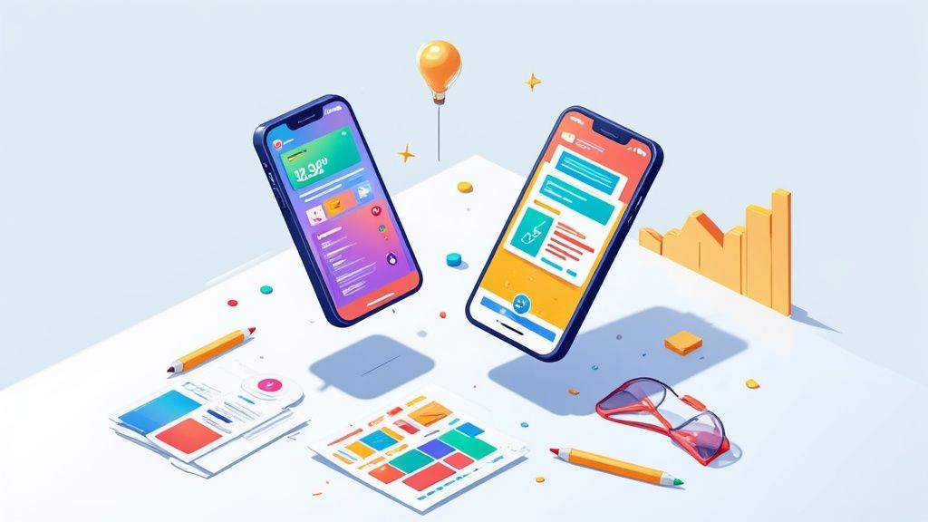
For example, using a solid collection of templates lets you maintain a consistent style while still highlighting different parts of your app.
The templates above show a bunch of different layouts with bold captions and device frames, proving how a template system can create previews that are both eye catching and informative.
Make Every Second Count
The game has changed when it comes to the design of app store visuals. We have seen a clear shift toward formats that make features impossible to miss. Research from pros like SplitMetrics shows that a staggering 80% of users decide whether to download an app within the first 7 seconds of landing on its page. Those first screenshots are everything.
Even more telling? Only 4% of users bother to enlarge portrait screenshots. This means big, scannable captions are no longer a "nice to have". They are absolutely essential for getting your message across fast.
Your screenshot gallery is not just a collection of images; it is a meticulously crafted sales pitch. Each screenshot is a slide in your presentation, and every detail matters in that final decision to tap "Get" or "Install."
Designing Screenshots That Drive Downloads
Let's move from theory to action. This is where the real magic happens: applying design principles that turn casual browsers into actual users. The mission is to build a visual story that not only looks incredible but acts as a powerful conversion engine on both the App Store and Google Play.
Your very first screenshot is the most critical piece of this entire puzzle. It absolutely must communicate your app's core value in an instant. Forget listing features; focus on the ultimate benefit. For instance, a budgeting app should not lead with "Track Expenses." A headline like "Achieve Your Financial Goals Faster" connects with what the user actually wants.
Creating a Cohesive Visual Story
Once you have hooked them with a strong opening, the rest of your screenshots need to guide them through a logical story. Each image should build on the last, showcasing a key feature wrapped in a clear benefit. This narrative flow helps people quickly grasp how your app solves their problem or makes their life better.
To pull this off, you need to balance three key elements:
- Device Frames: Using the latest iPhone or Android mockups makes your app feel modern and relevant. It helps users instantly picture it on their own device.
- Vibrant Backgrounds: A bold, on brand background color makes your screenshots pop in search results. It is your best weapon against a sea of lookalike competitors.
- Clear UI Previews: While the background draws them in, the actual UI inside the frame has to be clean and readable. Focus on a single, compelling action.
A classic mistake is cramming way too much into one image. Cluttered layouts and generic text like "Easy to Use" are instant conversion killers. Your captions have to be bold, benefit driven, and scannable in under three seconds. A good screenshot editor allows you to quickly experiment with different captions and layouts to see what works best.
Keeping Your Visuals Fresh and Effective
Designing a great app store screenshots template is not a one and done task. The app stores are always changing, and so are user expectations. The top performing apps are constantly refreshing their visuals to stay ahead. An industry report found that leading apps on the Apple App Store update their screenshots 2–4 times per year, with 49% making at least two updates annually. This is not just for looks; it is directly tied to better rankings and more downloads.
Think of your screenshot set as a living part of your product. As you add features or refine your UI, your store presence must evolve with it to accurately reflect the value you offer.
When you are designing these screenshots, getting the dimensions right for every device is non negotiable. The specs for an iPhone 15 Pro Max are totally different from a Google Pixel. You can use an image resizer tool to adapt your visuals perfectly, making sure they look sharp and professional on every single screen. It is a small step that prevents the pixelated or badly cropped images that can instantly destroy a user's trust.
Building Your Template From a Blank Canvas
There is a certain power in starting with a blank canvas. Instead of tweaking a pre-made design, you get total creative control to build an app store screenshots template that is 100% yours and perfectly nails your brand. This is not just about making one set of screenshots; it is about building a master template you can reuse and adapt for years to come.
The first step is always getting the foundation right. This means making core decisions: picking a layout that tells a story, choosing the right device frames, and locking in a consistent color palette and typography. A great editor handles the tedious technical stuff, freeing you up to focus on what really matters: the creative side.
Defining Your Visual Identity
Think of your template as an extension of your app's brand. Consistency builds trust, and trust drives downloads. Before you even think about dropping in your UI previews, you need to nail down these core components.
- Select a Layout: How will you tell your story? A single, centered device can be powerful and direct. A split screen design might work well for a before and after shot. Or maybe a panoramic layout that flows across multiple images is the way to go. The structure should serve the story.
- Choose Device Frames: This one is simple: always use the latest device models. An iPhone 15 Pro or a new Google Pixel frame instantly makes your app feel modern and relevant. The best editors have these pre built so you do not have to go hunting for them.
- Establish Brand Colors: Pull your primary brand colors into the backgrounds and accent elements. A vibrant, consistent color scheme makes your screenshots instantly recognizable, helping you stand out in those crowded search results.
- Set Your Typography: Your captions have to be scannable in just a few seconds. Choose a bold, readable font. This is a place where legibility trumps stylistic flair every single time.
The design process is not just about making things look pretty. It is a strategic flow, moving from your core value proposition to the final visual execution.
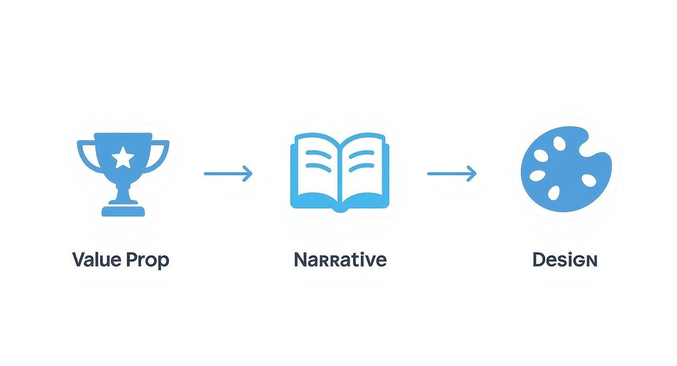
As this shows, a great design starts with a strong message, is backed up by a clear narrative, and is brought to life through thoughtful visual choices.
Crafting High-Impact Captions
With your visual foundation locked in, it is time for the words. Your captions need to be short, benefit driven, and pack a punch. Ditch the generic feature descriptions. Instead of "Task Manager," think "Organize Your Day in Seconds." Focus on what the user will achieve with your app.
Once you have got a solid template, you can even take it a step further. If you are managing frequent updates across many localizations, it is worth learning how to automate screenshot updates using the App Store Connect API to save a ton of time.
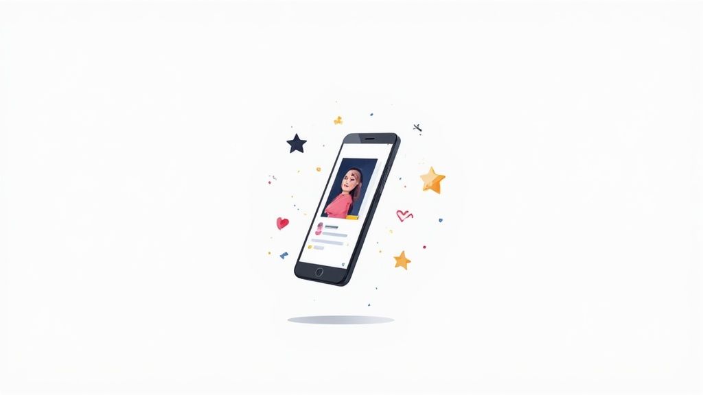
You can see these principles at play in the ScreenshotWhale editor. Notice the clean layout, vibrant background, and a headline that clearly states a benefit. The editor makes it easy to experiment with these elements in real time.
A good editor makes it easy to pull these elements, a device frame, custom background, and impactful text, into a design that looks like it was made by a pro.
Essential Screenshot Sizes for iOS and Android
Getting the dimensions right is non negotiable. Uploading the wrong size can lead to rejection or, worse, stretched and ugly images on your store page. Here is a quick reference table for the most common sizes you will need for your template.
| Device | Portrait Dimensions (Pixels) | Landscape Dimensions (Pixels) | Primary Use |
|---|---|---|---|
| iPhone 6.7" | 1290 x 2796 | 2796 x 1290 | iPhone 15 Pro Max, 14 Pro Max |
| iPhone 6.5" | 1242 x 2688 | 2688 x 1242 | iPhone 11 Pro Max, Xs Max |
| iPhone 5.5" | 1242 x 2208 | 2208 x 1242 | iPhone 8 Plus, 7 Plus |
| iPad Pro 12.9" | 2048 x 2732 | 2732 x 2048 | All 12.9-inch iPad Pro models |
| Android Phone | 1080 x 1920 | 1920 x 1080 | Universal for Google Play (16:9) |
| Android Tablet (7") | 1200 x 1920 | 1920 x 1200 | Google Play 7-inch tablet requirement |
| Android Tablet (10") | 1600 x 2560 | 2560 x 1600 | Google Play 10-inch tablet requirement |
Always double check the latest requirements from Apple and Google, but these sizes will cover the vast majority of devices your users have. Building your template around these specs from the start will save you a world of headaches later on.
By creating a master template, you are not just designing one set of screenshots. You are building a scalable system that saves countless hours on future app updates and feature launches.
This system is your secret weapon. It means you can produce professional grade visuals efficiently, even if you do not have a design background. For more ideas on effective layouts and styles, check out these mobile app design templates. A strong template is not just a design asset; it is a growth engine for your app.
Exploring High-Impact Screenshot Layouts
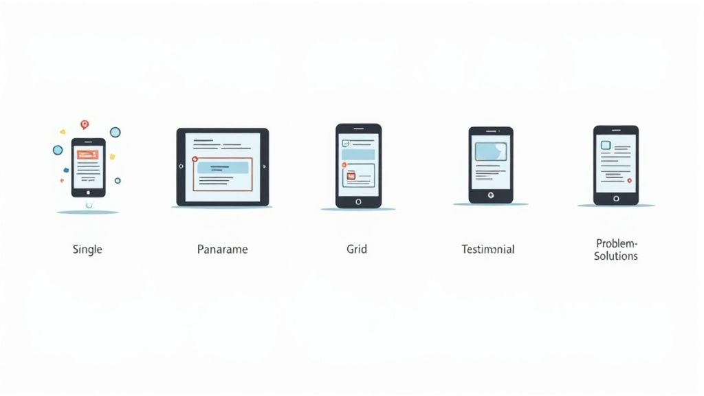
There is no single screenshot layout that works for every app. It is just not that simple. Different designs have different jobs. Some are built to show off one killer feature, while others are better at walking a user through a complete journey. Picking the right structure is what turns your app store screenshots template into a machine for winning installs.
So, let's break down five of the most effective screenshot layouts top performing apps use. Each one tells a story in its own way, and choosing the right one is absolutely critical for boosting conversions on both the App Store and Google Play. Once you get a feel for their strengths, you can match your template design to your app's goals.
Classic Single Device Frame
The single device frame is the old faithful of screenshot layouts. It is exactly what it sounds like: one device mockup, usually an iPhone or a popular Android model, sitting front and center against a clean background. It might sound basic, but this classic approach is powerful because it is so focused.
Its biggest advantage is clarity. By putting a single screen in the spotlight, you get rid of all the noise and pull the user's eye straight to a key feature or benefit. This layout is perfect for the first one or two screenshots in your gallery, where you have just seconds to communicate your app's main value. It works especially well for utility apps, finance tools, or any app where one specific screen can tell a powerful story all by itself.
Immersive Panoramic Layout
If the single frame is straightforward, the panoramic layout is all about creating an experience. This approach uses a single, continuous background image that flows across multiple screenshots, creating a seamless visual path. As users swipe through the gallery, it feels like they are moving through one big, cohesive scene.
This layout is a natural fit for storytelling. You can guide users on a visual journey, showing a step by step process or a narrative that unfolds with each swipe. It is a fantastic choice for games, travel apps, or any app with a strong visual brand. That immersive quality makes your product page feel incredibly polished and memorable, which gets people to swipe through the entire set.
A panoramic layout transforms your screenshot gallery from a simple feature list into an engaging visual narrative. It encourages swiping and keeps potential users invested in your app’s story.
Problem-Solution Narrative
This layout gets right to the point with a classic marketing hook. Each screenshot, or sometimes a pair of them, presents a common user problem followed immediately by your app's solution. For example, the first screenshot might hit them with a headline like "Tired of Messy Inboxes?" over an image of a cluttered email app. The very next one shows your app’s clean interface with the headline, "Achieve Inbox Zero in Minutes."
This structure connects with people on an emotional level because it speaks directly to their frustrations. It is incredibly effective for productivity apps, wellness tools, or any app that solves a clear, annoying problem. By framing your features as the answer, you make your app’s value proposition impossible to ignore.
Optimizing Your Screenshots with A/B Testing
Getting your first template designed feels like a huge win, but your work is not done. It is just getting started. A solid app store screenshots template is the foundation, but what separates the top charting apps from everyone else is a commitment to refining that foundation with real user data. The goal is to stop guessing what you think works and start proving what actually drives downloads.
This is where A/B testing comes into play. It is a simple but powerful method: show one version of your screenshots to one group of users, and a second version to another. By changing just one thing at a time, you get clear, undeniable proof of what motivates people to hit that "Install" button. It is how you take the guesswork out of your app store page and turn it into a high performance conversion machine.
What to Test for Maximum Impact
You could test nearly anything in your screenshots, but some changes have a much bigger impact on conversion rates than others. To get the best results fast, focus your first few tests on these high impact variables.
The key is to isolate a single element for each test. For example:
- Your Captions: Pit a benefit driven headline like "Save an Hour Every Day" against a feature focused one like "Advanced Task Management." Which one connects more with your audience?
- The Backgrounds: See how a vibrant, solid color background stacks up against a subtle gradient or a real world lifestyle image. Does one feel more premium or trustworthy?
- Your Layouts: Test a clean, single device frame layout against a more dynamic panoramic design. Which one does a better job of telling your app's story at a glance?
- The Feature Highlight: Does showing off your flashy new AI feature get more installs than highlighting the core organizational tools users rely on daily?
By testing these elements one by one, you will slowly build an invaluable understanding of what your audience truly wants to see.
A/B testing transforms your app store page from a static billboard into a dynamic conversion engine. Every test provides a lesson that can be applied to future updates, creating a cycle of continuous improvement.
Localizing Your Template for Global Growth
Once you have dialed in a high performing template, the next frontier is taking it global. Simply translating your captions is not real localization. To truly connect with users in different countries, you need to adapt your entire visual strategy to their culture. This is a proven tactic for rocketing up the international charts.
Think about it: a color that signifies excitement in one country might mean something completely different in another. The people in your lifestyle images, the specific use cases you feature, and even the tone of your captions might need a complete rethink for each new market.
This is where a powerful tool like ScreenshotWhale becomes a huge time saver. Its AI translation engine can instantly adapt your text into over 100 languages, but the real magic is in the template system itself. You can easily duplicate your master template, then just swap out a few UI screens or background images to align with cultural norms in a new region.
This approach ensures your app feels native and genuinely relevant to users everywhere, which can dramatically boost your global reach and conversion rates.
Answering Your Top Screenshot Questions
Diving into the world of app store screenshots brings up a lot of questions. Getting the details right can feel like navigating a maze, but it is one of the most critical parts of your app's success. Let's tackle the most common questions from developers and marketers, so you can build your app store screenshots template with confidence.
How Many Screenshots Should I Actually Use?
Simple answer: use every single slot they give you. That is 10 for the Apple App Store and 8 for Google Play. Do not leave any on the table.
Think of each screenshot as a free billboard for a key feature. Your first two or three are the most important since they are what people see without scrolling. This is your prime real estate. Use it to hit them with your most powerful value propositions right away.
What's the Best Way to Add Text?
Text is your secret weapon for communicating value in a split second. The key is to use a large, bold, and super readable font. The best results often come when captions are placed in a dedicated space above the device frame, not plastered over the UI where they might obscure important details.
Keep your copy short and focused on benefits, not just features.
- Instead of: "Manage Tasks"
- Try: "Organize Your Life in Minutes"
The goal is for someone to glance at it and instantly get what your app does for them. A good template will have a designated spot for this text, which keeps everything looking sharp and consistent.
A classic mistake is text that is too small or has terrible contrast with the background. Always preview your screenshots on a real phone to make sure people can actually read what you wrote.
Should I Bother with Device Frames?
In most cases, absolutely yes. Wrapping your UI in a device frame, like an iPhone or Android mockup, helps users visualize your app on their own phone. It just feels more tangible and professional. It grounds the experience in reality.
The exception? Games or super immersive apps. For those, a full screen, frameless image can be way more powerful because it pulls the user right into the action. If you are on the fence, there is only one way to know for sure what works for your audience: A/B test both styles.
How Often Should I Update My Screenshots?
Your product page should be a living, breathing thing. You need to update your screenshots whenever you release a major new feature, finish a big UI overhaul, or run a seasonal campaign.
If you do not have any of those on the roadmap, a good rule of thumb is to refresh your visuals at least once a year. This keeps them looking modern and in line with current design trends. An up to date store listing sends a strong signal to users (and the app stores) that your app is actively maintained and getting better all the time.
Ready to stop guessing and start creating visuals that actually convert? With ScreenshotWhale, you can design a high converting app store screenshots template in minutes. Pick from professionally designed layouts, customize everything to fit your brand, and export pixel perfect assets for every device you can think of. Give it a try and see how easy it is to level up your app store presence.