Mobile App Design Templates for Boosting App Store Growth
Discover how to use mobile app design templates to create high-converting app store screenshots and accelerate your iOS and Android app growth.
Mobile app design templates are your secret weapon for creating professional, high-converting app store screenshots that actually drive downloads. Think of them as pre-built layouts: a structured foundation that lets you produce polished, on-brand visuals without needing to be a design guru. This approach saves a ton of time and makes sure your app’s first impression is a powerful one, directly impacting your app store growth and conversions.
Why High-Converting Screenshots Drive Downloads
In a ridiculously crowded app marketplace, your screenshots are your primary sales pitch. They are one of the most influential marketing assets you have, and they often determine whether a user taps "Get" or just keeps scrolling. A potential user makes a split-second judgment based on these visuals, making their quality a direct driver of your app's growth on both the Android and iOS stores.

This visual-first evaluation means that investing in how you present your app's UI/UX pays off, big time. We are talking real numbers here. Research shows that every $1 invested in user experience can return a staggering $100: that’s an incredible 9,900% ROI. Using a solid mobile app design template is a direct investment in that experience, ensuring your store presence reflects the quality of your app and drives conversions.
Communicate Value Instantly
Let's be honest, users rarely read those long app descriptions you spent hours writing. Instead, they scan your screenshots to quickly figure out what your app does and why they should care. An efficient, high-converting app store screenshot, made with a template, combines a clean device mockup, benefit-focused text, and your actual UI to tell a compelling story in a heartbeat.
It immediately answers the user’s core question: “What’s in it for me?”
Your app store screenshots are not just previews; they are advertisements. Their job is to sell the experience and solve a problem for the user before they even download the app.
Build Trust and Credibility
Professional, polished screenshots send a clear signal: this is a high-quality, trustworthy app. On the flip side, poorly designed or generic visuals can make a product look buggy or unprofessional, scaring away potential users.
By using an editor with curated templates, you can easily create a cohesive and attractive visual narrative that builds confidence and helps your app stand out. For example, within a site editor, you can set a consistent background color and font style across all your screenshots with a single click, ensuring your branding feels unified. This consistent branding across all your visuals reinforces credibility and encourages people to trust your app enough to download it.
If you want to dive deeper into the nuts and bolts, check out our guide on creating effective app store screenshots.
To help you get started, here’s a quick breakdown of what makes a screenshot truly effective and what features to look for in a template.
Elements of a High-Converting Screenshot
| Element | Why It Matters for Conversion | Practical Example in an Editor |
|---|---|---|
| Compelling Headline | Grabs attention and quickly communicates the core benefit. | Use customizable text fields to make your headline bold and punchy. |
| Clean Device Mockup | Puts your app in a familiar context and makes it look professional. | Select the latest iPhone or Pixel frame from a device library with one click. |
| Actual UI | Shows the app's functionality and proves it's real and well-designed. | Drag and drop your screen captures directly into the template's device frame. |
| Benefit-Oriented Captions | Explains why a feature is valuable, not just what it is. | Position flexible text boxes next to key UI elements to highlight outcomes. |
| Consistent Branding | Builds trust and brand recognition across the screenshot set. | Set custom brand colors, fonts, and backgrounds that apply to all visuals. |
Ultimately, a good template gives you all these building blocks. It’s not just about making things look pretty; it's about having the right tools to build a visual argument that convinces people to hit that download button and boost your app store growth.
Selecting the Right Design Template for Your App
Choosing a design template for your app's screenshots isn't just about making things look pretty. It's a strategic move that directly shapes how a potential user sees your app's value. A great template doesn't just catch the eye: it nails your branding, speaks to your target audience, and puts your most important features front and center, leading to higher conversions.
Think of it as the foundation for efficient and high-converting app store screenshots that turn casual browsers into loyal users.
Just take a look at the Apple App Store. The top apps almost always use a clean, benefit-focused approach in their visuals.
See how they communicate their purpose almost instantly? They use minimal text and crystal-clear UI in those first few screenshots. That’s exactly what you're aiming for. Find a template that lets your app's benefits shine through without any guesswork.
Aligning Templates with Your App's Niche
The category your app falls into should be the number one factor guiding your template choice. A meditation app, for instance, calls for a calm, minimalist vibe with serene colors. On the other hand, a high-octane gaming app needs something dynamic and bold. A good site editor will often group templates by category to make this a whole lot easier.
Here’s a practical breakdown:
- Productivity Apps: Look for templates with clean lines and structured layouts. You'll want plenty of room for feature callouts that highlight efficiency and organization.
- E-commerce Apps: Your best bet is a template with large image areas to really show off your products. The design needs to feel modern and trustworthy to get people to hit "buy."
- Gaming Apps: Go for vibrant, action-oriented templates. You need a layout that can handle exciting in-game moments and splashy, attention-grabbing fonts.
Considering Platform Specifics for iOS and Android
While your brand needs to stay consistent, your screenshots absolutely must feel native to each platform. It's a subconscious thing: users trust apps that respect the design language of their phone. This means your templates should offer platform-specific mockups for both iOS and Android.
One of the most jarring mistakes you can make is showing an iPhone mockup in your Google Play Store listing. It screams carelessness and can instantly erode a user's trust. Always, always match the device frame to the store.
A quality site editor makes this a breeze, letting you toggle between an iPhone and a Google Pixel frame with a single click. It’s a tiny adjustment that makes a massive difference in how professional your app looks. For a deeper dive into getting this right, check out our complete guide on mobile app mockups.
Evaluating Layout Font and Color
Once you've narrowed it down by category and platform, it's time to dig into the details. Is the font easy to read? Does it fit your brand’s personality? Crucially, can you easily tweak the color palette in the editor to match your brand's specific hex codes?
Today's users expect a sophisticated experience, and your template design needs to reflect that. If you're looking for pre-built structures to get started, exploring a variety of mobile design templates can really speed things up.
Ultimately, the best template is a flexible one. It gives you a strong starting point but still lets you tell your app's unique story, clearly and persuasively.
Turning a Template into Your Brand's Story
A great template is just the starting point. The real work, and where the magic happens, is in the customization. This is where you take a proven layout and inject your app's unique personality, turning a generic structure into something that genuinely drives downloads. And with a good site editor, you don't need to be a design wizard to pull it off.
The goal is to craft a set of visuals that are instantly, unmistakably yours.
This isn't just about dropping your UI into a frame. It's about making sure every single element, from the background color to the headline copy, sings in harmony with your brand. Get this right, and you’ll create a cohesive, persuasive story that unfolds across your entire screenshot gallery.
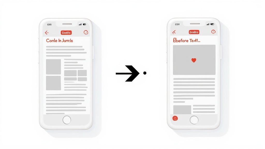
From Placeholder to "Aha!" Moment
First things first: get rid of those placeholder images and drop in your actual app screens. A quality site editor should make this dead simple: just drag and drop your exported UI files right into the device mockups. Instantly, the design starts to feel like your own.
But don't just pick any screens. You want to showcase your app's "aha!" moments. These are the screens that make a user's life easier, solve their biggest headache, or deliver that core bit of value. A finance app might show off its beautifully simple dashboard, while a social app could highlight its most engaging content creation tool.
Nail Your Brand's Look and Feel
Next up, it’s time to sync the template's visuals with your brand guidelines. Generic colors and fonts scream "template," and that's the last thing you want. Customization here is what builds a memorable presence on the app stores.
Inside the site editor, you’ll find options to tweak the background, text, and accent colors. Don't just eyeball it: pull the exact HEX codes from your brand's style guide and plug them in. This one small step is the secret to perfect consistency.
Here’s a quick, actionable approach:
- Background: Pick a vibrant color that makes your UI pop without being distracting. A solid brand color or a subtle gradient usually does the trick.
- Fonts: If the template allows, choose a font that matches your brand's voice, whether that's modern, playful, or buttoned-up professional.
- Text Colors: Legibility is king. Make sure your headlines and captions are easy to read against the background. I like using a primary brand color for headlines to really grab attention.
Your brand colors aren't just for looks. Consistent color usage has been shown to boost brand recognition by up to 80%. That feeling of familiarity builds trust and makes people much more likely to hit that download button.
Rewrite Headlines to Sell the Benefit, Not the Feature
The placeholder text in a template is just a suggestion. Your headlines are prime real estate for convincing someone to install your app, so they need to pack a punch. The secret? Focus on the benefit, not the feature.
For example, a meditation app's template might say "Meditation Timer." That's a feature. A far more compelling, benefit-driven headline would be something like, "Find Your Calm in 5 Minutes." See the difference?
This simple shift changes the focus from what your app does to what your app does for the user. It's a fundamental move in conversion copywriting. A good site editor lets you edit text on the fly, so you can experiment with different messages and see what connects with your audience. This is where you stop just showing screens and start telling a story that boosts conversions.
Stunning visuals might catch a user's eye, but it's the copy that truly seals the deal. The text on your app store screenshots is your direct sales pitch. It’s your best shot at turning a passive glance into an active download.
In the few seconds you have to make an impression, every single headline and caption has to pull its weight. Our mobile app design templates give you the perfect canvas, but filling it with words that sell is the real key to app store growth. The goal is to be sharp, clear, and laser-focused on what your user actually needs.
Nail Your Headlines with Action
Your headline is the very first thing people read, so it cannot be passive. It needs to hit hard. A formula that works time and time again is leading with a strong action verb that screams what the user can accomplish. Ditch the bland descriptions and give them a command that frames your app as the solution they've been looking for.
Think about it. A generic headline for a fitness app might just say "Workout Tracking." It's true, but it's flat. A much stronger, action-oriented version is "Track Your Progress Daily." See the difference? That simple tweak shifts the focus from a feature to an achievable goal for the user.
Here are a few formulas I've seen work wonders:
- Verb + Benefit: "Organize Your Day," "Master a New Language"
- Solve a Problem: "Never Miss a Deadline," "End Budgeting Stress"
- Achieve a Goal: "Reach Your Fitness Goals," "Build a Reading Habit"
Always Talk Benefits, Not Features
Here’s a hard truth: users don't really care about your app's features. They care about what those features can do for them. This is the absolute core of benefit-driven copywriting. You have to frame every piece of text around the positive outcome or the problem you're solving.
Your copy should answer the user's silent question: "How does this make my life better?" If your text is describing a button or a menu, you're talking about features. If it’s describing an emotion or an achievement, you're talking about benefits.
For example, instead of listing "Advanced Photo Filters," try "Create Stunning Photos in Seconds." The first describes a tool; the second sells a result people actually want. This approach makes your app's value click instantly.
Build Trust with Social Proof and Localization
Has your app hit a big milestone? Don't be shy: show it off! A simple caption like "Join 1 Million Happy Users" can be ridiculously persuasive. This is what we call social proof, and it works because it builds instant trust and lowers the risk a user feels when trying something new.
And finally, don't sleep on localization. Translating your screenshot copy for different countries is a must if you want to go global. What works for a user in the US might completely miss the mark somewhere else. Using an editor with a built-in translation feature makes this a breeze, letting you adapt your high-converting copy for a worldwide audience without the headache.
Getting Your Screenshots Ready for the App Store
https://www.youtube.com/embed/Qgq6jsRtfbA
Alright, you've designed some killer screenshots. Now comes the final, slightly nerve-wracking part: navigating the submission process for the Apple App Store and Google Play.
This stage is all about precision. Get the dimensions, formats, or naming conventions wrong, and you're looking at frustrating rejections and delays. Trust me, there's nothing worse than having your launch held up by a simple file format error. A smooth submission means your visuals get in front of users without any friction.
Thankfully, most modern screenshot editors simplify this dramatically. Instead of manually resizing every single image for every required device, a good tool will have an export function that spits out all the necessary assets in just a few clicks. It’s a massive time-saver and your best defense against mismatched specs.
Nailing the Technical Details
Before you can upload anything, you have to export your finished designs in the exact format the app stores demand. They are incredibly picky about this.
Here’s what you need to get right every time:
- File Format: Always, always export your screenshots as PNG files. JPEGs might be smaller, but PNGs preserve the crisp quality of your UI without any weird compression artifacts.
- Color Profile: Stick with an RGB color profile. It's the standard for digital screens and ensures your brand colors look just as you intended on users' devices.
- No Transparency: Make sure your final PNGs are fully opaque. Both stores will reject images that have an alpha channel or any transparent pixels.
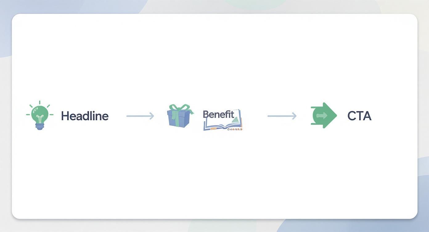
When you're writing the captions, it helps to have a clear flow in mind. I find this simple structure works wonders for grabbing attention and getting the point across quickly.
This flow is all about leading with a strong headline, immediately showing the user what’s in it for them, and then subtly prompting them to download. It just works.
If you want a full step-by-step on the upload itself, our detailed guide on how to upload a screenshot breaks it all down.
Meeting the Platform-Specific Rules
This is where many developers trip up. Each store has its own rulebook, and Apple is notoriously specific, requiring different screenshot sizes for multiple iPhone and iPad models. While Google Play is a bit more flexible, providing assets for various screen densities is still the best way to go.
To make this easier, here’s a quick cheat sheet for the latest requirements.
App Store Screenshot Requirements at a Glance
This table is a handy reference for the core specs you'll need to meet for both Apple and Google.
| Specification | Apple App Store (iOS) | Google Play Store (Android) |
|---|---|---|
| Required Sizes | 6.7", 6.5", 5.5", and 12.9" iPad Pro (3rd gen) are mandatory. | At least 2 screenshots are required, with up to 8 per device type. |
| Aspect Ratio | Varies by device (e.g., 19.5:9 for modern iPhones). | Primarily 16:9 or 9:16. Other ratios are supported. |
| Format | PNG (no alpha) or high-quality JPEG. | PNG (no alpha) or JPEG. |
| Max Screenshots | Up to 10 per device type. | Up to 8 per device type (phone, tablet, Wear OS, TV). |
Always remember to check the latest official documentation from Apple and Google before a big launch, as these specs can and do change.
Pro Tip: Failing to provide the correct screenshot sizes is one of the most common, and easily avoidable, reasons for an app submission to be rejected. Double-check the latest guidelines before you hit "submit."
Getting this right matters. The global mobile app market is projected to hit around $585.7 billion by 2025. With Apple holding a massive 76.9% of the market share, adhering to their standards is non-negotiable if you want to reach the largest segment of paying users.
For a deep dive into the entire release cycle, I highly recommend checking out this complete guide to publishing your app on the App Store. Mastering these final technical steps ensures all your hard work on design and development actually pays off with a successful launch.
A Few Common Questions About App Design Templates
If you’re staring at your store listing and wondering how many visuals are too many, you're not alone. Let's tackle some of the most common questions that pop up when working with mobile app design templates. Getting these right can save you a lot of headaches later.
How Many Screenshots Should I Actually Use?
Both the App Store and Google Play let you upload up to 10 screenshots, but this is a classic case of quality over quantity. Don't just fill the slots for the sake of it.
Most successful apps I've seen aim for 5–7 really solid visuals that tell a clear, compelling story. Your first three are absolutely critical because they’re what users see without scrolling. They have to hook the user immediately.
A few actionable tips:
- Make sure each screenshot highlights a core benefit, not just a feature. Keep people scrolling.
- Arrange them in a logical flow that walks the user through the app's value.
- Keep your text short and sweet. Cluttered layouts are an instant turn-off.
You can definitely start with the same core design for both stores, but tailoring is key. Each platform has its own vibe, UI guidelines, and device frames. When you're in ScreenshotWhale, it's as simple as switching the device frame to an iPhone for the App Store and a Google Pixel for Google Play. It’s a small detail that makes a big difference.
How Often Should I Update and Test My Screenshots?
Think of your screenshots as a living part of your app, not a one-and-done task. They need to evolve.
Anytime you push a major update or give your UI an overhaul, your screenshots should reflect that. A good rule of thumb is to give them a refresh every six to twelve months anyway, just to keep the listing looking modern and active. Stale visuals can make an app feel abandoned.
But don't just guess what works. A/B testing is your best friend here. Some apps I've worked with have seen a 15% lift in installs just by testing and rotating their screenshot sets. The data doesn't lie.
“Treat your app screenshots as marketing assets, not simple previews.”
— Susan, ASO Specialist & Developer
Testing your designs is straightforward. Here’s a simple cycle to follow:
- Create two different versions of your screenshot set in ScreenshotWhale.
- Run an A/B test using Google Play's experiments or the product page optimization feature in App Store Connect.
- Look at the click-through rates and conversion data to see which set performed better.
Rinse and repeat. This continuous loop ensures your visuals are always working as hard as they can for you. Answering these questions puts you in a much better position to squeeze real value from your design templates. Now you’re ready to start customizing and testing.
Ready to scale your app store conversions? Get started with ScreenshotWhale for free.