Your Guide to High-Converting Mobile App Mockups
Create mobile app mockups that boost downloads. Learn to design high-converting app store screenshots that drive growth and user engagement.
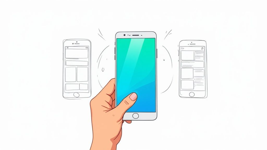
So, what exactly is a mobile app mockup?
Think of it as the movie trailer for your app. A great app idea is the script, sure, but the mockup is that polished, exciting preview that convinces people they need to download. It's not just a pretty picture; it's a powerful marketing tool designed to boost app store growth by giving potential users on the App Store and Google Play a compelling reason to tap "Install."
Mockups, specifically high-converting app store screenshots, bridge the crucial gap between a rough concept and a fully functional product, offering a realistic glimpse of what it’ll feel like to actually use your app.
Where Mockups Fit in the Design Process
It’s easy to get mockups confused with their cousins, wireframes and prototypes. They each play a distinct role in bringing an app to life:
- Wireframes: These are the bare-bones blueprints. Think black-and-white sketches focused purely on structure and layout—where the buttons go, where the text sits. No styling, no frills.
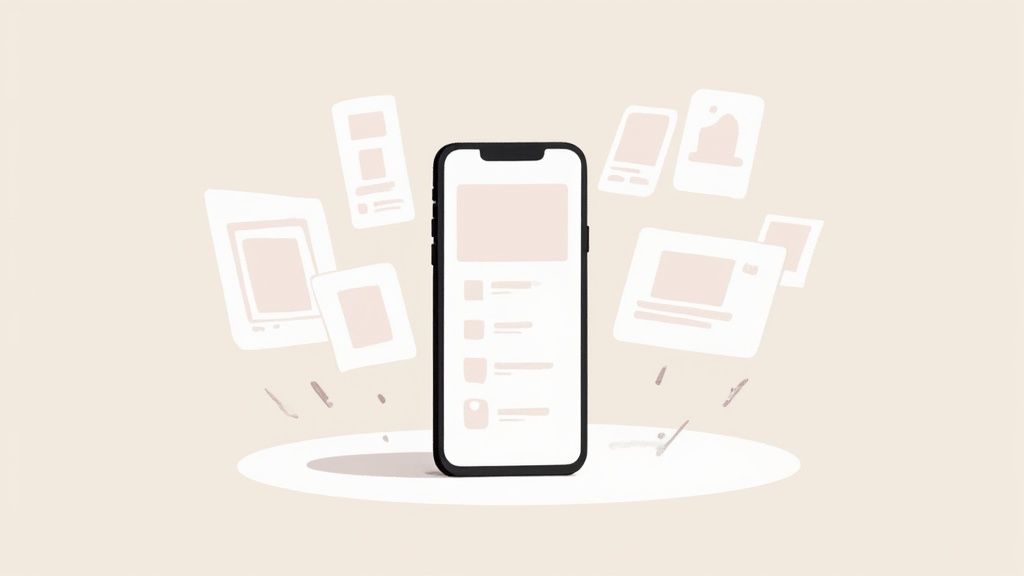
- Mockups: This is the visual model. It takes that blueprint and adds color, typography, real images, and branding. It’s a static image, but it shows exactly what the app will look like on the App Store or Google Play.
- Prototypes: This is the test drive. Prototypes are interactive and clickable, simulating how a user would navigate from one screen to the next. It’s the closest you get to the final product before a single line of code is written.
The Power of a First Impression
On a crowded app store, you have just seconds to grab someone's attention. High-quality mobile app mockups are your best shot at making those seconds count. They instantly communicate your app’s value, build trust, and scream professionalism.
A polished visual presentation signals that the app underneath is well-built and reliable, which directly influences a user's decision to tap that "Install" button. This isn't just about looking good; it's visual storytelling that boosts your app store growth and conversions.
The industry knows this, too. Projections show the global mobile app designers market is set to grow from $0.9 billion in 2025 to a staggering $2.5 billion by 2032. This boom is fueled by the relentless demand for tools that create stunning, high-converting mockups and deliver a top-tier user experience. You can learn more about this growing market and its key trends.
Ultimately, investing time in creating efficient and high-converting app store screenshots isn't just another design task—it’s a core marketing strategy. By showing off a clear, attractive, and benefit-driven preview of your app, you set the stage for success and a growing user base on both iOS and Android.
How Mockups Drive Your App Growth
Let's be clear: professional mobile app mockups do more than just make your app store page look pretty. They're a powerful engine for real, tangible growth. High-quality visuals have a direct line to the metrics that matter most—download rates, app store rankings, and even how long users stick around.
It all boils down to one word: trust.
When someone lands on your app page, they make a split-second judgment. Polished, well-designed mockups send a clear signal: this is a high-quality, trustworthy app. That split-second impression is often all it takes to lower their hesitation and get them to tap the 'Install' button. This is where you turn a casual browser into a loyal user.
Fueling Your App Store Optimization
The app store algorithms, both on iOS and Android, have a soft spot for apps with high conversion rates—that's the percentage of visitors who actually download your app. When you create compelling mockups that convince more people to install, you're sending a strong positive signal to the app stores.
This simple act can kick off a powerful chain reaction:
- Improved Rankings: Higher conversion rates can seriously boost your app's visibility in search results and category rankings.
- Increased Organic Downloads: Better rankings mean more organic traffic, which creates a positive feedback loop of discovery and growth. It feeds itself.
- Lower Acquisition Costs: When your organic performance is strong, you don't have to lean so heavily on paid ads. Your marketing budget suddenly becomes a lot more efficient.
The Secret Weapon for A/B Testing
So, how do you figure out which message actually connects with your audience? Mockups are the perfect tool for A/B testing your app store listing. You can quickly whip up different versions of your app store screenshots to test all sorts of variables.
By experimenting with different headlines, background colors, device frames, and featured screenshots, you can gather data-driven insights on what truly drives downloads, eliminating guesswork and optimizing for maximum impact.
For instance, a fitness app could test a mockup that highlights a "Personalized Workout Plan" against another one showing off a "Community Challenge" feature. The version that pulls in more installs tells you exactly what users value most, helping you refine your entire marketing message. Getting this right is especially key for different platforms, and we dive deep into this in our guide to crafting perfect iOS app screenshots.
Securing Stakeholder and Investor Buy-In
Mockups aren't just for the app stores. They're an essential tool for getting your internal team and external backers on the same page. A detailed visual of your app makes your vision tangible for stakeholders, developers, and potential investors.
Instead of just describing features, you can show them precisely how the app will look and feel. This clarity helps secure the resources you need for development and can be the very thing that convinces an investor to write that check. In a market this crowded, a strong visual pitch makes all the difference.
And the scale of this market is massive. Back in 2023, there were over 257 billion daily app downloads, with users spending a mind-boggling 5.1 trillion hours on their phones annually. That kind of fierce competition means making a knockout first impression is non-negotiable. You can dig into more stats like these in this insightful report.
Designing Mockups That Actually Convert
Great mockups aren't just about looking good; they're about getting someone to act. You want every app store screenshot to walk a potential user straight toward that "Install" button by showing them exactly how your app solves their problem.
This is where visual storytelling comes in. It’s how you turn a static image into a tiny, persuasive narrative. When you nail this, you’re not just showing off features—you're demonstrating benefits, and that’s what drives real app store growth.

Visual Hierarchy And Focus
Think of your mockup like a movie poster. You need to direct the viewer's eyes to the most important part first. A big, bold headline at the top saying “Track Your Sleep in One Tap” does exactly that.
- Actionable Insight: Use large, can't-miss-it headlines to deliver the main benefit in under 2 seconds. In an editor, make your headline font size at least 2-3x larger than any subtext.
- Focus on one key UI element per screenshot. Too much at once just creates confusion.
- Guide the eye with subtle cues, like arrows or even illustrated hands pointing to a key button.
When every element has a purpose, the whole design feels intentional and professional. A clean, clutter-free layout builds trust instantly.
“Users decide in 3 seconds whether an app is worth their time. Make your value proposition impossible to ignore.”
To really understand how these small details work together, it helps to break them down. Each design choice sends a subtle psychological signal to the user, guiding their perception and, ultimately, their decision to download your app.
Key Design Elements and Their Impact
| Design Element | Psychological Impact | Best Practice Example |
|---|---|---|
| Visual Hierarchy | Directs attention and eliminates confusion. | A powerful benefit statement placed right at the top. |
| Color Psychology | Evokes specific emotions like trust or excitement. | Using vibrant, high-contrast colors to make your UI pop. |
| Typography | Improves readability and reinforces brand identity. | Pairing a strong, bold headline font with a clean body font. |
As you can see, these aren't just aesthetic choices; they're strategic tools for persuasion. Getting them right is critical for making a strong first impression.
Color Choices And Psychology
Color is a shortcut to emotion. A vibrant orange can signal energy and fun, perfect for a social or gaming app. Cool blues build trust, making them ideal for finance or productivity tools.
- Actionable Insight: Use a site editor's color picker to select a vibrant background that complements your app's UI. A gradient or abstract shape can make the device frame pop.
- Make sure your text and background have enough contrast to be easily readable.
- Limit your palette to 3 main colors to avoid a chaotic, overwhelming look.
Simpler color schemes feel more cohesive and professional. They also make A/B testing way easier because you have fewer variables to track.
Typography That Guides Users
On a small screen, readable text is everything. A font that’s too thin will disappear in the glare of a phone, while a super chunky headline can completely overpower the rest of the text.
Here’s a simple process to follow:
- Choose a bold, legible font for your headlines that looks great on both Android and iOS devices.
- Pair it with a simple, neutral sans-serif for body copy to keep things clear and easy to read.
- Actionable Insight: In your editor, slightly increase the line spacing (leading) of your captions to give the text room to breathe, making it easier to scan.
With a tool like ScreenshotWhale’s drag-and-drop editor, you can experiment with different font pairings in real-time. It’s a hands-on way to find what works best and speed up your design process.
Crafting Benefit Focused Captions
The right caption can instantly reframe a feature as a solution. Instead of stating the obvious like "Offline Mode Available," connect it to the user’s life: "Stay Connected Anywhere, No Wi-Fi Needed." See the difference? One is a feature; the other is a benefit.
- Start by describing the problem, then immediately show how your app solves it.
- Keep captions short—under 8 words is a good rule ofthumb for quick scanning.
- Use action-oriented words like "Save," "Discover," or "Unlock" to inspire a tap.
These benefit-driven captions work together with your visuals to tell a complete story. They tie everything back to how your app will make the user's life better.
For a deeper dive, check out our guide on app store screenshot best practices for 2024.
Streamlining Creation With ScreenshotWhale
Instead of wrestling with design tools, ScreenshotWhale’s drag-and-drop interface lets you create and update stunning visuals in minutes. You can swap backgrounds, tweak captions, and test different fonts on the fly.
The platform comes loaded with professionally designed templates already optimized for the latest Android and iOS device frames. It automatically applies best practices for things like color contrast and typography, so you can be confident every mockup you create meets the app stores' guidelines.
Your Step-By-Step Mockup Creation Guide
So, how do you actually make a high-converting mobile app mockup? The good news is you don’t need a design degree. It’s a pretty straightforward process once you break it down. It’s all about thinking strategically and then picking the right tool for the job.
Let's walk through how to turn your raw app screens into polished, persuasive assets that grab attention on the iOS and Android stores.
Think of it like putting together a movie trailer. You need to pick the best scenes (your app screens), write a killer script (your headlines), and edit it all together to tell a story that gets people hooked.
Let's dive in.
First, Plan Your Visual Story
Before you even think about opening a design tool, you need a plan. Your app store screenshots have to tell a story—one that guides a potential user from their problem straight to your app's solution.
Start by asking yourself a few simple questions:
- What’s the single biggest value my app delivers? This is your hero. It needs to be the star of your first one or two screenshots.
- What are the top three features that deliver this value? Each of these can get its own screenshot.
- What’s the natural flow a new user would take? Arrange your screenshots to follow that journey.
When you build a narrative like this, your mockups feel intuitive and convincing. They stop being a random collection of screens and start making the benefits of your app impossible to miss.
Next, Choose The Right Mockup Tool
Once you have your story straight, it’s time to pick a tool to bring it to life. The market is full of options, from powerhouse design platforms like Figma to specialized tools built just for creating app store screenshots.
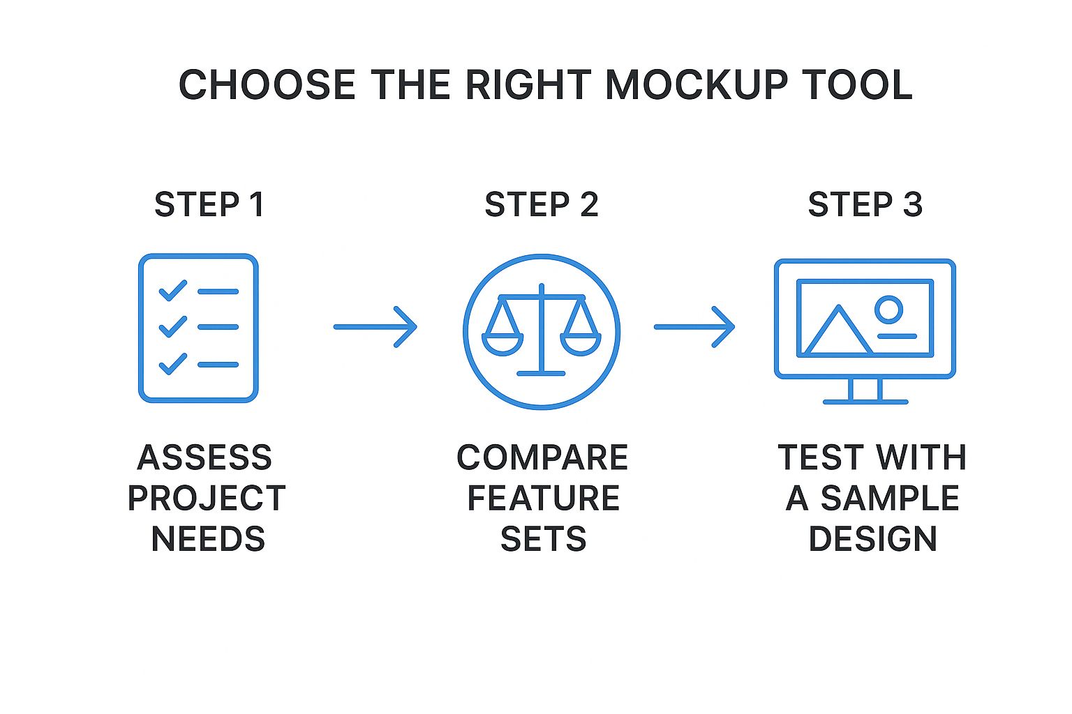
The big takeaway here is that efficiency is key. Tools like ScreenshotWhale are designed to speed this whole process up with ready-made templates and simple drag-and-drop features. This lets you focus on your message, not on fiddling with pixels.
Now, Assemble Your Mockup
Alright, it’s time to get hands-on. Using an editor like ScreenshotWhale makes this a breeze, but these core steps apply no matter which tool you're using.
Pick Your Device Frame: First things first, choose the right device frame. Use an iPhone for the iOS App Store and a Google Pixel or Samsung Galaxy for the Google Play Store. The right device creates instant familiarity and trust.
Upload Your App Screens: Drag your screenshots right into the device frames. Make sure you’ve captured clean, high-resolution images that show off your UI clearly.
Write Punchy Headlines: Above each screenshot, add a headline that sells the benefit. Instead of a boring label like "Dashboard," go for something action-oriented like "Track Your Progress Instantly." Keep it short, powerful, and focused on what the user gets out of it.
Choose a Vibrant Background: The background sets the entire mood. Pick a solid color, a subtle gradient, or an abstract image that matches your brand. A great background makes your screenshots pop and helps them stand out from the crowd.
Practical Example: In a site editor, try a two-color gradient using one of your brand colors and a complementary bright accent color. This adds professional polish and visual appeal with minimal effort.
- Arrange and Sequence: Now, drag your finished mockups into the story order you planned out earlier. Your first screenshot should be your strongest, immediately communicating your app's main purpose. The next ones should build on that promise, showcasing key features and benefits.
This step-by-step process turns your raw materials into a polished final product, ready to capture interest and drive downloads. And the potential is huge. The global mobile app market was valued at $206.85 billion back in 2022, and it’s projected to grow at 13.8% annually through 2030, thanks to massive demand in areas like mobile shopping. You can discover more insights about these mobile app industry trends to see just how big this opportunity really is.
Advanced Strategies To Maximize Conversions
Creating a solid mobile app mockup gets your foot in the door. But if you want to turn that good first impression into a download machine, you need to think bigger. It's time to stop treating your app store screenshots as static images and start seeing them as dynamic, optimizable assets.
This is where you shift from designer to growth marketer. It means using data to figure out exactly what makes your audience tap that "Install" button, whether they're on Android or iOS.

A/B Testing Your Way To More Downloads
Guesswork is the enemy of growth. The single most powerful strategy you can use is A/B testing—showing two different versions of your mockups to different groups of people to see which one performs better. Simple as that.
You can test almost anything, but you'll get the fastest results by starting with high-impact changes. For instance, pit a headline focused on "saving time" against one that screams "saving money." Or see if a vibrant, colorful background beats a clean, minimalist one.
Here are a few variables that pack a punch:
- Headline Copy: Are you selling convenience, power, or fun? Test different value propositions.
- Background Colors: Does your bold brand color grab more attention than a simple white or dark theme?
- Screenshot Order: What if you put your social proof screen first? It might build trust and boost downloads.
- Device Frames: Try a slick panoramic layout against traditional single-device frames.
By systematically testing one thing at a time, you get clear, actionable data on what works. This scientific approach strips emotion and opinion out of the design process, leaving you with pure results.
Localization For Global App Store Growth
If your ambitions are global, a one-size-fits-all approach just won't cut it. Localization is more than just translating your captions; it's about making your mockups feel like they were made specifically for each market.
Effective localization means digging into:
- Cultural Nuances: A color, symbol, or phrase that works in one country could have a totally different—even negative—meaning somewhere else.
- Visual Preferences: Some cultures respond to busy, detailed designs, while others prefer minimalism.
- Local Terminology: Go beyond direct translation. Use local slang and common phrases to connect with users on their level.
Manually creating unique mockups for dozens of languages is a massive time sink. This is where tools with AI-powered translation, like the internationalization engine in ScreenshotWhale, become invaluable. It lets you instantly generate mockups for over 100 languages, so you can scale your global presence without drowning in design work.
Leveraging Video And Social Proof
Static images are great, but they aren't your only tool. Both the Apple App Store and Google Play Store let you upload video previews. A short, punchy video can show off your app’s flow and key features in a way static mockups never could, often giving conversions a serious lift.
Think of it this way: pairing your mockups with a video tells a more complete story. It caters to everyone—the scanners who just want to see the visuals and the watchers who want to see your app in action.
Finally, never underestimate the power of social proof. Weaving trust signals directly into your mockups builds instant credibility and can create a sense of urgency. Try adding:
- "Featured on..." Badges: If your app got a shout-out from a well-known publication.
- User Testimonials: A short, punchy quote from a happy customer.
- Award Logos: Any industry awards or recognitions your app has earned.
These small additions provide third-party validation, reassuring potential users that your app is the real deal. For more tips on building a killer app store presence, our comprehensive iOS App Store optimization guide has plenty of other valuable insights.
Common Mockup Mistakes Killing Your Downloads
Creating a killer mobile app mockup is a huge milestone, but it's just as crucial to dodge the common traps that can absolutely sink your app store performance. I've seen it happen too many times: even the best apps can die a slow death because of poor presentation.
These simple, yet costly, mistakes can make an amazing product look unprofessional. They confuse potential users and torpedo your download rates before you even have a chance. Let's break down the most frequent blunders so you can avoid them and make sure your mockups do their job: showing off your app's true quality and turning casual browsers into loyal users.
Cluttered Designs and Information Overload
This is probably the biggest one. It’s the temptation to show everything at once. When a user sees a screenshot crammed with tiny buttons, a dozen text boxes, and complex UI elements, their brain just shuts down. It registers as "work."
They won't waste a second trying to figure it out; they'll just swipe on to the next app. Simple as that.
The fix? Each screenshot needs one clear focus. Instead of showing a busy dashboard, zoom in on the single most important metric or feature on that screen. This little trick guides the user's eye and makes the benefit crystal clear in an instant.
Good Example: A mockup with a bold headline, "Track Your Habits Instantly," featuring a clean screenshot showing just the habit-tracking component.
Bad Example: A screenshot of the entire app interface with no clear headline or focal point, leaving the user to guess its purpose.
Inconsistent Branding and Outdated Visuals
Your app store screenshots are a direct reflection of your brand. When the colors, fonts, and device frames are all over the place from one image to the next, it screams unprofessionalism. It sends a message that you lack attention to detail, which makes users question the quality of the app itself.
Along the same lines, using outdated device frames—like an old iPhone model for an app on the latest iOS—instantly makes your app feel old and neglected. Nobody wants to download a relic.
You should always use the most current device mockups for both Android and iOS. This shows your app is modern, relevant, and well-maintained. A tool like ScreenshotWhale makes this a breeze by offering up-to-date templates for all the latest devices, so your visuals always look fresh. When you keep things consistent, you build brand recognition and trust—two things absolutely critical for boosting your growth.
A Few Common Questions About App Mockups
If you're just diving into the world of mobile app mockups, you probably have a few questions. That's a good thing. Let's clear up some of the most common ones so you can move forward with confidence.
Wireframe vs. Mockup vs. Prototype: What’s the Difference?
It helps to think of app design as a journey with three key stops.
A wireframe is your first stop—the bare-bones blueprint. It's a simple, black-and-white sketch that focuses purely on structure and layout. No colors, no fancy fonts, just boxes and lines showing where things will go.
Next up is the mockup. This is where the app starts to feel real. It’s a static but high-fidelity visual design that adds color, typography, and branding. A mockup shows you exactly what the final app will look like, but you can't click on anything yet.
Finally, you have the prototype. This is an interactive, clickable simulation of the app. It lets you tap through screens and experience the user flow, all before a single line of code is written. It’s the closest you can get to the real thing without actually building it.
How Many Mockups Do I Really Need?
Both the Apple App Store and Google Play give you up to 10 slots for screenshots, but don't feel pressured to use them all. Quality always trumps quantity here.
My advice? Aim for at least 5 to 7 mockups. That’s usually the sweet spot for telling a complete and compelling story about what your app does and why someone should care.
Remember, your first two or three mockups are the most critical. They're what people see without scrolling. If those don't instantly communicate your app's core value, you've already lost them. They'll just keep swiping.
Should I Bother Making Different Mockups for iOS and Android?
Yes. 100% yes. This isn't just a nice-to-have; it's a must-do for anyone serious about conversions.
Each platform has its own distinct feel—unique UI conventions, navigation patterns, and of course, device frames (think iPhones vs. Google Pixel phones).
When you create platform-specific mobile app mockups, you're showing a level of care and attention to detail that users notice, even if only subconsciously. It makes your app feel native and trustworthy, which can have a huge impact on your conversion rates and drive more downloads.
Ready to create stunning, high-converting app store screenshots in a matter of minutes? With ScreenshotWhale, you get professionally designed templates, a simple drag-and-drop editor, and an AI-powered translation engine to help your app grow globally. Get started for free at https://screenshotwhale.com.
Article created using Outrank