
How to Create High-Converting iOS App Screenshots to Boost Growth
A complete guide to creating high-converting iOS app screenshots. Learn design principles, ASO strategies, and technical specs to boost App Store growth.
Your app's screenshots are your digital storefront window. They're often the single most impactful element a potential user sees before deciding to hit that download button.
This isn't just about making things look pretty. High-quality, strategic iOS app screenshots are a powerful conversion tool, and getting them right can dramatically boost your app store growth and kickstart serious revenue.
Why Your App Screenshots Are Your Most Crucial Sales Pitch
Think of your app's product page as a landing page. The App Store is a crowded space, and you have just a few seconds to grab someone's attention. A potential user will spend mere moments on your page—in that flash of time, your screenshots have to tell a compelling visual story that drives them to convert.
That first impression is everything. It’s not about just showing off features; it’s about instantly communicating your app's core value. A great set of screenshots answers the user's unspoken question: "What problem does this solve for me?"
The Direct Impact on Conversions
The link between well-designed screenshots and growth isn't just a theory; it’s backed by cold, hard data. In a marketplace with over 2 million apps, visuals have a massive sway on user decisions. Well-crafted screenshots can send install rates soaring, with some studies estimating an improvement of 20% to 50%, depending on the app category and the quality of the visuals.
Good screenshots build trust and set clear expectations. When users see a polished, professional, and clear visual guide, they feel a whole lot more confident about their decision to download, whether on the iOS App Store or the Google Play Store.
More Than Just Pictures: A Visual Narrative
Your screenshot gallery is a storytelling opportunity. Don’t just throw random images up there. Each screenshot should build on the last, guiding the user on a quick journey that highlights benefits, shows off how easy your app is to use, and drives home what makes you unique.
Your goal isn't to document every single button and menu. It's to build a persuasive argument for why your app deserves a spot on someone's home screen.
To pull this off, every screenshot needs a purpose. Here’s a simple, actionable narrative structure that works wonders for conversions:
- Screenshot 1: The Hook. Hit them with your app's main value proposition. A powerful headline paired with a vibrant visual of your app's best screen.
- Screenshots 2-4: The Core Features. This is where you show how you solve their biggest pain point. Focus on the benefits, not just the functions.
- Screenshot 5: The Social Proof. End with a bang. Showcase a key award, a glowing testimonial, or a killer statistic to build that final layer of credibility.
This structured approach transforms a simple image gallery into a high-converting sales funnel, laying the foundation for real, sustainable app store growth.
Before you can get creative with flashy, high-converting designs, you first have to play by the rules. The Apple App Store has a very specific set of technical guidelines for iOS app screenshots, and ignoring them is the fastest way to get your app update rejected.
Think of these requirements as the foundation for your app's visual marketing. Get this part right, and everything you build on top of it will be solid. These rules aren’t just there to make your life harder; they exist to make sure every user has a consistent, high-quality experience, no matter what Apple device they're using.
The New Standard for Screenshot Sizes
One of the biggest recent changes is how Apple handles screenshot sizes. Gone are the days of needing a dozen different image sets for every iPhone model.
Now, Apple only requires two main screenshot sizes for any new submission in App Store Connect: one for a 6.9-inch iPhone and one for a 13-inch iPad. Apple takes these two master sizes and automatically scales them down to fit older, smaller devices. This shift is a huge time-saver and simplifies the whole submission process.
This image gives you a quick visual breakdown of how different device screens correspond to specific pixel dimensions.
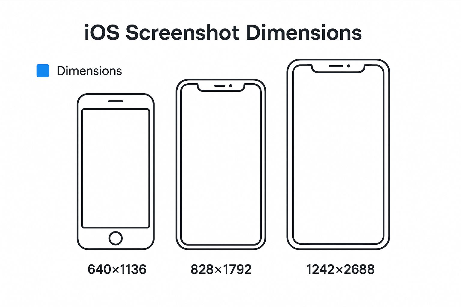
As you can see, precision is everything. Being even one pixel off can cause an upload error.
Essential Dimensions and File Formats
So, what are those magic numbers? Getting the dimensions perfect is non-negotiable. App Store Connect will throw an error if your images are even a single pixel off, which is a common and frustrating roadblock for developers.
To help you get it right the first time, here’s a quick reference guide to the two mandatory sizes you'll need.
Essential iOS App Screenshot Dimensions
| Device Display | Required Dimension (Portrait) | Required Dimension (Landscape) | Notes |
|---|---|---|---|
| iPhone (6.9-inch) | 1290 x 2796 pixels | 2796 x 1290 pixels | This is the Super Retina XDR display on models like the iPhone 15 Pro Max. |
| iPad (13-inch) | 2048 x 2732 pixels | 2732 x 2048 pixels | This is for the 12.9-inch iPad Pro (3rd gen and later). |
These two sizes cover the vast majority of devices you'll need to support.
But it’s not just about the size. The file itself has to meet a few technical specs, too.
Your screenshots must be a flattened JPEG or PNG file in the RGB color space. Most importantly, they cannot have any transparency (also known as an alpha channel).
Getting these details right is the first step toward a smooth and successful app submission. For a more exhaustive look at all the nuances, you can check out our complete guide to App Store screenshot guidelines.
Navigating Apple’s Content Policies
Apple's rules go beyond just pixels and file types. They also care a lot about what's inside your screenshots. The guiding principle here is authenticity. Your iOS app screenshots must be an honest reflection of the user's actual in-app experience.
This means you can’t show anything that isn't part of your app's UI. Forget about including photos of someone holding a phone or using lifestyle imagery that isn't a direct capture of your app in action—that’s a straight path to rejection.
The whole point is to set realistic expectations. Misleading visuals don't just get your update blocked; they erode user trust and can lead to a flood of negative reviews. Keep your screenshots clean, honest, and focused on what makes your app genuinely great.
Design Principles for Screenshots That Convert
Getting Apple's technical specs right is just the starting line. If you really want to move the needle on app store growth, your iOS app screenshots have to do more than just exist—they have to sell. This is where creative strategy kicks in, turning basic screen grabs into a powerful conversion engine.
Great screenshots tell a story. In just a few swipes, they guide a potential user from mild curiosity to a confident tap on the "Get" button. Think of your 10 available slots as panels in a comic strip. Each one builds on the last, creating a compelling narrative about what your app will do for them.
This isn't about listing features; it's about showing the user a better version of their life with your app. It’s the difference between saying "Our app has a calendar" and showing them "Never miss an important deadline again."
Craft a Compelling Visual Story
Your first one or two screenshots are everything. These are often the only ones a user sees in the search results, making them your primary hook. They need to communicate your app's core purpose and biggest benefit in a single, powerful glance.
From there, each screenshot should peel back another layer of the story. A simple and incredibly effective structure follows this path:
- The Hook (Screenshot 1): Lead with your single most important value proposition. What’s the one thing your app does better than anyone else? Make that message big, bold, and impossible to miss.
- The Solution (Screenshots 2-4): Show your app solving a real problem. Use action-oriented captions to explain how a feature translates into a tangible, real-world benefit.
- The Proof (Screenshots 5+): Time to build trust. This is the perfect spot for social proof—a glowing testimonial, an award you’ve won, or a key statistic that hammers home your app's quality.
When you structure your gallery this way, you create a logical flow that answers a user's questions before they even think to ask them.
Write Captions That Highlight Benefits
The text you overlay on your screenshots is just as important as the visuals themselves. A classic mistake is writing captions that just describe a button or a screen. That’s a massive missed opportunity. Your captions need to scream the benefit that feature delivers.
Users don't download apps for their features; they download them for the outcomes those features deliver. Your captions should speak directly to those desired outcomes.
Take a fitness app, for example. Here’s a practical, actionable before-and-after:
- Feature-Focused (Weak): "Track Your Workouts"
- Benefit-Focused (Strong): "Reach Your Fitness Goals Faster"
See the difference? The second option connects directly to the user's motivation, making it far more persuasive. Keep your text short, punchy, and make sure it’s easy to read against the background.
Use a Vibrant and Cohesive Color Palette
Color choices have a huge impact on how users perceive your app. A consistent and vibrant palette doesn't just look good; it reinforces your brand identity and makes you look professional. Stick to colors that align with your app's logo and UI for a seamless feel.
Bright, high-contrast colors can make your key messages pop, drawing the eye right where you want it. The goal isn't to be chaotic. A clean background with one or two dominant brand colors is usually the most effective approach. This simple principle is just one of many you'll find in guides covering App Store screenshot best practices for 2024, which can help you dial in your visual strategy.
Create Engaging Panoramic Layouts
Want to get users to keep swiping? Try a panoramic or connected layout. This design trick uses a continuous background image that flows across multiple screenshots, visually pulling the user from one frame to the next.
It creates a more immersive, dynamic experience that makes your product page feel polished and high-end. When a user sees that one screenshot flows into the next, their natural curiosity kicks in, encouraging them to swipe to see the whole picture. It’s a subtle but powerful way to boost engagement and make sure your full story gets told.
By applying these design principles, you can elevate your ios app screenshots from a simple technical requirement to your most effective marketing asset.
The Hidden ASO Impact of Quality Screenshots
Most developers see their iOS app screenshots through a single lens: conversion. The thinking goes that their only job is to convince someone who’s already on the product page to tap the download button.
While that’s definitely a huge part of their job, it’s only half the story. The truth is, high-quality screenshots have a powerful, indirect impact on your App Store Optimization (ASO) and where you rank in search results.
Investing in great screenshot design isn't just about boosting installs from page visitors. It's a core piece of a modern ASO strategy that makes your app more visible to organic search in the first place. Think of it this way: the App Store algorithm is always on the hunt for signals that an app is a high-quality, relevant result for what a user is searching for.
How Engagement Signals Influence Ranking
Picture the App Store algorithm as a silent observer, watching how users interact with search results. It uses this behavior to figure out which apps are the most relevant. When your app shows up in a search list, users see your icon, title, subtitle, and—crucially—your first few screenshots.
If those screenshots are compelling and instantly communicate what your app does, people are far more likely to tap through to your product page. This tap-through rate (TTR) is a huge positive signal for Apple. It tells the algorithm that your listing grabbed a user's attention and looked like a great match for their search.
A higher conversion rate from search results is a strong indicator to the App Store that your app is a relevant and high-quality result for specific keywords. Essentially, you're proving your relevance through user behavior.
This creates a powerful feedback loop for app store growth. Better screenshots lead to more taps and downloads. More taps and downloads signal relevance to Apple. That relevance, in turn, can boost your search ranking. Higher rankings mean more visibility, and the cycle continues, driving real, sustainable organic growth. If you want to go deeper, our comprehensive iOS App Store optimization guide breaks down how all these ranking factors connect.
A Shift in the Algorithm
This link between screenshots and rankings isn't just a theory. Developers and ASO experts have been noticing a major shift that seems to tie the quality of iOS app screenshots directly to changes in keyword rankings.
While Apple hasn't made a big public announcement, many have reported wild swings in their keyword positions. Some apps got sudden boosts while others dropped, seemingly unrelated to their usual ASO efforts. You can learn more about how screenshot quality is becoming an implicit ranking signal.
This strongly suggests the algorithm is now smart enough to evaluate screenshot quality, quantity, or relevance as an unspoken ranking factor. Screenshots are no longer just a conversion tool on your product page; they're a direct line of communication with Apple's ranking system.
Why Premium Design Is Non-Negotiable
This new reality makes investing in screenshot design more critical than ever. Here’s how premium visuals feed that ASO feedback loop:
- Increased Taps: Vibrant, benefit-focused visuals simply stand out in a crowded search list, getting more users to click on your app instead of a competitor's.
- Higher Time-on-Page: Once they're on your page, engaging screenshots (like panoramic layouts) encourage users to swipe and spend more time exploring. This is another positive signal.
- Improved Conversion: A clear visual story that solves a user's problem leads to more confident downloads, directly boosting your install-from-search metric.
Every tap, swipe, and download sends a small but meaningful signal to the App Store that your app delivers on its promises. Over time, those signals add up, building your app's authority for your target keywords and helping you climb the search rankings.
Tools and Workflows for Efficient Screenshot Creation
Let's be honest, producing polished, high-converting iOS app screenshots for every single device and language can be a soul-crushing manual process. Fiddling with dozens of images, localizing them one by one, and getting every size right is slow, expensive, and a recipe for mistakes.
Thankfully, you don't have to do it that way. The right tools and a smart workflow can automate the whole thing, saving you an incredible amount of time and sanity.
Instead of wrestling with Photoshop for hours on end, you can generate a complete, App Store-ready set of visuals in minutes. This isn't just about saving time—it's about gaining the agility to test new screenshots, update your page for new features, or launch in a new country without missing a beat.
Choosing Your Screenshot Toolkit
When it comes to creating screenshots, a developer's toolkit generally falls into a few key categories. There's a solution out there for every team, depending on your needs and budget.
Here are the most common paths people take:
- Manual Design Software: Tools like Figma or Sketch give you absolute creative control. The downside? You need serious design skills and a lot of patience to manually manage templates, sizes, and exports for every device.
- General-Purpose Design Platforms: Think Canva. These platforms are super user-friendly with drag-and-drop editors and tons of templates. They're great for getting started but often lack the specialized features app marketers really need, like one-click localization or direct App Store Connect integration.
- Dedicated Screenshot Generators: Platforms like ScreenshotWhale are built for one job: creating amazing app store assets. They give you the best of both worlds—professionally designed templates combined with powerful automation.
Comparison of Screenshot Creation Tools
To figure out what’s right for you, it helps to see these options side-by-side. Here’s a quick comparison of popular tools, focusing on what really matters for driving downloads and growth.
| Tool Name | Key Feature | Best For | Pricing Model |
|---|---|---|---|
| ScreenshotWhale | AI-powered localization and professionally designed templates. | Teams focused on global growth and high-speed production. | Freemium & Subscription |
| Figma | Total creative freedom and collaborative design capabilities. | Experienced designers who need granular control. | Freemium & Subscription |
| Canva | Simplicity and a vast library of general graphic templates. | Individuals or small teams with basic design needs. | Freemium & Subscription |
| AppMockUp | Simple device mockups and pre-built layout options. | Developers needing a quick and straightforward generator. | Freemium & Subscription |
The choice really comes down to a trade-off between control and efficiency. Manual tools offer unlimited customization, but dedicated generators deliver the speed and automation you need to compete in a fast-moving market.
A Workflow for Speed and Quality
Having the right tool is only half the battle; an efficient workflow is just as critical. If you're aiming for rapid growth on both the App Store and Google Play, you need a process that's repeatable and fast.
Here’s a practical, actionable workflow using a dedicated site editor like ScreenshotWhale:
- Select a Proven Template: Don't start from a blank canvas. Pick a professionally designed template with vibrant colors that fits your app's category. This ensures the layout is already optimized for readability and conversions.
- Upload Your Raw Screens: Just drag and drop your raw app captures into the editor. The tool should handle the rest, automatically placing them inside polished device mockups against an appealing background.
- Craft Benefit-Driven Copy: In the editor, write captions that sell the why, not just the what. Focus on user outcomes, not just features. A good tool will let you easily adjust font styles and sizes to ensure text is clear on every device.
- Automate Localization: This is where specialized tools really pay for themselves. Instead of manually translating and redesigning screenshots for every market, you can use a one-click translation feature. An AI-powered engine can instantly generate localized copy for dozens of languages, making global expansion a breeze.
- Export All Required Sizes: With a single click, export your finished designs in every single dimension required by App Store Connect and the Google Play Store. This step alone can save you hours of mind-numbing resizing and formatting.
By adopting a workflow built around automation, you free up your team to focus on strategy—like A/B testing different messages or analyzing performance—instead of getting bogged down in repetitive design tasks.
This approach ensures you can consistently crank out high-quality, on-brand, and fully localized iOS app screenshots for every update, promotion, or new market launch, giving you a serious competitive edge.
Common Questions About iOS App Screenshots
Let's be honest, navigating the world of iOS app screenshots can feel like trying to hit a moving target. The rules, best practices, and design trends are always shifting. To help you get it right, I’ve pulled together answers to the questions I hear most often from developers and marketers.
Think of this as your personal cheat sheet. Getting clear on these points will save you from costly rejections and help you build a store presence that actually pulls in downloads.
What Are the Most Common Mistakes to Avoid?
One of the biggest pitfalls is simply ignoring Apple's exact size requirements. I’ve seen it happen time and time again—being off by a single pixel is all it takes to get an entire update rejected. Another frequent error is cluttering screenshots with tiny, low-contrast text that’s impossible to read on a phone.
But the technical stuff is only half the battle. So many developers fail to show their app's core value within the first couple of screenshots. Users make snap judgments. If your main benefit isn't immediately obvious, you've probably lost them for good.
Here are a few other common missteps:
- Using Raw Captures: Just uploading raw screen grabs without any context, device frames, or benefit-driven captions makes your app look unprofessional. It’s a rookie mistake.
- Forgetting Localization: Failing to translate and adapt your screenshots for different markets is a massive missed opportunity. It can absolutely crush your global conversion rates.
- Showing an Outdated UI: Your screenshots have to reflect the current version of your app. Showing old designs creates a jarring disconnect and instantly erodes user trust.
Steering clear of these common errors will put you miles ahead of the competition and signal to users that your app is a high-quality, polished product.
How Many Screenshots Should I Actually Upload?
Apple lets you upload up to 10 screenshots, but more isn't always better. The sweet spot for most apps is somewhere between 5-7 really solid images. The first three are non-negotiable; they're the most visible in search results and on your product page, so they have to be perfect. Don't just fill the slots to hit the maximum—make every single one count.
Each screenshot is another chance to tell your app's story. Use them strategically to walk a user from initial curiosity to a confident download.
A proven strategy is to structure your gallery like a mini-presentation. Hook them with the first screenshot by showing your core value proposition. The next few should detail key features and showcase different use cases. Then, use the last one for a little social proof, like a great quote from a review, to seal the deal.
Can I Use the Same Screenshots for iOS and Android?
You can, but you definitely shouldn't. While your core message might stay the same, the visuals must be tailored to each platform's unique world. Users are savvy; they can spot a "ported" store listing from a mile away, and it just feels lazy.
For iOS app screenshots, you must use iPhone mockups and make sure your designs align with Apple's clean, minimalist vibe. Over on the Google Play Store, it's the opposite—use Android device frames and follow Google's Material Design principles. Customizing your screenshots for each store shows a commitment to providing a top-notch, native experience, which is essential for building trust and boosting conversions.
How Often Should I Update My App Screenshots?
There are a few key moments when a screenshot refresh is an absolute must. You should always update them whenever you release a major UI redesign or roll out a significant new feature. This keeps your store page in sync with the actual in-app experience.
Beyond the big updates, it's just smart practice to give your screenshots a facelift every 6-12 months. It keeps them looking modern and lets you test out new messaging or design styles. A visual refresh signals to both users and the App Store algorithm that your app is actively maintained and getting better. Regularly A/B testing different screenshot styles is one of the most effective ways to keep improving your conversion rate over time.
Ready to create stunning, high-converting screenshots in minutes? With ScreenshotWhale, you can access professionally designed templates, an AI-powered translation engine, and a simple drag-and-drop editor to build a store presence that drives downloads. Start designing for free today!
Article created using Outrank