Winning App Store Screenshots That Boost Downloads
Discover how to design winning app store screenshots for iOS and Android. Our guide offers actionable tips to improve ASO and increase app downloads.
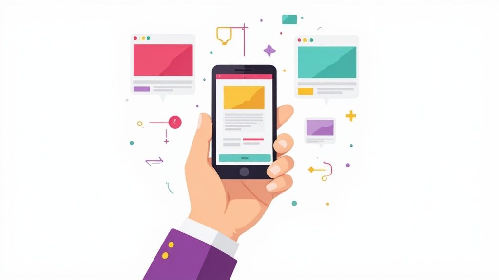
Your app store screenshots are not just a few pictures on a product page. They are your entire sales pitch, rolled into one visual punch. The difference between a beautifully designed, benefit focused set of screenshots and a mediocre one can literally make or break your app's success. It is the moment a casual browser becomes an actual user.
Why Your Screenshots Are Your Most Powerful Sales Tool
Think about it. In the crowded, fast paced world of the app stores, you have just a handful of seconds to grab someone's attention. Your icon and title might reel them in, but it is the app store screenshots that sell the experience. They are a visual promise of what your app will deliver, making them the single most influential element on the page for boosting conversions.
These visuals do the heavy lifting. They are your silent salesperson, showing off your app's core value without the user having to read a single word. A great set of screenshots demonstrates usability, spotlights the coolest features, and can even build an emotional connection. All before they even glance at your description.
The Decisive First Impression
People make snap judgments. It is human nature. Most users decide whether to download an app within the first few seconds of landing on its page. In that tiny, critical window, your screenshots are the main course. Everything else is just a side dish.
This infographic breaks down just how dramatic the impact of well optimized screenshots can be.
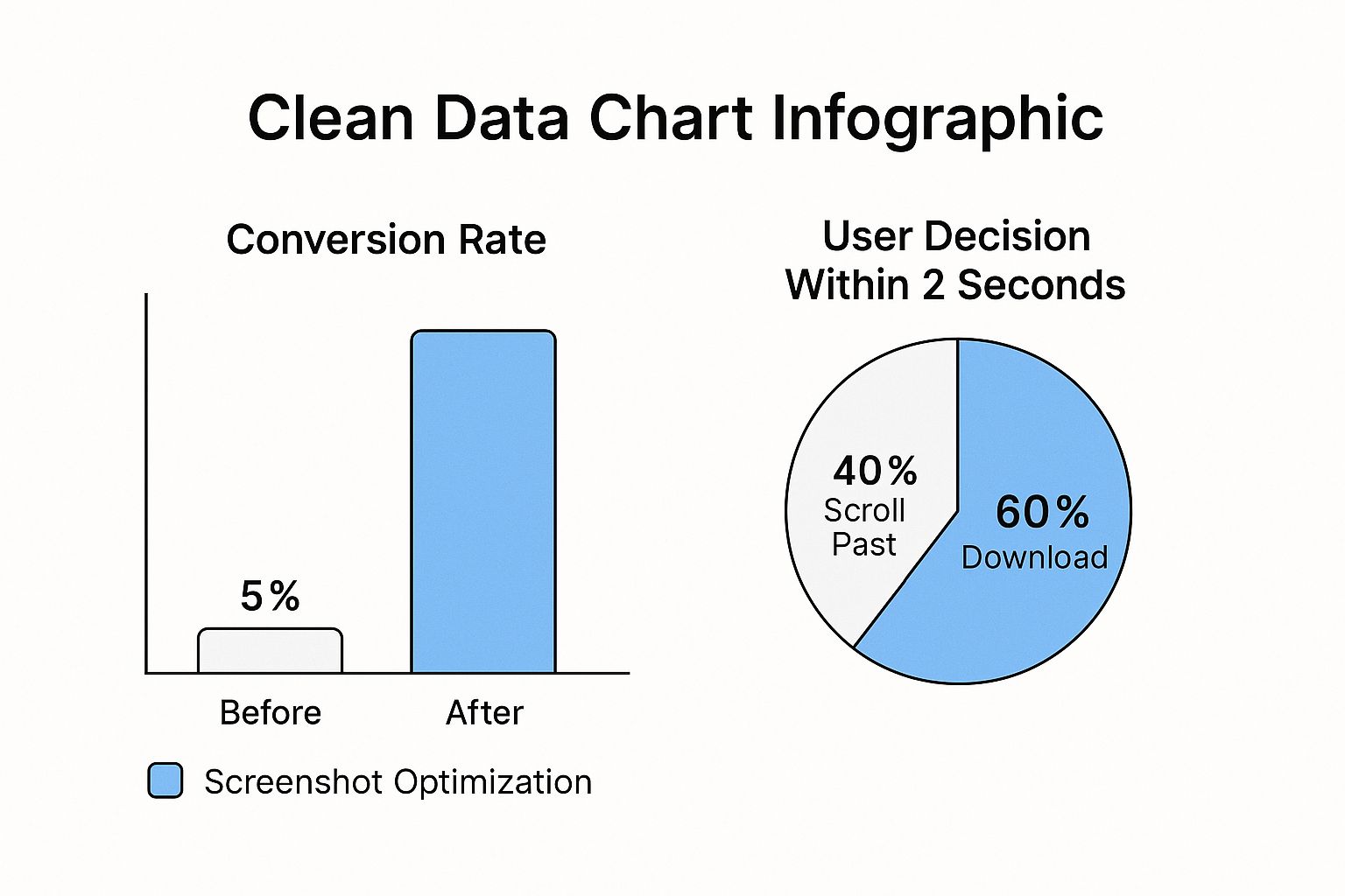
The data does not lie. A strategic redesign can send your download numbers soaring, proving that the time you invest in your visual presentation pays off, big time. This is a core part of driving app store growth.
The difference between a download and a pass is often the story your screenshots tell. If they do not immediately convey value and solve a user's problem, you have lost a potential customer. It is a visual elevator pitch where every pixel counts.
This immediate gut reaction is everything in a market that is projected to hit a mind boggling $138 billion globally in 2025. With over 92 billion app downloads expected that same year, your screenshots are mission critical marketing assets that have a direct line to your app's bottom line. If you want to dive deeper, you can explore more of these app store statistics to really understand the competitive landscape.
Bridging iOS and Android Design Philosophies
While your goal is the same on both platforms, get the download, your approach to creating effective app store screenshots needs to be different for Apple's App Store and the Google Play Store. Each has its own design language, user expectations, and a laundry list of technical guidelines.
- Apple App Store (iOS): Apple users expect a clean, polished, almost aspirational look. The designs that perform best are often minimalist, using high quality device mockups and short, punchy, benefit focused text to tell a cohesive story.
- Google Play Store (Android): Over on Google Play, there is a bit more room for vibrant, dynamic, and feature packed layouts. Professionalism is still crucial, of course, but you have more flexibility to use bold graphics and detailed callouts to explain what your app does.
Getting a feel for these nuances is the first step. A one size fits all strategy almost never works. Users on each platform are conditioned to a certain visual style, and tailoring your screenshots to meet those expectations builds instant trust. It makes your app feel like it belongs on their device, which is a huge step toward earning that download. We will get into actionable strategies for both throughout this guide.
Crafting a Compelling Visual Story
Your app store screenshots are more than just a gallery of your UI. Think of them as your silent, high speed sales pitch where every single pixel has a job to do: convince the user to download. To get more installs, you have to tell a visual story that immediately answers the user's biggest question: "What problem does this app solve for me?"
The first screenshot is the hero of that story. It is your digital handshake in a crowded search results page. This one image has to grab attention and communicate your app's core value in a split second, giving users a reason to stop scrolling and learn more. A weak opening is a guaranteed way to lose a potential user before they have even seen what your app can do.
The Power of A Polished Aesthetic
A professional, consistent look across your screenshot gallery builds instant trust. It sends a clear signal: this app is well made, reliable, and worth the download. This polish comes from getting a few key design elements right.
Start with vibrant, on brand colors that make your visuals pop. They create an emotional hook and make your gallery memorable. Pair those colors with clean, easy to read typography, and your benefit driven captions become scannable and powerful.
Think of your screenshot set as a cohesive campaign. Each image should feel like part of the same family, reinforcing your brand identity through consistent fonts, colors, and layout styles. This consistency makes your app look more professional and trustworthy.
The real game changer? Framing your UI inside device mockups. Placing your app screens within a photorealistic iPhone or Android frame gives them context and helps users instantly visualize your app on their own device. It is a subtle but powerful technique that adds a layer of professionalism. If you want to get this right, there are some great guides on creating high quality mobile app mockups that can make a huge difference.
Here is a great example from Apple itself, showing how crisp device frames and benefit focused captions tell a clear story.
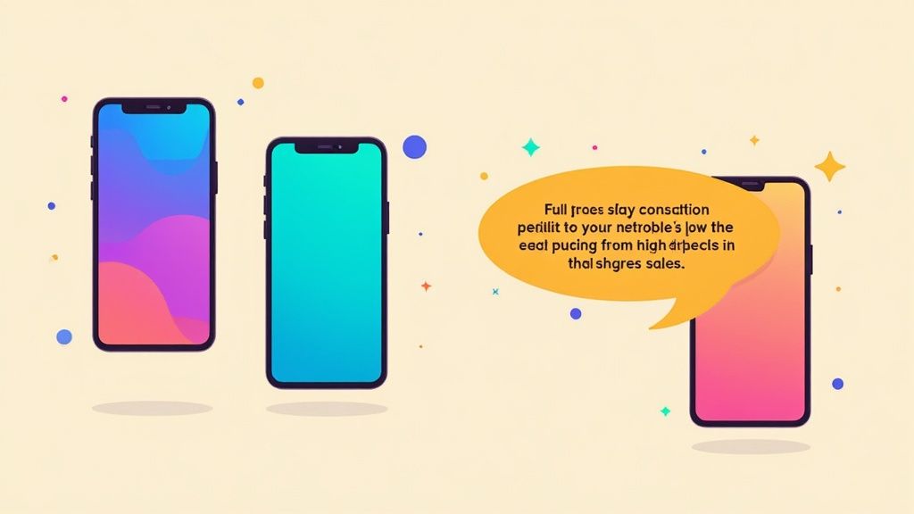
This official example shows how a clean background, a bold headline, and a clear device mockup all work together to create an inviting and easy to understand preview.
Writing Captions That Convert
The text you overlay on your screenshots is just as important as the images themselves. Bad captions just list features; high converting captions sell benefits. Instead of saying "Task Manager," a much better caption is "Organize Your Day in Seconds." See the difference? That small shift focuses on solving the user's problem, not just describing a function.
Here are a few principles I always follow for writing compelling captions:
- Lead with the Benefit: Always start with what the user gets out of it.
- Keep it Short: Use concise phrases that are easy to scan on a small screen.
- Use Action Words: Employ strong verbs that create a sense of action and excitement.
- Stay Consistent: Maintain the same tone and style across all your screenshots.
This approach transforms your app store screenshots from a simple feature list into a powerful visual argument for why someone needs your app.
iOS vs Android Screenshot Design Approaches
While the core principles are the same, the two major app stores have different aesthetic expectations and user behaviors. What works on the App Store might not perform as well on Google Play, and vice versa. Here is a quick breakdown of how to tailor your designs for each platform.
| Design Element | Apple App Store (iOS) Best Practice | Google Play Store (Android) Best Practice |
|---|---|---|
| Overall Aesthetic | Clean, minimalist, premium feel. Focus on high quality visuals and typography. | More flexibility for vibrant, dynamic, and feature rich layouts. Can be more playful. |
| Captions & Text | Short, benefit driven headlines. Often uses larger, more stylized fonts. | Can be more descriptive. Sub headings and short bullet points are common. |
| Device Mockups | Almost always uses the latest iPhone mockups to showcase a native experience. | Uses a mix of generic Android or specific device (e.g., Pixel) mockups. Feature graphics are key. |
| Color Palette | Tends to follow the app's branding with a focus on whitespace and readability. | Often uses bolder, more contrasting color schemes to stand out in a busy store. |
| Storytelling Flow | Prefers a clean, linear story. "One feature, one benefit" per screenshot. | Often uses connected or panoramic layouts to showcase a workflow or multiple features at once. |
Understanding these nuances helps you create a set of screenshots that feel native and optimized for the audience you are trying to reach on each store, which can definitely boost your conversion rates.
Structuring Your Visual Narrative
The order of your screenshots matters. You should be guiding the user on a logical journey, with each image building on the last. Start with your single biggest value proposition, then introduce key features, and maybe end with some social proof or a final call to action.
You can also get creative with the layout to guide the user's eye. Panoramic screenshots, where a single continuous image is split across multiple frames, are a fantastic way to create an immersive experience. This encourages swiping and keeps the user engaged with your story.
Ultimately, your goal is to make the decision to download feel obvious and easy. By telling a clear, compelling, and visually stunning story, your app store screenshots become an unstoppable engine for growth on both the iOS and Android stores.
Your app store screenshots have a new, powerful job that goes far beyond just convincing users to download. They are now a core piece of your App Store Optimization (ASO) strategy, and they directly influence how easily people find your app in the first place.
This is a fundamental shift in how we need to think about screenshot design.
For years, screenshots were purely conversion tools. Their only goal was to tell a compelling visual story to someone who had already landed on your product page. But the game has changed, big time.
With Apple's 2025 algorithm update, the role of screenshots evolved dramatically. Since June 2025, Apple started pulling text directly from screenshot captions and indexing it as searchable metadata. In simple terms: the words you put on your screenshots now directly impact your app's search ranking.
This change shook up keyword rankings for thousands of apps overnight, making screenshot optimization a non negotiable part of any serious marketing strategy.
Every word on your screenshots is now a potential keyword that can help you rank higher. It is a huge opportunity to gain an edge over competitors who are still treating their screenshots like simple, static images.
Weaving Keywords into Your Visual Story
The real challenge here is weaving high intent keywords into your captions without them feeling forced, clunky, or just plain unreadable. You have to enhance discovery while preserving the clean, benefit driven messaging that actually drives downloads. It is a delicate balance.
Think about a fitness app. A common caption might be something like, "Track Your Progress." It is fine, but it is a massive ASO missed opportunity. A much smarter, keyword rich version would be, "Your Personal Fitness Tracker for Workouts." This version cleverly includes valuable keywords like "fitness tracker" and "workouts"—terms people are actively searching for.
Here is a practical way to get this right:
- Map Out Your Core Keywords: Start with a solid list of your most important keywords. Focus on the terms that describe your app’s main functions and the biggest benefits for your users.
- Prioritize the First Three Screenshots: The text on your first few screenshots carries the most weight, both for users scanning your page and for the search algorithm. Put your highest priority keywords here.
- Write for Humans, Optimize for Robots: The captions must still be compelling and easy to read. A keyword stuffed caption that confuses users will absolutely kill your conversion rate, defeating the whole purpose.
- Think in Natural Phrases: Instead of jamming in single keywords, use phrases that sound natural. For instance, instead of just "photo editor," try something like "Easy Photo Editor with Filters."
Your screenshot captions are now dual purpose assets. They have to sell the benefit to the user while simultaneously signaling relevance to the App Store's search algorithm. Mastering this balance is key to modern app store growth.
This technique is also fantastic for targeting long tail keywords that you just cannot fit into your app title or subtitle. By embedding them in your visuals, you expand your app’s search footprint and can start ranking for more competitive terms.
Validating Your Designs with A/B Testing
Okay, so you have created some keyword rich, visually appealing screenshots. That is step one. The second, equally crucial step is proving they actually work. You cannot just assume a new design or caption will perform better; you have to test it.
A/B testing is your best friend here. It lets you scientifically measure which creative assets drive the most downloads. On the App Store, Apple’s own Product Page Optimization feature is built for exactly this, allowing you to test different sets of screenshots against each other.
Let's walk through a real world scenario. Imagine a meditation app wants to test two different screenshot strategies:
- Variation A (Benefit Focused): The captions are soft and aspirational, like "Find Your Calm" and "Sleep Better Tonight." The visuals are serene and abstract.
- Variation B (Keyword Optimized): The captions are direct and problem solving, like "Guided Meditation for Anxiety" and "Sleep Stories for Deep Rest." The visuals show more of the actual app UI.
By running an A/B test, the developer gets hard data on which version drives a higher conversion rate. The results might show that Variation B not only improves search visibility for terms like "guided meditation" but also converts better because the captions are more specific and solve a clearer user problem.
Effective A/B testing is all about changing one variable at a time. You could test:
- Different caption copy
- Varying color schemes or backgrounds
- New device mockups or layouts
- The order of your screenshots
By continuously testing and iterating, you can fine tune your app store screenshots into a high performance engine for both discovery and conversion. This data driven approach removes the guesswork and ensures your creative efforts are directly contributing to your app's growth.
Nail Your Technical Specs and Sizing
Getting the technical details of your app store screenshots right is not just a good idea, it is a gatekeeper to getting your app published. Mess up the sizes or formats, and you risk a rejection from the app stores, delaying your launch and causing a world of frustration. Think of these specs as the non negotiable foundation for your entire visual pitch.
At first glance, the list of devices and resolutions can feel overwhelming. The good news? Both Apple and Google have simplified things quite a bit. You do not need to create a dozen unique versions for every phone and tablet out there. Instead, the strategy is to focus on a primary, high resolution set for the latest flagship devices.
From there, the app stores automatically scale your images down to fit older or smaller devices. This lets you pour your energy into perfecting one master set that looks incredible, knowing it will be adapted for everything else.
Navigating iOS Screenshot Requirements
Apple is famously strict with its guidelines, all in the name of a polished user experience. With over 1.96 million apps on the App Store, their rules have become laser focused. For screenshots, you are required to submit designs for at least two key sizes: one for the 6.9-inch iPhone and another for the 13-inch iPad.
These dimensions cover the latest and largest screens, ensuring your app looks its best on modern hardware. Apple’s backend then does the heavy lifting, resizing them for smaller models like the iPhone SE or older iPads.
Submitting the correct screenshot sizes is your fast pass through the app review process. It sounds basic, but failing to meet these specs is one of the most common, and easily avoidable, reasons for rejection. Double check every single pixel before you hit upload.
Because your designs will be scaled down, you have to think small. Make sure your text and UI elements are crystal clear and legible, even on the tiniest of screens.
Understanding Google Play Store Sizing
The Google Play Store is a bit more laid back, which makes sense given the sheer diversity of the Android ecosystem. Instead of demanding pixel perfect sizes for specific models, Google gives you a set of flexible guidelines.
To get your app on Google Play, you will need to provide:
- At least 2 screenshots (but you should absolutely use all 8 slots).
- Files in JPEG or 24-bit PNG format (without transparency).
- Dimensions that fall between 320px and 3840px.
- An aspect ratio no more extreme than 2:1 or 1:2.
This flexibility often means you can repurpose your iOS assets with a few tweaks. That said, it is always a good idea to preview how they will look on popular Android aspect ratios, like those found on Samsung Galaxy or Google Pixel devices. For a complete rundown of every dimension you might need, our guide on app store screenshot sizes has you covered.
Designing for Portrait and Landscape Orientations
Your screenshot strategy should mirror how people actually use your app. If you have built a social media or productivity app that lives in portrait mode, your screenshots need to do the same. It gives users an honest preview of the experience.
On the other hand, if you are showcasing a game, video editor, or creative tool that truly comes alive in landscape mode, that is what you need to show. It is all about capturing that immersive, full screen feel. You can even mix orientations if your app handles both, just make sure the sequence feels natural.
Ultimately, choosing the right orientation ensures your app store screenshots offer a true to life glimpse that builds trust and gets people to hit that "Install" button.
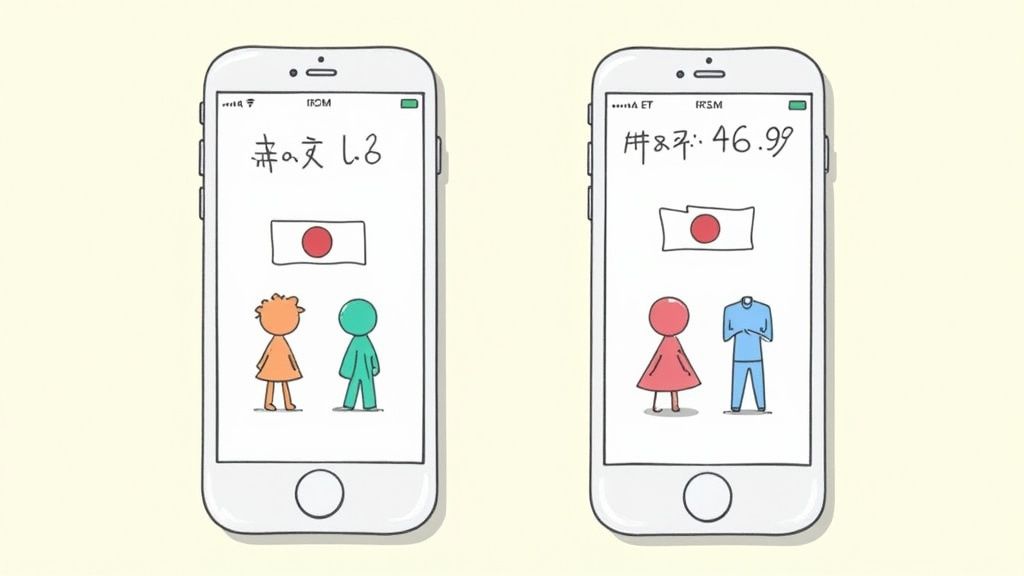
Going Global? Your Screenshots Need to Speak the Language.
If you are serious about growing your app on a global scale, your visual marketing has to do more than just show up. It needs to speak the local language. And I do not just mean translating text. I am talking about screenshot localization, the art of adapting your entire visual pitch to connect with different cultures. This is how you build trust and drive real growth in international markets.
Think about it. A user in Tokyo has entirely different cultural norms and expectations than a user in Berlin. Just slapping a German translation on your English captions is not going to cut it. True localization means rethinking everything, from the in app data you showcase to the very color palette you use.
This might sound like a ton of work, but modern tools are built to handle this exact problem. For instance, a platform like ScreenshotWhale lets you lock down a master design and then uses an AI engine to instantly translate your captions into dozens of languages. You get a consistent, high quality look that is perfectly adapted for each region.
It's More Than Just Translation
The real conversion lifts happen when you go beyond the basics. This is where you get into deep cultural adaptation, understanding regional user habits, currencies, and even visual tastes. A smart strategy here is what keeps you from making clumsy mistakes that can kill a potential user's interest before they even hit "download."
Picture a finance app. If you show balances in US Dollars ($) to a European audience, it is an instant disconnect. It feels foreign. Your localized screenshots must show Euros (€) to feel native and trustworthy. The same goes for a food delivery app, showing American fast food chains in a Japanese App Store listing just will not resonate. You need to feature ramen shops and local favorites.
Here is what that deeper localization looks like in practice:
- Currency and Units: Get this right. Adjust all monetary values, date formats (DD/MM/YYYY vs. MM/DD/YYYY), and units of measurement (kilometers vs. miles) to match local conventions.
- In-App Content: The examples inside your UI have to feel local. This means using common names, recognizable locations, and culturally relevant products.
- Colors and Imagery: Be mindful that colors carry different meanings around the world. A quick bit of research can help you avoid using a color that has negative connotations in a key market.
- Tone of Voice: Your caption's tone should match how people communicate. Some cultures respond to direct, benefit focused language, while others prefer a more formal or subtle approach.
A killer localization strategy makes someone feel like your app was built just for them and their country. That attention to detail builds instant trust and can be the single biggest factor in boosting downloads in new markets.
How to Manage a Multilingual Workflow Without Going Insane
Let's be real: managing dozens of localized screenshot sets by hand is a nightmare. Every time you update your UI or tweak your marketing message, you would have to manually update every single language variant. That is a massive design bottleneck waiting to happen.
This is where a centralized site editor becomes your best friend for creating app store screenshots. A platform that supports internationalization (i18n) lets you link a single design template to a spreadsheet of your translations. Need to update the text? You change it in one place, and the editor automatically regenerates perfectly updated screenshots for every language.
For example, you could have one master template for your "main feature" screenshot. The editor would then pull the right translated caption for each market, "Organize Your Life" for English, "Organiza Tu Vida" for Spanish, "Organisez Votre Vie" for French, and pop it into the design. No manual copy pasting required.
This approach flips localization from a tedious, time sucking chore into a streamlined, scalable system. It keeps your brand consistent across every region while delivering a truly native experience to users everywhere, setting you up for sustainable global growth.
Answering Your Biggest App Screenshot Questions
Getting into the weeds of app store screenshots brings up a lot of questions. It is a critical part of your app's growth, so let's clear up some of the most common uncertainties I see developers and marketers wrestle with on both the App Store and Google Play.
How Many Screenshots Should I Actually Upload?
Both Apple and Google give you 10 slots, and you should be using at least five to seven of them. Do not leave this prime real estate empty. The first two or three images are everything, they are what users see instantly without having to scroll.
Think of those first few slots as your headline act. They need to grab attention and immediately communicate your app's core value. Use the remaining screenshots to dive deeper, showcasing secondary features, building trust with testimonials, or walking users through specific scenarios. A full gallery gives people a solid preview and makes them feel much more confident hitting that "Download" button.
Portrait or Landscape?
This is not a stylistic choice; it is a user experience one. The answer should come directly from how people actually use your app. For most utility, social, or productivity apps, portrait screenshots are the way to go. They feel natural and are incredibly easy for people to scan on their phones.
But if you have built a game or a video streaming app, it is a different story. You absolutely need to use landscape screenshots. It is the only way to genuinely show off that immersive, full screen experience you worked so hard to create. Some clever developers even create a continuous panoramic image split across several portrait slots to encourage swiping, a neat trick if it fits your brand.
The golden rule is simple: showcase your app in its most common orientation. A mismatch between your screenshots and your app's actual use creates an instant disconnect and is a surefire way to lose a potential download.
What Are the Biggest Mistakes People Make?
Even experienced developers can stumble into the same old traps with their app store screenshots. Just knowing what these pitfalls are is the first step toward making sure your visuals are polished and effective.
Here are the missteps I see most often:
- Raw UI Dumps: Just dropping unedited screen captures with zero context is a massive missed opportunity. They look lazy and tell no story.
- Text Overload: Trying to cram a novel onto a screenshot makes it impossible to read on a small screen. It just overwhelms people.
- Features Over Benefits: Captions like "Export Function" are dead on arrival. Instead, focus on the user benefit: "Share Your Designs Instantly."
- Dated Device Mockups: Nothing screams "abandoned app" like showing it on an iPhone from five years ago. Always use current device frames.
- Inconsistent Branding: A messy, jumbled design across your screenshot set makes your app look unprofessional and untrustworthy.
- Ignoring Localization: Failing to translate your screenshots for different countries is like closing the door on a huge global audience.
Steer clear of these common errors, and you will be miles ahead of the competition, with a visual story that actually converts.
Ready to create stunning visuals without the usual design headaches? ScreenshotWhale gives you professionally designed templates and a simple editor to build beautiful, high-converting app store screenshots in minutes. Generate your first set for free.