Mastering App Store Screenshot Sizes for Higher Conversions
Unlock app growth with our guide to app store screenshot sizes. Learn iOS and Android requirements and create high-converting visuals that boost downloads.
If you want to boost your app store growth, the very first step is getting your app store screenshot sizes right. It sounds simple, but it's a critical checkpoint that trips up many developers and directly impacts conversions.
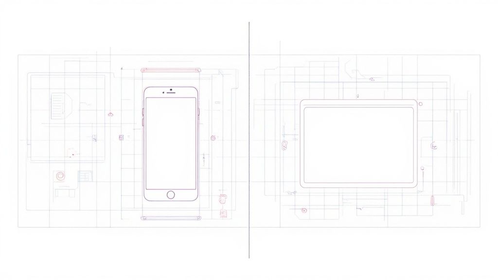
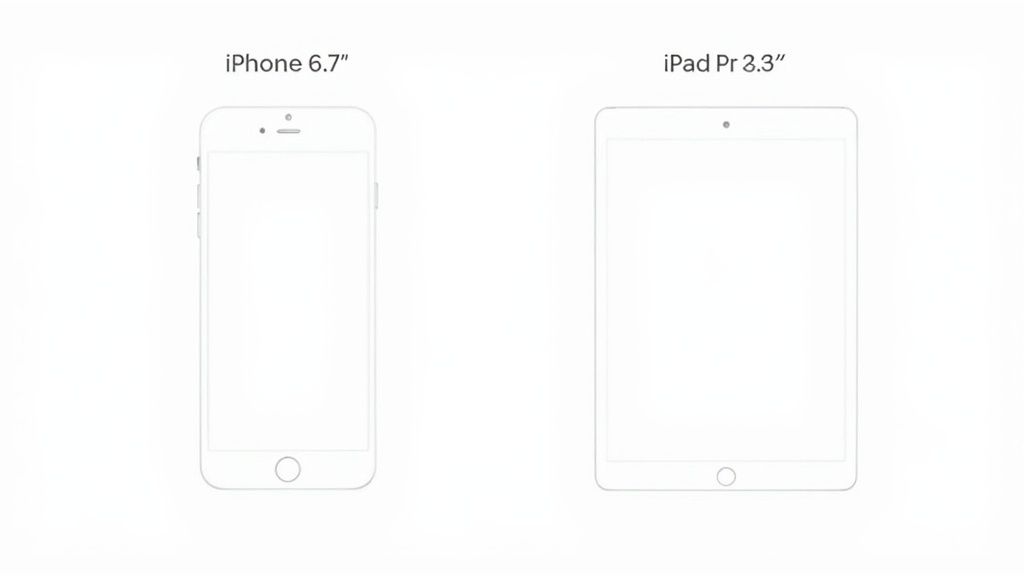
For the Apple App Store, you absolutely must submit screenshots for the 6.7-inch iPhone (1290 x 2796 pixels) and the 12.9-inch iPad Pro (2048 x 2732 pixels). These are non-negotiable. The Google Play Store is a bit more forgiving, generally asking for a 16:9 aspect ratio, with 1080 x 1920 pixels being a safe and effective choice for high-converting visuals.
Why Screenshot Dimensions Matter for App Growth
Think of your app's screenshots as your most powerful conversion tool on your product page. They are the first real glimpse someone gets of your app's functionality and user experience. Get the dimensions wrong, and your images look blurry, stretched, or just plain unprofessional. That immediately erodes trust.
Nailing the sizes ensures your images are sharp and perfectly displayed across every device, which has a direct impact on download rates. A pixel-perfect presentation not only helps you stand out in a ridiculously crowded marketplace but also prevents frustrating rejections during the app review process. This is a foundational step for efficient and high-converting app store presences on both iOS and Android.
This chart breaks down the main screenshot dimensions you'll need to worry about for the major platforms.
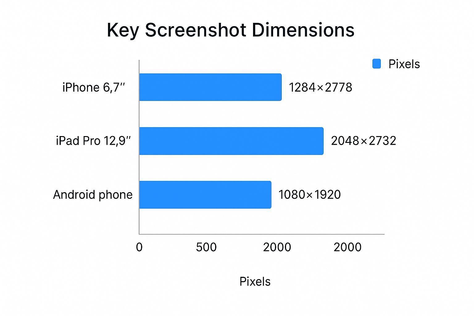
As you can see, the requirements for iPadOS tablets demand significantly larger and higher-resolution assets compared to what you'll need for either iOS or Android phones. It's a common oversight, so pay close attention to your tablet designs.
Quick Reference App Screenshot Sizes for iOS and Android
To save you some time, I've put together a quick lookup table with the most common and required screenshot dimensions. Keep this handy when you're preparing your assets for submission.
| Platform | Device Category | Required Dimensions (Pixels) | Aspect Ratio |
|---|---|---|---|
| Apple App Store | 6.7" iPhone | 1290 x 2796 | 19.5:9 |
| Apple App Store | 5.5" iPhone | 1242 x 2208 | 16:9 |
| Apple App Store | 12.9" iPad Pro (6th Gen) | 2048 x 2732 | 4:3 |
| Apple App Store | 12.9" iPad Pro (2nd Gen) | 2048 x 2732 | 4:3 |
| Google Play Store | Phone | 1080 x 1920 (recommended) | 16:9 |
| Google Play Store | 7-inch Tablet | Flexible, e.g., 1200 x 1920 | 16:10 |
| Google Play Store | 10-inch Tablet | Flexible, e.g., 1600 x 2560 | 16:10 |
Getting these specs right from the start saves you from headaches later. It ensures your app looks its best, passes review smoothly, and makes the kind of first impression that turns a casual browser into a new user.
Getting Your Apple App Store Screenshots Right
If you've ever submitted an app to Apple, you know they don't mess around with their guidelines. Getting your app store screenshot sizes spot-on is non-negotiable if you want a smooth submission process and a professional-looking store page that drives conversions.
Thankfully, Apple simplified things for developers back in 2023. Instead of needing a dozen different sizes, you now just focus on two key device dimensions: the 6.9-inch iPhone (that’s 1290 x 2796 pixels) and the 13-inch iPad (2048 x 2732 pixels). Apple’s backend handles the rest, automatically scaling your assets to fit older or smaller devices. This was a huge relief for developers, as it helps keep a consistent look across the millions of apps on the store. You can dig deeper into the specifics by checking out the latest App Store guidelines on Adapty.io.
The Essential Technical Rules
It's not just about the pixel dimensions, though. A few technical rules are just as important for getting your submission accepted without a headache.
- File Formats: Keep it simple. Only PNG and JPEG files are allowed.
- Transparency: Your images need to be fully opaque. No alpha channels or transparency.
- Screenshot Limit: You get up to 10 screenshots for each language or localization you support.
Following these rules isn't just about ticking a box for the review team. It's about crafting a polished, high-converting App Store page that actually convinces people to hit that "Get" button.
Getting Your Screenshots Right for the Google Play Store
When it comes to app store screenshots, the Google Play Store is a bit more laid-back than Apple's App Store. Instead of demanding exact pixel dimensions for every device, Google focuses on aspect ratios and a general size range. This flexibility is a huge help, considering the wild variety of screen sizes in the Android world.
This approach ensures your visuals look great whether they’re viewed on a compact phone or a massive tablet.
The Must-Haves for Google Play
Before you can publish your app, you have to meet a few non-negotiable rules. These requirements are in place to make sure every app listing offers a consistent, high-quality experience for users.
- How many? You need to upload a minimum of 2 screenshots, but you can add up to 8 for each device type (that’s phone, tablet, and Wear OS).
- What shape? Stick to either a 16:9 (landscape) or 9:16 (portrait) aspect ratio.
- How big? The sides of your images must fall somewhere between 320 pixels and 3840 pixels.
My advice? A simple, practical strategy is to design one high-quality set of screenshots at 1080 x 1920 pixels. This size is super versatile and scales perfectly for the overwhelming majority of Android devices out there. It'll save you a ton of production time while still making your app look sharp.
Getting your app store screenshot sizes right is just table stakes. If you really want to move the needle on app growth, your visuals need to tell a story that makes people want to hit that download button.
Those first few screenshots are everything. Most people make a snap judgment in seconds, deciding whether your app is for them before they even scroll.
This is where you stop thinking like a developer and start thinking like a marketer. Your job is to turn a simple screen capture into a marketing asset that actually converts.
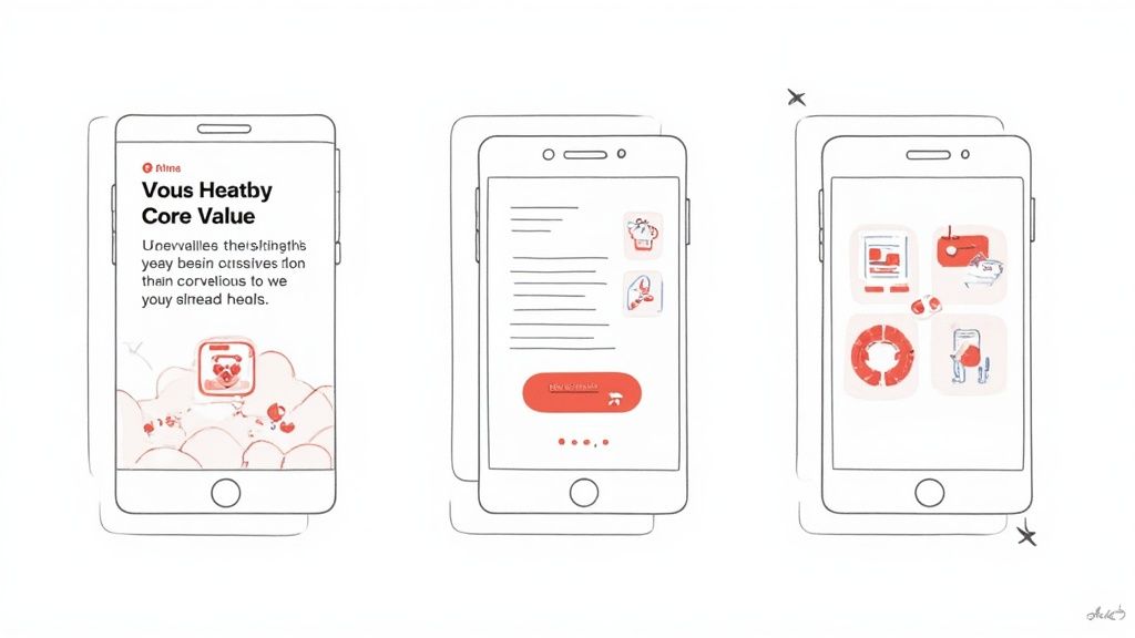
Crafting a Compelling Visual Narrative
You should treat your screenshot gallery like a mini-storyboard. Each image needs to flow into the next, walking the user from your app's main promise to the specific features that make it happen.
A well-designed screenshot doesn't just show what your app does; it shows users how your app will improve their lives. This subtle shift from features to benefits is the key to higher conversion rates.
Lead with your strongest benefit in that very first image. Use bold, easy-to-read captions layered on top to get the value across instantly. For example, instead of just showing a list of exercises, a fitness app's first screenshot might say, "Your Personalized Workout Plan". This actionable insight speaks directly to user needs, boosting conversions.
You can find more practical advice for designing visuals that convert by reading about iOS app screenshots and how they directly influence user behavior. When you get this right, your app store page stops being just a listing and becomes a powerful conversion tool.
Boosting Your ASO with Optimized Screenshot Content
It’s easy to think of screenshots as just visual filler, but they're actually one of your most powerful—and most overlooked—assets for App Store Optimization (ASO). Modern app store algorithms now scan the text inside your screenshots, which means they've become a critical tool for getting your app discovered.
This changes everything. Clear, benefit-driven captions aren't just for users anymore; they're for the search ranking bots, too. When you weave high-value keywords directly into your designs, you can give your app’s visibility a serious boost. For instance, a fitness app could overlay text like "Personalized Workout Plans" on a screen, turning a simple image into a dynamic ASO asset.
Take a look at this chart. It shows exactly how keyword-rich screenshots can directly influence app rankings after an algorithm update.
The data is pretty clear: apps that started embedding text into their screenshots saw real, measurable gains in search visibility. This shift has redefined screenshot strategy. It’s no longer just about visual appeal; it’s a smart blend of conversion-focused design and keyword optimization.
Integrating Keywords Naturally
A major update in early 2025 changed the game by modifying the App Store's search algorithm to pull and analyze text from screenshot captions, directly impacting how apps rank. You can read more about how this algorithm change affects ASO on Appfigures.com.
This technique is a core part of any strong growth strategy. We cover even more of these tactics in our detailed guide on app store optimization best practices.
Streamlining Your Screenshot Creation Workflow
Getting pixel-perfect screenshots ready for every single required device size can grind your release process to a halt. I've seen it happen time and time again. The problem gets even worse when you're managing multiple languages and localizations. A smart, efficient workflow isn't just a nice-to-have; it's absolutely essential for growth and saves a staggering amount of time while keeping your brand looking sharp.
For teams with design chops, popular tools like Figma and Canva are a solid place to start. They're packed with powerful features and have a huge community creating templates specifically for app screenshots. This approach gives you total creative control to manually design high-converting, on-brand images.
Automate and Accelerate Your Process
But let's be honest, manual design doesn't scale. For real efficiency, specialized screenshot generators are the way to go. These tools can take a single master design and instantly spit out every localized, device-specific image you need, all perfectly formatted for both the App Store and Google Play.
This kind of automation frees you from tedious pixel-pushing and lets you focus on what really matters: strategy. You can spend your time A/B testing different visual approaches to figure out what actually drives downloads. For instance, you could use an editor to test a blue background against a purple one and see which one boosts conversions more, giving you actionable data for app store growth.
Once you have your assets ready to go, you can learn more about how to upload a screenshot and finalize your submission. By bringing the right tools into your process, you can transform a frustrating bottleneck into a streamlined part of your growth engine.
Getting your app screenshots wrong is one of those simple mistakes that can quietly sabotage your growth. It can lead to flat-out store rejection or, just as bad, kill your conversion rates.
One of the most common pitfalls is simply uploading the wrong sizes. You'd be surprised how often it happens. The result is pixelated, stretched, or awkwardly cropped images that just scream "unprofessional." That first impression matters, and a blurry screenshot instantly erodes trust.
Another tripwire is creating visuals that don't actually show the app. People want to see what they're getting. Apple's guidelines are crystal clear on this: screenshots have to be real captures from your app. App Store Connect gives you up to 10 slots for a reason, but so many developers only use a handful. That’s a huge missed opportunity to tell a compelling story and show off your app's best features. Every single one of those images is a sales pitch, directly influencing that download decision.
For a deeper dive on making every slot count, Apptweak has a great guide on how to improve your app's visual presentation.
Unreadable Text and Poor Localization
Even if you nail the dimensions, your hard work can be undone by something as basic as text. Tiny fonts, low-contrast colors, or just too much text crammed into a caption all make it impossible for a user to quickly grasp what your app does. They’ll just squint, get frustrated, and swipe on to the next app.
And then there's localization, or the lack of it. This is a massive oversight for anyone with global ambitions. Imagine a user in Japan seeing screenshots with English text. It immediately sends the message that the app isn't for them, creating a disconnect that’s hard to overcome. Taking the time to properly translate and culturally adapt your visuals isn't just a nice-to-have; it's essential if you want to maximize your app's appeal and drive growth around the world.
Got Questions About App Screenshots? We’ve Got Answers.
Here are the quick answers to the questions we hear most often about app store screenshot sizes and best practices. Think of this as your cheat sheet for getting your submission right the first time.
What Are the Absolute Must-Have Screenshot Sizes for the App Store?
If you're short on time, focus on these two sizes: 6.7-inch iPhone (1290 x 2796 pixels) and the 12.9-inch iPad Pro (2048 x 2732 pixels).
Nailing these is critical because Apple’s system is smart enough to automatically scale them down to fit most other device sizes. It's a huge time-saver and simplifies the whole submission process.
How Many Screenshots Should I Actually Upload?
The short answer: as many as you can. Both Apple and Google Play give you up to 10 slots per language, and you should aim to use them.
Realistically, filling at least 5 to 7 of those slots gives potential users a solid tour of your app's best features. It's your chance to tell a visual story, and doing it well can seriously boost your download numbers.
Can I Put Text on My Screenshots?
Yes, and you absolutely should. Adding short, punchy captions that highlight a benefit is one of the most effective things you can do. It helps users instantly grasp what your app does and why they need it.
Plus, here’s a pro tip: the app store algorithms actually scan this text. That makes it a quiet but powerful tool for your App Store Optimization (ASO) and can help you rank higher in search results.
Do I Have to Use Actual Screenshots from My App?
This one is non-negotiable: yes. Both Apple and Google are very strict that your screenshots must be an honest representation of your app’s interface and what it can do.
You can definitely get creative by adding marketing text or placing the UI inside a cool device frame, but the core image has to be the real deal. If it isn't, you risk getting your app rejected during the review process.
Stop wasting hours wrestling with Figma and start converting more users. ScreenshotWhale gives you a massive library of professional templates and an AI-powered translation engine to create stunning, localized visuals in minutes. Create your perfect app store screenshots today!