Google Play Store Optimization Your ASO Guide
Unlock app growth with this guide to Google Play Store optimization. Learn proven ASO strategies to boost visibility, conversions, and downloads.
So, you want to master the Google Play Store? Good. In a marketplace with millions of apps screaming for attention, just showing up is a guaranteed way to fail.
This guide is your roadmap to actually getting noticed. We're going to break down every critical piece of your store listing, from crafting titles that Google's algorithm loves to designing visuals that stop a user mid-scroll. This is how you drive real, organic downloads and boost app store growth.
Why This Is Non-Negotiable
Let's be blunt: great optimization is your only real shot at organic growth. Think of it as SEO for your mobile app. Without a solid strategy, even the most brilliant app will get buried. This is where a focused approach to App Store Optimization (ASO) makes all the difference.
The goal is simple: align what you show users with what they’re actually searching for, all while playing nicely with Google's ranking algorithm. As of 2025, Google is doubling down on user engagement and quality signals. That means your metadata, the titles, descriptions, and keywords, is just as crucial as having killer screenshots and a rock-solid app.
If you're just getting started and want a bird's-eye view, our comprehensive app store optimization guide is a great place to begin.
Google looks at the entire journey, from the moment a user lands on your listing to how they interact with your app after the install. It’s all connected. You can get more great insights on Google's priorities from the team at AppRadar.
The whole point is to build a store listing that doesn't just attract eyeballs but convinces someone to hit that "Install" button. Every element has to work together to build trust and scream value from the first glance.
Before we dive deep into the specific tactics, let's get a clear overview of the core pillars we'll be working on.
Key Pillars of Google Play Optimization
This table breaks down the essential components of ASO for the Google Play Store. Think of these as the levers you can pull to directly influence your app's visibility, appeal, and ultimately, its download numbers. Each element serves a distinct purpose but they all work together to create a powerful growth engine.
| Optimization Element | Primary Goal | Impact on Growth |
|---|---|---|
| App Title | Boost keyword rankings and establish brand identity. | High impact on search visibility; a strong title can significantly lift ranking. |
| Short Description | Quickly communicate the app's core value proposition. | Crucial for converting impressions to page views, especially above the fold. |
| Long Description | Detail features and benefits with target keywords. | Influences keyword ranking and provides depth for users who want more info. |
| Icon | Create a memorable first impression; increase CTR. | A visually appealing icon can dramatically increase taps from search results. |
| Screenshots & Video | Visually showcase the app's benefits and user experience. | The single biggest driver of conversion; shows users why they should install. |
| Ratings & Reviews | Build social proof and trust. | Heavily influences conversion rates and is a key signal for Google's algorithm. |
Mastering these pillars isn't just about checking boxes; it's about creating a cohesive and persuasive story that resonates with both users and Google.
Throughout this guide, we'll even get into how you can use powerful tools like ScreenshotWhale to create professional, high-converting screenshots without spending hours in a design tool. Let's get started.
Nailing Your App Metadata for Clicks and Rankings
Your app's metadata is the text that tells both users and Google's algorithm what your app is all about. It's the absolute foundation of your Google Play Store optimization, directly impacting where you rank and, more importantly, whether a user even bothers to learn more. Getting this right is a careful balancing act between feeding the algorithm the right keywords and speaking to users in a way that actually connects.
I like to think of it as your app's digital storefront. The title is your main sign, the short description is the catchy window display, and the long description is the expert salesperson inside, ready to share every last detail. Each piece has to work together to grab attention and drive installs.
Uncovering High-Impact Keywords
Great Google Play ASO begins with speaking your customer's language. You need to get inside their heads and find the exact words and phrases they type into that search bar. Throwing generic terms at the wall won't work; the goal is to uncover those high-intent, long-tail keywords that signal a user is ready to download.
Start by just brainstorming your app's core features. If you've built a fitness app, you might jot down "workout tracker" or "exercise log." Now, the real work begins, digging deeper into what a user is actually trying to accomplish.
- Think User Intent: What problem are they trying to solve? They probably aren't searching for "workout tracker." They're searching for "at home HIIT workouts" or "gym workout planner for women."
- Spy on Your Competitors: Check out the top-ranking apps in your category. What keywords are they using in their titles and descriptions? ASO tools can give you a peek under the hood to see what's driving their traffic.
- Use the Play Store Itself: Start typing your main keywords into the Play Store search bar and pay close attention to the autocomplete suggestions. Those are real, popular searches that can point you to some golden long-tail opportunities.
Don't just focus on what your app is; focus on what it does for the user. A keyword like "guided meditation for sleep" is far more powerful than just "meditation app." It targets a specific need and has way more conversion potential.
The competition is fierce. By 2025, the Google Play Store is projected to host around 2.06 million active apps, with an average of 40,000 new ones hitting the market every single month. With that level of saturation, precise keyword targeting isn't just a good idea, it's essential for survival. You can find more stats on this crowded marketplace over at tekrevol.com.
Your App Title: The Most Powerful SEO Asset You Have
Hands down, the app title is the single most important piece of metadata for your Google Play rankings. The algorithm places a massive amount of weight on the words you use here. Of course, your brand name has to be in it, but you've got 30 characters to play with. Use every last one of them.
The best approach I've found follows a simple formula: Brand Name - Top Keyword or Brand Name: Top Keyword Phrase.
Let's say your photo editing app is called "PixelFlow."
- Weak Title: PixelFlow
- Good Title: PixelFlow - Photo Editor
- Excellent Title: PixelFlow: AI Photo Editor
The "Excellent" version is specific, includes the valuable "AI" modifier, and tells the user exactly what the app does. This helps you rank for both "photo editor" and "AI photo editor" while still building your brand.
The Short Description: Your 80-Character Elevator Pitch
This is it. Your 80-character shot to hook a user and stop their scroll. While it has a minor impact on keyword indexing, its main job is conversion. This text sits right under your title and screenshots, and it needs to be punchy, benefit-driven, and compelling.
Stop listing features. Start talking about benefits.
- Feature-Focused (boring): "AI filters, background removal, and text overlays."
- Benefit-Driven (much better): "Transform your photos in seconds with AI filters and one-tap background removal."
The second one instantly shows the user what they can achieve. It screams speed and simplicity, two things that get people to hit that install button.
The Long Description: Telling Your Full Story
Okay, I know what you're thinking: "Does anyone actually read this?" Most users will just skim it, but the long description is critical for two reasons. First, it gives genuinely interested users the nitty-gritty details they need to make a final decision. Second, Google's algorithm reads and indexes every single word for keywords. You've got 4,000 characters, so make them count.
Nobody is going to read a wall of text. Structure it for skimmers.
- Use Rich Formatting: Break up your text with bullet points, bold text, and even a few relevant emojis to make key features pop.
- Reinforce Your Keywords: Weave your primary and secondary keywords into the text naturally about 3-5 times to signal their importance to Google.
- Lead with Your Best Stuff: Your opening paragraph should be a power-packed summary of your main value proposition before you dive into a long list of features.
A well-crafted long description serves both audiences perfectly. Skimmers get the highlights they need, and deep-divers get all the info they want, all while you're boosting your keyword rankings in the background.
Designing Visuals That Drive Downloads
Once you've nailed your app's metadata, it's time to focus on what really sells: your visual assets. Your icon, feature graphic, and screenshots are your most powerful conversion tools on the Google Play Store. They're the first real glimpse a user gets into your app's quality and experience, often making the difference between a quick tap on "Install" and a swipe to the next app.
Text tells, but visuals sell. A great title might get users to your page, but it's your creative assets that close the deal. They offer a tangible peek into your app, helping users see themselves solving a problem or having fun with it. A polished, professional look builds instant trust and separates you from the crowd.
Your App Icon: The First Impression
Think of your app icon as the face of your brand on Google Play. It’s arguably the single most important visual you have, showing up everywhere, search results, category lists, and right on the user's home screen after they download. A killer icon has to be simple, memorable, and instantly recognizable, even when it's tiny.
Imagine a user searching for a "meditation app." They're hit with a grid of competing icons. Yours needs to pop.
- Avoid Text: Tiny text just becomes an unreadable blur. Go for a bold, clear symbol that captures your app's core purpose.
- Embrace Vibrant Colors: Pick a color palette that fits your brand but is also bright and eye-catching. Good contrast is your best friend for grabbing attention.
- Keep It Simple: Overly complex designs get lost in the noise. A single, strong shape is far more effective than a detailed illustration.
An icon that’s clean, bold, and unique can seriously boost your click-through rate from search, driving more of the right people to your store listing.
Creating Efficient, High-Converting App Store Screenshots
App screenshots are your sales pitch. Their job isn't just to show what your app looks like, but to tell a compelling story about the value it delivers. Users rarely read the long description. Your screenshots must convey your app's main benefits in a few seconds for both Android and iOS stores.
The best screenshots take the user on a quick journey. The first image should hook them with your most powerful value proposition. Each one after that should build on it, showcasing key features in a logical flow that feels like a mini-tutorial.
Focus on benefits, not just features. Instead of a caption like "Advanced Charting," try "Track Your Progress Instantly." The second one speaks directly to the user's goal, making it far more persuasive.
For a deeper dive into crafting these visuals, check out our detailed guide on creating powerful mobile app mockups that actually convert.
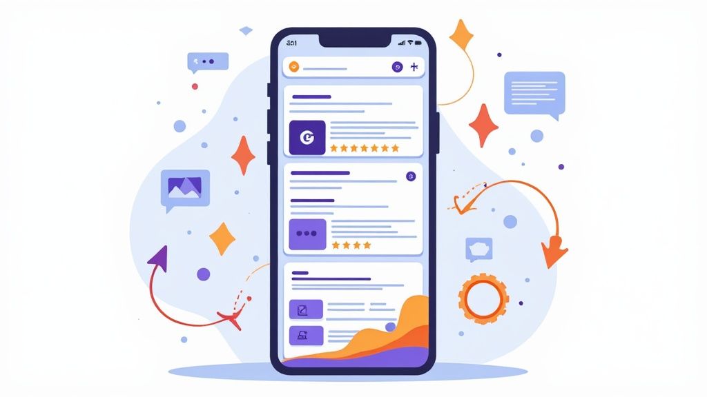
The screenshot below from the ScreenshotWhale editor is a perfect example of combining a clean device frame, a vibrant background, and a benefit-driven caption to create a professional visual that stands out. Notice how easy it is to change the text, background color, and device frame right in the editor to test new ideas quickly.

This design effectively highlights a key feature ("AI-Powered Insights") within a layout that's clean, appealing, and easy to digest at a glance.
Best Practices for High-Converting Screenshots
Making screenshots that pop isn't just about pretty pictures; it’s a strategic game. Using a tool like ScreenshotWhale makes this way easier by giving you professionally designed templates and a simple drag-and-drop editor. You can quickly add device frames, custom backgrounds, and punchy captions to make your visuals look top-tier.
Here are a few actionable insights for making screenshots that get results:
- Lead with Your "Aha!" Moment: Your very first screenshot needs to showcase your app's single most compelling feature. Make it impossible for someone to scroll away without getting what makes your app special.
- Use Bold, Legible Captions: Each screenshot should have a short, punchy caption at the top. Use large, readable fonts and focus on the outcome the user gets, not just the function.
- Create a Cohesive Visual Style: Keep your branding consistent across all screenshots. Using the same device frames, background colors, and fonts creates a polished look that builds trust.
- Showcase Social Proof: If you have impressive user numbers or press mentions, dedicate a screenshot to it. A simple line like "Trusted by 1 Million+ Users" can be a massive conversion driver.
The top-performing apps don't just "set and forget" their visuals. Data shows that about 49% of top apps refresh their screenshots at least twice a year, and 57% of leading games use A/B testing to fine-tune them. This proves that Google Play rewards apps that are always testing and improving.
The Strategic Role of a Promo Video
A promo video is optional, but it can be an incredibly powerful asset. It appears before your screenshots and often auto-plays (muted), giving you a chance to make a dynamic first impression. A sharp, well-made video can significantly lift conversion rates by quickly showing off your app's user experience.
Keep your promo video short and sweet. The first 10-15 seconds are absolutely critical. Focus on showing the app in action, highlighting its most exciting features with upbeat music and quick cuts. A video is simply more engaging than static images and does a much better job of conveying the flow and feel of your app.
At the end of the day, all your visuals need to answer one question for the user: "Why should I download this?" By crafting a stunning icon, telling a compelling story with your screenshots, and creating an engaging promo video, you give them a clear and powerful answer that drives downloads.
Boosting Your Ranking with Reviews and Performance
While your app’s title and screenshots are what get you noticed, they're only half the story. The real engines of long-term growth are the "off-listing" factors: user reviews, average rating, and technical stability. These are powerful signals that tell Google’s algorithm your app actually delivers a great experience, which is exactly what it wants to promote.
Think of it this way: your store page makes a promise, but your app’s performance and user feedback are the proof. A high crash rate or a stream of one-star reviews sends a blaring signal to Google that something is wrong. That can undo all the hard work you put into your metadata and visuals.
On the flip side, a fantastic rating and a developer who actually responds can do wonders for your rankings and conversion rates.
The Power of Positive Ratings and Reviews
User ratings and reviews are massively influential, both for potential users and for the Play Store algorithm itself. For users, they’re pure social proof. People trust other users, and a high star rating instantly builds credibility, making that "Install" button a much less risky click.
For Google, your rating is a direct report card on user satisfaction. In fact, apps that drop below 3.0 stars often see a significant hit to their visibility, especially in curated sections like "Explore." A high rating, however, tells the algorithm your app is a quality product that users genuinely like, making it a prime candidate for better search rankings and features.
A proactive review management strategy isn't optional anymore. You can't just sit back and hope for good reviews. Actively encouraging happy users to leave feedback and promptly addressing negative comments shows everyone, users and Google, that you're an engaged, reliable developer.
This kind of active management pays off. For example, by digging into user feedback to find and fix pain points, The North Face boosted its average Play Store rating from 3.5 to 4.6 stars. That 22% jump didn't just improve their reputation; it directly improved their visibility.
Strategies for Encouraging Positive Feedback
Here’s the thing: unhappy users are often the most motivated to leave a review without any prompting. To balance the scales, you need a smart, non-intrusive way to ask your satisfied users for their thoughts.
Timing is everything.
- Ask at the "Aha!" Moment: Trigger a review prompt right after a user accomplishes something meaningful. Did they just finish a level in your game? Complete a workout? Save their first project? That's the moment. You're catching them when they feel most positive about your app.
- Use a Two-Step Prompt: Instead of kicking users straight to the Play Store, first ask them in-app if they're enjoying the experience. If they tap "Yes," then you can ask for a review. If they tap "No," you can route them to a support channel. This turns a potential bad review into valuable private feedback.
- Respond to Every Single Review: Get in the habit of replying to all reviews, good and bad. Thank users for their praise and offer solutions or apologies for any issues. This public engagement shows you care and can even convince someone to go back and update a negative rating.
Monitoring Your App’s Technical Performance
Behind the scenes, Google is constantly evaluating your app’s technical stability. This data lives in the Android Vitals section of your Google Play Console, and it has a direct impact on your search ranking. Users hate slow, buggy, or crash-prone apps, and so does Google.
Key metrics you absolutely must monitor with your dev team include:
- ANR Rate (Application Not Responding): This tracks how often your app freezes up and becomes unresponsive. It's a killer for user experience.
- Crash Rate: The percentage of sessions that end abruptly in a crash.
- Slow Rendering and Startup Times: These metrics flag performance bottlenecks that make your app feel sluggish and frustrating.
These aren't just obscure technical stats; they are core to your Google Play Store optimization. An app with a high crash rate will get penalized with lower rankings because it’s delivering a poor experience. Work closely with your developers to set performance goals and make checking your Android Vitals dashboard a regular ritual. A stable, reliable app is the bedrock of sustainable growth.
Scaling Growth with A/B Testing and Localization
A static store listing is a huge missed opportunity. If you're serious about sustained growth on Google Play, you have to adopt a mindset of constant, data-driven improvement. This means getting past the "set it and forget it" approach and diving into the world of A/B testing and strategic global expansion.
By methodically testing every piece of your listing, you start making informed decisions that actually move the needle on conversions. At the same time, reaching a global audience through smart localization can unlock enormous new markets, turning your app into a genuine international asset.
Using Google Play Experiments to Boost Conversions
Guesswork has no place in a solid ASO strategy. Your best friend here is the "Store listing experiments" tool built right into the Google Play Console. It lets you run controlled A/B tests on pretty much every element of your listing, from the icon and screenshots to your descriptions and promo video.
The concept is simple. You create a variation of an asset (let's say, a new icon) and show it to a slice of your store visitors. Google then pits its conversion rate against your current version. The results can be eye-opening; I’ve often found that tiny, unexpected changes can lead to significant gains in downloads.
This flow chart breaks down the simple but powerful process of running a store listing experiment, from creating variants to seeing the final conversion lift.
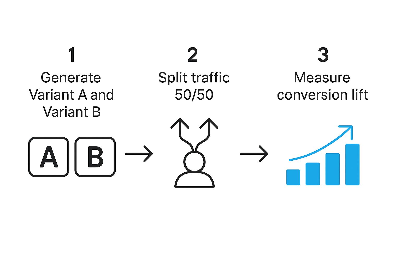
As you can see, it’s all about splitting your traffic to see what performs better in the real world, which directly fuels your growth.
The secret to a good experiment is starting with a clear hypothesis. Don't just throw random ideas at the wall. Ask a specific question, like, "Will a benefit-focused caption in our first screenshot drive more installs than our current feature-focused one?" This keeps your tests sharp and your results actionable.
What Should You A/B Test for Maximum Impact?
While you can test nearly anything, some elements carry more weight in a user's decision-making process. To get the biggest bang for your buck, start with the assets people see first.
- App Icon: This is your app's face in crowded search results. Test different color palettes, styles (like flat vs. gradient), or even different symbols to see what truly grabs attention.
- Screenshots: These are your storytellers. Experiment with the order, the caption style (benefit vs. feature), or the background colors. I’ve seen a simple tweak to the first screenshot alone yield a 5-10% lift in conversions.
- Promo Video: If you have one, don't forget to test the thumbnail (or poster frame). A magnetic thumbnail can be the difference between a user watching your video or just scrolling right past it.
- Short Description: Play around with different calls to action or lead with an alternative core benefit. Does "Track your workouts" perform better than "Get fit from home"? Only a test will tell you for sure.
A word of caution: when running tests, only change one variable at a time. If you change both the icon and the short description in the same experiment, you'll have no idea which change was responsible for the results. Be patient, let the test run long enough to gather meaningful data, and then act on what you learn.
To get your creative juices flowing, here’s a quick breakdown of things you can start testing right away.
A/B Testing Ideas for Your App Listing
| Element to Test | Variation Idea 1 | Variation Idea 2 | Metric to Measure |
|---|---|---|---|
| App Icon | Brighter color scheme | Character-based icon | First-time installs |
| Screenshots | Benefit-oriented captions | Lifestyle imagery background | First-time installs |
| Short Description | Lead with a question | Use emojis for emphasis | First-time installs |
| Promo Video Thumbnail | Show in-app action | Feature a human face | Video plays, installs |
These are just starting points, of course. The goal is to build a habit of testing, learning, and iterating based on real user behavior, not just your gut feelings.
Expanding Your Reach with Smart Localization
If your app is only available in English, you're leaving a staggering amount of growth on the table. Localization is the process of adapting your store listing, and your app itself, for different languages and cultures. And it goes way beyond just running your text through a translator.
Real localization means culturally adapting your visuals, keywords, and overall message. For example, a screenshot that hits home with an American audience might fall flat in Japan, where different visual aesthetics and social cues are the norm.
Start by looking for high-potential markets. Check your app analytics and Google Play Console data to see where your app is already getting some organic installs. These are your prime candidates for your first localization push.
- Translate Your Metadata: The first, most obvious step is translating your app title, short description, and long description into the local language.
- Localize Your Visuals: This is where a tool like ScreenshotWhale is a game-changer. Its AI can instantly translate your screenshot captions into over 100 languages, letting you create culturally relevant visuals without a massive design overhaul.
- Conduct Local Keyword Research: Don't just translate your English keywords. That's a classic mistake. Use ASO tools to find the actual search terms that users in that country are typing into the search bar.
By combining rigorous A/B testing with a thoughtful localization plan, you'll transform your Google Play listing from a static page into a dynamic growth engine, one that's constantly improving and expanding its reach across the globe.
Common Questions About Google Play Store Optimization
Navigating the world of Google Play can feel like trying to hit a moving target. The algorithm is always evolving, new features pop up, and it's easy to get lost. Let's clear up some of the most common questions developers run into.
How Long Does It Take to See ASO Results?
This is the big one, and the answer is... it depends.
If you're running an A/B test on your visuals, like trying a new set of screenshots, you can sometimes see a conversion lift in about a week. But for keyword and metadata changes, you need to be more patient. Plan on waiting at least two to four weeks before you can really measure the impact on your rankings and visibility. It takes time for Google's algorithm to crawl, index, and re-evaluate your listing.
How Often Should I Update My Store Listing?
A "set it and forget it" mindset is a surefire way to get left behind. Your store listing isn't a static page; it's a living, breathing asset. There's no magic number, but a good rule of thumb is to give it a thorough review every quarter.
Regular updates show Google that your app is actively maintained, which is a solid positive signal. That said, you should be ready to jump in more frequently for a few key reasons:
- Seasonal Events: Align your visuals and text with holidays like Christmas or major cultural moments.
- New Feature Launches: Your screenshots and descriptions need to immediately show off that major update you just shipped.
- Performance Dips: If you suddenly see a drop in impressions or installs, that's your cue to dive in and see what's wrong.
What’s the Difference Between ASO and SEO?
It’s easy to mix these two up. They both aim to increase visibility through search, but they play in completely different sandboxes. SEO is all about getting websites to rank in search engines like Google. ASO is hyper-focused on getting mobile apps to rank inside an app store.
The ranking factors are worlds apart, too. While keywords matter for both, ASO puts a huge emphasis on things like visual appeal, user ratings, conversion rates, and even app performance metrics like crash rates.
If you want to go deeper, we break it all down in our guide on what app store optimization is.
Think of it this way: SEO gets people to your website's front door. ASO not only gets them to your app's front door but also convinces them to come inside and stay.
Should I Focus More on Keywords or Visuals?
This is the classic ASO chicken-and-egg question. The honest answer? You have to master both. They perform two different, but equally critical, jobs.
Keywords are all about discovery. They're the foundation that lets people find your app when they type something into the search bar. Without the right keywords in your title and descriptions, your app is practically invisible.
Visuals, your icon, screenshots, and promo video, are all about conversion. The moment someone lands on your page, your visuals do the heavy lifting to convince them to tap that "Install" button. A killer keyword strategy paired with mediocre visuals will get you plenty of views, but almost no downloads.
At the end of the day, a balanced approach is the only path to sustainable growth on the Google Play Store.
Ready to create visuals that stop the scroll and drive downloads? With ScreenshotWhale, you can design high-converting, professional app store screenshots in minutes. Try it today and turn your store listing into a powerful growth engine. https://screenshotwhale.com