A Guide to Visuals for iTunes and App Store Success
Master visuals for iTunes and the App Store. Learn how to design high-converting icons, screenshots, and previews that boost app growth and visibility.
Getting your visuals right for the App Store is a make or break moment for any app. Seriously. These assets are not just decoration. They are your front line marketing, the first thing a potential user sees, and often the only thing that convinces them to tap "Get." Think of them as the silent salesperson telling your app's story in a split second.
A casual browser can become a loyal user based on that first impression alone.
Understanding Essential App Store Visuals
Your app's storefront on iOS and Android is built from a specific set of visual assets. Each one has a job to do, guiding a user from discovering your app in search all the way to hitting that download button on your product page. A polished, cohesive set of visuals builds immediate trust and screams "this app is legit," which is exactly what you need to stand out and boost app store growth.
I like to think of these assets as a single, powerful narrative. Your app icon is the book cover, grabbing attention on a crowded digital shelf. Your screenshots are the illustrated pages inside, showing off the best parts of the experience. And the app preview? That’s the movie trailer, giving a dynamic sneak peek of your app in action.
Before we dive deep into the specs for each asset, let's get a high level view of what we're working with. This quick reference table breaks down the core visual components, their main purpose, and how they directly impact your App Store Optimization (ASO) efforts and conversions.
Quick Reference Guide to App Store Visuals
| Asset Type | Primary Purpose | Key ASO Impact |
|---|---|---|
| App Icon | Instant brand recognition and communicating the app's core function at a glance. | Drives click through rates from search results and browse pages. A memorable icon encourages repeat engagement. |
| App Screenshots | Visually explaining key features, benefits, and the user experience. Tells a compelling story to the user. | The most significant factor in converting page views to downloads. Well designed screenshots increase conversion rates. |
| App Previews | A dynamic video demonstration of the app in action, showcasing its flow and functionality. | Increases engagement and conversion, especially for games or complex apps. Autoplays in search, boosting visibility. |
This table is your starting point. Mastering these three areas is fundamental to a successful App Store presence. Now, let's break down each one.
The Core Visual Components
To build a store presence that actually converts, you have to nail three things. If you skimp on any one of these, you're weakening the whole package and leaving downloads on the table.
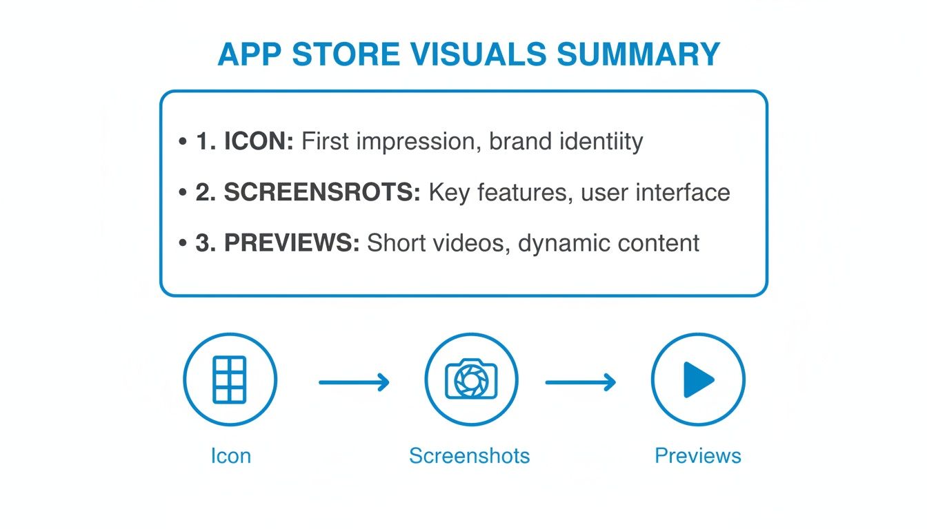
App Icon: This is your app's face. It is everywhere: in search results, on the user's home screen, featured on the App Store. A great icon needs to be simple enough to be recognized at a tiny size, memorable, and give a clear hint about what your app does.
App Store Screenshots: These are, without a doubt, your most powerful tool for persuasion. Do not just show random screens from your UI. Your screenshots need to tell a story, highlighting the benefits of your features and guiding the user toward that download button. They are critical for boosting conversions.
App Previews: Think of these as short, silent commercials. These muted videos autoplay in search results and on your product page, offering a live demo of your app. They show off the flow and feel of your app in a way static images just cannot match.
Technical Specifications for App Store Screenshots
Getting your app's visuals right for the App Store is not just about creativity. It is about hitting Apple's exact technical specs. This is the first hurdle in a successful submission. Every screenshot needs to be pixel perfect, correctly formatted, and sized for specific devices, otherwise, you're looking at a rejection.
Apple's guidelines are notoriously strict, but for good reason. They are all about maintaining a consistent, high quality experience for users browsing millions of apps. If you miss the mark on these requirements, you can expect frustrating delays during the review process, which can hold up a new launch or a critical update.
This summary breaks down the key visual assets you need to nail for a solid App Store presence.
From your icon all the way to your video previews, each piece has a specific job in convincing someone to hit that download button.
Core File and Dimension Requirements
Before you even think about device sizes, all your visuals for the App Store have to meet some basic file criteria. Getting these wrong is one of the most common, and avoidable, reasons for rejection. Double check these before you upload anything.
- File Format: Your screenshots must be a high quality JPEG or 24 bit PNG.
- Color Space: Stick to the RGB color space.
- Transparency: Screenshots cannot have an alpha channel, which means no transparency is allowed.
- Resolution: All files must be 72 DPI.
These are the foundational rules that apply across the board. For the nitty gritty on exact dimensions, it is worth checking a complete guide on App Store screenshot sizes to make sure every single asset is optimized.
Device-Specific Dimensions
This is where it gets really specific. You have to match the exact resolution for each device Apple requires. Pixel perfect visuals like 2688x1242 for 6.5 inch iPhone displays or 2388x1668 for iPads are not just suggestions. They are mandatory. This level of detail has a real impact on conversion rates, especially on a platform that sees 38 billion annual downloads.
A key thing to remember: The App Store requires you to upload a set of screenshots for the largest phone and tablet sizes. App Store Connect then automatically scales them down for smaller devices, but providing assets for each major size ensures the best possible presentation.
For instance, you'll need to provide screenshots for the 6.7" iPhone display (think iPhone 15 Pro Max) and the 12.9" iPad Pro display. By covering these, you ensure your app looks sharp and professional on the vast majority of modern devices.
Preparing Your Visuals for Submission
Once you have your designs ready, getting them into App Store Connect involves a few final, crucial steps. You will need to export each screenshot with the correct file name and dimensions. Make sure your image editor’s export settings are locked in to the right format (PNG or JPEG) and resolution (72 DPI).
When it comes to video previews, understanding the right formats is just as important. For vertical previews, consulting a good a guide to vertical video dimensions can be a lifesaver. This helps ensure your app previews are crisp, properly oriented, and make an immediate impact on potential users scrolling through your product page.
Getting the technical specs right is just the starting point. The real magic happens when your App Store screenshots do more than just show your UI. They have to tell a compelling visual story that turns casual browsers into actual users. Your first five screenshots are prime digital real estate, and every single one needs to communicate a clear, tangible benefit to boost conversions.
Think of it like a five panel comic strip. The whole point is to create a cohesive narrative that walks a potential user through your app's core value. Do not just list features. Show them the problems you solve or the joy you create. That is how you build an emotional connection and make the decision to download feel obvious.
Crafting a Compelling Visual Narrative
A strong narrative always starts with a clear message. Before you touch a single pixel, nail down the top three to five benefits your app delivers. Do you save people time? Help them connect? Make a complicated task feel simple? These benefits should be the theme for each screenshot.
This simple shift in focus ensures your visuals for iTunes and the App Store are centered on what actually matters to the user. Use vibrant colors and bold, readable text that aligns with your brand to make those benefits pop. Keeping your layout, color palette, and fonts consistent across all the screenshots builds a sense of professionalism and trust.
This example really nails how to highlight distinct benefits in each frame, creating a value proposition that is instantly clear and appealing.
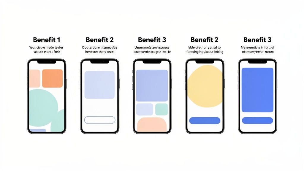
By using those bright backgrounds and short, punchy captions, the design immediately pulls your eye to the app’s key advantages. It just works.
Layouts and Captions That Drive Action
How you lay out your screenshots is critical. A perennially popular and effective method is the "device in hand" mockup, which shows your UI on a photorealistic phone. This simple trick grounds the app in reality and helps people instantly picture themselves using it. Another powerful technique I've seen work well is using panoramic or connected screenshots that create a seamless, flowing image as you swipe through the gallery.
Of course, your captions are just as important as the images. They need to be short, powerful, and all about the benefit.
- Focus on Outcomes: Instead of "Task Manager," try "Organize Your Entire Life."
- Use Action Verbs: Words like "Create," "Discover," and "Share" are way more engaging.
- Keep it Short: Honestly, a single, impactful line of text per screenshot is usually all you need.
The best screenshots answer the user's unspoken question: "What's in it for me?" They turn abstract features into real world benefits, making a direct appeal to what the user actually needs or wants. That is the heart of effective visual persuasion on the App Store.
Using Templates for Professional Results
Let us be real: creating high quality screenshots for every single device is a massive time sink, especially if you're a small team or a solo dev. This is where specialized tools can be a game changer. Using a platform like ScreenshotWhale lets you start with professionally designed templates built for specific app categories.
Whether your app is for fitness, finance, or gaming, these templates are already built with conversion best practices baked right in. You can quickly customize layouts, drop in your own UI, tweak the colors to match your brand, and generate a full set of compliant screenshots for every required device size in just a few minutes. This kind of workflow does not just save you hours of design work. It guarantees your visuals look consistently professional and are optimized to drive downloads.
Think of your app icon and previews as your one two punch in the App Store. While screenshots lay out the details, these two assets play very different, but equally critical, roles. Your icon is your brand's handshake, the very first thing people see in search results, featured lists, and eventually, on their home screen. It has to be instantly recognizable and give a clue about what your app does.
App Previews? That is your sales pitch in motion. These short videos show off your app's experience in a way static images just cannot. They are absolute conversion machines, especially for apps with slick animations, unique workflows, or visually stunning games.
![]()
Designing an Unforgettable App Icon
A great app icon is simple, memorable, and looks sharp everywhere. It has to scale perfectly, from a tiny notification badge all the way up to its full size glory on the App Store. The biggest mistake is using words or complex images that turn into an unreadable smudge when shrunk down.
Your best bet is to focus on a single, bold symbol that captures your app’s core function. Stick to a limited color palette that reflects your brand and, just as importantly, pops against various wallpapers. Before you commit, test your design against the competition to make sure it does not just blend in. For a full breakdown of the technical specs, our guide on the right icon size for the App Store has you covered.
Creating High-Converting App Previews
App Previews are 15-30 second videos that put your app on display. The catch? They autoplay on mute in the search results, which means the first few seconds are everything. Your mission is to create a fast, benefit focused trailer, not a slow moving tutorial.
An effective App Preview demonstrates the "magic moment" of your app within the first five seconds. Show users the most exciting or valuable part of the experience right away to stop them from scrolling.
Here’s how to make previews that actually convert:
- Storyboard First: Plan out a clear story. Kick off with a problem, present your app as the hero, and finish with a solid call to action.
- Show, Do Not Just Tell: Since most people watch without sound, use on screen text to highlight key benefits.
- Keep it Fast Paced: Use quick cuts and dynamic transitions to hold their attention for the full 30 seconds.
- Use Real UI: Always use authentic footage from your app. It builds trust and sets the right expectations from the get go.
While both your icon and previews are visual, they serve very different strategic purposes. Let's break it down.
Comparing App Icons and App Previews
| Visual Asset | Key Objective | Design Best Practice | Common Mistake |
|---|---|---|---|
| App Icon | First impression & brand recognition | Simple, scalable symbol with bold colors | Using text or complex details that do not scale |
| App Previews | Demonstrate value & user experience | Show the "magic moment" in the first 5 seconds | Creating a slow tutorial instead of a fast paced trailer |
Ultimately, nailing your icon and your previews completes your visual marketing strategy. A killer icon pulls people in, and a compelling video preview seals the deal, turning scrollers into downloaders and driving real app store growth.
Boosting Your ASO with Optimized Visuals
Your App Store screenshots do a lot more than just show off your app on the product page. They are a powerful, and frankly, often overlooked tool for App Store Optimization (ASO). They have a direct say in how easily people find you through search.
This is not just about pretty pictures. The App Store’s algorithm literally reads the text you bake into your screenshot designs. Suddenly, that caption space becomes prime real estate for keyword indexing. By working the right keywords into your visuals for itunes (now the App Store), you can directly influence your app's search ranking and kickstart organic growth.
Turning Screenshots into Ranking Tools
You need to think of each screenshot caption as a chance to signal your app's purpose to Apple's search algorithm. For instance, a meditation app with captions like "Welcome Screen" or "Feature One" is leaving a massive opportunity on the table.
Instead, you should be using phrases that your potential users are actually typing into the search bar.
Better captions would look something like this:
- "Guided meditation for sleep"
- "Reduce anxiety with daily calm"
- "Mindfulness exercises for focus"
This approach helps the algorithm connect the dots and understand that your app is a great match for those specific searches, giving you a real edge. The trick is to weave these keywords into benefit driven statements that sound natural and convincing to a person, not just a machine.
This whole strategy has become way more important since Apple's recent App Store algorithm updates. Screenshots went from being simple conversion aids to genuine ranking factors, with the text in them now being scanned for keywords. With over 1.9 million apps to compete against, this is a game changer. If you want to go deeper, you can learn more about how ASO is evolving on YouTube.
Actionable Keyword Strategies for Visuals
So, how do you put this into practice? It all starts with solid keyword research. Figure out the main and secondary terms your audience uses to find apps like yours. Once you have that list, you can start integrating those keywords directly into your screenshot captions.
The goal here is a perfect marriage of discovery and conversion. Your visuals need to be optimized with keywords for the algorithm while simultaneously showing clear benefits to the user. A keyword should never make your design confusing or less appealing.
Let us say you're making screenshots for a fitness app, and "home workouts" is a key term. Your first screenshot could have the caption: "Your Personal Trainer for Home Workouts." That one line immediately tells both the user and the App Store what you're all about.
Using a screenshot editor that lets you quickly swap out text and duplicate templates makes testing different keyword combinations a breeze. It is all about experimenting to find that sweet spot for maximum impact.
Streamlining Your Visual Production Workflow
Let’s be honest: churning out high quality App Store visuals for every required device size can grind any project to a halt. It is a massive bottleneck, especially if you're a solo dev or part of a small team. An efficient workflow is not some nice to have luxury. It is what lets you launch on time, roll out seasonal campaigns, and push updates without pulling all nighters in a design tool.
The whole point is to build a repeatable system. One that keeps your brand consistent and your visuals looking sharp, every single time, without eating up all your time.
This all starts with a solid foundation. Before you even think about opening a design app, put together a simple style guide for your visuals for iTunes and the App Store. Nail down your brand’s color palette, typography, and caption style. Getting these rules in place ensures every screenshot feels like it belongs to your app. Once you have that, you can build a master template that becomes the blueprint for everything else. This one step will save you countless hours down the road.
A Step-by-Step Guide to Efficient Production
Thankfully, modern tools are built to automate the most tedious parts of this process. What used to be a multi day slog can now be done in minutes. With a screenshot editor like ScreenshotWhale, you can generate a full set of high converting visuals for both iOS and Android stores with just a few clicks. The entire workflow is designed for speed.
Here’s what that looks like in practice:
- Choose a Template: Start with a professionally designed template that fits your app's vibe, whether it’s for fitness, finance, or gaming. These are already built with conversion best practices baked right in.
- Upload Your UI: Just drag and drop your raw app screen captures. The tool automatically wraps them in the right device mockups, like an iPhone 15 Pro or Google Pixel.
- Customize the Design: Tweak the background colors, fonts, and captions to match your style guide. This is where you make sure every visual perfectly reflects your brand. For example, use the color picker to select your exact brand hex code for the background and choose a font that matches your app's UI.
- Export All Sizes: With one click, you get every single screenshot size you need for all your target devices. The platform spits out pixel perfect, compliant assets ready to upload directly to App Store Connect and Google Play.
Maintaining Brand Consistency and Quality
A streamlined workflow is about more than just moving fast. It is about keeping a high bar for quality across all your visuals. Templates give you a strong, consistent structure that stops your brand from looking sloppy or different between updates. That consistency is what builds user trust and makes your app feel professional and reliable.
An automated workflow frees your team to think about strategy instead of getting bogged down in production. When you cut out all the manual resizing and reformatting, you get back precious time to focus on A/B testing, localization, and actually improving the content of your visuals for better conversions.
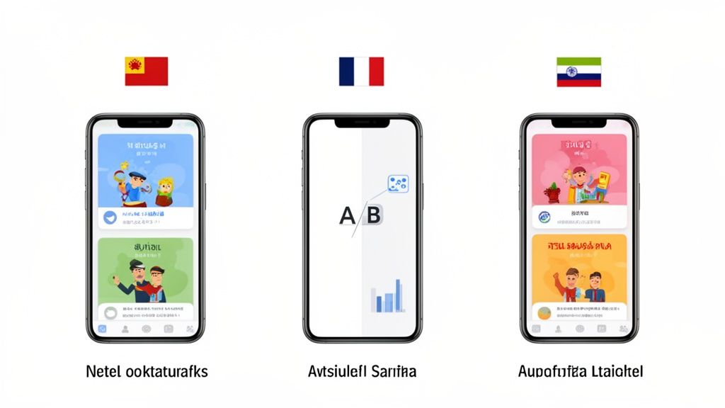
Taking Your App Global with Localization and A/B Testing
If you want your app to succeed beyond your home country, you have to think globally. And I'm not just talking about translating a few lines of text. To really make an impact in international markets, your visual assets, your screenshots and app previews, need to speak the local language. This is all about localization, making your app feel native and trustworthy to people everywhere.
This goes way deeper than swapping out English for Japanese. It means adapting UI elements like currency symbols and date formats, and even changing the imagery to match regional expectations. A screenshot that crushes it in North America might completely fall flat in Tokyo. Properly localizing your visuals for iTunes and the App Store is a non negotiable step for building a global user base.
The Power of Cultural Adaptation
Real localization is about adapting the entire visual story you're telling. This might mean your calendar app's screenshots showcase culturally relevant holidays, or your lifestyle app uses models and imagery that actually reflect the local population.
When it comes to your app previews, this becomes even more critical. Getting your videos localized often requires techniques like professional video translation subtitling to make sure your message lands perfectly with different audiences.
Here are the key things you need to nail:
- Text and Captions: Get all your on screen text and marketing captions translated accurately by a native speaker.
- UI Elements: Switch up the formats for dates, times, and currency to match local conventions.
- Imagery: Use images, colors, and themes that feel culturally appropriate and relatable.
Putting in this effort sends a clear signal to users: you built this app for them. That alone can do wonders for trust and download rates. For a much deeper look, check out our complete guide on mobile app localization.
A/B Testing with Product Page Optimization
The best part is, you do not have to guess what will work in each market. Apple gives you a powerful tool right in App Store Connect called Product Page Optimization (PPO). It’s designed to help you make data driven decisions by A/B testing your visual assets.
With PPO, you can set up three alternate product pages to test against your original one. This is your chance to get creative. Test different screenshot styles, try new color palettes, rewrite your captions, or see if a different app preview video performs better. You can then direct a percentage of your App Store traffic to each version and get hard data on what drives the most installs.
When you're competing with 1,916,393 other apps for the attention of users who download over 38 billion apps a year, you need every advantage you can get. Testing helps you find that edge.
By methodically testing your visuals, you stop making assumptions and start relying on data. This cycle of testing and iterating is how you uncover the highest converting creative for each market, setting your app up for real global growth.
A solid testing process looks something like this:
- Form a Hypothesis: Start with a clear idea, like "Screenshots with a blue background will convert better in the UK than our current green ones."
- Create Variations: Design the new set of screenshots based on your hypothesis.
- Run the Test: Set up the PPO test in App Store Connect, targeting the specific region you're interested in.
- Analyze Results: Let the test run until you have enough data to confidently declare a winner.
- Implement and Repeat: Make the winning version your new default and immediately start thinking about your next test.
Your Top App Store Visuals Questions, Answered
When you're in the trenches of an app launch, a lot of questions pop up around the visuals. I get asked these all the time, so I've put together some straight answers to help you get your app's presentation right and avoid common pitfalls.
Do I Really Need to Make Screenshots for Every Single iPhone and iPad?
Thankfully, no. That would be a nightmare. Apple has streamlined this process quite a bit. You just need to focus on the largest device sizes for both iPhone and iPad.
Right now, that means you'll upload one set for the 6.7 inch iPhone display and another for the 12.9 inch iPad Pro. App Store Connect handles the rest, automatically scaling them down for all the smaller screens. Just nail those two sizes, and you're covered across the board.
What’s More Important, My Visuals or the App Description?
Visuals, and it is not even close. A great description is important for App Store Optimization (ASO) and for users who are already hooked, but the initial download decision is almost always visual. Your icon, screenshots, and app preview video do the heavy lifting.
Think of it like this: users are scrolling quickly. They do not read, they scan. High quality visuals can boost your conversion rates by up to 35% because they communicate your app's value in a split second. Your description is there to back it up, but the visuals land the first punch.
How Many Screenshots Should I Actually Upload?
Apple lets you upload up to 10 for each language, but the magic really happens in the first three to five. These are the ones users see immediately, without swiping. This is your prime real estate.
My advice? Treat those first few slots like a storyboard. Your first screenshot should scream your app's biggest, most compelling benefit. The next few should walk the user through other key features, telling a quick story that makes them want to hit "Get."
Should I Use Raw UI or Polished Mockups for My Screenshots?
This is a classic debate, but the best answer is a hybrid of the two. You absolutely have to show your genuine UI. Apple can reject your app if you do not, and it is misleading to users. But just throwing up a raw screen capture is a huge missed opportunity.
The screenshots that consistently perform the best are the ones that take real UI, place it inside a clean device frame, and set it against a branded background with a punchy, benefit focused caption. This approach looks professional and trustworthy, combining the authenticity of your actual app with smart marketing. It is the single best way to get higher engagement and drive downloads.
Ready to stop wrestling with Photoshop and start creating screenshots that actually convert? ScreenshotWhale gives you professionally designed templates, a dead simple editor, and AI powered localization to knock out stunning visuals in minutes. Start designing for free at ScreenshotWhale.