
App Icon Dimensions iOS: Optimal Sizes for Your App
Learn the essential app icon dimensions iOS requires. Get sizing tips for iPhone, iPad, and the App Store to enhance your app's appeal and downloads.
When you're getting your app ready for launch, the single most important icon file you'll create is your App Store icon. It needs to be a clean, high-resolution 1024x1024 pixel image. This master icon is what users see first when browsing the App Store, making it a critical tool for boosting app store growth and conversions. From this single asset, Apple's system generates most of the other sizes needed across the iOS ecosystem.
This master icon is what users will see when browsing the App Store, making it a critical piece of your app's marketing.
Quick Reference for iOS App Icon Dimensions

While Apple handles a lot of the resizing, you still need to supply specific icon sizes within your project's asset catalog in Xcode. Getting these dimensions right is non-negotiable—it prevents last-minute submission rejections and ensures your app looks crisp and professional on every device, from the Home Screen to Spotlight search. A polished look is your first step toward higher conversions.
This section is designed to be your go-to checklist. It's a scannable summary of the essential sizes you’ll need for iPhone, iPad, and the App Store, so you can quickly verify your assets and get back to designing.
Essential iOS App Icon Sizes at a Glance
For a quick overview, here's a table summarizing the most common and critical icon dimensions you'll be working with. Use this as a handy reference to ensure you haven't missed anything for your iPhone, iPad, and App Store listings.
| Usage Context | Dimensions (Pixels) | Scale Factor |
|---|---|---|
| App Store (Primary) | 1024 x 1024 | @1x |
| iPhone Home Screen | 180 x 180 | @3x |
| iPhone Spotlight | 120 x 120 | @3x |
| iPhone Settings | 87 x 87 | @3x |
| iPad Home Screen | 167 x 167 | @2x |
| iPad Pro Home Screen | 167 x 167 | @2x |
| iPad Spotlight | 80 x 80 | @2x |
| iPad Settings | 58 x 58 | @2x |
Having these key sizes prepared ahead of time will dramatically streamline your workflow. It allows you to focus less on technical specs and more on creating a visually compelling icon that drives downloads and helps your app stand out.
How to Manage Your App Icon Set in Xcode

If you’ve ever felt overwhelmed by the sheer number of icon sizes Apple requires, you’re not alone. Thankfully, Xcode gives us a fantastic tool called an asset catalog to wrangle them all. This visual editor, specifically the AppIcon.appiconset file, is where you'll manage every single icon variation your app needs.
The asset catalog lays everything out with clearly marked slots for each device and context—from the main Home Screen icon down to the tiny one used for Spotlight search. It completely removes the guesswork.
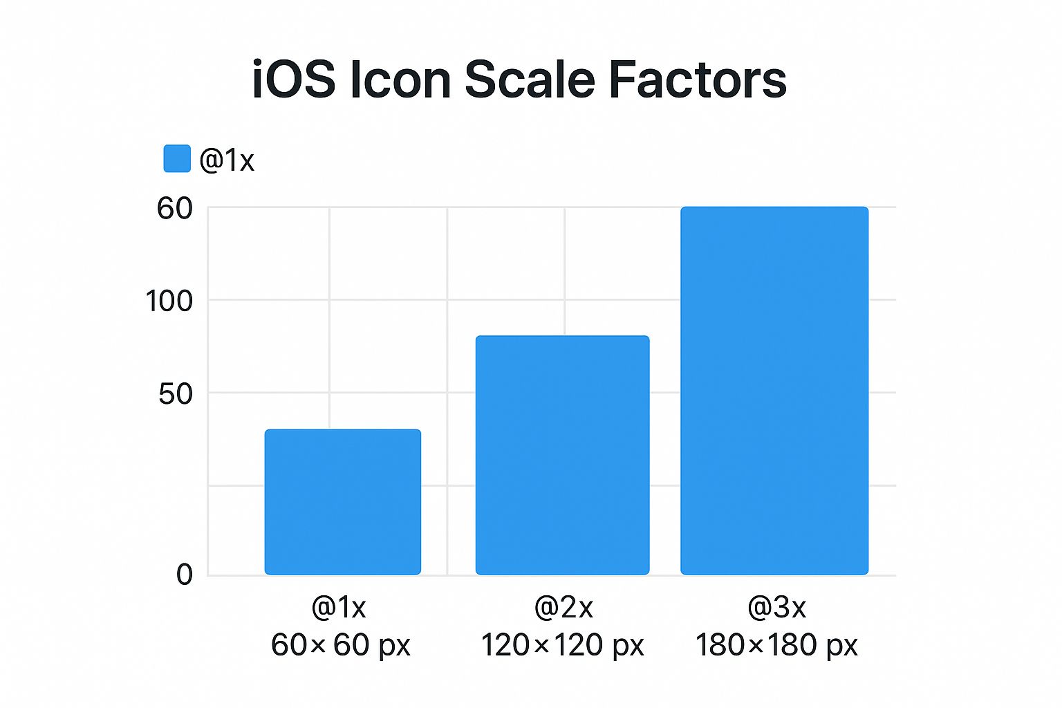
The entire system is based on scale factors: 1x, 2x, and 3x. Think of 1x as the base size for older, non-retina displays. From there, 2x and 3x assets are simply double and triple the pixel dimensions to look sharp on high-resolution Retina screens. For example, an icon with a 60pt base size needs a 120x120 pixel PNG for @2x displays and a 180x180 pixel PNG for @3x displays.
Populating Your App Icon Set
Getting your icons into the catalog is as simple as dragging and dropping. Once you have all your PNG files exported at the correct dimensions, you just pull them from your Finder window and drop them into the matching slots in the AppIcon set. Xcode labels each slot with the exact context and size, like "iPhone Notification 20pt @2x @3x," so it's hard to go wrong.
A complete asset catalog is more than just good housekeeping; it's your first line of defense against annoying validation errors when you submit to the App Store. Xcode will flag any missing icon sizes right away, saving you from a potential rejection later.
Taking the time to populate these slots correctly is crucial. It ensures your app's branding looks crisp and professional everywhere, from a user's Home Screen to the App Store itself. A polished presentation is a small detail that makes a big difference in boosting user trust and app store growth.
Definitive iPhone and iPad Icon Dimensions
While the Xcode asset catalog is your primary tool, it's still crucial to understand why you're creating each specific icon size. Every dimension has a purpose, from the main Home Screen icon that users see every day to the tiny version that pops up in a notification. If you skip one, iOS might fall back to a different size, but the result is often a blurry, unprofessional-looking icon that can make users second-guess your app's quality.
The key is to provide pixel-perfect assets for every single slot. This guarantees your icon looks sharp and clean on every device, whether it's an older iPhone SE or a brand-new iPad Pro. Apple’s system is precise; it won’t stretch a smaller icon to fit a larger space. It expects the exact size for each context, so accuracy is non-negotiable.
This handy visual breaks down how the base point (pt) size of an icon translates into actual pixels (px) depending on the screen's scale factor.
As you can see, a single point size scales up for @2x and @3x Retina displays, which is how your icon stays crisp on those high-resolution screens.
Required iPhone Icon Sizes
For any modern iPhone, your main focus will be on the @2x and @3x scale factors. Here’s the list of essential sizes you absolutely have to provide:
- Home Screen (60pt): This is the most important one. You'll need a 120x120 px (@2x) and a 180x180 px (@3x) version.
- Spotlight Search (40pt): When a user pulls down to search, this is the icon they see. Prepare an 80x80 px (@2x) and a 120x120 px (@3x) icon.
- Settings (29pt): A small but important touch. This icon appears next to your app's name in the Settings app. You’ll need 58x58 px (@2x) and 87x87 px (@3x).
- Notifications (20pt): This tiny icon appears with push notifications. Make sure you have a 40x40 px (@2x) and a 60x60 px (@3x) ready.
Required iPad Icon Sizes
Things are a bit different for the iPad, which still uses a mix of @1x and @2x scales depending on the model and context.
- Home Screen (76pt): The standard iPad Home Screen icon requires 76x76 px (@1x) and 152x152 px (@2x).
- iPad Pro Home Screen (83.5pt): The larger iPad Pro models need their own specific size: 167x167 px (@2x). Don't miss this one!
- Spotlight Search (40pt): For iPad search results, you'll need 40x40 px (@1x) and 80x80 px (@2x).
- Settings (29pt): Just like the iPhone, you need an icon for the Settings app. Provide a 29x29 px (@1x) and a 58x58 px (@2x).
Designing Your App Store Icon to Drive Downloads
Think of your App Store icon as your app's front door. It’s the very first thing people see, and in a sea of competitors, a great icon can be the deciding factor between a user scrolling by or tapping to learn more. That's why the 1024x1024 pixel icon you upload to App Store Connect needs to be more than just a pretty picture; it has to be a high-converting asset.
While Apple uses this large, master file to generate all the smaller sizes needed across iOS, its most important job is to sell your app on the storefront. On the technical side, the rules are simple: it must be a flat PNG file with no transparency (the alpha channel must be removed). Don't round the corners yourself—Apple's system will automatically apply the iconic "squircle" mask.
Moving Beyond the Basics to Boost Conversions
Getting the specs right is just step one. An icon that actually drives downloads follows a few battle-tested design principles. It needs to be recognizable at a glance and tell a story about what your app does without relying on words.
Here are a few actionable insights to create a high-converting icon:
- Keep It Simple: Resist the urge to cram in tiny details or text. A single, bold, and easily understood symbol is far more powerful. Remember, this icon has to look good on a giant monitor and on the smallest iPhone screen.
- Use Color Strategically: Pick a color palette with strong contrast that will stand out against both light and dark mode wallpapers. A unique color choice with vibrant colors can make your app leap off the screen in crowded search results.
- Build Your Brand: Your icon is a tiny billboard for your brand. It should feel connected to everything else a user sees, from your App Store screenshots to the app's internal user interface. This consistency builds trust and boosts conversions.
A well-designed icon isn't just about checking a box for the App Store review process; it's a powerful tool for growth. I've seen A/B tests prove that the right icon design can lift conversion rates by over 30%.
Ultimately, you’re aiming for an icon that stops thumbs from scrolling and clearly signals your app's value. It’s a visual handshake that invites people to your product page and nudges them toward that download button. If you're looking to improve your app's overall visual presentation, our guide on creating effective mobile app mockups is a great next step.
A Look Back at iOS Icon Requirements
To really get a handle on today's long list of app icon dimensions for iOS, it helps to understand how we got here. It’s not just Apple being difficult; it's a direct result of rapidly advancing hardware and a constant push for pixel-perfect user interfaces. Knowing this history can help you anticipate what's next.
When the very first iPhone debuted back in 2007, its screen was pretty simple by modern standards. The app icon size reflected this: a straightforward 57x57 pixels. That was all you needed, and it looked great for the time. But that was just the beginning.
The real shift happened in 2010 with the launch of the iPhone 4 and its now-famous Retina display.
From Standard to Retina and Beyond
The Retina display was a game-changer. By doubling the pixel density from 163 to 326 PPI, it made everything on screen unbelievably crisp. To keep app icons looking sharp on these new screens, Apple introduced the @2x scale factor, requiring developers to supply a 114x114 pixel version. This established the new rule: as screen technology improved, so must the assets.
This pattern has continued ever since. The introduction of Retina HD and Super Retina displays on newer iPhones and iPads brought even higher resolutions. This led to the need for assets like the 180x180 pixel icon for the home screen and, of course, the giant 1024x1024 pixel version required for the App Store.
It wasn't just about pixel counts, either. The release of iOS 7 in 2013 signaled a massive design overhaul. We said goodbye to the detailed, skeuomorphic icons and hello to the flat, clean "squircle" that defines the iOS aesthetic today.
This journey from a single, small icon to a whole set of different sizes shows Apple's unwavering commitment to quality. As displays get better, every single visual element has to keep up. For a fantastic deep dive into this history, check out the detailed timeline on Jim Nielsen's blog.
Best Practices for a Killer App Icon Design
Getting the iOS app icon dimensions right is the first step, but the actual design is what makes or breaks your app's first impression. A great icon is more than just a pretty picture; it’s a tiny powerhouse that has to grab attention, explain what your app does, and convince people to tap "Get." The goal is an icon that’s immediately recognizable, whether it's a huge tile on an iPad or a tiny notification badge.
Think of your icon as a single, bold statement. Your best bet is to build it around one powerful, memorable symbol that perfectly captures your app's main purpose. Ditch the idea of cramming words or detailed photos into that small space. They just turn into an unreadable mess at smaller sizes and dilute your brand. Instead, lean into a strong, simple shape and a vibrant color palette that pops against any wallpaper, in both light and dark mode.
Tying Your Icon Design to App Store Success
A standout icon doesn't just look good; it's a critical piece of your app store growth strategy. It needs to feel like it belongs with your other App Store assets, especially your screenshots, to tell a consistent and appealing brand story. For instance, using a screenshot editor, you can set a background color for your screenshots that matches your icon's primary color, creating a seamless and professional product page. This visual consistency is key to building trust and boosting conversions on both the iOS and Android stores.
We cover how to nail that visual consistency in our guide to creating efficient and high-converting iOS app screenshots.
This link between design and experience is pure Apple philosophy. When iOS 7 introduced the "squircle" shape, it was more than a facelift—it was a move to create a unified visual language across every device. This change standardized the icon grid and marked Apple's pivot from realistic skeuomorphic textures to the clean, flat aesthetic we see today. If you're curious about the journey, this in-depth history of iOS icons is a fascinating read.
Frequently Asked Questions About App Icons
It's easy to get bogged down in the specifics of iOS app icon dimensions, but once you know a couple of core rules, the whole process becomes much clearer. Here are the quick answers to the questions we see pop up all the time.
First and foremost, the only file you absolutely must have is your 1024x1024 pixel App Store icon. Think of this as the master copy. It's what you upload to App Store Connect, and Apple uses it to create all the other smaller sizes needed. Just make sure it’s a standard, non-transparent PNG.
A classic mistake is rounding the corners of your icon yourself. Don't do it. Always design and submit a perfect square. Apple’s system automatically applies the signature rounded corner mask—what some call a "squircle"—to every icon. This ensures your app looks right at home on a user's device.
Automating Your Workflow
Manually resizing and exporting dozens of icon variations is a recipe for a headache and a great way to introduce errors. I always recommend using an icon generator tool or a script to handle this.
You just feed it your high-resolution 1024x1024 master icon, and it spits out every single size you need, perfectly named and ready for your Xcode asset catalog. It saves a ton of time and guarantees you haven't missed anything.
Of course, a great icon is just one piece of the puzzle. To learn how to make your entire app listing more visible, be sure to read our complete iOS App Store optimization guide.
Ready to create stunning, high-converting visuals for your app? ScreenshotWhale makes it easy to generate professional App Store screenshots in minutes. Try our powerful editor and professionally designed templates today at https://screenshotwhale.com.
Article created using Outrank