Pro App Screenshots for App Store Growth
Create stunning app screenshots for app store success. Learn proven design, ASO, and storytelling tips to boost downloads and conversion rates instantly.
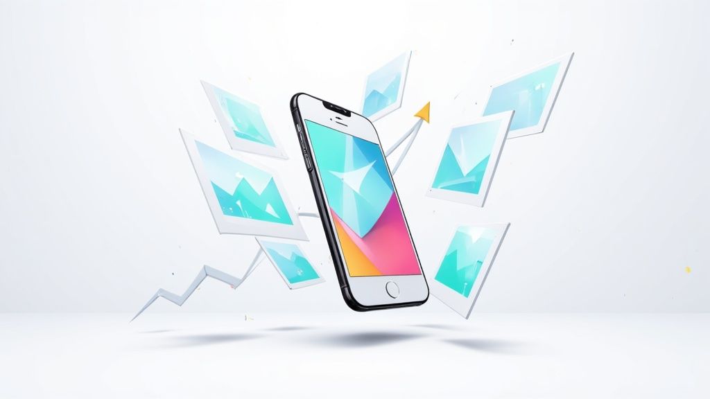
Your app screenshots are your single most powerful conversion tool on the App Store and Google Play. This is not an exaggeration. They often make or break a user's download decision before they have read a single word of your description.
Think of these visuals as your high impact sales pitch. Those first three images can either grab someone's attention instantly or send them scrolling away forever. To boost app store growth, you need to create efficient, high converting app store screenshots that work hard for you.
Why App Screenshots Drive Downloads
Picture your app store page as a physical storefront. Your icon is the sign out front, and your title is the name above the door. But your screenshots? They are the window display. They offer the first real glimpse of what is inside.
In a marketplace as crowded as the app stores, that first look is everything. Users are visual creatures who make snap judgments in seconds.
Well designed, message driven screenshots do more than just show off your app's UI. They communicate its core value proposition on the spot. They quickly answer the user's unspoken questions:
- What does this app actually do?
- How will it make my life easier or more fun?
- Does it look polished and easy to use?
A strong set of screenshots builds immediate trust and sets the right expectations, turning casual browsers into committed downloaders and boosting your conversions.
The Critical First Impression
The average user spends just 7 seconds deciding whether to install an app. In that tiny window, visuals are processed way faster than text. It is no surprise, then, that effective screenshot design can boost conversion rates by 20–35%.
Here is a statistic that really drives the point home: a staggering 90% of users on both the App Store and Google Play do not bother scrolling past the third screenshot. This means your first few images carry all the weight of that critical first impression. Prioritizing their quality is not just a good idea, it is non negotiable for app store growth.
More Than Just Pictures
Beyond just showing off features, your screenshots are a huge part of your app's identity. They need to feel cohesive and aligned with your brand, using the same colors, fonts, and tone of voice a user will find inside the app itself.
This consistency is key to building a strong visual branding.
Your app screenshots aren't just a gallery; they are a visual story. Each image should build on the last, guiding the user from a problem they face to the solution your app provides, making the "download" button the logical next step.
Ultimately, great screenshots transform your store listing from a simple information page into a compelling narrative that persuades users to join your community. Investing time and effort here is a direct investment in your app's growth. It is how you stand out.
App Store vs Google Play Screenshot Requirements
While both stores prioritize visuals, they have slightly different rules and allowances. Knowing these technical details upfront saves a ton of headaches during the submission process. Here are the key differences for creating app store screenshots for the Android and iOS stores.
Here is a quick cheat sheet comparing the key specifications.
| Specification | Apple App Store (iOS) | Google Play Store (Android) |
|---|---|---|
| Number of Screenshots | Up to 10 | Up to 8 per device type |
| File Format | JPEG or PNG (without alpha) | JPEG or 24-bit PNG (no alpha) |
| Orientation | Portrait or Landscape | Portrait or Landscape |
| Device Mockups | Optional but highly recommended | Optional but highly recommended |
| Video Previews | Up to 3 App Previews | 1 promo video (YouTube link) |
| Key Devices | 6.7-inch (iPhone 15 Pro Max) & 12.9-inch (iPad Pro) | Phone, 7-inch tablet, 10-inch tablet |
The main takeaway? Apple gives you a bit more room to tell your story with 10 screenshots, while Google is slightly more restrictive at 8. Both, however, are pushing video hard, so do not neglect that opportunity.
Crafting a Compelling Visual Story
Your app store screenshots should not just be a random collection of UI captures. Think of them as a mini storyboard, a visual narrative that guides a potential user from a problem to a solution, with your app as the hero. Each image is a chapter, building on the last to create a powerful argument for hitting that download button.
This storytelling approach is far more effective than just listing features. Why? Because it connects with the user on an emotional level, helping them actually envision how your app will improve their life. A strong narrative flow turns passive browsing into active interest, and I have seen it boost conversions time and time again.
From Problem to Success Story
The best visual stories all follow a simple, three act structure. It starts by acknowledging the user's pain point, introduces your app as the clear solution, and finishes by showcasing their success. It is a classic formula because it works, making your value proposition immediately understandable.
Let us say you have a meal planning app. Your visual story could unfold like this:
- The Problem: The first screenshot shows a chaotic kitchen or someone looking stressed about what to cook. The caption could read, "Tired of the 'What's for Dinner?' Panic?" This is instantly relatable.
- The Solution: The next few screenshots introduce your app in action. One might show a simple recipe discovery feature ("Find Delicious Recipes in Seconds"), while another highlights an automated grocery list ("Shop Smarter, Not Harder").
- The Success: The final image shows a happy family enjoying a home cooked meal, or the user feeling relaxed and in control. The caption seals the deal: "Effortless Meals, Happy Home."
This sequence does not just show what the app does; it shows what the app achieves for the user. It is a compelling journey that makes the download feel like the logical next step.
Your screenshot sequence should answer the user's core question—"How will this app make my life better?"—by showing them, not just telling them. Treat each image like a frame in a comic strip that tells one unified, persuasive story.
Writing Benefit-Focused Captions
The text you place on your screenshots is just as important as the visuals. These captions need to be short, punchy, and focused entirely on benefits, not features. A user does not care about your "proprietary sorting algorithm"; they care that they can "Find the Perfect Movie in a Tap."
Here is how to translate dry features into compelling benefits for your captions:
- Feature: User profiles
- Benefit: "Connect With Friends & Share Progress"
- Feature: Dark mode
- Benefit: "Easy on Your Eyes, Day or Night"
- Feature: Data encryption
- Benefit: "Your Privacy, Always Protected"
Keep the language simple and action oriented. Use a large, readable font that stands out against the background. The goal is for someone to grasp the core message of each screenshot in a single glance. Creating effective mobile app mockups can help you test different caption styles and layouts to see what resonates best before you commit to a final design.
A Real-World Example: Headspace
The meditation app Headspace is a master of this. Their screenshots do not just show meditation timers or audio players. They tell a story about mental well being and personal growth.
Their sequence often starts by addressing a common user pain point like stress or sleeplessness. Subsequent screenshots walk the user through the app’s solutions, such as guided meditations or "sleepcasts." The final images do not show the app at all, they evoke feelings of calm, focus, and happiness.
They nail the copy, too, with benefit driven captions like "Less Stress, More Resilience" and "Sounder Sleep, Happier Days." This consistent narrative reassures users that the app is a supportive tool for improving their mental health, making the decision to download an easy one.
Once you have nailed down your story, it is time to make it look good. The right design choices will make your screenshots pop, grabbing a user’s attention and pulling them toward that download button.
Think of this as your crash course in creating visuals that convert, even if you are not a designer. Your goal is not just to make something pretty; it is to create something functional. Every color, font, and layout choice has to work together to communicate your app's value in a split second.
The Power of Color and Contrast
Color is not just for decoration, it is a shortcut to a user's emotions. The right palette can instantly set the tone for your app. A fitness app might go with energetic oranges and greens to feel active and healthy. A finance app, on the other hand, would probably stick to a clean, trustworthy blue to build a sense of security.
When you are picking colors, keep a few things in mind:
- Brand Consistency: Your screenshots should feel like an extension of your app's UI and brand. This creates a cohesive, recognizable look.
- Emotional Connection: What feeling are you trying to sell? Calm? Excitement? Productivity? Use color psychology to drive that message home.
- High Contrast: This is non negotiable. Your text and key elements have to stand out against the background, especially on a small phone screen where readability is everything.
Getting the visuals right is a huge part of looking polished and professional in the app stores.
Choosing Fonts That Communicate Clarity
The font you use for captions is critical. Users glance, they do not read. Your text has to be legible in an instant. This means you should steer clear of overly decorative or thin fonts that are a nightmare to read on a small screen.
Go for bold, clean typography. There is a reason sans serif fonts like Helvetica, Roboto, or Montserrat are so popular. They are easy to scan and give your screenshots a modern, professional vibe. And please, make the font size large enough to be read without squinting.
If a user has to squint to read your message, you have already lost them. The best app screenshots use typography to make their value proposition impossible to miss.
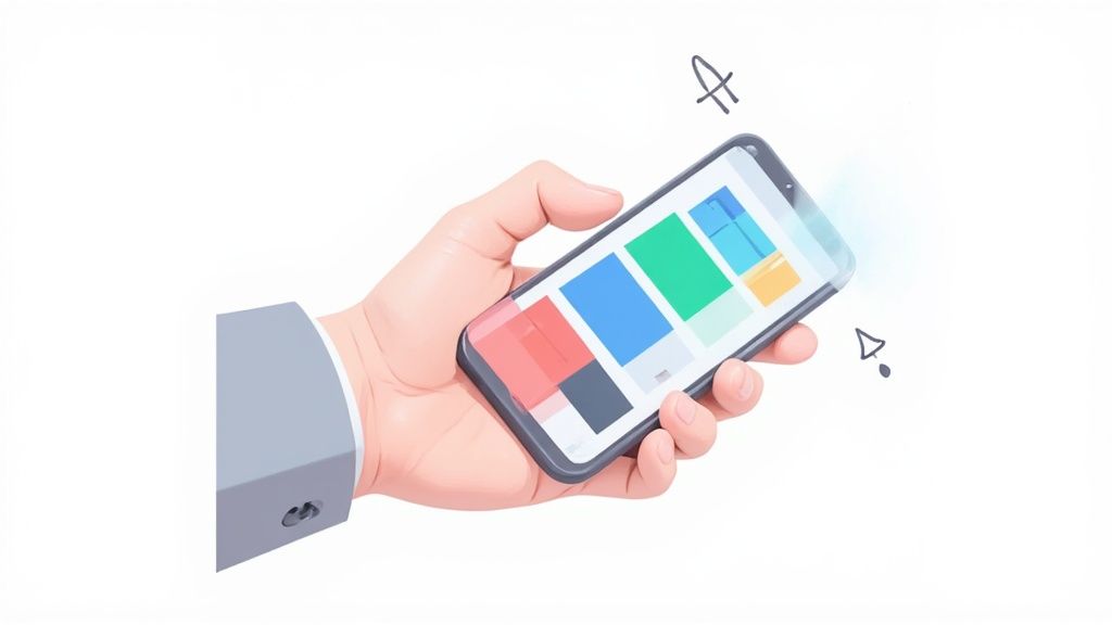
Clean Layouts That Guide the Eye
A cluttered screenshot is a dead screenshot. Your layout needs to be clean and organized, with a clear visual path that leads the user’s eye straight to the most important info. Do not be afraid of white space; it gives your design elements room to breathe and keeps things from feeling cramped.
There are a few tried and true layout styles for app screenshots for app store listings that just work:
- Device Frames: Putting your UI inside a realistic phone mockup (like an iPhone 16 Pro) makes your app feel tangible and immediately recognizable.
- Vibrant Backgrounds: A solid color or a subtle gradient in the background can make your device frames and captions really stand out.
- Lifestyle Imagery: For certain apps, showing real people using the app can create an emotional hook and demonstrate its real world value.
Whatever style you land on, stick with it across your entire screenshot gallery. Consistency builds trust.
Ultimately, every one of these design choices is about one thing: turning viewers into users. It helps to think bigger than just screenshots and consider broader marketing strategies. These actionable conversion rate optimization tips offer great insights that apply here, too. The core idea is to make sure every single part of your app store page is working hard to drive downloads.
Navigating Technical Specs for App Stores
There is nothing more frustrating than getting your app update rejected for a technical reason you could have easily avoided. Both Apple and Google have very specific rules for screenshot dimensions, formats, and sizes, and they are not flexible.
Think of these specs as the key to the lock. If your images do not fit their exact requirements, the door to the app store simply will not open. This is not just about avoiding a rejection notice; it is about making sure your hard design work looks crisp and professional on every single device. Get this part right, and you are building a solid foundation for a high converting store page.
The Smart Way to Handle Screenshot Sizes
Here is a massive time saver: the 'base requirement' strategy. Instead of driving yourself crazy creating a dozen different sizes for every possible iPhone or Android device, both stores let you upload one primary set of screenshots. You design for the largest, most current device, and they automatically scale your images down for smaller and older models.
It is an incredibly efficient workflow. You focus your energy on creating one perfect, high resolution set of screenshots, and let the app stores handle the rest. This also guarantees a consistent visual experience for every user, no matter what device they are on.
For a complete pixel by pixel breakdown for every iPhone and iPad, check out our full guide on app store screenshot dimensions.
This infographic breaks down the core elements of the design process, from picking the right colors and fonts to nailing the final layout.
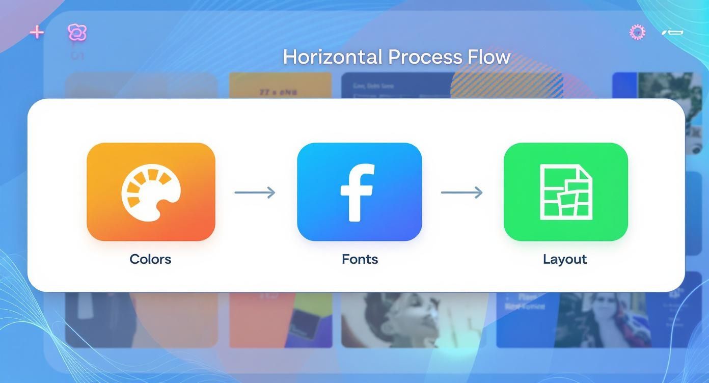
As you can see, a methodical approach is key. It all starts with brand aligned colors and readable fonts, which set the stage for a clean, effective design.
Apple App Store Specifics
Apple’s rules have shifted over the years to keep up with their device lineup. For 2025, they have standardized the process: all new apps and updates must submit screenshots for the 6.9-inch iPhone and the 13-inch iPad.
These are your base requirements. App Store Connect uses these two sizes to automatically generate the correct assets for every other device in the Apple ecosystem. It is a smart system that ensures your visuals look great everywhere. You can find more details in this ASO guide for App Store screenshots.
By focusing your efforts on the mandatory 6.9-inch iPhone and 13-inch iPad sizes, you cover all of Apple's requirements for new submissions. This simple trick eliminates the need to produce dozens of variations, streamlining your entire workflow.
Google Play Store Guidelines
Google Play uses a similar 'design for the biggest' approach, but they organize it by device type instead of specific screen dimensions. You will need to provide screenshots for phones, 7-inch tablets, and 10-inch tablets. You can upload up to 8 screenshots for each category.
Just like with Apple, the goal is to provide beautiful, high resolution images that shine on a large screen. Trust the store’s system to handle the downscaling for smaller devices.
Your Pre-Submission Checklist
Before you hit that 'submit' button, do a quick sanity check to avoid the most common technical hang ups.
- File Format: Are your images JPEG or 24-bit PNG (no transparency)? Both stores are absolute sticklers on this.
- Number of Images: Did you use all your slots? Apple gives you up to 10, and Google offers up to 8. More screenshots give you more chances to tell your story.
- Correct Base Sizes: Double check that your primary set matches the required dimensions (6.9" iPhone for Apple, high res phone/tablet for Google).
- Content Compliance: Are you only showing your actual app UI? Both stores will reject screenshots that contain extra marketing fluff or photos of people holding devices.
- Readability: Is your caption text big, bold, and easy to read? What looks great on your 27-inch monitor might be totally unreadable on a tiny phone screen.
Using Screenshots to Boost Your ASO
For a long time, App Store Optimization (ASO) was pretty straightforward: you focused on your app’s title, subtitle, and maybe the keyword field. Screenshots were seen as purely a conversion tool, something to convince users to download after they had already landed on your page.
But the game has completely changed. Your visual gallery is now a powerful tool for discoverability, turning what was once just decoration into a core part of your ASO strategy. Your app screenshots for app store listings are no longer just for show; they can actively drive organic traffic right from the search results.
The New Algorithm Text Scanning
This huge shift can be traced back to algorithm changes around 2025. Apple quietly updated its search algorithm to start scanning and indexing the text written inside your screenshot captions, treating it just like any other metadata. Suddenly, the keywords in your captions could directly influence your app's search ranking. You can learn more about this major algorithm update and its effects.
This makes crafting keyword rich, benefit driven captions more critical than ever. You are now playing a dual purpose game where the same text that persuades a user to install is also helping new users find you in the first place.
Your screenshot captions have graduated from simple descriptions to strategic ASO assets. Every word you place on your visuals is an opportunity to rank for keywords that your target audience is actively searching for.
How to Weave Keywords into Captions Naturally
Of course, the goal is to integrate keywords without sounding like a robot. A caption stuffed with keywords might tick the algorithm box, but it will absolutely kill your conversion rates if it reads poorly. Your captions still need to tell a compelling story and communicate value clearly.
Here is a simple framework I use to balance ASO with user experience:
- Identify Core Keywords: Start with high intent keywords describing your app's main purpose. What problem does it solve? What would a real person type into the search bar to find an app like yours?
- Focus on Benefits, Not Just Features: This is key. Frame your keywords inside benefit oriented statements. This makes the text feel natural and persuasive, not like you are just listing functions.
- Keep it Short and Punchy: Users scan, they do not read. Make every word count and use large, legible fonts so your message lands instantly.
For a deeper dive into keyword research and other ASO techniques, check out these app store optimization best practices.
Practical Examples of Keyword Integration
Let us see what this looks like in practice. Notice how the strong examples embed the keyword in a way that feels helpful and user focused.
Meditation App
- Weak Caption: "Meditation Timer"
- Strong Caption: "Find Calm with Guided Meditation" (Keyword: "guided meditation")
- Strong Caption: "Improve Sleep with Bedtime Stories" (Keyword: "bedtime stories")
Photo Editing App
- Weak Caption: "Filter Options"
- Strong Caption: "Apply Aesthetic Filters in a Tap" (Keyword: "aesthetic filters")
- Strong Caption: "Perfect Your Selfies with Face Retouch" (Keyword: "face retouch")
Budgeting App
- Weak Caption: "Expense Tracking"
- Strong Caption: "Track Spending with an Expense Tracker" (Keyword: "expense tracker")
- Strong Caption: "Create a Simple Monthly Budget" (Keyword: "monthly budget")
This strategic approach transforms your screenshots from passive visuals into active drivers of organic growth, helping you climb the search rankings and attract more qualified users.
Answering Your Biggest Screenshot Questions
When you are deep in the weeds of app store optimization, the same questions about screenshots tend to pop up again and again. Whether you are a solo dev trying to make a splash or a marketing team aiming for the top charts, getting these details right can make all the difference.
Let us cut through the noise and tackle some of the most common questions I hear about creating screenshots that actually drive downloads.
How Often Should I Be Updating My Screenshots?
Leaving your screenshots to gather digital dust is a surefire way to make your app look abandoned. As a general rule, you should give your visuals a refresh every 3 to 6 months. This keeps your product page looking current and signals to users (and the app stores) that you are actively invested in your product.
But some moments demand an immediate update. Do not wait.
- A Major Feature Drop: When you roll out a game changing new feature, your screenshots need to shout about it. This is your prime opportunity to show users what is new and why they should be excited.
- A Fresh UI: If you have spent weeks or months redesigning your app's interface, your store page has to reflect that hard work. Showing old UI when you have a beautiful new one creates a disconnect that can kill trust instantly.
- Seasonal Campaigns: Holidays and special events are perfect excuses to create themed screenshots. They feel timely, relevant, and can give you a nice little bump in conversions.
Think of it this way: regularly updated app screenshots for app store listings are a sign of a healthy, evolving app.
Portrait or Landscape? Which One Should I Use?
This one is simpler than you think: follow your app's lead. The whole point is to give people an honest peek into what it is like to use your app.
If your game is meant to be played horizontally, your screenshots must be in landscape. Trying to cram a wide view into a tall, skinny portrait frame just looks bizarre and confusing. On the flip side, if your app is used vertically, stick with portrait shots. It is all about representing the experience accurately.
Always, always show your app as it is meant to be used. You want to set clear, honest expectations right from the jump. This attracts the right kind of users and cuts down on the number of people who uninstall moments after opening the app.
Some games get clever with this, stitching several portrait screenshots together to create a single, sweeping panoramic image. It can look incredible, but the underlying principle is the same: authenticity is what converts.
What Are the Biggest Mistakes People Make?
So many apps fall into the same traps, making simple, preventable errors that tank their conversion potential. Just avoiding these common blunders will put you miles ahead of the competition.
Here are the mistakes I see most often:
- Blurry, Low Res Images: Nothing screams "amateur hour" like a pixelated screenshot. Start with high resolution captures. Always.
- Text You Cannot Read: Your captions need to be legible at a glance on a small phone screen. If someone has to squint to read your value prop, you have already lost them.
- Just a Raw Screenshot: Simply uploading a plain UI capture with no context is a wasted opportunity. You need a benefit driven headline to tell a story and explain why someone should care.
- Skipping Localization: Forgetting to translate and adapt your screenshots for different countries is like leaving money on the table. It is a huge missed opportunity for global growth.
Is Localizing Screenshots Really That Important?
It is not just important, it is absolutely critical if you have any global ambitions. And I am not just talking about translating the words in your captions.
Proper localization means adapting your visuals to fit the cultural norms, color preferences, and even the devices popular in a specific market. An image that works perfectly for an American audience might fall completely flat with users in Japan or Brazil.
When you take the time to create a fully localized store page, you are sending a powerful message to international users: "We built this for you." That builds instant trust and can dramatically lift your download rates, giving you an edge that lazy competitors cannot match.
Ready to create stunning, high converting visuals in minutes? ScreenshotWhale provides professionally designed templates and an AI powered translation engine to make your app screenshots stand out in every market. Create your perfect app store screenshots today at https://screenshotwhale.com.