A Complete Guide to App Store Screenshot Dimensions
Master app store screenshot dimensions for iOS and Android. Our guide covers specs, best practices, and ASO tips to boost app conversions and visibility.
Getting your app store screenshot dimensions right is a small detail that makes a huge difference. It is not just about avoiding a rejection from Apple or Google. It is about making a great first impression that drives app store growth. Nail the specs, like 1290 x 2796 pixels for the latest iPhones or the 1080 pixels standard for Android, and you are on your way to boosting conversions.
A Quick Guide to Screenshot Dimensions
Your screenshot dimensions are a foundational piece of your App Store Optimization (ASO) strategy. If you get this wrong, your app update or launch can get delayed by a rejection. More importantly, the right sizes ensure your visuals look crisp and professional on every device, which builds instant trust with potential users.
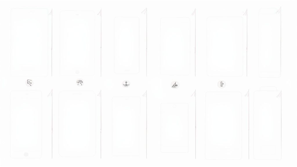
This infographic breaks down the essential rules for both the Apple App Store and Google Play, covering the core dimensions and file formats you will need to know.
As you can see, both platforms are strict, but they have their own quirks, especially around the variety of required sizes and accepted file formats. Think of these specs as your first checkpoint for creating a store listing that actually converts.
To give you a quick lookup table, here are the core requirements you will be working with most often.
Essential Screenshot Dimensions for iOS and Android
This table lays out the specific dimensions, orientations, and file formats you will need for your screenshots on both the App Store and Google Play. It is a handy reference to keep bookmarked.
| Platform | Device Category | Orientation | Required Width (px) | Required Height (px) | File Format |
|---|---|---|---|---|---|
| Apple App Store | 6.7" iPhone | Portrait | 1290 | 2796 | JPG or PNG |
| Apple App Store | 6.5" iPhone | Portrait | 1242 | 2688 | JPG or PNG |
| Apple App Store | 5.5" iPhone | Portrait | 1242 | 2208 | JPG or PNG |
| Apple App Store | 12.9" iPad Pro | Landscape | 2732 | 2048 | JPG or PNG |
| Google Play Store | Phone | Both | Min: 320 | Min: 320 | JPG or PNG |
| Google Play Store | Phone | Both | Max: 3840 | Max: 3840 | JPG or PNG |
| Google Play Store | 7-inch Tablet | Both | Min: 320 | Min: 320 | JPG or PNG |
| Google Play Store | 10-inch Tablet | Both | Min: 320 | Min: 320 | JPG or PNG |
Keep in mind that these are the most common specs. Always double check the latest documentation from Apple and Google before a big launch, as requirements can and do change.
Tips for Screenshots That Convert
Getting the pixel counts right is just the start. The real magic happens when you treat your screenshots as a storytelling tool to drive app store growth. You have just a few seconds to convince someone your app is worth their time.
Here’s how to make those seconds count:
- Lead with your best feature. Most people only glance at the first one or two screenshots. Put your most powerful benefit front and center. For a fitness app, this means showing a dynamic workout in progress, not the login screen.
- Add clear, benefit driven text. Do not just show a screen. Explain its value. Use short captions like "Track Workouts in Seconds" to tell users why it matters to them.
- Keep your branding consistent. A cohesive style using the same vibrant colors, fonts, and layout across all screenshots makes your app look polished. It builds brand recognition and trust at a glance.
iOS App Store Screenshot Specifications
Getting your iOS screenshot dimensions right is a strict requirement. Apple is famously particular about its guidelines for a good reason. They want every app to look crisp and professional on their high resolution Retina displays.
If you submit visuals that are even a single pixel off, you are looking at a rejection from App Store Connect. It is an instant roadblock that can delay your launch or a critical update.
The good news is that Apple has simplified the process. You are no longer required to create a unique set of screenshots for every single iPhone model.
Instead, the core rule is to upload a complete set for the largest device sizes. As of now, that means you must provide screenshots for the 6.7 inch iPhone and the 12.9 inch iPad Pro (3rd generation or later). Apple's system then handles the heavy lifting, automatically scaling your images down for smaller devices.
Detailed iOS Screenshot Dimensions by Device
To get started, you need to know the exact artboard sizes for your designs. Here is a quick reference table with the most critical app store screenshot dimensions you will need for modern iOS devices.
| Device Model | Display Size | Portrait Dimensions (px) | Landscape Dimensions (px) | Recommended Format |
|---|---|---|---|---|
| iPhone (Super Retina XDR) | 6.7" | 1290 x 2796 | 2796 x 1290 | PNG or JPEG |
| iPad Pro (Liquid Retina) | 12.9" | 2048 x 2732 | 2732 x 2048 | PNG or JPEG |
When you are setting up your project in a design tool, make sure your artboards match these sizes perfectly. For a portrait screenshot on the latest iPhone, that is exactly 1290 pixels wide by 2796 pixels tall. No exceptions.
Remember to design your screenshots as non interlaced PNG or high quality JPEG files. A common mistake is to export images with transparency. Apple requires fully opaque images, so make sure you disable any alpha channels in your final export.
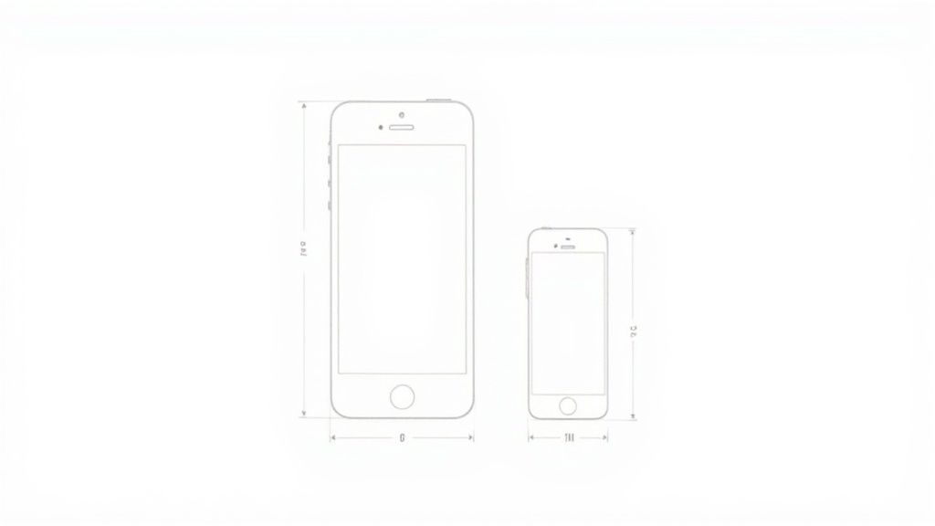
These dimensions have not always been so massive. Think back to the iPhone 6, which only required 750 x 1334 pixel assets. Today's requirements for 1290 x 2796 pixels reflect the industry’s shift to larger, edge to edge screens. This evolution has also led to a 30% increase in the time developers and designers spend preparing assets. You can dig deeper into this ASO evolution over on the SplitMetrics blog.
Android Google Play Store Screenshot Specifications
Unlike Apple’s environment, the Android world is incredibly diverse. This means your Google Play Store screenshots need to shine on hundreds of different devices, from tiny budget phones to massive tablets.
Thankfully, Google's requirements are a lot more flexible than Apple's. Instead of demanding exact pixel dimensions for every model, they focus on adaptability. You are required to upload between two and eight screenshots for each device type in either JPEG or 24 bit PNG format (no alpha transparency).
Core Dimension Requirements
Google gives you a range to work within, not a rigid set of numbers. This allows your visuals to scale properly across all the different screen densities and aspect ratios out there.
- Minimum Dimension: 320 pixels
- Maximum Dimension: 3840 pixels
- Aspect Ratio: The longest side cannot be more than twice the shortest side. So, a 2:1 ratio is your limit (e.g., 1080 x 2160 is fine, but 1080 x 2200 is not).
This freedom means you have to be smart about your design to ensure high conversions. I have seen countless screenshots where crucial text gets cut off on certain phones. You need to make sure your key selling points are centered and have enough padding to avoid being cropped.
If you want to go deeper on creating all the different assets, check out our complete guide on optimizing your https://screenshotwhale.com/blog/google-play-store-graphics.
My Pro Tip: Stick to a high resolution, standard size like 1080 x 1920 pixels. It is a 16:9 aspect ratio that scales beautifully on the vast majority of modern Android phones and ensures your app looks crisp and professional.
By designing for a common aspect ratio, you simplify your workflow while guaranteeing a polished, reliable look for every potential user. That consistency builds trust and ultimately drives more downloads.
Designing Screenshots That Drive Conversions
Getting the app store screenshot dimensions right is only half the battle. If you really want to boost downloads, your visuals need to tell a story that grabs a user's attention in seconds. Think of your screenshot gallery as a visual sales pitch. Each image should build on the last to drive home your app's true value.
It is not just about technical specs. Truly understanding the basics of creating engaging content for your audience is what separates screenshots that just exist from screenshots that actually get people to hit "Install."
Crafting a High Converting Visual Narrative
Your first screenshot is your most important asset. It has one job: communicate your app's main benefit immediately. If you have a productivity app, lead with a screenshot showing a completed to do list, not the settings menu. Use bold captions and a vibrant, appealing color palette to make that first impression count.
From there, your next screenshots should create a natural flow.
- Showcase core features: Dedicate each image to a single, powerful feature. Do not cram too much in.
- Use compelling callouts: Add short, punchy text that explains the benefit of what users are seeing.
- Maintain brand consistency: Stick to the same fonts, vibrant colors, and layouts. It builds a professional, trustworthy image.
The best screenshots guide the user on a quick journey. They start with a strong hook, introduce key benefits, and end with a clear reason to download. This is how you turn passive browsers into active users and boost app store growth.
File Formats and Maximizing Your Slots
When it is time to export your designs, you are choosing between JPEG and PNG. I stick with PNGs for screenshots that have sharp text and flat colors since they offer lossless quality. JPEGs are better for photographic images where file size is a bigger concern, which helps with faster load times on the store.
The number of screenshot slots has also grown, and you should use them. Apple now allows up to ten screenshots, and apps that use all ten see an average conversion rate boost of 15%. Do not forget about localization, either. Tailoring your visuals for a global audience matters. Studies show localized screenshots can increase downloads by up to 20% in non English regions.
Using a Site Editor to Create Your Screenshots
Manually designing screenshots in Photoshop can feel like a real time sink, especially when juggling all the different app store screenshot dimensions. A much more efficient way to create high converting screenshots is with a web based editor built for this task. These tools come packed with templates and automation, cutting down the process from hours to minutes.
The idea is simple: you start with a pre built layout that already looks great and fits your app's vibe. If you are wondering where to even begin with templates, our guide on choosing an app store screenshot template is a good place to start. From there, you can tweak everything, including device mockups, vibrant background colors, and fonts, to make sure the final look is perfectly on brand.
A Step by Step Example
Let’s walk through a practical example. First, you select a template and the editor automatically sets the correct dimensions, like 1290 x 2796 pixels for new iPhones. Then, instead of messing with layers, you just drag and drop your raw app captures right into polished device mockups.
Next comes the fun part: adding text and graphics. A good site editor lets you overlay punchy captions to highlight your best features. For instance, you could add a vibrant colored text box with the words "Plan Your Day in 60 Seconds" to showcase your app's efficiency. This turns a plain screen capture into a powerful marketing tool that sells your app.
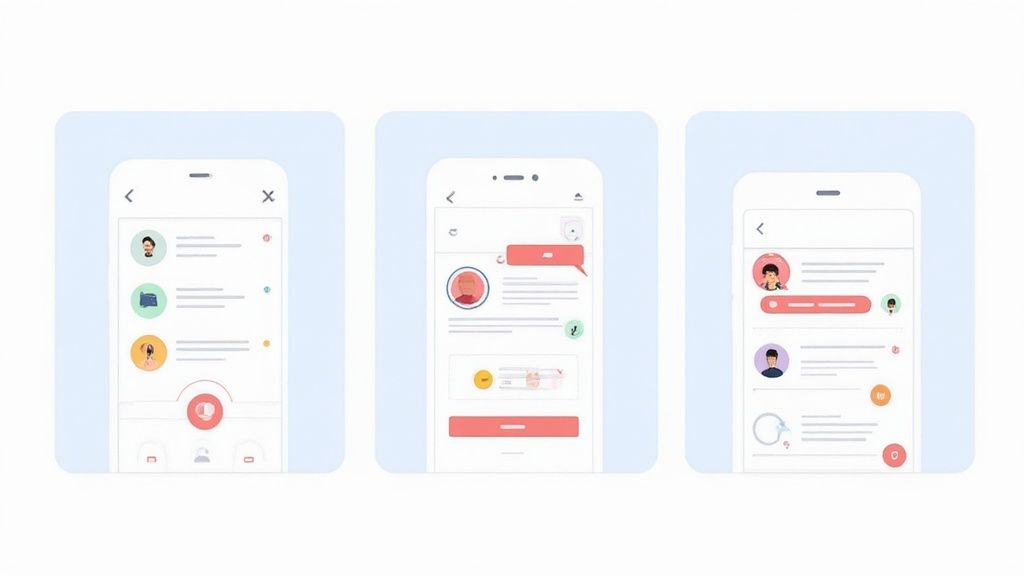
As you can see in the image, the interface is straightforward. Your app's UI sits neatly inside a device frame, and you have a side panel with all the options you need to change colors, edit text, and adjust the layout on the fly. No design degree required.
The real magic for efficiency is the export. A good editor automates this entire step. With a single click, it generates every single size you need for both the iOS and Android stores. And if you are looking to get even more creative with your visuals, exploring some of the best free AI image generators can give you unique, appealing backgrounds that make your screenshots stand out.
Optimizing Screenshots for App Store Discovery
Your screenshots do more than just show off your app's features. They are a massive piece of your App Store Optimization (ASO) puzzle. Sure, getting the app store screenshot dimensions right is the first step, but what you put inside them directly impacts whether users find your app in the first place.
This is especially true on Apple’s App Store now. They have updated their algorithm to treat the text inside your screenshots as searchable metadata. That change means the captions you write can make or break your app's ranking for key search terms. When the text in your screenshots aligns with your app's title, you are sending a powerful signal that Apple’s algorithm loves.
Weave Your Keyword Strategy Into Your Visuals
You need to start treating your screenshot captions as a direct extension of your keyword list. It is a critical insight for app store growth.
- Spotlight Keyword Rich Features: Use your first one or two screenshots to highlight the features people are actually searching for.
- Write Captions That Sell the Benefit: Instead of a flat "New Filter," try "Edit Photos with Pro Filters." It is far more descriptive and hits a term users are likely typing into the search bar.
- Keep Text Readable: Your captions have to be big and clear enough to be read at a glance. Most people will never zoom in.
Apple’s algorithm now pulls text directly from your screenshot captions, treating it as keyword metadata. This makes your visual design a direct factor in your ASO performance and conversions.
This is not a small tweak. It completely changes the discovery game. Recent data shows that apps that strategically place keywords in their screenshot captions have seen their organic search visibility jump by an average of 25%.
Think about that. We already know that only 9% to 13% of users ever bother to scroll past the first few portrait screenshots. Optimizing this prime real estate for both visual appeal and keyword value is non negotiable for growth. You can dig deeper into how the App Store algorithm has evolved over on Appfigures.
Frequently Asked Questions
Got questions about app store screenshots? I have rounded up the most common ones I hear from developers and marketers. We will tackle everything from choosing between JPEG and PNG to handling new device requirements. Use these actionable insights to clear up confusion and sharpen your ASO strategy.
What Happens if I Upload Wrong Dimension Screenshots?
If you upload screenshots with the wrong dimensions, the app store will almost certainly reject your submission. It is a quick way to get your update or launch delayed. Both Apple and Google have automated checks that validate every asset against their specific requirements, and they do not mess around.
For instance, trying to sneak a 1242 x 2688 pixel screenshot into a slot that demands 1290 x 2796 pixels will throw an immediate error. It is a frustrating but common roadblock. To avoid it, always double check the latest specs or use an editor built for the job. And if you are fuzzy on the submission steps, our guide on how to upload a screenshot can help you sidestep those common mistakes.
Should I Use Portrait or Landscape Screenshots?
This really comes down to your app's core experience. For the vast majority of apps, portrait is the way to go. It feels more natural and fills the screen better when a user is casually scrolling through the store on their phone.
However, if your app is a game, a video player, or anything that lives primarily in landscape mode, then your screenshots should reflect that. Showing the app in its natural habitat is key for conversions. Some of the most effective product pages actually use a mix, telling a compelling story by showcasing different features in different orientations.
How Important Is the Text in My Screenshots?
It has become incredibly important, especially on the Apple App Store. A few years ago, captions were just for users. Now, they are for the algorithm, too. Apple's systems actively scan the text within your screenshot images for keywords, which can directly impact where your app shows up in search results.
This means you need to be strategic. Use clear, punchy captions that not only highlight your app's benefits but also weave in relevant keywords. It is a two for one deal: you improve user conversion and discoverability at the same time.
Your screenshot text is no longer just for users. It is for the App Store’s search algorithm too. Treating captions as a part of your keyword strategy is essential for modern ASO.
Do I Need Different Screenshots for Every Single Device?
Thankfully, no. Both stores have gotten much smarter about this over the years, so you do not have to create dozens of unique sets.
For the Apple App Store, the general rule is to provide screenshots for the largest phone and iPad sizes. The store's system is pretty good at scaling them down to fit smaller devices automatically.
Google Play is similarly adaptive. While you can often get away with one set, it is still best practice to provide assets for a few different screen density buckets. This ensures your screenshots look crisp and professional across the huge variety of Android devices out there.
Ready to create stunning, high converting screenshots in minutes? ScreenshotWhale gives you professionally designed templates and a simple editor to produce on brand visuals that meet all the latest store guidelines. Check out our tools and templates at https://screenshotwhale.com.