Google Play Store Graphics: A Guide to Boosting App Conversions
Discover how google play store graphics can transform placeholders into eye-catching screenshots and icons that drive more downloads.
Your Google Play Store graphics are your app's first impression. More than just visuals, they are your most powerful sales tool. In a sea of apps, they grab a user’s attention and can convince them to download, often doing a better job than any description you could write.
Great visuals can turn a casual browser into a committed user in just a few seconds, directly impacting your app store growth.
Why Your Graphics Are Your Best Sales Pitch
On a digital storefront, visuals do all the heavy lifting. People make snap judgments, often deciding whether to install an app in under three seconds. A killer icon, a punchy feature graphic, and clean, benefit-driven screenshots must work together to tell a story about what your app does and how it boosts the user's experience.
These are not just decorations; they are your most direct line to a potential user.
This visual sales pitch is what helps you stand out. As of early 2025, the Google Play Store has something like 2.06 million apps available. That is a ton of noise to cut through. Your graphics need to do it instantly. If you want to dive deeper into the numbers, check out this Google Play Store stats report.
The Psychology of Visual Conversion
First impressions happen in a blink. A polished, professional set of graphics immediately signals trust and quality. It suggests the app itself is just as well-built. On the flip side, low quality or generic visuals can scream "bad user experience," causing people to scroll right past without a second thought.
To create high converting graphics, focus on these actionable insights:
- Show the Value, Fast: Your screenshots need to highlight the core benefits, not just list features. Show people how your app solves a problem or makes their life better.
- Build Your Brand: A unique, memorable app icon is your brand's face. It has to be recognizable in the store and on a crowded home screen.
- Create an Emotional Hook: Use vibrant colors, dynamic layouts, and relatable situations in your graphics. You want to create a positive vibe that makes someone want to hit that install button.
Your store listing is a silent conversation with a potential user. The graphics are your opening line, and they need to be persuasive enough to make them want to hear more.
To really nail this and turn your visuals into a conversion machine, it can be worth exploring advanced AI Image Tools for Viral Visual Content Creation for a creative boost.
Ultimately, putting time and effort into high quality Google Play Store graphics is a direct investment in your app’s growth. For a full breakdown of strategies, check out our complete guide on optimizing your app for Google Play ASO.
Before you can even think about designing jaw dropping visuals, you need to know the rules of the playground. Getting the technical details right for your Google Play Store graphics is not just a good idea, it is non negotiable. If you do not meet the specs, you are looking at submission rejections or, even worse, a distorted, amateurish look that scares potential users away.
Let's break down the core assets you absolutely have to get right.
The challenge is real: you are trying to grab one person's attention out of three billion users browsing over two million apps, and you have about three seconds to do it.
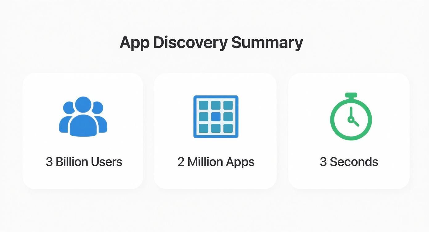
That infographic drives the point home. The margin for error is razor thin. Your graphics have to be technically perfect and visually compelling from the very first glance.
Your Core Graphic Checklist
Your store listing is built on three visual pillars. Each one has a distinct job to do and its own set of technical requirements that are critical for app store growth. Nail these, and you are on your way to better conversions.
Here’s what you need to focus on:
- App Icon: This is the face of your app. It has to be a 512 x 512 pixel PNG. It shows up everywhere, from the store listing itself to the user's home screen, so it needs to be bold, simple, and instantly recognizable.
- Feature Graphic: Think of this as your billboard. At 1024 x 500 pixels (JPEG or PNG), it is often the first large visual users see. It can even feature a promo video. Its job is to be eye catching and summarize your app's core promise in a single image.
- Screenshots: This is your visual story. You need a minimum of two, but you should really aim for the maximum of eight for phones. They show off your app's features and user experience. The required dimensions can vary across phones, tablets, and wearables, so pay close attention.
Think of these assets as a team. Your icon grabs attention, your feature graphic makes a bold promise, and your screenshots provide the evidence to back it up. A weak link in this chain can break the entire conversion funnel.
For a quick reference, I have put together a table with the essential specs. Keep this handy so you never have to second guess the requirements.
Google Play Store Graphic Asset Requirements
| Graphic Asset | Required Dimensions (pixels) | File Format | Key Purpose |
|---|---|---|---|
| App Icon | 512 x 512 | 32-bit PNG (with alpha) | Your app's primary identifier; must be recognizable at all sizes. |
| Feature Graphic | 1024 x 500 | JPEG or 24-bit PNG | The main header image or video preview on your store listing. |
| Screenshots | Varies by device (Min 320px, Max 3840px) | JPEG or 24-bit PNG | Showcases app functionality and user experience. |
| Hi-res Icon | 512 x 512 | 32-bit PNG (with alpha) | A higher fidelity version of your app icon used in various places on Google Play. |
| Promo Graphic | 180 x 120 | JPEG or 24-bit PNG | Used for promotions on older Android OS versions (pre-4.0). |
Getting these dimensions right every single time is crucial, but it can also be a tedious part of the process.
This is exactly why tools like ScreenshotWhale exist. They’re built with these specifications already baked in. Inside the editor, you can select a "Google Play" template, upload your raw app captures, and the tool automatically places them in correctly sized device frames. This frees you to focus on what really matters: creating efficient and high converting app store screenshots for both Android and iOS without sweating the technical details.
Designing Screenshots That Tell a Compelling Story
Your app screenshots are so much more than just pictures of your UI. They’re your app’s visual pitch. The goal is not just to show what your app looks like, but to make someone feel what it is like to use it. This is your shot to tell a story that connects with a user's needs and gets them to hit that install button.
The first few images you show carry almost all the weight. In fact, studies show that about 90% of users never scroll past the third screenshot. This makes those initial visuals absolutely critical for getting your app's value across. Unlike the Apple App Store, where people might browse a bit more, Google Play users tend to make a snap judgment based on your video and the first few images they see. You can dig deeper into this with some great insights from ASO Mobile on effective screenshot strategies.
Bottom line? Your first three screenshots have to work together as one killer introduction.
Crafting a Powerful Visual Narrative
To build a story that actually converts, you have to talk about benefits, not just features. A feature is what your app does. A benefit is how it makes a user’s life better, easier, or more fun. Structure your screenshots to walk the user through a quick journey that makes perfect sense.
Let’s take a fitness app as an example. Here’s how you could frame the first three images:
- Hook them with the problem: The first image could say, "Track Your Workouts Effortlessly." This immediately speaks to a common frustration.
- Show them the solution: The next screenshot might display a clean progress chart with the caption, "Visualize Your Progress Instantly." Now you are showing the core benefit.
- Reveal the awesome outcome: The last shot could feature a milestone achievement screen saying, "Crush Your Goals and Celebrate!" This creates an emotional link to success.
This sequence tells a complete story of transformation, which is way more powerful than just showing random parts of your UI.
Your screenshot gallery should read like a short, compelling comic strip. Each frame builds on the last, leading the user to the ultimate conclusion that they need your app.
Design Elements That Boost Conversions
Beyond the story, the execution has to be on point. Your Google Play Store graphics need to look polished and professional to build trust. Using clear device frames is a great touch; it helps users imagine the app on their own phone, making the experience feel more real.
Don't be afraid to use vibrant colors that match your brand but also pop in the search results. Pair those visuals with short, powerful captions. Keep the text punchy, action oriented, and easy to read in a split second. The right mix of visuals and words can stop a user mid scroll and turn a casual glance into a download.
If you are looking for more practical tips on creating these visuals, we have put together a full guide on how to generate screenshots for the App Store.
Creating Your Unforgettable App Icon and Feature Graphic
Long before a user even glances at your perfectly crafted screenshots, two other graphics have already made a first impression: your app icon and your feature graphic.
Think of it this way: your icon is your app’s handshake, while the feature graphic is its billboard. Getting them right is the difference between stopping a scroller in their tracks and being completely ignored.
Your app icon is arguably the single most important piece of branding you have on the Play Store. It shows up everywhere: in search results, on a user's home screen, and in their notifications. Simplicity is your greatest asset here. A great icon uses bold, recognizable shapes and a limited color palette that stands out, even when it’s tiny. I have learned the hard way that trying to cram text or complex imagery into an icon just creates a blurry mess on a phone screen.
Nail Your Feature Graphic
The feature graphic is a huge, often overlooked, conversion opportunity. This 1024 x 500 pixel banner sits right at the top of your store listing, giving you a prime spot to make a bold statement. It’s the very first thing people see and can even act as the preview image for your promo video.
To make it work for you, it needs to feel connected to your icon's branding while offering a bit more context.
- Complement Your Icon: Stick to the same color scheme and style. This creates a cohesive, professional brand identity right off the bat.
- Showcase the Core Value: Use a single, powerful image or minimal text to instantly communicate what your app is all about. Do not overcomplicate it.
- Create Intrigue: It needs to be visually exciting enough to make someone want to tap your video or at least scroll down to see more.
Think of your feature graphic as the cover of a book. It needs to be compelling enough to make someone want to open it up and see what’s inside. A generic or low quality graphic tells them not to bother.
Mastering these two assets sets the stage for everything else. Your icon draws the eye, and your feature graphic builds that initial spark of excitement.
For a deeper dive into the principles behind memorable visuals, check out our guide on how to create app icons that convert. By getting these primary graphics right, you create a powerful entry point to your app’s story.
Common Graphic Mistakes That Kill Conversions
Your app could be a masterpiece, but if the visual pitch on the Google Play Store misses the mark, you are dead in the water. I have seen it happen time and again: simple, avoidable errors in store graphics actively push potential users away. It’s like sabotaging your own launch before anyone even hits "Install."
Let's be honest, many developers stumble on the basics. They upload low resolution images that look blurry and unprofessional on a modern smartphone screen. Or they create a set of screenshots with wildly inconsistent branding, making the app feel cheap and thrown together.
An even bigger sin? Misleading visuals. Showing off features that do not actually exist or dressing up your UI to look like something it is not is a fast track to disaster. You might trick someone into downloading, but that initial frustration will lead straight to a flood of one star reviews. And digging out of that hole is tough.
Violating Policies and Forgetting the Rest of the World
Beyond sloppy design, there are the mistakes that can get you booted from the store entirely. It is not a rare occurrence, either. In a recent year, around 46% of apps were yanked from the store for various issues, and a staggering 2.36 million were blocked for policy violations before they even went live.
And here’s a mistake I see all the time, especially with new developers: assuming one set of graphics works for everyone, everywhere.
Failing to localize the text and cultural references in your screenshots is like telling a massive global audience, "This app is not for you." You are leaving a huge number of potential downloads on the table.
The fix is to approach your store listing with the same rigor as your app development. By applying proven conversion rate optimization strategies to your graphics, you can dodge these costly mistakes and turn casual browsers into loyal users.
A Few Common Questions About Store Graphics
Getting your Google Play Store graphics just right can feel like navigating a maze of details. I get asked about this stuff all the time, so here are some quick answers to the questions that pop up most often.
How Often Should I Update My Store Graphics?
Think of your graphics as a signal that your app is alive and kicking. You will definitely want to refresh them whenever you roll out a major new feature, finish a big UI overhaul, or launch a seasonal campaign.
A good rule of thumb is to A/B test different screenshot styles every few months. It is a low effort way to see what really connects with your audience and can steadily bump up your conversion rates.
What’s the Real Difference Between Play Store and App Store Graphics?
While the goal is the same, to get the install, the playbook is different. Google Play users often respond well to more dynamic, benefit focused screenshots packed with text overlays that tell a story.
On the other hand, Apple's App Store crowd sometimes prefers cleaner, UI centric visuals without all the extra flair. The technical specs and the number of screenshots you can upload also differ. Bottom line: never use the exact same assets for both stores without tailoring them first. It is a rookie mistake that can cost you downloads.
Can I Just Use AI to Make My App Store Graphics?
Absolutely, AI can be a great creative partner. I have seen it work wonders for brainstorming icon concepts or generating unique background textures for screenshots. It’s a fantastic starting point.
But you cannot stop there. It is crucial to have a designer, or a specialized tool, refine those initial assets. This final step ensures your graphics actually look like your app's UI, match your brand, and feel unique, not like something spit out by a generic generator.
Ready to create stunning, high converting visuals without the headache? ScreenshotWhale combines professional templates with a simple editor, so you can generate perfect Google Play Store graphics in minutes. Start creating for free today.