How to Generate App Store Screenshots That Boost Downloads
Discover how to generate screenshots for app store to attract more installs. Get pro tips on visuals, layouts, and optimization for iOS and Android.
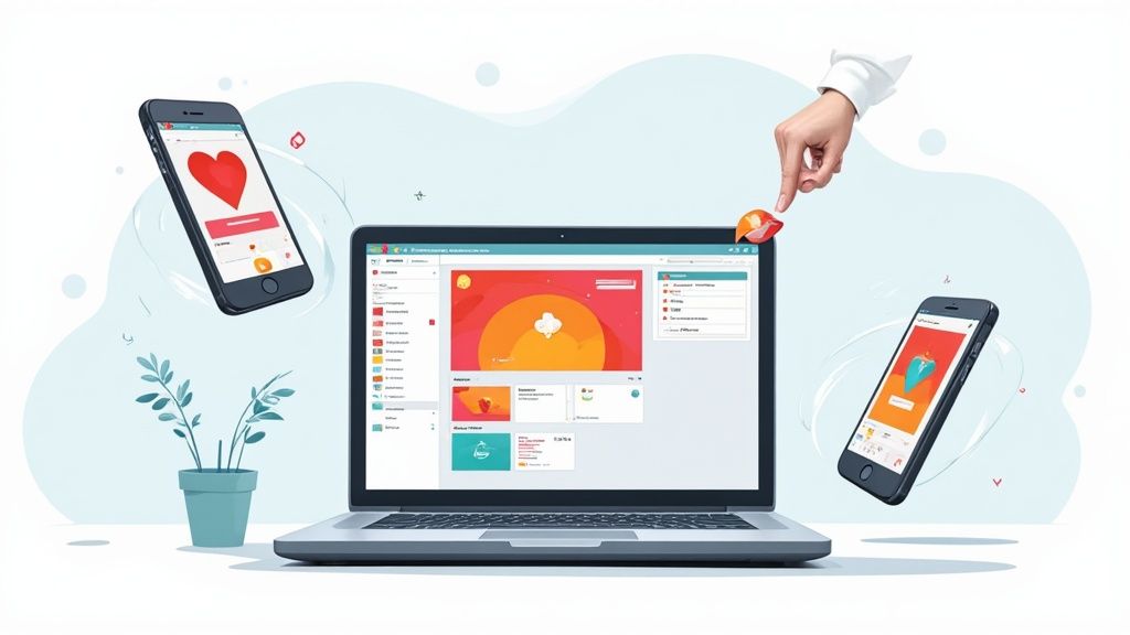
To get people to download your app, you have to think of your app store screenshots as your most important conversion asset. They are way more than just previews of your UI. They are your number one sales tool, the thing that convinces someone to tap "Install" in just a few seconds.
If you want to communicate your app's value and kickstart growth, crafting a compelling visual story with professional design and clear captions is the fastest way to do it.
Why Screenshots Are Your Most Powerful Conversion Tool
Let’s be honest, your app’s screenshots are the first real interaction a potential user has with your product. Long before they read a single line of your carefully crafted description, their eyes jump straight to the visuals. This is your one shot to make a great first impression.
Think of it as a silent pitch. A feature list explains what your app does, but your screenshots show how it feels to use it. A well designed gallery builds immediate trust and answers questions the user has not even thought to ask, turning a passive browser into an active downloader.
From Simple Previews to Conversion Engines
High quality screenshots do a lot more than just show off your UI. They weave a narrative that clicks with your target audience by putting the spotlight on key benefits.
For instance, a fitness app screenshot should not just display a workout log. It should promise to help users "Achieve Your Fitness Goals Faster," with a powerful visual to back it up. This small shift in focus from features to outcomes makes the decision to download feel natural and rewarding. It's a perfect example of the real power of app store screenshots in action.
The financial stakes are massive. The Apple App Store alone is projected to pull in around $138 billion in global revenue in 2025. With over 92 billion app downloads expected, a killer visual presentation is not just nice to have; it is essential for survival.
Your screenshots are not just images; they are your app’s storefront. Each one needs to be meticulously designed to tell a piece of your story, guiding the user from curiosity to conversion.
By investing the time to generate app store screenshots that are both beautiful and strategic, you are not just decorating your product page. You are building the foundation for serious growth and a stronger brand.
Staying on Top of App Store Screenshot Rules
Getting your screenshots right is not just about good design. It is about following the rules. Both Apple and Google have very specific guidelines, and ignoring them is a surefire way to get your app update rejected. Mastering these technical specs is the first hurdle in getting your app store listing approved without a hitch.
Apple, thankfully, has made things a lot simpler. For 2025, they have narrowed down their requirements, asking developers to focus on just two primary screenshot sizes: one for the 6.9-inch iPhone and another for the 13-inch iPad.
Once you upload these two sets, Apple's system automatically scales them for smaller devices. This is a huge time saver. It means you can stop stressing about creating a dozen different sizes and pour all your energy into making those two master sets absolutely perfect.
Mastering Platform Specifications
While Apple’s approach is about simplicity, Google Play is all about flexibility. That makes sense given the huge variety of Android devices out there, from tiny phones to massive tablets. But with that flexibility comes a bit more responsibility to make sure your screenshots look sharp everywhere.
Here’s a quick rundown of what you need to know:
- Apple App Store: You must provide screenshots for the 6.9-inch iPhone (like the iPhone 15 Pro Max) and the 13-inch iPad Pro. Nail these two, and Apple handles the rest.
- Google Play Store: You can upload up to 8 screenshots for each device type: phone, tablet, and even Wear OS. While the sizes can vary, sticking to a 16:9 aspect ratio is your best bet for most phones.
One of the most common mistakes I see is developers uploading the exact same phone screenshots for their tablet layout on Google Play. Do not do it. Always create custom sized visuals for each device to avoid awkward cropping and give users a much better first impression.
To help you get started, here's a quick reference table with the most critical dimensions you'll need.
Essential Screenshot Dimensions for iOS and Android
This table is your cheat sheet for the key screenshot sizes required by Apple and Google. Using these dimensions ensures your visuals will look great and meet submission guidelines on the most popular devices.
| Platform | Device | Required Dimensions (Pixels) |
|---|---|---|
| Apple | 6.9" iPhone | 1290 x 2796 (Portrait) or 2796 x 1290 (Landscape) |
| Apple | 13" iPad Pro | 2048 x 2732 (Portrait) or 2732 x 2048 (Landscape) |
| Phone (16:9) | 1080 x 1920 (Portrait) or 1920 x 1080 (Landscape) | |
| 10-inch Tablet | 1600 x 2560 (Portrait) or 2560 x 1600 (Landscape) | |
| 7-inch Tablet | 1200 x 1920 (Portrait) or 1920 x 1200 (Landscape) |
Getting these technical details right from the very beginning will save you a world of headaches later. For a complete list of every possible size, check out our comprehensive guide on app store screenshot sizes. Trust me, taking a few minutes to double check dimensions now beats getting stuck in a cycle of rejections and submission delays.
How to Create High-Converting Screenshots
Okay, we've covered the technical rules. Now, let's get to the fun part: creating screenshots that actually convince people to download your app. This is where you turn basic screen grabs into a compelling visual story, one that persuades users and becomes a serious driver for your app's growth.
A great way to get started is with professionally designed templates. They give you a solid foundation with clean layouts and vibrant color palettes that are already built to grab attention. Instead of staring at a blank canvas, you can jump straight into the creative part.
This screenshot editor shows exactly how a simple template, a device frame, and a clear caption come together to create a professional looking visual. It just works.
Using a tool like this takes the technical headache out of the design process. You can upload your raw screen capture, choose a device frame like the latest iPhone, type in your benefit focused headline, and select a vibrant background in just a few clicks. This efficiency lets you focus on what really matters: your message.
Crafting a Powerful Visual Narrative
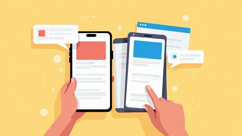
Your screenshots need to work together, almost like panels in a comic book. They should guide the user through what your app is all about, with each image building on the last to create a seamless story that highlights the key benefits.
Your first screenshot is everything. It has to make an instant impact and show your app’s main purpose in a single glance. From there, the next few images can dive into specific features, but always, always frame them from the user's point of view.
Key Takeaway: Do not just show what your app does; show what your user can achieve with it. A screenshot for a music app should not just show a "Song Search" screen. It should sell the experience of "Discover Your New Favorite Band."
This benefit driven approach is what separates screenshots that just exist from ones that truly convert. If you want to go deeper on this, especially for Apple's ecosystem, our guide on crafting effective iOS app screenshots has a ton of platform specific tips.
Focusing on Benefits Over Features
The text on your screenshots is precious real estate. Keep it short, punchy, and focused on outcomes. A user does not care about the name of a feature; they care about what it does for them.
It's a subtle but powerful shift in language.
- Instead of: Task Filter
- Try: Find Your Most Important Tasks Instantly
See the difference? The second option connects directly with a user's pain point, making your app feel like the obvious solution to their problem.
To really make your visuals pop, think about using striking backgrounds, modern device frames, and custom fonts that feel true to your brand. If you want to get really fancy, you can even explore using AI generators for stunning digital product images to give you an extra edge.
Every single element should work together to create a polished, trustworthy presentation that turns casual browsers into loyal users.
Using Screenshots to Boost Your App Store SEO
Most developers think of screenshots as a conversion tool, and they are not wrong. But they are missing a trick that can seriously boost an app's discoverability. Your screenshots are not just for showing off features anymore. They are a core part of your App Store Optimization (ASO) strategy.
It all changed when Apple quietly updated its algorithm to start indexing the text in screenshot captions. This was a huge shift. Suddenly, those little lines of text were not just for users; they were for the search engine, too. Keywords in your captions can now directly influence your app's search ranking. You can get more details on this App Store algorithm change over at consultmyapp.com.
Weaving Keywords into Your Visuals
So, how do you actually take advantage of this? It starts with good old fashioned keyword research. Think about the terms your ideal users are typing into the search bar to find a solution your app provides. Go beyond the obvious ones.
Once you have your list, the art is in weaving them into your captions without sounding like a robot. The caption has to work for two audiences: the user scrolling by and the App Store algorithm.
- A generic caption like "Advanced Filtering Options" is a missed opportunity. It’s boring and does not target a specific search term.
- But something like "Find Vegan Recipes Fast" is much better. It speaks directly to a user's need while targeting the keyword "vegan recipes".
This simple mindset shift turns the design process into an SEO process. When you generate screenshots for the app store, you are not just making pretty pictures; you are building discoverable assets.
Treat every screenshot caption as a piece of SEO real estate. It is a small change in perspective that can give you a real edge over competitors who still see screenshots as just visuals. Done right, it can lead to a significant bump in organic traffic without spending a dime on ads.
Go Global by Automating and Localizing Your Screenshots
So you've decided to take your app global. That’s a huge step, but it also introduces a massive new challenge: creating unique screenshot sets for every single language and device. If you've ever tried to do this manually, you know it's a soul crushing bottleneck.
This is where automation completely changes the game. It turns what was once days of tedious design work into a simple, repeatable workflow.
Instead of wrestling with Figma or Photoshop for hours, you can use a dedicated tool to perfect a single master design. From there, the tool automatically generates perfectly sized assets for every iPhone, iPad, and Android device you need. It’s the difference between spending an afternoon on one language set versus generating a dozen in the same amount of time.
This is not just about saving time; it is a core part of a smart App Store Optimization (ASO) strategy that boosts global conversions.
Localization Is More Than Just Translation
Automation’s real magic, though, happens when you pair it with localization. To truly connect with a global audience, you have to do more than just swap out the text. You need to adapt your entire visual presentation.
This means ensuring your captions, the UI shown in the app, and even the background imagery resonate with users in that specific region. It is about cultural connection, not just language.
Here's a number that always sticks with me: a study found that 76% of online shoppers prefer to buy products with information in their own language. When you localize your app store page, especially your screenshots, you are meeting that expectation head on. It is one of the fastest ways to see a real lift in downloads when entering a new market.
To push this even further, many teams are now looking at advanced tools like specialized AI generators to help create and adapt visual assets on the fly. By combining automation with smart localization, you can finally generate screenshots for the app store at a scale that matches your global ambitions.
Still Got Questions About App Screenshots?
Even with a solid game plan, a few questions always pop up when you're in the thick of designing your App Store visuals. Let's tackle some of the most common ones I hear from developers to clear things up and help you get more downloads.
How Many Screenshots Should I Actually Upload?
Both Apple and Google give you 10 slots. You do not have to fill every single one, but aiming for at least five is a good rule of thumb. That gives you enough real estate to tell a compelling story and show off your app's best features.
Remember, the first three screenshots are absolutely critical. They are what people see without even scrolling. Make them count.
What Are the Biggest Mistakes You See People Making?
The most common killer is tiny text. Seriously. If someone has to squint to read your captions on their phone, you have already lost them. Another classic mistake is showing confusing UI screens that do not scream "this is why you need my app!"
The absolute worst offense? Just uploading raw screen captures. Your screenshots are marketing assets, not just pictures of your app. Give them context with a punchy caption, put them inside a device frame, and use a background that makes your UI pop.
Oh, and one more thing: inconsistent design. When your screenshots look like they were made by five different people, it just feels unprofessional. A cohesive look builds trust in a split second.
Should I Make My First Screenshot a Video?
An App Preview video can be a powerful tool, but it is not always the best choice for that crucial first slot. A killer static image can often get your main value prop across much faster than a video someone has to tap to play.
My advice? A/B test it if you can. For a simple utility app, a strong image might just convert better. But for a slick game or an app with a complex workflow, a video might be the only way to truly show off the experience. It really depends on what best captures your app's magic.
Ready to create stunning, high converting visuals in minutes? With ScreenshotWhale, you can generate screenshots for the app store using professional templates, a simple drag and drop editor, and powerful automation tools. Stop wrestling with design tools and start driving more downloads today. Try ScreenshotWhale for free!