A Guide to App Store Screenshot Size
Master the correct app store screenshot size for every device. Our guide covers iOS and Google Play dimensions to boost your app's growth and conversions.
Getting your app store screenshot size correct isn’t just a technical checkbox; it's the first step to a successful launch and a powerful driver for app store growth. If you get the size wrong, your app will be rejected. It’s that simple. High-converting screenshots begin with the right dimensions.
For the Apple App Store, precision is everything. You absolutely must provide screenshots for the 6.7-inch iPhone (1290 x 2796 pixels) and the 12.9-inch iPad Pro (2048 x 2732 pixels). There are no exceptions. Over on Google Play, the rules are more flexible; they focus on aspect ratio rather than locking you into exact pixel dimensions, giving you a bit more freedom to create an efficient workflow.
Your Quick Reference for App Screenshot Sizes
Submitting the wrong screenshot size is one of the most common and frustrating reasons for an app to get rejected. It’s not just about avoiding a delay. Getting the dimensions perfect is a crucial piece of your App Store Optimization (ASO) strategy and directly impacts your conversion rates.
Perfectly sized, vibrant screenshots ensure your app’s visual showcase is crisp, professional, and compelling. When a user lands on your page, those images are what they really look at, and that first impression influences their decision to tap "Get." Think of them as your primary sales tool for boosting app store growth.
This guide is your quick reference to the most important dimensions. Stick to these, and you'll not only avoid common errors but also make sure your visual assets are optimized to convert visitors into users. For a deeper dive, our complete guide to app store screenshot guidelines covers everything you need to know.
Key Screenshot Dimensions
One of the biggest mistakes developers make is underestimating the difference in pixel widths between devices. You can't just resize a phone screenshot and expect it to look good on a tablet.
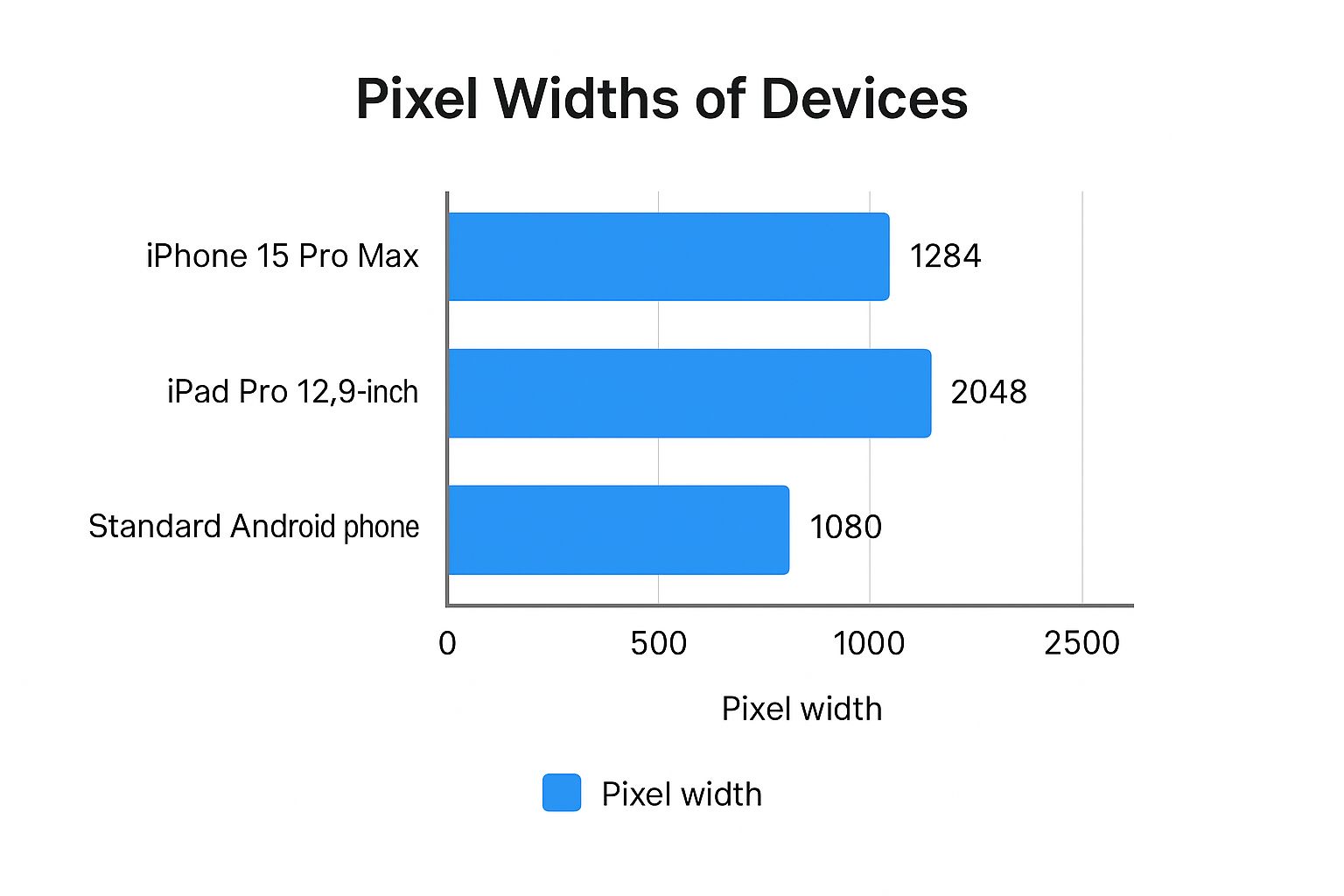
As you can see, the iPad Pro requires a massive canvas compared to a phone. A simple stretch and fit job will look blurry and unprofessional, instantly killing your credibility. You have to design for each form factor to create high converting app store screenshots.
Here’s a quick table to keep the most common requirements handy.
Essential App Store Screenshot Dimensions at a Glance
This table breaks down the required screenshot sizes for the most popular devices on both the Apple App Store and Google Play. Bookmark this; it will save you a ton of headaches.
| Platform | Device Type | Required Dimensions (Portrait) | Required Dimensions (Landscape) |
|---|---|---|---|
| Apple App Store | 6.7" iPhone | 1290 x 2796 pixels | 2796 x 1290 pixels |
| Apple App Store | 5.5" iPhone | 1242 x 2208 pixels | 2208 x 1242 pixels |
| Apple App Store | 12.9" iPad Pro | 2048 x 2732 pixels | 2732 x 2048 pixels |
| Google Play | Phone | Min. 320px, Max. 3840px side | Min. 320px, Max. 3840px side |
| Google Play | Tablet (7" & 10") | Min. 320px, Max. 3840px side | Min. 320px, Max. 3840px side |
Remember, for Google Play, the key is the 16:9 aspect ratio for landscape and 9:16 for portrait. While they don't enforce exact pixel counts like Apple, sticking to common device resolutions is always the best practice to ensure your screenshots look sharp on every screen.
How Screenshot Size Drives App Store Growth
Your app store screenshot size isn't just another box to check on your pre-launch list. It's a surprisingly powerful lever for growth and conversions. When someone lands on your product page, you have just a few seconds to win them over. Your screenshots are the first and most powerful proof of your app's quality.
Think about it. Crisp, clear screenshots with vibrant colors create an instant feeling of trust and professionalism. On the flip side, a distorted or blurry image immediately signals a lack of care, making users wonder if the app itself is just as sloppy. This first impression has a direct, measurable impact on whether they tap "Get" or simply move on.
The Psychology of a Polished Store Presence
A professional store listing does more than just look good; it has a real psychological effect on potential users. When your screenshots are sized correctly and designed with care, they present your app's interface exactly as you intended, letting the value shine through without any friction.
Your screenshot gallery is your digital storefront. An unkempt shop turns customers away, and the same principle applies here. Messing up your screenshot dimensions can lead to serious problems:
- User Distrust: Stretched or blurry images make an app feel cheap, unprofessional, or even broken before it's ever installed.
- Poor Communication: If the visuals aren't optimized, you risk obscuring the very features you're trying to highlight.
- Lost Conversions: People are far less likely to download an app that looks like it was thrown together with little attention to detail.
Avoiding Rejection and Boosting Conversions
Beyond making a good impression, getting the screenshot size right is a non-negotiable requirement for submission. Uploading assets with the wrong dimensions is one of the most common and frustrating reasons for rejection from both Apple and Google, leading to annoying and costly delays.
Mastering your screenshot dimensions turns a simple compliance task into a powerful marketing advantage. Every single pixel should work to tell a compelling story, showcase value, and convince a user that your app is the one they've been looking for.
Ultimately, these visuals are a critical touchpoint in your user acquisition funnel. Nailing the size ensures a smooth submission process and lays the groundwork for a product page that actually boosts conversions. To see how visuals fit into the bigger picture, explore broader strategies for growing a tech startup brand, where a polished app store presence is key.
Mastering iPhone Screenshot Dimensions
Getting your iPhone screenshot dimensions right for the iOS App Store can feel like chasing a moving target. Apple's rules are famously specific, and one wrong move can lead to a frustrating rejection from App Store Connect. An actionable insight here is to focus on creating an efficient workflow from the start to save time and ensure your app's first impression is a sharp one.
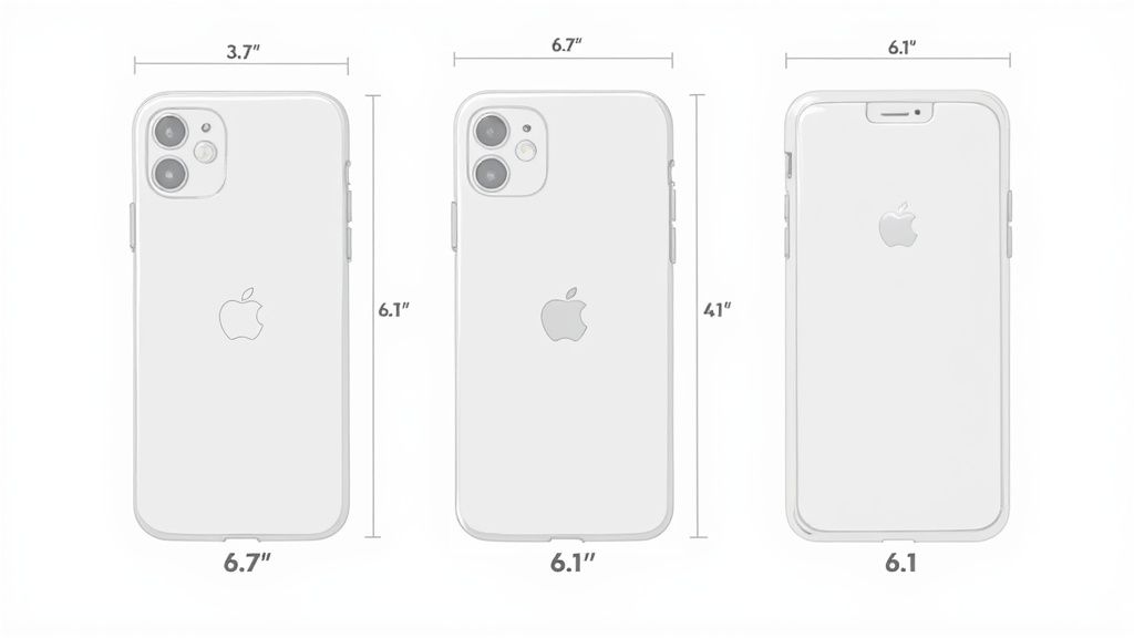
This guide breaks down the exact specs for the iPhone models that matter most. The big takeaway? Apple's process revolves around the largest displays. If your app is on the iPhone, you absolutely must provide screenshots for the 6.7-inch display. This one set of images is the source for many smaller iPhone models, as Apple automatically scales them down for you.
Core iPhone Display Requirements
To make your submission as smooth as possible, focus on the largest required screen size first. This strategy ensures you meet the baseline requirements and cover the vast majority of modern devices without having to generate a dozen unique sets of images.
6.7-inch Display (Required): This is your top priority. It covers heavy hitters like the iPhone 15 Pro Max and iPhone 14 Pro Max. You'll need images at 1290 x 2796 pixels for portrait and 2796 x 1290 pixels for landscape.
6.5-inch Display (Alternative): While the 6.7-inch set is what Apple really wants, you can optionally provide screenshots for this size, which includes devices like the iPhone 11 Pro Max. The dimensions are 1242 x 2688 pixels for portrait. If you don't supply these, don't worry; Apple will just use your 6.7-inch assets.
5.5-inch Display (Optional): This one is for older phones like the iPhone 8 Plus, with dimensions of 1242 x 2208 pixels. It's no longer mandatory, but you can still provide it for a better fit on older hardware if you want to be thorough.
Here’s a classic mistake: creating one set of screenshots and then manually resizing them in an image editor. This almost always results in blurry, unprofessional-looking images. Always generate your screenshots at the native resolution for each required size to keep them crisp and impactful.
Streamlining Your Workflow
The evolution of App Store screenshot sizes really shows Apple's obsession with visual quality. Years ago, it was simpler, but now developers have to tailor assets to various screens. For good reason; with over 70% of app downloads influenced by visual appeal, getting your screenshots right isn't just a technical step. It's a critical marketing move for app store growth.
In fact, some studies show a well-designed set of screenshots can boost downloads by up to 25%. You can dig deeper into the impact of visuals on app store performance on apptweak.com.
To create a single, high-converting set of screenshots efficiently, design for the 6.7-inch display (1290 x 2796 pixels). This one set fulfills Apple’s main requirement and will be automatically adapted for many other iPhones, including popular 6.1-inch devices like the iPhone 15 and 14. This approach saves a ton of time while ensuring you meet the essential criteria for a smooth launch.
Your Guide to iPad and the Full Apple Ecosystem
If you want your app to succeed beyond the iPhone, you have to nail the visuals for the rest of the Apple ecosystem. A user’s experience should feel seamless and polished, whether they find you on an iPad, an Apple Watch, or their living room Apple TV. Each device has its own unique context, and adapting your screenshots is a non-negotiable step for real app store growth.
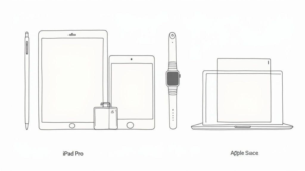
Submitting screenshots for the iPad is just as critical as it is for the iPhone. If your app is iPad compatible, you must provide screenshots for the 12.9-inch iPad Pro. That's the baseline requirement. The good news is Apple's system is smart enough to automatically scale those assets down for smaller models, ensuring your app looks great on everything from an iPad mini to the latest iPad Air.
iPad Screenshot Dimensions
To keep your submission process smooth and simple, just focus on that one largest size. It’s the single set of screenshots that will cover all your bases for the entire iPad lineup.
- 12.9-inch iPad Pro (Required): This is the one you absolutely cannot skip for any iPad-compatible app. The dimensions you need are 2048 x 2732 pixels for portrait orientation and 2732 x 2048 pixels for landscape.
- Other iPad Models: While you can upload specific sizes for devices like the 11-inch iPad Pro or the standard iPad, it’s not required. Apple does a fantastic job of downscaling your 12.9-inch assets to fit these screens perfectly, so you can save yourself the extra work.
Be warned: if your app supports the iPad and you forget to provide the required 12.9-inch iPad Pro screenshots, you’re looking at an immediate rejection from App Store Connect. It's a common slip up, but thankfully, a very easy one to avoid.
Branching Out to Apple Watch and Apple TV
To truly maximize your app's presence, you've got to tailor your visuals for Apple Watch and Apple TV. These platforms have completely different user experiences, and just reusing your phone screenshots won't cut it. An Apple Watch face is tiny and intimate, while an Apple TV screen is a huge, shared display.
An app that looks professional on every device builds incredible user trust. Adapting your visuals from a small watch face to a large TV screen shows a commitment to quality that directly influences download decisions across the entire ecosystem.
Here are the specific dimensions you'll need for these devices:
| Platform | Key Device Models | Required Dimensions (pixels) |
|---|---|---|
| Apple Watch | Series 7, 8, 9 | 396 x 484 |
| Ultra & Ultra 2 | 410 x 502 | |
| Series 4, 5, 6, SE | 368 x 448 | |
| Apple TV | Apple TV 4K | 1920 x 1080 or 3840 x 2160 |
By sticking to these guidelines, you ensure your app presents a consistent, high quality look that builds user confidence and drives downloads across every single Apple platform.
Navigating Google Play Screenshot Requirements
Unlike Apple’s rigid, device-specific rules, the Google Play Store takes a much more flexible approach to screenshots. You don't need to sweat over exact pixel dimensions for dozens of different phones. Instead, Google cares more about aspect ratio and a general size range. This is a huge relief for developers trying to support the massive, fragmented Android hardware market, allowing for a more efficient workflow.
Your goal here is simple: create one universal set of high quality screenshots that looks fantastic on everything from a Samsung Galaxy to a Google Pixel. When your visuals are crisp and compelling on any device, you're building a powerful store listing without drowning in device-specific asset creation.
Core Google Play Screenshot Specifications
Let’s get down to the brass tacks. You have to provide at least two screenshots for your app listing, but you can upload up to eight for each device type (phone, 7-inch tablet, 10-inch tablet, and Wear OS).
Here are the technical rules you need to follow:
- Format: Stick to JPEG or 24-bit PNG. Crucially, your PNGs can't have transparency (no alpha channel).
- Minimum Dimension: The shortest side of your image must be at least 320 pixels.
- Maximum Dimension: The longest side cannot be more than 3840 pixels.
- Aspect Ratio: While there's some wiggle room, sticking to a 16:9 aspect ratio for landscape or 9:16 for portrait is your best bet. This prevents the Play Store from awkwardly cropping your beautiful designs.
One common tripwire is submitting screenshots where the longest side is more than twice the length of the shortest side. This can make your assets look distorted or get cut off in certain promotional spots on the store, which is the last thing you want.
Best Practices for Phones and Tablets
To make your life easier and ensure your app looks great everywhere, just create one universal set of screenshots at a common, high resolution size like 1080 x 1920 pixels for portrait. This hits the sweet spot; it looks sharp on most modern Android phones and nails the recommended 9:16 aspect ratio. This is a practical, actionable insight that simplifies the process for the Android store.
The real key to winning on Google Play is creating a single, polished set of screenshots that scales gracefully. A well-designed 1080p set meets all the requirements and looks professional across hundreds of different Android devices, which goes a long way in boosting user trust and conversions.
Now, if your app has a specific tablet experience, you absolutely must provide separate tablet screenshots. Google is a stickler for this. If you don't show off your tablet UI, they might kick your app out of the tablet section of the Play Store entirely. The same size and format rules apply here for both 7-inch and 10-inch tablets. Getting these visuals right isn't just a suggestion; it's a core part of effective Google Play Store optimization that helps you reach a bigger audience and drive more downloads.
Designing Screenshots That Convert Visitors to Users
Getting the dimensions right gets your app approved, but great design is what gets it downloaded. Nailing the technical app store screenshot size is just the entry ticket; the real work lies in crafting visuals that tell a story and convince a casual browser to become a loyal user. This is where compliance meets creativity to boost conversions.
Think of your first screenshot as your single most important ad. In search results, it's often the only one people see. It has to do the heavy lifting: instantly showing what your app is all about and why it’s worth their time. Don't just show a random screen; use that prime real estate to highlight a killer benefit with a caption they can read at a glance.
Crafting a Compelling Visual Narrative
Your screenshot gallery should feel less like a random collection of images and more like a storyboard. Each screenshot needs to build on the one before it, walking the user through your app’s best features in a way that feels natural and persuasive. Keep your branding tight with a consistent color palette and font that screams your app.
A few simple techniques can make a world of difference:
- Bold Captions: Use short, punchy text that frames the feature as a benefit. Instead of "Map View," try "Find Your Ride in Seconds." It’s a small change that reframes the entire message.
- Clean Annotations: Use simple arrows or circles to point out specific UI elements, but don’t overdo it. The goal is to guide the eye, not create a cluttered mess. Your app’s interface should still be the star.
- Device Frames: Wrapping your UI in a device mockup makes it feel real and professional. It helps users immediately picture the app on their own phone, which is a powerful psychological trigger.
Once you have your raw captures, using an online screenshot editor can be a game changer. These tools are perfect for adding those professional touches like device frames, stylized text, and vibrant backgrounds without needing a design degree. For example, you can upload a plain UI capture, select a device frame, add a headline like "Plan Your Day Effortlessly," choose a colorful background, and export a high-converting image in minutes.
Showcasing Your Unique Value Proposition
Ultimately, your screenshots need to answer one question for the user: "Why this app?" Focus your visual story on what makes you different. Is it a groundbreaking feature? An incredibly intuitive UI? Whatever your secret sauce is, make it the undeniable theme of your gallery.
Your screenshot gallery is your most powerful sales pitch. Each image is an opportunity to showcase a key benefit, build trust, and prove that your app delivers on its promises. A well-crafted visual narrative can increase conversions by clearly demonstrating value before the user even taps "Get."
I've put together a quick table to show how small shifts in design can have a huge impact on how users perceive your app.
Screenshot Design Elements for Higher Conversion
| Design Element | Standard Approach | High-Converting Approach | Impact |
|---|---|---|---|
| Headline Text | Feature-focused ("Task List") | Benefit-focused ("Organize Your Life") | Connects the app to a user's real-world needs, increasing emotional resonance. |
| Visual Style | Plain UI captures | UI in device frames with branded backgrounds | Makes the app look more professional and polished, building user trust. |
| Color Palette | Default app colors | Consistent, branded color scheme | Reinforces brand identity and makes the gallery look cohesive and intentional. |
| Story Flow | Random feature screens | A logical sequence showing a user journey | Guides the user from problem to solution, making the value proposition clear. |
| Annotations | No callouts or cluttered arrows | Minimal, clean highlights on key buttons | Draws attention to important features without overwhelming the user. |
The difference is subtle but powerful. The high-converting approach isn't about adding more noise; it's about being more intentional with every single element to guide the user toward the download button.
By combining sharp messaging with clean, vibrant design, your screenshots stop being a submission requirement and start being a growth engine. To see more real-world examples and dive deeper into these strategies, check out this guide on crafting persuasive app store screenshots.
Common Screenshot Submission Mistakes to Avoid
Getting your app submitted should feel like hitting a major milestone, not getting stuck in a frustrating loop of rejections. I've seen it happen time and again: simple, totally preventable screenshot mistakes are what hold up most launches.
Knowing what these common pitfalls are is the secret to a smooth, successful submission.
One of the most frequent errors, by far, is uploading images with the wrong app store screenshot size. It sounds minor, but being off by a single pixel is enough to get an automatic rejection from App Store Connect. Before you even think about uploading, always double check your dimensions against the latest requirements for mandatory devices like the 6.7-inch iPhone.
Another classic mistake is using the wrong file format. Both Apple and Google are strict about this: it's JPEG or 24-bit PNG, period. A common trip up with PNGs is including transparency (an alpha channel). This is a definite no go and will cause your upload to fail instantly.
Strategic and Compliance Errors
Beyond the technical specs, there are bigger blunders that can torpedo your app's approval chances and, just as importantly, your conversion rates. You have to get these right.
- Misleading Visuals: Your screenshots absolutely must represent the current version of your app. Showing off features that aren't actually there or using an outdated UI is a fast track to rejection and, worse, it destroys user trust before they've even downloaded.
- Illegible Text: What’s the point of a great caption if no one can read it? Tiny fonts might look okay on your desktop, but they become useless blurs on a mobile screen. Make sure any text is big, crisp, and has enough contrast to be readable at a quick glance.
- Status Bar Clutter: For a clean, professional look that screams quality, your status bar needs to be pristine. Apple’s own guidelines prefer a full battery icon, maxed out Wi-Fi signal, and a clean carrier display. Showing a low battery warning or, even worse, personal notifications just looks sloppy.
At the end of the day, your goal is to present a polished, honest preview of what it's like to use your app. Every single detail, from the pixel dimensions to what’s in the status bar, shapes a user's first impression and the reviewer's final decision. Nailing it shows you're a pro who cares about quality.
A Few Common Questions, Answered
Let's clear up some of the most common questions that pop up when dealing with app store screenshots.
Can I Use the Same Screenshots for iPhone and iPad?
Nope, you can't. Apple treats iPhones and iPads as entirely different beasts, each with its own technical specs. You absolutely must provide a separate set of screenshots for the 12.9-inch iPad Pro if your app runs on tablets. This is in addition to the required 6.7-inch iPhone set.
The resolutions and aspect ratios are totally different. If you try to submit without both, App Store Connect will reject your build straight away. It’s a non-negotiable rule.
How Many Screenshots Should I Bother Uploading?
Honestly, you should use all the slots you can. The App Store gives you up to 10 screenshots, and Google Play offers up to 8 for each device type. Think of it this way: every empty slot is a missed opportunity to sell your app and boost conversions.
We know from user behavior data that people often swipe through at least the first few images before making up their mind. The more screenshots you have, the more chances you get to show off key features, explain what makes your app special, and build a visual story that gets people to hit that "Install" button. It’s a simple way to help your app store growth.
What Are the Best Tools for Making App Store Screenshots?
If you're a developer and efficiency is your top priority, specialized screenshot generators are the way to go. They come loaded with pre-made templates and mockups that handle all the tricky app store screenshot size requirements for you automatically. They offer an efficient way to create high-converting screenshots for both the iOS and Android stores.
But if you want total creative freedom to build something custom and really fine tune your visuals for conversions, then professional design software like Figma or Photoshop is your best bet. It's more work, but it gives you complete control from the ground up.
Ready to create stunning, high-converting visuals in minutes? ScreenshotWhale offers professionally designed templates, an easy-to-use editor, and AI-powered localization to help you meet every app store screenshot size requirement and drive more downloads. Start designing today at https://screenshotwhale.com.