How to Create App Icons That Boost Downloads
Learn how to create app icons that drive downloads. Our guide covers design principles, ASO, and platform-specific tips for iOS and Android app store growth.
Your app icon is more than a tiny graphic. It is the single most important marketing asset you will create, and it has a direct line to your user acquisition and conversion rates. A great icon can explain what your app does and signal its quality in less than two seconds, a critical first step for growth on the app stores.
Why Your App Icon Is a Conversion Powerhouse
Think about it: the app icon is the very first visual handshake you have with a potential user. Long before they bother to read your description or swipe through your screenshots, they see your icon. That little square of digital real estate is your brand’s face in an impossibly crowded marketplace, doing the heavy lifting in search results, "featured" lists, and eventually, on a user's home screen.
This is not just about looking pretty; it is about hard business metrics. A clear, compelling icon can dramatically boost your tap-through rate from a search result to your product page. That initial tap is the first domino to fall in the conversion funnel. A weak icon stops people dead in their tracks before they even think about downloading.
The Psychology of the First Impression
Users make snap judgments. We all do. An icon that looks unprofessional, cluttered, or just plain generic sends an immediate signal: this app is probably a low quality experience. That perception, formed in an instant, is incredibly difficult to shake.
On the flip side, a polished, thoughtful icon builds immediate trust and makes people curious. A high converting icon achieves three things instantly:
- Clarity: Does the icon give an instant clue about the app’s purpose? A musical note for a music app or a camera lens for a photo editor creates a connection before the user has even read your app's name.
- Memorability: Does it stand out from the sea of blue and white icons? A unique shape or a bold color scheme helps people remember your app and find it again later.
- Quality: Does it look like it was designed by a pro? High quality graphics imply a well built, reliable app behind them.
This focus on a strong first impression must carry through to your entire store presence. Your screenshots should be just as polished. For example, use a screenshot editor to place your app’s UI inside clean, high resolution device mockups with compelling titles. This maintains brand consistency and boosts conversion rates. If you're looking to create that same polished feel, our guide on crafting effective mobile app mockups is a great next step.
A great app icon does not just represent your app; it sells it. It is a silent salesperson working 24/7 to boost your visibility, attract the right users, and ultimately drive more downloads.
From Graphic to Growth Driver
A simple icon refresh can trigger a significant surge in downloads and boost app store growth. A/B testing has proven that tweaking an icon's color, symbol, or overall style can lift conversions by double digit percentages.
For example, a finance app might see a jump in installs by switching to a color that feels more secure, like a deep green or blue. A game, on the other hand, might get a boost from a more dynamic, character focused design that pops off the screen.
Understanding this strategic value is the first step. Once you see your icon not just as a piece of art but as a primary engine for growth, you can start creating one that does more than just sit there. It starts turning casual browsers into loyal users.
Core Principles of High-Converting Icon Design
A great app icon is not just a pretty picture; it is a tiny, powerful marketing tool. It is often the very first thing a potential user sees, and in a crowded app store, it has to do a lot of heavy lifting. It needs to grab attention, communicate your app's purpose, and convince someone to tap for a closer look, all in a fraction of a second.
This is not about guesswork. The icons that consistently drive downloads are built on a solid foundation of design principles. Getting these right is what separates an icon that gets lost in the noise from one that actively boosts your app's growth.
The best icons speak a universal language. When a user can guess what your app does just by looking at the icon, you have already won half the battle for their attention.
Achieve Unmistakable Clarity and Simplicity
Your icon needs to communicate one single, focused idea. Instantly. The biggest mistake is trying to cram too much detail into that tiny square. Multiple elements, complex shapes, or text just turn into an unrecognizable smudge, especially at small sizes like in a notification tray or a settings menu.
Look at the most successful apps on your phone right now. They do not try to tell a whole story. A simple camera lens, a musical note, an envelope, they get the message across immediately. This is not just about looking clean; it is about reducing cognitive friction. A cluttered icon forces the user to stop and figure it out, and frankly, they just will not.
Prioritize Scalability and Recognition
Remember, your app icon lives in a lot of places beyond the app store. It is on the home screen, in notifications, widgets, and buried in the device’s settings. It absolutely has to remain legible and impactful at every single size. This is scalability, and it is non negotiable.
The best way to nail this is to design your icon in a vector format from the start. This gives you the freedom to scale it up or down without any loss of quality. Make sure to test your design at various sizes. Shrink it way down. Does the main symbol still pop? Is it still clear?
A truly scalable icon is instantly recognizable whether it is a tiny favicon in a browser tab or blown up on a high resolution tablet display. It maintains its integrity and brand identity across all user touchpoints.
This is not just theory; the data backs it up. A comprehensive study found that a strategic icon redesign can boost user acquisition by as much as 25%. For example, some finance apps saw a 12% conversion lift just by switching to bold, vibrant colors. These numbers show just how much design choices matter. You can dig into more of the data on the impact of icon design on app success.
Develop a Unique and Ownable Style
In a sea of competitors, blending in is the same as being invisible. Your icon needs a distinct visual identity that stands out. This does not mean it needs to be loud or garish; it just has to be different from the other apps in your category.
Think about a unique combination of shape, color, and style.
- Distinct Shape: Use a memorable silhouette that does not look like everything else.
- Strategic Color Palette: Choose colors that evoke the right feeling and create contrast against your competitors.
- Brand Consistency: The icon's style should feel like it belongs to the same family as your app's UI and overall brand. It is the front door to your app's experience.
By focusing on these core ideas, you move from just decorating your app to building an asset that works for you, driving clicks and ultimately, growing your user base.
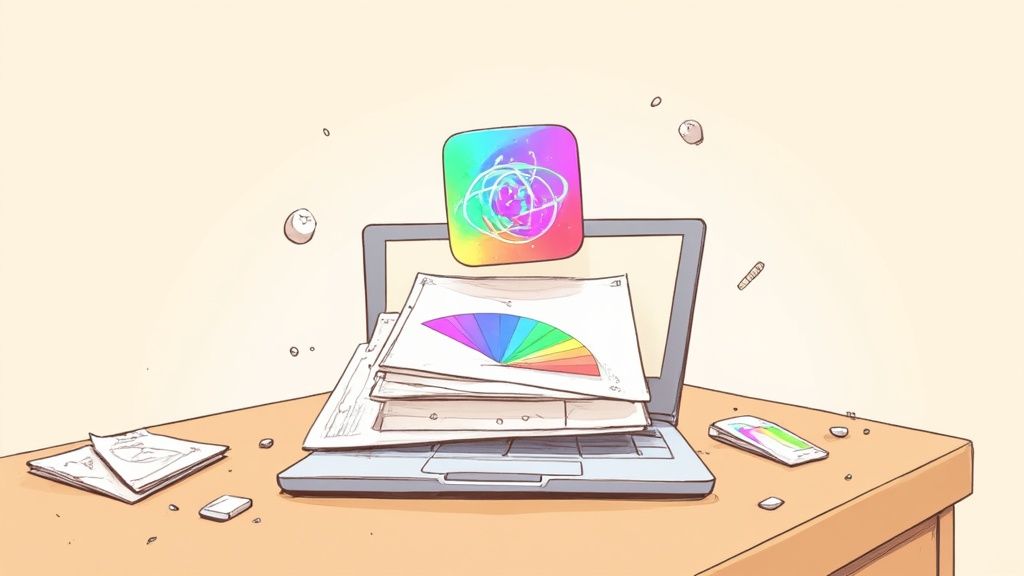
The Creative Process for Designing Your Icon
So, how do you turn a spark of an idea into a polished app icon that actually gets people to tap "Install"? It is less about waiting for a strike of genius and more about a methodical, creative journey. This is not about guesswork; it is about making smart, informed decisions that lead to a pixel perfect design.
The goal here is to pull back the curtain on that workflow, giving you a clear, repeatable path to create something professional from scratch.
This infographic breaks down the core stages you will move through, from strategic analysis all the way to the final design.
As you can see, a great icon starts with understanding the market, moves into creative exploration, and finishes with a strong color strategy that connects emotionally.
Find Your Unique Angle with Competitor Analysis
Before you even think about opening a design tool, you need to understand the visual world your app will live in. Seriously, open the App Store or Google Play right now and search for keywords in your category. What do you see?
Take notes. What are the common color palettes, symbols, and styles? Are all the finance apps just using shields and piggy banks? Are the fitness apps a sea of abstract, dynamic shapes? This research is not about copying what is popular, it is about finding an open lane so you can stand out.
- Identify Visual Tropes: Make a list of the overused symbols in your niche. Your job is to find a fresh metaphor that still clearly communicates what your app does.
- Analyze Color Palettes: Notice which colors dominate the search results. If every single competitor is using blue, a vibrant green or a warm orange could make your icon impossible to miss.
- Evaluate Simplicity vs. Detail: See where others land on this spectrum. You might find an opportunity for a clean, minimalist icon in a visually cluttered category, or the other way around.
For example, a new fitness app could easily avoid the generic dumbbell or running figure. Instead, it might use a stylized heartbeat graph or an energetic, upward pointing arrow to communicate progress and vitality. That small pivot is enough to create a unique identity.
From Sketch to Digital Mockup
Armed with your research, it is time to start brainstorming. And I mean really brainstorming. Start with low fidelity sketches on actual paper. Do not censor yourself or worry about perfection; the goal is to get as many ideas out of your head as you can. Explore different shapes, compositions, and symbols.
Once you have a handful of concepts that feel strong, it is time to bring them into a design tool like Figma or Sketch. These vector based platforms are the industry standard for a reason, they let you create scalable graphics that look sharp at any size, from a tiny notification icon to a full screen promo asset.
At this stage, your main focus should be on creating a strong, instantly recognizable silhouette. Remember, your icon will often appear in monochrome notifications or on different home screen backgrounds, so its shape needs to be distinct all on its own. For a deeper dive into the foundational stages of visual creation, check out this guide to master the graphic design process.
Applying Color Theory to Boost Conversions
Color is the final, and arguably most critical, layer of your icon's design. It is not just decoration; it is a direct line to your user's emotions. The right palette can trigger specific feelings and drive people to take action.
Think of color as a psychological shortcut. Blues and greens often evoke feelings of trust and calm, making them perfect for finance or health apps. Reds and oranges create a sense of excitement and urgency, which can be great for entertainment or food delivery apps.
Your goal is to build a palette that not only aligns with your brand but also pops in a crowded search result. Use online color palette generators to explore complementary, analogous, or triadic color schemes that feel right. And please, test your chosen colors in both light and dark mode to ensure your icon always looks its best. The right color choice can be the difference between an icon that blends in and one that gets the tap.
Getting Your Icon Right for iOS and Android
Following the platform rules is not just about dodging a rejection from the app review team. It is about creating an icon that feels right at home on a user's device, something that looks professional, trustworthy, and delivers a seamless experience. Apple and Google have fundamentally different ideas about how icons should look and behave, and getting a handle on these differences is one of the first things you learn when making an app icon that actually gets downloads.
https://www.youtube.com/embed/XYN3Um4DafE
Each platform brings its own set of technical and design rules to the table, and they will shape your creative process from the start. Nail these, and your icon will look sharp and polished on every single device, building that crucial instant credibility with potential users.
Designing for the iOS App Store
Apple is all about consistency. When you are designing for iOS, you do not actually create the final rounded corner shape, often called a "squircle." Instead, you have to provide a perfectly square image, with no rounded corners or transparent areas. Apple's system handles the rest, automatically applying its iconic corner mask to your design.
This is a point you cannot miss: never include transparent elements in your iOS icon. The App Store requires a completely opaque, square image, which it then fits into its standard icon template. If you try to get clever with transparency, you will end up with visual glitches or an outright rejection.
For a deeper dive into the exact sizes you will need for everything from the App Store to the Settings menu, our article on app icon dimensions for iOS has you covered. And if you are looking for more creative tips, there is a guide to creating stunning app icons for iPhone that is worth a read.
Understanding Android Adaptive Icons
Google, on the other hand, takes a more flexible route with its adaptive icons. This clever system is designed to make your app icon look great across the massive variety of Android devices out there, each with its own manufacturer specific shapes, circles, squares, squircles, and everything in between.
An adaptive icon is actually built from two separate layers:
- Foreground Layer: This is where your main logo or symbol sits. You will want to design this with a bit of "safe zone" padding around the edges.
- Background Layer: This is a simple, opaque layer that sits behind your foreground. It can be a solid color or a subtle gradient.
The Android system then moves these two layers independently to create subtle, delightful animations and ensures the icon fits perfectly into whatever shape mask the device launcher is using. This layered approach is now a requirement for all new apps submitted to the Google Play Store.
By splitting the foreground and background, Android's adaptive icons deliver a visual experience that is both consistent and dynamic. Your core brand element always stays centered and clear, while the background adapts to the user's specific device and theme.
It can be a lot to keep track of, especially when you are working on both platforms at once.
Here is a quick reference table to help you keep the technical requirements straight.
App Icon Technical Requirements iOS vs Android
| Specification | Apple App Store (iOS) | Google Play Store (Android) |
|---|---|---|
| Shape | Submit a full square image. Apple applies the mask. | Design foreground & background layers. The device applies the mask. |
| Transparency | Not allowed. Must be a fully opaque image. | Allowed in the foreground layer. Background must be opaque. |
| Key Concept | Uniformity and consistency across all icons. | Flexibility and adaptability to different device shapes. |
| Primary Size | 1024x1024 pixels for the main App Store icon. | 1024x1024 pixels for design (512x512 PNG for the final asset). |
At the end of the day, Apple prioritizes a clean, uniform look, while Google opts for a more dynamic and adaptable system. Both approaches have their strengths, but knowing the rules of the road for each is non negotiable for a successful launch.
Using Modern Design Trends to Get Noticed
An icon that feels current gives your app an immediate edge. While the core principles of good design are timeless, tapping into modern trends signals to users that your app is fresh, actively maintained, and relevant. Aligning with these styles helps your icon stand out in a crowded App Store, which can directly boost your app's growth and conversions.
This is not just about looking good; it is a strategic choice that shapes how people perceive your app before they even hit the download button. Let us dig into a few of the most effective trends right now and how you can use them to create an icon that grabs attention.
Embrace Vibrant Gradients and Textures
The era of strictly flat design has evolved, giving way to icons with more depth and personality. Multi toned, vibrant gradients are a fantastic way to make your icon pop against a sea of single color competitors. The real trick is to blend complementary colors and then add subtle noise or grain textures to give it a tactile, premium feel.
This approach works exceptionally well for creative, social, or lifestyle apps where you want to evoke energy and excitement. The right gradient can make an icon feel almost alive, drawing the user's eye and making them curious to see what's inside.
Master Dynamic Minimalism
Minimalism does not mean boring, it means being intentional and bold. The trend of Dynamic Minimalism is all about using dead simple shapes and striking, high contrast color palettes to create a symbol that is both memorable and instantly recognizable. Clarity is the name of the game here.
This style is a powerhouse for productivity, utility, and finance apps. Why?
- It Builds Trust: A clean, uncluttered design feels professional and reliable.
- It Improves Recall: Simple, iconic shapes are just easier for our brains to process and remember.
- It Ensures Scalability: A minimalist icon looks sharp and clear at any size, from a large home screen widget down to a tiny notification dot.
By stripping away every non essential detail, you are left with the pure, confident essence of your app.
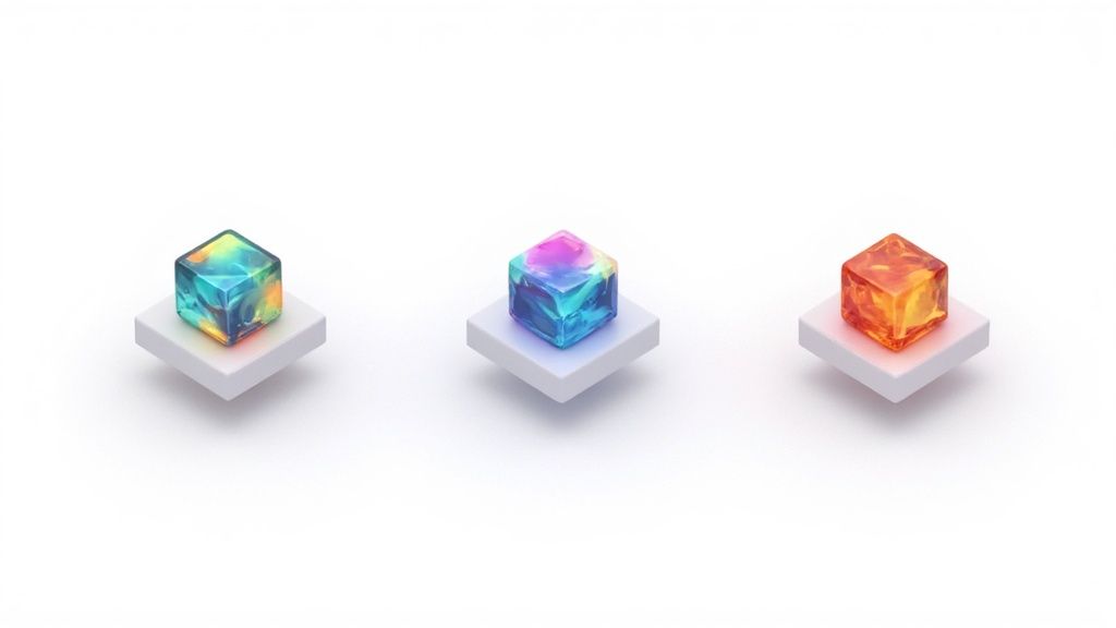
Leverage 3D Elements and Glassmorphism
Three dimensional elements and "Glassmorphism" are making a huge comeback, adding a sense of depth and realism that makes icons feel more immersive. Glassmorphism, in particular, uses a frosted glass effect with soft blurs, subtle highlights, and a semi transparent background to create a layered, modern look. It feels both futuristic and approachable at the same time.
This trend is a perfect fit for gaming, entertainment, or tech focused apps. Think about it: a 3D character icon for a game offers a sneak peek of the in game world, making it far more compelling than a flat, abstract symbol.
The data backs this up. Apps using Glassmorphism have seen conversion rates jump by as much as 22%. Similarly, Dynamic Minimalism can lead to 31% higher icon recall rates, while 3D symbolism in gaming apps has been shown to boost engagement by 24%. A cohesive design across multiple apps? That can improve cross promotion effectiveness by 35%. You can dig deeper into how current icon trends drive downloads on App Samurai.
Ultimately, choosing the right trend is not about chasing fads. It is about making a strategic decision that perfectly aligns your icon’s style with your app's purpose and your target audience’s expectations.
Common Questions About App Icon Creation
Even with the best plan in the world, you are going to hit a few snags when designing your app icon. It just happens. Getting clear answers quickly can save you hours of headaches and let you get back to what you are actually trying to do: make an icon that people want to tap.
This is your go to spot for those practical, "how do I actually do this?" questions. We will cover everything from picking the right software to making sense of A/B testing.
What Is the Best Software for Creating App Icons?
Stick to a vector based design program. Our top picks are always Figma, Sketch, or Adobe Illustrator. Do not even think about using a pixel based tool like Photoshop for this.
Vector tools create graphics with math, not pixels. That means you can design your icon once and scale it up or down to any size without it ever looking blurry or pixelated. It is the only way to ensure your icon looks sharp everywhere, from a massive App Store feature banner down to a tiny notification dot.
How Do I A/B Test My App Icon?
A/B testing is where you really start to see serious growth. The idea is simple: show two different icon versions (an 'A' and a 'B') to different groups of users and see which one gets more installs.
Thankfully, you can run these tests directly on the app stores themselves:
- Google Play Store: Has a built in "Store Listing Experiments" feature that makes it incredibly easy to test your icon, screenshots, and even your description.
- Apple App Store: Their version is called "Product Page Optimization," which lets you test new icons against your current one to see what drives more downloads.
The key is to start with a clear question. For instance, you might test a blue background against a red one, or a simple, abstract glyph against a more detailed illustration. Let the test run long enough to get statistically significant results, then roll out the winner.
For a deeper dive into improving your entire store presence, our app store optimization guide is a great next step.
Should My Icon Follow Design Trends?
Yes, but with a bit of strategy. Following trends can make your app feel modern and relevant, but blindly copying what is popular is a recipe for getting lost in the crowd. The trick is to analyze what is working within your specific app category.
For example, data shows that 30% to 36% of top performing apps use gradients, while symbols for communication show up in up to 36% of social app icons. This is not a coincidence; it shows that aligning with user expectations in your niche can give you a real edge.
These numbers prove that intelligently using popular elements, like gradients or familiar symbols, is a vital part of creating an icon that connects with users. AppTweak has some great research on mobile app icon trends if you want to dig in further.
The goal is not to replicate trends, but to adapt them to fit your unique brand. That way, your icon feels both current and authentic.
Need the icon itself, not just the specs?
Generate App Store and Google Play icons in every required size from one design.
Open the icon tool