App Store Screenshot Template: Turn Browsers into Users
Use the app store screenshot template to showcase your app features and boost installs. Edit easily and optimize conversions today.
An app store screenshot template is not just a design file; it is a pre-built layout that helps you create professional, consistent visuals for your app's page on both the Apple App Store and Google Play. Think of it as a powerful shortcut to making your screenshots look sharp, stay on-brand, and ultimately convince people to hit that install button for maximum app store growth.
Why Screenshots Are Your Most Powerful Conversion Tool
Let's get one thing straight. In the split-second world of app discovery, your screenshots are not just images. They are your entire sales pitch, and they do the heavy lifting that no block of text ever could.
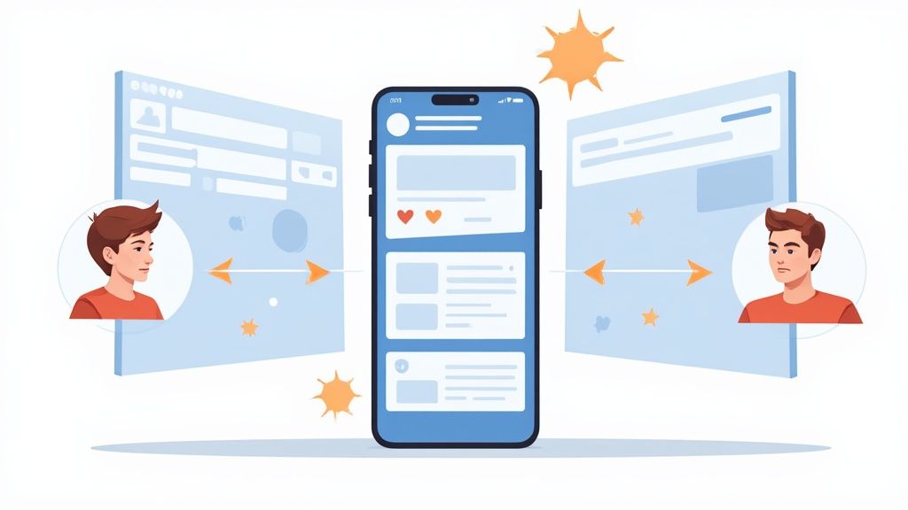
These visuals are the very first thing a potential user looks at, making them your single most important asset for standing out. A great set of screenshots instantly answers the only question that matters: "Will this app solve my problem or make my life better?"
The First Impression Is Everything
The fight for user attention is brutal. With hundreds of thousands of apps launching every month, only a tiny fraction, about 0.5%, ever find real success.
Here is the kicker: users decide whether to download an app in about 7 seconds, and that decision is almost entirely based on visuals. This is where a polished screenshot template gives you a massive edge. We have seen well-crafted screenshots boost conversion rates by 20–35%.
A cohesive visual story does more than just list features; it builds immediate trust. When a user sees clean, easy-to-understand screenshots, they assume the app itself is high-quality and reliable.
Your screenshot gallery is not a feature list; it is a visual story. The first three images should tell a user everything they need to know to make a download decision, focusing on the ultimate benefit your app provides.
Turning Views into Downloads
At the end of the day, every single element on your product page has one job: drive installs. Screenshots are uniquely built to do this by bridging the gap between a casual browse and a firm commitment, boosting conversions for both Android and iOS stores.
Here’s how they work their magic:
- Communicate Value Instantly: A strong headline paired with a clear UI image explains a core benefit faster than any paragraph ever could.
- Set the Right Expectations: High-quality visuals show users exactly what they are getting, which means fewer disappointed users and better reviews down the line.
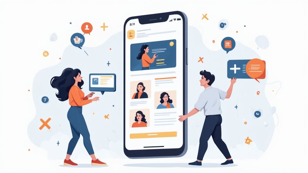
- Create an Emotional Connection: For lifestyle or gaming apps, screenshots can spark feelings of fun, calm, or excitement, connecting with the user on a much deeper level.
Optimizing these visuals is a cornerstone of boosting your app's performance. For a deeper dive, check out our guide on essential conversion rate optimization techniques. Screenshots are what transform your app from just another icon in a search result into a must-have solution.
Defining Your Visual Story and Brand Identity
Before you even think about firing up a design tool, you need a story. Your screenshots are your silent sales pitch on the App Store, and the best ones tell a visual story that walks a user from "Hmm, what is this?" to hitting the install button. That story is built on two things: clear benefits and a consistent brand identity.
Your first job is to boil your app’s entire value down to 3 to 5 core benefits. I am not talking about listing features like "photo filters" or "budget tracking." That is what your app does. A benefit is how it makes the user's life better.
For example, instead of just saying "Customizable Dashboards," a much stronger benefit is "See Your Finances Your Way." See the difference? It immediately makes the value personal and clear.
Building Your Narrative Arc
Once you have those core benefits, you need to arrange them in a logical sequence, like a mini-storyboard. The very first screenshot has to hook them with your single biggest promise. From there, each image should build on that promise, revealing how different parts of your app come together to create an experience they cannot live without.
Here’s a simple way to think about it:
- The Hook: What is the ultimate problem you solve? Lead with that.
- The Solution: Show the key feature that makes it happen.
- The Deep Dive: Highlight a secondary benefit that sweetens the deal.
- The Trust Builder: Flash some social proof, like an award or a key integration.
This structure ensures that even someone who just glances at the first two images gets the gist of what your app is all about.
Establishing a Cohesive Visual Style
Your visual style is what makes your screenshots look trustworthy and professional. Every element, from the colors you choose to the fonts you use, should feel like it belongs to your app and speaks to your target audience. This is where an app store screenshot template becomes your best friend, keeping everything consistent across the entire gallery.
A fintech app, for instance, should project trust and security. That means clean, professional designs with blues, whites, and sharp, minimalist fonts. On the flip side, a gaming app needs to scream excitement with vibrant colors, bold typography, and action-packed layouts.
Check out this finance app example. It uses a clean layout and a cool color palette to communicate trustworthiness and simplicity right off the bat.
Notice how the bold headlines, clear UI mockups, and consistent branding work together? That is the kind of professional first impression that boosts conversions.
A quick pro-tip: the device frame you choose is more important than you think. Always use an iPhone frame for the Apple App Store and a generic or specific Android frame (like a Google Pixel) for Google Play. A mismatch looks sloppy and can instantly make a user question your app's quality.
By nailing down your narrative and visual identity first, you build a solid framework. This makes sure every screenshot is not just a picture, but a deliberate move to convince users your app is the one they need.
Nailing the Technical Specs for iOS and Android
Getting the technical specs right for your app screenshots can feel like a tedious chore, but it is one of those things you absolutely have to nail. Mess it up, and you risk a rejection from the review team, delaying your launch. Get it right, and your visuals will look crisp and professional on every single device.
The rules for both the Apple App Store and Google Play are always shifting, so staying current is key.
The good news? Things have gotten way simpler, especially on Apple's side.
Apple’s New, Streamlined Approach for iOS
Remember the days of exporting a dozen different screenshot sizes for every iPhone model? Thankfully, that is over. Apple has completely streamlined the process, saving developers a ton of time and headaches.
Now, you only need to upload one set of screenshots for the 6.9-inch iPhone display and one for the 13-inch iPad. That is it. Apple’s system automatically handles the scaling to fit all the other screen sizes. This is a massive win for efficiency; you can pour all your energy into crafting one perfect set of visuals instead of endlessly resizing files.
This shift means you can design a single, high-quality template for the largest iPhone and iPad sizes, and trust Apple to adapt it for every other device. It just works.
How Google Play Handles It Differently
Google Play takes a more hands-on approach. Instead of a single master size, you are required to upload between 2 and 8 screenshots for each device type you support: phones, tablets, and even wearables.
The dimensions are flexible, needing to be somewhere between 320 and 3840 pixels. This gives you more granular control over how your app is presented on different devices, but it also means your design template needs to be adaptable to various aspect ratios. For a deeper dive, check out our complete guide to app store screenshot sizes.
Of course, these technical details are just one piece of the puzzle. Understanding the broader context, like these 5 key factors for developing an Android app, can give you a better perspective long before you even get to the submission stage.
App Store vs Google Play Screenshot Requirements
To make things easier, here is a quick side-by-side look at the core technical rules for both platforms. It is a handy cheat sheet to keep you on track.
| Specification | Apple App Store (iOS) | Google Play Store (Android) |
|---|---|---|
| Primary iPhone Size | 6.9-inch display (mandatory) | No single mandatory size |
| Primary iPad Size | 13-inch display (mandatory) | N/A (specific tablet sizes) |
| Screenshot Count | Up to 10 per localization | 2 to 8 per device type |
| File Format | PNG or JPEG (no transparency) | PNG or JPEG |
| Resizing Method | Automatic scaling by Apple | Manual upload for device types |
At the end of the day, Apple prioritizes simplicity with its auto-scaling system, while Google offers more direct control at the cost of a bit more work. Knowing the difference is the first step to a smooth submission process on both fronts.
How to Create High-Converting App Store Screenshots
Alright, let's get into the nuts and bolts of actually building a screenshot template that gets people to hit "Install." This is where your visual story comes to life. Even if you are not a designer, you can create something polished and professional; it is all about making that first impression count.
The real goal here is to move past just showing raw screens from your app. A high-converting template is a strategic combination of your UI, benefit-driven headlines, a clean layout, and your own branding. It’s about guiding the user's eye and making them feel the value of your app before they even download it.
Choosing Your Layout and Writing Headlines
First things first, you need to pick a layout in whatever editor you are using. Your choice here should tie directly back to the story you are trying to tell. A single-device layout, for instance, is great for a clean, focused look. On the other hand, a multi-device or overlapping layout can be perfect for showing off different parts of a user journey all in one go.
Once you have settled on a layout, turn your attention to the headline. Honestly, this short snippet of text is probably the most important part of the entire screenshot. It has to sell a benefit, not just list a feature.
- Weak Headline: "Expense Tracking Feature"
- Strong Headline: "Track Spending in a Snap"
See the difference? The strong headline communicates speed and ease, immediately solving a user's problem. Make sure you use high-contrast colors for your text so it is impossible to miss, especially on small phone screens where people are scrolling at lightning speed.
A great template has a clear visual hierarchy. Your headline should be the star of the show, followed by your app's UI inside the device frame, and then the background. This creates a natural flow that guides the user's eye exactly where you want it.
Modern tools have really simplified the process, especially for creating screenshots across multiple devices. For example, within an editor, you can start with a single iPhone design, and with one click, generate perfectly sized versions for every required Android model.
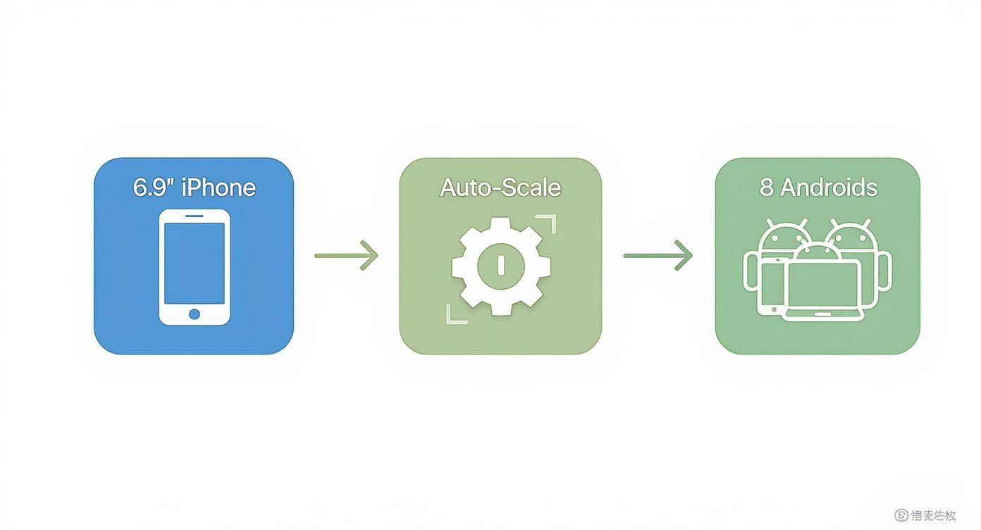
This kind of automated workflow is a massive time-saver. It ensures your visuals look sharp on every platform without you having to manually resize a thing, making your process more efficient.
Designing for Conversions
With your layout and headlines locked in, it is time to fine-tune the design for maximum impact. This is where some basic design principles can make a huge difference. A consistent visual style across every single screenshot builds trust and just makes your app look more legit.
Here are the key elements to nail:
- Color Palette: Stick to your brand's colors. A consistent palette reinforces who you are and makes your app listing instantly recognizable. You can use vibrant, appealing colors for the background, but just make sure they do not overpower your UI.
- Font Choice: Pick a clean, readable font that matches your brand's personality. This is not the time to get fancy with decorative fonts that are tough to read on a small screen.
- Device Frames: This is a big one: always use the correct device frame. Seeing an iPhone frame on the Google Play store just looks sloppy and immediately breaks user trust. A good site editor will have up-to-date mockups for the latest devices, like the iPhone 16 Pro Max or Google Pixel, ready for you to use.
When you combine these elements, your screenshot template stops being just a picture and becomes a powerful conversion tool. It does not just show what your app does; it communicates a sense of quality and reliability that convinces users to give your app a try.
If you are looking for a bit of inspiration, browsing through different mobile app design templates is a fantastic way to get the creative juices flowing and find a starting point for your own unique visual story.
Testing and Optimizing Your Screenshots for Growth
Getting your first set of screenshots live is not the finish line; it is the starting block. Your initial design, no matter how good you think it is, is really just your best guess. The real app store growth comes from treating it like a hypothesis that needs to be tested.
This is where A/B testing becomes your secret weapon. It is a straightforward process: you show slightly different versions of your screenshots to different groups of users and see which one gets more installs. It’s the single best way to stop guessing and start making decisions based on actual user behavior.
Running A/B Tests That Actually Work
Getting started with testing is simpler than most people think. The trick is to only test one thing at a time. If you change the background color and the caption copy, you will never know which change made the difference.
So, start by creating a single variation of your current screenshot set. Here are a few high-impact elements I have seen work wonders:
- Background Colors: Pit a bold, vibrant background against a clean, minimalist one. Does loud and proud beat simple and sleek? Only the data knows.
- Caption Copy: Try rephrasing your headline. For example, test a direct benefit statement ("Organize Your Life Instantly") against a question ("Tired of Digital Clutter?").
- Feature Order: Is your "collaboration" feature the real hook, or is "analytics" what gets people to tap 'install'? Swap the order of your screenshots and find out.
- Imagery Style: Test a clean shot of your UI against a more lifestyle-oriented image, like someone actually using your app at a coffee shop.
By isolating one variable, you can say with confidence that the change you made was responsible for any bump in downloads.
Unlocking Global Growth with Localization
While A/B testing fine-tunes your appeal to your current audience, localization is how you break into entirely new markets. This is so much more than just translating text. A small effort here can bring massive returns.
Do not just translate; localize. This means adapting your visuals, colors, and even the features you highlight to fit the cultural expectations and preferences of each market you enter.
The numbers do not lie. Data from across the industry shows that smart A/B testing can boost conversion rates by up to 40%. On top of that, thoughtful localization, adapting screenshots to specific languages and cultures, has been shown to lift conversions by as much as 33%. If you want to dig into the data, you can discover more insights about app store A/B testing.
This approach turns your app store page from a static billboard into a dynamic conversion machine. By constantly testing, learning, and localizing, you make sure your screenshots are always working as hard as possible to bring in new users.
Common Questions About App Screenshot Templates
Even with a solid plan, you are going to hit some specific questions when you start building out your app store screenshots. I have seen these same queries pop up time and time again with developers and marketers. Getting them right can be the difference between a good listing and a great one.
Here are the answers to the questions I hear most often.
What Makes a Good App Store Screenshot Template?
A great template is not just a random collection of screens. It’s clean, it’s branded, and it tells a story at a glance. It should have a consistent layout, use your app's color palette, and feature a font that’s both on-brand and super readable on a tiny screen.
But here is the most important part: a good template focuses on benefits, not features.
Instead of a generic caption like "Expense Tracking," go for something powerful like "Manage Your Budget in a Tap." See the difference? One describes a function, the other promises a solution. The best templates walk a user through your app's core value within the first few images, making the decision to download feel obvious.
How Many Screenshots Should I Actually Upload?
Use as many slots as you can. That means up to 10 for iOS and 8 for Google Play. A full gallery signals that your app is well-supported and packed with value, which builds trust.
However, the real magic happens in the first two or three images. Let's be honest, most users make their decision based on these alone. They need to see your primary value proposition immediately. No scrolling, no swiping, just an instant understanding of what your app does for them.
Use the rest of the slots to show off secondary features, different use cases, or social proof like awards and five-star reviews.
Treat your first three screenshots like they are the only ones a user will ever see. They need to tell a complete story: what problem you solve and how you make their life better.
Can I Use the Same Screenshots for Both App Stores?
I know it is tempting to save time here, but please do not. You should always create custom templates for each store. The technical dimensions and aspect ratios are different, and trying to use one set for both often results in blurry or badly cropped images that just look sloppy.
But there’s a bigger reason. Showing an iPhone frame on Google Play (or an Android frame on the App Store) is a huge red flag for users. It breaks the native feel and screams "lazy port." It erodes trust instantly.
Tailoring your visuals to each platform’s design language is a small effort that delivers a much better user experience and almost always improves conversion rates.
Should I Show UI or Lifestyle Photos?
This really depends on your app, and it is one of the best things you can A/B test.
For most utility, productivity, or finance apps, clear UI inside a device frame is the way to go. Users want to see exactly how the app works and what the interface looks like. No surprises.
On the other hand, if you have a lifestyle, social, fitness, or gaming app, mixing in photos of people can create a powerful emotional connection. It helps users imagine themselves using your app in the real world. A hybrid approach can work wonders here: start with a couple of strong UI shots and then sprinkle in a lifestyle image later in the sequence to show the outcome.
Ready to create stunning, high-converting screenshots in minutes? ScreenshotWhale offers professionally designed templates and a simple drag-and-drop editor to make your app stand out. Start building your perfect app store visuals today at https://screenshotwhale.com.