How to Create High-Converting App Store Images for iOS & Android
Master the app store image with proven design and ASO tips to boost downloads on iOS and Android.
When a user lands on your app store page, what's the first thing they really look at? It’s not your carefully crafted description or your clever app name. It's your images.
In the few seconds you have to make a case, your app store images do all the heavy lifting. They are not just pictures; they are your single most powerful conversion tool. This guide provides actionable insights to help you create efficient, high-converting screenshots for both the App Store and Google Play to boost your app store growth.
Your App Store Image Is Your Most Powerful Marketing Tool
Think of your app store page like a physical storefront. Your app icon is the sign hanging over the door, sure, but your images are the window display. They give people a direct peek into the experience your app offers, and snap judgments are made in an instant.
A great set of screenshots works like a movie trailer. It builds excitement, shows off the best parts, and convinces someone to commit. This visual storytelling is the heart and soul of App Store Optimization (ASO), the game of getting your app seen and downloaded. Get the app store image strategy right, and you will see a direct impact on user trust, conversion rates, and even your app's search ranking. The stakes could not be higher.
The First Impression Is Everything
From a pure conversion perspective, nothing moves the needle quite like your app store images. Industry analysis shows that by 2025, you have roughly 7 seconds to grab a user’s attention before they bounce. That means your first one to three images carry almost all the weight of their decision to install.
It is not just a hunch, either. Well designed screenshots have been proven to lift conversion rates on product pages by 20–35% without changing anything else about the app. If you are looking for more, you can find out more about the latest screenshot strategies.
This example from ScreenshotWhale shows how a professional template can turn a basic UI capture into a compelling ad.
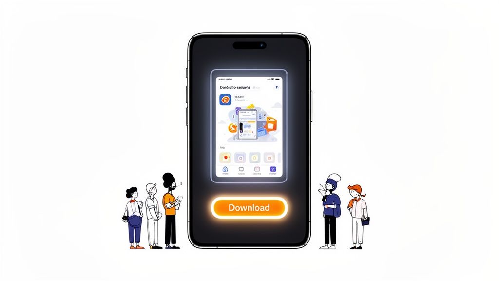
The combination of a clean device mockup, a punchy headline, and vibrant colors immediately gets the point across. It is no longer just a screenshot; it is a high impact marketing asset.
Why Your Visuals Drive Conversions
An effective image gallery does a few key things all at once. It educates users on what your app actually does while creating an emotional hook that makes them want to hit "Get" or "Install."
- Communicates Value Instantly: Someone should grasp your app's main purpose within seconds of seeing that first image. No guessing allowed.
- Builds Trust and Credibility: Polished, professional looking visuals send a clear signal: this is a high quality app from a developer who cares.
- Tells a Cohesive Story: Each image should flow logically into the next, taking the user on a quick tour of your app's best features.
Your screenshot gallery is not a feature list; it is a sales pitch. Every single image needs to answer the user's ultimate question: "How will this app make my life better?" Always lead with benefits, not just features. That is the secret to visuals that actually convert.
Playing By The Rules: App Store vs. Google Play Images
Before you can even think about designing app store images that get people to tap "Install," you have to know the rules of the game. Both Apple’s App Store and Google Play have their own specific, non negotiable technical requirements. Ignore them, and you are looking at a frustrating rejection.
Think of these guidelines not as creative handcuffs, but as the foundation for a successful launch. Getting them right from the start means your hard work will not get stuck in review limbo. You will be building your visual marketing on solid ground, free to focus on compelling design instead of fixing annoying technical errors.
Let's break down what each store actually demands.
Key Differences Between iOS and Android
While both platforms want to give users a clean experience, their rulebooks for screenshots are surprisingly different. The most obvious distinctions pop up in the number of images you can upload and the specific device sizes you must provide. These are not minor details; submitting the wrong asset can bring your entire app submission to a screeching halt.
Apple lets you upload up to 10 screenshots for each device type and language, but the sweet spot for conversions is between 5 and 7. That is usually enough to tell a clear, compelling story without overwhelming anyone. Google Play is a little tighter, allowing up to 8 screenshots for phones and tablets.
But here is the reality check: data from MobileAction.co shows that 90% of users almost never scroll past the third image. Your first few visuals have to do all the heavy lifting.
To make things easier, here is a quick side by side look at the core technical rules to help you plan your asset creation.
App Store vs Google Play Image Requirements At A Glance
This table breaks down the essential specs for each platform. Having this handy before you start designing can save you a ton of headaches later.
| Specification | Apple App Store (iOS) | Google Play Store (Android) |
|---|---|---|
| Max Screenshots | 10 per device type (iPhone, iPad) | 8 per device type (Phone, Tablet) |
| Required Sizes | Must provide 6.7-inch (iPhone) and 12.9-inch (iPad Pro) | Flexible; upload for one size, and Google may resize |
| File Formats | JPEG or PNG | JPEG or 24-bit PNG (no alpha) |
| Content Policy | Strict on realistic UI and avoiding misleading content | More lenient, but prohibits inappropriate or deceptive content |
It is pretty clear from this that a one size fits all approach is a recipe for disaster. You really need to plan for each store's unique demands from the get go.
Mastering The Most Common Requirements
Beyond the basics, you have to nail the dimensions. These change every time a new flagship phone comes out. For Apple, you absolutely must submit screenshots for their largest device sizes, right now, that is the 6.7-inch iPhone and the 12.9-inch iPad Pro. Apple then automatically scales them down for smaller screens.
Google Play gives you a bit more wiggle room. You can upload images for one device, and the store will try to adapt them for others, but this can sometimes lead to some seriously awkward cropping. Honestly, the best strategy for both platforms is to create custom sized assets for the main device categories. For a much deeper dive into the nitty gritty, check out our complete guide on app store screenshot requirements.
The goal is not just to meet the bare minimum. It is to blow past it. A pixel perfect, device specific app store image screams quality and professionalism, and that builds trust with potential users before they have even downloaded your app.
Finally, always respect the content policies. Do not sneak in unapproved brand logos, do not make misleading claims, and do not show off device content, like a picture of someone holding a phone. Just showcase your actual app experience in a clean, honest way. This keeps you compliant and sets the right expectations for your new users, which almost always leads to better reviews and people sticking around longer.
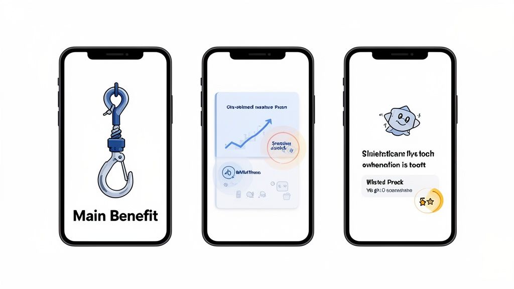
Designing Screenshots That Tell A Compelling Story
Let's be honest: great app store images do a lot more than just show off your app’s UI. They tell a story. A really persuasive one. This is where you graduate from basic screen captures to the art of visual storytelling, crafting a narrative that turns casual browsers into committed users. Every single pixel needs a purpose, gently nudging that person toward the download button.
Think of your screenshot gallery as a short, silent movie about your app. The first frame is your opening scene; it has to grab their attention immediately. From there, each image builds on the last, creating a story that flows. When you get this right, you are not just showing off features; you are selling an experience.
Start With a Powerful Hook
Your first screenshot is the main event. It has less than three seconds to communicate your app's single biggest benefit. This is absolutely not the place for your login screen or settings menu. You need to lead with the "aha!" moment, the core value that makes your app a must have.
For a fitness app, that could be a dynamic workout screen buzzing with progress metrics. For a productivity app, maybe it is a perfectly organized dashboard showing a satisfying list of completed tasks. The goal is to make someone instantly understand how your app will make their life better.
This first image sets the entire mood for your gallery. It needs to be visually arresting, clear as day, and connect on an emotional level. If a user only ever sees this one image, they should still walk away knowing exactly what your app is all about.
Use Bold Captions and Vibrant Colors
Raw UI captures just are not going to cut it. You have to guide the user's eye and spell out what they are looking at. This is where bold, easy to read captions and a killer color palette come in. Your text should not be a feature label; it should be a benefit driven headline.
So, instead of "Task List," try something like "Organize Your Entire Day in Seconds." Do not just say "Budget Tracker"; go with "Finally Take Control of Your Finances." This small shift in language transforms your features into solutions for real world problems, which is infinitely more compelling.
Your color choices should be deliberate and on brand. Use high contrast, vibrant colors to make key elements pop off the screen and stand out against the app store's background. A consistent color scheme ties all your images together, creating a professional look that builds trust and brand recognition.
Do not just show the feature, sell the outcome. A user does not download an app for its buttons and menus; they download it for the feeling of accomplishment, organization, or entertainment it provides. Your captions and design must bridge that gap.
Showcase Features as Benefits
Every potential user is subconsciously asking, "What's in it for me?" Your screenshot gallery is your big chance to answer that question visually. Each image should focus on a key feature, but, and this is the important part, present it through the lens of a user benefit.
This is the real secret to effective storytelling in your app store assets. A feature is what your app does. A benefit is what the user can do with it. Nailing this distinction is what drives downloads.
Here’s a quick breakdown of how to frame features as benefits:
- Feature: Dark Mode
- Benefit: "Work Comfortably, Day or Night."
- Feature: Real-Time Collaboration
- Benefit: "Achieve Your Goals, Together."
- Feature: 100+ Recipe Filters
- Benefit: "Find the Perfect Meal in an Instant."
This approach helps people mentally place themselves inside your app, making the decision to download feel both natural and logical. For a deeper dive, our guide on crafting perfect app screenshots for the App Store is packed with more examples.
Build Trust With Mockups and Social Proof
Placing your app inside a realistic device mockup instantly makes it feel more tangible and professional. It helps users picture your app running on their own phone, which creates a subtle sense of familiarity and trust. Tools like ScreenshotWhale offer a whole library of up to date mockups for the latest iPhones, iPads, and Android devices, so your visuals always look current.
But it is not just about looking professional. Social proof is one of the most powerful conversion tools you have. If your app has been featured in the press, won an award, or has fantastic reviews, you need to bake that right into your screenshot design.
Think about adding powerful elements like these:
- Awards and Recognition: A simple badge or laurel like "Apple's App of the Day" or "Featured on TechCrunch" speaks volumes.
- User Testimonials: A short, impactful quote from a 5 star review can be incredibly convincing.
- Impressive Metrics: Show off stats like "1 Million Happy Users" or "50,000+ 5-Star Reviews."
This kind of external validation lowers the perceived risk for a new user. It tells them, "Hey, other people have tried this and loved it," making them far more confident in their decision to hit install. Weaving social proof into your visual story is a proven way to boost your app store growth.
The Hidden SEO Power Of Text In Your Images
For years, we have treated our app store image galleries as a visual sales pitch. A way to show, not just tell. But the game has changed. Top developers are now tapping into a powerful, often missed strategy: the text you place inside your screenshots is no longer just for users; it is a direct signal to the app store’s search algorithm.
This shift turns your visuals from static marketing assets into dynamic SEO tools. Think of it as adding a whole new layer of keywords to your app listing, one that is perfectly blended with your most compelling visuals. When you get this right, you can seriously boost your app's discoverability without cluttering up the user experience.
From Conversion Asset To Indexed Content
This is not just a theory. Since 2025, App Store images have become indexed content in Apple’s search algorithm, giving real ASO weight to the text you bake into your screenshots. ASO platforms have confirmed that Apple now actually extracts visible text from screenshot captions, treating those words a lot like it treats your traditional keyword fields.
So what does this mean in practice? It means the short, benefit driven captions you write, like "Track spending instantly" or "Edit photos like a pro", are now helping your app rank for terms like "spending tracker" and "photo editor." It is a genuine game changer for getting your app seen.
How To Strategically Embed Keywords
The trick here is to weave high value keywords into your captions naturally. The goal is not to awkwardly stuff keywords into your designs. It is about aligning your marketing copy with the exact search terms your target audience is already punching into the search bar.
Here’s a simple process you can follow:
- Identify Core Keywords: Start with a list of 5-10 primary keywords that nail your app's main functions.
- Craft Benefit Driven Captions: For each screenshot, write a short, punchy caption that solves a user problem and just so happens to include one of your core keywords.
- Ensure Readability: Use a bold, clear font that is easy to scan on a small screen. The text has to be legible for both your potential users and the algorithm.
Think of each screenshot caption as a mini headline. It should be punchy, descriptive, and optimized for search. This dual purpose approach is at the very core of modern ASO strategy.
To really get the most out of this, you need to understand how it fits into the bigger picture. For a fantastic overview of all the moving parts, check out this comprehensive App Store Optimization (ASO) guide.
Amplifying Your Global Reach Through Localization
This text indexing feature gets even more potent when you localize your app. By translating the text within your screenshots, you can start ranking for local keywords in international markets, opening up your app to entirely new audiences. For instance, a caption translated into Spanish helps you compete for searches from Spanish speaking users. It is that simple.
The numbers do not lie: studies show that properly localized listings can improve installs by up to 48% in multilingual markets. Apple supports up to 10 screenshots per localization, and with tools like ScreenshotWhale offering AI driven translation, you can turn each regional image set into a keyword rich asset tailored to that specific market. It is a must do for any serious global launch, and we dive deeper into these strategies in our complete app store optimization guide.
A Practical Workflow For Creating Stunning Screenshots
Alright, let's turn all this theory into reality. Knowing the design principles is one thing, but actually sitting down to produce a full set of polished, compliant screenshots can feel like a mountain of a task. An efficient workflow is not just nice to have, it is essential, especially for indie devs and small teams who need to move fast without cutting corners on quality.
The good news is that modern tools have completely changed the game here. You no longer need to be a Photoshop wizard or spend days wrestling with complex design software to get professional looking results. A smart workflow means you can go from zero to a full gallery of stunning screenshots in minutes, not hours.
Here’s a practical, step by step process you can follow using a platform like ScreenshotWhale. Our goal is to get from raw app captures to a complete set of high converting, localized images with as little friction as possible.
Step 1: Start With A Professional Template
The secret to an efficient workflow is to not start from scratch. Ever. Instead of staring at a blank canvas, you can pick from a library of professionally designed layouts built for different app categories and devices. This is a huge shortcut because design best practices are already baked right in.
Find a template that matches your app's vibe and speaks to your audience. A fitness app, for example, might look great with a dynamic, high energy layout. A fintech app, on the other hand, needs a design that feels clean, sharp, and trustworthy. Picking the right template saves a ton of time and makes your visuals look credible from the get go.
Just look at this selection; you can immediately see how different styles fit different types of apps.
Each template gives you a pre built structure for device mockups, text placement, and color schemes. It is a massive head start that lets you focus on your app's unique selling points instead of getting bogged down in pixels and font sizes.
Step 2: Customize With A Drag and Drop Editor
Once you have got your template, it is time to make it yours. This is where a simple drag and drop editor becomes your best friend. A fast, intuitive workflow lets you upload your raw app captures directly into the device mockups and see your design come alive in real time.
For example, after selecting a vibrant, modern template, you can simply drag your app's "Dashboard" screen capture onto the device frame. Instantly, your UI is perfectly placed. Next, click on the placeholder headline and type your benefit driven caption, like "See Your Whole Day, Instantly." You can then use the color picker to change the background to your primary brand color, ensuring every visual element aligns with your app's identity. This hands on customization takes only seconds but makes the design uniquely yours.
Step 3: Generate Localized Assets In One Click
If you want to compete globally, your app store images need to speak the local language, literally. But manually creating localized screenshots for multiple countries is a soul crushing task that can bring your entire release schedule to a grinding halt. This is where automation feels like a superpower.
A truly efficient workflow must include one click localization. After you have finalized your main design, an AI powered engine can instantly translate your captions into dozens of languages. In a single click, it generates a complete, ready to upload set of screenshots for every international market you are targeting.
Automated localization does not just save time; it unlocks global growth. When you present your app's value in a user's native language, you dramatically increase the odds of a download. It is the simplest way to boost international conversion rates with almost zero extra effort.
This approach keeps your message consistent and powerful across all regions, turning localization from a costly bottleneck into a simple final step. To really streamline the process, you can even explore using sophisticated AI image generators for rapid prototyping and generating different visual concepts. This kind of tool integration is what defines a modern, scalable workflow for any developer with global ambitions.
Your Top Questions About App Store Images, Answered
Even with a killer strategy, questions always pop up when you are in the trenches creating and managing your app store visuals. Getting these details right is what separates a good app page from a great one, helping you avoid rookie mistakes and stay ahead of the curve.
Let's dive into some of the most common questions we hear from developers and marketers.
The image below gives you a quick visual of the ideal workflow; it is a simple, three step loop.
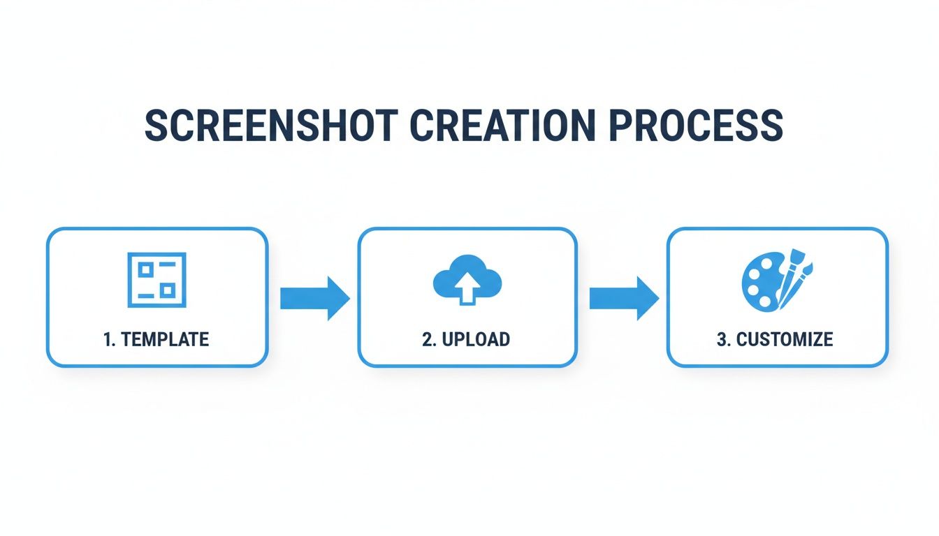
Starting with a solid template, popping in your screen captures, and then adding your custom flair is the fastest way to get professional results.
How Often Should I Update My App Store Images?
A good rule of thumb is to refresh your app store images anytime you roll out a major feature, give your UI a facelift, or launch a seasonal campaign. It is also smart to A/B test new creative every few months to see what really connects with your audience.
Fresh visuals do more than just show off what's new. They send a clear signal to potential users that your app is alive and actively maintained, which builds a ton of trust. Stale, outdated screenshots can make an app feel abandoned, and that is a surefire way to tank your conversion rate.
What Are The Biggest Mistakes People Make With Screenshots?
It is painful to see a great app get dragged down by sloppy screenshots. Avoiding these common blunders will make your visuals look polished and professional, which directly boosts user confidence and, ultimately, downloads.
Here are the top mistakes to steer clear of:
- Naked UI Captures: Just tossing up a raw screenshot without any context or text is a missed opportunity. You are forcing users to guess the benefit.
- Unreadable Text: Using tiny, thin, or low contrast fonts is a classic mistake. If people cannot read your captions on a phone screen, they are useless.
- Visual Overload: Cramming too much text, multiple UI elements, or distracting graphics into one image just creates chaos. It looks unprofessional and confuses the message.
- No Storytelling: A random jumble of screens makes no sense. Your gallery should guide the user through a logical story, with each image building on the last.
- Forgetting Device Frames: Placing your app inside a realistic device mockup makes it feel more tangible and legitimate. It is a small detail that makes a big difference.
A winning app store image nails one key idea and communicates it instantly. The goal is clarity, not complexity. If a user has to squint or think too hard to figure out what they are looking at, you have already lost them.
Should I Bother With Videos In My App Store Listing?
Absolutely. An App Preview video can be a game changer. On both the App Store and Google Play, videos can autoplay silently in search results, which is a fantastic way to cut through the noise and grab someone's attention.
A well made video can show off your app's core functionality and user experience in a way static images just cannot match. It is your best shot at showing your app in action and conveying its unique feel. Just keep it short, ideally 15 to 30 seconds, and focus only on your most exciting features to make a lasting impression.
Can I Just Use The Same Images For iPhone And iPad?
Nope, and you would not want to anyway. Apple requires separate, device specific screenshots because the screen sizes and aspect ratios are completely different. Try to submit the wrong size, and you will get an instant rejection during the review process.
More importantly, the iPad's larger screen is a golden marketing opportunity. Use that extra real estate to show off more detailed features, a more complex interface, or a slick split screen view you could not possibly display on a phone. Tailoring your visuals to each device shows a commitment to quality and attention to detail that users definitely notice.
Ready to create stunning, high converting visuals for your app in minutes? With ScreenshotWhale, you get professional templates, a simple drag and drop editor, and one click localization to make your app stand out from the crowd. Try ScreenshotWhale for free and start boosting your downloads today!
Put this into practice on your own listing
Import your live app into an ASO workspace — metadata, keywords, competitors, and store screenshots in one place.
Import my app