A Practical Guide To Creating An App Store Mockup That Converts
Learn how to create a high-converting app store mockup to boost downloads. Our guide offers actionable tips for design, captions, and localization.
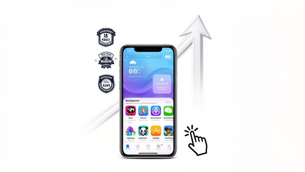
What exactly is an app store mockup? Think of it as a supercharged screenshot. It is your app's UI, beautifully framed inside a device like an iPhone or Android phone, and often jazzed up with sharp, benefit-driven text and branded backgrounds. These are not just pictures; they are your primary marketing assets on the Apple App Store and Google Play, designed to show off your app and convince people to hit that download button.
How Mockups Drive Your App Store Growth
In the absolute jungle of the app marketplace, your screenshots are your elevator pitch. They are the first real glimpse anyone gets into what it is like to use your app, and they can make or break the decision to tap "Get" or just keep scrolling. A polished app store mockup does more than just display your UI; it tells a story about the value you are offering.
This visual storytelling is the heart and soul of good App Store Optimization (ASO). High quality mockups instantly build trust and give off a vibe of professionalism, signaling to users that your app is the real deal, well designed and reliable. They turn plain screen grabs into little advertisements that scream your core features in seconds.
The First Impression Is Everything
Picture your app store page as a physical storefront. Your icon is the sign hanging out front, and your screenshots are the window display. That display needs to be bright, compelling, and dead simple to understand at a glance.
Let's get real. In a place like the Apple App Store, with a mind boggling 1,916,393 apps all fighting for eyeballs and users downloading over 38 billion apps a year, your screenshots are the unsung heroes of conversion. ASO pros know this. They have seen that apps with truly optimized screenshots can get up to a 30% higher click through rate from search results. Why? Because those images are the first hook people see when they are scrolling. You can dig into more data on app store performance to see the full picture.
Turning Viewers Into Users
A killer app store mockup closes the deal. It bridges that gap between a user discovering your app and actually downloading it by answering their one crucial question: "What's in it for me?"
Effective mockups pull this off by:
- Highlighting Key Benefits: Do not just show a boring login screen. Slap a caption on it like "Your Fitness Journey Starts Here" to frame the feature as a real benefit.
- Creating a Narrative: String your mockups together to tell a mini story. Guide the user from the moment they open the app to achieving a key goal.
- Building Brand Identity: Stick to your brand's colors, fonts, and device frames. Consistency makes your app memorable and look professional.
By framing your app's best features within a sharp, professional mockup, you turn a passive scroller into someone who is actually interested. It is not just about showing what your app does; it is about showing what your user can achieve with it.
Selecting The Right Device Frames And Templates
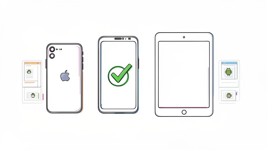
The device frame you choose is the foundation of your entire app store presence. Think of it as the packaging for your product. You would not put a brand new gadget in a dusty, yellowed box from a decade ago, would you? The same logic applies here.
Using an outdated phone frame instantly makes your app feel old and neglected. It plants a seed of doubt before a user even gets to your features. That is why it is so important to start with a modern, recognizable device. For iOS, that means the latest iPhone models. For Android, you cannot go wrong with flagships like the Samsung Galaxy or Google Pixel series. This simple choice immediately signals that your app is current and built for the phones people actually have in their pockets.
Finding Your Perfect Layout
Beyond just the device, the template layout sets the stage. A good mockup editor will not just give you a blank canvas; it will offer a library of professionally designed templates that are built from the ground up to drive conversions.
Many of these are sorted by app category, fitness, finance, social media, you name it. This is a huge help. The visual language that works for a dating app is going to be completely different from what works for a serious productivity tool.
As you browse through templates, keep a few things in mind:
- Room for Words: Is there a clear, intentional space for your captions? Your text is just as vital as your UI screenshot.
- Brand Harmony: Can you easily tweak background colors and fonts to align with your app's brand? A consistent look is a professional look.
- Clear Focus: Does the template guide the user's eye to the most important element, your app's interface? The frame should enhance your screenshot, not compete with it.
The right template strikes that perfect balance. It shows off your UI while leaving plenty of room to communicate value with punchy captions and on brand colors. If you are building for the newest Apple hardware, our guide on crafting a perfect iPhone 16 mockup is a great place to start.
Using An Editor For Quick Results
This is where modern mockup editors really shine. Instead of getting bogged down in complex design software, you can just pick a device, choose a template, and drop your screenshots right in. It is the perfect environment for experimenting with different layouts to find the one that best tells your app's story. For example, within an editor, you can test a "Feature Grid" layout against a "Panoramic" one to see which better highlights your app's workflow and boosts conversions.
The goal is to select a combination of device frame and template that makes your app look both aspirational and instantly familiar. A user should be able to look at your mockup and immediately picture themselves using your app on their own phone.
Getting this part right ensures your visuals are not just pretty. They are structured to be informative, compelling, and incredibly effective at convincing people to hit that download button.
Writing benefit-driven captions for your iOS and Android screenshots
Your screenshots show the what, but the captions? That is where you sell the why. These tiny headlines are your secret weapon for turning a casual browser into a committed user. Powerful captions do not just list features; they nail the value proposition and solve a real problem for your user, all while giving your App Store Optimization (ASO) a nice little bump.
The whole game is to stop describing and start persuading. Instead of a dry, feature based caption like "Calendar Integration," you want to hit them with the benefit: "Never Miss a Meeting Again." It is a subtle but critical shift that connects with a user's actual needs and answers their unspoken question: "How is this app going to make my life better?"
Weaving In Keywords Naturally
Do not forget that ASO is not limited to your app's main description page. Your screenshot captions are prime real estate for keywords, too. You can subtly weave in your main targets to help with discoverability.
For instance, if you have built a "meal planner" app, a caption like "Your Weekly Meal Planner, Simplified" works on two levels. It clearly states a benefit (simplicity) while also reinforcing your primary keyword. It is a delicate balance, of course. The copy has to feel natural and compelling to a human first. The SEO boost is just the smart, strategic bonus. To really dial this in, exploring the best App Store Optimization tools can give you a massive edge in finding those high impact keywords.
Crafting a Compelling Screenshot Story
Your screenshots should not be a random collection of screens. They need to tell a cohesive story, with your captions acting as the narrative guide. I have found this structure works wonders for just about any app:
The Hook (Screenshot 1): Kick things off with your app's biggest, boldest promise. This is your core value proposition. What is the number one reason someone should download your app? Put it right here, loud and clear.
The Core Functions (Screenshots 2-4): Dedicate the next few screenshots to showcasing individual, high impact benefits. Each one should solve a specific problem or deliver a key piece of value.
The Social Proof (Final Screenshot): Always end with a bang. Use your last slot to flash an award, a snippet from a glowing review, or a big milestone like "Join 1 Million Happy Users."
This narrative approach walks a potential user through your app's greatest hits, building their confidence and excitement with every single swipe. For a deeper dive on this, our complete app store optimization guide has you covered.
The most effective captions are short, benefit driven, and easy to absorb in a split second. Ditch the jargon. Focus on clear, active language that inspires someone to take the next step. Every single word counts when you have only got a tiny space to make a huge impact.
It can be tough to shift from a feature first mindset to a benefit oriented one. This table should help. It shows how to transform a few common, weak feature descriptions into strong, user centric captions.
Feature-Focused vs. Benefit-Oriented Captions
| Weak Caption (Feature) | Strong Caption (Benefit) |
|---|---|
| Advanced Charting Tools | Visualize Your Progress Instantly |
| Encrypted Messaging | Your Private Chats Stay Private |
| Multi-Language Support | Learn Any Language, Anywhere |
| To-Do List Functionality | Organize Your Day in Seconds |
See the difference? The strong captions connect directly to a user's goals and desires, making the value of your app immediately obvious. That is how you get the download.
Designing Mockups That Actually Convert
Think of an effective app store mockup as a masterclass in visual hierarchy. It is not just about what you show, it is about how you show it. Your real job is to guide the user's eye straight to the most compelling parts of your app, making your value proposition crystal clear in seconds.
This all starts with one simple rule: one screenshot, one message. I see so many developers try to cram three or four features into a single image. It is a classic mistake, and it always ends up looking like a cluttered, confusing mess. Instead, dedicate each mockup to a single, powerful benefit. This creates a clean, focused design that people can actually understand at a glance.
A killer technique for this is using a panoramic layout, where your background seamlessly flows across multiple screenshots. When a user swipes through them, it creates this fluid, almost cinematic experience that feels incredibly premium. In a site editor, you can achieve this by selecting a panoramic template and uploading a single wide background image that spans your entire screenshot set. It is one of my favorite ways to build a cohesive visual story.
Building A Cohesive Brand Identity
Consistency is everything when you want to look professional on the app stores. Every single visual element in your mockup, from the font to the background color, needs to work together to reinforce your brand. This means being super intentional with your choices.
Your core design elements should include:
- Vibrant, On-Brand Colors: Use your brand’s color palette for backgrounds and text highlights. This is the fastest way to create a visual link back to your app icon and overall brand.
- Clean, Legible Fonts: Pick a font that is dead simple to read on a small phone screen. And stick with it. Using the same font across all your mockups makes everything look polished and unified.
- Strategic Use of White Space: Do not be scared of empty space. It is not wasted, it is a design tool. It cuts down on the clutter and forces the user’s attention onto what matters: your app's UI and the benefit driven caption.
When you nail these details, you build trust. A thoughtfully designed store page implies a thoughtfully designed app.
Avoiding Common Design Pitfalls
So many promising apps are completely let down by lazy design choices in their mockups. One of the most common mistakes I see is just overwhelming visual clutter. This happens when there is too much text, too many competing colors, or a background that is louder than the screenshot itself. Remember, the focus should always, always be on your app.
The best designs get out of the way. Your mockup’s job is to frame your app’s value, not to be the star of the show. Keep it clean, keep it focused, and let your UI do the talking.
Another frequent error is inconsistent branding. Using a jumble of different fonts, colors, and device frames across your screenshot gallery just looks amateur. It screams "we do not have our act together," which can really confuse potential users. A unified visual style is non negotiable for building a brand people remember and trust.
To make sure your designs are hitting the mark, it is also a good idea to stay current on the latest mobile app design best practices. By sidestepping these common traps, you can create mockups that are not just beautiful, they are engineered to drive downloads.
Streamline Your Mockups for Global App Success
Taking your app global is a huge milestone. But if you want to actually succeed, you need to do more than just translate your UI text. Your app store mockups have to speak the local language, both literally and culturally. This whole process is called localization, and it is all about adapting your screenshots and captions to really connect with users in different parts of the world. Done right, it turns cultural relevance into a direct driver of downloads.
This used to be a soul crushing amount of manual work. I am talking endless copy pasting into translation tools, then painstakingly redesigning dozens of mockups for every single language. Thankfully, modern mockup editors have changed the game. With just a few clicks, you can translate your carefully crafted captions into a whole suite of languages, generating a complete set of localized mockups without ever leaving the editor.
Of course, before you can localize, you need a solid design foundation. This simple process breaks it down.
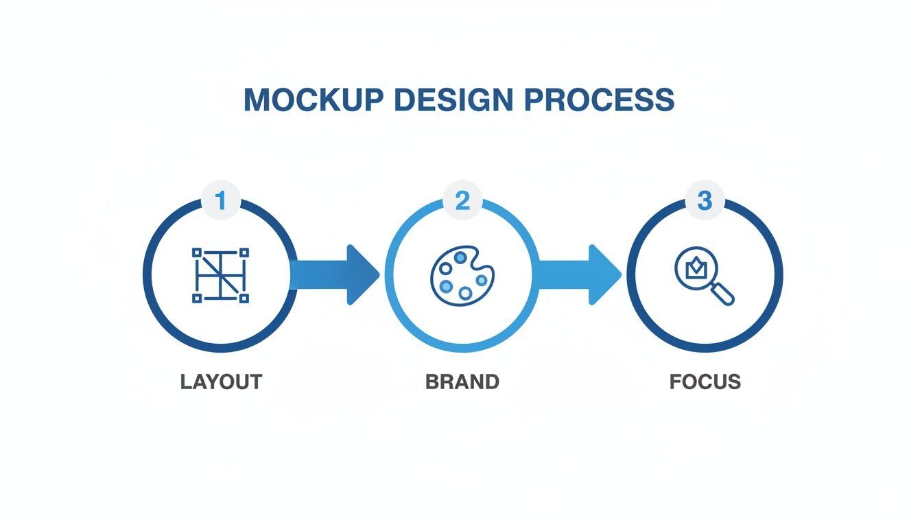
If you nail these three stages, Layout, Brand, and Focus, your core design will be strong enough to adapt to any market in the world.
Nail The Technical Requirements
Beyond just the text and design, both Apple and Google have a laundry list of technical rules for screenshot submissions. Get these wrong, and you are looking at frustrating rejections that can kill your launch momentum. It is critical to export your mockups at the exact sizes and formats for every device you are targeting.
Here are the non negotiables:
- File Format: Always use high quality PNG. JPEGs can create compression artifacts that will get your mockups bounced right back.
- Color Profile: Stick with the standard sRGB color space. This ensures your colors look consistent across all devices.
- Transparency: Make sure your final PNGs have no alpha channel or transparency. It is a surprisingly common reason for rejection.
For a deeper look into the nuances between regional language and design, check out our guide on how to localise or localize your app assets.
Why Following The Rules Is Everything
Let's be clear: ignoring these guidelines is not an option. Launch delays can be fatal in a crowded market. Apple, in particular, has become stricter than ever, especially with over 1.9 million apps and 38 billion annual downloads to manage. They are quick to reject mockups that feel like pure hype, enforcing a 'real UI' policy where only subtle annotations are allowed.
The rules demand high fidelity PNGs at native device sizes, and failing to comply will trap you in an endless review cycle. In fact, some experts estimate that as many as 40% of rejections stem from visual mismatches, costing developers precious weeks when speed is everything.
The real goal of localization is to make your app feel native and trustworthy to a global audience. Good tools automate the tedious parts, letting you focus on the cultural nuances that truly connect with users. Nailing the technical exports ensures you fly through the review process without a hitch.
Your App Store Mockup Questions, Answered
Even after you have got a solid plan, the little details of creating a great app store mockup can trip you up. Getting these things right is often what separates an app that gets scrolled past from one that gets an immediate download. Let's tackle some of the most common questions I hear from developers and marketers.
How Many Screenshots Should I Actually Upload?
Apple lets you upload up to 10 screenshots and Google Play allows 8, but do not fall into the trap of thinking more is always better. The real goal is quality over quantity.
You should aim for at least 5-7 killer screenshots that tell a compelling story about why your app is worth someone's time. The first 2-3 are, by far, the most critical, they are what people see instantly in search results. Make them count. Only use all the available slots if every single screenshot adds a new piece to the story and looks just as polished as the first one.
Should I Go With Vertical or Horizontal Mockups?
This is not a style choice; it is a user experience decision. Let your app guide you.
For the vast majority of apps, vertical (portrait) mockups are the way to go. It just makes sense, it is how people hold their phones when they are browsing the app stores. It feels natural.
But if you have built a game or a video app that is almost always used in landscape mode, then horizontal is your best bet. It gives people an honest preview of what they will actually see. When in doubt, lead with the format that matches your app's primary use case.
What Are The Biggest Mistakes People Make?
I see so many great apps get let down by simple, avoidable mistakes in their screenshots. It is frustrating because they are so easy to fix. Some of the most common blunders include:
- Busy, Cluttered Designs: Trying to cram way too much text or a dozen visual elements into one image. It just becomes an illegible mess.
- Ancient Device Frames: Nothing screams "this app is outdated" like showing it on a phone model from five years ago.
- Misleading UI: Showing features that do not exist or an interface that does not match the real app is a surefire way to get rejected by reviewers and disappoint users.
- No Clear Story: Just throwing up a random collection of screens without a narrative. It is confusing and does not sell the app's benefits.
And one of the biggest missed opportunities? Completely ignoring localization. If you do not adapt your screenshots for different languages and cultures, you are slamming the door on global growth.
Think of your screenshot gallery as a curated journey, not a random photo dump. Each image should build on the last, walking a potential user from "What's this?" to "I need this."
How Often Should I Refresh My App Store Mockups?
Your screenshots are not a "set it and forget it" asset. A good rule of thumb is to update them any time you push a major UI overhaul or roll out a game changing new feature. You want your store page to be an honest reflection of what is inside the app.
It is also smart to give your visuals a refresh for a big marketing campaign or even seasonally to keep things looking current. And honestly, if you are not A/B testing different designs, captions, or benefit callouts every few months, you are leaving downloads on the table. It is one of the best ways to keep optimizing your conversion rate.
Ready to create stunning, high converting visuals for your app in minutes? With professionally designed templates, an intuitive editor, and AI powered localization, ScreenshotWhale makes it simple to produce an app store mockup that drives downloads. Start creating for free today!