Google Play App Screenshot Size A Complete Guide
Master the latest Google Play app screenshot size requirements. Our guide covers dimensions, formats, and best practices to boost your app's conversion rate.
To get your Google Play app screenshot size right, you'll need to stay within a range: a minimum dimension of 320 pixels on any side and a maximum of 3840 pixels. On top of that, your screenshots must be either JPEG or 24-bit PNG files, and each one needs to come in under 8MB.
Quick Reference Guide to Screenshot Dimensions
Nailing your screenshot dimensions is the first step to a professional-looking Google Play Store listing that boosts app store growth. While Google gives you some wiggle room, knowing the core requirements is your best defense against submission rejections. It also ensures your visuals look crisp no matter what device a user is on. If you're looking for a good primer on the basics, there are some great guides on how to set visual content sizes.
Thankfully, Google Play’s rules for screenshot size have been pretty consistent. They've stuck with that 320-pixel minimum and 3,840-pixel maximum dimension for all devices, which allows their system to automatically scale images for different phone models. The platform supports both 9:16 portrait and 16:9 landscape aspect ratios. Just remember, your files must be JPEG or 24-bit PNGs (no transparency allowed), with that hard 8MB cap per image.
Key Screenshot Rules at a Glance
This quick summary covers the most critical technical limits for your Google Play screenshots.
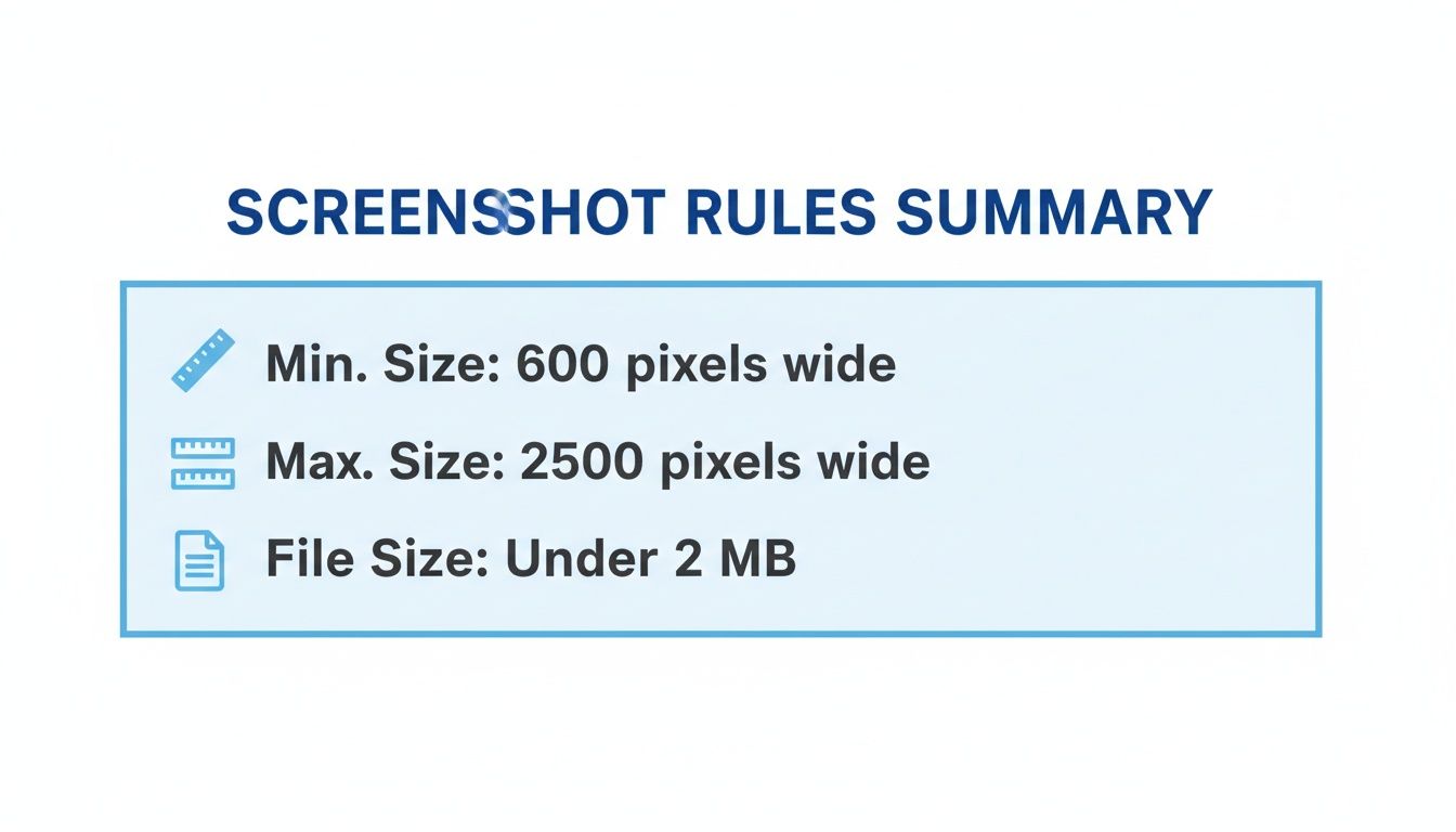
As you can see, the dimensional range is pretty generous, giving you plenty of flexibility. But that 8MB file size limit is the real catch, it means you absolutely have to optimize your images.
Specifications by Device Type
To make this even simpler, here’s a quick lookup table breaking down the screenshot requirements for each major Android device category.
Google Play Screenshot Specifications by Device Type
| Device Type | Minimum Dimensions (pixels) | Maximum Dimensions (pixels) | Required Aspect Ratio | Screenshot Count |
|---|---|---|---|---|
| Phone | 320 on shortest side | 3840 on longest side | 16:9 landscape or 9:16 portrait | 2 to 8 |
| 7-inch Tablet | 1080 x 600 | 7680 on longest side | 16:9 landscape or 9:16 portrait | 1 to 8 |
| 10-inch Tablet | 1080 x 600 | 7680 on longest side | 16:9 landscape or 9:16 portrait | 1 to 8 |
| Wear OS | 384 x 384 | 3840 on longest side | 1:1 | 1 to 8 |
| Android TV | 1920 x 1080 | 3840 on longest side | 16:9 landscape | 1 to 8 |
Following these guidelines ensures your app looks its best across the entire Android ecosystem. If you’re looking for more in-depth strategies that cover both Android and iOS, you might find our guide to https://screenshotwhale.com/blog/master-app-store-screenshot-sizes helpful.
Core Requirements for Phone Screenshots
Since most people on Google Play are using Android phones, getting your screenshots right for this audience is non-negotiable. It’s a direct line to driving growth and conversions. Google’s guidelines are intentionally flexible to make sure your app looks great on a dizzying array of devices, from budget phones to the latest flagships. Nailing these fundamentals is your first step toward creating visuals that actually convert.
The most critical rule is the size range. Your phone screenshots need a minimum side of 320 pixels and a maximum side of 3840 pixels. This huge range is what allows your listing to adapt across the entire Android ecosystem. For example, a standard 1080x1920 pixel screenshot fits comfortably within these limits and is a solid choice for most modern apps.
Choosing the Right Aspect Ratio
Beyond pure dimensions, you have to pick between two supported aspect ratios: 16:9 landscape or 9:16 portrait. This isn't just a technical box to check; it’s a strategic decision that shapes how potential users see your app.
- 9:16 Portrait: This is the default for most apps, think social, productivity, or utilities. It perfectly mirrors how people naturally hold their phones, giving them an honest preview of the day-to-day experience.
- 16:9 Landscape: This ratio is built for immersive apps like games, video players, or photo editors. It uses the full width of the screen to show off dynamic action and cinematic visuals.
The choice comes down to your app's core purpose. A fast-paced racing game would feel claustrophobic in portrait, while a simple to-do list app would look awkward and clunky in landscape. Always pick the orientation that tells your app's story best.
Technical File Specifications
Finally, let's talk about the technical nuts and bolts. These are the rules that ensure your screenshots load quickly and display properly. If you ignore them, you risk rejection from the Play Store or, just as bad, a sluggish page that turns users away.
You have to stick to two hard constraints:
- File Format: Your images must be either JPEG or 24-bit PNG. Here's the catch: Google Play does not allow alpha channels (transparency) in your PNG files.
- File Size: Each individual screenshot must be under 8MB. This limit is there for a reason, it forces you to find a good balance between image quality and file size, keeping your store page snappy for everyone, even those on a spotty connection.
Following these rules isn't optional for a successful launch. To see how these screenshots fit into the bigger picture, check out our full guide on how to publish an app on Google Play.
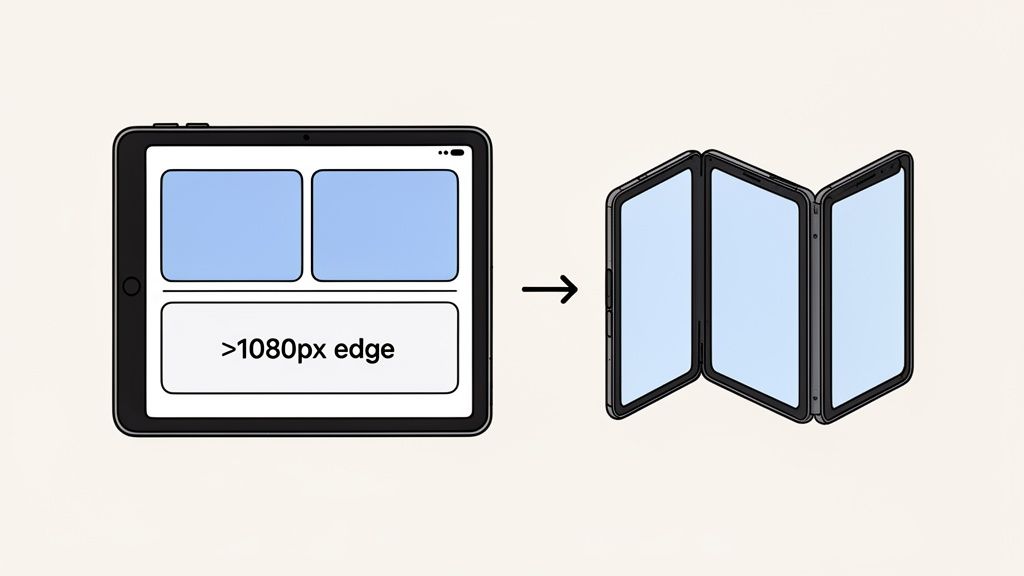
Optimizing for Tablets and Foldable Devices
Don't sleep on tablets and foldables. These larger screens are a premium opportunity to grab a user's attention, and if you treat them like an afterthought, you're leaving installs on the table. They offer so much more real estate, letting you showcase rich, complex features that would just feel cramped on a regular phone.
Failing to provide dedicated screenshots for these devices does more than just miss a chance to impress. It sends a clear signal to users that your app isn't fully optimized for their device. That's a quick way to lose their trust and their download.
The user experience on a tablet is fundamentally different, and your screenshots have to reflect that. In fact, Google is pretty clear on this: if your app supports tablets, you must provide screenshots for both 7-inch and 10-inch devices. This isn't just a friendly suggestion; it's a hard requirement to get your app properly featured for tablet users.
Tablet Screenshot Specifications
For tablets, Google has a different rulebook than for phones. The whole point is to prove your app makes great use of all that extra screen space.
- Minimum Dimension: The shortest side of your screenshot has to be at least 1080 pixels. This ensures your images look crisp and professional on modern, high-res tablet displays.
- Aspect Ratio: You have the same flexibility as with phones, both 16:9 landscape and 9:16 portrait ratios are fair game.
- Showcase Functionality: This is your chance to shine. Highlight multi-pane layouts, drag-and-drop features, or expanded toolbars. Show people exactly how your app delivers a better, more productive experience on their tablet.
For instance, a productivity app could feature a split-screen view with a document open on one side and research notes on the other. That kind of visual instantly communicates a powerful benefit that’s only possible on a larger screen.
Crafting Visuals for Foldable Devices
Foldables are a whole new and exciting challenge. For these premium devices, users expect apps to adapt gracefully as the screen unfolds, and your screenshots need to tell that visual story.
A great approach is to create a narrative sequence. The first screenshot shows the app in its compact, folded state. The next one or two can illustrate the beautiful transition as the device opens, culminating in the expanded layout on the full screen. This visual journey is a powerful conversion tool.
To pull this off, you'll want to create a series of screenshots that really highlights your app's responsive design.
- Folded State: Kick things off with a screenshot of the app on the smaller, exterior screen. This should present a clean, concise version of your core UI.
- Unfolding Motion: You can't show an actual animation, but you can imply motion. A great way to do this is with a professional device mockup that shows the device partially open, with your UI adapting across the hinge.
- Unfolded State: Finish with a stunning shot of your app using the entire inner display. This is where you show off an immersive, tablet-like experience with multi-column layouts or expanded content.
Using polished mockups with vibrant, on-brand backgrounds is absolutely critical here. It makes your visuals look professional and helps users picture your app on their own high-end device, which goes a long way in boosting their confidence to hit that install button. Your goal is to prove your app is a first-class citizen in this growing ecosystem.
Getting Your Screenshots Right for Wear OS and Android TV
Pushing your app beyond phones and tablets means you have to start thinking in new visual languages. Wearables and TVs aren't just smaller or bigger screens; they're entirely different contexts. What looks great on a phone feels awkward on a smartwatch and gets lost on a huge TV screen.
Getting this right is critical for app store growth, and Google Play's own rules have tightened up to reflect this. Take Wear OS, for example. You’re now required to submit at least one 384x384 pixel screenshot with a perfect 1:1 aspect ratio. That rule didn't even exist in the early days.
This shift makes sense when you consider that roughly 16% of smartphone users now own a smartwatch. It’s why nearly 70% of professional ASO teams have stopped relying on a single set of screenshots and now create specific variants for each device. You can dig into the full history of these requirements in Google's official documentation.
Designing for Wear OS
With Wear OS, you're designing for a tiny screen and interactions that last mere seconds. Your screenshots have to land a punch, fast.
- Stick to the Specs: The rules are clear: 384x384 pixels at a 1:1 aspect ratio. Don't deviate.
- Show One Thing Well: Forget showing every feature. Pick one core function, a watch face complication, a fitness stat, a quick reply, and make that screenshot all about it.
- Clarity Over Everything: Use big, bold fonts and high-contrast icons. The goal is instant comprehension. If someone has to squint, you've already lost.
Think of each Wear OS screenshot as a tiny, powerful billboard. It has to communicate your app's value on the wrist in a single glance.
Creating Screenshots for Android TV
Android TV flips the script entirely. The context shifts from a personal, handheld device to a shared, lean-back living room experience. The screen is massive, but the viewer is sitting on the couch, feet up.
Your Android TV screenshots aren't just for the person holding the remote; they're for everyone in the room. They need to be visually appealing and simple enough to grasp from ten feet away. This means big, bold visuals win out over dense text every single time.
The main requirement here is a 1920x1080 pixel screenshot with a 16:9 landscape aspect ratio. When you’re putting these together, keep a few things in mind:
- Aim for a Cinematic Vibe: High-quality background images and clean layouts make your app feel like a premium, native TV experience.
- Make Fonts Readable from the Couch: Small, detailed fonts are a non-starter. Your text needs to be legible from across the room, period.
- Frame It in a TV: Showing your app's UI within the context of a television screen instantly tells users your app is built for their big screen.
By tailoring your visuals for these platforms, you're not just ticking a box. You're showing a level of polish and commitment that builds trust and drives downloads across the entire Android ecosystem.
Designing Screenshots That Drive Installs
Getting the technical specs right for your Google Play screenshots is just the start. The real goal? Creating visuals that actually convince someone to tap "Install." A perfectly sized screenshot that doesn't show your app's value is a huge missed opportunity. Strategic design is what turns your store listing from a simple gallery into a conversion machine.
Think of it this way: your screenshots are often the first real taste a user gets of your app. They need to tell a compelling story, highlighting not just features, but the benefits of those features. This is pure App Store Optimization (ASO) at its core. Each image needs to work with the others to answer a user's biggest question: "How will this app make my life better?"
Weave a Cohesive Visual Story
Those first two or three screenshots are everything. They're often the only ones a user will see before making a snap judgment. So, don't just throw up random screens. Instead, create a logical flow that walks them through what makes your app great.
- Screenshot 1: The Hook. Lead with your single most powerful feature or benefit. This is your "wow" moment that has to grab their attention instantly.
- Screenshot 2: The "How". Now, show that feature in action. If you promised "Effortless Budgeting," this screen needs to show the clean, simple interface that makes it happen.
- Screenshot 3: The Payoff. End with the result. This could be a slick spending report, a completed goal, or a connection made with a new friend.
This narrative approach makes your app’s purpose crystal clear and memorable. It turns a passive glance into an engaging preview of the experience waiting for them.
Use Captions to Sell Benefits, Not Features
The text you overlay on your screenshots is prime marketing real estate, don't waste it. Avoid lazy labels like "Search Filter." Instead, write bold, benefit-focused captions that speak directly to a user's pain points.
A great caption translates a feature into a solution. "Customizable Dashboard" becomes "Your Day, At a Glance." See the difference? That small shift focuses on what the user gains, making the feature instantly more appealing. The best captions are short, punchy, and use high-contrast text that's readable in a split second.
The example below shows a few templates that nail this. They use clear, benefit-driven captions and vibrant colors to make an immediate impact.
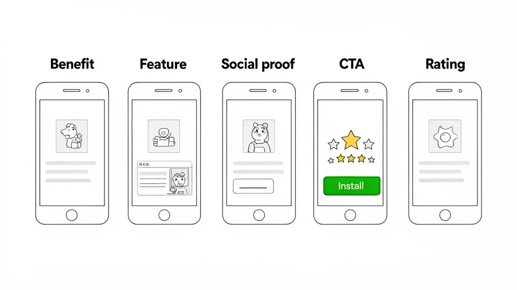
These designs do a great job of combining device mockups with compelling text to create visuals that convert.
Leverage Social Proof and Credibility
Building trust is critical to getting installs. You can bake social proof right into your screenshot designs to boost your credibility on the spot. It's a powerful trick used by top apps in every category. A user is always more likely to trust a nod from their peers or experts than from the publisher alone. Weaving social proof into your visuals taps into that psychology, cuts down on hesitation, and gets you more downloads.
Here are a few easy ways to do it:
- Showcase Awards: If your app was named "Editor's Choice" or won an industry award, stick that badge front and center on one of your first screenshots.
- Display High Ratings: A simple graphic showing a five-star rating with a caption like "Loved by 1 Million Users" is incredibly effective.
- Use Testimonials: Pull a short, powerful quote from a user review or a media shout-out. A finance app might quote a tech blog: "The easiest way to manage your money."
When you design screenshots that are not only compliant but also crafted to sell, your store listing becomes a high-performance marketing asset.
Automating Screenshots for Global Markets
Going global is one of the biggest levers you can pull for app store growth. But if you've ever tried it, you know the reality: manually creating screenshots for dozens of languages is an absolute nightmare. It’s a slow, expensive, and frustrating bottleneck that stops a lot of great apps from ever reaching their full international potential.
Honestly, this manual grunt work is where brand consistency goes to die and growth just stalls out.
To do this right, you need a smarter workflow. Prepping designs for localization is so much more than just translating text. You have to account for things like text expansion, where a tidy English phrase explodes into a long German sentence that breaks your layout. Then there are right-to-left scripts like Arabic or Hebrew, which can throw your entire design into chaos if you're not prepared.
The Power of Automated Localization
This is exactly where automation becomes your secret weapon. Imagine uploading a single set of English captions and, moments later, getting back perfectly localized screenshot sets for every language you support. A good screenshot editor with built-in AI translation makes this possible, ensuring your app’s first impression is flawless in every single market.
This approach immediately solves the biggest headaches:
- Speed: A task that used to eat up days of tedious design work can now be done in minutes. Seriously.
- Consistency: Your brand’s look and feel stays perfectly uniform across all languages and regions. No more weird, off-brand variations.
- Accuracy: The right tools can handle tricky scripts and text lengths automatically, preventing those awkward, broken layouts.
For developers who are serious about scaling internationally, looking into the best screenshot API services can be a game-changer. These tools are built to handle high-volume production. And if you want to go deeper, our complete guide on mobile app localization covers more strategies to nail this.
Creating an Efficient Workflow
Once you build an automated workflow, you can launch in new markets faster and with way more confidence. Localization stops being a painful last-minute task and becomes an integrated part of your design process. This is how you set your app up for maximum reach, whether you're on the Google Play Store or Apple's App Store.
An efficient localization pipeline isn’t a luxury for big publishers anymore, it’s an essential tool for any developer aiming for global success. It turns a complex, time-sucking job into a streamlined operation that directly fuels user acquisition worldwide.
By embracing automation, you get to focus on what you're best at, building a great app, while your localization engine hums along in the background. It's the key to unlocking real growth on a global scale.
A Few Common Questions About Screenshot Sizes
Getting the hang of Google Play’s screenshot rules can be a bit tricky. Most of the confusion usually pops up in a few key areas, so let’s clear those up with some quick, straight-to-the-point answers. Think of this as your cheat sheet to avoid those last-minute submission headaches.
Can I Just Use My Phone Screenshots for Tablets?
Nope, and this is a classic mistake that gets apps rejected from tablet listings all the time. Google is firm on this: you need to upload separate, dedicated screenshots for 7-inch and 10-inch tablets.
These images have to show that your app actually provides a real tablet experience, not just a stretched-out phone app. Simply resizing your phone screenshots won’t cut it. You need to show off features like multi-pane layouts or expanded menus. As a hard rule, the shortest side of any tablet screenshot must be at least 1080 pixels.
What Happens if My Screenshots Are the Wrong Size?
The Google Play Console will reject the file on the spot. If you try to upload an image that’s smaller than the 320-pixel minimum or larger than the 3840-pixel maximum, you'll get an error message. It's a hard stop, you won't be able to move forward with your submission until you fix it.
There are no exceptions here, so it's always a good idea to double-check your export settings in your design tool before you start uploading. It’ll save you a lot of frustration.
Do I Really Need to Bother with Wear OS Screenshots?
You absolutely do, assuming your app supports Wear OS. In that case, providing at least one screenshot is mandatory. The spec is a 384x384 pixel image with a perfect 1:1 aspect ratio.
This isn't the place for fancy marketing. The screenshot has to show your actual in-app UI, with no device frames or promotional text. If you skip this, your app will be invisible to anyone browsing the Play Store on their smartwatch, which is a pretty good way to miss out on a whole audience.
The big takeaway here is that every device type, phone, tablet, Wear OS, and Android TV, has its own set of visual rules. This isn't just about ticking a compliance box. It’s about signaling quality to users, building trust, and ultimately, driving more downloads.
Is It Okay to Put Marketing Text on My Screenshots?
Yes, and you definitely should! Adding text overlays to call out key features and benefits is a proven way to boost conversions. That said, Google's policy is clear: the screenshots must primarily show the actual in-app experience.
So, avoid burying your UI under a wall of marketing buzzwords. A short, punchy caption at the top of the screenshot that explains the value on screen is the way to go. This approach creates high-converting visuals that work well for both the Google Play and iOS app stores.
Ready to create stunning, high-converting screenshots that meet every Google Play requirement? ScreenshotWhale gives you professionally designed templates and an intuitive editor to build your entire screenshot set in minutes. Plus, our AI-powered localization can get you ready for global markets effortlessly. Try ScreenshotWhale today!