High-Conversion Google Play App Screenshots That Drive Installs
Transform your Google Play app screenshots from simple images to powerful conversion drivers. Learn design, ASO, and copywriting strategies to boost downloads.
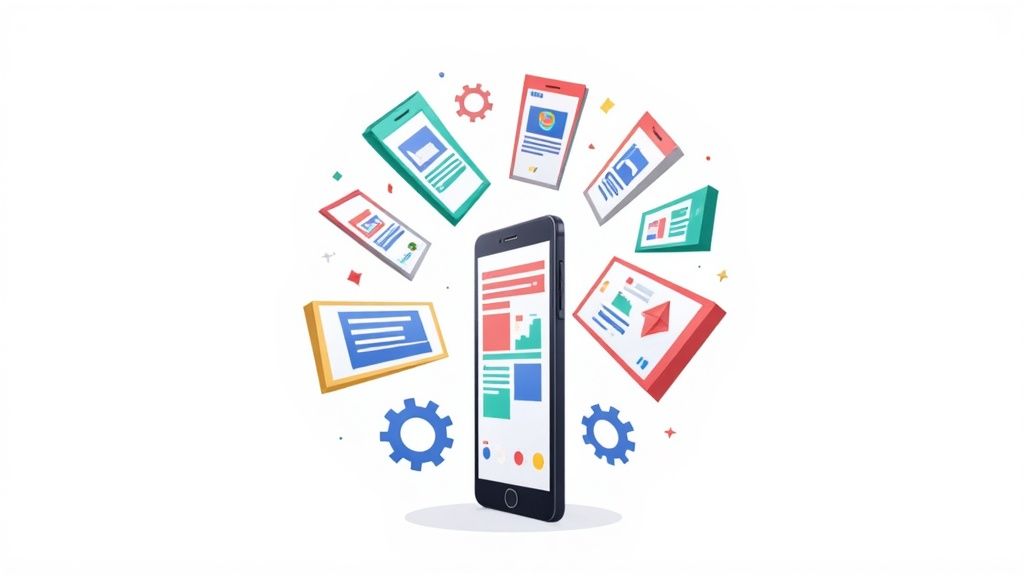
On Google Play, your app screenshots are not just a gallery of features; they are your storefront window. They are often the only thing a user looks at before deciding to tap ‘Install’ or just keep scrolling.
Get them right, and you have a new user. Get them wrong, and you have just handed a customer to your competition.
Your First Impression is a Visual One
Think about it like the cover of a book. Long before someone reads the description, checks out the reviews, or even notices your app icon, their eyes dart to the screenshots. In that split second, they make a judgment call.
This is not just about showing off what your app does. It is about crafting a visual story that screams "this will make your life easier" or "this is the fun you have been looking for." Nailing this is the heart of App Store Optimization (ASO), and it can make a massive difference to your app store growth.
We are going to go way beyond the basic technical specs. This is your blueprint for creating efficient and high-converting app store screenshots for both Android and iOS that stop the scroll and turn casual browsers into loyal users.
The 7-Second Pitch
The Google Play Store is crowded. Insanely crowded. With over 2 million apps fighting for attention, you do not have time for a long sales pitch.
In fact, you barely have any time at all. A staggering 90% of users never even scroll past the first three screenshots. That gives you about 7 seconds to make your case before they swipe on.
But here is the good news: getting this right can boost your conversion rates by 20-35%. You can find more deep dives into app store visuals over at asomobile.net.
The trick is to make every pixel earn its place. Each screenshot needs to answer the user's silent question: "What is in it for me?"
Take a look at how Google Tasks does it. No fluff, just pure value.
They nail it. A clean device mockup, a bold headline ("Get more done"), and a simple UI shot. You instantly get what the app is about: productivity.
Why Screenshots Are Your Growth Engine
Great screenshots do more than just look pretty. They are a core driver of user acquisition and a key to boosting app store growth.
- Skyrocket Conversion Rates: When your screenshots clearly show the benefits, you are directly answering a user's needs. This makes the decision to install almost a reflex, pushing your page-to-install conversion rate way up.
- Supercharge Your Ads: Running paid campaigns? Your store listing is the finish line. Compelling screenshots mean a lower cost per install (CPI) because the users who click your ad are far more likely to convert once they see a killer visual pitch.
- Set the Right Expectations: Clear visuals show people exactly what they are getting. This leads to happier users who stick around longer because the app experience matches the promise you made. Fewer mismatched expectations, fewer uninstalls.
Before you can get creative, you have to nail the fundamentals. Think of Google Play’s technical requirements as the unskippable first step. Get them right, and your visuals get approved fast and look crisp on every Android device out there. Get them wrong, and you are looking at frustrating rejections or, even worse, stretched and blurry images that scream "amateur."
A one-size-fits-all approach just does not cut it here. A screenshot perfectly framed for a phone will look disastrous on a 10-inch tablet. You have to create dedicated assets for each device category you support.
Why does this matter so much? Because your screenshots are one of the most powerful drivers of both impressions and conversions on your store listing.
It’s a simple but crucial relationship: great screenshots grab attention in search results (impressions) and convince people to hit that install button (conversions).
The Core Technical Rules
On the surface, Google Play’s rules are pretty simple. You just need to follow a few core guidelines for your image files.
- File Format: Stick to JPEG or 24-bit PNG. Critically, transparency (alpha channels) is a no-go.
- File Size: Each individual screenshot has a hard limit of 8MB. Make sure your images are optimized before you try to upload.
- Quantity: You can upload between 2 and 8 screenshots for each device type your app runs on.
These rules apply across the board, but the real nuance comes into play with device-specific dimensions and aspect ratios. If you're curious how these compare to Apple's rules, check out our complete guide to App Store vs. Google Play screenshot requirements.
Device-Specific Dimensions You Can't Ignore
The Android ecosystem is incredibly diverse, from tiny watch faces to massive TVs. Each one needs its own set of visuals to ensure your app looks polished and professional, no matter where a user discovers it.
Let's break down the specs for the most common devices you'll be designing for.
Key Takeaway: You absolutely must provide dedicated screenshots for each device type you support. If your app is available on tablets, you need to upload tablet-specific screenshots. Skipping this step can make your app invisible to users on those devices.
Here’s a quick reference table to keep the essential requirements straight.
Google Play Screenshot Specifications by Device
| Device Type | Minimum Screenshots | Maximum Screenshots | Required Dimensions (Pixels) | Common Aspect Ratios |
|---|---|---|---|---|
| Phones | 2 | 8 | Min edge: 320, Max edge: 3840 | 9:16 (Portrait) or 16:9 (Landscape) |
| 7-inch Tablets | 2 | 8 | Min edge: 320, Max edge: 3840 | 16:10 or similar |
| 10-inch Tablets | 2 | 8 | Min edge: 320, Max edge: 3840 | 4:3 or similar |
| Wear OS | 1 | 8 | Min 384 x 384 | 1:1 (Square) |
| Android TV | 1 | 8 | Min 1280 x 720 | 16:9 (Landscape) |
For phones and tablets, your screenshot's short edge must be at least 320px, and the long edge can’t be more than 3,840px. For Wear OS, you're looking at a minimum of 384px by 384px. And for Android TV, you’ll need at least one TV screenshot and a separate TV banner just to be listed.
Meeting these exact specs is the foundation. Once you have this down, you can start focusing on the creative elements that will actually drive installs.
Alright, you've got the technical specs down. Now for the fun part. This is where you stop just following the rules and start creating a visual pitch that grabs users by the collar and tells them, "This is the app you've been looking for."
Your google play app screenshots are not just a simple gallery; they are your single best sales tool on the entire store listing.
Good design is all about telling a story in a few quick swipes. It’s about making your app's core promise so clear and compelling that downloading it feels like the only logical next step. Let's dig into the design principles that consistently turn casual browsers into loyal users.
Tell a Cohesive Visual Story
Think of your first three to five screenshots as a storyboard, not a random collection of features. You need to take the user on a quick journey from the problem they have to the solution you provide. The most successful apps nail this narrative flow.
- Hook them with the Core Value: Your very first screenshot has one job: to answer, "What is in it for me?" Lead with your strongest benefit or what makes you unique. Make it punchy.
- Showcase Key Features: Use the next few images to back up that big promise. Each screenshot should spotlight a critical feature that delivers on your core value.
- Seal the Deal with Social Proof: Your last featured screenshot can be a great place for a testimonial, a high rating, or a clear call to action that nudges them to install.
This story-driven approach helps people instantly get what your app is about and builds the confidence they need to hit that green button.
Leverage Powerful Design Techniques
The best google play app screenshots almost always use a few tried-and-true design patterns. They are not just for show; these techniques add a layer of polish and clarity that makes your app feel trustworthy and look professional.
- Device Mockups: Putting your UI inside a sleek device frame (like a Google Pixel or Samsung Galaxy) makes your app feel tangible, like it is already on their phone. It creates an immediate, personal connection.
- Vibrant Backgrounds and Branding: Do not be shy with color. Use neat, appealing imagery with vibrant colors to make your screenshots leap off the page. It reinforces your brand and makes your listing memorable in a sea of competitors.
- Panoramic Layouts: This is a killer technique. Creating a seamless panoramic image that flows across multiple screenshots is a clever way to get users swiping through your entire gallery. It makes sure they see your whole story.
A study on user behavior revealed that users form an opinion about an app in less than a second, and visually appealing screenshots can increase conversion rates by up to 35%. Your design choices are directly tied to your app store growth.
Create a Strong Visual Hierarchy
Visual hierarchy is just a fancy way of saying you need to guide the user's eye to the most important stuff first. If your message is not instantly clear, you have lost them.
For a deeper dive into how visuals fit into your overall growth strategy, exploring content marketing best practices can offer some valuable big-picture thinking.
Here’s how to build a hierarchy that works:
- Bold Headlines: Use a big, clean font for your main caption. This is the first thing people read, so it has to scream the main benefit of that screen.
- Subheadings and Body Text: Smaller fonts are for the supporting details. They add context but do not fight the headline for attention.
- Contrast is Key: Make sure your text is easy to read. White text on a dark background or black text on a light one is a classic for a reason because it just works.
By weaving together a strong narrative, proven design patterns, and a clear visual hierarchy, you can transform your google play app screenshots from mere images into a high-performance conversion machine. For more creative sparks, check out our guide on Play Store app images for more examples and fresh ideas.
Writing Screenshot Copy That Sells
Let's be honest: your visuals might grab a user's attention, but it is the copy that closes the deal. The words you put on your screenshots are your elevator pitch, turning a quick glance into a decisive tap on the "Install" button.
Think about the difference between "Task Management" and "Organize Your Life Effortlessly." One is a dry category label; the other is a solution to a real problem. This is benefit-driven copy in a nutshell. It’s about showing, not just telling, and you have about 7 seconds to make it stick.
This is where tools like ScreenshotWhale really shine. Instead of bugging a designer for endless revisions, you can jump into their editor, tweak the text layers yourself, and test out different headlines in minutes. No Photoshop, no code, just fast iteration.
Craft Benefit-Driven Headlines
A great headline does not just describe a feature; it speaks directly to a user's pain point and offers a clear, immediate solution. It’s like reaching out and saying, "I know what you are struggling with, and this is how I can help."
The trick is to start with a strong verb that promises value. Use an active voice that paints a picture of a better outcome. Think "Plan Your Next Adventure" for a travel app, or "Track Your Health in Minutes" for a fitness tool. That kind of language connects instantly.
To nail your headlines, focus on these key ingredients:
- Action Verb First: Kick things off with words like "Discover," "Plan," "Master," or "Create."
- Concrete Outcome: Be specific. What will the user actually do? Think "scan receipts" or "find cheap flights."
- Brevity is Key: Aim for five words or less. It needs to be understood in a single, quick scan.
But even the most brilliant copy will fall flat if nobody can read it. That brings us to layout.
Optimize Text Placement and Readability
Where you put your text is just as important as what it says. You are designing for a tiny screen, often viewed in a hurry, so legibility is non-negotiable.
First, choose a clean, readable sans-serif font like Roboto or Open Sans. They are built for screens and stay crisp at small sizes. When you are in a site editor like ScreenshotWhale, play with the font size and color until your text pops against the background. Do not just trust the preview; export a draft and look at it on your own phone.
An ASO expert once told me, "Clear text placement in the first three screenshots can boost conversion by 25%." It’s that critical.
Use the editor’s built-in guides to get it right every time:
- Align to the Top: Place your main headline in the top third of the screenshot. That’s where the eye naturally goes first.
- Give it Breathing Room: Keep at least 10% padding around your text. You do not want it getting clipped on different device sizes.
- Check Your Contrast: Aim for a contrast ratio of at least 4.5:1 between your text and its background. This is a must for accessibility and just plain good design.
Finally, do not forget to tell people what to do next. A powerful call to action (CTA) is your final nudge toward an install.
A good CTA should:
- Use clear, direct language like "Start Tracking Today."
- Tie back to the benefit, like "Claim Your Free Trial."
- Be tested! Use A/B experiments to see which version performs best.
Use Color Contrast to Highlight Copy
Your screenshots are competing in a crowded, visually noisy search results page. A vibrant background is your first weapon to stand out, but you can also use color to make your copy impossible to ignore.
A simple but effective trick is to place a semi-transparent color block behind your text. This little bit of separation can dramatically improve legibility, especially on a busy background. In an editor, you can often add this as a separate shape layer behind your text layer.
A couple of color tips to keep in mind:
- Stick to your brand palette. Choose complementary shades that feel harmonious and reinforce your brand identity.
- When in doubt, go for high contrast. White text on a bold color like #00a6f4 is a classic for a reason; it is accessible and easy to read.
These small color tweaks are not just for looks; they guide the user's eye straight to your headline and your call to action, making your screenshots work that much harder for you.
Unlocking Global Growth With Testing And Localization
If you want to scale your app, your store listing has to speak to everyone, everywhere. Your google play app screenshots are a huge part of this global handshake. Just translating your English captions will not cut it; you need a strategy that mixes deep cultural understanding with relentless, data-driven testing.
This is where localization and A/B testing become your two most powerful tools for boosting app store growth. Localization makes sure your message clicks culturally, and testing proves what actually works.
Beyond Translation: Localizing Your Screenshots
Localization is the art of adapting your app’s visual story to fit a specific market's cultural context. It’s way more than just changing "Get Organized" to "Organisez-vous." Real localization means rethinking your entire visual pitch from the ground up.
Think about something as simple as colors. In the West, red might signal a warning or excitement. In China, it’s all about luck and happiness. Or consider features; your main selling point in the United States might be an afterthought for users in Japan, who could be looking for a completely different benefit.
A key insight from global ASO experts is that localized screenshots can increase conversion rates in target markets by 25-40%. It’s simple: people are far more likely to download an app that looks and feels like it was made just for them.
To do this right, you need to adapt:
- Visuals and Imagery: Use device mockups that are actually popular in that region. If you show people in your app, make sure they reflect local diversity.
- Cultural References: Slang, idioms, and pop culture references almost never land well. Ditch them for concepts that make sense to the local audience.
- Feature Emphasis: Do your homework. Find out which of your app's features solve the most pressing problems for users in that market, and lead with those benefits in your screenshots.
A/B Testing Your Way to Higher Conversions
So you’ve created a slick set of localized screenshots. How do you know they are actually any good? You test them. Google Play's own Store Listing Experiments feature is a free, powerful tool for making decisions with data instead of just gut feelings.
It all starts with a clear hypothesis. For example: "I believe that using panoramic screenshots with benefit-driven headlines will increase installs by 15% more than our current feature-focused screenshots."
From there, you create different versions (or "variants") of your screenshots to test against your current ones (the "control"). This is A/B testing in a nutshell: pitting different creative ideas against each other to see what real users respond to. For a full rundown of what's out there, check out this guide on the best app store optimization tools, which covers both native and third-party options.
Here's what the experiment setup looks like inside the Google Play Console.
The interface lets you build out your variants, define your audience, and set how long the experiment runs. It gives you full control. This data-first approach takes all the guesswork out of the equation and gives you hard proof of what drives downloads.
Analyzing Results for Continuous Improvement
Running a test is only half the battle. Knowing how to read the results is what turns that data into actual growth. Google Play will show you which variant performed best based on installers or, even better, retained installers.
You’ll want to let your experiments run for at least seven days to smooth out any weekly bumps in user behavior. The goal is to get enough data to reach statistical significance, which is just a fancy way of saying you can be confident the results are not a fluke.
Once a winner is declared, push the changes live to your store listing. But do not stop there. The world of ASO is always moving. Your next test should build on what you just learned, creating a cycle of continuous improvement. Test new value propositions, different color schemes, or totally different layouts. Every successful experiment is another step toward maximizing your app's global potential.
Building An Efficient Screenshot Production System
If you've ever found yourself manually creating localized google play app screenshots for every device, you know the pain. It’s a complete nightmare. As your app grows, trying to manage all the different screen sizes, languages, and A/B tests becomes a massive bottleneck.
The secret to getting out of this rut is to stop thinking in one-offs and start building a real system. A scalable production workflow built on templates and automation is what turns this dreaded, time-sucking task into a smooth, predictable part of your update cycle.
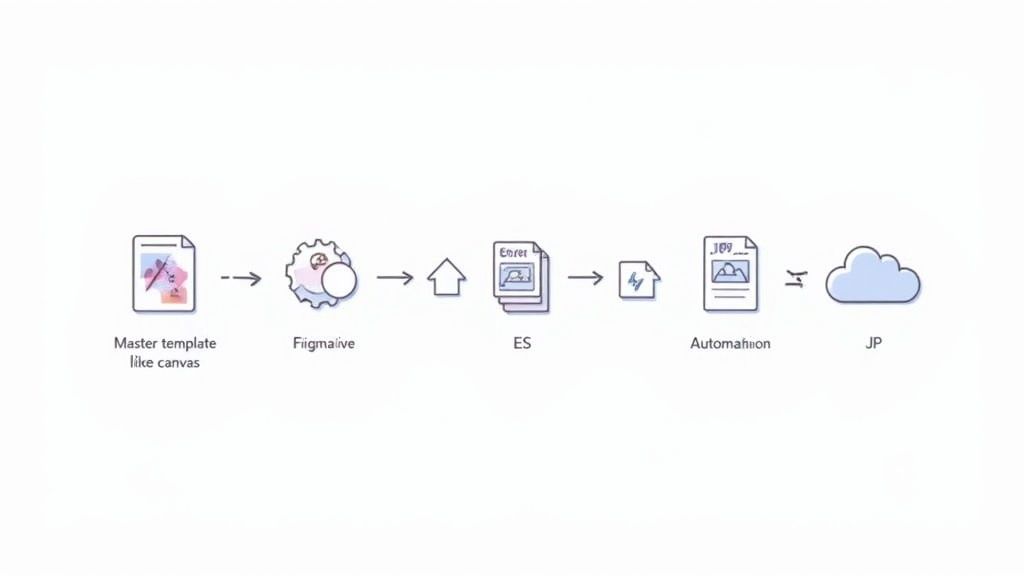
Create A Master Template In Figma Or Sketch
Your entire workflow hinges on one thing: a solid master template. This is your ground zero. By setting one up in a tool like Figma or Sketch, you create a single, flexible source of truth that contains every core element: device mockups, backgrounds, text layers, and brand assets. This is an absolute game-changer for staying consistent and moving fast.
Think of it as a blueprint for your screenshots. Need to update a feature or tweak a headline? You only have to change it once in the master template. From there, those edits can ripple out across every single device format, from a Google Pixel to a 10-inch tablet.
This template-first mindset is the key to making sure every screenshot has that consistent look and feel that reinforces your brand across the entire store listing.
Automate The Generation Of Localized Variants
With your master template ready, it is time to bring in the machines. Manually cranking out dozens of localized screenshot sets is not just mind-numbingly boring, it is also a recipe for mistakes. This is where specialized tools step in and save you a ton of time and sanity.
Platforms like ScreenshotWhale were built for exactly this job. You can hook up your master template and let the tool do the heavy lifting:
- Instantly generate screenshots for all the required Google Play sizes.
- Automatically translate your copy into hundreds of languages.
- Rapidly create A/B test variants by swapping out headlines or changing backgrounds.
We are talking about taking a process that used to take days and crushing it down to just a few minutes. This frees up your designers and marketers to actually think about strategy instead of being stuck in repetitive production work.
To take things even further, you can look into the best AI content creation tools out there. Many of them include solutions for image generation and editing that can make your entire production process even more efficient.
Streamline Your Asset Management And Upload Process
The final piece of the puzzle is organization. A messy folder full of badly named files can bring your whole workflow to a screeching halt, especially when you're juggling multiple languages and device types. A clear asset management strategy is not just nice to have; it is essential.
Start with a dead-simple, consistent file naming convention. A logical structure might be something like: [AppName]_[Device]_[Language]_[ScreenshotNumber].png. For example: MyApp_Phone_ES_01.png.
It’s a simple habit, but it makes finding, updating, and uploading the right files to the Google Play Console ridiculously easy. When you combine a master template, automation tools, and a disciplined file system, you create a production engine that can scale right alongside your app’s growth, keeping your store listing polished and professional.
Got Questions About App Screenshots?
Diving into app store optimization always brings up a few questions. I've been there. Here are some quick, no-nonsense answers to the most common things I see developers asking about Google Play screenshots.
Do I Really Need Different Screenshots for Phones and Tablets?
Yes, you absolutely do. Google is pretty clear on this: you need to upload dedicated screenshots that show your app running on a tablet. If you do not, your app will effectively be invisible to anyone browsing the Play Store on a tablet.
Think about it from a user's perspective. Seeing a stretched-out phone screenshot on a 10-inch screen just looks broken and lazy. It screams "bad user experience," which is exactly the kind of thing Google tries to avoid showing people.
Can I Put Device Frames Around My Screenshots?
While Google's official docs can sometimes sound like they are against anything that is not a raw UI capture, using clean, modern device frames is a standard and highly effective practice. The trick is to make sure the frame enhances the screenshot, not just clutters it.
A good rule of thumb is to use mockups of popular devices like a Google Pixel or Samsung Galaxy. It makes your app feel more real, helping users picture it on their own phone. This simple touch can genuinely bump up your conversion rates.
Just do not go overboard. Avoid overly flashy frames or anything that could be misleading. The star of the show should always be your app's actual interface.
How Often Should I Update My Screenshots?
You should definitely update your Google Play app screenshots anytime you roll out a major UI redesign or launch a big new feature. Your store listing has to be an honest preview of what users will get. Nothing kills trust faster than downloading an app that looks nothing like its screenshots.
Beyond major updates, it’s a good habit to give your visuals a refresh every six to twelve months anyway. It keeps your page from looking stale and gives you a chance to A/B test new messaging or designs. You'd be surprised what a small tweak can do for your conversion rate.
What’s the Single Biggest Mistake People Make?
Hands down, the most common mistake is creating screenshots that just list features instead of showing benefits. So many developers just take a capture of a screen and label it "Task Management." That tells a user what it is, but gives them zero reason to care.
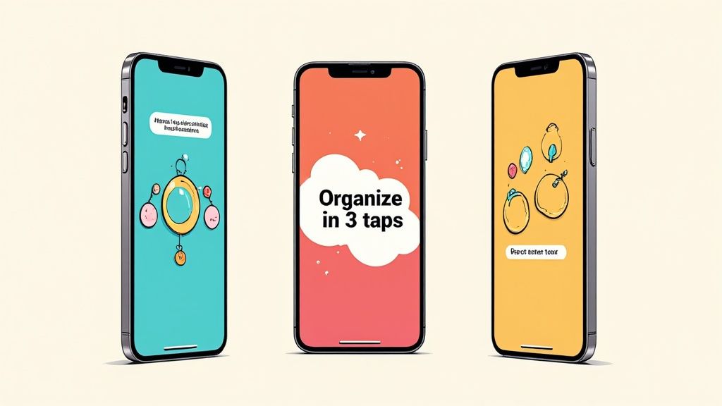
You have to shift your thinking. Instead of "Task Management," try a headline like "Organize Your Life Effortlessly." See the difference? That small change, from describing a button to selling an outcome, is what separates a screenshot that gets scrolled past from one that gets the install.
Ready to create stunning, high-converting visuals without the hassle? ScreenshotWhale combines professional templates with a simple editor, letting you produce beautiful, localized app store screenshots in minutes. Stop wasting time and start driving installs. Create your screenshots today at ScreenshotWhale.