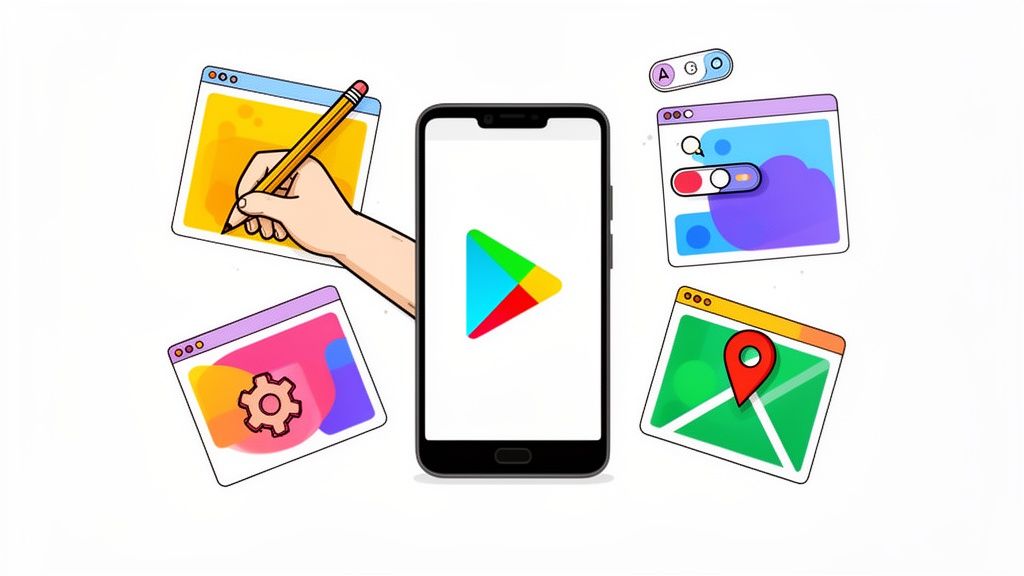
A Guide to Google Play Store Screenshot Design That Converts
Learn how to design a high-converting Google Play Store screenshot that drives downloads. Our guide covers specs, design best practices, and A/B testing.
In the crowded aisles of the Google Play Store, your screenshots are not just pictures. They’re your app’s visual elevator pitch.
Think of them as a powerful sales tool. Your Google Play Store screenshot gallery is often the first and only real chance you get to show people what your app is all about. A sharp, compelling set of visuals can instantly get the point across, build trust, and nudge a curious browser to tap "Install."
Why Screenshots Are Your Most Powerful Conversion Tool
Your app’s product page is prime digital real estate. Every single element has a job to do. While your icon and title might catch someone's eye, it’s the screenshots that really seal the deal.
People make snap judgments. We're talking seconds. In that tiny window, they decide if an app is even worth their time. High quality, informative screenshots act as a quick, easy to digest preview of what they’ll actually get.
They cut through the noise and answer a user's most immediate questions:
- What does this app actually do?
- Is the interface clean and simple, or a confusing mess?
- Does it have that one feature I’m looking for?
- Will this thing solve my problem or keep me entertained?
A weak or generic set of visuals plants a seed of doubt. It's an instant turn off, causing potential users to bounce from your page without a second thought. On the flip side, a polished, strategic presentation builds immediate credibility and gets people excited. It makes the decision to install feel obvious and right. This kind of visual storytelling is fundamental if you want to boost app store growth.
The Decisive First Impression
The first few screenshots carry almost all the weight. They have to hook the user right away with a clear and compelling value proposition. This is not just about showing off a feature; it's about framing that feature as a tangible benefit.
For example, instead of a caption that just says "Calendar View," try something like "Plan Your Week in Seconds." That benefit driven language, paired with a clean visual, makes the value proposition hit home instantly.
This first impression has a real, measurable impact. I've seen it time and time again. Well optimized screenshots can boost app page conversion rates by an impressive 20 to 35%, which directly translates to more downloads. With hundreds of thousands of new apps flooding the stores every month, making your visuals count is non negotiable. You can find more insights on how a solid app store screenshot strategy impacts user acquisition.
"Your screenshots are not a gallery; they are a narrative. Each image should build on the last, telling a story that guides the user from curiosity to conversion. The goal is to make the download feel like the obvious next step."
Driving Conversions and Visibility
At the end of the day, great screenshots do more than just look pretty. They’re a core piece of your App Store Optimization (ASO) puzzle.
Google’s algorithm pays close attention to user engagement signals, including conversion rates. When it's deciding how to rank apps in search results, a page that successfully converts visitors into users is seen as more relevant and valuable.
By improving your conversion rate with better screenshots, you kick off a positive feedback loop. Higher conversions can lead to better visibility in search and browse, which in turn drives more organic traffic to your page. This makes your Google Play Store screenshot gallery one of the highest leverage assets you have for building sustainable, long term growth.
Getting the Technical Specs Right on Google Play
Before you even think about the creative side of things, you've got to nail Google Play’s technical rules. These are not just arbitrary hoops to jump through; they exist to make sure your app's page looks sharp and professional across the thousands of different Android devices out there.
Trust me, trying to skirt these rules is a fast track to getting your submission rejected. That means launch delays and a lot of wasted time. Getting it right from the start ensures your visuals get approved smoothly and look fantastic to every potential user, no matter what phone or tablet they’re using.
Mastering Dimensions and Aspect Ratios
Google expects you to think beyond a single phone screen. To get your app in front of the most people, you need to provide screenshots for phones, 7 inch tablets, and 10 inch tablets. This is not just about ticking a box. It's about creating a tailored, professional storefront for every type of user.
You can upload up to 8 screenshots for each device type, and that even includes specialized formats for Wear OS and Android TV. The required dimensions cover everything from older phones to massive high res screens, so precision is key.
Here are the core requirements you need to burn into your memory:
- File Format: Stick to JPEG or 24-bit PNG (no alpha channel or transparency). I usually lean towards PNG because the lossless quality keeps text and UI elements looking crisp.
- Aspect Ratio: It's 16:9 for landscape and 9:16 for portrait. Do not mess with these, or your images will get stretched, cropped, or just look plain weird in the store.
- Dimension Range: The smallest side of your image must be at least 320px, and the largest side can be no more than 3840px. This range covers the huge variety of Android screens, from tiny budget phones to 4K displays.
This is all about making that first impression count.
As you can see, those first few screenshots are everything. You have just a handful of seconds to grab someone's attention and convince them to download.
Avoiding Common Rejection Traps
Getting your screenshots approved on the first try saves so much headache. Over the years, I've seen developers make the same preventable mistakes that get their app flagged by the Google Play review team.
One of the biggest culprits? Transparent backgrounds. Google is very clear: your PNGs must be 24-bit without an alpha channel. Another classic mistake is submitting images with the wrong dimensions or aspect ratios, which is an easy way to get an automatic rejection.
A pro tip: pay close attention to what’s in your screenshots. Google’s policies forbid misleading visuals. Do not show features that do not exist, and make sure there are no notification bar icons from other apps. Keep your visuals clean, focused, and honest.
Finally, make sure any text you add to your screenshots is easy to read, even on small phone screens. If people have to squint to read your captions, you’ve already lost them.
For a full rundown of the technical rules for both major platforms, you might find our guide on app store screenshot requirements helpful. Knowing the rules inside and out is the first step to building a store page that not only gets approved but actually converts visitors into users.
Designing Screenshots That Drive Downloads
Once you’ve got the technical rules sorted, the real work begins. Designing a powerful google play store screenshot gallery is not about just ticking boxes. It's a creative strategy. You’re telling a visual story that has to grab a user's attention and not let go.
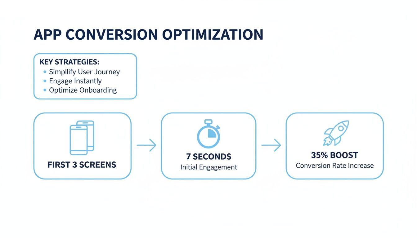
Think of your screenshots as a narrative. Each image should build on the last, guiding someone from casual curiosity to a confident tap of the "Install" button. Your first three images are the hook, and they have to scream your app's core value instantly.
Crafting a Compelling Visual Narrative
Your first screenshot is the opening line of your story. It needs to be bold, clear, and laser focused on the single most important benefit your app delivers. Skip the login screen or a boring menu. Jump straight into the action.
From there, each screenshot should expand on that promise. If your first image promises “Effortless Meal Planning,” the next should show how easy it is to add recipes, and the third might highlight a smart grocery list feature. This progression creates a logical flow, making your app feel intuitive before they’ve even downloaded it.
A great visual narrative accomplishes a few key things:
- Answers Questions Quickly: It shows what the app is, who it's for, and why it’s better than the competition.
- Builds Excitement: It showcases those "aha!" moments and makes people eager to experience them firsthand.
- Reduces Uncertainty: A clear preview removes the guesswork, making the download feel like a safe, smart choice.
Using Captions to Highlight Benefits
Your captions are just as important as the visuals themselves. This is a critical distinction that can make or break your conversion rates. Weak captions describe a feature; powerful captions sell a benefit.
Instead of a flat "Task List," a much stronger caption is "Organize Your Life in Minutes." See the difference? That small tweak shifts the focus from a simple function to a valuable outcome the user actually wants. You’re connecting your app’s functionality to a real world solution.
Here’s a simple framework I use for writing benefit driven captions:
- Start with an action verb: Words like "Create," "Track," "Share," or "Discover" are instantly engaging.
- Focus on the end result: What will the user be able to achieve?
- Keep it short and punchy: The text needs to be large, legible, and scannable in seconds.
To get your creative process flowing and ensure your screenshots look polished, it's worth checking out a comprehensive guide to making screenshots simple with annotation tools.
Polishing Your Look with Mockups and Colors
A professional presentation builds instant trust. One of the easiest ways to elevate your screenshots from basic screen grabs to polished marketing assets is by using branded device mockups. Placing your UI inside a clean phone frame just makes it feel more tangible and professional.
Color plays an equally vital role. Your background colors should align with your brand’s palette while providing enough contrast to make your UI and captions pop. Sometimes, just using vibrant, appealing colors is enough to make your app page stand out in a sea of competitors.
The visual hierarchy here is crystal clear. Your eye is guided directly to the app's core function and its primary benefit.
This brings up a key point: creating a clear visual hierarchy is essential. This means using size, color, and placement to direct the user’s eye to the most important elements first. Your caption should be the most prominent piece of text, followed by the specific UI element you want to showcase.
"A great screenshot doesn’t just show what your app does; it makes the user feel the benefit. It's the difference between showing a map and promising an adventure."
When you combine a strong visual story, benefit focused captions, and a polished design, you create a google play store screenshot gallery that does more than just display your app. It actively sells it. If you want to go deeper on this, we've written more about mastering mobile app screenshots for app store growth in another detailed article.
Advanced Strategies for App Store Growth
Once your screenshots are polished and professional, you can start shifting your focus from foundational design to more advanced growth tactics. This is where you move beyond just having a presence and start unlocking serious gains in conversions and global reach.
The two heaviest hitters in your toolkit are screenshot localization and systematic A/B testing. Getting these right will take you from guesswork to a data driven process that fuels continuous improvement.
Go Global with Screenshot Localization
This is way more than just swapping out text. True localization means adapting your entire visual narrative to connect with different cultures. This is a non negotiable step if you're serious about boosting global downloads.
What resonates in one market can completely fall flat in another. It's about more than language; it's about cultural references, using models or characters that reflect the local population, and even tweaking color palettes to align with regional tastes.
Think about it: a fitness app might show people hiking in mountains for its Canadian screenshots but feature beach workouts for its audience in Brazil. A finance app absolutely needs to show local currency symbols and date formats to feel trustworthy and relevant from the first glance.
The key takeaway is simple: users are far more likely to download an app that feels like it was made for them. Generic, one size fits all visuals feel distant and can tank your conversion rates in valuable international markets.
Demystify A/B Testing with Store Listing Experiments
Google gives you an incredible, free tool right inside the Play Console called Store Listing Experiments. This is your secret weapon for A/B testing creative assets, including your google play store screenshot gallery. It's how you stop guessing and start making decisions based on actual user behavior.
With this tool, you can pit different versions of your screenshots against each other to see which set convinces more people to hit that install button. You can even run up to five localized experiments at the same time, letting you optimize for multiple markets in parallel.
Before you launch any test, you need a clear hypothesis. A good one sounds something like this: "I believe screenshots with a bright blue background will increase installs because it aligns with our brand's energetic vibe." This gives your experiment a purpose.
Here are a few powerful elements you should be testing:
- Background Colors: Try a vibrant, branded color versus a more neutral or lifestyle focused background image.
- Caption Style: Test short, punchy benefit statements against longer, more descriptive feature explanations.
- Feature Order: Does leading with your most unique feature in the first screenshot beat starting with the app's core function?
- Mockup Style: Pit clean, simple device frames against more stylized or angled mockups to see what catches the eye.
Do not underestimate the power of your screenshots. In the Google Play Store, it’s projected that 90% of users will make an install decision based on the first three images by 2025. This intense focus on visuals can drive conversion boosts of 20 to 35% and directly impacts everything from search click through rates to user retention. In a marketplace where over 1,200 new apps are added daily, and with Android's massive global footprint, optimizing every visual element is no longer optional. You can find more insights about the latest Google Play Store statistics on tekrevol.com.
Interpreting Your Test Results for Maximum Impact
After your experiment has run for at least a week, long enough to gather meaningful data, Google will show you which version came out on top. The metric you really want to watch is "retained first time installers," because that tells you which variant brought in users who actually stuck around.
But do not just apply the winner and call it a day. Dig into the why. Did the bolder color just grab more attention? Was the shorter caption easier to digest? Every test is a learning opportunity. The insights you gain will inform your future design choices, creating a powerful cycle of continuous improvement for your app's store presence.
How To Automate Your Screenshot Production
Creating a polished set of screenshots for one device in one language is a decent amount of work. Now, imagine doing that for phones, 7-inch tablets, and 10-inch tablets. Then, multiply that effort across ten, twenty, or even fifty different languages for a global launch.
Suddenly, you're looking at a massive bottleneck. The manual effort grinds your updates to a halt and completely drains your design resources.
This is exactly where automation changes the game. Instead of treating each google play store screenshot as a one off design project, you can build a system that scales. The right tools bring efficiency and consistency, turning a process that once took days into something you can knock out in minutes.
The Power of a Template-Based Workflow
A reusable template is the foundation of an efficient screenshot workflow. Think of it as the master blueprint for your app's visual identity on the store. It locks in your brand's fonts, colors, background styles, and device mockup choices.
When you set up a master template in an editor, you guarantee every single screenshot that comes out of the system is perfectly on brand. That consistency builds trust and makes your app look professional, no matter the language or device.
This approach has some huge advantages:
- Brand Consistency: Every screenshot maintains the same visual DNA, reinforcing your brand.
- Rapid Updates: When you ship a new feature, you just swap the UI image and update the caption. The design work is already done.
- Scalable Localization: You can manage dozens of languages without ever opening a design tool. Just connect a spreadsheet of your translated captions.
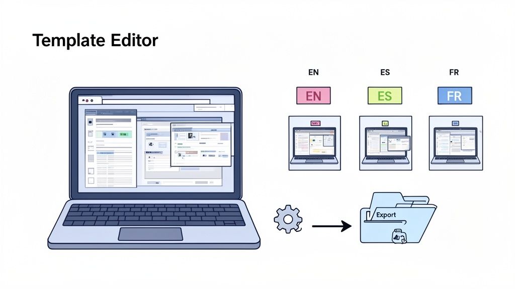
This diagram gets the point across perfectly. A template editor becomes your single source of truth, letting you generate assets for every language and device you need.
Generating Screenshots in Minutes, Not Hours
Once your template is dialed in, the real magic happens.
Tools like ScreenshotWhale are built around this exact workflow. You can link your template to a data source, like a simple CSV file, that holds all your translated captions.
With a single click, the tool can then churn out a complete set of screenshots for every language and every required device size, for both the Google Play Store and the iOS App Store. What used to be a tedious, soul crushing cycle of copying, pasting, and exporting is now completely automated.
This workflow is a game changer for agile teams. You can finally sync your screenshot production with your development sprints, making sure your store listing is always showing off the latest features without creating a design bottleneck.
To get your production pipeline really humming, it helps to know what software is out there. Beyond template editors, you'll need a solid way to capture clean UI images from your app. It's worth taking a moment to explore free screen capture tools to find the best fit for your team.
Setting Up Your First Automated Project
Getting started is surprisingly simple.
First, you pick a professionally designed template that feels right for your app's category, whether it's fitness, social media, or productivity. These are already optimized for conversion, so you're starting from a good place.
Next, you make it your own in the editor. This usually involves three steps:
- Uploading your UI screen grabs: Pop your app's actual interface into the device mockups.
- Adjusting captions and text: Write compelling, benefit driven captions that tell a clear story.
- Customizing colors and fonts: Tweak the background, text colors, and typography until they align perfectly with your brand guide.
After your design is locked, you connect your data for localization. The editor pulls in the translated text for each language, automatically resizing fonts and adjusting layouts to make everything fit.
Finally, you export the whole package, ready for upload to the Google Play Console. For a deeper look, our team put together a detailed guide on how to generate app screenshots using this very workflow.
Answering Your Top Screenshot Questions
When it comes to Google Play Store screenshots, a few questions pop up time and time again. Getting these right is the difference between a store page that just exists and one that actively turns visitors into users.
Let's dig into some of the most common ones I hear.
How Many Screenshots Should I Actually Upload?
Google lets you upload up to 8 screenshots for each device type, and while the minimum is just 2, you should treat that as a baseline, not a target. I always recommend using at least 4 to 5 slots to build a compelling visual narrative for your app.
Here's the deal: your first three screenshots are your money makers. A lot of users simply will not scroll past them. Use that prime real estate to show off your app's core value, highlight a killer feature, and build enough trust to convince someone to hit that download button.
What’s the Best Way to Show Off a New Feature?
Launching something new? Give it the spotlight it deserves. My go to strategy is to dedicate one of the first three screenshot slots to the new feature to guarantee it gets seen.
The key is to frame it with a caption that sells the benefit, not just the function. Instead of a bland label like "New Calendar View," go for something that speaks to the user, like "Plan Your Entire Day in a Tap." The visual should show the feature in action, making the value immediately obvious.
If you really want to optimize, run an A/B test. Pit the new feature screenshot in the first position against the second and see which one drives more conversions.
Think of your screenshot gallery as a dynamic marketing asset, not a static one. Do not be afraid to shuffle your visuals to highlight what's new and exciting. It keeps your listing looking fresh and tells users you're constantly improving the app.
Should I Use Portrait or Landscape Screenshots?
This one’s simple: follow your app’s lead. If your app is a game that’s almost always used in landscape mode, your screenshots have to match that experience. For pretty much everything else, like productivity, social, and lifestyle apps, portrait is the way to go.
Users expect to see a preview that looks exactly like what they'll get on their device. Consistency is everything. Mixing orientations can feel jarring and unprofessional unless your app genuinely has critical functions in both modes. A cohesive gallery just feels right.
Can I Just Use a Video Instead of Screenshots?
You need both. Think of them as a one two punch.
Google Play gives you one promo video slot, and it appears right before your screenshots. A video is fantastic for showing off dynamic gameplay, a complex user flow, or just capturing the feel of your app in a way static images cannot.
But, and this is a big but, a video does not replace a solid screenshot gallery. Many people would rather scan images for a few seconds than commit to watching a video. To give yourself the best shot at a download, create a killer promo video and optimize every single one of your screenshot slots.
Ready to stop wrestling with design tools and start creating high-converting screenshots in minutes? With ScreenshotWhale, you get professionally designed templates, automated localization for over 100 languages, and a full set of store assets with just a few clicks. Take a look at how ScreenshotWhale works and see for yourself.