Generate App Screenshots That Boost App Store Conversions
Learn how to generate app screenshots that drive installs. Get expert tips on design, ASO, and automation for iOS and Android to boost your app's growth.
Your app screenshots are not just a gallery of features; they are your primary sales pitch. Getting them right can drastically increase downloads by grabbing a user's attention and building trust in seconds. It all starts with understanding the snap judgments people make when they land on your store page.
Why Your App Screenshots Are Costing You Downloads
Let’s be honest, most app store visitors judge your app in a heartbeat, and your screenshots are the very first thing they see. This is not just about showing what your app does; it is your single best chance to sell the experience. Polished, strategic visuals are directly tied to higher download rates and real app store growth.
The mobile market is an incredibly crowded space. With hundreds of thousands of new apps popping up every month, only a tiny 0.5% ever find real success. In this environment, you have just a few seconds to make an impression.
Data shows that about 90% of users do not even bother scrolling past the third screenshot. This makes those first few images the most powerful factor in their decision. Because of this, screenshots have evolved from simple previews into marketing powerhouses that can boost app page conversion rates by 20–35%. You can dig into more data on how screenshots impact ASO to see the full picture.
The Psychology Behind a User's Snap Judgment
Potential users do not read; they scan. They are making lightning fast decisions based on visual cues, looking for solutions, not just a list of features. A well crafted screenshot does not just display a UI; it tells a story.
Here is what is happening in their mind:
- It Builds Instant Trust: Professional, clean, and branded screenshots signal a high quality app. Messy or generic images? They suggest the app itself is untrustworthy or poorly made.
- It Communicates Value Quickly: A user should "get" your app's main benefit just by glancing at the first one or two images. No deep thinking required.
- It Creates an Emotional Connection: Vibrant colors, relatable scenarios, and compelling copy can spark positive feelings, making a user far more likely to hit "Install."
Your app screenshots are not a user manual. They are a billboard. Their job is to create desire and communicate a clear, compelling benefit in the blink of an eye.
Moving from Features to Benefits
One of the most common mistakes is developers simply showcasing features without any context. A screenshot that says "Calendar Integration" is technically accurate, but it is flat.
A much better approach is to show the app in action with a caption like, "Never Miss a Meeting Again." See the difference? That small shift transforms a technical detail into a tangible benefit for the user. It answers their unspoken question: "How will this make my life better?"
This mindset is crucial before you even think about design. By focusing on what the user gains, you elevate your visuals from a simple gallery into a high converting asset for both the iOS and Android stores. The rest of this guide will walk you through exactly how to do that.
Before you even think about opening Figma or picking out a color palette, we need to talk about the most important step: planning your visual story.
This is where so many developers go wrong. They jump straight into design, grabbing random captures of their app. But great screenshots are not just pictures; they are a carefully choreographed sequence designed to sell a solution. This planning phase is where you turn your app's core value into a narrative that actually drives downloads.
Think of your screenshots as a silent movie. A potential user should be able to swipe through the first few images and instantly "get" what your app does and why they need it. Your job is to pinpoint those "aha!" moments, the key features or outcomes that make a user's life better.
Nail Your Core Message and Find the "Aha!" Moments
Every great app has a core value proposition. First, you have to distill this down into a single, powerful message. Do you help people save time? Connect with friends? Learn a new skill? This central theme is the anchor for your entire visual story.
With that message in mind, identify the top three to five features that deliver on that promise. I am not talking about the most complex or technically impressive features. I mean the ones that provide the most immediate, tangible value to the user.
- For a fitness app: The "aha!" moment is not the settings screen; it is seeing a personalized workout plan pop up in seconds.
- For a budgeting app: It is that pie chart that clearly shows where their money is going, making it obvious how to save.
- For a social app: It might be the screen where they discover a new community that shares their niche interest.
Your goal is to capture these moments visually and put them right up front. The very first screenshot has to be your strongest because it carries 90% of the weight in a user's decision to even look at the rest.
Choose Your Narrative Style
Okay, you have got your key moments. Now, how are you going to present them? There are a few proven styles, and the best one really depends on your app's personality and who you are talking to. You can even mix and match, but the key is to stay consistent.
Here is a quick breakdown of two popular approaches:
| Style | Description | Best For |
|---|---|---|
| Benefit-Oriented Captions | Each screenshot has a big, bold caption highlighting what the user gets, not just what the feature is. The visual simply proves the claim. | Apps that solve a clear problem or offer a tangible improvement to someone's life. This style is direct, persuasive, and it just works. |
| Feature-Focused Showcase | This style dials back the text and lets your app's clean UI do the heavy lifting. It is a "show, don't tell" approach, perfect for highlighting beautiful design. | Apps with a visually stunning or unique user interface, like design tools, games, or super-polished utility apps. |
A powerful trick that works wonders is the "panoramic" story. As a user swipes, the background or device mockups flow seamlessly from one image to the next. It creates this engaging, immersive experience that practically begs them to see the whole set.
Prioritize Your Visual Flow
Once you have your story and your style, it is time to map out the sequence. A logical flow is absolutely essential for building a convincing case for why someone should download your app. You are telling a story, so it needs a beginning, middle, and end.
A structure that consistently performs well is:
- The Hook (Screenshot 1): Start with your single most compelling benefit. This is your headline. It needs to immediately answer the user's unspoken question: "What's in it for me?"
- The Core Features (Screenshots 2-4): This is where you show off those "aha!" moments you identified. Each image should build on the last, demonstrating the app's power and simplicity. You can get really creative here, and for some great ideas, check out different types of mobile mock ups to see how you can frame your features.
- The Social Proof (Final Screenshot): End with a strong closing argument. This could be a killer testimonial, an award you have won, or a mention of your user count ("Join 1 million users!"). It is all about building trust and a little bit of urgency.
When you invest time in this strategic planning phase, you ensure that every single pixel is working overtime to convert casual browsers into loyal users.
Designing Screenshots That Drive Action
Alright, you have got your plan. Now for the fun part: bringing your visual story to life. This is where your strategy turns into actual designs that convince a casual browser to hit that "Install" button. We are aiming for a set of screenshots that do not just look sharp but actively work to drive up your conversions.
It all starts with a solid visual foundation.
Using device mockups is one of the fastest ways to make your screenshots look polished and legitimate. Instead of just showing a flat UI, placing it inside a recognizable frame, like an iPhone 16 Pro Max or a Google Pixel, makes your app feel tangible. It is a small touch, but it dramatically boosts the perceived quality of your product.
Another huge shortcut? Starting with a great template. Tools like ScreenshotWhale offer libraries full of templates designed around ASO best practices. This gives you a head start with clean layouts and readable text, so your message is crystal clear from the get go. No design degree required.
Crafting a Visually Stunning Layout
Think of your layout as the stage for your app's story. The colors, fonts, and branding elements you choose should all tie back to the core message you defined earlier. Consistency is everything here.
- Vibrant, On Brand Colors: Stick to your brand’s palette to create a cohesive experience. A bright, eye catching background can make your screenshots pop in a crowded store, just make sure it does not overshadow the UI. Your app is the hero of the story.
- Clear and Consistent Branding: Your app icon or logo should be present but subtle. It reinforces brand recognition and builds a sense of trust, connecting the screenshots to the app the user is about to install.
- Strategic White Space: Do not feel the need to fill every single pixel. White space is a designer's best friend. It guides the eye, makes text easier to read, and gives your screenshots a clean, uncluttered feel.
The best designs look effortless. They guide the user's focus directly to the most important elements on the screen, the benefit in the caption and the feature in the mockup, without any unnecessary distractions.
Writing Captions That Convert
Your captions are your headlines. They do the heavy lifting. A common mistake is writing captions that just describe a feature, like "Task Management." It is accurate, but it is flat.
A much better approach is to focus on the benefit the user gets from that feature. For example, "Organize Your Life in Minutes." See the difference?
This simple shift from what it is to what it does for me is the secret to high converting copy. Each caption should be a punchy, concise statement that highlights a key advantage. Use a large, clear font that is easy to read against your background. Remember, people are scanning quickly on small screens. Clarity beats cleverness every time.
Before you finalize your screenshots, run through this quick checklist. It is a simple way to catch common mistakes and ensure every element is working hard to convert users.
Design Element Checklist for High-Converting Screenshots
| Element | Best Practice | Why It Matters |
|---|---|---|
| Device Mockups | Use current, high quality mockups (e.g., iPhone 16 Pro Max). | Instantly adds professionalism and helps users visualize the app on their own device. |
| Background | Use on brand, vibrant colors or gradients that complement the UI. | Makes screenshots visually appealing and stand out in search results without distracting from the app itself. |
| Captions | Write short, benefit driven headlines in a large, legible font. | Users scan, they do not read. Benefits sell the solution, not just the feature. |
| UI Presentation | Showcase clean, compelling, and data rich screens. | The UI must look intuitive and valuable at a glance. Avoid empty states or confusing interfaces. |
| Branding | Include your app icon or logo subtly on each screenshot. | Reinforces brand identity and builds trust throughout the user's journey on your store page. |
| Consistency | Maintain a consistent style (colors, fonts, layout) across all screenshots. | A cohesive set looks more professional and tells a clearer, more organized story. |
This checklist helps ensure you are not just making pretty pictures, but strategically designed assets built for performance.
A Practical Before-and-After Example
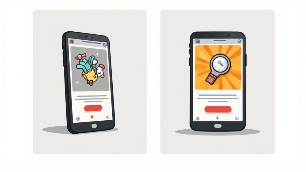
Let's say you have built a new meditation app.
Before (Feature-Focused):
Imagine a plain screenshot of the app's home screen. The caption above it just says, "Meditation Timer." It is technically correct, but totally uninspired. The user has to do all the work to figure out why they should care.
After (Benefit-Driven):
Now, picture that same screen inside a sleek smartphone mockup. The background is a calming, vibrant blue gradient that matches the app's branding. Above the phone, a bold, clear caption reads: "Find Your Calm in 5 Minutes."
The "after" version is worlds more powerful. It does not just show a feature; it sells a solution. The professional mockup, on brand colors, and benefit focused copy create an immediate emotional connection and communicate the app's value in a split second.
Remember, the app stores have their own rules. Apple’s guidelines now require all images to be actual captures from your app. The App Store allows up to 10 screenshots per device, while Google Play allows up to 8, plenty of room to tell your story.
Ultimately, great screenshot design is a mix of art and science. It demands a real understanding of what your users want and a commitment to communicating that value clearly. By applying these principles, you can create screenshots that not only look fantastic but become one of the biggest drivers of your app's growth. For a deeper dive into visual excellence, it is worth exploring some general mobile app design best practices.
Great looking screenshots are a start, but they will not move the needle if people cannot find your app in the first place. This is where your visuals become a secret weapon for App Store Optimization (ASO), the art and science of getting your app seen in the crowded iOS App Store and Google Play Store.
Think of your screenshots as visual keywords. When a user lands on your product page, that blend of eye catching design and benefit focused captions is what pushes them to tap "Install." That decision, the conversion rate, is a huge signal to the app stores. A high conversion rate tells them your app is a winner, which can lead to better rankings and a steady stream of organic downloads.
Localizing for a Global Audience
If you are aiming for a global audience, simply translating your captions is not enough. True localization means tailoring your entire visual language to fit different cultures. A color, an icon, or a turn of phrase that lands perfectly in one country might be confusing or even off putting in another.
A finance app, for example, would be dead on arrival in Japan if its screenshots were plastered with dollar signs ($) instead of the local yen (¥). Likewise, a wellness app should feature models and environments that feel familiar to the local user base. It is these small details that build immediate trust and make your app feel like it was made just for them.
Going global means thinking local. Users are far more likely to download an app that looks and feels like it was made for them, not just translated for them. This cultural adaptation is a non negotiable step for boosting international growth.
Thankfully, managing separate screenshot sets for dozens of languages does not have to be a nightmare. Modern tools let you build one master template and then automatically generate localized versions by swapping out the text and key visuals. It saves an incredible amount of time and keeps your brand looking sharp everywhere. For a deeper dive into the Android side of things, our guide on ASO for the Google Play Store has a ton of specific tips.
Adhering to App Store Technical Requirements
There is nothing more deflating than getting an app submission rejected because of a technicality with your screenshots. Both Apple and Google have strict, non negotiable guidelines that can change with new device releases. Keeping up is essential for a smooth launch.
Here are the big ones you absolutely cannot ignore:
- Correct Dimensions: Every store has a laundry list of required image sizes for different devices, from the latest iPhone 16 Pro Max to various iPads and Android phones. The wrong size is an instant rejection.
- File Formats: Stick to JPEG or 24-bit PNG files (with no alpha channel). Trying to upload anything else will just result in errors.
- Number of Screenshots: The App Store gives you up to 10 slots, and Google Play gives you up to 8. You should always aim to use every single one to tell a complete, compelling story.
These rules are not suggestions; they are requirements. Getting them wrong costs you time and delays your launch. This is another area where a dedicated screenshot generator is a lifesaver, as it handles all the formatting and sizing automatically. To really level up, using an AI photo analyzer can help you fine tune your visuals for maximum impact across different markets.
Using A/B Testing to Find What Works
So, you have designed a brilliant new set of screenshots. How do you know they are actually better than the old ones? You test them. A/B testing is your best friend here. It is the process of showing different versions of your app store page to different groups of users to see which one converts better. It takes the guesswork out of design.
Google Play makes this incredibly easy with its built in Store Listing Experiments. On the App Store, you can achieve the same thing using Product Page Optimization.
Imagine a language learning app torn between using cartoon illustrations and photos of real people traveling. They could run a test showing the illustrated set to 50% of visitors and the photo set to the other 50%. Within a week, they would have hard data showing which visual style drove more downloads.
As the global app market continues to explode, this kind of data driven optimization is no longer optional. A/B testing has become a standard practice for top developers. This cycle of testing, learning, and refining is what separates the apps that succeed from the ones that disappear.
Stop Wasting Time on Screenshots: The Automation Workflow
Manually creating screenshots for every new update, device size, and language is a soul crushing time sink. Seriously. It is a repetitive, tedious grind that pulls you and your team away from building great features. This is where automation stops being a nice to have and becomes your most valuable ally for scaling your app's growth.
Modern tools can completely flip the script on your workflow, turning a multi day headache into something you knock out in minutes. Picture a pipeline where you capture new screens, and they are instantly dropped into branded templates with all your localized text applied automatically. This is not some far off dream; it is a practical solution you can set up right now.
Setting Up an Automated Pipeline
Let's walk through a real world scenario. Imagine your app is available in ten languages, and you support five different iPhone and three Android device sizes. A tiny UI tweak would traditionally force you to create 80 unique screenshot sets (10 languages x 8 devices). Done manually, this is a nightmare of resizing, translating, and exporting that nobody wants to deal with.
With an automated system, the process is worlds apart:
- Build a Master Template: First, you design one perfect set of screenshots in a generator tool. You define your background, device mockups, font styles, and caption layouts. This becomes your single source of truth.
- Plug In Your Localized Text: Instead of painfully typing out captions for each language, you just upload a simple spreadsheet with all the translations.
- Click and Generate: With a single click, the tool merges your raw app captures with the master template and the translated text. It then spits out every single required size for both the App Store and Google Play.
This process cuts what could be hundreds of developer hours per year down to mere minutes. It is not just about saving time; it is about giving your team the focus to work on product improvements that actually matter.
The Real-World Benefits of Automation
The impact of automating how you generate app screenshots goes way beyond just speed. It creates a ripple effect of positive outcomes that feed directly into your app’s success. You can even use a tool like an AI image generator to quickly create a bunch of unique and compelling background assets for your templates.
The advantages are crystal clear:
- Flawless Brand Consistency: Every single screenshot, no matter the language or device, perfectly matches your brand guidelines. No more weird inconsistencies from manual edits.
- Ship Updates Faster: You can push out updates more quickly, knowing your store assets will be ready in minutes. This agility is key to staying ahead of the competition and responding to user feedback.
- Grow Globally Without the Pain: Launching in a new country becomes incredibly simple. Just add another column to your translation file, and your localized screenshots are ready to go.
By moving from manual labor to an automated workflow, you stop treating screenshots as a chore and start wielding them as a strategic asset. That efficiency is the secret to maintaining a polished, professional presence on the app stores while moving at the speed your users expect.
Putting It All Together: Your Screenshot Playbook
We have covered the strategy behind a compelling visual story and the nitty gritty details of high converting design. Now, let’s boil it all down into an actionable playbook.
Think of this as your quick reference guide. Whether you are auditing your current visuals or kicking off a complete redesign, these steps will keep you grounded. It is a reminder that world class screenshots are the product of a smart process, not just a random spark of creativity. This framework puts you in full control of your app's visual marketing.
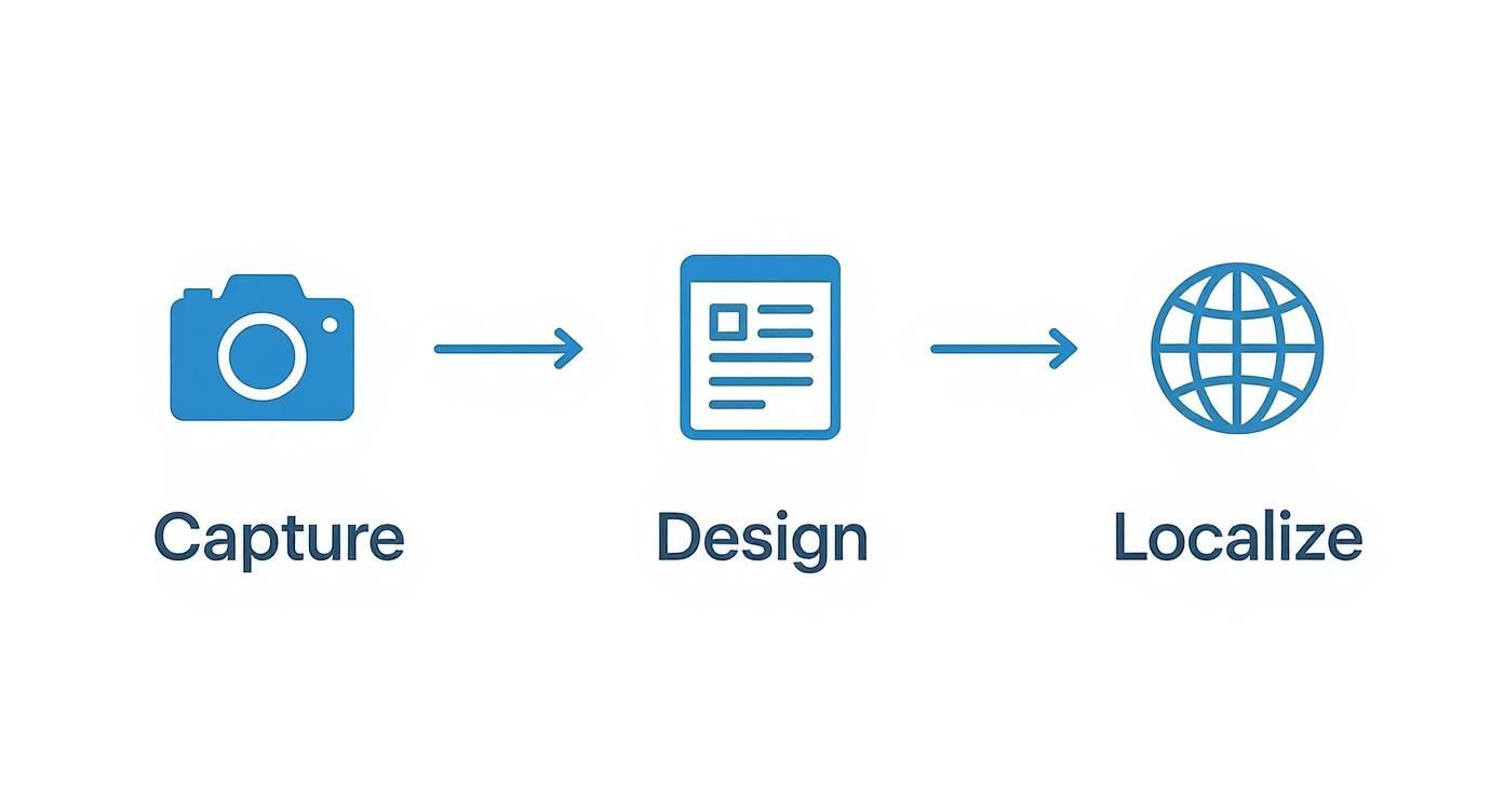
This simple flow shows how to get this done efficiently, especially when you are working at scale.
The key is connecting the capture, design, and localization stages into a single, repeatable system. When you do that, you eliminate the manual bottlenecks that slow everything down.
Your Final Screenshot Checklist
Use this checklist to make sure every screenshot you produce is optimized for growth. It is designed to help you generate visuals that deliver real results on both the App Store and Google Play.
Define Your Story First. What is the single most compelling benefit your app offers? Your first screenshot has to nail this in under three seconds. Never, ever start designing until you have a crystal clear narrative.
Prioritize Benefits Over Features. Take a hard look at your captions. Do they describe what a button does, or what a user actually achieves? Flip "Task Manager" to "Organize Your Entire Day." This small shift is a conversion boosting machine.
Maintain Brand Consistency. Your screenshots should feel like a natural extension of your app. Stick to your brand's colors, fonts, and layout across the entire set. This is not just about looking good; it is about building trust and looking professional.
Optimize for Scannability. Are your captions short, punchy, and easy to read on a small screen? Use large, legible fonts against a high contrast background. Remember, users scan, they do not read paragraphs.
Your goal is not just to create pretty pictures. It is to craft a strategic visual sales pitch that turns casual browsers into loyal users. Every single element should work together to convince someone that your app is the solution they have been searching for.
A Few Common Questions, Answered
Got a few lingering questions about creating your app screenshots? I get these a lot, so here are some quick, straightforward answers to help you navigate the process.
How Many Screenshots Do I Need for the App Store and Google Play?
My advice? Use every single slot they give you. The Apple App Store lets you upload up to ten screenshots for each device type, while the Google Play Store gives you eight.
Think of each slot as another chance to make your case. You are telling a visual story about your app, and leaving spots empty is like ending that story halfway through. It is a massive missed opportunity to show off a key feature, build trust, or convince a hesitant user to tap "Install."
What's the Best Tool to Generate App Screenshots?
This really depends on your workflow, but if you value your time and want to scale, a dedicated screenshot generator is the way to go. Sure, you can wrestle with tools like Figma, and they give you a ton of creative freedom. But that freedom comes at a cost. It becomes a huge time sink once you start juggling multiple device sizes and languages.
A specialized tool like ScreenshotWhale is built for this exact job. It is designed to automate the grunt work, combining professional templates, device mockups, and localization features so you can get a full set of store ready visuals done in minutes, not days.
Do My Screenshot Designs Need to Be Different for iOS and Android?
Absolutely, yes. While your core message and the features you highlight might stay the same, the visuals should feel completely native to each platform.
This is not just about using the right device mockups, like an iPhone 16 Pro Max for iOS and a Google Pixel for Android. It is also about respecting the subtle UI differences and user expectations on each operating system.
When you tailor your designs, you are sending a powerful signal: "This app was built for your device." That small detail shows a level of care that builds instant trust and can make a real difference in your download rates.
Ready to stop wasting time in design tools and start creating stunning, high converting visuals? ScreenshotWhale gives you everything you need to generate professional app screenshots in a fraction of the time. Give our templates a try and see just how easy it is to level up your app store presence.