How to Publish App in App Store: A Step-by-Step Guide
Learn how to publish app in app store effectively with our expert tips on submission, visuals, and optimizing your app for success.
Getting your app into the App Store is a journey. It is part technical prep, part marketing savvy. You'll need to get your code and assets in order, build a product page that actually converts, and finally, navigate the submission process in App Store Connect.
Building Your Pre-Launch Foundation
Before you even touch App Store Connect, you need to lay some serious groundwork. Think of this as the foundation of your launch. A lot of developers get antsy and rush this part, and it almost always comes back to bite them with frustrating delays or flat-out rejections from Apple.
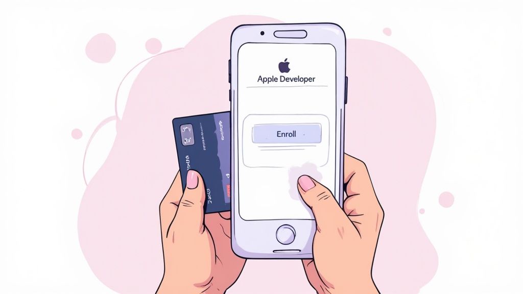
The very first gate you have to pass through is enrolling in the Apple Developer Program. There's no way around it. Apple is famously protective of its ecosystem, and this program is how they maintain quality and security.
The $99 annual fee is just the cost of doing business. It unlocks access to everything you need: beta software, essential development tools, and most importantly, the portal to submit your app.
Preparing Your Technical Assets
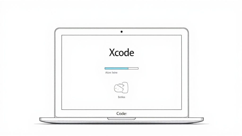
Once you are in the program, it is time to get your technical ducks in a row. This is all done within Xcode, Apple’s mothership for development.
You will need to compile a final, production-ready build of your app. This is not a test version; it is the real deal—the polished, debugged, and optimized archive you will upload to App Store Connect.
Next up are your provisioning profiles and distribution certificates. These are critical digital files that essentially act as your app’s passport, tying it directly to your developer account and verifying its legitimacy. I have seen countless submissions get tripped up here. A common mistake is using a development certificate instead of a distribution one, so double-check everything.
To help you keep track of all the moving pieces, here is a quick checklist of the essentials you'll need before you start the submission process.
Essential Pre-Submission Asset Checklist
Having these assets ready before you log into App Store Connect will make the entire process much smoother and less stressful.
| Asset/Information | Purpose | Key Considerations |
|---|---|---|
| Final App Build | The compiled .ipa file created in Xcode. |
Must be a release build, not debug. Signed with a distribution certificate. |
| App Name | The official name displayed on the App Store. | Must be unique and under 30 characters. Reflects your app's core function. |
| App Icon | The visual identity of your app. | Needs to be provided in multiple sizes, without transparency. 1024x1024 is the primary. |
| App Screenshots | Visual showcase of your app's features and benefits. | Required for various device sizes (e.g., 6.7" iPhone, 12.9" iPad). |
| App Description | The main marketing text for your product page. | First few lines are most important. Focus on benefits, not just features. |
| Keywords | A comma-separated list of search terms. | Max 100 characters total. Research relevant, high-traffic keywords. |
| Privacy Policy URL | A link to your app's privacy policy. | This is mandatory. The page must be live and accessible. |
| Support URL | A link to a support page or contact form. | Provides users with a way to get help or give feedback. |
Once you've got these items gathered, you're in a great position to start the final submission steps.
The Critical Role of Rigorous Testing
I cannot say this enough: test, test, and test again. An app that crashes or is riddled with bugs is the fastest way to get rejected. Apple’s reviewers have a very low tolerance for instability because their job is to protect users from bad experiences.
A buggy or incomplete app is one of the most common reasons for rejection. It not only fails the review but also kills your reputation with early adopters if it somehow slips through.
Here is how to build a solid testing plan to avoid that fate:
- Embrace TestFlight: Use Apple's own beta testing platform, TestFlight, to distribute builds to your team and a trusted group of external testers. It is your single best tool for pre-launch testing.
- Get Diverse Feedback: Do not just test on your own iPhone. Get your app into the hands of people using different models (older and newer) and various iOS versions. This is how you catch those weird, device-specific bugs.
- Test on Real Devices: The Xcode simulator is great for quick checks, but it is not the real world. Performance, touch sensitivity, and network conditions can feel completely different on actual hardware.
A polished, stable app is not just about passing the review. It's about setting yourself up for positive reviews, user retention, and long-term growth. Nailing this groundwork is a crucial part of a much larger strategy, which you can dive into in our complete app store optimization guide.
Crafting Your Product Page to Drive Downloads
Your App Store product page is not just a listing. It's your storefront, your sales pitch, and your number one marketing tool all rolled into one. This is the exact moment a casual browser decides to become a committed user. Getting App Store Optimization (ASO) right is not just a good idea—it's absolutely fundamental if you want to get noticed.
Think of ASO as SEO, but for the App Store. The entire game is about making your app easy to find and impossible to resist. It all starts with the elements people see first. Each one has a specific job to do in grabbing attention and convincing someone to hit "Download."
Nailing the First Impression with Your Name and Subtitle
Your app's name is your headline. It needs to be memorable and unique, and if you can, it should hint at what your app actually does. Apple gives you a tight 30 characters, so make every single one count. A great name is easy to remember and even easier to tell a friend about—that's how word-of-mouth magic happens.
A generic name like "Task Manager" will drown in a sea of lookalikes. But something more distinct, like "ZenTask" or "FlowList," immediately creates a brand identity while still being clear.
The subtitle is your 30-character elevator pitch. It is your shot to build on the name and spell out your core value. Since it shows up right under your app's name in search results, it's a seriously powerful tool for conversion.
- Weak Subtitle: "Get Organized Now"
- Strong Subtitle: "Plan Your Day in Seconds"
See the difference? The second one is punchy, specific, and promises a real benefit, making it far more compelling to someone scrolling through options.
Unlocking Discoverability with Strategic Keywords
Keywords are the engine of your discoverability. These are the exact terms people are typing into the search bar when they're looking for an app just like yours. In App Store Connect, you get a dedicated 100-character keyword field to list them out, separated by commas.
This field is completely invisible to users; it is purely for the App Store's algorithm. Do not waste precious characters on spaces, your app name (it's already indexed), or plural versions of words you've already used. Be efficient.
To find the right keywords, you have to get inside your user's head. What problem are they trying to solve? What words would they use to describe what your app does? Tools like Sensor Tower or App Radar are great for digging up terms that get a lot of searches but do not have crushing competition.
Remember, the App Store is a crowded place. A solid ASO strategy is what separates you from the noise in a market where consumer spending recently hit an incredible $89.3 billion. Standing out is not a bonus; it's a requirement for survival. You can find more insights on the App Store's competitive landscape on tekrevol.com.
Writing a Description That Tells a Story
Okay, they've clicked on your listing. Now what? Your app description is where you close the deal. So many developers fall into the trap of just listing features. Do not do that. Your job is to tell a story that resonates with the user's problems and goals.
The first couple of lines are everything. This is the "above-the-fold" content they see without having to tap "more." Lead with your absolute strongest benefit and a clear call to action.
Make your description scannable. People are skimming, not reading a novel. Use short paragraphs, bullet points, and clear headings to make the information easy to absorb.
Here's a simple framework that just works:
- Start with a Hook: Open with a sentence that grabs their attention by hitting on a common pain point.
- Highlight Core Benefits: Use a bulleted list to show off the top 3-5 benefits. Focus on outcomes, not just what the app does.
- Elaborate on Features: Briefly explain how your key features deliver on those benefits you just promised.
- Add Social Proof: Got any awards, press mentions, or impressive user numbers? Now's the time to mention them (e.g., "Join over 1 million happy users!").
- End with a Call to Action: Wrap it up by inviting them to download the app and get started.
When you focus on the why (benefits) instead of just the what (features), your description stops being a boring list and becomes a powerful argument for why your app deserves a spot on their phone.
Designing High-Converting Screenshots and Previews
Once you have nailed your app’s name and keywords, your visuals are what will actually close the deal. Let's be honest: in the lightning-fast scroll of the App Store, most people make a download decision based almost entirely on your screenshots.
High-quality screenshots are not just pictures of your UI. They're your most powerful marketing assets. They tell a story and sell an experience, and you've got about three seconds to make your pitch. This is your chance to show, not just tell, what makes your app worth their time. Generic, uninspired screen captures will get you ignored.
Beyond Simple Screen Captures
The best screenshots are a thoughtful mix of your app’s interface, compelling captions, and clean design. Your goal is to create a cohesive narrative that walks a potential user through your app's core value. Each image should build on the last, highlighting a key benefit or feature that solves a real problem for them.
Think of your first one or two screenshots as your hook. They need to grab attention immediately and communicate exactly what your app does. From there, you can dive deeper into secondary features, showcase social proof, or hammer home your unique selling points.
Your screenshot gallery is a visual sales pitch. A study found that over 50% of users decide whether to download an app based on the first impression from the product page, where screenshots are the most dominant element.
To get this right, you have to turn basic captures into polished marketing assets. This is where a screenshot editor becomes your best friend. For example, a platform like ScreenshotWhale lets you drop raw UI captures into pre-designed templates with device mockups, vibrant backgrounds, and customizable text. You can select a template, upload a screen capture of your app’s main dashboard, add a bold caption like "Your Entire Day, At a Glance," and export a professional graphic in minutes. This instantly elevates a simple screen into a polished asset that boosts conversions.
If you're just starting out, you can learn more about the fundamentals in this detailed guide on iOS app screenshots.
Crafting a Compelling Visual Narrative
A great screenshot set tells a story. It should feel like a guided tour of your app’s best moments, with each image delivering a single, clear message highlighted by a bold, benefit-driven caption.
Here is how that might look for a fitness app:
- Screenshot 1: "Track Your Workouts Effortlessly." (Shows the main logging screen).
- Screenshot 2: "Visualize Your Progress." (Displays a clean graph of performance over time).
- Screenshot 3: "Join Community Challenges." (Highlights a social or competitive feature).
- Screenshot 4: "Personalized Plans Just for You." (Showcases a customization screen).
See the flow? It guides the user from the core function to advanced benefits and personalization, painting a complete picture of the experience. The text is not just describing the screen; it's selling the outcome.
To see what a difference this makes, let's compare the common approach to a high-converting one.
Screenshot Design Comparison for Higher Conversions
| Design Element | Ineffective Approach | High-Converting Approach |
|---|---|---|
| Captions | Describes the feature: "Workout Log" | Sells the benefit: "Track Your Progress Instantly" |
| Visuals | Raw, unedited UI captures | UI placed in device mockups with branded backgrounds |
| Story | Random collection of screens | A logical flow from core value to key features |
| Focus | Cluttered screens, no clear focal point | One main idea per screenshot, highlighted visually |
| Text | Small, hard-to-read font | Large, bold, and scannable headlines |
The takeaway is simple: moving from a feature-focused, raw design to a benefit-driven, polished narrative can dramatically improve how users perceive your app's value.
App Previews and Technical Requirements
App Previews—the short videos you can add to your product page—take this storytelling a step further. A well-made preview can seriously boost conversions by showing your app in action. Keep them short, between 15-30 seconds, and make sure the first few seconds are packed with excitement to hook the user before they scroll away.
Finally, you have to play by Apple’s rules. They have strict technical requirements for screenshots, and failing to meet them will get your submission rejected. You'll need to provide screenshots for various device sizes, focusing on the 6.7-inch (for modern iPhones) and 12.9-inch iPad Pro displays. While Apple often scales these for other devices, providing assets for each major size group is the safest bet.
Meeting these technical specs can be tedious, but it is a non-negotiable part of getting your app on the store. Using a specialized tool automates this by providing correctly sized templates for every required device, ensuring your visuals are not only beautiful but also compliant. It removes the guesswork and lets you focus on what truly matters: creating a visual story that drives downloads.
Navigating the App Store Connect Submission
You have built your app, nailed the product page, and designed some killer screenshots. Now for the final technical hurdle before you go live: the submission process in App Store Connect. This is where everything comes together, and believe me, attention to detail is your best friend here.
App Store Connect is Apple's nerve center for managing your app. The interface can look a bit intimidating at first, but once you get the lay of the land, it's a pretty logical workflow. Your first move is to create a new app record. Think of this as the main folder that will hold all your metadata and, eventually, your app builds.
Once that record is created, you will start filling in the blanks. This means plugging in your app's name, subtitle, description, and those keywords you spent time researching. You'll also upload your app icon, a tiny but mighty piece of your brand. If you want to get that part perfect, we have a whole guide on iOS app icon dimensions and best practices.
Setting Up Core App Information
With the basic marketing text in place, it is time to get into the logistical details. These are the settings that control how your app shows up to users and functions within the App Store ecosystem.
First up, pricing and availability. This is a big one. You can pick from various price tiers or just offer the app for free. You also need to decide which countries your app will be available in. You can go for a global launch right out of the gate or start with a more targeted regional strategy.
Next, you have to pick the right category. This is crucial for discoverability. An app that is miscategorized will struggle to find its audience, so choose carefully. A meditation app, for example, belongs squarely in "Health & Fitness," not "Lifestyle." It's a small choice that has a big impact.
Finally, you will need to fill out the privacy details. Apple takes user privacy very seriously, and you have to be completely transparent about what data your app collects and how you use it. This info populates those "App Privacy" labels on your product page, and getting it right is non-negotiable for passing review.
Uploading Your Build and Preparing for Review
After all the metadata is locked in, it's time to upload your final build from Xcode. You will use the "Archive" function in Xcode to push your compiled app straight to your App Store Connect account. It can take a little while to process, but once it is done, you can select it from your app record.
This is the point where a lot of developers get excited and rush, but do not skip one of the most important steps: providing clear notes for the app reviewer. This is your one chance to talk directly to the human who will be testing your app.
If your app requires a user login, you must provide a demo account (username and password). Forgetting this is one of the top—and most avoidable—reasons for an instant rejection.
Think of the review notes as a friendly guide for the reviewer. If your app has hidden features, a tricky workflow, or needs specific hardware to work, explain it here. A little clarity goes a long way and can seriously speed up your approval time.
This infographic gives you a good visual of the journey your app takes once you hit "Submit for Review."
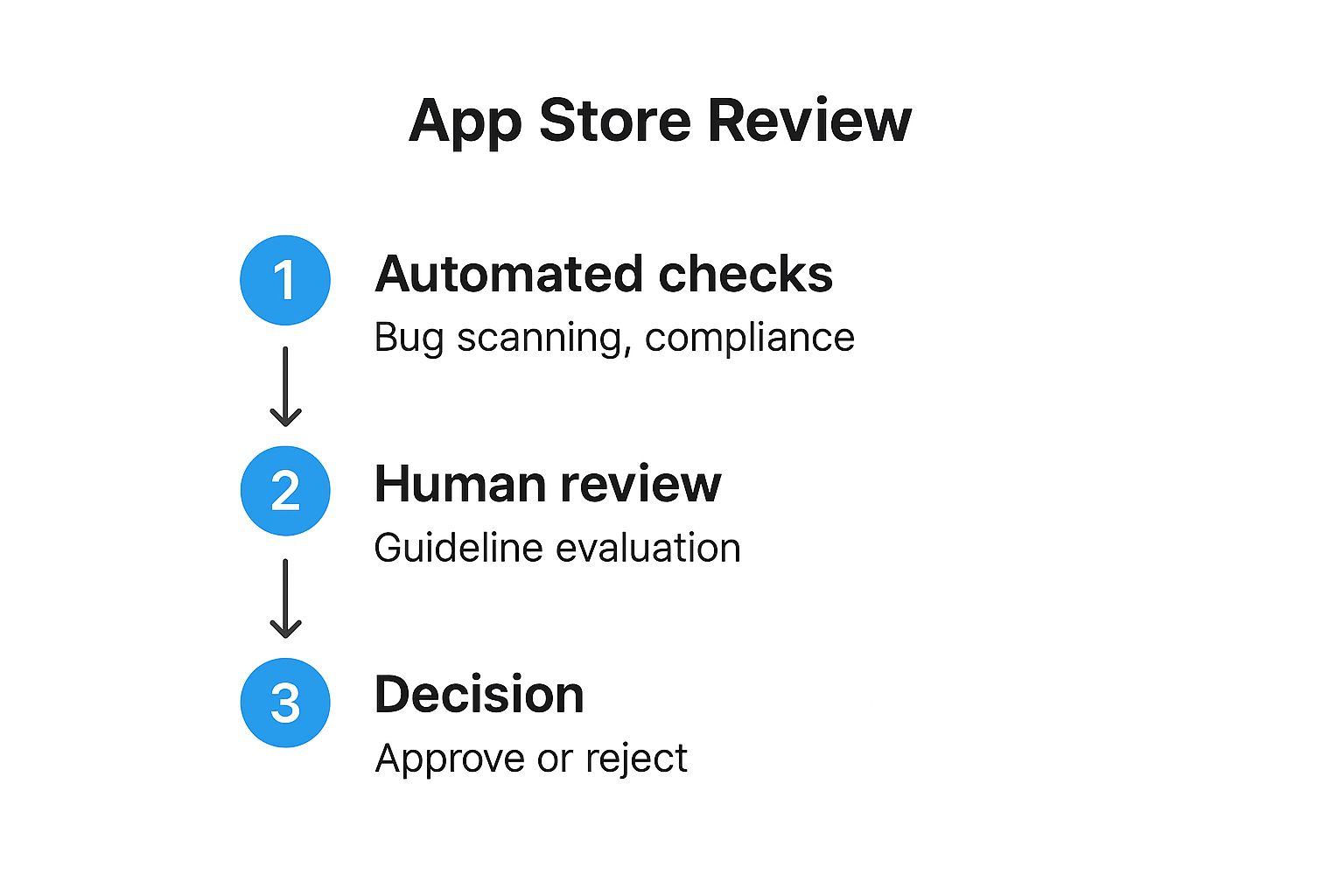
As you can see, your app first goes through some automated checks for common bugs and policy violations. Only after that does a human reviewer take over to evaluate it against Apple’s guidelines before making a final call. You have to clear both hurdles.
Once you have double-checked every field, attached your final build, and written thoughtful reviewer notes, you are ready for the big moment. Hitting "Submit for Review" sends your app off to Apple, kicking off the review process and getting you one step closer to launch day.
Surviving App Review and Planning for Growth
Hitting that "Submit for Review" button in App Store Connect feels like crossing the finish line. It's a huge moment. But in reality, you've just started the next leg of the race. Now comes the waiting game, followed by the crucial first few weeks after launch.
Once you submit, your app's status flips to "Waiting for Review." This is where a mix of Apple's automated checks and human reviewers take over. You can keep an eye on its progress right in App Store Connect as it moves through the queue.
Navigating the App Review Process
The review timeline can be a bit of a black box. I have seen apps get approved in under 24 hours, while others with more complex features like in-app purchases can take several days. It is unpredictable, so do not build your launch party around a specific date just yet.
If your app gets rejected, do not panic. It happens to everyone, from indie devs to the biggest names in the App Store.
Apple will give you a reason in the Resolution Center, usually pointing to a specific clause in their App Store Review Guidelines. Your job is to read their feedback, figure out what went wrong, and respond professionally.
- Communicate Clearly: When you reply, be polite and get straight to the point. Explain the changes you made to fix the issue.
- Provide Specifics: If you think a reviewer misunderstood a feature, a clear explanation or even a quick screen recording can work wonders.
- Resubmit with Confidence: Once you have addressed the problem—whether it's a code change or a metadata tweak—you can resubmit it for review.
A cooperative attitude goes a long way. The reviewers are not trying to block you; their goal is to maintain the quality of the App Store.
Planning Your Post-Launch Strategy
Getting approved is a massive win, but a successful app is not just about a single launch event. It is about building momentum from day one. Your first big decision is when to go live.
In App Store Connect, you can have your app release automatically the moment it is approved, or you can opt for a manual release. I almost always recommend a manual release. It gives you full control, letting you perfectly time your launch with marketing campaigns, a press push, or a big social media announcement.
The moment your app is live, the feedback loop begins. Early user reviews and analytics are pure gold. They give you unfiltered insights into what users love, what confuses them, and what is flat-out broken.
This initial feedback is the fuel for your first critical update. Do not wait months to push improvements. A quick update that squashes bugs or adds a small, highly requested feature shows your users you're listening. That is how you build loyalty and earn those coveted five-star reviews.
This cycle—launch, monitor, update—is the engine of real growth. It turns your release into an ongoing process of improvement driven by actual user data. This is how you compete in a marketplace with a truly staggering economic scale. The Apple App Store ecosystem recently generated around $1.3 trillion in global billings and sales. This includes everything from digital goods to physical services like ride-sharing, which saw revenue explode by 162% over five years. You can learn more about the App Store's economic impact and marketing statistics at amraandelma.com. Thriving here means being able to adapt and evolve based on what your users are telling you.
Alright, let's tackle some of the questions that always come up when you're on the final stretch of launching your app. Getting these answers sorted out beforehand can save you a ton of stress and last-minute scrambling.
Here are the big ones I see developers ask all the time.
How Long Does the App Store Review Really Take?
Apple says to give them up to a week, but that is rarely the case these days. The good news is that things are much faster now. In my experience, about 90% of apps get reviewed within 24 to 48 hours. This is a game-changer for pushing out quick bug fixes and updates.
But do not get too comfortable with that timeline. Certain things can definitely slow it down. If your app is particularly complex, uses in-app purchases, or if you happen to submit it during a major holiday rush, expect a longer wait. It's just smart planning to build a few extra days into your launch schedule. You never know when an unexpected delay might pop up.
What Are the Most Common Reasons for Rejection?
Getting rejected is a rite of passage for many developers, but honestly, most rejections are completely avoidable. The number one killer? Bugs and crashes. If your app is not stable, it is almost guaranteed to get bounced back. Apple is obsessed with user experience, and a buggy app is the fastest way to fail that test.
Beyond that, a few other common tripwires I see are:
- Incomplete Information: This one is so simple to fix, yet it trips up so many people. Forgetting to provide demo account credentials for an app that has a login screen is a classic rejection reason.
- Privacy Violations: You absolutely must have a clear, easy-to-find privacy policy. You also have to be completely honest about all the data you collect in App Store Connect. No fudging the details here.
- Guideline Mismatches: This is a broad one, but it covers everything from ignoring Apple's Human Interface Guidelines to designing a UI that just does not feel right on iOS.
The best defense here is just solid preparation. Test your app on every device you can get your hands on, triple-check all your metadata, and write clear, helpful notes for the reviewer. Make their job easy, and they'll make your life easy.
Can I Update My App After It Is Published?
Of course! Shipping version 1.0 is just the starting line. You can—and absolutely should—submit updates through App Store Connect whenever you've got new features, squashed some bugs, or improved performance.
Just remember, every single update goes through the exact same review process as your original submission. That means each new build needs to be just as polished, stable, and compliant as the first one. This cycle of shipping, learning, and improving is how you build a successful app over the long run.
What Happens if My App Is Rejected?
First off, do not panic. If your app is rejected, Apple will send you a notification in the Resolution Center inside App Store Connect. This message will not be vague; it will point to the specific guideline you violated and usually give you some context on what you need to fix.
The Resolution Center is also your direct line to the review team. You can reply to ask for more clarification or even appeal the rejection if you genuinely believe there's been a misunderstanding. Once you have fixed the issue, you just resubmit the corrected build and get back in the review queue. It is a pretty straightforward process.
Ready to create stunning, high-converting visuals for your own app? With ScreenshotWhale, you can design professional App Store and Google Play screenshots in minutes. Our easy-to-use editor, beautiful templates, and AI-powered localization tools help you boost conversions and achieve app store growth without the design overhead. Start creating for free today on screenshotwhale.com.