High-Converting Images For App Store Growth
Create high-converting images for app store success. This guide shares actionable strategies for iOS and Android screenshots that boost downloads.
Your app store images are your digital storefront. They are the first thing a potential user sees, long before they read a single word of your description. High quality, compelling visuals are your primary pitch, and they have to communicate your app's value in just a few seconds.
This first impression is everything. It directly shapes a user's decision to tap that "Get" button or just keep scrolling.
Crafting Your Visual First Impression
Let's be real: most users absolutely judge an app by its cover. Before they bother with your carefully crafted description or glowing reviews, they scan your icon and screenshots. This visual audit happens in less than three seconds, making it the most pivotal moment in your app store optimization (ASO) strategy for boosting conversions.
Your job is to turn passive browsers into genuinely interested users, and you do that with a powerful visual narrative.
Stop thinking of your app store images as a simple gallery. They are your silent salesperson, working 24/7. Each screenshot should build on the last, telling a story that spotlights a key benefit or a killer feature. This is your blueprint for creating efficient and high converting app store screenshots that drive installs and fuel your app's growth.
The Power of a Strong Visual Narrative
An effective visual strategy does more than show what your app looks like; it shows what your app does for the user. It has to instantly answer their unspoken question: "How is this going to make my life better, easier, or more fun?"
To nail this narrative, you need to zero in on a few key things:
- Communicate Core Value Instantly: Your first one or two screenshots have to get the main point across immediately. If you have a fitness app, lead with a vibrant progress chart. If it is a productivity tool, show off a clean, organized to do list.
- Highlight What Makes You Different: What is your unique selling proposition? Use your images to showcase the features that your competitors wish they had.
- Build Trust Through Professionalism: Polished, high resolution images with consistent branding do not just look good. They signal a high quality product. This builds instant trust with people who have never heard of you.
A potential user typically decides whether to download an app within just a few seconds of landing on its product page. Your images are the primary driver of this decision, making them one of the most powerful conversion tools at your disposal.
Adapting to iOS and Google Play
It is a classic mistake to treat the iOS App Store and the Google Play Store as if they are the same. They are not. They have different design philosophies, different user expectations, and different technical requirements. A one size fits all approach to your app store images will throttle your conversion potential.
Even subtle differences in UI elements, font styles, and layout conventions should shape your design choices. When you tailor your visuals to each platform, you show an attention to detail that users notice. It creates a more native and trustworthy experience that can give your download numbers a serious boost.
Designing Screenshots That Tell a Story
Let's get one thing straight: your app store screenshots are not a feature checklist. They are your most important sales pitch. A random collection of screen grabs feels lazy and does nothing to convince a potential user. What you need is a deliberate, logical flow that tells a compelling story about your app’s real value.
That story starts the second someone lays eyes on your first screenshot. This image has to be your hook, grabbing their attention with your app’s biggest, boldest promise. Do not waste this prime real estate on a welcome screen or a login page. Lead with the "aha!" moment, the single most powerful outcome a user gets from your app.
Building Your Screenshot Sequence
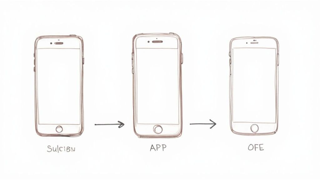
Think of your screenshot gallery as a mini presentation. Each image builds on the last, logically showcasing key features and, more importantly, their tangible benefits. It is about guiding the user on a journey.
A great sequence often follows a simple but powerful framework. The first screenshot hooks them with the main value proposition. The images that follow then walk them through exactly how your app delivers on that promise.
For instance, if your app helps people save money, the first shot might show a graph of their savings growing. The next few could highlight the simple budgeting tools that make it happen. This narrative takes a user from curiosity to understanding, making the decision to download feel both natural and obvious. It’s a proven way to improve how people perceive your images for app store listings.
Core Design Principles for High Conversions
A great story needs equally great design. Your visuals have to be clean, professional, and instantly understandable. Amazing apps fail to get traction simply because poor design choices made them feel untrustworthy.
Here are the design fundamentals you absolutely have to nail:
- Vibrant, On Brand Colors: Stick to a color palette that reflects your brand identity. High contrast, vibrant colors help your screenshots pop against the app store background and pull the user's eye in.
- Crisp, Legible Fonts: The text on your screenshots must be readable at a quick glance on a small phone screen. Choose a clean, sans serif font and make sure it has plenty of contrast with whatever is behind it.
- Punchy, Benefit Driven Captions: Keep your text short and focused on what the user gets, not just what the feature is. Instead of "Task Manager," try "Organize Your Day in Seconds." Leading with an action verb makes the copy feel more dynamic.
When you're putting together your app's visual story, knowing how to create compelling product showcases using tools like Canva can make a huge difference. That knowledge helps you apply design principles that make your features truly stand out.
The Importance of Professional Mockups
Raw screen captures just do not cut it anymore; they often look unprofessional. Framing your UI inside a realistic device mockup instantly adds a layer of polish and context. It helps users visualize the app on their own device, making the whole experience feel more tangible and real.
Using device mockups is one of the fastest ways to increase the perceived quality of your app. It shows attention to detail and helps build trust before the user has even tapped "Install."
These mockups should look clean and modern. A huge mistake is using outdated device models, which can make an app seem old or neglected. Many screenshot tools, including ScreenshotWhale, provide up to date mockups for the latest iPhone, iPad, and Android devices, so your visuals always look current. To dive deeper into this, check out our guide on using a mockup for mobile app screenshots.
Learning From High-Growth Apps
One of the best ways to get better is to see what successful apps are already doing. Go browse the top charts in your category. Spend some time breaking down why their screenshot galleries work so well.
Look at how they structure their story. For example, Uber uses a simple, clear design with a dark background and high contrast text to quickly explain the core benefit. Their first screenshot gets straight to the point: "Your ride, on demand." Each image after that logically walks you through the simple steps of booking a car.
Notice their use of color, captions, and device frames. How do they handle social proof, like awards or user testimonials? By deconstructing these winning examples, you can find actionable insights to apply to your own app store images and build a visual strategy designed from the ground up to boost conversions.
Your App Icon is Your First Handshake
In a packed App Store search list, your screenshots do not get the first look. Your icon does. This tiny square is your single best chance to earn a tap, and it has to do a ton of work without a single word of text. It has to be instantly recognizable and shout your app's purpose in a split second.
A killer icon is simple, memorable, and cuts through the noise of your competition. It becomes the visual anchor for your brand, showing up not just in search results but on a user's home screen every single day. Getting this one element right is non negotiable for building brand recall and driving downloads.
The Makings of a Standout Icon
The secret to a great icon usually boils down to a few core principles, and simplicity is king. Overly detailed designs just turn into an unrecognizable smudge at smaller sizes. The goal is a bold, clear symbol that someone can identify at a glance.
Color and contrast are your best friends here. Vibrant, high contrast colors help your icon pop against both light and dark backgrounds, grabbing attention in a sea of lookalikes. Take a peek at the color palettes used by the top apps in your category. You want to fit in just enough to meet user expectations but be unique enough to stand out.
Here are a few pointers to steer your design process:
- Lean into Symbolism: Use a single, powerful symbol that nails your app's core function. A musical note for a music app is universal. A speech bubble for a messaging app is instantly understood.
- Ditch the Text: Unless your brand name is super short and stylized like a logo (think Facebook's "f"), avoid text. It becomes unreadable at small sizes and just creates clutter.
- Test for Scalability: Your icon has to look sharp everywhere, from a huge App Store display to the tiniest notification badge. Make sure your design holds up at every required resolution.
A well designed app icon is not just branding; it is a conversion tool. I've seen minor tweaks to symbol clarity and color contrast lead to a serious jump in tap through rates from search results.
A/B Testing Your Way to More Downloads
So, how do you know if your icon is actually working? You test it. A/B testing different icon variations is not just a "nice to have," it is a core growth strategy. Guesswork is expensive; data gives you a clear path forward.
You can use platform native tools like Apple's Product Page Optimization to test different icons with a slice of your organic traffic. Just run one version against another and see which one drives more downloads. Google Play offers similar features, giving you the power to make design decisions backed by real numbers.
The impact can be massive. Mobile gaming developer Nanobit, for instance, ran a 40 day A/B test on iOS, pitting their old icon against a redesigned one with higher contrast. The result? The new icon drove a 22% increase in organic installs and an 18% uplift in their conversion rate.
Nailing the Technical and Aesthetic Polish
Finally, you have to make sure your icon meets all the technical specs while looking modern and professional. Both Apple and Google have strict guidelines on shape, size, and style, and following them is not optional.
For example, Apple prefers icons without transparent backgrounds and automatically rounds the corners for you. Your design needs to work within that container. Our guide on the correct icon size for app store submissions breaks down all the specific requirements you need to nail.
At the end of the day, your app icon is the face of your product. It’s that small but mighty asset that earns you the click, builds brand recognition, and becomes a familiar sight on your users' home screens. Investing the time to get it right is one of the smartest moves you can make.
Getting the technical specs right for your app store images isn’t just about avoiding a rejection from Apple or Google. It’s about professionalism. When your screenshots are low res or awkwardly cropped, your app instantly feels cheap and untrustworthy. That’s a conversion killer.
The good news? Both platforms have simplified things quite a bit. You no longer have to generate a dozen different image sizes for every device under the sun. Instead, you create one top tier set, and the stores handle the scaling for older, smaller devices.
iOS App Store Screenshot Requirements
For the Apple App Store, your life just got a lot easier. All you really need to worry about are the largest, most current iPhone and iPad screen sizes. This ensures your app looks absolutely fantastic on the latest hardware, which is what Apple wants to see.
Here's what Apple currently requires:
- For iPhone: You absolutely must submit screenshots for the 6.7 inch display. Think of the iPhone 15 Pro Max. The dimension you need to hit is 1290 x 2796 pixels for portrait.
- For iPad: You’ll need to provide screenshots for the 12.9 inch iPad Pro. That means creating assets at 2048 x 2732 pixels for portrait.
- File Format: Stick to high quality PNG or JPEG files. Critically, they cannot have any transparency (no alpha channel).
- Quantity: You can upload up to 10 screenshots for each device. My advice? Use every single slot. It is free real estate to tell a complete story about your app.
If you need a super detailed breakdown of every possible size, our complete guide on app store screenshot dimensions is the perfect resource to bookmark.
Submitting the correct, highest resolution assets is non negotiable. It’s a direct signal to users that your app is modern, well maintained, and built with care. Getting this wrong is like showing up to a job interview in a wrinkled shirt.
Google Play Store Screenshot Guidelines
Google Play gives you a lot more flexibility than Apple, which can be both a blessing and a curse. You are not locked into specific device dimensions, but you still need to follow a clear set of rules to make sure your visuals display properly across the massive, fragmented Android ecosystem.
Here’s your go to checklist for Google Play images:
- Quantity: You get up to 8 screenshots for each supported device type—phone, tablet, and even Wear OS.
- Aspect Ratio: This is the big one. While there are no strict pixel requirements, your images must have an aspect ratio between 9:16 (portrait) and 16:9 (landscape). Most developers stick with portrait for phones, and for good reason.
- Dimensions: Each side must be between 320 pixels and 3840 pixels. This huge range is meant to accommodate everything from tiny budget phones to high end tablets.
- File Format: Just like Apple, it’s PNG or JPEG only. Keep the file size under 8 MB each.
The real key to success on Google Play is consistency. Because there is not one "required" size, it is dangerously easy to upload images with slightly different dimensions, which makes your store listing look messy and unprofessional. I always recommend picking a standard high resolution 9:16 canvas, like 1080 x 1920 pixels, and using that for all your phone screenshots.
App Store Image Specifications At a Glance
Technical specs can feel overwhelming, but they really boil down to just a few key numbers. This quick reference guide will help you get the required screenshot dimensions right every time for popular iOS and Android devices, ensuring your images are perfectly optimized.
Keeping this little table handy can save you a ton of time and prevent those frustrating upload errors right before a big launch.
| Device | Portrait Dimensions (pixels) | Landscape Dimensions (pixels) | Platform |
|---|---|---|---|
| iPhone 15 Pro Max (6.7") | 1290 x 2796 | 2796 x 1290 | iOS App Store |
| iPad Pro 12.9" | 2048 x 2732 | 2732 x 2048 | iOS App Store |
| Google Play (Phone) | 1080 x 1920 (Recommended) | 1920 x 1080 (Recommended) | Google Play Store |
| Google Play (Tablet 7") | 1200 x 1920 (Recommended) | 1920 x 1200 (Recommended) | Google Play Store |
| Google Play (Tablet 10") | 1600 x 2560 (Recommended) | 2560 x 1600 (Recommended) | Google Play Store |
At the end of the day, these specs are exactly what tools like the ScreenshotWhale editor are built to handle for you. When you pick a template for an iPhone 15 Pro Max, the canvas is automatically set to the perfect dimensions. This lets you focus on the creative side of designing high converting images without ever having to worry about pixel counts again.
Advanced Strategies to Outperform Competitors
Having pixel perfect visuals and a compelling narrative is a great start, but that just gets you to the starting line. To truly pull ahead of the pack, you have to treat your app store images as a dynamic growth engine, not a static asset.
This means adopting the same strategies top charting apps use every day: relentless A/B testing, deep localization, and smart automation. It is the shift from guessing what works to knowing what works. Instead of creating one set of screenshots and crossing your fingers, you start making data driven decisions that scientifically lift your conversion rates.
It’s the difference between just being in the app store and actually competing in it.
Using Data to Drive Your Design
The single biggest mistake developers make is assuming they know what users want. Data, not your gut feeling, should be calling the shots in your creative process. Both Apple and Google give you powerful, native tools to test different visual approaches without spending a dime on third party services.
For iOS apps, Apple’s Product Page Optimization (PPO) is your new best friend. It lets you run up to three different sets of screenshots, icons, or app preview videos against your current page. The system automatically shows these variations to a slice of your organic App Store visitors and spits out clear data on which one converts best.
Let's say you're torn between two ideas for your screenshots:
- Variation A: A clean, minimalist design with bold headlines.
- Variation B: Vibrant, colorful backgrounds with more detailed feature descriptions.
Instead of debating it in a meeting, run a PPO test. After a week, Apple might show you that Variation B has a 15% higher conversion rate. Just like that, you have made a data backed decision that will directly increase your downloads. No more guesswork.
Thinking Globally with True Localization
Localization is so much more than just translating your screenshot captions. I cannot stress this enough. True localization means adapting your entire visual presentation to click with different cultural contexts and user expectations. A set of images for app store listings that crushes it in the United States might fall completely flat in Japan or Brazil.
Effective localization means adapting everything:
- Imagery and Models: Use models and lifestyle imagery that actually look like the local population.
- Color Schemes: Colors carry heavy cultural meaning. Do a little research on which colors evoke positive emotions in your target markets.
- UI Elements: If your app shows currency, dates, or measurements, show them in the local format. Seeing a "$" symbol in a European market just feels lazy and can be an instant turn off.
Going beyond simple text translation to full cultural adaptation can unlock massive growth in international markets. It tells users you built a product with them in mind, which is a powerful way to build trust and drive installs.
This level of detail might sound like a ton of work, but tools with built in translation features, like the AI engine in ScreenshotWhale, can handle the text part in seconds. For a practical example, inside the editor, you can select your caption text and use a "Translate" function to instantly generate versions for Spanish, German, and Japanese. This frees you up to focus on the more impactful cultural design tweaks that really make a difference.
Automation for Speed and Scale
Manually creating dozens of screenshots for every device, language, and A/B test is a waking nightmare. It’s slow, expensive, and ridiculously prone to human error. This is where automation becomes a massive competitive advantage, especially for small teams or solo developers.
Modern screenshot generation platforms let you build a single master template. Inside an editor, you can design your layout, lock in your brand colors, and write your core captions. From there, the system can automatically:
- Generate all required sizes for every iPhone, iPad, and Android device.
- Translate the captions into dozens of languages for localization.
- Create variations for A/B testing with different backgrounds or headlines.
What once took days of tedious design work can now be knocked out in minutes. This speed lets you be more agile, pushing out updated visuals for every new feature release or seasonal campaign without missing a beat. It also guarantees absolute consistency across every single one of your app store images, strengthening your brand presence around the globe.
Data from top iOS developers shows that high res icons designed with minimalism and platform specific tweaks can boost search performance by 36%. On top of that, testing different visual assets with specific user segments can improve conversions by up to 40%, reinforcing just how valuable this cultural customization really is. You can learn more about designing a compelling app icon from AppSamurai.
Common Questions About App Store Images
Even with a solid strategy in place, you are always going to run into specific questions when it's time to actually create the images. Getting those details right is what separates a decent app store page from one that truly converts. Let's tackle the questions I hear most often from developers and marketers.
First, think of your process as a continuous loop: you test, you localize for new markets, and you automate to scale.
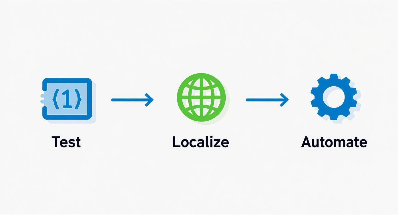
This is not a one and done task. Real growth comes from this cycle: A/B testing gives you data, localization expands your reach, and automation makes it all manageable without burning out your team.
How Often Should I Update My App Store Screenshots?
A good baseline is to review your screenshots at least quarterly. But you should do a full refresh anytime you ship a major new feature, overhaul the UI, or launch a big seasonal campaign. Fresh visuals are a powerful trust signal; they tell users your app is alive and actively maintained.
If you run an A/B test and find a new creative set that boosts conversions, do not wait. Push it live immediately.
App icons are a different beast and often need more frequent updates to keep up with design trends. In fact, industry data shows 42% of top apps update their icons at least three times a year to stay visually relevant. Shopping and Dating apps refresh most often, and gaming apps average about four more icon updates per year than non gaming apps. Apple even encourages bold A/B tests on icons, so you have a clear path to measure the lift. You can discover more insights about app icon trends on ASO Mobile.
What Are the Biggest Mistakes to Avoid?
It is usually the small details that do the most damage. Low resolution or blurry images are an instant turn off, making your app look amateurish. Another classic mistake is cramming way too much text into a cluttered design; it’s completely unreadable on a phone screen.
But the biggest missed opportunity? Failing to communicate your app's core value within the first two screenshots.
The most common pitfall I see is developers just using raw screen captures. No branding, no captions, no story. That does absolutely nothing to build a persuasive narrative or convince someone to tap "Install."
Other big mistakes include:
- Ignoring Device Specific Dimensions: This is how you end up with awkwardly cropped or stretched visuals that look broken.
- Neglecting Localization: Not adapting your images for key international markets is like leaving free money on the table.
- Using Outdated Device Mockups: Nothing screams "this app is dated" louder than showing it on an old iPhone model.
Should My iOS and Android Screenshots Be the Same?
Absolutely not. While your core message and value props should be consistent, the visuals need to be tailored to each platform's native design language. It’s a subtle detail, but one that savvy users definitely pick up on.
For the App Store, your screenshots should feel at home on iOS, using native UI elements like the iOS status bar and fonts. Over on Google Play, your images need to reflect Material Design components and navigation.
Users are deeply familiar with their phone's OS. When your screenshots reflect that, it creates a seamless, trustworthy experience. It shows you care enough to get the details right, and that small effort can have a surprisingly big impact on your conversion rates.
Ready to create stunning, high-converting images for your app store page in minutes? ScreenshotWhale provides professionally designed templates, a simple drag and drop editor, and AI powered localization to help you boost installs and stand out from the competition. Start designing for free today at ScreenshotWhale.