Create a High-Converting Mockup for Mobile App
Learn to design a high-converting mockup for mobile app screenshots. Boost your app store growth with actionable tips on visuals, copy, and automation.
A high-quality mockup for mobile app screenshots is not just a design asset; it is your most powerful conversion tool. Think of it as the digital storefront window for your app. Long before a user ever downloads anything, these visuals are your instant sales pitch, shaping their entire perception and driving installs on both the Apple App Store and Google Play.
Your App Store First Impression Is Everything
Before anyone hits the 'install' button, they size up your app based on its screenshots. This is the moment a professional mockup stops being a nice-to-have and becomes a primary driver for app store growth. Your app store page is your digital storefront, and the screenshots are the window display designed to pull people inside.
A well-crafted visual can communicate your app's core value in just a few seconds, which is often all the time you have.
This guide is not just about basic design; we are diving into practical, actionable insights that actually boost downloads. The goal is to create efficient and high-converting app store screenshots for the Android and iOS stores.
Crafting a Compelling Visual Story
Your screenshots need to do more than just show your UI. They need to tell a story. That story has to quickly answer one question for the user: "How will this app make my life better?" This means your mockups should be all about benefits, not just a laundry list of features.
For instance, instead of showing a plain calendar screen, place it in a vibrant mockup with a punchy caption like "Plan Your Week in Seconds." See the difference? You have just turned a simple feature into a tangible, desirable outcome.
To build a powerful visual story, focus on these key elements:
- Lead with Your Core Value: Your first two screenshots are your prime real estate. They must immediately communicate what your app is all about and why it's worth their time.
- Show the User's Journey: Do not just show random screens. Arrange your screenshots in a logical sequence that guides users through a key workflow, whether it is signing up, finishing a task, or reaching a goal.
- Use Persuasive Captions: Every visual needs a short, benefit-driven headline. This text should reinforce the value being shown on the screen, making the "why" crystal clear.
When you nail these narrative elements, your mockup for mobile app visuals stop being a simple preview and start actively persuading your target audience that your app is the solution they have been looking for. This directly impacts their decision to download.
Selecting Device Frames and Visuals That Convert
Those first few seconds a user spends on your app store page? They are everything. If you want to grab their attention, you have to start with visuals that demand it, and that begins with the device frame you wrap your UI in.
Using the latest iPhone or a current Android model in your mockup for mobile app is more than just a style choice. It is an instant signal that your app is modern and actively maintained.
Think about it from the user's perspective. A current device frame builds subconscious trust. It quietly tells them, "this app is up-to-date and will work perfectly on the phone I already have in my pocket." It is a tiny detail, but it can completely shape their perception of your app’s quality before they have even seen a single feature.
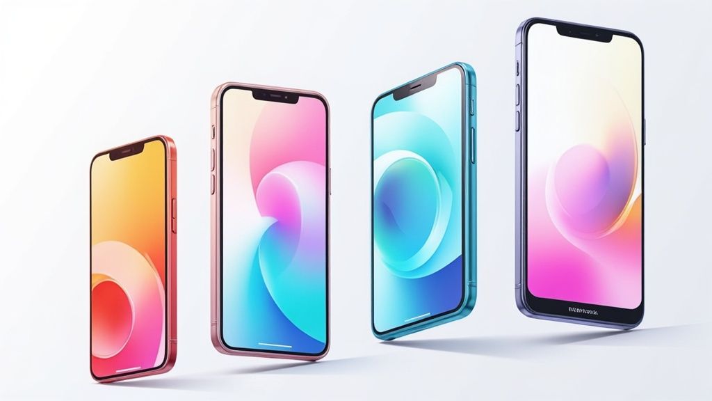
This example right from Apple's own guidelines shows how clean, modern device frames set a high standard. They create a polished, professional first impression that makes your whole product feel more premium.
The Psychology of Color and Clarity
Once you have picked your device frame, the colors and fonts you choose become powerful psychological tools. This is not the place for a generic gray or white background; that is just a missed opportunity. Vibrant, on-brand colors are what grab attention and stir up emotion. A practical technique is to use your site editor’s color picker to pull a key color from your app logo and generate a complementary gradient. This creates a backdrop that feels both professional and connected to your product.
Clarity is just as critical. Your captions have to be readable at a glance. Choose clean, legible fonts that stand out against your background. If a potential user has to squint to read your value proposition, you have already lost them. That focus on instant readability makes your key features easier to digest and builds a sense of trust.
This stuff matters more than ever when you consider the sheer scale of the market. Back in 2023, there were about 6.92 billion smartphone users globally. With over 250 billion app downloads happening each year, the competition is fierce. In that environment, a polished presentation is not a luxury; it is what gives your app a fighting chance.
Your real goal here is to build a cohesive visual story across every single screenshot. Each element, from the device frame to the background color and font choice, has to work together in harmony to show off your brand's identity and convince users to hit that download button.
Creating a Cohesive Visual Narrative
Stop thinking of your screenshots as individual images. They are a sequence, a unified story. Each one should feel like it belongs to the same family, reinforcing your brand with every swipe. This is where using a tool like ScreenshotWhale becomes a huge time-saver, because you can create templates to lock in your look.
For example, you can set up a master template with everything you need:
- Your Brand's Gradient Background: In the site editor, create a vibrant gradient using your brand's primary and secondary colors. This ensures every single screenshot has the same professional, eye-catching backdrop.
- A Consistent Device Frame: Select the latest iPhone model from the device library. Using the same modern device across all your visuals makes the set feel deliberate and clean.
- Standardized Font and Caption Placement: Choose your font, set its size, and lock its position at the top of the frame. Now every caption will look uniform and professional.
When you create a template, you are guaranteeing that every screenshot feels intentionally designed and on-brand. This consistency makes your entire app store page look more trustworthy and professional, which is a massive factor in boosting conversions.
This strategy transforms a bunch of separate images into a single, powerful marketing asset. And if you're specifically targeting the Apple ecosystem, we have got more tips in our guide on creating mockup apps for iPhone.
Writing Compelling Captions and Compositions
A stunning visual is only half the battle. If you want to drive real conversions, your mockup needs an equally powerful message. This is where you learn to write short, punchy captions that instantly tell people your app's benefits, turning a simple screenshot into a persuasive sales pitch.
When you pair a well-composed mockup for mobile app with great copy, you are telling a story. And that story needs to solve a user's problem and convince them to tap 'Install' in just a few seconds.
This kind of precision matters more than ever. The global app market is projected to blow past $522 billion in 2025, with over 7.49 billion mobile users worldwide. Mockups are your secret weapon for getting early feedback and speeding up development, especially since low-code platforms, expected to build 70% of new apps by 2025, rely on them to accelerate workflows by up to 90%.
Crafting Headlines That Scream Value
It is time to ditch generic phrases like "Easy to Use" or "Beautiful Interface." Honestly, they are forgettable and tell the user absolutely nothing of substance. Your goal should be to craft headlines that highlight a specific, tangible benefit or outcome, using strong action verbs to get the point across.
Get inside the user's head. What problem are they trying to solve right now? Frame your captions around that solution.
- Instead of "Manage your tasks," try "Conquer Your To-Do List."
- Instead of "Simple budgeting," try "Track Every Penny Effortlessly."
- Instead of "Photo editing," try "Create Stunning Photos in Seconds."
See the shift? It is no longer about what your app is, but what it does for the user. Nailing the right tone in writing is also key here; it helps you connect with your audience and lets your app's personality shine through.
Guiding the User's Eye
Your visual composition is the silent partner to your captions. It is how you strategically arrange elements on the screen to pull the user’s eye directly to the most important information. A simple but incredibly effective technique is placing a key feature in the top half of the screenshot with a bold, benefit-driven caption right above it.
This ensures your core value proposition is the very first thing people see, even if they are just giving it a quick glance. The human eye naturally drifts toward the top of an image, so use that behavior to your advantage.
Think about the visual hierarchy. The caption should be the most prominent text, followed by the specific UI element you want to show off. Everything else, the background, the device frame, should support that main message without creating distractions. When you combine a clear visual focus with a powerful caption, your app screenshots will tell a cohesive story that actually gets people to take action.
Getting your mobile app mockups to look great is a huge win, but it is only half the battle. If your screenshots do not meet the strict rules set by Apple and Google, your launch or update will grind to a halt.
It is not just about avoiding rejection, though. It is about showing users you have built a quality app that is made for their specific device. Compliance is your ticket to get in the door, but genuine global growth requires thinking bigger. That is where localization comes in; it is a powerful tactic for boosting downloads all over the world.
Navigating the Technical Requirements
The single most common reason for getting your screenshots rejected is simple: you did not follow the technical rules. Each app store has its own requirements for resolutions, aspect ratios, and file formats. Getting these details right is not optional.
For instance, the Apple App Store demands very specific screenshot sizes for different iPhone and iPad models. Google Play is a bit more forgiving but still has clear guidelines you cannot ignore. You cannot just design one set of images and upload them everywhere; you will need to export different versions for each store. To really get into the weeds on this, check out our detailed guide on App Store screenshot sizes.
Adhering to these guidelines shows users that your app is professional and specifically designed for their device. Using an iPhone frame for a Google Play submission, for instance, immediately signals a lack of attention to detail and can hurt user trust.
It can be a lot to keep track of. Here is a quick-reference table to help you compare the essential requirements for each platform.
Apple App Store vs. Google Play Screenshot Requirements
| Specification | Apple App Store (for iPhone) | Google Play Store (for Phone) |
|---|---|---|
| Required Sizes | At least one set for 6.7" and 5.5" displays | Minimum 2 screenshots required |
| Aspect Ratio | Varies by device (e.g., 19.5:9) | 16:9 or 9:16 |
| File Format | PNG or high-quality JPEG | PNG or JPEG (no alpha) |
| Content Policy | Must accurately reflect the app's UI; no misleading content | No violence, profanity, or deceptive claims |
While this table covers the basics, always double-check the latest documentation from Apple and Google before you submit, as these rules can and do change.
Beyond Translation: Localizing for Culture
Once your mockups are compliant, it is time to think globally. True localization goes way beyond just translating your captions into another language. It is about adapting your entire visual presentation to resonate with different cultural norms and user expectations.
This is an incredibly powerful strategy for growth. Time and again, data shows that users are far more likely to download an app that feels like it was made specifically for them.
Here are a few practical steps to take your localization to the next level:
- Adapt the UI: Do not just swap out the text. Show UI elements that reflect local formats, like currency symbols (€, ¥, $), date conventions (DD/MM/YYYY vs. MM/DD/YYYY), or even culturally relevant imagery.
- Adjust Captions for Nuance: A direct, literal translation often sounds robotic or loses its marketing punch. Work with native speakers to craft captions that capture the right tone and connect with the local audience.
- Showcase Relevant Features: If your app has features that are more popular in certain regions, make those the star of the show in your localized screenshots.
Think about launching a travel app. For your Japanese audience, you might show screenshots featuring Kyoto's temples and list prices in Yen. But for users in the United States, you would swap that out for images of the Grand Canyon with prices in US dollars. This kind of thoughtful detail makes your app feel native and trustworthy, which has a direct and immediate impact on your conversion rates.
Ready to Scale? How to Automate Your Screenshot Production
Let's be honest: manually creating dozens of screenshots for different devices, languages, and screen sizes is a huge time sink. It is the kind of repetitive work that slows down updates, opens the door for inconsistencies, and frankly, is a poor use of a skilled designer’s time. For any team pushing frequent updates or managing a portfolio of apps, this manual approach just does not scale.
This is where automation stops being a buzzword and becomes a real competitive edge. Imagine setting up one master template in a screenshot generator, linking a simple spreadsheet with your captions in five different languages, and then letting the tool automatically spit out every single required size for both the App Store and Google Play. This is not some far-off dream; it is a practical workflow you can set up today.
A Smarter Workflow for a Global Audience
When you automate your mockup for mobile app production, you are doing more than just saving time. You are baking brand consistency directly into your process and freeing up your team to focus on high-impact creative work instead of mind-numbing pixel-pushing. This newfound agility means you can react instantly to market feedback or A/B test results without a massive production bottleneck.
For instance, a tool like ScreenshotWhale lets you define a single, polished design with your brand’s fonts, colors, and layout. From there, you can connect an API or even just a data source to feed in translated text and new UI captures. The platform handles the rest, generating a complete, perfectly localized set of screenshots in minutes, not days.
The localization process becomes a clear, repeatable flow: start with a global template, adapt the content for language and culture, and then deploy it across every local market you're in.
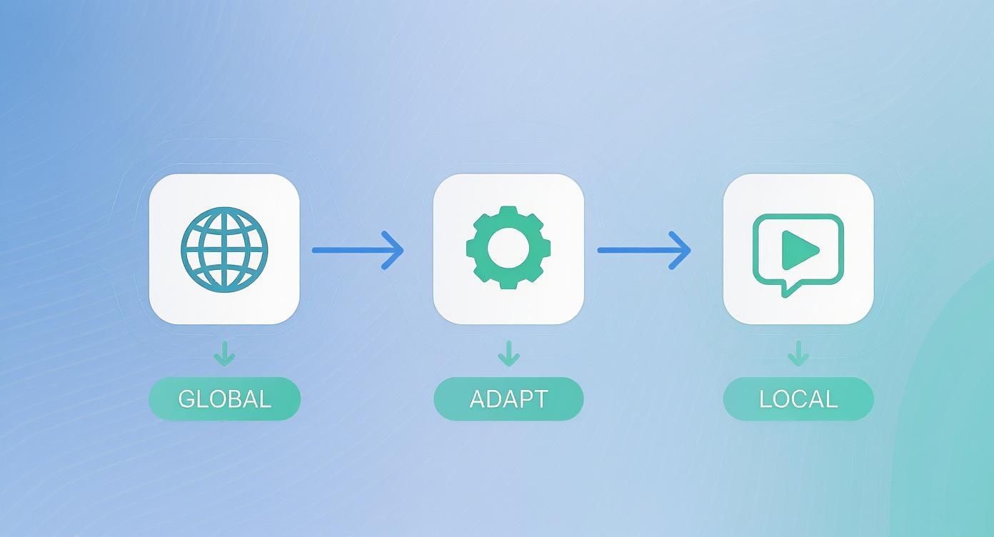
As the infographic shows, great localization is not just about translation. It's a multi-step journey from a universal design to culturally-tuned assets that truly connect with users.
The need for this kind of efficiency is only growing. With a projected 28.7 million developers worldwide by 2025 and app downloads expected to hit a staggering 136 billion in 2024, automation is no longer a luxury. It is a core strategy for managing the sheer scale of modern app development and staying ahead of the competition.
Putting Screenshot Automation into Practice
Getting started with automation is less complicated than it sounds. The real key is shifting your mindset from manual, one-off designs to a more systematic, template-based approach.
Here is a practical way to get going:
- Build Your Master Template: In your site editor, design your ideal screenshot layout. Set a vibrant background, select a modern device frame, and lock in your caption style.
- Centralize Your Copy: Manage all your caption text in a single spreadsheet, using columns for each language. This file becomes your single source of truth for all marketing copy.
- Integrate via API: For maximum power, use an API to trigger screenshot generation automatically as part of your CI/CD pipeline. Every time you deploy, your store assets get updated, too.
By systemizing your screenshot production, you turn a tedious, error-prone task into a reliable and scalable process. This workflow ensures that your app store presence is always professional, up-to-date, and perfectly tailored to every market you serve.
If you're looking to dive deeper into the nuts and bolts of workflow automation, this practical guide to building your first automation with N8n is a fantastic resource. For more specific advice on applying these ideas to your app, check out our guide on how to generate app screenshots.
Your Game Plan for Screenshots That Actually Convert
So, let's pull all this together. Think of this as your final game plan for creating app store screenshots that do not just sit there looking pretty. They work hard to bring in new users.
First things first: you have to nail the visual story. Your first two screenshots are your make-or-break moment. They need to show off your app's absolute best feature, wrapped in a modern device frame with vibrant colors that pop. Pair that with a short, punchy caption focused on a real benefit. A potential user should glance at it and "get" what your app does in less than three seconds. No exceptions.
Next up is playing by the rules. Both the Apple App Store and Google Play are notoriously strict. That means getting the resolutions, aspect ratios, and device frames perfect for each platform. Trust me, putting an iPhone mockup on your Google Play page is a rookie mistake that instantly kills credibility.
Stop Doing It Manually, Start Automating
If you want to scale and not lose your mind, you have to move past creating every single screenshot by hand. The real pros use a template-based workflow with a solid screenshot generator. It is a total game-changer.
Here is how that looks in practice:
- Build a Master Template: You lock in your brand's colors, fonts, and layout once. From then on, every screenshot is perfectly consistent. No more guesswork.
- Go Global in Minutes: Instead of endless copy-pasting, you just connect a spreadsheet with your translated captions. This turns a multi-day localization nightmare into a ten-minute task.
- Automate Your Updates: The best part? You can hook it all up to an API. When you push a new feature, new screenshots are generated automatically.
This is not just about saving time. It is a strategic shift. You turn screenshot production from a tedious chore into a powerful engine for growth. Your screenshots become your hardest-working marketing assets, consistently boosting app store growth.
App Mockup Questions We Hear All the Time
When you are trying to nail your app store presence, a few questions about screenshots and mockups pop up again and again. Getting the answers right is often the difference between blending in and standing out.
What's the Single Most Important Part of an App Screenshot?
Clarity, without a doubt. It is all about the first impression.
Your first one or two screenshots have to instantly signal what your app is all about and why someone should care. A potential user scrolling through the store should get the core idea in about three seconds, tops.
The winning formula is simple: combine a clean, compelling visual of your app's killer feature with a short, punchy caption that screams "benefit." You are not just showing a feature; you are showing them exactly how your app makes their life easier or better. Fast.
How Often Should I Be Updating My App Store Screenshots?
Anytime you push a major UI overhaul or a game-changing new feature, your screenshots need to follow suit. It is basic housekeeping. This shows users (and the app stores) that your app is alive, well, and actively maintained.
But even if you have not shipped a huge update, it is a smart move to refresh your visuals every 3 to 6 months. Think of it as a chance to run a new A/B test. Try different captions, a new layout, or a fresh visual style. See what resonates. This kind of ongoing optimization is how you steadily climb the conversion ladder.
A stale app store page hints at a stale app. Regular updates, even minor visual tweaks, send a powerful signal that your product is active and constantly improving.
Can I Just Use the Same Mockups for Both Apple and Google?
Technically, you could, but you absolutely should not. While your brand style should definitely be consistent across both platforms, using the exact same image files is a recipe for trouble.
For starters, each store has its own strict technical requirements for image sizes and aspect ratios. You have to play by their rules.
More importantly, it is about creating a native experience. Seeing an iPhone mockup in the Google Play Store just feels wrong to an Android user, and vice versa. Using mockups that match the platform, like an iPhone for the App Store and a Google Pixel for Google Play, builds immediate trust and familiarity. It is a small detail that makes a surprisingly big impact on downloads.
Ready to create stunning, high-converting screenshots in minutes? With professionally designed templates and an AI-powered localization engine, ScreenshotWhale makes it easy to produce beautiful, compliant, and effective app store assets that drive growth. Start creating for free on ScreenshotWhale.