Mastering the iOS App Store Preview to Boost App Downloads
A practical guide to creating a high-converting iOS App Store preview. Learn ASO, design, and storytelling secrets to drive installs and grow your app.
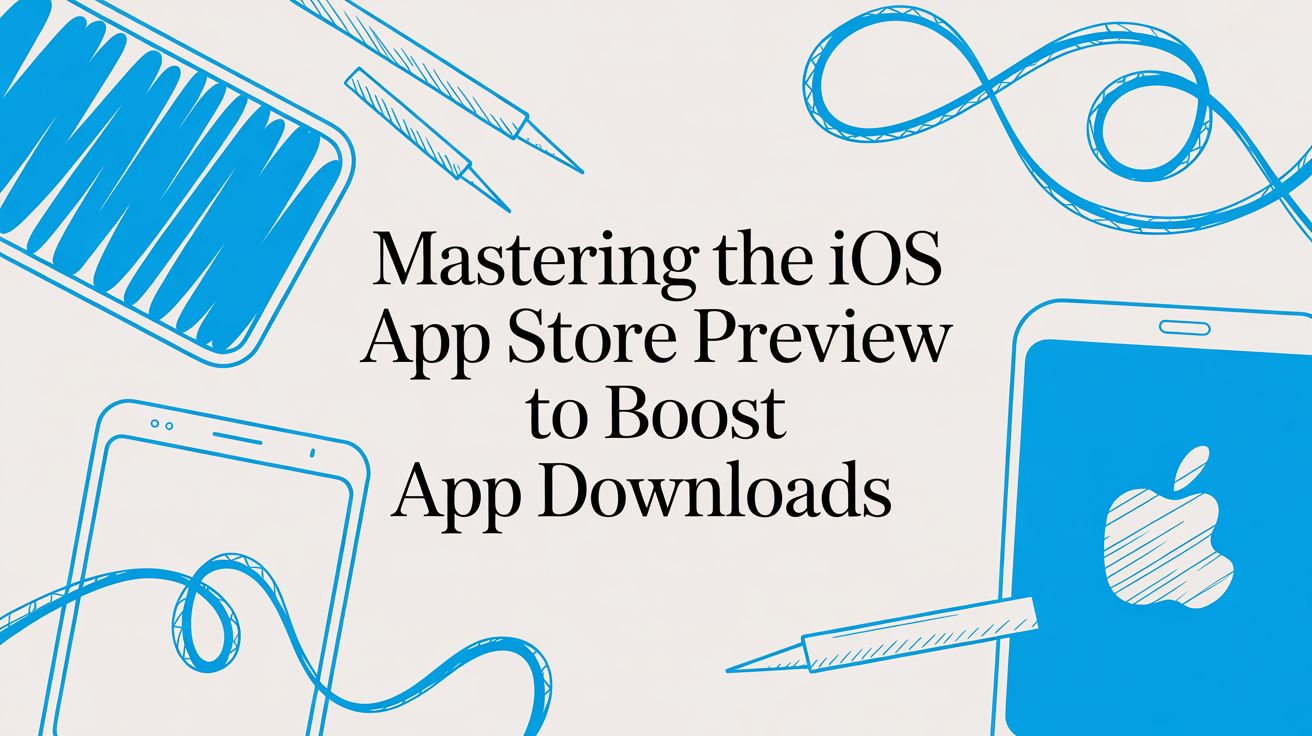
Your iOS App Store preview is, without a doubt, the most important asset you have for turning eyeballs into downloads. Think of it as your silent salesperson, giving potential users a dynamic, visual first impression of what your app is all about. A well-crafted video and a killer set of screenshots can instantly show off your app's value and build trust, often making the difference between a new user and a missed opportunity.
Why Your App Store Preview Is a Conversion Powerhouse
In the insanely crowded App Store, you have just a few seconds to grab someone's attention. Let's be honest: most people scan visuals like screenshots and videos long before they ever read the first line of your description. That split-second judgment is where a powerful preview proves its worth, telling a visual story that either hooks a user or loses them for good.
This isn't just theory; it's how people actually behave. Your visuals are your primary pitch, tasked with showing a user how you solve their problem. A common mistake I see all the time is just displaying random features. Instead, your goal should be to build a compelling narrative around the benefits, establishing credibility and making that 'Get' button an irresistible next step.
Driving Growth with Optimized Visuals
An optimized preview has a direct, measurable impact on your app store growth and conversions. It’s a huge piece of App Store Optimization (ASO), influencing how people perceive your app’s quality and relevance. A polished, informative preview can significantly cut down on user hesitation and lead to much higher install rates.
Did you know that your iOS App Store preview screenshots are the silent sales team for your app? With over 2,091,214 apps competing for attention, those first few images decide if a user taps 'Get' or just keeps scrolling. I've seen well-optimized previews boost conversion rates by up to 30% in big markets like the US and Europe, where iPhone has a massive market share. If you're curious, you can discover more insights about iOS App Store trends.
Key Benefits of a High-Converting Preview
Putting real effort into a high-quality preview pays off in several tangible ways, for both iOS and Android stores:
- Increased Conversions: A clear, benefit-focused preview can dramatically lift your page's conversion rate. More visitors become active users. Simple as that.
- Improved User Expectations: When you accurately show what your app does, you attract the right kind of users. People who are more likely to be happy, leave good reviews, and stick around.
- Enhanced Brand Trust: Professional, high-quality visuals send a strong signal that your app is well-maintained and trustworthy, giving people the confidence to download.
Your app store screenshots are not a gallery of features; they are a visual sales pitch. Every image should answer the user's core question: "How does this make my life better?"
Ultimately, investing time in creating efficient and high-converting app store screenshots isn't just another item on a launch checklist. It's a fundamental strategy for sustainable app store growth.
iOS App Store Preview Asset Specifications
Before you even think about storyboarding or editing, you need to know the rules of the game. Getting the technical specs wrong means App Store Connect will reject your assets, wasting valuable time.
Here's a quick reference table I keep handy to make sure everything is compliant.
| Asset Type | Device | Maximum Dimensions (Pixels) | File Format | Key Notes |
|---|---|---|---|---|
| App Preview Video | iPhone | 1920 x 1080 | .mov, .m4v, .mp4 | 15-30 seconds long, <500 MB |
| App Preview Video | iPad | 1920 x 1080 | .mov, .m4v, .mp4 | 15-30 seconds long, <500 MB |
| Screenshot | iPhone (6.7") | 1290 x 2796 | .png, .jpg | Required for Super Retina XDR |
| Screenshot | iPhone (5.5") | 1242 x 2208 | .png, .jpg | Standard for many devices |
| Screenshot | iPad Pro (12.9") | 2048 x 2732 | .png, .jpg | Required for 3rd gen and later |
| Screenshot | Apple Watch | 396 x 484 | .png, .jpg | For Series 7 and later |
Getting these details right from the start saves a massive headache later. Always double-check the latest App Store Connect guidelines, as Apple occasionally updates them.
Crafting a Visual Story That Converts
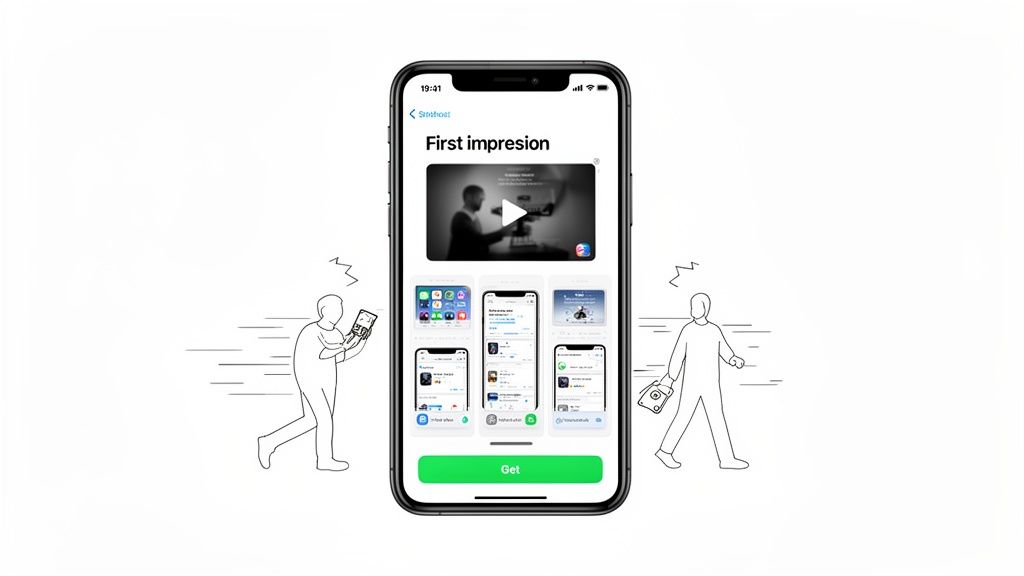
Great App Store previews don't just show off your UI; they tell a story. Think of it as your one shot to take a potential user on a visual journey, guiding them from a quick glance to a confident tap on the "Get" button. This all starts with a crystal-clear idea of your app's core value and a solid plan to show it, not just tell it.
Those first one or two screenshots are your hook. They have a single job: grab attention by hitting on the main problem your app solves. People scroll fast. You need to show them a pain point they recognize and immediately hint that you've got the solution. That's what stops the swipe.
Mapping the User Journey
Once you’ve got their attention, the next few screens need to build on that promise. Don't just throw a random assortment of features at them. Treat your screenshots like chapters in a mini-story. Each one should logically follow the last, presenting your features as the direct answer to the problem you just introduced.
A narrative is way more persuasive than a feature dump. For instance, a productivity app could kick things off with a screenshot of a messy, overwhelming to-do list. The next few visuals would then walk the user through features like smart categorization, calendar integration, and progress tracking. Each screen is a step toward an organized, stress-free life.
The most effective app store previews create a visual flow that mirrors the user's ideal journey. It's not about what your app can do, but what your user can achieve with it.
This storytelling approach helps people actually picture themselves using your app successfully. They see the "before" and "after," making your value proposition feel real and incredibly appealing.
Practical Storyboarding Examples
Let's break down how this works for different types of apps.
- Fitness App: The story might start with a user feeling stuck on the couch (the problem). Subsequent screenshots could show them setting a goal, discovering a workout they're excited about, tracking progress with slick charts, and finally, celebrating a new personal best (the solution and the reward).
- Photo Editing App: Lead with a dull, unimpressive photo. The narrative then unfolds by showcasing one-tap filters, powerful color correction tools, and cool creative effects, all building up to a stunning, share-worthy final image.
- Budgeting App: Open with the familiar stress of not knowing where your money is going. Then, walk them through linking a bank account, seeing expenses categorized automatically, setting a budget, and finally, looking at a clean financial overview that brings peace of mind.
This storyboard from ScreenshotWhale's editor is a great example of structuring a visual narrative.
The template literally forces you to think in terms of a story, making sure every visual has a clear purpose beyond just showing off your UI.
Bringing Your Visual Story to Life
Pulling this off means being thoughtful about both your design and your copy. The goal is for each screenshot to do some heavy lifting, communicating a key benefit with as little text as possible. Use clean layouts and pops of color to guide the eye straight to what matters.
Keep your captions short and focused on the benefit. Instead of a dry, feature-focused phrase like "Advanced Filtering Options," try something like "Find Your Perfect Match." It’s a small tweak, but it shifts the focus from a technical detail to a user outcome. You're building a persuasive visual argument that flows so smoothly, the user gets to the end and downloading feels like the natural next step. For more ideas, check out our guide on creating amazing app store images that pop.
So you've got your story straight. Now, the real work begins: designing an iOS App Store preview that actually gets people to tap "Get."
Great design isn't just about making things pretty. It’s about making your app look credible, trustworthy, and instantly valuable. Every choice from mockups and captions to colors and fonts is a signal to the user about the quality of your app.
This means we have to move beyond just dumping raw, unedited screenshots onto the store. While they might feel authentic, they lack the polish and context needed to stop someone from scrolling. Our goal is to transform those plain screens into compelling marketing assets.
Use On-Device Mockups for Instant Credibility
One of the easiest wins you can get is placing your app's UI inside a clean, modern device mockup. When someone sees your interface running on the latest iPhone or Apple Watch, it immediately makes your app feel current and professionally maintained.
It’s a subtle but powerful psychological cue. It tells the user you care about their experience and that your app is built for their device. In tools like the ScreenshotWhale editor, you can literally just drag and drop your screen into a library of the latest device frames. The difference is night and day.
Write Powerful, Benefit-Driven Captions
Your captions are the headlines of your visual story. They need to be short, punchy, and focused entirely on what the user gets out of it. Ditch the jargon and forget about naming features. Instead, answer the user's silent question: "What can I do with this?"
A few rules of thumb I stick to for captions:
- Keep it brutally short. Aim for 3-7 words, max. People scan, they don't read.
- Lead with action. Start with verbs like "Organize," "Track," "Discover," or "Share." It puts the user in the driver's seat.
- Sell the outcome, not the feature. Instead of "Advanced Filters," try "Find Your Perfect Match." One is a tool; the other is a dream.
A great caption doesn't describe the screen. It describes the feeling or accomplishment the user will get from that screen. It transforms a feature into a solution.
Think of each screenshot and its caption as a tiny, self-contained ad. String them together, and you've built a narrative that pulls the user straight to the download button.
Leverage Color and Typography
Your use of color and typography can make your screenshots pop off the page and direct the user’s eye exactly where you want it to go. Using your brand's primary colors is great for consistency, but don't shy away from a bold accent color to highlight a key button or call to action.
Fonts matter just as much for readability on a tiny screen.
- Legibility is everything. Go with a clean, sans-serif font that’s easy to scan.
- Create a clear hierarchy. Use a bigger, bolder font for your main headline and something smaller for any subtext. This helps users get the main point in a split second.
These little details add up, making your iOS App Store preview more scannable and visually engaging, which is crucial for holding a user’s attention.
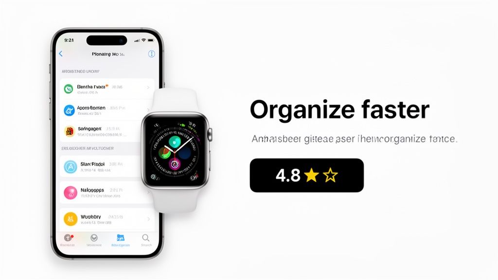
Weave in Social Proof to Build Trust
Nothing convinces a potential user like seeing that other people already love your app. You can bake social proof right into your screenshot designs, and it works like a charm.
Try adding small, tasteful elements like:
- Star Ratings: A simple graphic saying "4.8 Stars" can work wonders.
- Awards or Recognition: If you were "Featured by Apple," show it off!
- Short Testimonials: A snippet from a real review like, "The best productivity app!" is incredibly persuasive.
This visual optimization is a proven driver of growth and a key reason some apps take off while others stagnate.
Turn Generic Screenshots into Marketing Assets
Let's walk through a practical example of this transformation using a site editor.
Before: You have a raw screenshot of your fitness app's dashboard. It shows a bunch of data points, but on its own, it doesn't communicate much value.
After (using an editor like ScreenshotWhale):
- Select a template. Start with a pre-designed layout that has a vibrant background.
- Add a device frame. Drag your screenshot into a sleek iPhone 15 Pro mockup.
- Write the caption. Add a bold, clear headline at the top that declares, "Crush Your Fitness Goals."
- Add social proof. Use a badge element to subtly highlight a "4.9 Star Rating" in the corner.
You've just transformed a generic screen into a powerful marketing asset that sells a benefit, builds trust, and looks utterly professional.
To keep sharpening your edge, you can even explore AI-powered experimentation for optimizing app previews. By consistently applying these design principles, your preview stops being just a requirement and becomes your most effective tool for App Store growth.
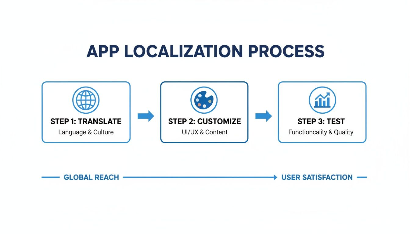
Scaling Your App Globally with Smarter Localization
Thinking about taking your app global? It's a huge step, but it's way more than just swapping out English text for another language. To really succeed, you have to get inside the heads of your new audience. Your iOS App Store preview is their first impression, and what works in one country can completely miss the mark in another.
True global expansion means you’re not just translating words; you're translating the entire experience. This involves rethinking your imagery, color choices, and even which features you show off. This whole process of adapting your visual storefront for different markets is what we call internationalization, or i18n for short.
It sounds like a ton of work, and it can be. But getting it right is a massive growth lever, and thankfully, modern tools have made it easier than ever.
The Power of Cultural Adaptation
Great localization is subtle. It makes people feel like your app was built specifically for them. This means paying close attention to the visual cues in your app store screenshots.
- Imagery and Models: The faces in your screenshots matter. They should look like the people in the local market. Using culturally familiar imagery creates an instant bond and makes your app feel less like a foreign product.
- Color Symbolism: Colors mean different things around the world. Red might scream "danger" or "excitement" in the West, but it’s the color of good fortune in China. A little research here goes a long way in making sure your design choices land correctly.
- Featured Use Cases: Show, don't just tell. A food delivery app expanding to Japan should probably feature someone ordering ramen, not tacos. This simple switch shows you’ve done your homework and actually understand the local culture.
We’ve written a much deeper guide on this, breaking down the strategy behind whether to localise or localize your content. It’s worth a read if you’re serious about this.
Accelerating Localization with AI
Let's be real: manually creating dozens of unique screenshot sets for every language is a soul-crushing task. This is where an AI-powered i18n engine, like the one we've built into ScreenshotWhale, completely changes the game. What used to take days of tedious design work can now be done in minutes.
The workflow is incredibly straightforward. You design one master template. The AI then takes over, translating your captions into over 100 languages and, crucially, adjusting font sizes and layouts to handle varying text lengths. The result is a polished, native-looking set of screenshots, every single time.
Localization is no longer a resource-heavy luxury; it's a scalable strategy. With the right tools, a small team can launch a global-ready App Store presence that rivals the biggest players in the industry.
This kind of automation frees your team from the grunt work, letting you focus on the bigger picture: strategy, testing, and growth.
A/B Testing Your Way to Higher Conversions
So you’ve got your localized assets. How do you know which ones actually work? You test them. Apple’s Product Page Optimization (PPO) is your best friend here. It lets you run A/B tests right on the App Store to see what visuals convince more people to hit that "Get" button.
Setting up a test in App Store Connect is simple. You create a "treatment" page with your new screenshots and pit it against your original "control" page.
Here are a few high-impact ideas to get you started:
- Captions: Is "Save Time" more compelling than "Get Organized"? Test different benefit-driven headlines.
- Backgrounds: Does a clean, solid color background outperform a lifestyle photo or a flashy gradient?
- Screenshot Order: Try leading with a screenshot that shows off social proof versus one that highlights a core feature. See what moves the needle.
After letting a test run for a couple of weeks, Apple gives you the data. You’ll see a clear winner with a higher conversion rate. From there, you just apply the winning version to your main product page and start the process over again. This data-driven loop turns localization from a guessing game into a reliable growth engine.
Automating Your Workflow for Faster Updates
If you're a busy developer or marketer, you know the pain. Manually creating screenshots for every single app update is a massive time sink. It’s a tedious grind that pulls you away from building new features or, you know, actually growing the business. The secret to keeping your iOS App Store preview fresh without losing your mind is building an efficient, scalable workflow.
The whole process starts with templates and brand kits. Think of it as creating a master design that holds your brand’s colors, fonts, and layout rules. This single step ensures every visual you produce looks consistent. It’s not just about saving time; it reinforces your brand identity across both the iOS and Android stores.
The Power of Consistent Branding
When someone lands on your updated App Store page, they should instantly recognize your app. A brand kit is your single source of truth for this.
It usually boils down to a few key things:
- Color Palettes: Your primary and secondary brand colors.
- Typography: The specific fonts and weights you use for captions and headlines.
- Logo Usage: Clear rules on where and how your app icon or logo appears.
- Layout Rules: Pre-defined structures for different types of screenshots (e.g., feature highlights vs. walkthroughs).
Using a tool like the ScreenshotWhale editor, you can set this up once and reuse it forever. The next time you ship a new feature, you just drop in the new screen capture, tweak the text, and the design is already done. No more fiddling with pixels.
The goal is to make updates a simple, repeatable process, not a full-blown redesign project. Consistency builds trust and makes your app look professionally managed, which absolutely impacts user perception and conversions.
This idea of a structured, repeatable process is also crucial for localization. It's not just about translation; it's a full workflow of translating, customizing, and testing assets for global markets.
Automation doesn't just make translation faster. It streamlines the entire adaptation process, from tweaking visuals for cultural fit to testing their performance.
True Automation Through an API
Templates are a huge leap forward, but the real magic happens with true automation. For teams juggling multiple apps or frequent updates, an API is a total game-changer. It lets you programmatically generate entire sets of polished, high-converting app store screenshots without ever opening a design tool.
Imagine you just pushed a minor UI fix. The old way involved manually taking new screens, editing them, and uploading everything. With an API, you just feed it the new raw captures and updated caption text. The system takes over, automatically placing everything into your templates, localizing them into a dozen languages, and spitting out the final assets.
This is a lifesaver for keeping your App Store page accurate and looking sharp, ensuring your visuals always reflect the latest build. You can dive deeper into how to generate app screenshots at scale in our detailed guide.
Building a Scalable Asset Pipeline
This level of automation creates a seriously powerful asset pipeline that can keep up with rapid growth. For teams expanding into new markets, an API-driven workflow can produce localized screenshot sets for ten different languages in the time it would take to do one set by hand. That's the kind of speed agile teams need.
The process is refreshingly straightforward:
- Capture: Automatically grab new screens during your testing or build process.
- Update: Send the new screens and localized text strings to the API endpoint.
- Generate: The API crunches the inputs, applies your templates, and creates all the required screenshot sizes.
- Deploy: The finished assets are ready to be uploaded straight to App Store Connect.
This hands-off approach turns a multi-day design task into a simple, automated step in your release cycle. For even more advanced automation, platforms like lunabloomai are using AI to push efficiency even further. By eliminating the manual bottleneck, you free up your team to focus on what actually matters: boosting your app’s growth and keeping your store preview engaging and effective.
Answering Your Biggest App Store Preview Questions
Jumping into App Store visuals for the first time brings up a ton of questions. It's easy to get lost in the details, but getting your iOS App Store preview assets right is a massive lever for growth. Let's cut through the noise and tackle the most common questions I hear from developers and marketers.
How Many Screenshots and Videos Should I Actually Use?
Apple gives you a pretty generous sandbox to play in: up to ten screenshots and three app preview videos for each language you support. But this isn't about filling every single slot. It's about telling a compelling story, and fast.
My rule of thumb? Aim for at least five to seven killer screenshots. You want enough to paint a clear picture of your app's value, but not so many that you overwhelm people. The first one to three are absolutely critical. They're what users see in search results before they even decide to tap on your app. Make them count.
When it comes to videos, one incredibly polished 15- to 30-second preview is worth more than three mediocre ones. Don't forget, videos autoplay on mute. Your first few seconds of visuals need to be magnetic enough to stop someone from scrolling.
What Are the Biggest Mistakes People Make with Previews?
So many teams fall into the same traps, and it tanks their conversion rates. Just by avoiding these common blunders, you'll be miles ahead of the competition.
Here are the mistakes I see over and over:
- Plain, Naked Screenshots: Just dropping in raw captures from your app feels lazy. They lack context and don't look professional. You need device frames and captions to tell a story.
- Tiny Novels for Captions: Nobody is going to squint to read long sentences on a phone screen. Keep your copy short, punchy, and focused on the benefits.
- Wasting Real Estate on Boring Screens: Your first screenshot should never be a login or splash screen. That's a huge missed opportunity. Get straight to the "aha!" moments that make your app special.
- Ignoring Localization: Using the same English screenshots for every single market is a surefire way to alienate a massive chunk of potential users. It screams, "we don't care about you."
- Using Outdated Device Mockups: Nothing makes an app look more neglected than showing it on an iPhone from five years ago. Keep your mockups current.
Should I Focus on My App's Features or Its Benefits?
This is a classic marketing dilemma, but for the App Store, the answer is crystal clear: always lead with benefits. You use your features to prove those benefits.
Think about it. People aren't scrolling through the App Store looking for a list of functionalities. They're looking for a solution to their problem. They want to make their life easier, more fun, or more productive.
A caption like "Advanced Filtering" is a feature. It's dry. Reframe it as "Find Your Perfect Meal in Seconds," which is a benefit. The screenshot can show the filtering UI, but the text needs to sell the outcome.
This simple shift in mindset connects what your app does with why a user should give a damn. It moves the conversation from technical specs to real-world value, which is infinitely more persuasive. Before you write a single caption, ask yourself: "What will the user accomplish with this?"
How Often Should I Update My App Store Screenshots?
Your App Store page isn't a "set it and forget it" asset. It should be a living, breathing reflection of your product.
At a minimum, you should update your screenshots whenever you release a major new feature or a significant UI redesign. This is just basic housekeeping. It ensures your store listing is accurate and shows off the best, most current version of your app.
Beyond that, smart teams refresh their visuals two to four times a year as part of their App Store Optimization (ASO) strategy. You can time these updates with seasonal events, A/B test a new value proposition, or just give the page a modern facelift. An active product page sends a strong signal to both users and Apple's algorithm that your app is alive and well.
Ready to stop guessing and start creating stunning, high-converting screenshots in minutes? With ScreenshotWhale, you can access professionally designed templates, an intuitive editor, and an AI-powered engine to localize your visuals for global markets instantly. Start designing for free today!
Put this into practice on your own listing
Import your live app into an ASO workspace — metadata, keywords, competitors, and store screenshots in one place.
Import my app