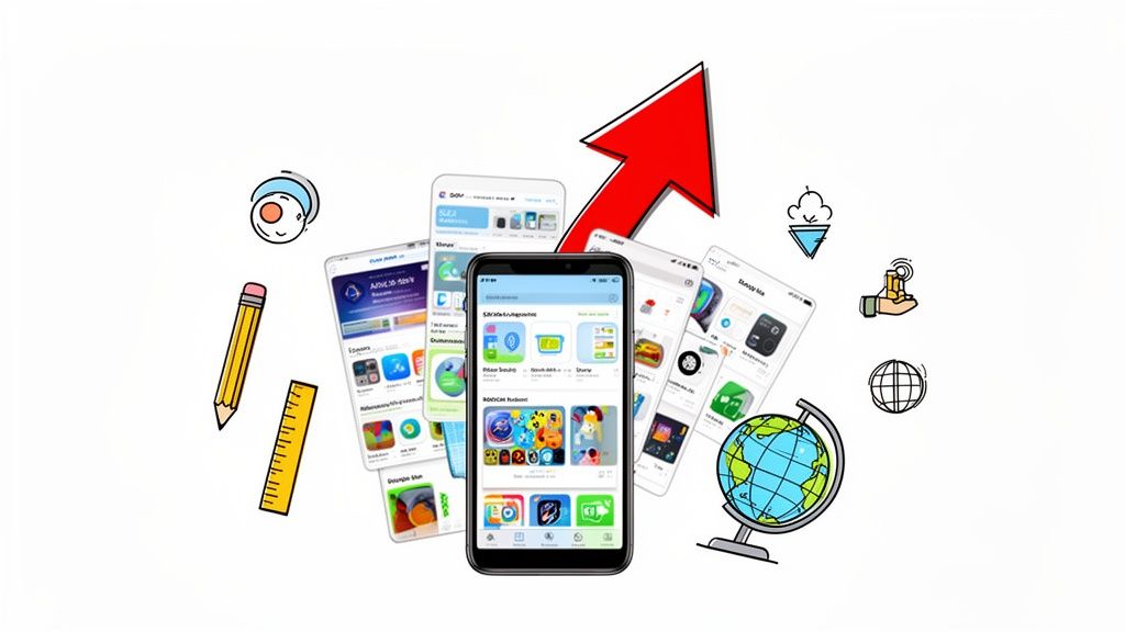
Create High Converting App Store Images That Drive Downloads
Learn how to design compelling app store images that boost growth. Our guide covers proven strategies for iOS and Android to create screenshots that convert.
Your app store images are your visual sales pitch. They are the first, and often only, chance you get to show off your app’s features and convince someone to tap that download button. Think of them as more than just pictures; they are a direct line to your potential users, telling a story about your app's value in a matter of seconds.
Why App Store Images Are a Dealbreaker for Conversions
Let's be real: we all judge an app by its cover. In the split-second a potential user lands on your store page, your images are doing all the heavy lifting. They are not just there to look nice; they are a powerful signal of your app's quality, professionalism, and the overall user experience you offer.
Well designed screenshots grab attention instantly. They create a strong first impression that can be the difference between stagnating and skyrocketing your app store growth. A polished, professional look builds trust and reassures users that your app is just as well built and reliable. This visual promise is often the final nudge that turns a "maybe" into a definite download.
The Seven Second Audition
People scroll fast. You have a tiny window to get them to stop and pay attention. In fact, research shows that most users spend just 7 seconds deciding if an app is worth their time.
In that fleeting moment, your app store images are the second most influential factor in their decision, right behind your star rating. That means your visuals can either make or break a conversion. It’s that simple. You can read more about this in a great guide from MobiLoud.
Your first two or three screenshots are everything. They need to tell a compelling story about your app's main benefit, convincing users that your solution is exactly what they have been searching for.
More Than Just a Pretty Face
Beyond the psychology, your app store images also play a surprisingly direct role in your App Store Optimization (ASO) strategy. The store algorithms are getting smarter all the time. They do not just see pixels; they actually analyze the text within your screenshots to get more context about your app's features.
By working relevant keywords into your screenshot captions, you are feeding the stores more data to rank you for relevant searches. This turns your visual assets into a powerful, and often overlooked, piece of your ASO puzzle. To see how all the pieces fit together, check out our deep dive into what ASO stands for.
To get this right, you first need to understand the core principles that drive effective design on both platforms. The end goal is the same, more downloads, but the best way to get there can differ quite a bit between Apple and Google.
Here's a quick breakdown of the fundamental differences to keep in mind.
Core Principles for High Converting App Store Images
| Principle | Apple App Store Focus | Google Play Store Focus |
|---|---|---|
| Aesthetic | Emphasizes a clean, premium, and minimalist design that feels native to the iOS ecosystem. | Allows for more vibrant, dynamic, and feature rich layouts that highlight functionality and benefits. |
| Storytelling | Favors a sequential narrative that guides the user through a core user journey or benefit. | Often uses a "feature first" approach, highlighting multiple key functions in the first few images. |
| Typography | Prefers bold, clear, and concise headlines using San Francisco or similar clean fonts. | Encourages creative and branded typography that captures attention and conveys personality. |
| Call to Action | Relies on the visual story to imply action, with less emphasis on explicit "Download Now" text. | More open to including direct calls to action (CTAs) and promotional text within the images. |
While these are not rigid rules, they reflect what users on each platform have come to expect. Aligning with these expectations is the first step toward creating visuals that feel right and convert effectively.
Nailing the technical specs for your app store images is ground zero. It can feel like a maze of requirements, but honestly, you just need to focus on a few key sizes and formats. Get those right, and Apple and Google will handle the rest.
Both stores have their own rulebooks for dimensions, file types, and sizes. Trying to wing it is a fast track to getting your submission bounced, and nobody wants that delay. Think of these specs less as limitations and more as your blueprint for creating assets that look incredible on every single device.
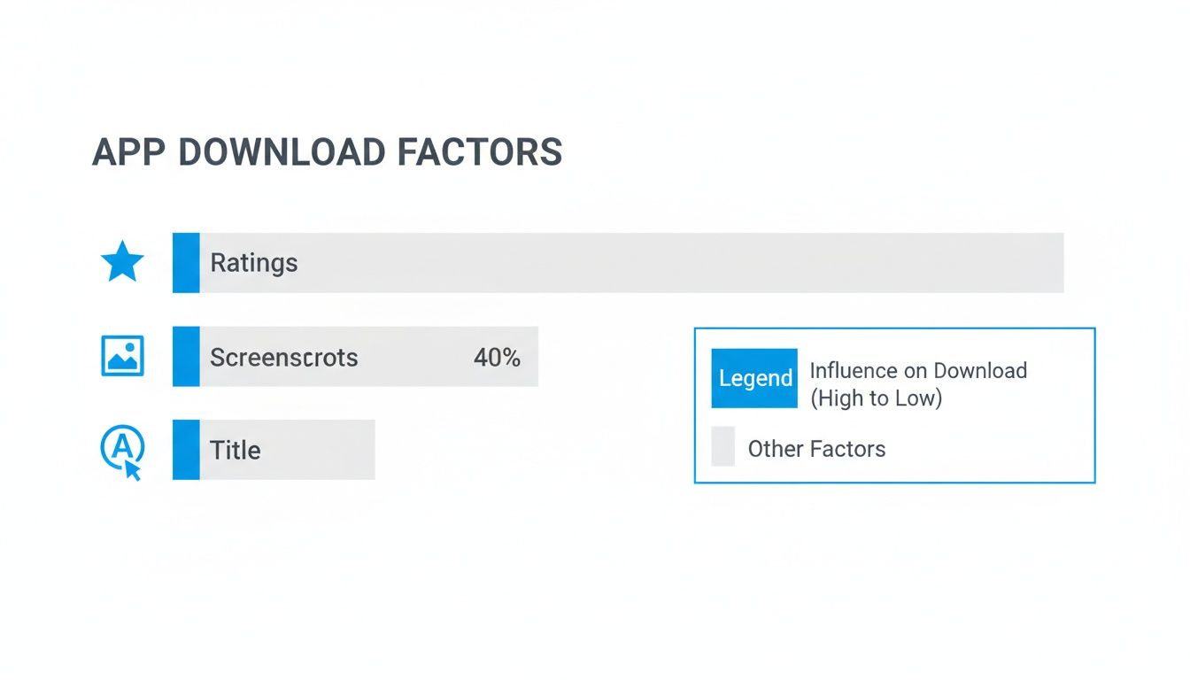
This data is pretty clear: after your star rating, your screenshots are the single most powerful tool you have to convince someone to tap that "install" button. They account for a whopping 40% of the decision.
Getting It Right for the iOS App Store
Apple is famous for its high standards, and that definitely extends to app store screenshots. The whole point is to give users a consistent, high quality look, whether they are on a brand new iPhone 15 Pro Max or an older iPad.
You’ll need to provide your images in PNG or a high quality JPEG format. One critical detail: no transparency (alpha channels). Each file also has to be in the RGB color space. Keep an eye on file size, too; a product page that loads slowly is a conversion killer.
How to Handle the Google Play Store
Over on the Google Play side of things, you get a bit more wiggle room, but there are still hard rules to follow. You can upload up to eight screenshots for each device type: phone, tablet, Android TV, and Wear OS. The format requirements are similar: JPEG or 24-bit PNG, and again, no alpha channels.
The big difference with Android is the emphasis on aspect ratio instead of exact pixel dimensions. Given the sheer variety of Android devices, your images have to be adaptable. The smallest any side can be is 320px, and the largest is 3840px, which ensures they look good on everything from a tiny budget phone to a high res tablet.
Pro Tip: You can mix and match aspect ratios in your gallery, but I would not recommend it. Keeping them all consistent just looks far more professional and makes for a much cleaner browsing experience for potential users.
For a deep dive into every single requirement, check out our comprehensive guide on https://screenshotwhale.com/blog/app-store-screenshot-requirements. It is the ultimate cheat sheet.
The Only Screenshot Sizes You Really Need to Worry About
Device fragmentation used to be a nightmare, forcing you to create dozens of image variations. The good news? Those days are over. Both stores now operate on a system where you provide a few key sizes, and they automatically scale them for other devices.
This makes your job so much easier. You just need to focus on creating perfect assets for the main device classes.
Below is a quick reference table that breaks down the essential sizes you’ll need for a smooth submission. If you get these right, you are 99% of the way there.
Device Screenshot Specifications for App Store & Google Play
| Platform | Device | Required Dimensions (Pixels) | Aspect Ratio | Notes |
|---|---|---|---|---|
| Apple iOS | iPhone (6.7") | 1290 x 2796 (Portrait) 2796 x 1290 (Landscape) |
~19.5:9 | This is the go to size. Apple uses this to scale down for most other modern iPhone models. |
| Apple iOS | iPad Pro (12.9") | 2048 x 2732 (Portrait) 2732 x 2048 (Landscape) |
4:3 | This one is mandatory if your app supports iPad. No getting around it. |
| Google Play | Phone | Between 320px & 3840px | 16:9 or 9:16 | There is no single required size, but you must stay within these min/max dimensions. |
| Google Play | 7-inch Tablet | 1024 x 600 (min) | Varies | Only required if your app is specifically optimized for 7-inch tablets. |
| Google Play | 10-inch Tablet | 1280 x 720 (min) | Varies | Required for apps that target larger Android tablets. |
Getting these pixel perfect can feel tedious, but it’s a non-negotiable part of the process.
To make this part of the workflow less of a headache, having a few good free image resizing tools in your back pocket is a lifesaver. They can help you quickly tweak your designs to hit the exact dimensions you need without sacrificing quality, saving you a ton of time.
Alright, let's get those technical specs out of the way. Now for the fun part: turning those plain app store images into a visual pitch that actually gets people to tap "Download."
The best screenshots do not just show your UI; they sell an experience. This is not about adding flashy graphics for the sake of it. It’s about cutting through the noise and making your app's value crystal clear to someone who has never heard of you before.
Weaving a Compelling Visual Story
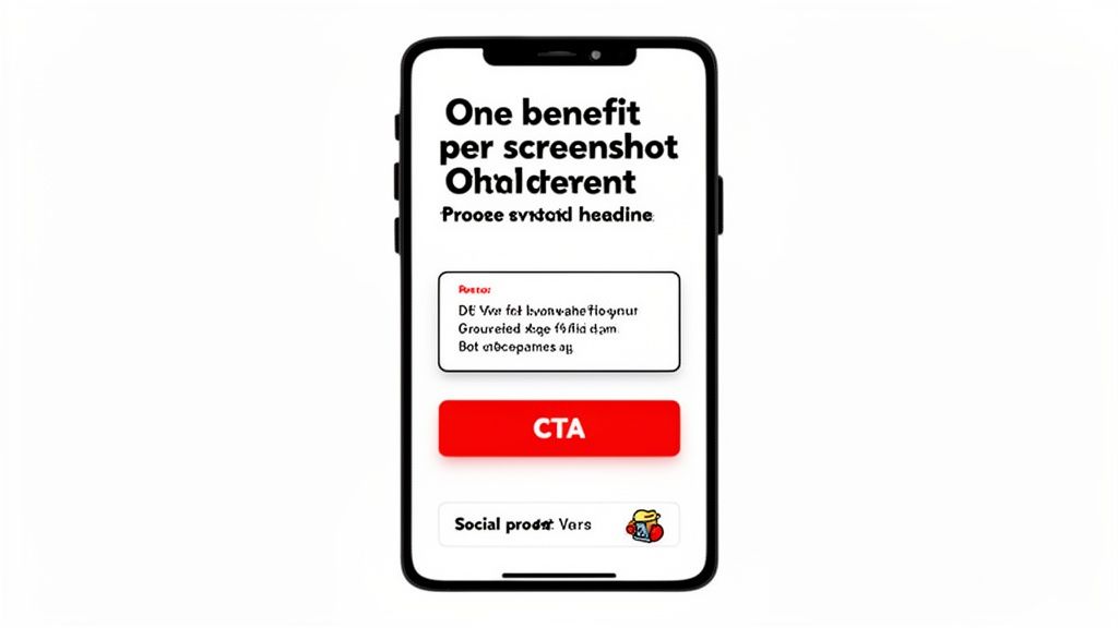
Think of your first screenshot as the hook. It has to grab them immediately with a powerful headline that hits on their main goal or frustration. Forget listing features, focus on the outcome.
A fitness app, for example, should not say "Track Your Workouts." That's a feature. Instead, lead with something like "Crush Your Fitness Goals." See the difference? One is what your app does, the other is what the user gets. That benefit driven hook connects instantly and sets the tone for the rest of your screenshots.
My number one rule: one key benefit per screenshot. A cluttered image with a dozen messages is just a confused mess. You are trying to build a clear, persuasive journey that makes hitting the download button feel like the only logical next step.
A great visual story has a natural flow, something like this:
- Screenshot 1: Hit them with your core value proposition.
- Screenshot 2: Show the main feature that makes it happen.
- Screenshot 3: Introduce a cool secondary benefit or feature.
- Screenshot 4: Earn their trust with some solid social proof.
- Screenshot 5: Wrap it up with a clear call to action or a final benefit.
Learning From the Apps That Nail It
You do not need to start from a blank slate. The most successful apps are already giving you a masterclass in screenshot design. Just look at TikTok or Strava. TikTok's screenshots are pure energy: vibrant, dynamic visuals that match the feel of the platform, using bold text to call out features like "Duet" and "Stitch."
Strava plays a different game: building trust through social proof. And it works. Adding things like user testimonials or media mentions can give your download numbers a serious bump. Strava knows its competitive, data driven audience, so it highlights quotes from heavy hitters like The Wall Street Journal. That kind of authority resonates.
At the end of the day, effective screenshots are all about applying solid User Experience (UX) design principles. Good UX is about clarity, and your screenshots are the very first piece of that experience.
Key Design Principles for Readability and Pop
You have seconds, maybe less, to get your message across. Your design choices will make or break that moment. This is where visual hierarchy and readability become your best friends.
Visual hierarchy is just a fancy way of saying you are telling the user's eyes where to look first. Here’s how to do it:
- Size and Scale: Your headline should be the biggest thing on the screen. Period. Their eyes should jump from the headline to the device mockup, then to any smaller text.
- Color and Contrast: Use bold, vibrant backgrounds that align with your brand, and make sure your text pops. A light font on a dark background (or vice versa) is an absolute must for readability on a small phone screen.
- Device Framing: Pop your UI into a clean device frame, like an iPhone or Pixel mockup. It instantly looks more polished and professional, providing context and separating your app's screen from the background.
And of course, people have to actually be able to read it.
- Font Choice: Keep it simple. Clean, sans-serif fonts are your go to. There is a reason everyone uses Helvetica, Roboto, or San Francisco; they are incredibly easy to read at a glance.
- Text Size: Your headline needs to be legible even when it’s just a tiny thumbnail in the search results. A great way to test this is to shrink your designs way down. Is the main message still clear? If not, make it bigger.
- Concise Copy: Short, punchy captions win every time. Use action verbs and stick to the benefits. Instead of "Our app allows you to track expenses," go with "Track Expenses Effortlessly."
Combine a strong narrative with these design fundamentals, and your app store images will do more than just fill a requirement. They will become your hardest working marketing asset, driving growth and boosting those conversion numbers.
If you want to see these principles in action, check out our breakdown of the https://screenshotwhale.com/blog/best-app-screenshots from some of the top brands out there.
A Practical Workflow For Creating Stunning Screenshots
Theory is great, but let's be honest, the real struggle is turning those ideas into a fast, repeatable process. You should not need days of painful back and forth with a design team just to get a full set of app store images.
With the right workflow and tools, you can knock out a professional, on-brand set in minutes. I'll walk you through how we do this using a dedicated platform like ScreenshotWhale, moving from a blank slate to a store ready set without the usual headaches.
Start With A Solid Foundation
Forget starting from scratch. The single fastest way to get effective app store images is to begin with a professionally designed template.
These templates are great because they have conversion principles already baked in. You get a massive head start on things like layout, typography, and visual hierarchy, letting you focus on your app's message instead of fiddling with pixels.
Platforms like ScreenshotWhale offer templates for specific categories: finance, fitness, social media, you name it. This is a bigger deal than it sounds. A template for a meditation app should feel completely different from one for a high octane mobile game. Starting with a category specific design ensures you are already speaking the right visual language for your target audience.
The biggest bottleneck in this whole workflow is usually that initial design phase. A good template lets you skip the "blank canvas" paralysis and jump straight to customizing a layout that's already 80% of the way there.
Once you have picked a template, the fun begins. This is where you inject your brand’s personality and show off what makes your app special.
Here’s what a typical editor looks like. You have got the main canvas with your template, a sidebar full of customization options, and a live preview of how everything will look on the app stores.

The best tools are built for speed. You can drag and drop elements, edit text right on the image, and see updates in real time. No lag, no friction.
Customization Made Simple
A good screenshot editor gets out of your way. You should not need a design degree to make simple, powerful changes. For instance, creating a screenshot for a budgeting app might follow these steps:
- Upload Your App's UI: Drag your app’s home screen UI capture into the editor. The tool should automatically place it inside the device mockup on your template.
- Write a Killer Headline: Click the placeholder text and type "Manage Money Simply." You now have a clear, benefit-driven headline that grabs attention.
- Match Your Brand Colors: Open the color panel. Input your brand’s primary color hex code, like a vibrant green. The tool can then suggest a beautiful gradient or a solid background that makes your UI pop.
These simple moves let you lock in brand consistency across all your app store images with just a few clicks. It takes what used to be a tedious chore and makes it a quick, even enjoyable, part of your marketing.
Swapping Devices And Layouts Instantly
One of the most mind numbing parts of doing this manually is adapting designs for different devices. You need one set for the latest iPhone Pro Max, another for a Google Pixel, and maybe one for an iPad.
A modern editor solves this problem completely.
With a single click, you can swap out the device frame in your template.
- Change an iPhone 15 mockup to a Samsung Galaxy.
- Switch from a portrait orientation to a panoramic layout.
- Update the device color from deep purple to a sleek silver.
This kind of flexibility is a game changer for app store growth. It lets you create visuals specifically for the iOS App Store and the Google Play Store without having to start over. The editor handles all the resizing and reformatting automatically, making sure your screenshots meet the exact specs for each platform.
This workflow is about more than just saving time. It’s about empowering anyone on your team, from a solo dev to a marketing manager, to create visuals that actually convert. When you remove the technical and design hurdles, you can finally focus on what really matters: telling a compelling visual story that gets people to hit "Download."
Scaling Your Global Reach With Localization
If you are serious about app store growth, you have to think beyond your home market. But going global is more than just translating your app’s description. Your app store images are a critical, non-negotiable part of your international strategy.
People in different countries have their own cultural expectations and visual tastes. A set of screenshots that crushes it in North America might completely flop in Japan or Germany. Real localization means adapting your entire visual pitch, from the text in your captions to the cultural nuances in your UI, so it truly connects with local users.
The Grind of Manual Localization
Manually localizing app store images for dozens of markets is a soul crushing task. It’s a slow, expensive loop: translate copy, send it to a designer, wait for the updated images, and then do it all over again for every single language and device.
This approach does not just burn through your budget; it absolutely kills your momentum. When a new feature ships, you need to get your visuals updated across all regions, fast. A manual workflow makes this nearly impossible, leaving your international store listings looking stale and inconsistent. This is where a smarter system becomes a must have for scaling.
Localizing your app store screenshots is one of the highest ROI activities you can do. One study found that localizing an app’s listing can boost downloads by a staggering 767%. It’s proof that users are far more likely to install an app that speaks their language, visually and literally.
Let AI Handle the Translations
Modern tools have completely changed the game here. Instead of juggling endless spreadsheets and design tickets, you can now automate the entire translation process.
With a platform like ScreenshotWhale, its AI powered engine can instantly translate your screenshot captions into over 100 languages. You nail down your master copy in English, and with a single click, the tool spits out perfectly translated text for every single market you are targeting.
This brings a few massive wins:
- Speed: You can generate dozens of localized screenshot sets in the time it used to take to produce just one.
- Consistency: Your brand style and layout stay unified across all languages, giving you a polished, professional look everywhere.
- Cost Savings: You drastically slash the design and translation expenses that come with doing it all by hand.
The AI does the heavy lifting, freeing up your team to focus on strategy instead of mind numbing production work. It ensures your app store images feel native to every user, no matter where they are.
Scaling Production for Teams and A/B Tests
For bigger teams that are constantly shipping updates or running A/B tests, automation becomes even more essential. Every product iteration calls for fresh app store images to showcase new features, highlight seasonal promos, or test out new messaging.
This is where integrating with an API becomes a real growth lever. An API lets your development or marketing systems programmatically generate new screenshot sets without anyone ever having to open an editor.
Picture this workflow:
- Your team pushes a new app update with a redesigned feature.
- An automated script grabs the new UI screens and updated caption text and sends them to the API.
- The API generates a complete, store ready set of images for all devices and all 28 languages supported on the App Store.
This level of automation means your store listing is always fresh and perfectly in sync with your latest product version. It frees up an incredible amount of time, eliminates human error, and gives you the agility to test and optimize your visual assets across every single market you’re in.
A Few Common Questions We Always Hear
As you start dialing in your visual strategy, a few questions tend to pop up again and again. Getting these small details right can make a huge difference in your app store growth, so let's clear them up with some direct, no nonsense answers.
How Many App Store Screenshots Should I Actually Upload?
The short answer? All of them.
Apple gives you 10 slots, and Google Play gives you 8. Your job is to fill every single one. Seriously.
Leaving slots empty is just a missed opportunity. Think about it: each image is another chance to show off a core benefit, spotlight a killer feature, or build trust with a bit of social proof. A full set of screenshots tells a potential user that you are professional and you have thought everything through.
A classic mistake is to upload three or four and call it a day. Do not do it. Max out your visual real estate. The data is clear: users who bother to scroll past the first few images are already highly interested and that much closer to converting. Give them more to love.
Is an App Preview Video Really Worth the Effort?
It is not mandatory, no, but I would argue it is one of the most powerful tools you have. A quick, punchy video can show off your app's user experience in a way static images just cannot match. It’s your chance to convey the feel of your app: the slick animations, the intuitive flow, the "aha!" moment.
Plus, these videos often autoplay (silently) right in the search results. That is a massive advantage for grabbing someone's attention. If you have got a game, a beautifully designed lifestyle app, or any service with a slick UI, a video can easily become the most persuasive asset on your entire product page.
It is more work, sure, but the potential lift in conversions makes it a no brainer.
What's the Best Way to A/B Test My Visuals?
The golden rule here is to never guess what works; test it. Thankfully, both platforms have built in tools that make this pretty straightforward.
For the Apple App Store: You will want to use Product Page Optimization (PPO). This lets you run up to three alternate versions of your product page against your current one. You can test different app store images, icons, and even your preview videos to see what actually moves the needle on your conversion rate.
For the Google Play Store: Their tool is called Store Listing Experiments. It is incredibly powerful, giving you the ability to test pretty much every creative asset: screenshots, icon, feature graphic, video, you name it. You can even run tests targeted at specific countries to see what resonates in different markets.
My advice? Start by testing big, bold ideas. For example, pit a set of benefit focused screenshots against a feature driven set. Once you have a clear winner, you can start drilling down and testing smaller stuff like background colors, caption copy, or the order of your images. Consistent, iterative testing is the real secret to long term growth.
Ready to create stunning, high converting app store images without all the manual work? ScreenshotWhale gives you everything you need, from professionally designed templates to an AI powered translation engine that makes global launches simple. Start designing for free and boost your downloads today.