Your Guide to a High-Converting iPhone Mockup App
Discover how to use an iPhone mockup app to create stunning App Store screenshots that boost downloads. Learn proven strategies for high-converting visuals.
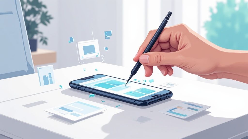
An iphone mockup app is the best tool you have for creating professional, high-converting app store screenshots. You know, the kind that actually make people want to download your app. It takes your standard screen captures and wraps them in a polished, realistic iPhone frame, which instantly makes your app look more credible and valuable. This is not just about making things pretty; it is a core marketing play for boosting app store growth and conversions.
Why Polished Mockups Are Your Biggest Advantage
Think of the App Store as a massive digital mall. Your screenshots are your storefront window. They are often the single most influential factor in a user's decision to tap "Get." If you just throw up raw, unstyled screen captures, even the most amazing app can feel half-baked or untrustworthy.
On the flip side, when you present your app inside a crisp, clean iPhone mockup, you are communicating professionalism and quality from the very first glance.
This is more than just an aesthetic choice, it is a psychological one. A well-designed mockup gives your app tangible context, helping potential users immediately visualize it on their own device. That simple act builds familiarity and trust, which significantly lowers their hesitation to download.
Stand Out in a Saturated Market
Let's be real: the iOS app market is incredibly competitive. In 2025, there are nearly 2 million apps from over 792,626 different publishers. With users downloading over 38 billion apps every year, that first impression has to be a knockout. You can read more about the competitive iOS market on wearetenet.com. Polished mockups are a key differentiator that separates the breakout successes from the apps that get lost in the noise.
Just take a look at how top-tier apps use compelling visuals to tell a story and pull users in.

Notice how they combine bold headlines with clear visuals inside device frames? They are not just showing features; they are quickly communicating the core value. This visual strategy is a fundamental part of modern App Store Optimization (ASO) and has a direct impact on your app’s visibility and conversion rates.
By framing your screenshots within a device, you are doing more than just showing off features, you are selling an experience. This approach helps users project themselves into the app, making the benefits feel more immediate and compelling.
Ultimately, using an iPhone mockup app is not just a late-stage design task. It is a strategic marketing decision that affects your entire user acquisition funnel, from the moment a user discovers your app to the second they hit that download button.
Choosing the Right Mockup Tool for Your Needs
Picking the right iPhone mockup app is not about chasing the longest feature list. It is about finding the tool that actually fits your workflow and does not get in your way. A great tool saves you precious time while spitting out high-quality visuals that genuinely move the needle in the app stores. You want that sweet spot between powerful features and just being easy to use.
The first thing I always check is the device library. Does it have the latest models, like the iPhone 15 Pro, but also a few older ones? You would be surprised how many users are on older hardware, and showing compatibility can broaden your appeal. A solid library of pre-built templates is another non-negotiable for me. It is a massive time-saver, letting you start from a professional layout instead of a daunting blank canvas.
What Really Matters: Features for Efficiency and Quality
The best tools go way beyond just slapping a frame on a screenshot. Deep customization is what turns a generic visual into a high-converting app store asset. This means you need granular control over every little detail.
Here is what I look for:
- Backgrounds: Can you use vibrant colors, subtle gradients, or most importantly, upload your own branded images? This is key for brand consistency.
- Device Angles: Tilted or angled views add a sense of dynamism that a flat, head-on shot just cannot match. It makes your app feel more tangible.
- Text Overlays: You absolutely need the ability to add benefit-driven headlines with full control over fonts, colors, and positioning. This is where you tell your story.
These are not just nice-to-haves; they are essential for creating efficient and high-converting app store screenshots for the iOS and Android stores that feel like a natural extension of your app's brand.
A truly effective mockup app lets you create visuals that are not just beautiful. They are finely tuned marketing assets designed to boost conversions on both the iOS App Store and Google Play.
A Quick Look Inside the Editor
Let's walk through a practical example. Imagine you are creating screenshots for a new meditation app.
Inside a modern iphone mockup app editor, your process would be simple and actionable. First, you would select a template with a calm, serene color palette that matches your app's vibe. Then, you would drag your app's screen capture showing the main meditation timer right onto the iPhone mockup in the template.
Next, you click the background layer and change the color to a soothing, deep purple gradient. To finish, you edit the placeholder text above the phone to read, "Find Your Calm in 5 Minutes." This entire process, from a blank slate to a professional, conversion-focused asset, can take less than two minutes.
This kind of streamlined process has become a lifeline, especially for the 42% of developers building with cross-platform frameworks. It helps create consistent visuals across platforms and, in my experience, can speed up the whole design and prototyping phase by up to 50%. You can explore some of these mobile development statistics to see just how common this is.
If you want to see exactly what I mean, playing around in our mockup editor is a great way to see these features in action. Choosing a tool with this kind of power and flexibility is how you efficiently create professional mockups that actually resonate with your audience and get them to hit that download button.
Designing Screenshots That Drive Downloads
Once you have picked your iPhone mockup app, the real fun begins. This is where you move beyond simple screen captures and start telling a visual story that convinces people to hit that "Get" button. Think of it less like design and more like marketing. Every pixel has a job to do, and that job is to communicate your app's value and boost conversions.
Your first two or three screenshots are everything. This is your primetime ad space. Do not waste it showing off random features. Instead, you need to build a narrative, starting with your app's single biggest selling point on the very first screen. If you have a fitness app, that might be "Personalized Workouts in Minutes." For a productivity app, maybe "Organize Your Life, Effortlessly."
Each screenshot that follows should build on that initial promise, showing exactly how your app delivers on it. It is like a mini-storyboard for your app's core benefit.
This flow diagram gives you a good idea of the creative process inside most mockup tools, from picking device models to customizing templates.
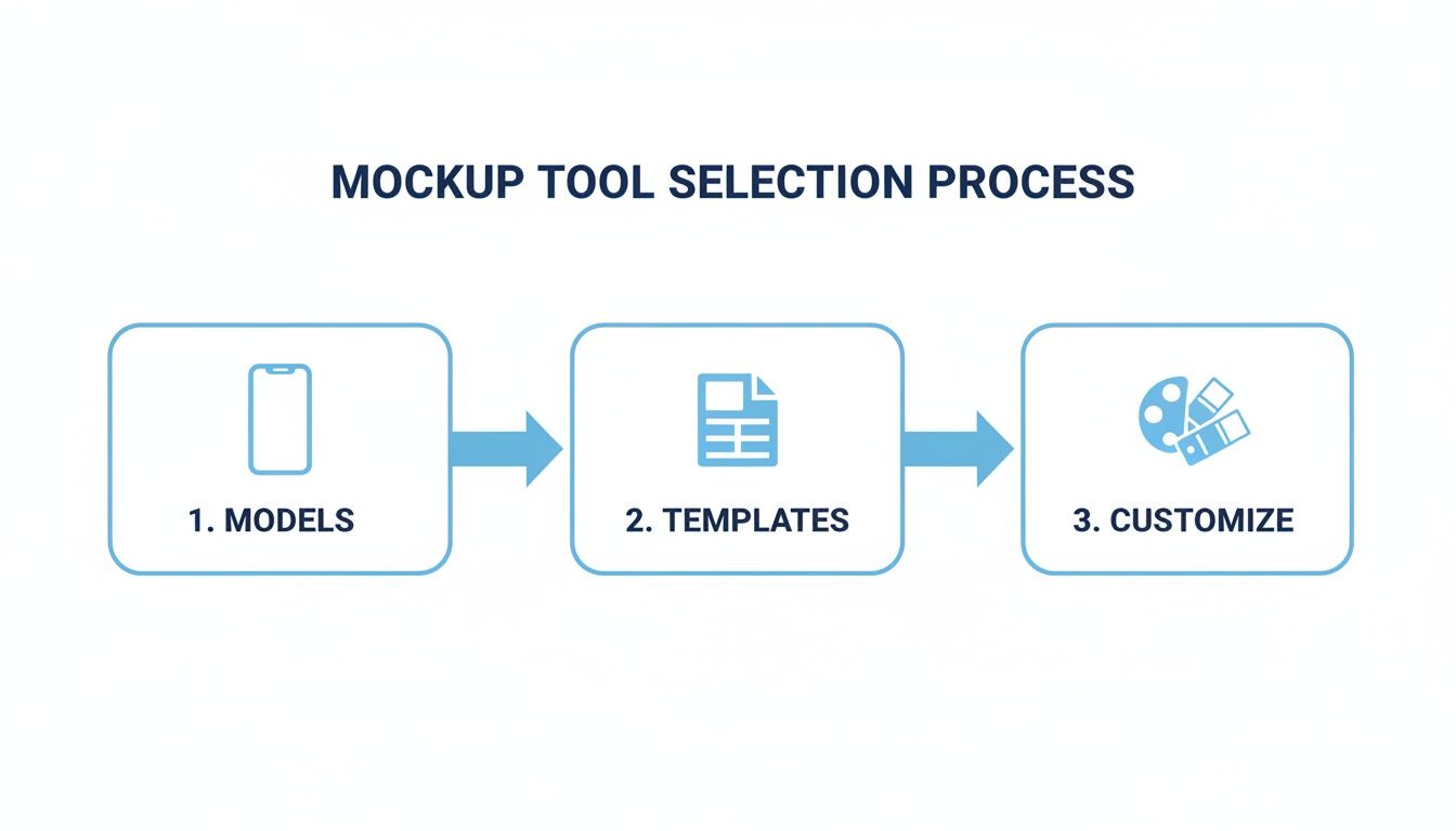
Following a structured approach like this is the key to getting a polished, professional result every time.
Crafting Headlines and Visuals That Convert
The copy you lay over your screenshot is just as vital as the image itself. It has to be short, benefit-driven, and easy to read at a glance.
For example, when you are in your mockup tool’s editor:
- Do not say: "Expense Tracking Feature"
- Instead, say: "Track Spending in Seconds"
See the difference? The second one focuses on what the user actually gets out of it. When adding this text, pick a bold, clean font that pops against your background. A classic mistake is using thin fonts or colors that just blend in, making your killer headline totally unreadable on a small phone screen.
Your background choice sets the whole mood. Use your brand’s colors or a slick, vibrant gradient to make your mockups stand out. If your app has a signature color palette, lean into it! This creates a cohesive, memorable look across your entire app store presence.
The goal is not just to show what your app does, but to make users feel how it will improve their lives. Strong visuals paired with benefit-oriented copy create an emotional connection that drives downloads.
Perfecting Composition for Maximum Impact
Good composition is all about arranging elements to guide the user's eye exactly where you want it to go. Your chosen iphone mockup app should give you total control over the placement of the device frame, your text, and any other graphics. Do not be afraid to experiment with angled or tilted device frames to give your screenshots a more dynamic, less static feel.
A pro-level trick I love is the "panoramic" layout. This is where you use a single, continuous background image that stretches across several screenshots. It creates a seamless, immersive effect as users swipe through your gallery, making it much more likely they will view all your images. For more great layout ideas, this iOS app screenshot template guide is an excellent resource.
Finally, always zoom in on the most important part of the UI you are trying to show. If you are highlighting a specific button or a key piece of data, make it big and obvious. The user should not have to squint to figure out what they are looking at. A well-composed screenshot is clean, focused, and communicates its point instantly.
To help pull all these composition elements together, I have put together a quick checklist. Run through this before you export your final images to make sure you have nailed the fundamentals.
Screenshot Composition Checklist
| Element | Best Practice | Why It Matters |
|---|---|---|
| Headline | Short, bold, benefit-focused. Use a highly legible font. | Grabs attention immediately and tells the user why they should care. Poor readability kills conversions. |
| Device Mockup | Use the latest iPhone model. Angle it slightly for a dynamic look. | Shows your app is modern and well-maintained. A slight angle adds visual interest and avoids a flat, boring look. |
| UI Focus | Zoom in on the single most important part of the screen. | Prevents clutter and directs the user's eye to the key feature you are showcasing. Clarity is key. |
| Background | Use on-brand colors, vibrant gradients, or a panoramic layout. | Creates a professional, cohesive brand identity and makes your screenshots visually appealing and memorable. |
| Readability | High contrast between text and background. No thin or overly stylized fonts. | Ensures your message is instantly understood, even when someone is quickly scrolling through the App Store. |
| Storytelling | Each screenshot builds on the last, telling a cohesive story. | Guides the user from your main value proposition to specific features, building their interest with each swipe. |
By keeping these best practices in mind, you are not just making pretty pictures; you are engineering a powerful marketing asset designed to turn browsers into loyal users.
Exporting Your Mockups for App Store Success
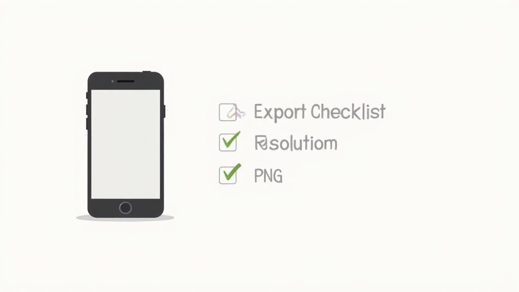
You have designed a stunning set of high-converting screenshots. Now for the final hurdle. Exporting your work correctly is non-negotiable for ensuring your mockups look crisp, load fast, and get approved by Apple and Google without a hitch.
This is not just about clicking "Save." Both app stores have their own precise specifications for image dimensions, resolution, and file formats. If you get these wrong, you risk blurry visuals, slow load times that kill user interest, or even an outright submission rejection. The goal is to deliver assets that are perfectly optimized for every single device.
Nail the Technical Specifications
First up, let's talk file formats. The choice between PNG and JPEG really boils down to one thing: image quality versus file size.
PNG (Portable Network Graphics): This should be your default for app store screenshots. PNGs use lossless compression, meaning they preserve every single pixel of quality. They also support transparency, which is a lifesaver if your designs have elements that overlay a background. This format keeps your text and UI elements looking razor-sharp.
JPEG (Joint Photographic Experts Group): JPEGs will give you smaller file sizes, but they achieve this with lossy compression. This can create weird artifacts and make your text look fuzzy. Stick with PNG 99% of the time. The only exception might be if your screenshot is purely a photograph with no text or sharp UI lines.
Dimension requirements are always changing, so it is mission-critical to have the latest specs on hand. We keep a detailed breakdown right here in our guide to current App Store screenshot dimensions. Of course, a great iPhone mockup app will handle all this for you, offering export presets for every required size.
Adapting iPhone Mockups for Google Play
It is tempting to just reuse your iOS screenshots for the Play Store, but trust me, do not do it. Android users expect to see your app running on an Android device, not an iPhone. Showing an iPhone mockup on Google Play creates an immediate disconnect. It makes your app feel like a lazy port, which can seriously damage trust and tank your conversion rates.
Your mockup choice should feel native to the platform. Using an iPhone for the App Store and a Google Pixel for the Play Store shows you respect each ecosystem and provides a much better user experience.
The good news? The core design work is already done. Your value propositions, headlines, and visual storytelling can stay exactly the same. The only thing you need to do is swap the device frame. Any quality mockup tool makes this a breeze, allowing you to duplicate your iOS designs and simply switch the device mockup to an Android model before you export.
Polished, platform-specific mockups are a cornerstone of effective App Store Optimization (ASO) strategies. By following these export best practices, you ensure your carefully crafted visuals achieve their maximum impact, helping you sail through the review process and give your app's growth a real boost.
Take Your App Growth to the Next Level
Okay, you have nailed the design and export process. Your mockups look sharp. But do not stop there. The real magic happens when you start treating those visuals as a core part of your app store growth strategy. The most successful developers do not just "set and forget" their app store screenshots. They are constantly testing, localizing, and even automating their visual assets. This is where a great iphone mockup app becomes your secret weapon for executing these advanced tactics quickly and efficiently.
One of the biggest levers for international growth is localization. I am not just talking about translating your screenshot text. True localization means adapting your visuals to actually resonate with different cultures. A feature that is a huge deal in North America might be an afterthought in Japan, so you would want to lead with a completely different screenshot for that market.
Your mockup tool should make this almost trivial. Instead of rebuilding every design for dozens of languages, you just duplicate your main template, swap out the text, and maybe tweak a few background images to feel more culturally relevant. This simple workflow lets you enter new markets with a product page that feels native and trustworthy.
A/B Testing Your Way to More Downloads
In a crowded app market, guessing is a recipe for failure. You need hard data to know which designs actually convince people to tap that "Get" button. This is where you need to get friendly with Apple's Product Page Optimization feature in App Store Connect. It is designed specifically for running A/B tests on your screenshots to see what works.
It all starts with a simple hypothesis. For example: "I bet screenshots with a vibrant, gradient background will convert better than my solid blue ones."
From there, you jump into your iPhone mockup app and create two identical sets of screenshots, changing only that one variable: the background. Then you pop over to App Store Connect and set up a test to show each version to a slice of your audience.
Here is a look at the Product Page Optimization interface where you will set up and track these experiments.
Once the test has run its course, you get clear, undeniable data on which mockups drove more downloads. This data-driven approach takes all the guesswork out of the equation and lets you systematically improve your conversion rate over time.
Scaling Up with Smarter Workflows
If you are managing a whole portfolio of apps or pushing out frequent updates, creating mockups manually for every single release is a nightmare. It is a huge time-suck. This is why building an efficient, scalable workflow is so critical.
The first step is creating a master template for your brand inside your mockup app. This template should have everything locked in: your brand’s fonts, color palette, and go-to layout.
When a new update is ready, your team simply has to drop in the new screen captures and update the text. This ensures brand consistency across your entire app portfolio and cuts down production time from hours to minutes.
This kind of efficiency is what separates the pros from the amateurs, especially when it comes to maintaining a polished store presence. Of course, stunning visuals are just one piece of the puzzle. A truly comprehensive approach, like a playbook for content marketing for tech companies, is what drives significant app growth.
For those looking to take it even further, automation is the final frontier. Using an API to generate screenshots programmatically allows you to integrate mockup creation directly into your development pipeline. Imagine your app store page updating automatically with perfectly polished visuals the moment you push a new build. That is the goal.
Even with the best mockup app in your corner, you are bound to run into some questions. Figuring out the right copy, how often to refresh your visuals, and the little details between platforms can feel like a moving target.
Let's clear up some of the most common questions developers ask. I will give you some straight-up, practical advice to help you get past these hurdles and make your designs work harder for you.
What’s the Secret to Good Screenshot Copy?
The biggest mistake I see is teams just listing features. Nobody cares about "GPS Tracking." What they care about is the feeling of "Never Lose Your Way Again." See the difference? Always frame your copy around the user's benefit.
Use active, punchy verbs. Keep it short, bold, and ridiculously easy to read. Each screenshot should deliver a single, clear idea. Assume someone is glancing at it for two seconds on a crowded bus. They need to get the point instantly, without squinting at tiny fonts.
How Often Should I Be Updating My App Store Screenshots?
At a minimum, you absolutely have to update them after any major UI change or when you ship a big new feature. Nothing erodes trust faster than showing up on the App Store with screenshots that do not match the actual app. It feels sloppy.
Beyond that, I would recommend a refresh every 6 to 12 months. This is your chance to test new messaging or try a different visual style. The A/B testing tools inside App Store Connect are perfect for this. It keeps your page from looking stale and lets you fine-tune your way to better conversion rates.
Think of your app store page less like a static billboard and more like a living, breathing marketing asset. It is something you should constantly be tweaking based on data and feedback.
Can I Just Use My iPhone Mockups for Android Too?
Technically, yes. But please, do not. It is a small detail that makes a huge difference. For the best results, you need to use iPhone mockups on the App Store and Android device mockups (like a Google Pixel) on Google Play.
Showing an iPhone frame on the Play Store immediately signals that your app is a lazy port. It breaks the native feel and just feels off. This can genuinely hurt your download numbers. Any decent mockup tool will have high-quality templates for both, so it is an easy win to get this right.
What Are the Most Common Mistakes to Avoid?
A few classic blunders can sink even the best-looking designs. Steer clear of these:
- Visual Overload: Do not cram too much text, distracting graphics, or busy backgrounds into one image. Keep it clean. Let the screenshot breathe.
- Fuzzy Screenshots: Never, ever use low-resolution screen captures. They look blurry and unprofessional, making your app feel cheap before anyone even installs it.
- No Clear Story: Your screenshots should not be a random collection of screens. They need to tell a story, guiding the user from your main value prop to your coolest features in a logical flow.
- Ignoring the Specs: Apple and Google update their dimension requirements. Always double-check the latest guidelines before you export. It will save you the headache of a submission rejection.
Ready to create stunning, high-converting screenshots in minutes? With ScreenshotWhale, you get access to professionally designed templates, a simple drag-and-drop editor, and powerful features to boost your app store growth. Start for free on screenshotwhale.com and see the difference for yourself.