Boost App Downloads with a High-Converting iOS App Screenshot Template
Learn how an iOS app screenshot template can boost downloads. Our guide covers design, storytelling, and A/B testing for high-converting App Store visuals.
An iOS app screenshot template is a pre-made layout that helps you create professional, high-converting visuals for the App Store and Google Play, fast. These templates are essential because they ensure your images meet Apple's strict size requirements and look polished. This is critical, since most people judge an app by its screenshots long before they ever read the description.
Why App Screenshots Drive More Downloads Than You Think
In the crowded App Store, your screenshots are your best salesperson. They are the first thing potential users look at, and they make snap judgments about your app's quality, usability, and value in just a few seconds. A great set of visuals can instantly show what your app does and why someone needs it, giving your conversion rates a serious boost and driving app store growth.
On the flip side, generic or poorly designed screenshots can be a death sentence for your downloads. Simple UI captures with no context or persuasive text just do not grab attention. They can make an app feel amateurish or confusing, causing users to scroll right past. That is why a solid screenshot strategy is not just a nice to have anymore; it is essential for creating high-converting app store screenshots.
Meeting Apple’s Strict Requirements
The App Store's submission rules have gotten a lot tighter over the years, forcing developers to be more disciplined with their visuals. Apple now requires all apps to submit screenshots for at least two main sizes: the 6.9-inch iPhone display and the 13-inch iPad display. This is not a suggestion, it is the baseline for App Store Connect.
In fact, something like 87% of app developers change their screenshot strategy whenever Apple rolls out new guidelines, which shows just how seriously everyone takes compliance. You can learn more about the specifics in our comprehensive App Store screenshot guide.
This chart gives you a quick look at the core device sizes you have to design for and how quickly developers adapt to these rules.
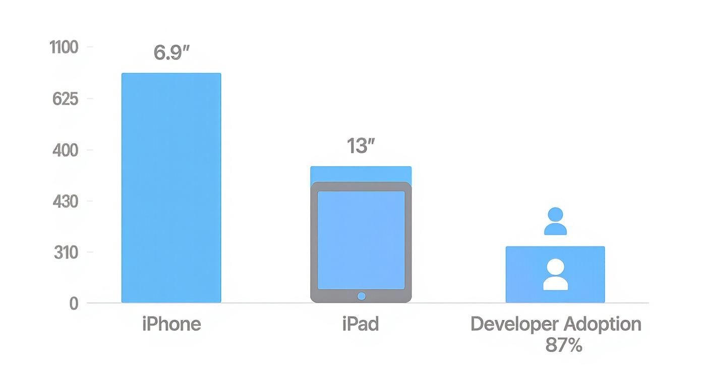
The takeaway is clear: if you nail the largest iPhone and iPad sizes, you have covered your bases for submission.
To make things easier, here is a quick reference table with the latest screenshot dimensions you absolutely need to know.
Essential iOS App Screenshot Dimensions
A quick reference guide to the latest mandatory and recommended screenshot sizes for key Apple devices to ensure compliance and optimal display.
| Device | Required Dimensions (Portrait) | Required Dimensions (Landscape) | Notes |
|---|---|---|---|
| iPhone 6.9" | 1290 x 2796 px | 2796 x 1290 px | Mandatory. Covers iPhone 15 Pro Max, 14 Pro Max. |
| iPhone 6.7" | 1284 x 2778 px | 2778 x 1284 px | Recommended. Covers iPhone 15 Plus, 14 Plus, etc. |
| iPhone 6.1" | 1179 x 2556 px | 2556 x 1179 px | Recommended. Covers iPhone 15 Pro, 15, 14 Pro, etc. |
| iPhone 5.5" | 1242 x 2208 px | 2208 x 1242 px | Recommended for older device support. |
| iPad Pro 13" | 2048 x 2732 px | 2732 x 2048 px | Mandatory. For 3rd gen and later iPad Pro. |
| iPad Pro 11" | 1668 x 2388 px | 2388 x 1668 px | Recommended. |
Getting these sizes right is the first step. Without them, your app update will not even get through the review process.
The Power of a First Impression
Your first few screenshots show up right in the App Store search results, making them a huge piece of your App Store Optimization (ASO) puzzle. They have to work together to tell a convincing story at a glance.
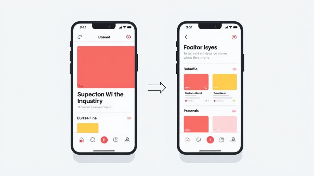
A well-crafted visual narrative does not just show features; it sells a solution. Your screenshots should guide the user from a problem they have to the solution your app provides, creating a desire to download.
This is where a good iOS app screenshot template really shines. It gives you a framework to present your app's main benefits clearly and beautifully. By using professionally designed layouts with device mockups, benefit-driven headlines, and consistent branding, you can turn boring screen captures into powerful marketing assets that get people to hit "Install."
How to Choose the Right iOS App Screenshot Template
Picking the right iOS app screenshot template feels like a huge decision, because it is. This choice has a direct impact on your App Store conversions. The whole point is to land on a design that does not just look sharp, but truly clicks with your app's function and brand identity. A template that absolutely crushes it for a high-energy gaming app will almost certainly fall flat for a clean, minimalist productivity tool.
The market is flooded with options. In just the past few years, the number of screenshot design tools has exploded, giving us over 500+ professionally designed templates built specifically for App Store and Google Play guidelines. You see it in the submissions, most new apps lean on templates instead of building from scratch. Prices range from free for basic stuff to $30-150 for premium packs with 50-500+ designs. You can find massive template collections on Figma.com that show just how much is out there.
This variety is great news. It means the perfect template for your app exists, but you need a smart way to find it.
Evaluate Template Styles and Functionality
First things first, what is the vibe? Are you going for a clean, device-centric look or something more dynamic that tells a story? Minimalist templates that put your app's UI front and center are perfect for utility and productivity apps where clarity is everything.
On the flip side, templates with vibrant backgrounds, creative layouts, and big, punchy text are a much better fit for lifestyle, social, or gaming apps. These designs let you build a narrative and connect with the user on an emotional level. For a closer look at these different design styles, check out our guide on mobile app design templates.
But do not just stop at looks. A good template has to be flexible.
- Color Palettes: Can you easily swap in your brand's exact hex codes for backgrounds and text?
- Font Choices: Are you stuck with a handful of fonts, or can you upload your own to keep branding consistent?
- Layout Flexibility: How much can you move things around? Can you adjust the device mockups, headlines, and other key elements?
A template that locks you into a rigid structure is a creativity killer. It will stop you from creating a visual story that feels genuinely unique to your app.
The Essential Template Checklist
To avoid headaches down the line, I always run potential templates through a quick checklist. This ensures you are not caught off guard by a technical issue during the design or submission process.
A great template saves you time and stress by pre-validating the technical details. It should handle all of Apple's sizing rules, so you can focus entirely on crafting a compelling message and showcasing your app's value.
Here is the checklist I personally use:
- Device Support: Does it include mockups for all the devices you need? At a minimum, it must have the mandatory 6.9-inch iPhone and 13-inch iPad sizes.
- Guideline Compliance: Is the template built with the latest App Store rules in mind? For instance, it should avoid showing real hands holding devices, which Apple can flag.
- Ease of Use: How quickly can you get up and running? The editor should be intuitive enough that you can create a full set of screenshots without needing a tutorial.
- Export Options: Can you export your finished images in the required PNG or JPEG format at the exact resolutions Apple demands? No weird compression or resizing allowed.
Getting your template right is just as important as optimizing visuals for various digital platforms. By being methodical, you will find an iOS screenshot template that not only looks fantastic but acts as a powerful engine for your App Store growth.
Customizing Your Template for Maximum Conversions
Alright, picking out a solid iOS app screenshot template is a great first move, but the real work and the real results come from the customization. This is your chance to take that good foundation and turn it into a high-converting powerhouse that looks like it was custom-made just for your app.
The whole point is to make the design a perfect reflection of your brand's personality and value, something that clicks instantly with your ideal user. A template gives you the skeleton, but it is your choices in color, text, and layout that give it a soul. Tiny tweaks can be the difference between screenshots that get scrolled past and ones that stop a user in their tracks and earn you a download.
It is about transforming a generic layout into a compelling story. Take a look at this versatile template collection from Figma, for instance. It is the perfect blank canvas.
Starting with something clean and well-organized like this means you can pour your energy into the branding and messaging, not waste it fighting with device mockups and spacing from scratch.
Writing Headlines That Actually Convert
Let's be blunt: your headlines are probably the most important part of your screenshots. They need to be short, punchy, and all about the user's benefit, not your app's features. Nobody cares that you have a "proprietary filtering algorithm." What they do care about is that they can "Find Your Perfect Match in Seconds."
Think of each headline as a tiny, high-stakes pitch. You have a split second to prove your app's worth before they are gone.
- Focus on the "Why": Do not just say "Customizable Dashboards." Try "Your Day, Your Way."
- Use Action Words: Kick things off with words like "Track," "Create," "Share," and "Discover." They are direct and get straight to the point.
- Keep it Short: Seriously, aim for no more than 4-7 powerful words.
This is the same logic used in a good landing page optimization checklist, which is all about turning visitors into customers. Your App Store page is your landing page, and these screenshots are your number one conversion tool.
Using Color and Fonts to Stand Out
Color and typography are your secret weapons for building brand recognition and telling the user’s eye exactly where to look. When you customize your template, make sure it aligns perfectly with your app's existing visual identity. This creates a smooth, professional journey for the user.
If your app’s primary color is a specific shade of blue, that color needs to show up in your screenshot backgrounds or headlines. That kind of consistency builds trust. For fonts, readability is king. A funky, stylized font might look cool in a design file, but if it is a struggle to read on a small screen, your message is completely lost.
Pro Tip: The best screenshot designs use color and contrast to make two things pop: the device mockup showing off your app and the benefit-driven headline. Everything else should just be supporting cast, adding context without creating clutter.
Any good template editor will let you plug in your brand’s exact hex codes and use your own font files. That level of control is what separates a polished, on-brand design from something that screams "generic template." If you're looking for more ideas on presentation, check out our guide on creating beautiful iPhone app mockups.
To keep things on track, here is a quick checklist to run through as you customize. It helps you focus on what matters and avoid the common pitfalls I see all the time.
Template Customization Checklist
| Customization Element | Best Practice | Common Mistake to Avoid |
|---|---|---|
| Color Palette | Use your app's primary and secondary brand colors consistently. | Using too many colors or picking shades that clash and create visual noise. |
| Typography | Choose one headline font and one body font. Prioritize readability. | Selecting a font that is hard to read on a small mobile screen. |
| Headlines (Copy) | Focus on user benefits and outcomes. Keep it short (4-7 words). | Listing technical features or writing long, descriptive sentences. |
| Device Mockups | Use the latest device frames (e.g., iPhone 15 Pro) for a modern look. | Using outdated device models that make your app look old. |
| UI Captures | Show your app's "aha!" moments, the most valuable and visually appealing screens. | Showing login screens, empty states, or overly complex interfaces. |
| Visual Hierarchy | Make the device UI and headline the two most prominent elements. | Overcrowding the design with unnecessary icons, shapes, or text. |
Following these guidelines ensures every element serves a purpose: to communicate value and drive that install.
A Quick Customization Workflow
Let's walk through an actionable example. Say you have selected a clean, minimalist iOS app screenshot template for your new fitness app. Here is how you can use an editor to bring it to life and create an efficient workflow.
- Brand It First: Before anything else, open the editor's color picker and change the default background to your brand's main color. Upload your brand font for the headlines and pick a super-readable font for any smaller captions.
- Drop in Your UI: Now, drag and drop your actual app screens into the device mockups. Be selective! Choose the screens that really sell your app, like a vibrant progress chart or a dead-simple workout scheduler.
- Nail the Headlines: For that progress chart screen, a headline like "Visualize Your Success" is way more compelling than "Data Analytics." For the scheduler, "Plan Your Week in 60 Seconds" easily beats "Scheduling Feature."
- Add Some Polish: Use subtle gradients, icons, or simple shapes from your brand kit to add a bit of depth. A small checkmark icon next to a key benefit can do wonders for reinforcing your message.
- Review the Series: Step back and look at all the screenshots together. Do they tell a clear story from left to right? Is the branding consistent? Most importantly, is your app's UI the undeniable star of the show?
By following this process, you are not just filling in a template; you are methodically building a powerful marketing asset that feels like it was designed exclusively for your app.
Crafting a Compelling Visual Story
Your App Store screenshots are not just a gallery of features; they are a visual pitch. When someone lands on your product page, they should be taken on a quick, compelling journey that starts with a problem they know all too well and ends with your app as the obvious solution. This is where a strong visual story, told across your first few images, can make a huge difference in your conversion rates.
The trick is to think like a storyteller, not just a developer. A user glancing at your screenshots needs to get what your app does in a matter of seconds. The narratives that work best are simple, direct, and immediately relatable.
Choosing Your Storytelling Framework
To build a narrative that actually converts, it helps to start with a proven framework. These structures give your screenshots a logical flow that guides the user right toward that "Get" button. Two of the most effective I have seen are the Problem-Solution and Feature-Benefit models.
- The Problem-Solution Flow: This one is a classic for a reason. Your first screenshot introduces a common pain point your target audience deals with. The next few screenshots then show exactly how your app solves it, step by step.
- The Feature-Benefit Flow: This approach focuses on a core feature and immediately connects it to a powerful, tangible benefit. It directly answers the user's most important question: "What's in it for me?"
For example, a meditation app could nail the Problem-Solution framework. The first screenshot might hit you with a headline like "Feeling Overwhelmed?" over a chaotic to-do list. The following images would then walk the user through the app’s calming exercises, ending on a screen that promises "Find Your Calm in Minutes." That creates a powerful emotional hook.
Deconstructing Top App Narratives
Let's look at how successful apps put this into practice. A top-charting budgeting app does not just show you a spreadsheet. Its first screenshot often grabs you with a question like "Where Does Your Money Go?" The following images then walk you through connecting a bank account, categorizing spending, and finally, seeing a beautiful chart that gives you clarity and control.
This sequence is completely intentional.
- The Hook (Screenshot 1): Grabs attention with a relatable problem or a bold promise.
- The "How" (Screenshots 2-3): Shows off the app's core function in a simple, visually appealing way.
- The Payoff (Screenshot 4-5): Reveals the ultimate benefit or desired outcome, leaving the user feeling empowered.
The best screenshot galleries create a sense of momentum. Each image builds on the last, making the user feel like they are progressing toward a valuable goal just by swiping. This builds desire and makes the download feel like the logical next step.
The Power of Visual Consistency
As you build out your story, visual consistency is absolutely critical. Using the same fonts, brand colors, and layout style across all your screenshots creates a seamless and professional experience. This is not just about looking good; it builds trust.
When your screenshots look cohesive, it signals to the user that the app itself is well-designed and reliable. A messy, inconsistent design can subconsciously suggest a buggy or unprofessional app, even if that is not true. Your iOS app screenshot template should be the foundation for this consistency, making sure every element is uniform. This polished presentation makes users feel more confident when they tap "Get," helping you lock in more downloads.
Taking Your App Store Game to the Next Level
Once you have nailed the visual story for your primary market, it is time to pull the levers that drive serious growth. This is where we move beyond the basics and start using data to make smarter design decisions. It is these finer points that often separate a decent app from a top-charting success.
The two most powerful tactics I have seen for boosting conversions are localization and A/B testing. By tailoring your visuals for a global audience and methodically testing your creative, you can unlock growth that most developers leave on the table. This is how the pros dominate their categories.
Boost International Downloads with Localization
Going global is so much more than just translating your app’s text. True localization means adapting your entire visual presentation to resonate with the cultural norms and expectations of each market. A screenshot that performs brilliantly in the United States might completely miss the mark with users in Japan or Germany.
This is where a good iOS app screenshot template with built-in localization features becomes a massive advantage. Instead of wrestling with dozens of separate design files, you can manage all your language variations from a single, unified template. It is a huge time-saver.
For any app with a global audience, localization is not just a "nice to have," it is a core growth strategy. A user is far more likely to download an app that speaks their language and reflects their culture. Your screenshots are the very first place they will look for that connection.
Imagine you have a food delivery app. In the U.S., your screenshots might feature juicy burgers and pepperoni pizza. But for the Indian market, you would want to swap those out for popular local dishes like biryani or paneer tikka. This small change makes the app feel instantly familiar and relevant, which can significantly improve your download numbers in that region.
A Simple Workflow for Localization
Here is a straightforward way to start adapting your screenshots for different countries:
- Pinpoint Your Key Markets: Dive into your analytics. Where is your traffic coming from? Which countries show the most potential? Start by focusing on your top 3-5 international markets.
- Translate Your Copy Thoughtfully: Do not just throw your headlines into an automated translator. Work with a native speaker to ensure the copy is not only accurate but also persuasive and culturally on-point.
- Adapt the Visuals: Look closely at the UI in your screenshots. Are there any images, icons, or examples that might not make sense in another culture? Swap them out for content that feels local and familiar.
- Max Out Your App Store Connect Slots: For each language you add, App Store Connect gives you 10 dedicated screenshot slots. Use every single one to create a fully localized and convincing experience for each audience.
A/B Test Your Way to Higher Conversions
So, how do you actually know if a green background converts better than a blue one? Or if a headline about "saving time" is more compelling than one about "staying organized"?
You test it.
A/B testing is simply showing different versions of your screenshots to different groups of users to see which one performs best. Apple's own tool, Product Page Optimization in App Store Connect, makes this surprisingly easy to do. You can create up to three alternate "treatments" to test against your original product page, letting you experiment with screenshots, icons, and videos to find the winning combination based on real data.
Running a Screenshot Test That Actually Teaches You Something
The key to a useful test is starting with a clear hypothesis. Instead of just throwing random ideas at the wall, begin with a specific question you want to answer.
A good hypothesis sounds something like this: "For our business-focused productivity app, screenshots with a darker, more professional color scheme will increase conversions."
From there, setting up the test is simple:
- Treatment A (Control): This is your baseline, using your current screenshots.
- Treatment B (Variant): This is the challenger, featuring the new dark-themed screenshots.
Once you launch the test, App Store Connect handles the rest, showing each version to a slice of your audience and tracking performance. The results will tell you exactly which set of screenshots drove a higher conversion rate. This data-driven approach takes the guesswork out of design and ensures your creative choices are directly tied to growth.
Answering Your Biggest Screenshot Questions
When you are in the thick of designing your App Store visuals, a few questions always seem to surface. Getting these right can be the difference between a smooth app update and a frustrating rejection from Apple, or worse, missing out on downloads. Let's clear up the common hurdles developers run into.
What Gets Screenshots Rejected Most Often?
Apple is famously particular, and screenshot rejections usually come down to a handful of common slip-ups. The biggest one? Simply not following the guidelines. This means showing the wrong device, like an Android phone in an iOS submission, or including real people in your mockups unless your app's function absolutely requires it (think fitness or photo apps).
Another huge red flag for reviewers is misleading content. Your screenshots have to be a genuine representation of what users will see in your live app. Do not show features that do not exist. Finally, simple technical mistakes like the wrong dimensions are an instant no-go. Using a solid iOS app screenshot template is probably the easiest way to avoid these technical headaches from the start.
How Many Screenshots Do I Actually Need?
Apple gives you up to 10 slots, but this is not a quota you need to fill. The goal is always quality over quantity. For most apps, the sweet spot is somewhere between 5 and 7 screenshots. That is enough room to tell a compelling story about your app without overwhelming potential users with too much information.
Your first 2-3 screenshots are by far the most important. They are what people see in the search results before they even tap on your listing. You have to make them count. Hit them with your most powerful features and benefits right out of the gate.
If you have built a really complex app or a game with a ton of different modes, then sure, using all 10 slots can be a smart move to show off its depth. But for the average app, a focused set of 5 to 7 powerful visuals will get the job done much more effectively.
Can I Just Use the Same Screenshots for iPhone and iPad?
Definitely not. This is a critical mistake that trips up a surprising number of developers. You absolutely cannot use the same image files for both devices. Apple's rules are clear: you need separate, correctly sized uploads for each device family.
But more importantly, your app’s UI is probably (and should be) optimized differently for a tablet. Just stretching an iPhone screenshot to fit an iPad's screen looks lazy and gives users a false impression of the experience. You need to take actual screenshots from your app's iPad build and put them into a proper iPad-specific template. It is not just about following the rules, it is about showing iPad users you cared enough to build an experience just for them.
Should My First Screenshot Be a Video?
Putting an App Preview video in that first slot can be a massive conversion booster, but it is not a silver bullet. A video shines when your app's value is all about motion and interaction. Think of dynamic games, intricate design tools, or apps with workflows that static images just cannot do justice.
A slick, well-produced video that hooks someone in the first few seconds can send your downloads soaring. On the flip side, a boring or low-quality video can hurt you. If your app’s core benefit is simple and can be nailed in a single, powerful image, a static screenshot might actually be the stronger choice. The only way to know for sure is to test it. Use App Store Connect's Product Page Optimization to A/B test a video against a static image and see what your audience responds to.
Ready to create stunning, high-converting visuals in minutes? With ScreenshotWhale, you can access professionally designed templates, a simple drag-and-drop editor, and powerful AI localization to make your app stand out in any market. Start creating your perfect App Store screenshots today.