Mastering iPhone App Mockups for App Store Growth
Discover how high-converting iPhone app mockups can drive downloads. Our guide offers expert strategies for creating screenshots that boost App Store success.
What exactly are iPhone app mockups? Think of them as polished, professional visual representations of your app's interface, neatly placed inside a device frame like an iPhone. They're far more than simple screenshots; they are essential marketing assets for your App Store page, designed to tell a compelling story, highlight key features, and ultimately convince people to tap that "Get" button.
Why Your App Mockups Define Your Success
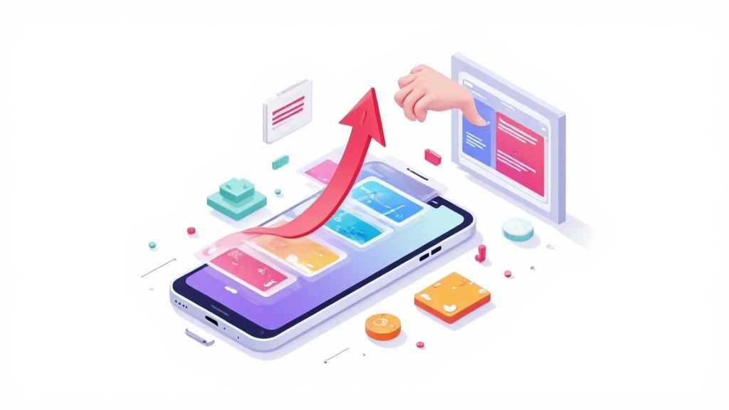
In the unbelievably crowded App Store, your app mockups are your single most important sales pitch. They are often the first, and sometimes only, chance you get to communicate your app's true value to a potential user. A sharp, professional mockup builds instant trust and can make a massive difference in your download conversion rates.
The top-performing apps have this down to a science. They use their screenshot gallery not just to show what the app looks like, but to walk the user through a visual journey. Each mockup zeroes in on a specific benefit, preemptively answers a user’s question, or showcases a unique feature that sets it miles apart from the competition. This strategic approach turns basic screen grabs into powerful, high-converting marketing tools for both the iOS and Android stores.
To give you a quick overview, let's break down the core components that every winning app mockup needs.
Essential Elements of a High-Converting App Mockup
| Element | Impact on Conversion | Key Objective |
|---|---|---|
| High-Quality Screenshots | High | Accurately represent the app's UI and functionality. |
| Device Frames | Medium | Provide context and a professional, polished appearance. |
| Compelling Captions | High | Highlight benefits, not just features, to resonate with user needs. |
| Clear Call-to-Action (CTA) | Medium | Guide the user on what to do next, encouraging a download. |
| Consistent Branding | Medium | Build brand recognition and trust through consistent colors and fonts. |
| Strategic Storytelling | High | Create a narrative flow that guides users from curiosity to conversion. |
Each of these elements plays a crucial role in transforming a simple App Store listing into a conversion machine. Getting them right is non-negotiable for boosting app store growth.
The True Cost of Neglecting Your Visuals
Treating your App Store visuals as an afterthought is one of the most expensive mistakes you can make. Users make snap judgments in literal seconds. If your mockups look amateurish, are filled with generic placeholder text, or just flat out fail to communicate value, people will simply scroll on by. This has a direct, negative impact on your App Store Optimization (ASO), as lower conversion rates signal to the algorithm that your page isn't relevant.
A strong visual presentation is non-negotiable. It’s the visual handshake that either invites users in or pushes them away, directly influencing your app’s discoverability and growth potential.
The mobile app market has become fiercely competitive. With no-code platforms making development more accessible, there’s an absolute explosion of new apps. While a staggering 136 billion apps were downloaded last year, that intense competition means developers must focus on delivering real, tangible value to stand out. This is where mockup and prototyping tools have become invaluable. They help validate designs and communicate a clear vision long before you sink heavy investment into development.
Building a Foundation for Growth
Creating high-converting mockups is not just a design task; it's a core component of a successful app launch and long term growth. It's a thoughtful process blending design principles with marketing psychology. To even get started, you need a solid grasp on how to get the perfect visual assets prepared. You can dive deeper into this crucial first step in our guide on preparing images for the App Store.
Ultimately, your goal is to create a set of mockups that work together to tell a cohesive, persuasive story. This guide will give you a clear roadmap to turn your app's screens into high impact visuals that not only look fantastic but also drive real, measurable results for your business.
Preparing Your Core App Screens
The foundation of every great iPhone app mockup is a flawless screenshot. Before you even touch layouts, captions, or device frames, you need pristine, high resolution screen assets that put your app's best foot forward. Many developers trip up right here, but getting this initial prep right makes the rest of the process a breeze.
Your goal is to capture your app's UI without any distracting on-screen clutter. Things like a low battery icon, a specific carrier name, or random notification badges can make a professional app look amateurish in a heartbeat. These little details break the user's immersion and weaken the story you're trying to tell.
Capturing Clutter-Free Screenshots
The most reliable way to get clean screen captures is using the iOS Simulator right inside Xcode. It’s a powerful tool that gives you total control over the device’s appearance, letting you generate perfect assets for any required dimension.
This is how the pros do it. You can easily set the status bar to a "clean" state, showing a full battery, full Wi-Fi signal, and a standard time like 9:41 AM, Apple's own preferred default for marketing materials. This controlled environment is non-negotiable for producing consistent visuals across your entire screenshot set, which is a huge factor in creating a polished App Store presence.
Sure, you can take screenshots directly from a physical device, but it’s much harder to control that pesky status bar. If you absolutely have to use a real phone, at least enable Do Not Disturb to stop unexpected notifications from photobombing your shot. But honestly, for professional iphone app mockups, the simulator is the only way to go for consistency and control.
Staging Your UI with Compelling Data
Okay, so you know how to capture a clean screen. Now for the fun part: staging the content within your app. This is where you switch from a technical hat to a marketing one. Your screenshots need to be more than just clean; they have to be compelling.
The biggest mistake you can make is using generic placeholder data. A screen showing 'John Doe' with a default profile picture and 'Lorem Ipsum' text feels lifeless and fails to communicate any real value.
Instead, populate your app with realistic, aspirational, and visually appealing data. Think of it like staging a home before selling it. You want potential users to instantly imagine themselves living their best life with your app.
Here are a few actionable ideas:
- For a fitness app: Show a completed workout with impressive stats, like a 5K run finished in 22 minutes.
- For a social media app: Display a vibrant feed with gorgeous photos and engaging captions, not empty states.
- For a productivity app: Showcase a well organized project board with clear, motivating task names that hint at success.
This staged content breathes life into your app and shows its core benefits in a way users can actually feel. Before you take a single screenshot, ask yourself: what is the one key takeaway I want a user to get from this image? This focus ensures every single asset is doing its job to drive conversions.
Organizing for an Efficient Workflow
The final piece of this prep work is just good old fashioned file management. Trust me, a little organization now will save you a massive headache later, especially when you start juggling multiple device sizes and languages.
Create a clear folder structure for your exported assets. I like to organize by feature, then by device size. For example: Onboarding/iPhone_6.7_inch/ and Dashboard/iPhone_6.7_inch/.
Make sure to export all your final, staged screenshots as high quality PNG files. This format preserves transparency and keeps everything looking crisp. This systematic approach makes it incredibly simple when you’re ready to upload these assets into a mockup editor to build your final designs.
Alright, you've got your raw screen captures prepped and ready to go. Now for the fun part: turning those simple images into powerful marketing assets that actually get people to hit the "Download" button. This is where we build the visual story that sells your app in a matter of seconds.
Think of it as combining a few key ingredients: the right device frames, a compelling background, a smart layout, and captions that pack a punch. When you get this mix right, you create a professional first impression on your App Store page that stops scrollers in their tracks. This is non-negotiable for both Apple's App Store and the Google Play Store, where users make snap judgments based entirely on what they see.
Here’s a simple look at the workflow before you dive into the design itself.
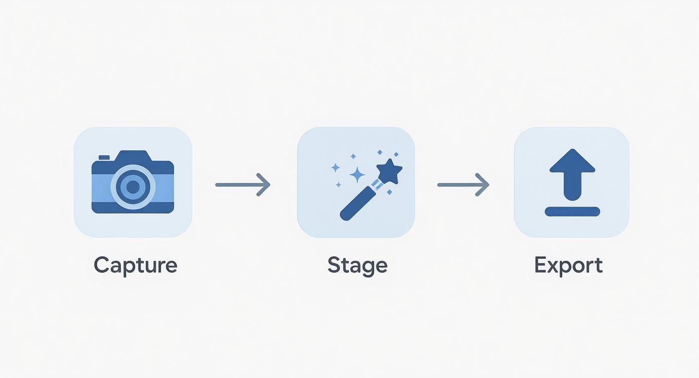
Following this ensures every screen you start designing with is clean and purposeful, laying the groundwork for a polished final result.
Choosing the Right Device Frames
First things first: the device frame. My rule of thumb is to always use the latest iPhone models available in whatever mockup tool you're using. Showcasing your app on a shiny new iPhone Pro sends a clear, if subtle, message: your app is modern, actively maintained, and built for today's users.
On the flip side, using an old, outdated device frame can make your app feel instantly neglected, even if the UI is flawless. It just creates a weird disconnect for users browsing on newer hardware. Keep it consistent, too. Stick to the same device model across all your screenshots for a clean, professional gallery.
Crafting a Compelling Visual Scene
With your device picked out, it's time to set the stage. This means choosing a background, layout, and color scheme that make your app's UI the star of the show without creating a lot of visual noise.
Backgrounds: Simple is almost always better. A solid color pulled from your brand palette or a soft, vibrant gradient does the job perfectly. You want to avoid busy patterns or photos that compete with your app's interface. Let the UI be the hero.
Layouts: Think about how you want to arrange the device and text. A single, centered phone is great for highlighting a killer feature. But you can also get creative with panoramic or connected layouts, where one continuous background flows across several screenshots to tell a more dynamic story.
Color Schemes: Lean into colors that match your brand identity. Good color choices can evoke emotion and help your screenshots stand out in a sea of search results. Just make sure you use high contrast combinations so your text captions are crystal clear.
A great mockup doesn't just show a screenshot; it frames it in a way that reflects your brand's personality. The background, colors, and layout should all work together to make your UI the undeniable center of attention.
Writing Captions That Drive Action
Honestly, your captions might be the single most important element for boosting conversions. This is your one chance to talk directly to the user and tell them why your app deserves a spot on their phone. The golden rule here is to focus on benefits over features.
Nobody cares that your app has an "advanced AI algorithm." They care that they can "Plan a week of meals in 60 seconds." A feature is what your app does; a benefit is what the user gets. That's the mindset shift that makes all the difference.
Keep your captions short, punchy, and action oriented. Use a big, readable font that’s easy to scan on a small phone screen. Each caption should highlight a unique selling point, so when someone swipes through them, they get a complete picture of your app's value. If you want to go deeper on this, there’s a great guide on crafting compelling mockups for mobile apps that really nails these principles.
A Practical Example in a Mockup Editor
Let's quickly walk through how this looks in practice with a mockup editor. Imagine we're working on a habit tracking app.
- Upload the Staged Screen: We’ll start by uploading a clean screenshot that shows a user hitting a successful meditation "streak." The data looks good. It's aspirational and easy to understand.
- Select the Device and Layout: We'll grab the latest iPhone Pro mockup and go with a simple, centered layout to keep the focus tight.
- Set the Background: To complement the app's calming color scheme, we’ll use the editor's color picker to apply a vibrant, dark blue gradient. This will make the UI elements really pop.
- Craft the Caption: Instead of something bland like "Track Your Habits," we’ll write a benefit focused headline: "Build Life-Changing Habits, One Day at a Time."
- Final Touches: We'll use the editor's text tools to make the caption font bold and white, ensuring it has plenty of contrast against the background so it’s impossible to miss.
And just like that, we've turned a basic screen capture into a persuasive marketing tool that communicates real value and nudges users toward that download button.
Navigating App Store Guidelines
Creating beautiful, high-converting iPhone app mockups is only half the battle. All that hard work means nothing if your screenshots get rejected during the app review process. It's a frustrating but common hurdle. Navigating the specific, and often strict, guidelines from Apple and Google is a step many developers overlook until it’s too late. A rejection can delay your launch by days or even weeks, so getting it right the first time is a huge advantage.
https://www.youtube.com/embed/9aW4nqe0pPQ
The core of compliance really comes down to technical specs. Each store has precise requirements for screenshot dimensions, and they vary significantly across different device sizes. A screenshot designed for a massive 6.7-inch iPhone Pro Max just won't work for a smaller SE model without proper resizing. Getting these dimensions perfect ensures your mockups render correctly on every device, preventing the kind of pixelation or awkward cropping that can tank a user's first impression.
Mastering App Store Dimensions
Apple, in particular, streamlines the process by having you upload a set of screenshots for the largest iPhone screen size, currently the 6.7-inch Super Retina XDR display. If your app also runs on iPad, you'll need a set for the largest iPad Pro, too. The App Store then automatically scales these down for smaller devices, which means your primary focus should be on creating pixel-perfect assets for the flagship models.
To take the guesswork out of it, you have to stick to the latest specs. We've put together a detailed breakdown of the required resolutions for every device in our comprehensive guide on App Store screenshot dimensions. Using a mockup tool makes this part of the job painless, as the templates are usually pre-sized to meet these exact requirements, saving you from tedious manual adjustments in Figma or Photoshop.
For a quick reference, here are the key specs you'll need to know for the Apple App Store.
Key App Store Screenshot Specifications
This table gives you the pixel-perfect dimensions required for today's most common iPhone models. Getting these right is your first step to a smooth submission.
| Device | Portrait Dimensions (pixels) | Landscape Dimensions (pixels) |
|---|---|---|
| iPhone (6.7") | 1290 x 2796 | 2796 x 1290 |
| iPhone (6.5") | 1242 x 2688 | 2688 x 1242 |
| iPhone (6.1") | 1284 x 2778 | 2778 x 1284 |
| iPhone (5.5") | 1242 x 2208 | 2208 x 1242 |
Remember, these are just the most popular sizes. Always double-check the latest requirements in App Store Connect before you finalize your assets.
Beyond Pixels: Accessibility and Legibility
But compliance isn’t just about pixels. Both Apple and Google are serious about accessibility and legibility. This means the text in your captions has to be large and clear enough for everyone to read, even when they're glancing at their phone on a sunny day.
A classic mistake I see all the time is using thin, overly stylized fonts or low contrast color combos. They might look cool in a design file, but they fail in the real world. Stick to bold, simple fonts with strong contrast against your background. If a user has to squint to read your value proposition, you've already lost them.
Your mockups must accurately represent your app's current functionality. Misleading visuals that promise features not yet available are a fast track to rejection and can seriously erode user trust. Be honest and showcase the real, polished experience.
Platform-Specific Design Considerations
It's also crucial to understand the different vibes of the iOS and Android markets. While Android holds a massive global market share of around 72.55%, the picture changes drastically in certain countries. In the United States, for instance, iOS is king with about 58% of the market. This regional strength means your iPhone app mockups must cater specifically to the expectations of an iOS audience, which tends to value seamless integration with Apple's ecosystem and a clean design language.
This platform-first mindset should guide your design choices. For an iPhone app, your mockups should feel distinctly "Apple." Use native UI elements and a clean aesthetic that feels right at home on an iPhone.
Streamlining Localization for Global Reach
If you plan to launch your app internationally, localization is non-negotiable. This goes way beyond just translating your captions; you need to adapt your visuals to be culturally relevant. A screenshot with data or imagery that resonates in the U.S. might fall flat or even be confusing in Japan or Germany.
Here’s a practical workflow I've found that works well:
- Finalize Your English Mockups: Perfect your designs, layouts, and captions in your primary language first. Get them exactly right.
- Translate Captions: Use a professional translation service or an integrated tool to accurately translate your short, benefit driven text. Don't rely on Google Translate for your storefront.
- Adapt Visuals: Scan your screenshots for anything culturally specific. A simple example is swapping out currency symbols or using names common to the target region in any sample data.
- Generate Localized Sets: A good mockup editor with built-in localization can automate this last step, generating dozens of translated screenshot sets in minutes. This ensures your app feels native to users everywhere, which can make a huge difference in conversion rates.
Testing and Optimizing Your App Mockups
Once your beautiful new iPhone app mockups go live on the App Store, the job isn’t finished. Far from it. In fact, this is where the real work begins. Launching your screenshots is just the start of a continuous cycle of improvement, where you use real world data to sharpen your visual message and drive more downloads.
The most successful apps treat their store listings not as static assets but as dynamic campaigns that are always being optimized. This is where you move from guesswork to data. Instead of hoping certain headlines, colors, or features will convert, you can run controlled experiments to find out for sure. It’s how you take the luck out of App Store Optimization (ASO) and build a clear path to boosting your conversion rates.
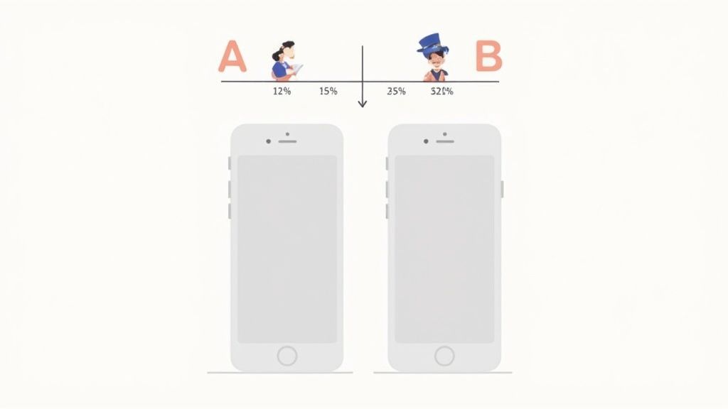
A/B Testing with Product Page Optimization
Apple gives us a powerful native tool for this exact purpose: Product Page Optimization. It lets you create up to three different "treatments" of your product page, each with different screenshots, app previews, or icons, and test them against your original page. The App Store then shows these different versions to a random percentage of users and reports back on which one actually performs better.
The key to any good test is starting with a clear hypothesis. A good hypothesis isn't just a vague idea; it's a specific, testable statement about what you believe will improve conversions.
For example, a weak hypothesis is, "New screenshots might perform better." A strong, actionable hypothesis sounds more like this: "Showing our 'Personalized Meal Plan' feature in the first screenshot will increase downloads by 10% because it highlights our app's main value proposition immediately."
With a clear hypothesis in place, you can start isolating variables to test.
What to Test in Your iPhone App Mockups
Whatever you do, don't try to change everything at once. The whole point of A/B testing is to pinpoint which specific change made the difference. Focus your tests on one variable at a time to get clean, unambiguous results.
Here are a few high impact variables to start with:
- Screenshot Order: Does leading with social proof (like a glowing testimonial) perform better than leading with a core feature? Your first two or three screenshots are absolutely critical, so testing their order can reveal some major insights.
- Captions and Headlines: Try testing different benefit oriented headlines. For instance, you could compare "Track All Your Workouts" (a feature) against "Reach Your Fitness Goals Faster" (a benefit). The latter often connects more deeply with user motivation.
- Color Schemes and Backgrounds: Does a vibrant, colorful background grab more attention than a minimalist, on brand gradient? Sometimes a simple visual tweak can have a surprising impact on user psychology.
- Highlighted Features: If your app has several key features, test which one resonates most with new users when presented first. Your "AI powered scheduler" might be technologically impressive, but maybe "One click meeting setup" is the benefit that truly gets people to tap "Get."
Running these tests allows you to replace assumptions with data. You might be surprised to learn that the mockup your team loves the most isn't the one that actually drives the most downloads. Let your audience tell you what works.
Automating Your Screenshot Workflow
As your app grows, especially across multiple languages and markets, manually updating dozens of screenshot sets becomes a massive bottleneck. This is where automation becomes a total game changer for your team's efficiency and ability to scale.
Think about it: manually creating localized screenshots for 10 languages across 3 device sizes is a recipe for errors and countless wasted hours.
Modern mockup tools like ScreenshotWhale offer an API that lets you automate the entire process. For agile teams, this is a huge advantage.
By connecting an API to your workflow, you can programmatically:
- Generate Localized Sets: Automatically pull translated text from a spreadsheet or translation service and generate complete, localized screenshot sets for dozens of languages in minutes, not days.
- Update Screenshots for New Features: When you ship a product update, you can trigger the API to automatically insert new screen captures into your existing templates. This ensures your App Store page is always current.
- Run Large-Scale A/B Tests: Quickly create multiple variations of your mockups by feeding the API different captions, backgrounds, or screen orders. This makes it incredibly easy to supply your Product Page Optimization tests with fresh creative assets.
This level of automation frees up your team from mind numbing, repetitive design tasks. Instead of spending days pushing pixels, you can focus on analyzing test results and refining your growth strategy. In a crowded marketplace, that's a massive competitive edge.
How Many Screenshots Should I Actually Upload?
Apple gives you up to 10 slots for screenshots, but let's be real: most people will only ever see the first three to five. These are the ones visible "above the fold" when someone lands on your page, making them the most valuable digital real estate you own. Your job is to make them count.
Think of those first few images as your visual elevator pitch. They need to tell a compelling story, fast.
- First Screenshot: Hit them with your single most powerful feature or value prop. This is your hook.
- Second Screenshot: Show how you solve their biggest problem. Make it relatable.
- Third Screenshot: Build trust with social proof like a testimonial, or show off a secondary feature that makes your app a must-have.
If a user only ever sees these three, they should walk away knowing exactly why they need to download your app.
Portrait or Landscape?
This one’s pretty straightforward: match the orientation to how your app is actually used. For the vast majority of apps, social, productivity, finance, portrait is the way to go. It feels natural because it’s how people hold their phones when they’re browsing the App Store.
But if you’ve built a game or a video editor that lives in landscape mode, your screenshots should too. It’s an honest reflection of the user experience. You can mix and match, but make sure it flows logically and doesn't feel jarring.
What's the Single Biggest Mistake People Make?
Hands down, the most common mistake I see is focusing on features, not benefits. It's a classic trap. Devs are proud of their "integrated algorithmic sorting," but users couldn't care less. What they want is to "Find the perfect restaurant in seconds."
Your screenshots and captions need to bridge that gap. Translate what your app does into what the user gets.
Always, always frame your app's functionality in terms of the value it delivers. Answer the user’s unspoken question: "What's in it for me?"
Before you hit publish, look at every mockup and ask yourself if it speaks to a real human desire or solves a nagging problem. That shift in perspective is what separates a pretty screenshot from a high-converting one.
Do My Mockups Have to Look Exactly Like My App?
Yes and no. On one hand, you absolutely must be honest. Your mockups need to represent your app's actual UI and functionality to get through Apple's review. Making up features is a surefire way to get rejected.
On the other hand, these are marketing assets, not technical diagrams. You should absolutely stage them to look their best. This means populating them with clean, aspirational data, picking the most visually stunning screens, and clearing out any clutter. Think of it like professional product photography for your app. It’s the real product, just shown in its best possible light.
Ready to create iphone app mockups that actually drive downloads? With ScreenshotWhale, you can generate professional-grade App Store and Google Play screenshots in minutes. Our templates are designed to convert, and our AI-powered localization tools help you launch faster worldwide. Start creating for free at screenshotwhale.com.