
High-Impact Mockups for Mobile Apps That Convert
Discover how to use mockups for mobile apps to drive downloads and growth. This guide covers strategies for creating high-converting app store screenshots.
Think of a mobile app mockup as the visual blueprint for your idea. It is not just a rough sketch; it is a static, high-fidelity design that shows exactly how your app will look and feel, bridging that crucial gap between a concept scribbled on a napkin and a polished product ready for the app store.
Why Mobile App Mockups Are Your Secret Weapon
Ever seen an architect try to build a skyscraper without a detailed blueprint? It would be a chaotic, expensive mess doomed to fail. A mobile app mockup is that blueprint for your app. It is the architectural rendering that guides your entire development process from start to finish.
These detailed designs give everyone, from stakeholders and investors to your designers and developers, a crystal-clear vision of the final product. Abstract ideas suddenly become tangible visuals. This ensures your entire team is on the same page about the user interface, color palette, typography, and brand identity before anyone writes a single line of code.
The Foundation of a User-Centric App
The real magic of creating mockups is that it forces you to think deeply about the user experience from day one. When you are laying out every screen, button, and navigation flow, you cannot help but spot potential friction points and usability issues early on.
It is the stage where you answer the most important questions:
- Is the navigation actually intuitive? Can someone move through the app without feeling lost?
- Is the visual hierarchy obvious? Do the most important actions and information grab your attention immediately?
- Does the design feel right? Will it meet the expectations of users on both iOS and Android?
A strong mockup is your first line of defense against a poor user experience. It is where you get to test, tweak, and perfect your app's visual journey, making sure the final product is not just functional, but a genuine pleasure to use.
This upfront work pays off, big time. The global market for mobile app design tools is exploding, projected to hit $2.5 billion by 2032. That number tells a story: a well-planned visual strategy is no longer optional for success. You can explore more insights about the mobile design market to see just how fast it is growing. By investing time in detailed mockups for your mobile app, you are not just designing screens, you are building a solid foundation for a product that can actually compete and win.
Choosing the Right Mockup for Your App's Stage
Not all mobile app mockups are created equal. Just like a builder uses different blueprints for different stages of construction, you should use different types of mockups depending on where you are in your app's journey. Nailing this choice is the secret to moving faster and ending up with a much better final product.
Think of it as an evolution. You start with a simple sketch, and step-by-step, it grows into a detailed, pixel-perfect design. Each stage adds another layer of clarity, helping you sharpen your vision and squash potential issues before they become expensive coding headaches.
From Simple Sketches to Interactive Prototypes
The journey kicks off with low-fidelity wireframes. These are your bare-bones visuals, often just simple black-and-white layouts. Their job is purely structural. They let you map out the user flow and figure out where key elements like buttons and menus should go, without getting bogged down by colors or fonts.
Next up, high-fidelity mockups. This is where your app's personality truly comes to life. These are static but visually rich designs that pull in your branding, color palette, typography, and imagery. They look exactly like the finished app, which makes them perfect for getting stakeholders excited and for creating those all-important app store screenshots.
Finally, you have interactive prototypes. These take your gorgeous high-fidelity mockups and make them clickable. Users can tap through screens, test out the navigation, and get a real feel for the app's flow. Prototypes are absolutely essential for user testing and confirming your design choices before development even starts.
This diagram perfectly illustrates the progression from an idea to a full-fledged app, with mockups acting as that critical bridge.
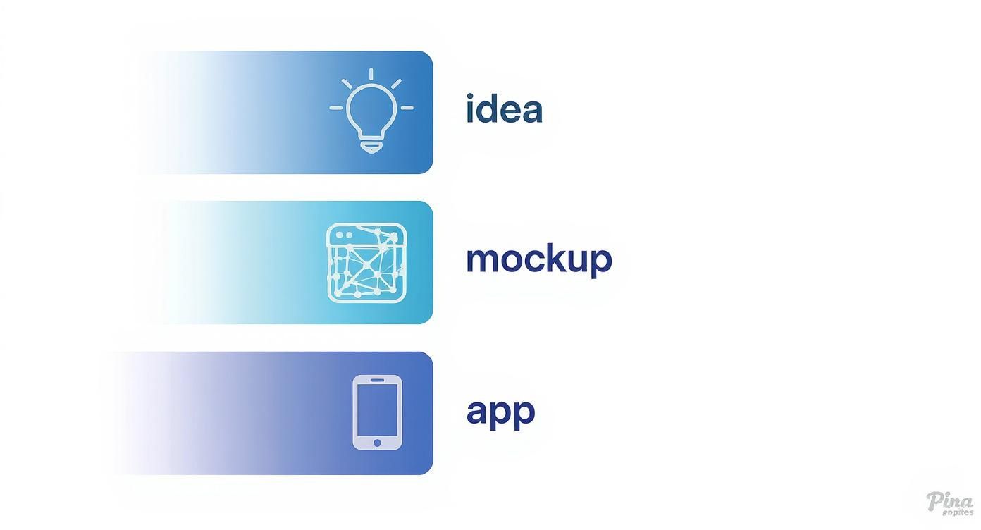
It is a clear reminder that mockups are not just an optional step, they are a foundational part of turning a concept into something real.
Matching Mockup Fidelity to Your Development Phase
So, when should you use each type? The key is to match the mockup’s level of detail to what you are trying to accomplish right now. To make it easier, here is a quick breakdown of which mockup to use and when.
| Mockup Type | Fidelity | Primary Use Case | Best For |
|---|---|---|---|
| Wireframe | Low | Mapping user flow and core structure. | Early-stage brainstorming and layout validation. |
| High-Fidelity Mockup | High | Visualizing the final look and feel. | Stakeholder presentations and app store assets. |
| Interactive Prototype | High | Testing usability and user interactions. | Pre-development user testing and feedback. |
This table makes it clear: using the right tool at the right time saves a ton of rework down the line.
In the beginning, stick with low-fidelity wireframes to quickly brainstorm and iterate on the core layout. It is way easier to move a few boxes around than to redesign a fully polished screen.
A common mistake is jumping straight into high-fidelity design. This can lock you into a specific visual direction way too early, making it painful to pivot based on feedback. Start simple, get the structure right, and then add the visual polish.
Once your concept is solid, it is time to move to high-fidelity designs. These are vital for presentations and are the foundation for your final app store screenshots. For developers looking for specific guidance, there are some fantastic resources on how to create compelling mockup apps for iPhone that really grab a user's attention.
And before you hand anything off to your development team, use interactive prototypes for in-depth user testing. This is your chance to make sure the app is truly intuitive and a joy to use.
How Great Mockups Drive App Store Conversions
Your app store page is the final hurdle. It is the last stop between a curious visitor and a new user. In a marketplace this crowded, you have just seconds, literally seconds, to grab someone's attention and convince them your app is the one they have been looking for.
This is where your mockups for mobile apps transform from simple designs into your most powerful sales team, directly fueling your app store growth.
They are your visual pitch, telling a story about your app's value in a single glance. A polished screenshot mockup does not just display a feature; it puts that feature into a real-world context, helping users instantly see how your app will solve their problem or make their life better. This kind of visual storytelling is infinitely more powerful than a block of text they will probably never read.
The Psychology of Visual Persuasion
When someone lands on your app page, their brain is working fast, and it is wired to prioritize visuals. Professional-looking mockups instantly build trust and send a clear signal of quality. An app that looks well-designed is assumed to be more reliable, secure, and easier to use, boosting conversion rates.
Think about it like this: would you be more drawn to a product in a plain brown box or one in beautiful, premium packaging? The packaging itself changes how you perceive the value of what is inside. Your mockups are that premium packaging.
- Builds Credibility: High-quality mockups show you have invested real time and effort, which suggests the app itself is just as polished.
- Communicates Value Instantly: A well-crafted screenshot can explain a core benefit faster than anyone can read a sentence.
- Creates an Emotional Connection: The right colors, fonts, and relatable scenarios help users connect with your brand on a gut level, not just a logical one.
This first impression is everything. In 2024 alone, there were 136 billion apps downloaded worldwide, and by the first quarter of 2025, consumer spending hit $40 billion. The competition is fierce. A visually stunning storefront is not a nice-to-have; it is essential for survival. You can see just how massive the app market is and why you cannot afford a weak first impression.
A Powerful Tool for A/B Testing
Great mockups are not just for launch day, they are one of your best tools for optimizing your app store presence over time. They give you the perfect way to A/B test different marketing messages without having to write a single line of code.
You can spin up different versions of your screenshots to test all sorts of things.
For example, using a screenshot editor, you could test:
- Different Captions: Does "Track Your Fitness" perform better than "Achieve Your Health Goals"? Test both with a simple text edit.
- Feature Highlights: Should the first screenshot show off social sharing, or is the personalized plans feature the real hook? Swap the first and second screenshots to find out.
- Visual Styles: Is a clean, minimalist design getting more taps, or does a bold, vibrant one with a colorful background catch more eyes? Try a different template to see what converts.
By testing these variations, you get hard data on what actually connects with your audience.
This cycle of testing and refining your visuals is the heart and soul of App Store Optimization (ASO). It turns your marketing from a guessing game into a data-driven strategy, letting you systematically improve your download conversion rate.
Time and time again, case studies show that moving from basic screen grabs to polished, professional mockups can send conversion rates soaring. The shift communicates a level of professionalism and clarity that directly influences a user's decision to hit that "install" button. To really get into the weeds on this, check out our guide on conversion rate optimization techniques and see how small visual tweaks can lead to massive growth.
Creating High-Converting App Store Screenshots
Your app store page is your digital storefront, and the screenshots are your window display. Period. They are often the single biggest reason someone hits "Install" or just keeps scrolling. To boost app store growth, you need efficient and high-converting app store screenshots for both Android and iOS stores.
Throwing up a few raw screen grabs is a massive missed opportunity. To actually move the needle on downloads, you have to turn those static images into a compelling story using polished mockups for mobile apps.
This is not just about showing what your app does. It is about framing your screenshots in realistic device mockups, adding bold captions that shout your main benefits, and using vibrant, appealing colors that feel like your brand. Think of each screenshot as a tiny billboard. Its only job is to communicate one key idea in less than three seconds. A killer set of screenshots tells a story, walking a potential user from their problem straight to your app's brilliant solution.
Crafting a Compelling Visual Story
The best app store listings do not just show random screens; they arrange them in a logical flow. Your first one or two images are everything, since they are the only ones most people will see without swiping. Use them to hook the user with your app's biggest promise or coolest feature.
From there, the next few screenshots should build on that initial hook, taking the user on a quick journey:
- Screenshot 1: Hit them with the main value proposition (e.g., "Plan Your Perfect Trip"). Use a large, bold font.
- Screenshot 2: Show off a core feature that makes it happen (e.g., "Discover Hidden Gems"). Place your app's UI inside a clean device frame.
- Screenshot 3: Prove how simple it is or highlight another key benefit (e.g., "Book in Seconds").
- Screenshot 4: Add a little social proof or personalization to seal the deal (e.g., "Join Millions of Travelers").
This storytelling approach makes your app's purpose instantly clear and way more convincing than a jumble of unrelated screens. When you are ready to get started, it is worth exploring tools that are built for this. You can discover powerful features for creating compelling app screenshots that make this whole process much smoother.
Using Templates for Professional Results
Look, you do not need to be a design guru to create visuals that pop. Platforms like ScreenshotWhale have entire libraries of pre-made templates, all designed around ASO best practices. They give you a rock-solid foundation, letting you focus on your app's message instead of wrestling with design software.
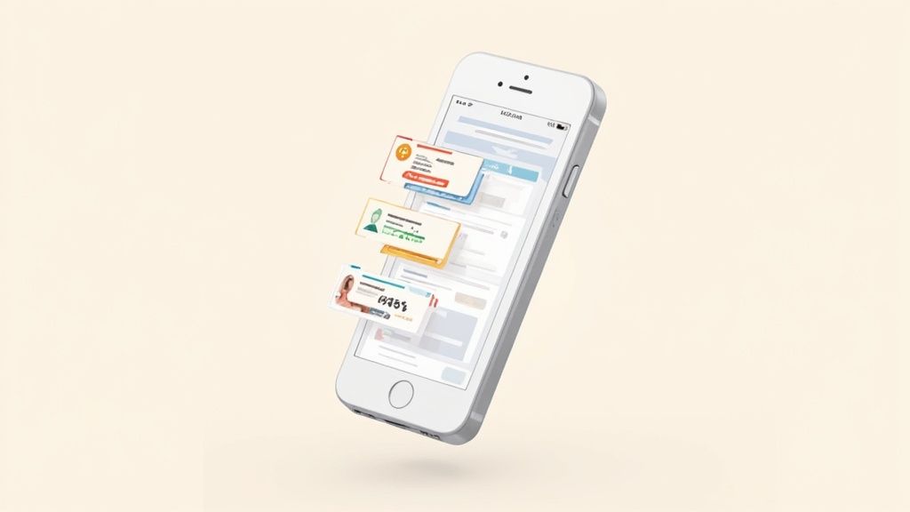
This image gives you an idea of the variety out there. You will find different styles with neat, appealing imagery and vibrant colors to match any app category you can think of, from fitness to finance.
Grabbing a template means you can churn out consistent, high-quality mockups in minutes. Just drag and drop your app screens, tweak the captions in the text editor, and adjust the background colors to match your brand. It is that simple.
The real win here is getting professional quality without the headache. A good template already handles all the weird dimension requirements for the Apple App Store and Google Play Store, so you do not have to guess.
This approach guarantees a polished, consistent look on every device, from the newest iPhone to the most popular Android phones. If you want to go deeper on how templates can speed up your workflow, check out our guide on picking the right app store screenshot template. At the end of the day, these tools help you build a storefront that turns casual browsers into loyal users.
Best Practices for Effective Mockup Design
Anyone can make a pretty picture, but designing a mobile app mockup that actually works? That is a completely different ballgame. It goes way beyond just picking a nice color palette or a cool font. You are building a strategic foundation that makes sure your app feels intuitive, is accessible to everyone, and is ready for the real world from day one.
This is where the details really matter. A great mockup is not just a static image; it is an authentic preview of what the user will actually hold in their hands, built with their experience in mind from the very first screen.
Maintain Consistency and Familiarity
Think about the apps you use every day. They feel predictable, right? That is not an accident. A consistent design language builds trust and makes your app feel instantly familiar, which is exactly what you want. Without it, you will just leave people confused and frustrated.
Here is where to focus your attention:
- Design System: Stick to the same colors, typography, and spacing on every single screen. This creates a unified and professional feel.
- UI Elements: Buttons, icons, and menus need to look and behave the same way no matter where they are. A "back" button should always be a "back" button.
- Platform Guidelines: Do not fight the platform. Follow the native UI conventions for iOS and Android. People are used to how their phone works, and straying too far from that can feel jarring and cheap.
Design with Real Content and for Everyone
Nothing shatters the illusion of a mockup faster than seeing "Lorem Ipsum" placeholder text. Using real, actual content from the start forces you to see how your design really holds up. It makes you tackle the tricky stuff early, like how to handle a super-long headline or an oddly shaped image.
At the same time, accessibility is not an optional checkbox, it is a core principle of good design. Simple things like using high-contrast colors and clear, readable fonts open your app up to a much wider audience. It is the right thing to do, and it is good for business.
An effective mockup is a collaborative tool, not a solo project. The feedback process is where good designs become great. Share your work early and often with your team to gather diverse perspectives and catch potential issues before they become costly coding problems.
To create mockups that genuinely connect, you have to know who you are designing for. This all starts with a deep dive into audience analysis in modern marketing. This step ensures your design choices are based on real user needs, not just your own assumptions.
By embracing these practices, you shift from just making pretty pictures to engineering a user-friendly product that is primed for success.
Of course. Here is the rewritten section, crafted to match the human-written style of the provided examples.
Your Top Mockup Questions, Answered
Even when you know why mockups matter, a few practical questions always pop up. Let's clear the air on some of the most common ones so you can get back to designing and growing your app.
Mockup vs. Prototype: What's the Real Difference?
It is easy to mix these two up, but they play completely different roles. Think of it like building a house.
A mockup is the architect's beautiful, full-color rendering. It shows you exactly what the finished house will look like, the paint color, the window style, the landscaping. It is all about the final visual polish. It is static, but it is a perfect picture of the end goal.
A prototype, on the other hand, is the physical model you can walk through. The walls might be unfinished and the furniture is just cardboard cutouts, but you can open doors, walk from room to room, and get a feel for the flow. It is interactive and all about the experience.
So, a mockup shows what your app looks like. A prototype shows how it works.
How Many Screenshots Do I Actually Need for the App Store?
Both the Apple App Store and Google Play give you up to 10 screenshot slots. My advice? Use as many as you can, aiming for at least five to seven.
Your first 2-3 screenshots are your storefront window, they are what everyone sees without scrolling. This is your prime real estate. Use it to hook users with your app's single biggest promise or most exciting feature. The rest of your screenshots should tell a short, compelling story that walks a potential user from their problem to your app’s brilliant solution.
Your screenshot gallery is your visual elevator pitch. Each image should build on the last, creating a narrative that makes the decision to install feel obvious and compelling.
Can I Just Use the Same Mockups for iOS and Android?
You could, but you really should not. It is one of those small details that makes a huge difference in conversions.
Each platform has its own design language, its own unique buttons, navigation bars, and system fonts. Using an iPhone mockup on the Google Play Store (or vice-versa) just feels... off. It screams "lazy port" and instantly breaks a user's trust.
When you tailor your mockups to match the native look and feel of each store, you show users you care. It builds credibility and makes your app feel like it truly belongs on their device.
What Are the Best Mockup Tools for a Beginner?
The good news is you do not need to be a design wizard to create incredible mockups. There are plenty of user-friendly tools out there that make it surprisingly simple.
- ScreenshotWhale: This one is a no-brainer for app store screenshots. It is built for this exact purpose, with professional templates that do most of the heavy lifting for you.
- Canva: A great all-rounder for marketing visuals. It has some solid mockup features that are easy to pick up and perfect for creating more than just screenshots.
- Figma or Adobe XD: If you are ready to go a little deeper into UI design, these are the industry standards. They have generous free plans and tons of tutorials to get you started.
Any of these can help you produce polished, effective mockups without the steep learning curve of traditional design software.
Ready to create stunning, high-converting app store screenshots in minutes? Try ScreenshotWhale and transform your visual presence with professionally designed templates and a simple drag-and-drop editor. Get started for free at screenshotwhale.com.