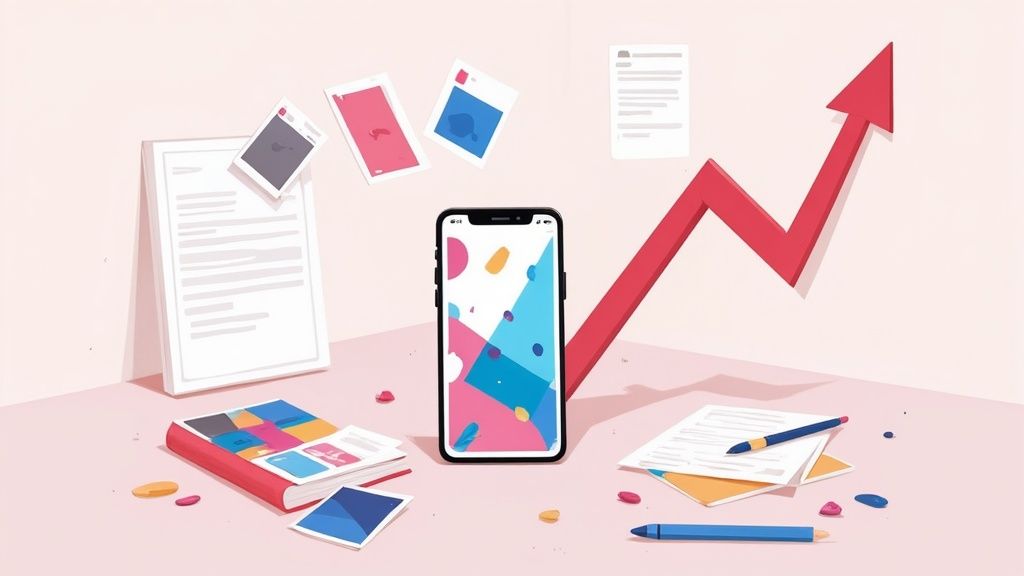
How to Create a Mobile App Mockup That Drives App Store Growth
Create a high-converting mobile app mockup with our guide. Learn to design stunning screenshots that boost app store downloads and drive growth.
A great mobile app mockup is more than a pretty picture. It is a strategic tool that turns an abstract idea into something people can see, feel, and get excited about before you write a single line of code. It's your app's first handshake with the world, and it's essential for boosting conversions on the App Store and Google Play.
Why a Killer Mockup Is Your Secret Growth Weapon
In today's crowded app stores, your visual presentation is a critical differentiator. A polished mockup makes your app's value crystal clear from the first glance. It becomes the foundation for every marketing asset you create, from eye catching social media ads to the high converting app store screenshots that drive downloads.
This is not just about aesthetics. It is about building a solid business case.
Think about it: walking into a meeting with stakeholders and showing them a beautiful, functional looking mockup is infinitely more powerful than just describing features in a document. The mockup tells a story that words and data simply cannot. It lets you visualize the user flow and spot potential roadblocks early, saving you from costly development mistakes down the line.
The Foundation of App Store Dominance
At the end of the day, every design choice you make should lead a user to one simple action: tapping that "Download" button. Your mockup is the direct source material for your entire app store presence. High fidelity mockups are what allow you to create screenshots that actually convert and fuel app store growth.
Here is why they matter so much:
- Showcase Your Core Value: Instantly communicate what your app does and why it is the best choice out there.
- Tell a Compelling Story: Guide potential users on a visual journey, highlighting the app’s best features and benefits in a logical flow.
- Boost Conversion Rates: Professional, attractive visuals build trust and make people far more likely to install.
To really make your mockups work for you, it helps to understand the competitive landscape of the mobile app industry. Knowing what you are up against helps you position your app to win.
To give you a clearer picture, I've put together a table showing exactly how a strong mockup translates into real world wins for your business.
How High-Fidelity Mockups Translate to Business Wins
| Benefit | Impact on Your App Project | Business Outcome |
|---|---|---|
| Crystal Clear Vision | Aligns stakeholders, designers, and developers on the app's look, feel, and flow. | Faster decision making, fewer misunderstandings, and a more cohesive final product. |
| Early User Feedback | Allows for user testing with a realistic prototype before development begins. | Reduced risk of building the wrong thing, leading to a product users actually want. |
| Investor Magnet | Provides a tangible, impressive visual to present in pitch meetings. | Increased chances of securing funding by making the app feel real and market ready. |
| Marketing Head Start | Generates high quality visuals for app store screenshots, ads, and landing pages. | Stronger launch campaign, higher conversion rates, and better return on ad spend. |
This table really drives home the point: investing time and effort into a top notch mockup is not an expense. It is an investment that pays dividends across the entire project lifecycle.
Driving Growth Before You Even Launch
The global mobile app market was valued at around $522.7 billion and it is only getting bigger, which means competition is fierce. In a market this packed, smart developers use mockups to validate their ideas and cut down on development costs before sinking in serious resources.
A mockup transforms an idea into a conversation starter. It allows for rapid iteration based on feedback, ensuring the final product is perfectly aligned with user expectations and business goals.
The visuals you pull from your mockups become the heart of your marketing strategy. We are talking about everything from the screenshots on your product page to the creative you use for paid user acquisition. A strong visual identity is a cornerstone of App Store Optimization (ASO), and it all starts with the mockup.
Finding Inspiration to Define Your App's Story
A great mobile app mockup does more than just show off features. It tells a story, one that convinces someone scrolling through the app store to stop and hit "Download." And just like any good story, it all starts with a little inspiration.
Before you touch a single pixel, your first stop should be where your future users are already hanging out: the App Store and Google Play. Go look at your top competitors. I mean really look.
Do not just make a list of their features. Pay attention to how they use their app store screenshots to build a narrative. Are they hitting one key benefit per screen? What kind of mood are they creating with their vibrant color choices, fonts, and device frames? This initial homework is priceless. It helps you understand what your audience already responds to and, more importantly, where you can do something different to stand out.
You can also find a goldmine of creative ideas on design platforms.
![]()
A quick browse through popular mobile designs on a site like Dribbble shows you how top tier designers use bold, vibrant colors, crisp layouts, and slick illustrations to make an experience feel intuitive. You will start to notice patterns, like how they use whitespace to avoid a cluttered look or create a visual hierarchy that pulls your eye to the most important buttons.
Create a Mood Board
Once you have gathered a bunch of ideas, it is time to create a mood board. This is a simple but incredibly powerful step for locking in your app's visual identity. It is basically a collage of images, colors, fonts, and UI elements that captures the feeling you want your app to have. Think of it as your visual North Star that will keep all your future design decisions on track.
Your mood board should nail down a few key things:
- Color Palette: Pick 3-5 primary and secondary colors that match your brand's vibe. Is your app high energy and fun, or is it more calm and professional? Bright, punchy colors can generate excitement, while a more muted palette often builds a sense of trust.
- Typography: Settle on one font for your headlines and another for your body text. The most important thing here is readability on a small screen, but you also want them to fit the overall aesthetic you are building.
- Imagery Style: Decide if you are going to use illustrations, real photos, or more abstract graphics. Sticking to one style is the secret to a polished, professional look.
- UI Elements: Grab a few examples of buttons, icons, and cards that you think look great and work well.
This whole process turns your vague ideas into a concrete visual direction. If you are looking for more inspiration on what is current, checking out different mobile app UI designs can give you some fresh perspectives.
A well curated mood board ensures consistency across your entire mobile app mockup. It is the difference between a random collection of screens and a cohesive visual journey that feels professional and trustworthy.
Ultimately, this discovery phase is all about translating your app's core value into a visual story that clicks with users from the moment they see your first screen. By sizing up the competition and defining your visual language early on, you are building a solid foundation for a mockup that actually drives downloads and helps your app grow.
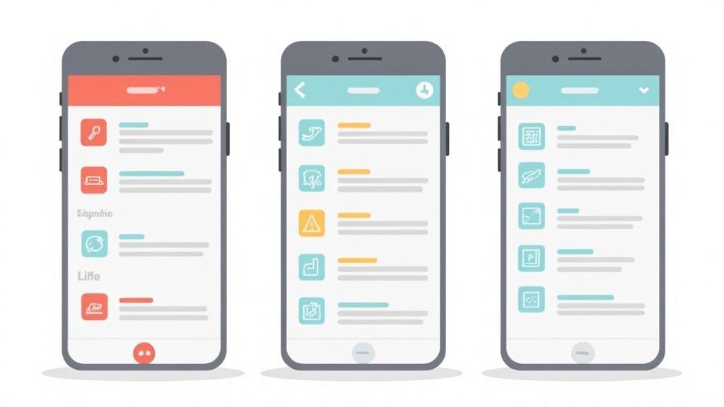
Crafting Your High-Converting Mockup Screens
Alright, let's move from theory to action. It is time to design the core screens that will actually convince people to hit that "download" button. These screens are the heart of your mobile app mockup, and every single one needs a crystal clear purpose.
To make this real, we will walk through the process using a hypothetical fitness app.
The goal here is not just to make pretty pictures. You are creating a visual argument for why your app deserves a spot on someone's crowded home screen. That means every button, every image, every piece of text has to work together to tell a story about value and ease of use.
This is the general flow I follow, moving from understanding the user to the final polished screens.

As you can see, it all starts with the user. You figure out what they need, define the visual style, and then you start building the actual screens.
Design the Critical Onboarding Flow
Your first few screens are your app's handshake, its first impression. For our fitness app, let's map out a simple, three screen onboarding flow. The job is to welcome the user, ask for their main goal (like "Lose Weight" or "Build Muscle"), and then gently ask for notification permissions.
- Screen 1: The Welcome. Go with a vibrant, high energy photo of someone mid workout. The headline needs to be about the benefit, not the feature. Something like, "Your Personal Fitness Journey Starts Now." Keep the text short and sweet.
- Screen 2: The Goal. Do not use a dropdown menu. Present big, clear, tappable buttons for each fitness goal. I like to add icons next to the text to make them easier to scan and a bit more visually interesting.
- Screen 3: The Permission. This is key. You have to explain why you need notifications. Instead of a generic system prompt, use copy like, "Enable notifications for workout reminders to help you stay on track!" This frames it as a helpful tool, not an annoying intrusion.
Build an Engaging Dashboard
The dashboard is where your users will live day to day, so it has to be informative without being a cluttered mess. For our fitness app, that means creating a strong visual hierarchy that immediately draws their eyes to what matters most.
Put the "Today's Workout" card right at the top. Make it the biggest, boldest element on the screen. Underneath, you can use smaller widgets for key stats like "Calories Burned" and "Weekly Progress." Whitespace is your best friend here. Give every element room to breathe so you do not overwhelm the user.
A well designed dashboard immediately answers the user's main question: "What should I do next?" It guides them to take action and proves the app's value every single time they open it.
Showcase a Key Feature Screen
Finally, you need to create a mockup for one of your app's absolute standout features. Let's say our fitness app has a "Custom Workout Builder." This screen needs to feel both powerful and dead simple to use.
Start by placing your design inside a modern device frame, like the latest iPhone or Google Pixel. This small touch makes your mobile app mockup feel current and professional.
Use a clean layout with a clear call to action button, like "Create My Workout," in a contrasting color that really pops. And please, use real, appealing images for the exercise thumbnails, not just generic grey boxes. Sourcing high quality photos is a small detail that makes a massive difference in perceived quality.
If you are looking to really sharpen your eye for creating these kinds of user friendly designs, it is worth checking out some of the top UI/UX design courses out there. They can give you a much deeper understanding of these core principles.
By putting these techniques into practice, you’ll build a mockup that does not just look good. It is engineered to boost conversions and drive real growth on the app stores.
Turning Mockups into High-Converting App Store Screenshots
Alright, your app mockup is polished and ready to go. You have nailed the internal reviews. But now comes the real test: winning over users on the App Store and Google Play. This is where you create efficient and high-converting app store screenshots for the Android and iOS stores.
This is the moment your design work stops being a plan and starts being your most powerful marketing tool. Your screenshots are not just pictures of your app; they are your primary sales pitch, and they have a massive impact on your conversion rates.
You have just a few seconds to grab someone's attention. That is it. So your screenshots absolutely must tell a clear, compelling story about why your app deserves a spot on their phone. They need to create a visual narrative that takes a user from "What is this?" to "I need this."
This means every single screenshot needs to pull its weight. Your first one or two are the most critical. They are often the only ones a user sees while scrolling through the search results. These have to instantly communicate what makes your app special.
What Makes a Screenshot Actually Convert?
I have seen it time and again: the best performing screenshots are a mix of three simple things. They combine a crisp mobile app mockup, a headline that focuses on the user's benefit, and a vibrant background that makes it all pop. The goal is to show how you make the user’s life better, not just list what your app does.
- Powerful Headlines: Instead of a dull label like "Workout Tracker," try something like "Track Your Progress, See Results." It is all about the outcome.
- Show, Do Not Tell: If your app has a custom workout builder, do not just say it. Show the interface in action, right there in the mockup. Let people see it for themselves.
- Cohesive Branding: Stick to your brand’s vibrant colors and fonts across every screenshot. This is not just about looking good; it builds recognition and, more importantly, trust.
When you blend these elements, a static image becomes a tiny, powerful ad for your app. Think of your screenshot gallery as a mini storyboard where each frame builds on the last, guiding the user through your app's best features.
Treat your app store gallery like a billboard. Each screenshot is a chance to highlight a key benefit, answer a potential user's question, and get them one step closer to hitting that download button.
Optimizing for iOS and Android
The core ideas are the same everywhere, but the Apple App Store and Google Play Store have their own vibes and technical rules. You absolutely have to tailor your presentation for each platform if you want to maximize your downloads.
For the Apple App Store:
- Focus on a Polished Look: Apple users tend to respond to clean, premium designs. Use high quality device frames (like the latest iPhone) and keep your backgrounds simple and elegant.
- Tell a Story in Order: Arrange your screenshots to walk the user through a logical flow. Start with the "aha!" moment, then reveal a core feature.
- Nail the Dimensions: Make sure your screenshots are the right size for all the different iPhone and iPad models. Pixelated or badly cropped images scream "unprofessional."
For the Google Play Store:
- Emphasize Features and Function: Android users often appreciate a more direct, feature forward approach. Do not be afraid to use callouts to point out specific UI elements.
- Use a Promo Video: Google Play puts your video front and center, right before the screenshots. This is prime real estate to show your app in action.
- Be Bold with Color: The Play Store's design gives you more room to be vibrant and dynamic. Use bold, appealing imagery with vibrant colors that stand out from the crowd.
Creating visuals that really work takes practice and a bit of trial and error. If you want to go deeper, there is some excellent guidance on creating high-quality screenshots that consistently get results.
By tweaking your strategy for each store, you give your mobile app mockup the best possible chance to turn casual browsers into loyal users.
Optimizing Your Mockup Creation Workflow
Creating a great looking mobile app mockup is one thing. Creating it efficiently is another, and it is what separates the pros from everyone else. A sharp, streamlined workflow does not just save you a ton of time; it frees up your brain to focus on what really matters, like nailing the user journey, instead of getting lost in repetitive design tasks. The goal here is to work smarter, not harder.
This means you have to stop designing every single button and icon from scratch for every project. The most productive designers I know all start their mockups from a solid foundation of high quality UI kits and pre made templates. Think of these resources as accelerators. They give you polished, consistent, ready to use components right out of the box.
When you use a well designed UI kit, you instantly sidestep hundreds of tiny design decisions. Button states, form field styles, navigation icons, it is all done. This lets you assemble entire screens in minutes, not hours. It is especially crucial when you are cranking out a series of mockups for app store screenshots and need them all to look perfectly harmonized.
Build Your Design System Early
One of the biggest time wasters in creating mockups is inconsistency. You change a button color on one screen, then completely forget to update it on the other five. The result is a messy, unprofessional looking product that quietly screams "amateur." This is exactly where a simple design system becomes a lifesaver.
Even a basic system can have a massive impact on your speed and quality:
- Define Your Colors: Nail down your primary, secondary, and accent colors from the start. Save them as styles in your design tool of choice (Figma, Sketch, etc.) so you can apply them with a single click.
- Set Your Typography: Choose your fonts, sizes, and weights for headings, subheadings, and body text. This is not just about looks; it ensures readability and a cohesive feel across your entire mockup.
- Create Components: Turn common elements like buttons, nav bars, and input fields into reusable components. The magic happens when you edit the main component. Every single instance updates automatically across your entire project.
Think of your design file not just as a canvas, but as an organized library. When every element has its place and a clear purpose, you can iterate on your mobile app mockup with confidence and speed, making feedback cycles painless.
Keep Your Files Organized
A messy design file is a slow design file. It might feel tedious at the moment, but religiously naming your layers and organizing your screens pays off big time. This is especially true when it is time to hand off your work to a developer or bring a teammate into the project.
A well structured file makes it dead simple for anyone to jump in, understand your design intent, and find the exact assets they need without bugging you. This disciplined approach is the secret to creating high quality mockups at scale, ensuring every screen feels like part of the same polished, trustworthy experience.
Getting Your Mobile App Mockup Questions Answered
When you are first diving into mobile app mockups, a few questions always seem to pop up. Let's clear the air on some of the most common ones so you can focus on what really drives growth on the app stores.
One of the first things people ask is about the difference between a wireframe, a mockup, and a prototype. It is actually pretty simple if you think of it like building a house.
A wireframe is the blueprint, just lines and boxes showing the structure. Then, your mobile app mockup is the photorealistic 3D model. It is static, but it shows you exactly how the final app will look and feel, with all the colors, fonts, and images in place. The prototype is the final step: a guided tour of the model home where you can open doors and walk from room to room. It is an interactive, clickable version that simulates the real user experience.
Choosing the Right Tools and Scope
For deep, professional design work, the industry heavyweights are tools like Figma, Sketch, and Adobe XD. They are packed with features for creating pixel perfect mockups and collaborating with your team. Honestly, they’re fantastic for that.
But what if you are a marketer or a developer who just needs to create high converting app store screenshots, and you need them now? That is where dedicated mockup generators come in. They are built for speed and efficiency, especially if you are not a full time designer. A good screenshot editor allows you to choose a template, upload your screen captures, and customize the text and background colors in minutes to generate professional, high converting visuals.
Another big question is how many screens you actually need for that first mockup. My advice? Do not just show off random screens. Tell a story.
A strong set of 5 to 7 key screens is usually all it takes to communicate your app's core value. Focus on the onboarding flow, the main dashboard, and at least one screen that highlights a killer feature. This is the perfect number to build a compelling narrative for your app store screenshots.
Can You Use Mockups for Early Feedback?
Absolutely. Static mockups are perfect for getting early feedback on the visual side of things. You can show them to potential users and get their gut reaction to your branding, color choices, and overall vibe before a single line of code is written.
Just keep their limitations in mind. A static mobile app mockup is great for validating your visuals, but it cannot tell you much about usability or user flow. For that, you’ll need an interactive prototype to see how people actually navigate your app from screen to screen.
Ready to turn your designs into App Store masterpieces? ScreenshotWhale provides professionally designed templates and a simple editor to create stunning, high-converting screenshots in minutes. Stop guessing and start growing at https://screenshotwhale.com.