7 Mobile App UI Designs to Boost Store Growth in 2025
Discover 7 powerful mobile app UI designs and templates to accelerate your workflow. Learn actionable tips to boost conversions and app store growth today.
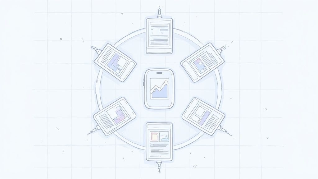
A great mobile app UI is more than just aesthetics; it is a direct driver of user acquisition and retention. The right design choices not only create a seamless user experience but also tell a compelling story on your app store page, boosting conversions and fueling growth. This guide breaks down 7 exceptional resources for mobile app UI designs, moving beyond surface level looks to provide actionable strategies. We will analyze the strategic advantages of each, showing you how to translate powerful UI concepts into high converting app store screenshots for both iOS and Android. Prepare to learn how thoughtful design accelerates your entire development lifecycle and ultimately convinces users to hit 'Install'.
This list provides a blueprint for finding, adapting, and implementing high quality designs efficiently. Each platform we cover offers unique advantages, from ready made templates that save hundreds of hours to foundational systems that ensure brand consistency. To lay a strong foundation for your mobile app's visual and interactive elements, consider the principles discussed in various user interface design frameworks for mobile apps which help structure these creative assets.
For every resource, you will find direct links and screenshot examples, allowing you to quickly evaluate which option best fits your project's scope, budget, and technical needs. We will focus on practical takeaways, helping you build an interface that not only looks professional but also performs as a powerful growth marketing tool in the competitive app stores. Let’s explore the platforms that will help you create a winning app experience.
1. Envato Elements
Envato Elements operates as a vast, all you can download marketplace, making it an invaluable resource for teams needing a high volume of design assets. Instead of purchasing mobile app UI kits individually, a single subscription grants access to thousands of options, covering nearly every conceivable app category from fintech and e commerce to social media and wellness.
This model is a game changer for agencies, startups, and developers who are constantly prototyping or launching new products. The platform provides a treasure trove of mobile app ui designs in multiple formats like Figma, Sketch, and Adobe XD, ensuring compatibility with your team's preferred design tools. This breadth of choice allows for rapid iteration and testing of different visual concepts without the friction of multiple purchases.
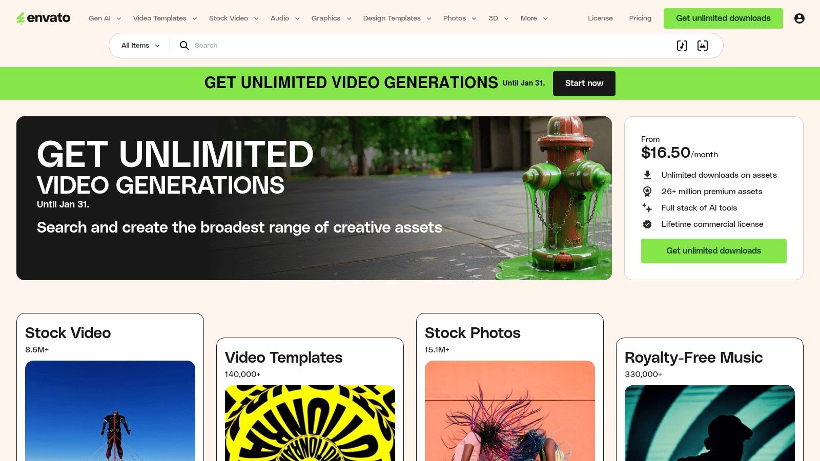
Strategic Analysis
The core value proposition of Envato Elements is its unlimited download model. This fundamentally changes the economics of sourcing design assets. For a fixed monthly fee (starting around $16.50/month), you gain access to an entire library, which is significantly more cost effective than buying single licenses that can cost $20 to $60 each.
The platform also standardizes licensing. Every asset downloaded comes with a simple, broad commercial license, eliminating the legal complexities that often arise from sourcing assets from multiple vendors. This is a critical advantage for commercial projects, ensuring your app's design is fully compliant.
Actionable Insights for App Store Growth
For teams focused on app store growth, Envato Elements is a goldmine for creating high converting promotional materials. You can find not only UI kits but also device mockups and graphic templates specifically designed for app store screenshots. To create efficient and high converting app store screenshots, you can download a mockup template, place your app’s UI screens into the designated smart objects, add benefit-driven text captions, and export a full set of polished visuals for both iOS and Android stores in minutes.
- Filter Effectively: Use the platform's robust filtering system. Search for your specific app category (e.g., "finance app UI kit") and then filter by file type (e.g., "Figma") to quickly find relevant, ready to use assets.
- Combine Assets: Do not limit yourself to a single kit. Mix and match components from different UI kits to create a unique visual identity for your app. The consistent licensing makes this process seamless.
- Boost App Store Visuals: Leverage the platform for more than just the app interface. Search for "app store screenshot templates" or "app promo video" to find vibrant, colorful assets that will help you market your app effectively on the App Store and Google Play. To dive deeper into this topic, explore these powerful mobile app design templates from Envato Elements.
| Feature | Details |
|---|---|
| Pricing Model | Subscription-based (monthly or annual) |
| Primary Benefit | Unlimited downloads of millions of creative assets |
| Key Formats | Figma, Sketch, Adobe XD, Photoshop |
| Unique Offering | Single commercial license for all items |
| Best For | Agencies, freelancers, and teams with high-volume needs |
Visit Website: https://elements.envato.com
2. Creative Market
Creative Market functions as a bustling digital marketplace where independent creators sell high quality design assets directly. It is the ideal destination when you need a single, specific UI kit without committing to a subscription. The platform excels in offering a curated yet vast selection of mobile app ui designs, sold on a per item basis.
This à la carte model is perfect for solo developers, founders, or teams with a clear vision for a single project. You can browse thousands of unique kits for Figma, Sketch, and Adobe XD, often featuring distinct aesthetics you will not find on larger subscription platforms. Each product page provides extensive details, including the number of screens, file compatibility, and a direct line to the creator for support, ensuring you know exactly what you are purchasing.
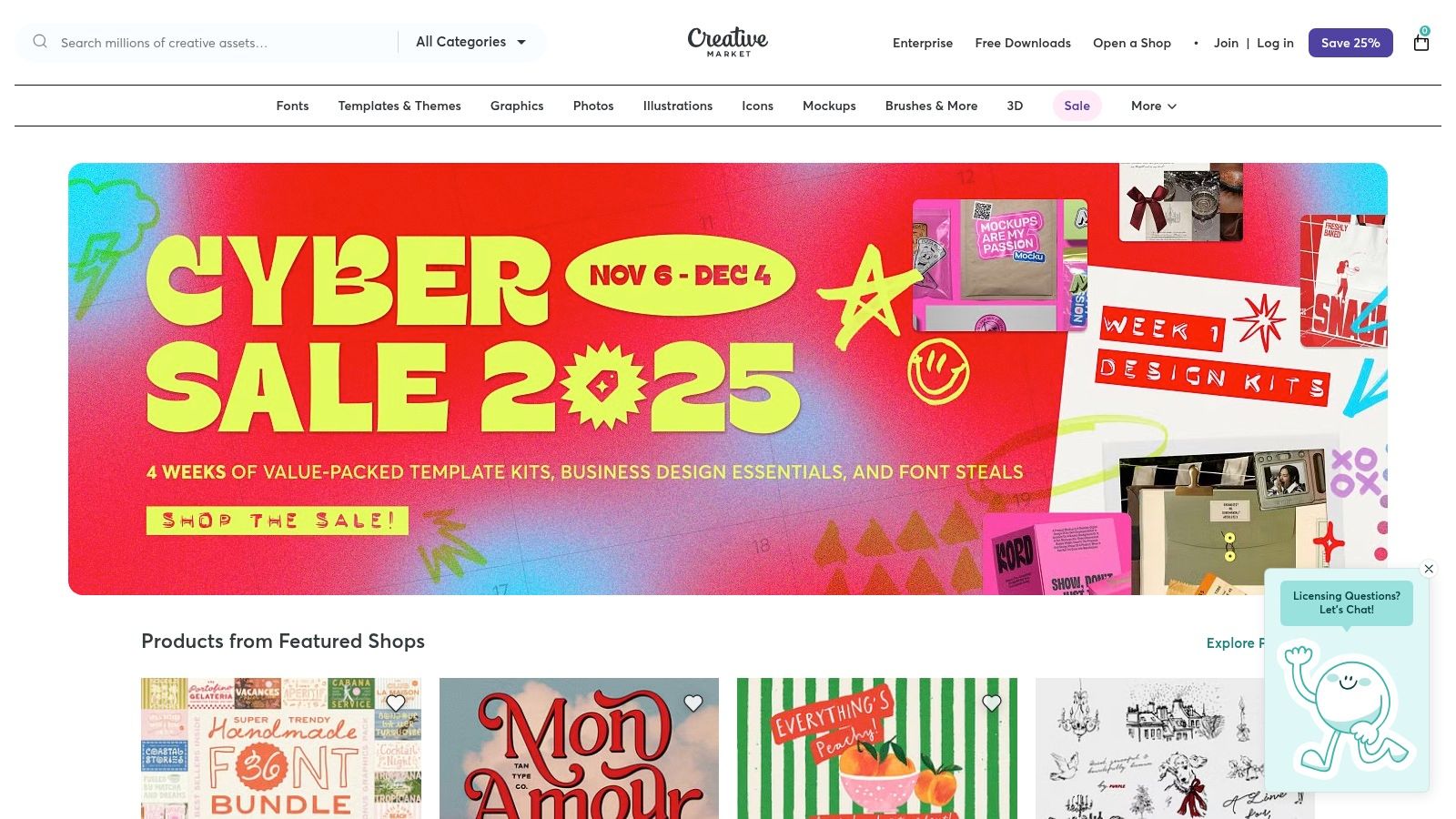
Strategic Analysis
The core strategic advantage of Creative Market is its pay per asset model. This provides flexibility and control, allowing you to acquire a premium, specialized UI kit for a one time fee, which can range from $15 to over $100 depending on its complexity. This is highly efficient for projects with a defined budget, eliminating recurring costs.
Moreover, purchasing directly from an independent designer often means you get a more polished and well organized product. Many kits come with comprehensive design systems, including organized layers, auto layout features, and both light and dark modes. This level of detail accelerates the design and development workflow, allowing you to build a high quality app interface much faster.
Actionable Insights for App Store Growth
For indie developers aiming to create a standout presence on the App Store or Google Play, Creative Market is an excellent source for unique design foundations. A well chosen kit can provide the visual polish needed to attract initial users and improve conversion rates. A practical example would be purchasing a "Travel App UI Kit" that includes vibrant, pre designed screens for booking flights and hotels. You can use these screens directly to create appealing app store screenshots that instantly communicate your app's core functionality and value, helping you achieve faster app store growth.
- Read the Reviews: Creator reputation is key. Always check reviews and ratings on a product page to gauge the quality of the UI kit and the responsiveness of the seller.
- Verify Compatibility: Before purchasing, carefully read the product description to confirm it supports your preferred software (e.g., Figma) and includes the necessary file formats and features like auto layout or component variants.
- Look for Bundles: Many creators bundle multiple UI kits or include bonus assets like custom illustrations and icon sets. Searching for "app UI bundle" can offer significant value and provide a more comprehensive design system for your project.
| Feature | Details |
|---|---|
| Pricing Model | Per-item purchases (no subscription) |
| Primary Benefit | Buy specific, high-quality UI kits directly from creators |
| Key Formats | Figma, Sketch, Adobe XD, Photoshop |
| Unique Offering | Direct creator support and highly curated niche designs |
| Best For | Solo developers, startups, and teams needing one-off assets |
Visit Website: https://creativemarket.com
3. UI8
UI8 operates as a high end, curated marketplace specifically for UI/UX designers and developers. Unlike broader marketplaces, its core strength is its strict curation process, ensuring that every asset, from full fledged design systems to individual icon packs, meets a high standard of quality and polish. This makes it a go to platform for sourcing premium, professional grade mobile app ui designs.
The platform is designer centric, focusing on providing meticulously organized files that are ready to use in Figma, Sketch, and Adobe XD. For teams looking to build a sophisticated and polished product, UI8 provides a reliable library of components that are not only aesthetically pleasing but also built with best practices in mind, saving significant development time.
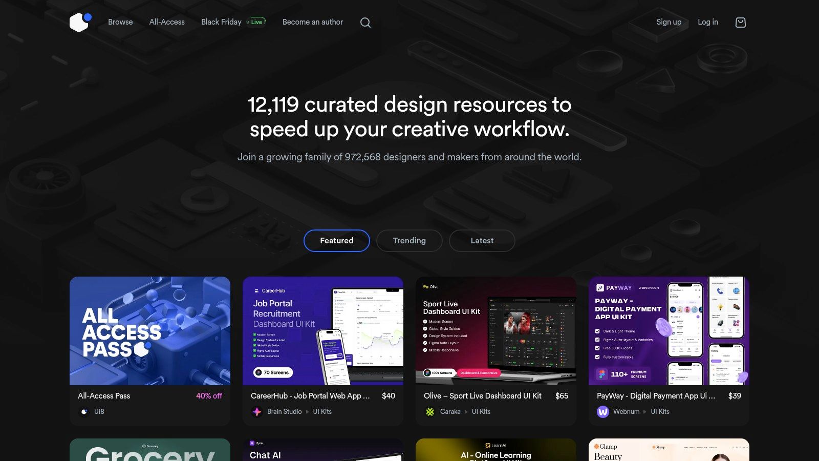
Strategic Analysis
UI8's value proposition is rooted in quality over quantity. Its per item pricing model encourages thoughtful purchasing, where each UI kit is a considered investment in your app's foundation. While this differs from subscription models, it allows teams to acquire highly specialized or niche design systems without a long term commitment.
The curation process is a key differentiator. By vetting authors and their submissions, UI8 guarantees a baseline of quality that is often missing from larger, more open marketplaces. This means designers can trust that the files will be well organized, components will be properly structured, and the overall design system will be coherent and scalable.
Actionable Insights for App Store Growth
For indie developers and startups aiming for a premium look, UI8 is an excellent resource for establishing a strong visual identity. The assets here can significantly elevate your app's perceived value and user experience, which is crucial for standing out in crowded app stores. To create high converting screenshots, purchase a UI kit with appealing data visualization components. Use these pre-built chart and graph screens to showcase your app's powerful analytics features, using vibrant colors and clear captions like "Track Your Progress in Real Time" to attract users and boost app store growth.
- Review Product Pages Thoroughly: UI8 authors provide detailed product pages with extensive previews, component lists, and usage examples. Scrutinize these to ensure the kit includes every screen and state your app requires before purchasing.
- Look for Design Systems: Prioritize kits labeled as "design systems." These are more comprehensive than basic UI kits, offering a full suite of linked components, styles, and guidelines that will accelerate your design and development workflow.
- Leverage for App Store Assets: Many UI kits on UI8 include pre made screens that can be directly adapted for App Store and Google Play screenshots. Use these high fidelity mockups to create compelling promotional visuals that showcase your app’s best features and drive downloads.
| Feature | Details |
|---|---|
| Pricing Model | Per-item purchase; some authors offer bundles |
| Primary Benefit | Curated library of high-quality, professional UI assets |
| Key Formats | Figma, Sketch, Adobe XD |
| Unique Offering | Vetted authors and a strong focus on premium design quality |
| Best For | Startups, designers, and developers seeking premium assets |
Visit Website: https://ui8.net
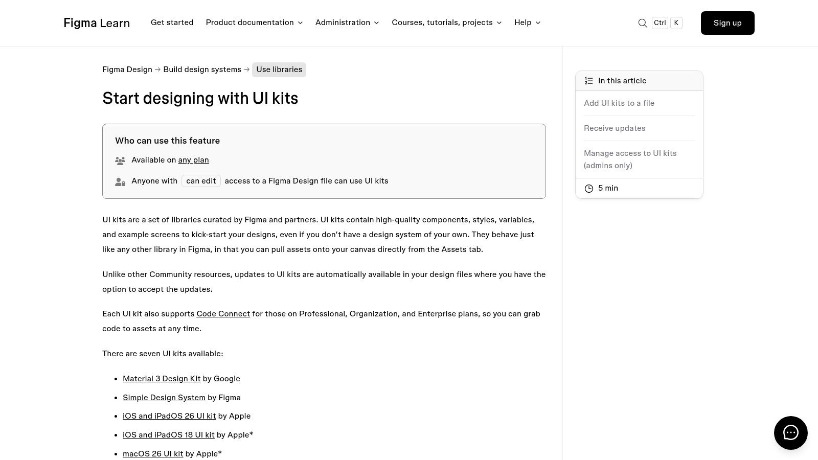
4. Figma UI Kits (Official/Curated in Figma)
Figma provides direct access to official, authoritative UI kits from platform holders like Google and Apple. These kits are not third party creations; they are the foundational design systems for iOS and Android, available as libraries you can add directly to your Figma workspace. This makes them the ultimate source of truth for creating platform compliant interfaces.
Integrating these libraries ensures your mobile app ui designs adhere to the latest platform specific guidelines, from button sizes and typography scales to navigation patterns. For developers and designers aiming for a native look and feel, these kits are non negotiable. They are constantly updated by Figma to reflect new OS releases, guaranteeing your designs stay current.
Strategic Analysis
The primary strategic advantage of using Figma's official kits is platform compliance and authenticity. Building with the exact components that Google (Material 3) and Apple (iOS 17) use eliminates guesswork and significantly reduces the risk of creating a user experience that feels foreign or broken on a device. These kits are free and integrated directly into the Figma ecosystem, removing any friction in accessing them.
The update mechanism is another key benefit. When Apple or Google releases a new OS version with UI changes, Figma updates the corresponding library. You receive a notification in your design files, allowing you to review and accept the updates seamlessly. This ensures your app’s design can evolve in lockstep with the platform, a critical factor for long term maintenance and user satisfaction.
Actionable Insights for App Store Growth
For teams focused on creating high converting app store screenshots, these kits are invaluable for building authentic, native looking mockups. A user is more likely to trust and download an app that looks like it truly belongs on their iPhone or Android device. For example, when creating screenshots for an iOS app, use the official Apple UI Kit in Figma to place your app's content within the native navigation bar and status bar. This creates an authentic preview that builds immediate user trust and increases the likelihood of a download, directly contributing to app store growth.
- Start with the Foundation: Before adding brand specific styles, always start your design with the official iOS or Material Design kit as your base. This ensures all core interactions are platform native.
- Create Authentic Mockups: Use the official status bar, navigation bar, and tab bar components from the kits when creating your app store screenshots. This small detail makes your promotional images look significantly more professional and trustworthy.
- Use as a "Design Linter": Compare your custom components against the official kit components. Are your touch targets large enough? Is your font hierarchy consistent with platform norms? Use it as a checklist for quality assurance. To better understand how these foundational elements impact user perception, you can explore the principles of effective mobile app UI design.
| Feature | Details |
|---|---|
| Pricing Model | Free (included with any Figma plan) |
| Primary Benefit | Access to official, up-to-date iOS and Android design systems |
| Key Formats | Figma Library |
| Unique Offering | Automatic library updates to sync with new OS releases |
| Best For | All app development teams, especially those prioritizing a native UX |
Visit Website: https://help.figma.com/hc/en-us/articles/24037724065943-Start-designing-with-UI-kits
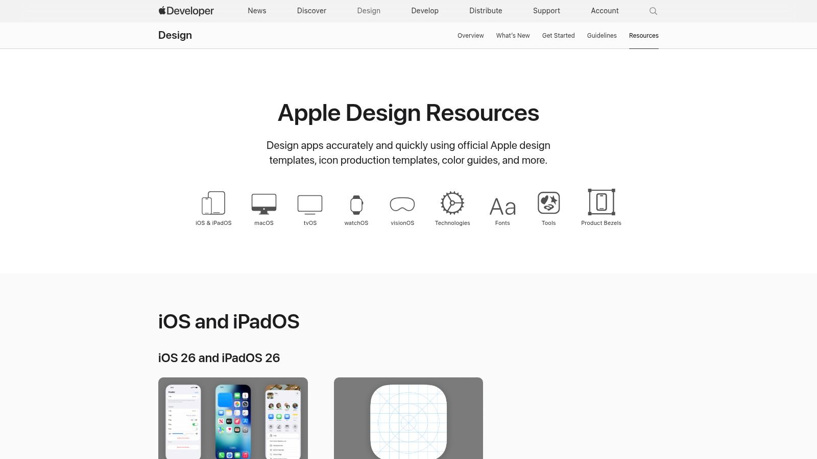
5. Apple Design Resources
When developing an app for the Apple ecosystem, fidelity to the native platform is paramount. Apple Design Resources is the official, definitive source for designers and developers seeking to build apps that look and feel perfectly at home on iOS, iPadOS, watchOS, and macOS. These resources are not just templates; they are the foundational building blocks of the native user experience, maintained directly by Apple.
This platform provides meticulously crafted UI kits for Figma and Sketch, complete with versioned updates that correspond to new OS releases. This ensures your mobile app ui designs use the latest components, from navigation bars and tab bars to system fonts and SF Symbols. For teams focused on creating a seamless, intuitive, and platform compliant app, starting here is non negotiable.
Strategic Analysis
The core value of Apple Design Resources is its unmatched authenticity and accuracy. Unlike third party kits that may approximate iOS styles, these are the official, pixel perfect assets. This eliminates guesswork and ensures your final product adheres to Apple's Human Interface Guidelines (HIG), a critical factor for passing the App Store review process smoothly.
These resources are provided completely free of charge, removing any cost barrier to high quality design. The primary trade off is that the kits are intentionally un themed. They represent the pure, unstyled iOS interface, requiring you to apply your own branding, color palette, and typography. This is a strategic advantage for production grade apps, as it encourages a design process that respects the platform's conventions while allowing for brand expression.
Actionable Insights for App Store Growth
For teams aiming to boost App Store growth, using these official resources is key to creating high converting promotional assets. Apple's guidelines heavily favor screenshots that accurately represent the in app experience. Using these kits ensures your mockups are credible and professional. For instance, build your App Store screenshots using Apple's official iPhone device frames. Populate them with your UI screens, ensuring you use the correct status bar and home indicator from the UI kit. This high fidelity approach produces professional visuals that meet Apple’s standards and drive conversions.
- Start with the Foundation: Before designing a single custom component, use the official templates for layouts and system elements. This ensures your app’s structure is instantly familiar to iOS users.
- Leverage SF Symbols: Integrate the comprehensive SF Symbols library provided by Apple. These vector based icons are designed to align perfectly with the San Francisco system font, guaranteeing visual consistency.
- Create Accurate Mockups: Use the provided device bezels and UI kits to build your App Store screenshots. This not only saves time but also produces visuals that meet Apple's presentation standards. For a deeper dive into this, you can learn more about creating effective mobile app mockups for the App Store.
| Feature | Details |
|---|---|
| Pricing Model | Completely free |
| Primary Benefit | Official, pixel-perfect fidelity to Apple's Human Interface Guidelines |
| Key Formats | Figma, Sketch, Adobe XD |
| Unique Offering | Versioned resources for iOS, iPadOS, macOS, watchOS, and visionOS |
| Best For | Developers and designers building production-grade native Apple platform apps |
Visit Website: https://developer.apple.com/design/resources/
6. Material Design (Google) – Material 3 Design Kits
Material Design is Google's official, open source design system, and its Material 3 iteration provides an essential foundation for modern Android app development. It offers comprehensive Figma UI kits that are not just design templates but a direct bridge to development. These resources are indispensable for teams aiming to build apps that feel native and intuitive on Android devices.
The kits provide a complete library of components, from buttons and navigation bars to complex dialogs and pickers, all built with modern Figma features like variables and variants. This system is designed to streamline the workflow between designers and developers, ensuring visual consistency and accelerating the implementation process. For anyone serious about creating high quality mobile app ui designs for the Android ecosystem, Material Design is the official starting point.
Strategic Analysis
The core strategic advantage of using Material 3 is its direct link to the Android development framework. Every component in the Figma kit corresponds to a ready made code component for developers, dramatically reducing ambiguity and build time. This design to code alignment is a powerful accelerator for product teams.
Furthermore, the entire system is free to use, which democratizes access to a world class design system. While its visual language is distinctly "Google," the system is built for customization. The use of design tokens and variables in the Figma kit makes it straightforward to apply your brand’s unique color palette, typography, and shape language, allowing you to create a distinct identity without reinventing the wheel.
Actionable Insights for App Store Growth
For teams targeting app store growth, using a familiar, native design system like Material 3 can improve user onboarding and retention. Users instinctively know how to interact with standard components, leading to a smoother first time experience. A practical way to create efficient screenshots for the Google Play store is to use the Material 3 kit to build screens that highlight key features. Apply your brand’s vibrant color theme using the kit’s variables, add compelling text, and place the final screens inside an official Pixel device frame to create professional, high converting visuals.
- Customize the Theme: Immediately dive into the "Tokens" or "Variables" section of the Figma kit. Adjust the primary, secondary, and tertiary colors to match your brand. This simple step is the fastest way to make the design feel less generic.
- Leverage Developer Docs: Encourage designers to work alongside the official Material Design developer documentation. This ensures they are using components as intended and helps them understand any technical constraints or possibilities.
- Build Store Screenshots: Use the official device frames and UI components from the kit to create polished, high fidelity app store screenshots. This guarantees your promotional assets accurately reflect the final in app experience, which builds user trust and boosts conversions.
| Feature | Details |
|---|---|
| Pricing Model | Completely free and open-source |
| Primary Benefit | Official, native components for seamless Android development |
| Key Formats | Figma |
| Unique Offering | Deep integration with developer frameworks and documentation |
| Best For | Android-first developers, startups, and cross-platform teams |
Visit Website: https://design.google/library/euphrates-dahout-material-design-figma
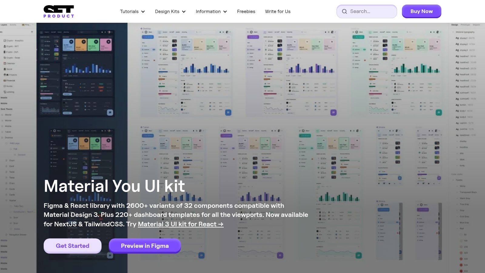
7. Setproduct
Setproduct offers a highly specialized storefront featuring premium, production ready design systems crafted by a single, well regarded creator. It focuses on delivering deeply integrated UI kits for Figma, specifically targeting teams that need comprehensive, pre themed systems to accelerate development for both Android and iOS platforms.
This approach is ideal for startups and established companies that prioritize speed and consistency. Instead of a broad marketplace, Setproduct provides meticulously organized mobile app ui designs, such as its extensive Material Me kit for Material 3 and its iOS mobile design system, which aligns perfectly with Apple's Human Interface Guidelines. This ensures developers can build apps that feel native and familiar to users from day one.
Strategic Analysis
The core value of Setproduct is its depth over breadth. While marketplaces offer variety, Setproduct provides a unified, coherent system where every component, variant, and template is designed to work together seamlessly. The one time purchase model with ongoing updates is a key differentiator, appealing to product teams who prefer a fixed cost for a long term asset rather than a recurring subscription.
This model is particularly effective for teams building complex applications. The kits are not just collections of screens; they are true design systems with thousands of component variants and hundreds of templates. This level of detail drastically reduces design debt and ensures a consistent user experience as the app scales, making it a strategic investment for serious projects.
Actionable Insights for App Store Growth
For teams looking to create high converting app store presences, Setproduct’s kits provide the foundational elements for professional and compelling screenshots. The consistency of the components allows you to quickly assemble realistic and feature rich mockups. To efficiently create screenshots, leverage the kit’s hundreds of pre built screen templates for onboarding, settings, and dashboards. Customize them with your brand's vibrant colors and content, then export them to create a full set of appealing visuals for the App Store and Google Play, driving conversions and boosting app store growth.
- Leverage Pre-built Templates: Use the hundreds of included screen templates (e.g., onboarding, checkout, dashboards) to rapidly generate diverse and visually appealing app store screenshots. This saves countless hours compared to designing each screen from scratch.
- Customize Themes: The design systems come with pre built light and dark themes. Use these to create two distinct sets of visuals for your App Store and Google Play listings, showcasing the app's versatility.
- Focus on Component Details: The extensive component library allows you to highlight specific, high value features in your promotional materials. Build mockups that zoom in on unique interactive elements, like custom charts or data entry forms, to showcase your app's power.
| Feature | Details |
|---|---|
| Pricing Model | One-time purchase with lifetime updates |
| Primary Benefit | Production-ready, deep design systems for Figma |
| Key Formats | Figma |
| Unique Offering | Extensive Material 3 and iOS-native kits from a single creator |
| Best For | Product teams, startups, and developers needing a robust, ready-to-ship system |
Visit Website: https://www.setproduct.com/material-me/
Top 7 Mobile App UI Design Resources Comparison
| Item | 🔄 Implementation Complexity | ⚡ Resource Requirements | ⭐ Expected Outcomes | 📊 Ideal Use Cases | 💡 Key Advantages / Tips |
|---|---|---|---|---|---|
| Envato Elements | Low — browse & download; minimal setup | Medium — subscription cost; multiformat files | ⭐⭐⭐ — broad coverage; inconsistent polish across authors | Teams needing lots of assets/unlimited downloads | 💡 Cost‑effective at scale; verify quality per kit |
| Creative Market | Low — per‑item purchase, immediate use | Low — pay per kit; standard design tools | ⭐⭐ — targeted kit quality varies by seller | One‑off projects or single‑kit purchases | 💡 Good for specific buys; check seller reviews & previews |
| UI8 | Low–Medium — curated purchases, straightforward integration | Medium — per‑item pricing; higher expected quality | ⭐⭐⭐ — generally polished, designer‑ready files | Teams wanting premium, curated UI kits | 💡 Higher quality bar; buy from official listings for licensing |
| Figma UI Kits (Official) | Medium — add libraries and accept updates in Figma | Low — free access; requires Figma account | ⭐⭐⭐⭐ — authoritative, up‑to‑date platform components | Figma workflows needing official components and consistency | 💡 Use as base system; combine with themed kits for branding |
| Apple Design Resources | Medium — versioned files, follow Human Interface Guidelines | Low–Medium — free but requires Apple fonts/SF Symbols | ⭐⭐⭐⭐ — highest fidelity for native iOS/macOS apps | Production‑grade native Apple platform apps | 💡 Official source for HIG fidelity; apply brand styles after import |
| Material Design (Google) – Material 3 | Medium — system theming and variables to apply | Low — free kits; strong developer docs | ⭐⭐⭐⭐ — deep component coverage; developer‑friendly | Android‑first or cross‑platform mobile projects | 💡 Great docs and components; theme to avoid generic look |
| Setproduct | Medium–High — comprehensive design system onboarding | High — premium one‑time purchase; adoption effort | ⭐⭐⭐⭐ — very production‑ready, speeds implementation | Product teams needing extensive pre‑themed systems | 💡 Pay once with updates; detailed docs but single‑publisher tradeoffs |
From UI Kit to App Store: Your Next Steps to Higher Conversions
Throughout this guide, we have explored a powerful lineup of tools and resources, from the expansive libraries of Envato Elements and Creative Market to the specialized, high fidelity kits on UI8 and Setproduct. We have seen how foundational frameworks like Apple’s Design Resources and Google’s Material 3 provide the essential building blocks for creating intuitive, platform native experiences. Each resource offers a unique pathway to crafting exceptional mobile app UI designs that resonate with users and solve real world problems.
The common thread connecting these successful designs is not just aesthetic appeal, but strategic intent. A beautiful interface is only half the battle. The true measure of its success lies in its ability to guide users, simplify complex tasks, and ultimately, drive conversions. By deconstructing the examples, we have uncovered replicable strategies in navigation, data visualization, and user onboarding that you can apply directly to your own projects.
Bridging Design and Development
Once your UI is meticulously planned and designed, the next critical phase is bringing it to life. Translating static designs into a functional, high performance application requires a skilled development team. Whether you have an in house team or are exploring other options, ensuring a seamless handover from design to code is paramount for preserving the integrity of your user experience. For teams looking to scale their development capacity, understanding the landscape of external partnerships can be a game changer. If you are considering this path, this practical guide to outsourcing custom software development can offer valuable insights into the process.
Translating UI into App Store Success
Your polished UI screens are more than just internal assets; they are your most powerful marketing tool on the App Store and Google Play. The journey from a great app to a successful business hinges on your ability to communicate its value in seconds. This is where your app store presence becomes critical.
Your screenshots are not a gallery; they are a visual sales pitch. Here are the key takeaways for transforming your UI into high converting store assets:
- Tell a Story: Arrange your screenshots to narrate a user journey. Start with the core value proposition, show the key benefit in action, and conclude with a feature that delights or builds trust.
- Highlight the "Why": Use concise, benefit driven captions on each screenshot. Instead of saying "Search Function," say "Find Your Perfect Meal in Seconds." This transforms a feature into a solution.
- Maintain Brand Consistency: Your screenshots should feel like an extension of your app. Use your brand's fonts, colors, and tone of voice to create a cohesive and professional presentation that builds immediate user confidence.
Ultimately, the goal is to create an efficient pipeline from design to store listing. By leveraging your perfected mobile app UI designs to create a compelling visual narrative, you turn your app store page into a powerful conversion engine, driving downloads and fueling sustainable growth.
Ready to transform your finished UI into stunning, conversion optimized App Store and Google Play screenshots? ScreenshotWhale provides professionally designed templates that let you create a compelling visual story in minutes. Stop wrestling with design tools and start driving more downloads today with ScreenshotWhale.