How to Create High Quality Screenshots That Boost App Store Growth
Discover how high quality screenshots can boost your app downloads. Learn proven design tips for iOS and Android stores to improve conversions.
High quality screenshots are your app's digital storefront. They are the primary visual pitch you make to a potential user. They are more than a simple showcase of features; they are a powerful sales tool that can instantly communicate your app's value, build trust, and convince someone to tap "Install" in seconds.
Why High Quality Screenshots Drive App Store Conversions
In the crowded marketplaces of the Apple App Store and Google Play, users make snap judgments. Your app's icon and title might earn a click, but the screenshots truly sell the experience and drive conversions.
Think of it like a book's cover versus its first few pages. One grabs attention, but the other must seal the deal.
When a user sees polished, high resolution visuals, it signals professionalism and credibility. Crisp, well designed screenshots lead to a subconscious assumption: the app itself must be just as well crafted. This first impression is critical for overcoming skepticism and building the trust needed to earn that download.
The Power of Visual Storytelling
Great screenshots do more than display your UI; they craft a compelling visual story. They show a user exactly how your app will solve their problem or improve their life. Instead of just listing what your app does, you are demonstrating the benefits in action.
- Communicate Core Value Instantly: The first one or two screens must immediately answer the question, "What does this app do for me?" Get straight to the point.
- Highlight Key 'Aha' Moments: Showcase the most exciting and valuable parts of the user journey. What is the one feature that will make someone need to try it?
- Create an Emotional Connection: Use vibrant colors, clear captions, and relatable scenarios. You want to evoke a positive feeling about the experience of using your app.
Your screenshot gallery is a silent salesperson working 24/7. A strategic investment in its design directly impacts conversion rates, profitability, and your ability to stand out from millions of competitors.
From Pixels to Profit
Ultimately, the quality of your screenshots has a direct, measurable impact on your app's growth. Blurry, uninspired, or poorly composed images will deter users, leading to lower conversion rates and wasted ad spend.
On the other hand, creating high quality screenshots is one of the most effective levers you can pull to boost performance.
At the heart of it all is the need for a pristine presentation. You can follow this practical guide to improve image quality to make sure your assets are always sharp. For a deeper dive, check out our own guide on how to increase app downloads through ASO. By focusing on a visually appealing and informative storefront, you are setting the stage for real, sustained growth.
Design Principles for High Converting Screenshots
Great design is not about making things complicated; it is about making them clear. When creating screenshots that get people to hit the "install" button, you must master a few core ideas that guide the user's eye and scream "value" in a split second. This is the practical foundation for making visuals that convince.
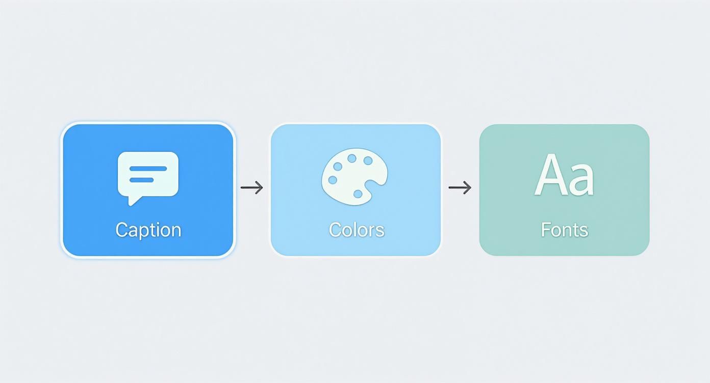
The first thing to nail is the caption. Every screenshot needs a single, punchy headline that sums up the core benefit of what is on the screen. Stop listing features and start talking about outcomes. Instead of "Advanced Filtering," try "Find Your Perfect Match Faster." That benefit driven language connects directly with what the user wants to achieve.
Next, let’s talk color. Your brand's colors do more than just look pretty; they build an emotional connection and make your app memorable. Use your most vibrant shades to pull attention to important elements, like a call to action or a key piece of data. The goal is to create a visual hierarchy where the user's eye is naturally drawn to the most important message first.
Crafting a Clear Visual Hierarchy
Visual hierarchy is simply telling the user where to look first, second, and third. You achieve this by blending your caption, colors, and font choices into one cohesive design. The most important message should always be the biggest and boldest thing on the screen.
- Pick the Right Fonts: Choose fonts that are clean, legible, and impactful. A bold, sans serif font for headlines is almost always a winner because it is easy to read on a small phone screen. Use thinner or more stylized fonts for any secondary text.
- Contrast is Your Best Friend: Your text must have high contrast against its background. White text on a dark overlay or dark text on a light background is a safe bet. Low contrast text is a massive conversion killer; if users cannot read it instantly, they will keep scrolling.
A well designed screenshot walks the user through a mini story on a single screen. The caption is the headline, the UI is the proof, and the overall design is the feeling you leave them with. It should feel effortless.
Designing for iOS vs. Android
While the core principles are the same, your execution needs to differ slightly for the Apple App Store and Google Play. Users on each platform are accustomed to a specific design language and have certain expectations. Getting these nuances right is a huge part of creating effective high quality screenshots for both storefronts.
To break it down, here is a quick look at where your focus should be for each platform.
iOS vs Android Screenshot Design Focus
Thinking about these differences helps you tailor your designs so they feel native to each store. An iOS user expects a certain polish, while an Android user might be looking for more direct information.
| Design Element | Apple App Store (iOS) Focus | Google Play Store (Android) Focus |
|---|---|---|
| Aesthetic | Clean, minimalist, and lifestyle focused. Often uses more white space and feels premium. | Feature rich, dynamic, and informative. Can be more detailed and direct about functionality. |
| Captions | Shorter, benefit driven headlines that evoke an experience or feeling. | Can be slightly more descriptive, often highlighting specific features and technical capabilities. |
| Layout | Prefers elegant, storytelling layouts that flow from one screen to the next. Consistency is highly valued. | Allows for more experimentation with layouts, sometimes showing more UI elements or data points. |
| Device Frames | Strictly uses the latest iPhone and Apple product frames for a native, trusted look. | Features popular Android devices like Google Pixel or Samsung Galaxy, reflecting the diverse hardware ecosystem. |
By tweaking your designs, you are respecting the platform's unwritten rules and meeting user expectations head on. For a much deeper dive, you should check out our guide on creating excellent app screenshots for the App Store. This targeted approach ensures your visuals feel right at home and do the heavy lifting to boost your conversions on each store.
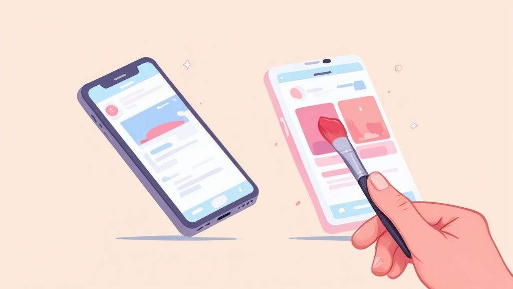
A Practical Guide to Creating Efficient, High Converting Screenshots
This is where the work begins: turning a basic screen capture into a marketing tool that persuades people to download your app. It is all about building a visual story that walks a potential user through your app's best moments.
But this process does not start with design tools. It starts with a story.
Before you touch a single pixel, storyboard the user's journey. Think about the "aha!" moments that make your app click. What are the first three to five things a user does that deliver real, immediate value? This narrative arc is the foundation for your screenshot set, ensuring each image flows logically to the next.
Once your story is straight, capture the cleanest screenshots possible. Use a simulator or a real device with a high resolution display to get pristine, pixel perfect images of your UI. Avoid distracting notifications, low battery icons, or personal data that could pull focus from what you are showing.
Bringing Your Screenshots to Life
Now you can move from a simple screen capture to a genuine piece of marketing art. With your clean images in hand, add the layers of context and persuasion that drive downloads. A tool like ScreenshotWhale is built for this, giving you a straightforward editor to add the design elements that matter.
Here is a look at the ScreenshotWhale editor. You can see how easy it is to combine device frames, captions, and backgrounds to pull your final design together.
The editor lets you see all your design choices in real time. For example, you can select a background color from your brand palette, type a benefit driven headline, and immediately see how it looks. This makes experimenting with different layouts and keeping everything on brand a breeze.
The goal is to turn a static image of your UI into a dynamic advertisement. Every element you add, from the device frame to the background color, should work together to highlight your app's core value and make the user feel what it is like to use it.
Polishing Your Visuals for Maximum Impact
With your core design locked in, the final stage is all about polishing. This means selecting modern device frames that feel right at home in both the iOS and Android stores. A sleek iPhone or Google Pixel frame adds an instant layer of authenticity and trust.
Next, pick a vibrant background. This could be a solid color from your brand palette, a subtle gradient, or a lifestyle image that shows your app in a real world context. The background’s job is simple: make your UI pop and grab the user's attention while they are scrolling.
This visual polish is no longer just a "nice to have." We have seen a huge shift toward digital tools for communication. The market for full screen website screenshot software, valued at around $150 million in 2023, is expected to nearly double. This shows a clear trend: people are relying more on high quality visuals to understand and analyze things online. You can learn more about the market's projected growth to see just how big this is getting.
The difference between a raw screen grab and a fully designed asset is night and day.
- Before: A plain UI screenshot has no context and zero persuasive power. It is just there.
- After: That same UI, placed in a slick device frame with a compelling caption and a colorful background, becomes a high converting marketing asset.
This transformation is what separates amateur app store listings from professional ones, and it has a direct, measurable impact on your download numbers. When you put in this creative effort, you are building a powerful engine for app store growth.
Advanced Tactics to Maximize Your Conversions
Once your design foundation is solid, it is time to dig into the strategies that separate good app store pages from great ones. These are the tactics that squeeze every drop of conversion potential out of your traffic. It is about working smarter, using persuasion, and letting data guide your decisions to fuel real growth.
One of the most powerful tools in your arsenal is social proof. People trust other people. It is that simple.
When you weave testimonials, user ratings, or press mentions directly into your screenshot designs, you build instant credibility. Imagine a potential user seeing "Featured by Apple" or a glowing five star review. That immediately validates your app, quiets their inner skeptic, and makes hitting the "Get" button a much easier decision.
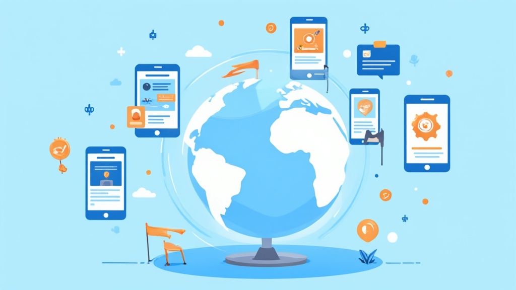
Using Localization to Unlock Global Growth
If your app is available in more than one country, a one size fits all approach to screenshots is a huge missed opportunity. Localization is more than just translating your captions; it is about adapting your entire visual narrative to resonate with different cultures.
For instance, an app marketed in Japan might thrive with bright, dynamic colors and playful illustrations. Meanwhile, a German audience might respond better to a clean, straightforward design that communicates efficiency and data security. By tailoring your visuals, you send a powerful message to international users: "We built this for you." That connection alone can send your global conversion rates through the roof.
Do not just translate your captions; transcreate your entire visual message. A localized screenshot speaks directly to a specific market, making potential users feel seen and understood, which is a massive advantage in a competitive landscape.
A Data First Approach with A/B Testing
Guesswork is the enemy of growth. The only way to know which designs drive downloads is to test them. Luckily, Google Play has a powerful built in A/B testing feature that lets you pit different screenshot variations against each other. It is an indispensable tool for optimization.
You can test almost any element to see what truly connects with your audience:
- Captions: Do benefit driven headlines outperform feature focused ones?
- Color Palettes: Does a vibrant, eye catching background win against a more minimalist design?
- Visual Order: Should you lead with your most powerful feature or save it for the third slide?
- Social Proof: Does adding a user testimonial actually increase installs? Test it and find out.
This data driven approach removes emotion and bias from the design process. You are no longer creating what you think looks good; you are building what you know converts.
The growing emphasis on visual assets is not just an app store trend. The global website screenshot software market, valued at around USD 1.4 billion, is projected to hit USD 4.5 billion by 2033. This explosion shows how critical visual optimization has become everywhere.
To get the most out of your efforts, your high quality screenshots should be part of a broader App Store Optimization (ASO) strategy. By continuously testing and refining, you turn your screenshots from static images into a finely tuned conversion engine, making sure every pixel is working hard to earn you that next download.
Building an Efficient Screenshot Workflow
If you are still manually creating screenshots for every new feature, language, or device update, you know the pain. It is a massive time sink. Building a scalable workflow is the only way to save hundreds of hours and keep your app store pages looking professional. The goal here is simple: work smarter, not harder.
This means you must move away from crafting single, one off images. The trick is to embrace a system built on templates and automation. By setting up a consistent design template, you lock in brand alignment across your entire gallery, from colors and fonts to the placement of captions and device frames.
Embracing Automation and Templates
An efficient workflow always starts with a master template.
Inside a tool like ScreenshotWhale, you can design a single, on brand layout and reuse it forever. When a new app update is ready, you simply swap in the new screen captures, tweak the captions, and export a complete set of fresh assets in minutes.
This approach completely kills the tedious cycle of recreating designs from scratch. Instead of spending your day nudging pixels, you can focus on what matters: communicating your app's value.
A templated workflow transforms screenshot production from a creative bottleneck into a streamlined, repeatable process. This lets your team push updates faster and maintain high quality without getting bogged down in repetitive design tasks.
This system becomes even more powerful when you support multiple devices. A huge headache for developers is generating assets for all the different screen sizes. Our guide on app store screenshot dimensions goes deep into the long list of required sizes.
This is where automation tools become your best friend. They handle all that complexity for you.
- Batch Processing: Generate every required size for both iOS and Android from a single design. No more manually resizing dozens of images.
- Team Collaboration: Cloud based editors let marketing and development teams work together, ensuring messaging and visuals are always in sync.
- Asset Management: Keep all your localized and device specific screenshots organized in one central hub, ready for the next update.
This push for efficiency is driving serious growth in the tools that produce high quality screenshots. The screen capture software market, currently valued at $9.58 billion, is projected to hit $17.34 billion by 2029. This growth signals a clear industry shift towards automated and scalable visual asset production. You can explore more about this market's impressive expansion to see the trend for yourself.
By adopting an efficient workflow, you are not just saving time; you are future proofing your entire app store marketing strategy.
Common Questions About App Store Screenshots
Diving into app store visuals always brings up a handful of questions. Getting these details right is the difference between screenshots that convert and screenshots that get ignored.
Let's clear up some of the most common hurdles.
How Many Screenshots Should I Upload?
Apple lets you upload up to ten screenshots and Google Play gives you eight. The temptation is to fill every slot, but you should not. Your prime real estate is your first three to five images, the ones users see without scrolling.
Focus all your energy on making those first few screens tell a powerful, fast story about why someone needs your app. If you have many unique features that cater to different users, then you can use all the slots. But never sacrifice quality for quantity.
A few incredible screenshots will always beat ten mediocre ones. It is not even close.
Should My iOS and Android Screenshots Look the Same?
While your core branding should be consistent, your visuals need to speak the native language of each platform. This is non negotiable. Always use native device frames: show iPhones for the App Store and Google Pixels (or other popular Androids) for Google Play. It is a small detail that makes your app feel like it belongs there.
Beyond the frames, you need to think about the mindset of the users on each platform.
- iOS Users: They tend to respond better to cleaner, more lifestyle focused designs. Think benefits and user experience.
- Android Users: They often appreciate more feature heavy, detailed visuals that give them a solid overview of what your app can do.
The winning move is to align your visual style with the platform's own design philosophy. It shows users you understand their world and built an experience just for them.
What is the Single Biggest Mistake to Avoid?
The number one killer of otherwise great screenshots is text that is too small to read. People are blazing through the app store on small phone screens. If they cannot read your captions in a split second, your message is dead on arrival.
To fix this, use large, bold fonts with high contrast against the background. Keep your captions ridiculously short and punchy. Aim for just one key benefit per screen. Your goal is instant communication, and unreadable text sabotages that completely.
Ready to create stunning, high converting visuals without the frustration? ScreenshotWhale gives you professionally designed templates and a simple drag and drop editor. You can generate on brand, high-quality screenshots for any device in minutes. Start creating for free today!