Mastering Mobile App Screenshots for App Store Growth
Discover how to design high-converting mobile app screenshots that boost downloads. Learn proven ASO strategies for both iOS and Android stores.
Your mobile app screenshots are not just a gallery of your UI. They are your single most important visual asset for getting downloads. Think of them as your silent sales pitch, the thing that shows a potential user your app's value in just a few seconds. Getting them right is critical for turning views into installs and boosting conversions on both the Apple App Store and Google Play.
Why Your Screenshots Are Your Most Powerful Sales Tool
The app stores are incredibly crowded. First impressions are everything. Users size up an app in the blink of an eye, and your screenshots are the primary visual proof of your app's quality and what it actually does. They are so much more than just a tour of your features; they are your frontline sales team, driving app store growth.
I like to think of an app's store page as a physical storefront. The icon is your sign out front, and the title is the store's name. But the screenshots? That is your window display. It is what shows people walking by what they can expect to find inside. A confusing or boring display will make them walk right on by, but a compelling one invites them to come in and look around.
The Psychology of the Swipe
You have to understand how people behave on these stores. Most of them do not read long, detailed descriptions, at least not at first. They scan visuals to make snap judgments. Your screenshots need to tell a clear and persuasive story almost instantly, guiding the user from a problem they have to your app's solution.
This visual narrative is what really drives conversions. The first screenshot has to hook them with a powerful benefit. The next should show a key feature in action, and the ones that follow need to build on that core value. It is a bit like crafting a great YouTube thumbnail; you are trying to grab attention and communicate value immediately. In fact, many of the same principles from AI-powered thumbnail design tips can be applied here to boost visual appeal.
The first three screenshots are everything. They absolutely must communicate your app's main purpose without making the user scroll or think too hard. If they do not get the core benefit in a few seconds, you’ve probably lost that download for good.
Connecting Visuals to App Store Growth
High-quality visuals have a direct and measurable impact on your App Store Optimization (ASO). A great set of screenshots can dramatically improve your page's conversion rate, which is a huge signal to both Apple's and Google's ranking algorithms. If you are just getting started with this, it is worth taking a moment to understand what ASO stands for and how it all works.
The numbers back this up. In the cutthroat world of the app stores, a massive 90% of users do not even scroll past the third screenshot. That gives you just a few seconds to capture their attention before they swipe away. Getting these first few images right can boost your conversion rates by an incredible 20-35%, turning casual browsers into active users.
Before you can get creative with your app’s story, you have to nail the fundamentals. Getting the technical specs for your screenshots right is the first, non-negotiable step. It’s what ensures your visuals get accepted by the stores and look sharp on every single device, saving you from a painful rejection during the submission process.
Think of these requirements as the canvas for your app's story. If the canvas is the wrong size or format, it does not matter how great the painting is, it just looks amateur. Both the App Store and Google Play have their own strict, and slightly different, rulebooks.
Mastering Apple App Store Requirements
Apple, as you’d expect, is pretty particular about their specs. For any iOS app, you absolutely must provide screenshots for the largest iPhone (the 6.7-inch display) and, if your app is universal, the largest iPad (the 12.9-inch display). The App Store handles the resizing for smaller devices, but getting these main sizes perfect is non-negotiable.
You get to upload up to 10 screenshots for each language you support. Here’s what you need to get right:
- File Format: High-quality PNG (without an alpha channel) or JPEG.
- Color Space: Stick to sRGB or P3.
- Device Frames: They are not required, but wrapping your UI in a clean device frame is a classic best practice. It just looks more professional.
A small detail that makes a huge difference: always account for the hardware on modern iPhones. Design your screenshots with the Dynamic Island and rounded corners in mind so that no key info gets cut off. It’s a subtle signal to users that you actually care about their experience on their specific device.
Keep in mind that the exact resolutions change whenever new devices are released. For a constantly updated reference, check out this detailed guide on the latest app store screenshot dimensions to stay compliant.
Understanding Google Play Store Guidelines
Google Play gives you a bit more breathing room than Apple, but that flexibility can sometimes create its own confusion. You can upload up to 8 screenshots for each device type your app supports: phone, 7-inch tablet, 10-inch tablet, Android TV, and Wear OS. This is your chance to show off a truly tailored experience for each screen.
Here are the key specs for Google Play:
- File Format: JPEG or 24-bit PNG (no alpha).
- Aspect Ratio: Keep it simple and use a 16:9 or 9:16 aspect ratio. If you use something else, you risk Google adding ugly black bars (letterboxing) to your images.
- Dimensions: You have a range to work with here. The minimum side length is 320px, and the maximum can go up to 3840px. Always aim for high-res.
One critical difference from Apple: Google does not automatically resize your phone screenshots for tablets. If your app works on tablets, you have to upload a separate set of tablet screenshots. It is the only way to earn the "Designed for tablets" badge, which can give you a nice visibility boost on those devices.
Exporting for Pixel-Perfect Results
So you’ve designed some killer screenshots in your favorite editor. The last hurdle is exporting them correctly. It’s so easy to trip at the finish line here. A common mistake is exporting with the wrong color profile or accidentally leaving in an alpha channel, which will get your upload rejected instantly.
Always do a final quality check on the exported files. Zoom in. Is the text perfectly crisp? Are the colors vibrant? Are there any weird compression artifacts? A little diligence here ensures your screenshots make a flawless first impression, from the smallest phone to the biggest tablet.
Designing Screenshots That Tell a Compelling Story
Once you have got the technical requirements sorted, the fun part begins. Great mobile app screenshots do more than just show off your app's UI; they sell an experience. They build a visual story that instantly tells a user what you are all about and convinces them to hit that download button.
Think of your screenshot gallery as a mini-storyboard. Each image is a single frame moving the user from a problem they have to the solution you provide. Your first screenshot is absolutely critical. It is your opening scene. It needs to hit them with a clear benefit, not just a feature, to create an immediate emotional connection.
Crafting a Visual Narrative
A good screenshot story has a logical flow. Always start with the "why" before you get to the "how." A meditation app, for instance, should not lead with a boring settings screen. Instead, the first shot could be a vibrant image with the caption "Find Your Calm in 5 Minutes." Right away, you are addressing a user's pain point.
From there, the next screenshots should walk them through the app’s core journey:
- Showcase the main event: A screen displaying a guided meditation session in progress.
- Highlight what makes you special: An image showing off progress tracking or personalized recommendations.
- Flash some social proof: A screenshot featuring a glowing user review or an impressive rating.
Each image builds on the last, creating a seamless argument for why your app is the one they need. This turns your gallery from a simple feature checklist into a powerful, high-converting sales pitch.
The Power of Vibrant Colors and Clear Typography
Visual design is the native language of the app stores, and your screenshots need to be fluent. Using vibrant, on-brand colors can make your visuals pop in a crowded search result, pulling the user's eye away from your competitors. A consistent color palette reinforces your brand identity and makes everything look polished and professional.
Typography is just as crucial. Your captions have to be instantly readable on a tiny screen. Go with a clean, legible font and make sure you have high contrast between your text and the background.
Do not make people squint. Use short, punchy headlines that drive home a single, powerful benefit on each screenshot. A caption like "Track Every Run" is way more effective than a long sentence explaining the nuances of your GPS tracking feature.
When you are in an editor, try to place your text in the upper portion of the screenshot. This keeps it from being obscured by UI elements or the device frame itself. Remember, clarity always wins over cleverness.
Using Captions to Drive Conversions
Think of captions as the voice of your screenshots. They give context and turn a static image of your UI into a compelling benefit statement. The best captions always focus on the outcome for the user.
Let's take a budgeting app as an example:
- Weak Caption: "Transaction Categorization Screen"
- Strong Caption: "See Where Your Money Goes"
The first one describes a feature; the second one highlights a direct benefit. It speaks to the user's actual goal, which is far more persuasive. By framing your messaging around benefits, you create an emotional hook that drives action. A quality site editor is invaluable here, letting you test different caption styles, fonts, and layouts to see what converts best.
This approach is non-negotiable in today's market. Global mobile app downloads recently hit 218 billion and are projected to jump to 255 billion. With over 6.3 billion smartphone users worldwide, your screenshots are the critical first impression you make in a hyper-competitive space.
Building a Consistent Brand Aesthetic
Finally, your screenshots must feel like a cohesive set. A consistent brand aesthetic makes your app feel trustworthy and memorable. This is more than just using the same colors and fonts; it is about applying a unified design style across every single image.
Here is what that might look like:
- Using the same device frame style in each shot.
- Applying a consistent background color or gradient.
- Sticking to a uniform layout for captions and UI elements.
When a user sees that level of consistency, it signals quality and attention to detail. This visual harmony does not just look professional. It makes your app's story easier to follow, guiding the user smoothly from one benefit to the next and, ultimately, to more downloads.
Connecting your visuals to App Store Optimization is where the real growth happens. Your screenshots don’t just sit on your store page; they show up in search results, too. This is your first shot at grabbing someone's attention before they even click on your app.
And this is where localization becomes a game-changer, turning casual browsers in global markets into actual users.
Simply translating the text on your screenshots is not going to cut it. True localization goes way deeper. You have to culturally adapt every single visual element to resonate with a local audience, making your app feel like it was made just for them. It means thinking about everything from color psychology to the people and places you feature.
Beyond Simple Translation
Imagine a fitness app showing someone jogging through a snowy park. That is perfect for a North American or European user in January. But for someone in Brazil or Australia, that image feels completely disconnected from their reality. It’s an instant signal that this app is not for them.
Good localization means swapping that snowy park for a sunny beach or a bustling city street, something that feels familiar to that specific market.
This cultural fine-tuning applies to every detail:
- Imagery and Models: Use faces, clothing, and settings that reflect the local culture.
- Color Palettes: Colors carry different meanings around the world. White is for weddings in the West, but it’s associated with mourning in parts of Asia. Know the difference.
- UI Text and Formats: Make sure your translated text actually fits inside your design without looking clunky or broken. And do not forget to adapt formats for dates, times, and currencies (e.g., DD/MM/YYYY vs. MM/DD/YYYY).
A Practical Process for Cultural Adaptation
Adapting your screenshots for a global audience does not have to be a massive headache. Start by researching your top target markets. Get a feel for their cultural norms, visual tastes, and even local slang you could work into your designs.
Next, build a master template for your screenshots in a tool like the ScreenshotWhale editor. This locks in your layout, font, and branding. From there, you can spin up localized versions just by swapping out background images, updating the UI captures, and using an integrated translation feature for the captions. This approach will save you countless hours and keep everything on-brand.
Treat each market like a brand-new launch. The tiny effort it takes to change a background image or use a local currency symbol makes your app feel native and trustworthy. That small detail can be the difference between a download and a pass.
This targeted approach has a huge impact on your numbers. We know that great screenshots can boost app page installs by 20-35%. With mobile commerce hitting $4 trillion and global app downloads projected to reach 255 billion, failing to localize is just leaving money on the table. For more stats on the power of mobile marketing, check out these insights about mobile app marketing on amraandelma.com.
Real World Examples of Success
The top apps are masters of this. A travel booking app might feature deals for cherry blossom season in its Japanese App Store screenshots while showing summer beach getaways to its Australian audience. A food delivery app will always highlight popular local dishes, like tacos in Mexico or ramen in Japan.
This level of detail shows users you actually understand their world. It builds an immediate connection that a generic, one-size-fits-all approach never could. As your app grows, this becomes even more important.
If you’re thinking about taking this a step further with video, it is worth looking into how new tools can help. For a deeper dive, resources like this guide on AI for Video Localization offer some great insights. By investing in real cultural adaptation for your screenshots, you are not just translating words. You are building relationships that turn views into downloads.
Streamlining Your Screenshot Creation Process
Anyone who’s ever had to create app screenshots knows the pain. It’s a slow, repetitive, soul-crushing process. A single app update can mean days spent manually capturing, designing, and exporting visuals for every required device size and language. It is not just inefficient; it is a massive bottleneck that can stall your entire release cycle.
The old-school way involves endless, tedious tweaks in Photoshop or Figma. You finally finish the set for the latest iPhone, only to realize you have to start all over again for iPads, then again for a half-dozen Android screen sizes. For a small team or a solo dev, that kind of manual grind is completely unsustainable.
Automating for Speed and Consistency
This is where automation tools absolutely change the game. Instead of building every single screenshot from scratch, you create one branded, master template. Think of it as a blueprint. This template then automatically spits out perfectly sized and formatted screenshots for every device in your lineup, from the massive iPhone Pro Max down to the most common Android phones.
Modern platforms are built to handle this mess for you. They come packed with libraries of device frames and slick, pre-designed layouts that already follow app store best practices. That means your screenshots not only look sharp but also meet all the technical requirements without you having to memorize a single pixel dimension.
A Practical Walkthrough with an Editor
Let’s run through a real-world example using a tool like ScreenshotWhale. Imagine you are pushing an update for your fitness app. First, you'd pick a template that vibes with your app's style. Then, you just drag and drop your new UI captures right into place.
From there, you can quickly dial in the key elements:
- Captions: Write compelling, benefit-driven text for each shot.
- Layouts: Instantly toggle between different arrangements to see which one tells your story best.
- Branding: Tweak colors, fonts, and backgrounds with vibrant color pickers and font libraries to get a perfect match with your brand identity.
Once you’re happy with the look, you export the entire set for every single required iOS and Android device with one click. A task that used to eat up an entire day can now be knocked out in under an hour. Best of all, you get perfect brand consistency across every single asset.
The biggest win here is not just the hours you get back. It is the ability to maintain an incredibly high level of quality and consistency with almost zero effort. That frees you up to focus on what actually moves the needle: testing, iterating, and improving your app's conversion rate.
Scaling Localization with Automation
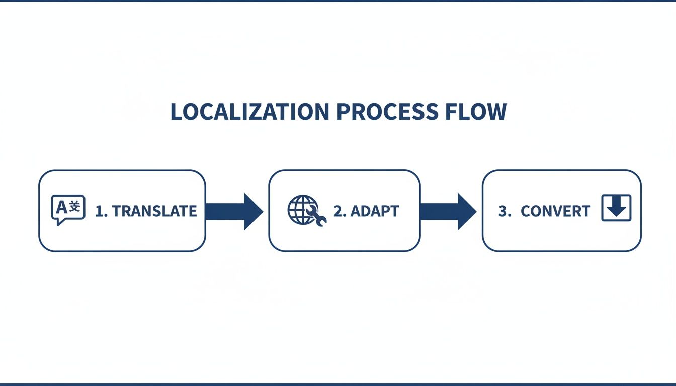
Automation becomes a true superpower when you start targeting global markets. The process of translating, adapting, and then generating localized screenshots is where most teams get completely bogged down. With the right setup, this becomes a simple, repeatable workflow.
The core steps of an efficient localization process are pretty straightforward when you break them down.
This workflow visualizes moving from basic translation to cultural adaptation, and finally to generating all the ready-to-upload assets.
Tools with integrated translation features can instantly convert your captions into dozens of languages. You just need to provide the translated text strings, and the platform will generate a complete set of localized screenshots for every market. This lets you launch in new countries at the same time as your main update, not weeks or months later. It’s all about creating efficient and high-converting app store screenshots that work smarter, not harder.
A Few Common Questions About App Screenshots
When you get down to the nitty-gritty of creating screenshots, a bunch of specific questions always pop up. Getting these details right is the difference between sailing through app store review and boosting your conversions, or getting rejected and watching potential users bounce. Let's tackle some of the most common things I see developers and marketers ask.
How Often Should I Update My Mobile App Screenshots?
My rule of thumb is simple: update your screenshots every single time you release a major UI redesign or a significant new feature. You want your store listing to be an honest, up-to-date preview of what's inside the app. If a user downloads your app based on a screenshot and finds the reality is completely different, you are just creating a bad first impression. Outdated visuals can also signal that your app is not actively maintained, which is a major red flag.
Beyond those big updates, it is just smart ASO to refresh your visuals every three to six months. Think of it as a scheduled check-up. This is your chance to A/B test different designs, try out new messaging, or switch up the layout to see what connects with your audience. You will never find the perfect visual formula if you are not consistently testing and iterating.
Should I Use Portrait or Landscape Screenshots?
This one’s easy: your screenshot orientation should always match how people actually use your app. You’re giving them a preview, so make it an authentic one.
If you have built a game that only works in landscape mode, your screenshots have to be landscape. For pretty much everything else, like utility, social, or productivity apps that people use vertically, stick to portrait.
Now, if your app works perfectly in both orientations, you have got some flexibility to mix and match. But always lead with the orientation that people use most often. Starting with an unexpected orientation can be jarring and might just convince a user to swipe past before they even figure out what your app is all about.
Can I Use Lifestyle Images Instead of App UI?
I see this question a lot. While slapping up a gallery of beautiful lifestyle photos might seem like a great way to tell a story, you need to be careful. Both Apple and Google have strict rules about screenshots accurately representing the in-app experience. A page full of pretty pictures with zero UI is a fast track to getting your app rejected for being misleading.
The smarter, more effective approach is to blend the two. Take your app's UI, place it inside a device frame, and then set that against a high-quality, relevant lifestyle background. This little trick grounds your app in a real-world context, helping users imagine how it fits into their lives, all while keeping you safely within the store guidelines.
The key is to show, not just tell. A screenshot of a recipe app is fine. But showing that same screen on a phone set against a beautiful kitchen counter? That’s far more powerful. It connects your app's function to the user's aspiration.
What Are the Biggest Mistakes to Avoid?
Lots of little mistakes can chip away at the power of your screenshots, but a few really stand out as conversion killers. If you just avoid these common pitfalls, you will be ahead of most of the competition.
Here are the top errors I see all the time:
- Using Low-Resolution Images: Nothing screams "low-quality app" like a blurry or pixelated screenshot. Always export at the highest required resolution. It looks unprofessional and makes people assume the app itself is just as sloppy.
- Showing an Empty or Boring UI: Please, never use a screenshot of your login screen or an empty state. Hook them immediately. Lead with your app's most exciting, value-packed screens.
- Overloading with Unreadable Text: Tiny fonts and long, wordy sentences are useless on a phone screen. Keep your captions short, bold, and focused on one single benefit per image.
- Failing to Localize: This is such a massive missed opportunity. Using the same English screenshots for every single market is just lazy. Taking the time to culturally adapt your visuals for different regions is critical for any app with global ambitions.
But the single biggest mistake of all is not clearly communicating your app's core benefit in the first one or two screenshots. Users make snap judgments. If they can’t figure out what your app does for them in a few seconds, they’re gone. You have lost them.
Ready to stop the manual grind and start producing stunning, high-converting mobile app screenshots in minutes? With ScreenshotWhale, you can use professionally designed templates and a simple drag-and-drop editor to create on-brand visuals that drive downloads. Automate your entire workflow, from sizing to localization, and get your app to market faster. Explore our templates and transform your app store page today at https://screenshotwhale.com.