Create a Mockup Mobile App That Converts
Learn how to design a high-converting mockup mobile app. This guide covers layouts, copy, and tools to boost your app store downloads.
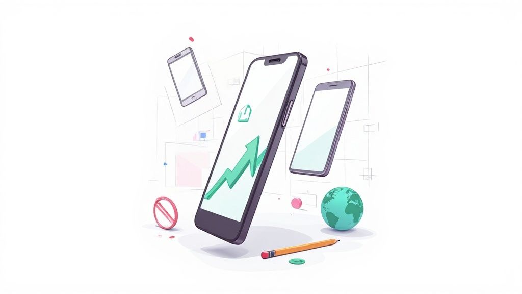
A great mockup mobile app screenshot is so much more than a pretty picture. It's your visual pitch, a split-second opportunity to communicate your app's core value, influence a user's decision, and drive that all-important download. It turns a standard app store image into your most powerful conversion tool.
In a crowded marketplace, this is your first impression. You have to make it count.
The Blueprint for a High-Converting Mobile App Mockup
Walking through the App Store or Google Play is like navigating a massive, noisy bazaar. Your screenshots are your one chance to grab a potential user's attention before they scroll right past. They are not just functional previews; they are critical marketing assets for boosting app store growth.
A well-designed mobile app mockup tells a story, highlights real-world benefits, and builds trust before the user even glances at your full description. Think of it as the cover of a book. It has to be compelling enough to make someone want to open it.
With market saturation at an all-time high, users have become incredibly selective. This is why polished, professional mockups are non-negotiable. With people spending around 3.5 hours daily in apps, a high-quality user experience is expected from the very first glance at your store page.
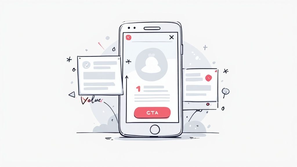
Why Your Mockups Are a Conversion Tool
Let's be clear: your app store page is a landing page, and your screenshots are the hero section. Each image needs to work hard to overcome a user's skepticism and answer the silent question: "What's in it for me?"
Before you even get to the visual design, a solid plan is crucial. A great mockup starts with a great foundation, which is why creating effective wireframes is such a critical first step. It ensures your design is not just visually appealing, but strategically sound.
A high-converting mockup does more than show what your app does. It shows users what they can achieve with your app. This shift from features to benefits is the key to unlocking higher download rates and boosting app store conversions.
To get there, every single element on that screenshot needs a purpose. This is a great starting point for what every high-converting mockup should include.
Key Elements of a Conversion-Focused App Store Mockup
This table breaks down the essential components of a successful app store screenshot mockup, explaining the purpose and best practices for each element to create efficient and high-converting app store screenshots for both Android and iOS stores.
| Element | Purpose | Best Practice Example |
|---|---|---|
| Headline | Grab attention and communicate the primary benefit in 3-5 words. | Instead of "Workout Tracker," use "Reach Your Fitness Goals." |
| Visual (UI) | Showcase the app's core functionality in a clean, uncluttered way. | A clear shot of the main dashboard or a key feature in action. |
| Device Frame | Add professionalism and context, making the screenshot feel tangible. | Use a modern, recognizable device like an iPhone 15 Pro or Pixel 8. |
| Background | Create a mood and make the device stand out without being distracting. | A simple gradient or a subtle, branded color that complements the UI. |
| Concise Copy | Explain the benefit shown in the visual. Keep it short and readable. | "Plan your week in seconds," not a long paragraph of feature details. |
Each of these pieces works together to tell a convincing story. When you treat your screenshots as a primary driver of growth, not just a box to check, you can significantly improve your metrics.
For a deeper dive into improving your store page performance, check out our guide on conversion rate optimization techniques.
Choosing Your Device Frames and Visual Layout
Your app store screenshots are not just a gallery; they're your app's visual pitch. The device frames you pick and the layout you design are the first things a potential user sees, and getting them right is critical for driving installs on both the App Store and Google Play.
First up, the device frame itself. Do you go with the latest, greatest flagship phone, or something more generic? This really comes down to who you're trying to reach. If your app targets tech-savvy early adopters, slapping your UI onto a shiny new iPhone 15 Pro frame instantly signals that your app is modern and premium. It just feels right.
On the other hand, if your app is meant for a massive, mainstream audience, a super-specific or flashy device might just be a distraction. In that case, a cleaner, more generic phone frame does a better job of putting the focus where it belongs: on your app's features and benefits. It feels more accessible to everyone, whether they're on Android or iOS.
Crafting a Compelling Visual Narrative
Once you've settled on a device, you need to arrange your screenshots into a layout that tells a story. You want to guide the user's eye from one key benefit to the next, almost like a mini-comic strip. Two layout strategies that work incredibly well are the panoramic storyboard and the feature grid.
A panoramic storyboard is a slick technique where you connect multiple screenshots with a single, continuous background. This creates a seamless, almost cinematic flow that pulls the user across your entire gallery. To build this in a site editor, you would set a wide background image and then place each device mockup along it, telling a story from left to right, maybe starting with the welcome screen, moving to a core feature, and ending on a successful outcome.
The feature grid is more direct. This layout usually has a clean, simple background and places multiple device mockups side-by-side, each highlighting a distinct feature with a clear headline. It’s perfect for utility apps or platforms where you need to communicate a lot of value, quickly and efficiently.
Actionable Design Principles for Killer Layouts
To really nail your mobile app mockups, you need to start thinking like a designer. Every element should be intentional, using visual hierarchy to draw attention to what matters most.
Here are a few design principles you can apply in any site editor right away:
- Rule of Thirds: Picture a 3x3 grid over your canvas. Do not just center everything. Instead, place key elements like the device frame or a big headline along those lines or where they intersect. It instantly makes the composition more dynamic and balanced.
- Visual Weight: Use size and color to make certain things feel more important. For instance, the screenshot showing your app's biggest benefit could feature a slightly larger or angled device to make it pop. A splash of vibrant color can guide the eye to a key button or piece of data inside your UI.
- Negative Space: Do not cram everything together. White space (or negative space) is your friend. It gives your design room to breathe and makes everything more readable. A cluttered layout is just a fast track to overwhelming the user.
The best app store screenshots are not just pretty; they’re designed to be understood in less than three seconds. Your layout is the key to achieving that clarity.
Putting It All Together in an Editor
Let's walk through a quick, practical example. Imagine you're in a site editor. You start by selecting a vibrant gradient background that matches your app's branding. Then, you drag an iPhone 15 Pro frame from the template library onto the canvas.
For your first screenshot, you place a single device frame in the center, tilting it slightly for a more dynamic look. You add a bold headline above it: "Plan Your Entire Week in Minutes." Simple and powerful.
For the next two screenshots, you switch to a split-screen layout, putting two smaller device frames side-by-side. One shows off "Smart Grocery Lists" and the other highlights "Recipe Discovery," each with its own concise subheading.
This simple combination tells a clear story. It hooks them with the main value prop, then drills down into the features that make it happen. By thoughtfully choosing your frames and mastering a few layout basics, you create a structured visual narrative that turns casual browsers into loyal users.
Writing Screenshot Copy That Sells
Your stunning visuals need a powerful voice. Think of it this way: great screenshot copy is what makes someone stop scrolling and actually consider your app. This is not just about listing features; it's about using the right words to solve a user's problem and nudge them toward that "Install" button.
Forget generic labels like "Task Manager" or "Photo Editor." That tells people what your app is, not what it can do for them. The best copy is short, hits on a clear benefit, and connects on an emotional level.
From Features to Benefits
This is the most common mistake I see developers make. They get caught up in describing features, which are the technical bits of your app, like "AI-powered filters." What you need to sell is the benefit, the positive outcome for the user, like "Create stunning photos in one tap."
It’s a simple mindset shift. After you write down a feature, just ask yourself, "So what?"
- Feature: "Syncs across devices."
- So what? Your work is always with you, no matter where you are.
- Better Copy: Access Your Projects Anywhere
- Feature: "15-minute workouts."
- So what? You can get fit even when you're slammed with work.
- Better Copy: Fitness That Fits Your Life
This little trick flips your messaging from being about you to being about them. And that's infinitely more persuasive.
Your first screenshot's headline has one job: communicate your app's single biggest value proposition in five words or less. If a user only reads that one line, they should get exactly why your app exists and what it solves for them.
Building a Messaging Hierarchy
Not all your benefits carry the same weight. Your screenshots need to tell a story, starting with the most compelling reason someone should download your app. We call this a messaging hierarchy.
- Primary Benefit (First Screenshot): This is your hook. It should hit on the user's biggest pain point or desire. For a budgeting app, that might be something like, "Finally Take Control of Your Money."
- Key Supporting Features (Screenshots 2-4): Each screenshot that follows should spotlight a major feature, but always framed as a benefit. Think "Track Spending Automatically" or "Set and Reach Savings Goals."
- Social Proof or Differentiator (Last Screenshot): You need to end with a bang. This is the perfect spot for a powerful testimonial, a major award, or a unique feature no competitor has. Something like "Join 1 Million Happy Savers" works great here.
This structure smoothly guides the user from a big-picture promise down to the specific features that make it happen, building their confidence with every swipe.
Text Placement and Font Choice
Where you put your text and how it looks is just as critical as the words themselves. When you're putting together your mockup mobile app design, remember that people are scanning incredibly fast on tiny screens.
- Placement: Headlines belong at the top for instant visibility. Subheadings can sit closer to the part of the UI they're describing. Just be sure to avoid placing text over cluttered parts of your app's interface where it gets lost.
- Font: Stick with a clean, sans-serif font like Inter, Lato, or Helvetica. It has to be super legible, even when it's small. Use different font weights (like bold vs. regular) to create a clear visual hierarchy between your main headline and any smaller text.
- Color: Your text needs to pop. High contrast is non-negotiable. Think white text on a dark overlay or dark text on a light one. Never, ever sacrifice readability for a cool design effect.
Do not forget that the content inside your app screen is also part of the "copy." The data, names, and images in the UI should look clean and realistic. For some tips on getting this right, you can learn more about how to capture high-resolution screenshots to ensure every visual element is crisp.
Finally, do not be afraid to experiment. A/B testing different headlines in your app store listing can give you some surprising insights into what language truly connects with your audience and gets you more downloads.
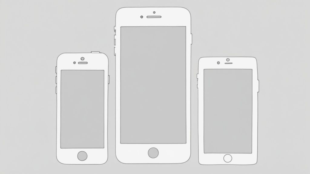
Look Great on Every Single Screen
A mockup that shines on an iPhone 15 Pro but falls apart on a Google Pixel tablet is not just a small mistake. It is a massive conversion killer. When your store presence looks inconsistent, it sends an immediate signal to potential users that you lack attention to detail, and they'll assume your app is the same. This is where we tackle the critical job of making your screenshots look perfect, everywhere.
Let's be real: people browse the App Store and Google Play on a wild variety of devices. We're talking the latest flagships, older models, giant tablets, and even those new foldable screens. A cropped headline or a weirdly stretched image is more than enough to make someone pause, second-guess, and move on to your competitor.
The stakes are surprisingly high. We know that 88% of users will ditch an app after just one bad experience, and a staggering 90% will quit over poor performance. That demand for a flawless experience starts right here, on your store page. If you want to dive deeper, there's a lot of great info on the state of mobile app prototyping and how these early design choices ripple out.
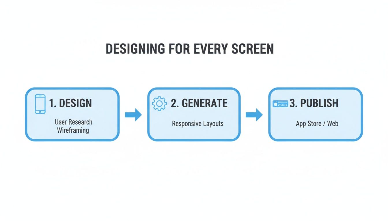
One Master Design to Rule Them All
The idea of manually creating dozens of screenshot variations is enough to make anyone's head spin. The secret is not to design more, but to design smarter. Modern mockup tools were literally built to solve this problem, letting you generate every required size for both stores from a single, master design.
Inside an editor like ScreenshotWhale, you set up one universal template. You nail down your layout, write your copy, and place your UI once. From there, the tool automatically resizes and reframes that core design to fit the specific resolution and aspect ratio for every device you need. It’s a complete game-changer for efficiency.
Your main goal is to create a 'safe zone' in your master design. Think of it as the central area where all your critical text and visuals must live to avoid getting awkwardly cropped on narrower or shorter screens.
This approach locks in consistency across your entire store presence and saves an unbelievable amount of time. You get to focus on crafting a powerful message instead of getting bogged down in the tedious mechanics of resizing.
Nail the App Store Requirements
Both Apple and Google have strict, non-negotiable specs for screenshots. Submitting images that are the wrong size is one of the most common, and frustrating, reasons for getting rejected during app review.
Here’s a quick rundown of what you need to know:
- For Apple: You absolutely must provide screenshots for the 6.7-inch iPhone (like the iPhone 15 Pro Max) and the 12.9-inch iPad Pro. Apple’s system then automatically scales these down for smaller devices. Get these two primary sizes right, and you're golden.
- For Google Play: Things are a bit more flexible but also more complex because of the sheer variety of Android devices. You need to supply screenshots that look good across different aspect ratios, from standard phones to tablets and even Chromebooks.
Using a good mockup generator takes all the guesswork out of this. When you pick an "iPhone 15 Pro Max" template, it’s already set to the required 1290 x 2796 pixel resolution. No more double-checking spec sheets or risking a submission rejection.
How to Keep It Readable and Well-Composed
A responsive design is about more than just hitting the right pixel dimensions. Your message has to stay clear and compelling, no matter how small the screen gets.
Here are a few battle-tested tips to follow:
- Keep Text Big and Punchy: A sentence that looks fine on a tablet can turn into an unreadable mess on a phone. Stick to short, bold headlines and keep any supporting text to a bare minimum.
- Go for High-Contrast Colors: Make sure your text pops against the background. You cannot go wrong with classic combinations like white text on a dark overlay or black text on a light background. It just works.
- Center Your Key Visuals: Place the most important part of your UI, and the device frame itself, smack in the middle of your 'safe zone.' This ensures your core value prop is never cut off, even on funky, extra-tall screens.
- Always Preview Your Work: Before you export anything, use the preview function in your mockup tool. Flip through the different device types. This simple gut-check will help you spot any awkward cropping or text that’s too small to read before it's too late.
Automating Your Mockups for Global Scale
Taking your app global is a huge win, but it creates a massive headache for your marketing assets. Manually creating a unique mockup mobile app screenshot for every language, every device, and every single update is a surefire way to burn out your team.
This is where you stop working harder and start working smarter. It's time to embrace automation.
True Localization Is More Than Translation
Going global is not just about swapping out English headlines for Spanish or Japanese. Real localization goes deeper. It's about adapting your visuals and copy to connect with different cultures. A color, an image, or a turn of phrase that lands perfectly in one country might feel odd or even off-putting in another.
To do it right, you need to understand the cultural nuances that build trust and drive people to hit that "install" button.
Think about the context inside your UI. Are the people in your example photos representative of your target market in Japan or Brazil? Do the sample names and addresses feel local and authentic? These small touches make a world of difference.
For instance, a fitness app targeting a Middle Eastern audience might need to adjust its imagery to be more culturally conservative than what it uses in North America. A finance app must display local currency symbols and formats that users recognize instantly.
The goal is to make your app feel like it was built just for that user, in their country. This level of personalization creates a stronger, more immediate connection and can dramatically boost your app store growth.
The Power of Automation with an API
Okay, so you have a strategy for localizing your copy and visuals. Now what? The next step is to automate the entire production line. Manually updating hundreds of screenshots is a nightmare, especially for apps with frequent updates or a long list of supported languages.
This is where the real magic happens.
This workflow highlights a key insight: with the right tools, generating perfectly tailored app store assets can become a streamlined, repeatable part of your process, not a bottleneck.
Leading mockup services offer an API (Application Programming Interface) that lets you generate screenshots programmatically. This is the ultimate secret weapon for scaling your marketing without scaling your team's workload.
How a Screenshot API Changes the Game
Instead of wrestling with a drag-and-drop editor, your development team can write a script that sends data directly to the mockup service. This data can include everything needed to create a perfect set of localized screenshots, all at once.
Here’s a taste of what you can automate:
- Localized Text: Send translated headlines and captions for dozens of languages in a single API call.
- UI Screens: Programmatically upload the latest UI captures for each language without touching an editor.
- Device Frames: Instantly specify which device mockups to use, from the newest iPhone to popular Android models.
- Backgrounds & Colors: Swap background colors or images to match seasonal campaigns or regional branding.
The competition in the app stores is fiercer than ever. The global developer community has exploded from just 2.5 million in 2010 to around 28 million by 2024. With Asia making up roughly 31% of iOS developers and Europe 29%, this growth underlines just how critical efficient, scalable design workflows are to stand out.
A Practical Automation Scenario
Imagine you're about to release a big update with a new feature, and your app supports 15 languages.
The old way? A designer would manually open a template, paste in 15 different sets of text, swap out screenshots, and export dozens of files. This could easily take a full day or more.
With an API, the process is completely different.
- Prep Your Data: You organize all your translated text into a simple data file (like a spreadsheet or a JSON file).
- Run a Script: A developer kicks off a script that loops through each language in your file.
- Generate Screenshots: For each language, the script makes an API call, sending the correct text and UI image to the mockup service.
- Get Your Assets: A few minutes later, you get a link to a folder with hundreds of perfectly generated, localized screenshots ready for upload.
This automated workflow turns a tedious, multi-day task into a quick, repeatable process. It ensures consistency, kills human error, and frees up your team to focus on work that actually moves the needle. To see the kind of tools that make this a reality, check out our guide on how to generate app screenshots with maximum efficiency.
Common Mobile App Mockup Questions
Getting your app store presence right means diving into the details. A lot of specific questions come up when you're creating mockups, and the right answers can be the difference between a launch that fizzles and one that soars. Let's tackle some of the most common ones I hear.
Mockup vs. Wireframe vs. Prototype
It's really easy to get these terms mixed up, but they each play a totally different role in the design process.
- Wireframe: Think of this as the basic blueprint. It’s a low-fidelity, black-and-white sketch that’s all about structure and user flow. It answers the question, "Where does everything go?"
- Mockup: This is the static, full-color visual design. It shows exactly what the final app will look like, fonts, colors, images, the whole deal, but it is not interactive. This is what you'll be creating for your app store screenshots.
- Prototype: This is a clickable, interactive simulation of your app. Users can tap buttons and move between screens, giving them a real feel for the experience before a single line of code is written.
For your app store page, your entire focus should be on creating polished, high-fidelity mockups that sell the final product's look and feel.
How Many Screenshots Should I Upload?
Both the App Store and Google Play let you upload up to 10 screenshots, but that does not mean you have to use all ten spots. The real magic happens in the first 3 to 5 images. That's what most people will see without even scrolling.
Your very first screenshot has one job and one job only: to communicate your app's single biggest benefit. From there, use the next few to tell a compelling story, showing off key features and the value they bring to the user.
You should always upload enough to showcase your app’s full value, but be ruthless about prioritizing what people see first.
Think of your first three screenshots as your elevator pitch. They have to be compelling enough to stop a user from scrolling past and convince them to learn more, or better yet, to hit that download button immediately.
Should I Use a Video Preview?
An app preview video can be a huge asset, but it should complement your static mockups, not replace them. I’ve seen data showing that many users scan the images first to decide if a video is even worth their time. The best strategy? Use both.
Use your video to show off dynamic workflows, complex features, or anything that really shines when you see it in motion. Your static mockups, on the other hand, are perfect for hammering home key value propositions with bold, easy-to-read text. If you're looking for ways to speed things up, there are great tips on capturing quick mockup screenshots-on-the-fly) that can help streamline your asset creation.
The combination of video and static images gives users multiple ways to understand your app, catering to different browsing habits and ultimately boosting your conversion potential.
Ready to create stunning, high-converting app store screenshots in minutes? With ScreenshotWhale, you can use professionally designed templates and a simple drag-and-drop editor to build a store presence that drives downloads. Get started for free at https://screenshotwhale.com.