Professional App Store Screenshots for iOS and Android
Learn new strategies for app store screenshots to boost visibility and downloads.
When users access your app store listing, what catches their attention first? Surprisingly, it's not your catchy app name or meticulously written description. It’s your visuals.
Your app store visuals hold immense power, serving as a key conversion tool in seconds. These images are not simply decorative; they are your strongest means to persuade potential users. This article offers practical advice on creating high-impact, conversion-focused screenshots for the App Store and Google Play to accelerate app growth.
App Store Visuals: Your Ultimate Marketing Tool
Imagine your app store page as a digital storefront. The app icon is akin to your store sign, but it's your images that function as the inviting window display. These provide a direct glimpse of the app's experience, allowing potential users to make quick decisions.
Excellent screenshots work like an engaging movie trailer. They spark interest, highlight the best features, and compel users to engage. This visual storytelling is fundamental to App Store Optimization (ASO), essential for enhancing visibility and encouraging downloads. Mastering the art of app store visuals impacts user trust, conversion rates, and even search rankings. The pressure is real.
Initial Impressions Matter Most
From a conversion standpoint, nothing influences users like your app store images. Industry reports suggest that by 2025, you have about seven seconds to captivate a user before they leave. Therefore, your first few images bear the brunt of the responsibility for persuading them to install.
It's not mere speculation. Well-crafted screenshots can increase product page conversion rates by 20–35% without any other changes to the app. For more strategies, explore our latest insights on screenshot design.
This example from ScreenshotWhale shows how a professional design can transform a basic UI capture into an enticing advertisement.
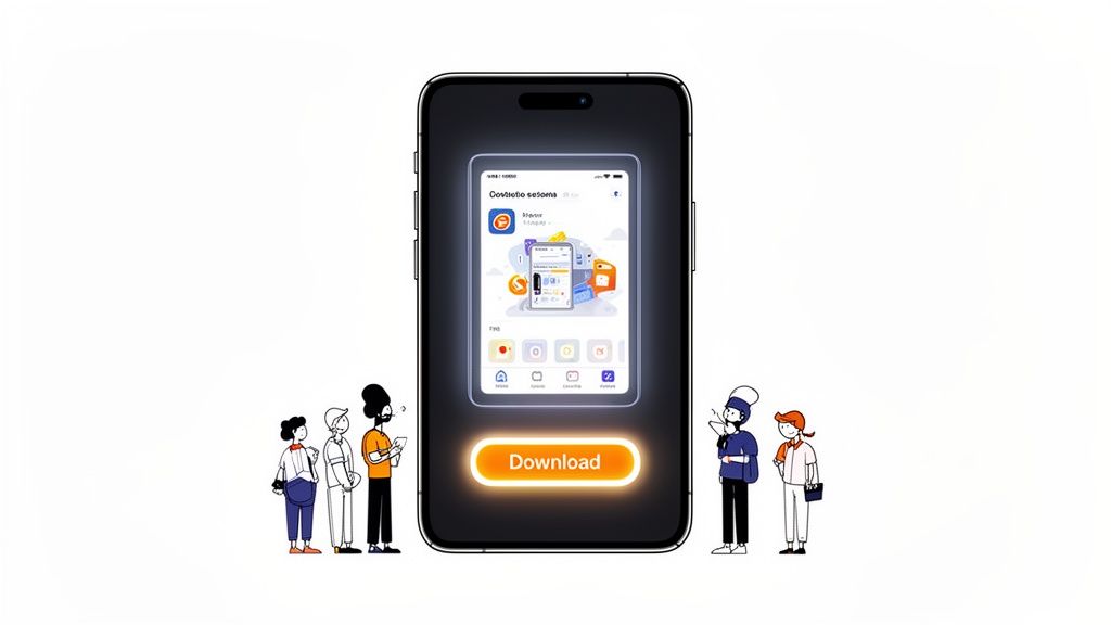
The synergy of a sleek device mockup, persuasive headline, and vivid colors instantly communicates the message. The image is not just a screenshot; it is an impactful marketing asset.
The Impact of Visuals on Conversion
An effective image gallery accomplishes several tasks simultaneously. It informs users about the actual functions of your app while creating an emotional connection that urges them to tap “Get” or “Install.”
- Instant Value Communication: The app’s primary function should be clear within seconds of viewing the first image. No ambiguities.
- Establishes Trust and Authority: Polished visuals suggest a high-quality app from a developer who values excellence.
- Narrates a Unified Story: Each image should naturally lead into the next, guiding the user through key features of the app.
Your screenshot gallery is more than a feature list; it is a compelling sales pitch. Each image must answer the user's essential question: “How does this app improve my life?” Focus on benefits over features for visuals that convert.
Understanding Rules: App Store vs. Google Play Requirements
Before designing attractive app store visuals, it's essential to understand the rules. Both Apple’s App Store and Google Play have unique, unyielding specifications. Ignoring them leads to frustrating rejections.
View these guidelines not as constraints but as stepping stones to successful launches. Establishing them from the outset ensures your efforts aren’t stuck in review, allowing you to focus on design without technical hindrances.
Let's dissect the requirements for each store.
Key Differences: iOS and Android
While both platforms aim for clarity, their screenshot rules vary. Notably, differences appear in the allowable number of images and required device sizes. Ignoring these details can derail your app submission.
Apple allows up to 10 screenshots for each device and language, with 5 to 7 being optimal for conversion. Google Play offers up to 8 screenshots for phones and tablets.
However, research from MobileAction.co shows that 90% of users rarely look beyond the third image. Your initial visuals must capture their interest effectively.
Here is a handy comparison for planning your assets.
Quick Guide: App Store vs Google Play Image Rules
This table outlines the essential specifications of each platform. Having this knowledge beforehand can prevent many challenges during the design process.
| Specification | Apple App Store (iOS) | Google Play Store (Android) |
|---|---|---|
| Max Screenshots | 10 per device (iPhone, iPad) | 8 per device (Phone, Tablet) |
| Required Sizes | Must include 6.7-inch (iPhone) and 12.9-inch (iPad Pro) | Flexible; upload one size, Google may resize |
| File Formats | JPEG or PNG | JPEG or 24-bit PNG (no alpha) |
| Content Policy | Strict on realistic UI and misleading content | More lenient, but disallows inappropriate or deceptive content |
Clearly, a universal approach won’t work. You need to anticipate each store’s specific demands from the beginning.
Mastering Common Requirements
Beyond basics, dimension accuracy is critical. They change with new flagship devices. For Apple, submitting screenshots for the largest devices, currently the 6.7-inch iPhone and 12.9-inch iPad Pro, is vital. Apple resizes these for smaller screens.
Google Play is more flexible, allowing single device uploads, but improper cropping can occur. The ideal approach is custom-sized assets for major device types on both platforms. For comprehensive information, consult our detailed guide on app store screenshot requirements.
Exceeding basic requirements shows professionalism. A pixel-perfect app store image exudes quality, building user trust before the app is even downloaded.
Respect content policies, not crossing lines with unauthorized logos or deceptive claims. Show your app experience plain and truthfully, fostering realistic expectations and better user reviews.
Crafting Screenshots with a Storytelling Approach
Let's be real: impressive app store images do more than showcase an app’s UI. They narrate an enticing story. This is where you elevate from plain screen captures to visual storytelling, crafting a narrative that converts browsers to users. Every pixel should purposefully lead potential users toward downloading.
Consider your screenshot collection a brief, silent film about your app. The first frame is the opening scene; it must capture attention immediately. Following images should build a story progressively. When executed correctly, you’re not just highlighting features but selling an immersive experience.
Create a Captivating Hook
Your first screenshot is the centerpiece. It has under three seconds to convey your app's main advantage. Avoid starting with a login screen or settings menu. Showcase the “aha!” moment, the core value making your app essential.
For a fitness app, it might be a vibrant workout screen filled with progress. For productivity apps, an organized dashboard listing completed tasks could be perfect. The aim is immediate understanding of how your app enhances life.
This opening image sets the tone for the gallery. It should be visually engaging, unmistakably clear, and emotionally resonant. If users only see this image, they should grasp your app's essence.
Incorporate Striking Captions and Color
Raw UI captures aren’t enough. Guide users’ vision, explaining what they view. This requires bold, legible captions and a strategic color palette. Captions should describe benefits, not just features.
For example, rather than “Task List,” opt for “Organize Your Day Effortlessly.” Don’t simply say “Budget Tracker”; use “Gain Financial Control Instantly.” This subtle shift transforms features into real-world solutions, which is far more compelling.
Color choices should be intentional and on-brand. High contrast, vibrant colors make key elements pop against the app store backdrop. A consistent color theme ties images together, projecting a professional image and enhancing brand recognition.
Do not simply exhibit features; promote the outcomes. Users download apps not for buttons and menus but for satisfaction, organization, or fun. Your captions and design need to bridge this gap.
Present Features as Advantages
Users always want to know, “What’s in it for me?” Your screenshot gallery should answer this question visually. Each image should highlight a key feature, but importantly, frame it from the perspective of user benefits.
This transformation from feature to benefit is central to effective app store storytelling. A feature is what the app does; a benefit is what users can achieve with it. Capturing this difference drives downloads.
Consider this approach to expressing features as benefits:
- Feature: Dark Mode
- Benefit: “Comfortable Use Anytime.”
- Feature: Real-Time Collaboration
- Benefit: “Attain Team Goals Together.”
- Feature: 100+ Recipe Filters
- Benefit: “Discover Perfect Dishes Quickly.”
This method helps users envision themselves using your app, making downloading feel intuitive and beneficial. For more insight, explore our comprehensive guide on crafting ideal app screenshots for the App Store.
Build Credibility with Mockups and Social Proof
Using realistic device mockups for your app makes it seem tangible and professional. It helps users envision the app on their phone, fostering trust further. Platforms like ScreenshotWhale offer up-to-date mockups for current devices, keeping your visuals fresh.
Besides professionalism, social proof amplifies conversions. Add badges for accolades, press mentions, or stellar reviews to your screenshots.
Consider these enhancements:
- Awards and Recognition: A simple badge like “Apple's App of the Day” speaks volumes.
- User Testimonials: A succinct, impactful 5-star review quote can be persuasive.
- Impressive Metrics: Declare stats like “1 Million Users” or “50,000+ 5-Star Reviews.”
External validation reduces perceived risk for new users, implying, “Others enjoyed this app,” increasing confidence in pressing install. Social proof in your visual narrative is a tested method for app store success.
The SEO Boost of Text in Your Images
Traditionally, app store images served as a visual sales tactic, showcasing rather than telling. Yet, the landscape has evolved. Leading developers now leverage a powerful strategy: the text in your screenshots also acts as a signal to app store search algorithms.
This change turns visuals into dynamic SEO assets. By embedding these keywords seamlessly with visuals, you elevate your app's discovery potential without cluttering the user interface.

Transforming Visuals into Indexed Content
Since 2025, App Store images have been treated as indexed content in Apple’s search algorithm, making the text within them impactful for ASO. Visible text in screenshot captions is now analyzed similarly to keyword fields.
In practice, this means captions like “Track Spending Instantly” or “Edit Photos Professionally” help your app rank for related terms like “spending tracker” or “photo editor.” It's a transformative tactic for enhancing app visibility.
Embedding Keywords Strategically
The key is to naturally incorporate high-value keywords into captions. Avoid forced inclusion; instead, align marketing language with search terms your audience uses.
Follow this straightforward process:
- Pinpoint Core Keywords: Develop a list of 5-10 primary keywords focused on primary app functions.
- Compose Benefit-Focused Captions: Write concise captions for each screenshot that solves user problems and includes primary keywords.
- Ensure Clarity: Use bold, clear fonts that are easy to read on smaller screens, catering to users and algorithms alike.
Consider each screenshot caption a mini headline. It should be impactful, descriptive, and search-optimized, embodying a dual-purpose approach crucial to modern ASO strategy.
Understanding this strategy’s fit in the broader context is essential. For an insightful overview, view our extensive App Store Optimization (ASO) guide.
Expanding Reach via Localization
This text indexing feature is enhanced through localization. Translating text within screenshots enables ranking for local keywords in various markets. For instance, translating captions to Spanish opens the door to Spanish-speaking user searches.
Research indicates that well-localized listings can increase installs by up to 48% in multilingual contexts. With Apple supporting up to 10 localized screenshots, and platforms offering AI translation, you can turn localizations into keyword-rich assets tailored for specific markets. It’s essential for any global launch, covered more deeply in our complete app store optimization guide.
A Step-by-Step Workflow for Creating Impactful Screenshots
Now, it’s time to put these principles into action. Understanding design concepts is one thing, but creating a full set of polished, compliant screenshots can be daunting. An efficient workflow is crucial, especially for indie developers and small teams aiming for speed without compromising quality.
Thankfully, modern tools simplify this process. Designing professional-looking images no longer requires expert skills or prolonged hours. A streamlined approach allows you to quickly produce a complete gallery of high-performing, localized visuals.
Here's a practical, step-by-step guide using a platform like ScreenshotWhale. Our aim is to transition smoothly from basic captures to a polished set of compelling images.
Step 1: Utilize a Ready-Made Template
The efficiency secret lies in avoiding a blank start. Instead of a clean slate, select from a suite of professionally designed layouts suited for app categories and devices. These templates provide a shortcut with inherent design best practices.
Choose a template reflecting your app's style and user demographic. Fitness apps might benefit from dynamic layouts while fintech apps require sleek, credible designs. The right template saves time and enhances credibility from the onset.
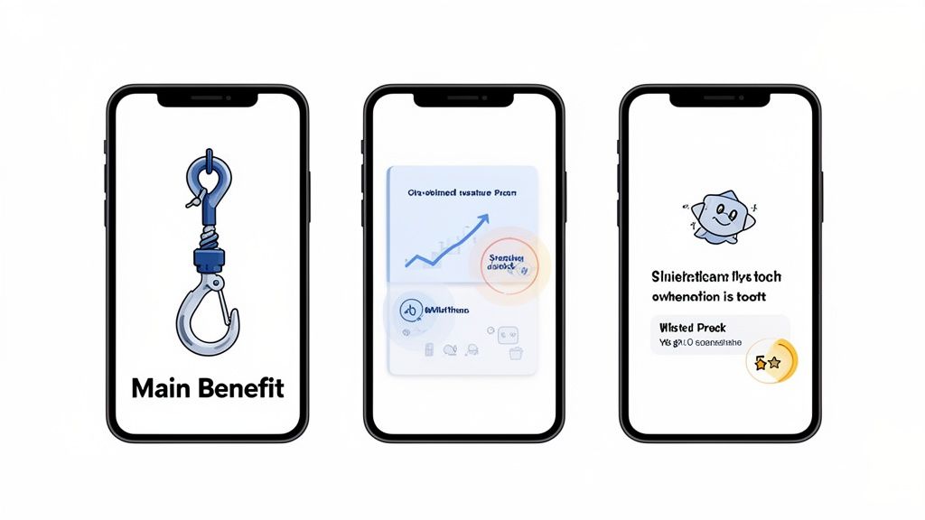
Examples showcase how diverse designs complement different app types.
Templates offer predefined structures for device mockups, text, and colors, facilitating a significant head start to focus on your app’s strengths rather than intricate details.
Step 2: Personalize Using Drag-and-Drop Tools
With a template ready, add personal touches. A user-friendly drag-and-drop editor is invaluable for real-time design visualization.
For instance, select a vibrant template and drag your app's “Dashboard” capture into the frame, perfectly fitting your UI. Adjust the headline text to say, “Visualize Your Day Instantly,” and use brand colors for the background. This quick customization enhances the design’s uniqueness.
Step 3: Create Localized Versions Effortlessly
Global competition requires localized image sets, but manually doing so is time-consuming. This is where automation becomes essential.
Efficient workflows leverage one-click localization. Finalize your design, and an AI tool translates captions into multiple languages, generating ready-to-upload screenshots for each target market.
Automated localization not only saves time but also sparks global growth. Communicating app value in users' native languages increases download chances. It’s the easiest way to enhance international conversions with minimal effort.
This approach maintains a consistent message across regions, turning localization into a finishing touch rather than a major challenge. To refine this, explore AI image generators for fast prototyping and diverse visual concepts. Such tool integration sets the standard for modern, scalable workflows with global aspirations.
Answering Common Questions about App Store Images
Even with a solid strategy, common concerns arise during app store visual creation and management. Accurate details distinguish a good app page from an outstanding one, avoiding pitfalls while leading the field.
Let’s address frequent inquiries from developers and marketers.
The following infographic illustrates a straightforward, three-step workflow.
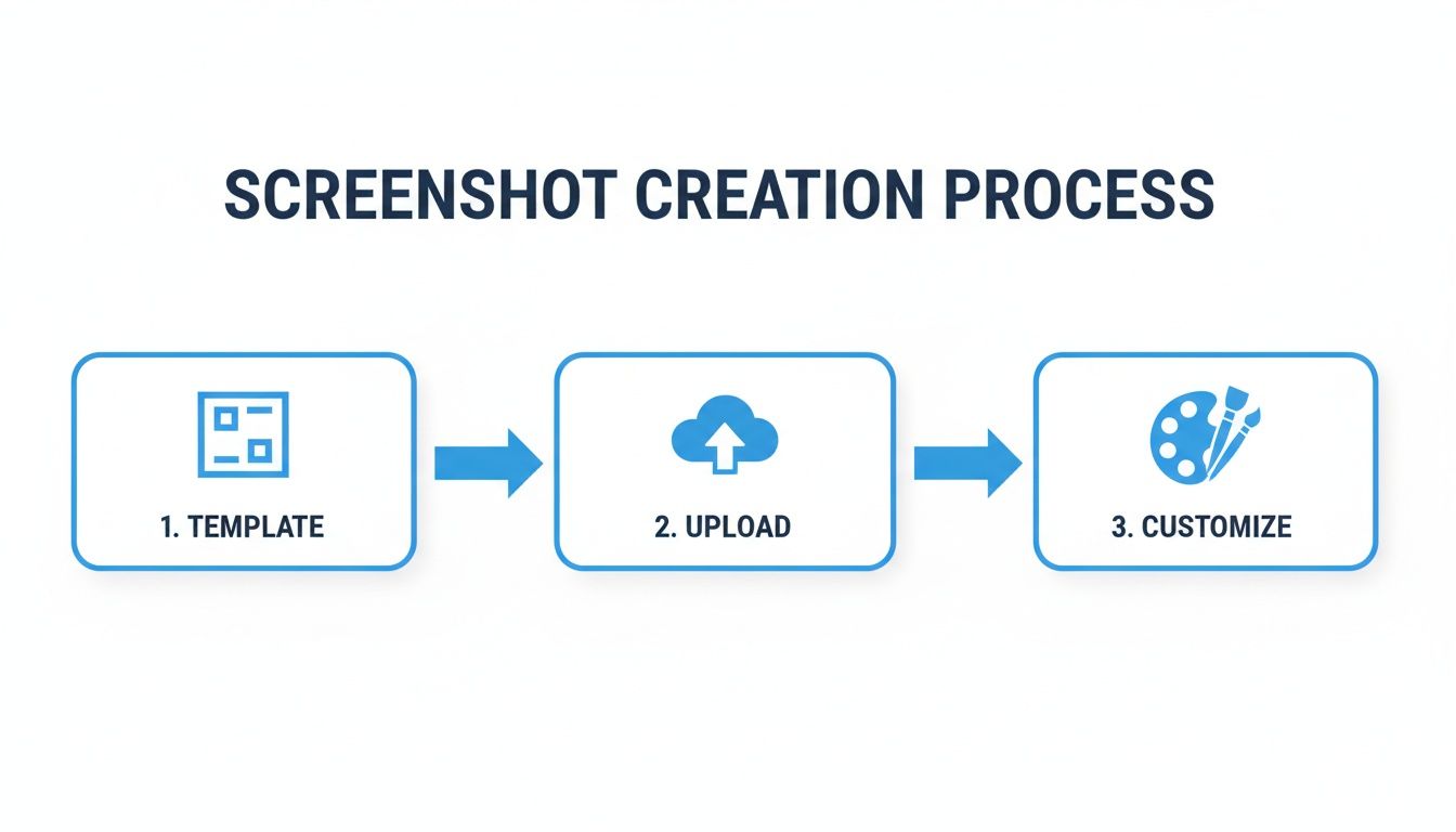
Starting with a template, inserting captures, and adding custom touches leads to quick, professional outcomes.
How Frequently Should App Store Images Be Updated?
Updating visuals is advisable for major feature releases, UI updates, or seasonal campaigns. Consider A/B testing new creative every few months to gauge audience connection.
New images showcase app vitality, building trust with users. Outdated visuals can suggest neglect, reducing conversion rates.
What are Common Mistakes with Screenshots?
It's frustrating seeing good apps undermined by poor screenshots. Avoid these errors for polished visuals that build user confidence and encourage downloads.
- Uncontextual UI Captures: Displaying raw screenshots without explanation prevents users from understanding benefits.
- Incomprehensible Text: Small, low contrast fonts fail. Ensure captions are readable on phone screens.
- Clutter: Overloading images with text or graphics results in confusion and appears unprofessional.
- Lack of Narration: Random screen sequences lack coherence. Images should narrate a logical, progressive story.
- Neglecting Device Frames: Using device mockups enhances tangibility and professionalism, making a significant difference.
Successful app store images communicate a key idea effortlessly. Prioritize clarity over complexity. If users struggle to understand, they are lost.
Are App Store Videos Worth Including?
Definitely. App preview videos greatly influence visibility. On both App Store and Google Play, autoplay videos in search results effectively capture attention.
A quality video demonstrates core functionalities and user experience in ways static images cannot. Keep it short, ideally 15–30 seconds, focusing on the most captivating features for lasting impact.
Should Images Be Shared Across iPhone and iPad?
No, and it's not advisable either. Apple requires distinct, device-specific screenshots due to divergent screen sizes and ratios. Mis-sizing can cause instant rejection during reviews.
The iPad's larger screen offers a unique marketing advantage. Utilize the space to showcase detailed features, complex interfaces, or split-screen displays. Tailored visuals for each device signify quality and careful attention to potential users.
Ready to craft exceptional, high-impact visuals for your app? With ScreenshotWhale, access professional templates, intuitive drag-and-drop editing, and effortless localization. Try ScreenshotWhale now and elevate your downloads!