A Guide to Android Screens Sizes for App Store Success
Master Android screens sizes with our complete guide. Learn about resolutions, DP/PX conversion, and how to create Play Store screenshots that boost downloads.
If you want your app to succeed, you have to nail the design for the massive world of Android screen sizes. It’s a make or break factor that directly affects how users see your app on the Google Play Store and impacts your app store growth. The secret is getting a handle on three things: screen resolution, pixel density, and density independent pixels. These three work together to keep your app looking sharp and consistent across thousands of different devices, from tiny phones to huge foldables, which is critical for creating high converting app store screenshots.
Why Android Screen Sizes Matter for App Growth
Unlike a closed ecosystem, Android runs on an incredible range of hardware from countless manufacturers. This is great for reaching a global audience, but it's a real headache for designers and developers. An app that looks perfect on a Pixel might look completely broken on a Samsung tablet, and screenshots that don't match a user's device can hurt conversions.
Key Concepts You Need to Know
Before you can create high converting app store screenshots, you need to get your head around the three core ideas that define every Android display:
- Screen Resolution: This is just the total number of pixels on a screen, written as width x height (like 1080 x 1920 pixels). More pixels usually mean a sharper image.
- Pixel Density (DPI): This tells you how many pixels are crammed into one physical inch of the screen. A small screen with a high resolution has a much higher DPI than a big, low resolution one.
- Density Independent Pixels (dp): This is the magic unit. Android uses this virtual pixel to make sure your UI elements look the same physical size on screens with totally different pixel densities.
Once you get these concepts, you're on your way to creating adaptive layouts that look good everywhere. For instance, using a tool like ScreenshotWhale to generate mockups for the most common resolutions ensures your marketing assets will look great to the largest groups of users.
When you design with these principles in mind, your app store screenshots will look crisp and professional on any device. That's a huge factor in boosting your conversions and driving real app store growth.
To build apps that scale consistently across Android's wild device landscape, you really need a solid grasp of user interface design frameworks for mobile apps. These frameworks give you the structure to manage all this complexity, ensuring a smooth user experience that you can show off in your store visuals. This foundation is what lets you create assets that don't just look good but actually convince visitors to become loyal users.
Dominant Screen Resolutions by Market Share
If you want your app to reach the widest audience and actually get downloaded, you have to design for the devices people are really using. It's easy to waste a ton of time and money designing for obscure or outdated android screens sizes. A smarter, data driven approach means you can focus your efforts on the resolutions that will actually make an impact, ensuring your app store screenshots connect with the biggest chunk of potential users and boost conversions.
For any ASO or marketing team, understanding the market share for different screen resolutions is non negotiable. This data tells you exactly which device mockups to pick for your promotional materials. For example, if one particular resolution is crushing it in the market, building your screenshots for that size means your app's first impression will be perfectly optimized for a huge segment of your audience.
Prioritizing Your Design and Testing Efforts
The world of mobile screen resolutions is incredibly fragmented, but a few key sizes really own the market. The global landscape is dominated by a handful of Android friendly resolutions, with 360x800 leading the pack at 10.23% market share. Right behind it are 414x896 at 9.48% and 390x844 at 6.4%. These numbers really highlight Android's incredible diversity, serving billions of people on everything from budget phones to high end flagships.
This is super actionable information. When you’re using a screenshot editor like ScreenshotWhale, you can confidently grab a mockup that matches one of these popular resolutions, like a Samsung Galaxy model that uses a 360x800dp base. This move ensures your screenshots aren't just pretty, they're highly relevant to the people you're trying to reach.
Why Certain Android Screens Sizes Prevail
You might be wondering why a resolution like 360x800dp is still so common. The reason is simple: it’s the go to size for countless mid range and budget friendly devices, which make up a massive slice of the global Android market. These phones are often the first smartphone for users in emerging economies, which represents a gigantic opportunity for app growth.
By catering to these dominant screen resolutions, you’re syncing your marketing efforts with how people actually use their phones in the real world. This simple act of focusing can lead directly to higher engagement and better conversion rates on the Google Play Store.
Key Takeaway: Stop designing in a vacuum. Use real market share data to focus on the screen sizes that truly matter. This targeted approach is not only more efficient but also delivers way better results for your app store growth.
The table below gives you a quick breakdown of the top mobile screen resolutions by their global market share. Use it as a cheat sheet for your design, testing, and screenshot creation process.
Top Android Screen Resolutions by Global Market Share
This table lists the most common mobile screen resolutions and their corresponding global market share, helping you prioritize design and testing for the largest user bases.
| Resolution (Width x Height) | Market Share (%) | Common Devices / Aspect Ratio |
|---|---|---|
| 360x800 | 10.23% | Samsung Galaxy A series, many budget devices (20:9) |
| 414x896 | 9.48% | iPhone 11, iPhone XR (19.5:9) |
| 390x844 | 6.40% | iPhone 12/13/14 (19.5:9) |
| 360x780 | 5.09% | Various budget Android models (19.5:9) |
| 412x915 | 4.67% | Google Pixel 6/7, Samsung Galaxy S21+ (19.5:9) |
While this data has you covered for phones, don't forget about the growing tablet market. To make sure you've got all your bases covered, we put together a complete guide for creating compelling screenshots for Android tablets.
A Practical Guide to DP and PX Conversion
If you want to design apps that look sharp across all the different Android screen sizes, you have to get comfortable with the relationship between Density Independent Pixels (dp) and Pixels (px). Honestly, these two units are the bedrock of creating scalable, consistent UIs. Let's break down exactly how to convert between them so you can design and export flawless assets with confidence.
Think of a dp as a flexible, abstract unit that aims to have a uniform physical size no matter what screen it’s on. A px, on the other hand, is a real, physical dot of light on the display. The bridge between them is the screen's density, measured in Dots Per Inch (DPI). Android sets a baseline at 160 DPI (mdpi), where 1dp conveniently equals exactly 1px.
The Conversion Formula Explained
The magic formula for converting dp to px is actually pretty straightforward:
px = dp * (DPI / 160)
What this formula really tells us is that as a screen gets denser (higher DPI), it takes more physical pixels to draw a single dp. For instance, a 10dp button on a high density screen will be made of more physical pixels than the same button on a low density one. This is the whole point, it ensures the button appears to be the same physical size to the user, which is absolutely vital for creating correctly sized elements in your app store screenshots.
This image below shows the top three most common screen resolutions you'll be designing for. It’s a great visual reminder of your main targets.
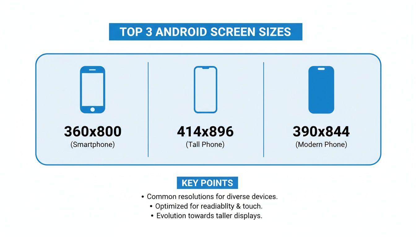
Seeing these resolutions side by side reinforces why getting dp and px right is so critical, they span a wide range of density buckets.
A Quick Reference for Common Densities
To speed up your workflow, it pays to just memorize the multipliers for Android's standard density buckets. These multipliers are just a shortcut for the conversion formula.
| Density Bucket | Qualifier | DPI Range | Multiplier | Example (100dp) |
|---|---|---|---|---|
| Low | ldpi | ~120 | 0.75x | 75px |
| Medium | mdpi | ~160 | 1x | 100px |
| High | hdpi | ~240 | 1.5x | 150px |
| Extra High | xhdpi | ~320 | 2x | 200px |
| Extra Extra High | xxhdpi | ~480 | 3x | 300px |
| Extra Extra Extra High | xxxhdpi | ~640 | 4x | 400px |
A pro tip from my own experience: always design your assets at the highest required density (like xxxhdpi) and then scale them down. This ensures your images and icons stay crisp on even the most pixel dense displays. It’s a non negotiable step for creating high quality app store screenshots that actually drive downloads.
Once you master this conversion, you gain precise control over your app’s visual presentation. It doesn't matter if you're a designer exporting assets or a developer implementing a layout; this knowledge ensures your UI elements and screenshots will look professional and consistent on any device. And that directly impacts user perception and boosts your app's credibility on the Google Play Store.
Mastering Android Density Buckets for Flawless Assets
Android’s solution to the wild west of screen densities is a pretty clever system called density buckets. Instead of forcing you to design for thousands of individual android screen sizes, the system groups them into a handful of manageable categories. Getting a handle on these buckets is non negotiable if you want to ship crisp, clear assets and avoid making your app look blurry or amateurish.
This system is what ensures an icon or image looks sharp whether it’s on a low resolution budget phone or a premium flagship. When your app runs, Android just checks the device’s screen density and automatically picks the right asset from your project. Nail this, and you're on the direct path to a better user experience and the better app store ratings that follow.
Understanding the Density Qualifiers
Each density bucket has a specific "qualifier," which is just a fancy name for the label you use when organizing your image assets. These little labels are what tell the Android OS which version of a graphic to load based on the screen's DPI. By providing assets for each key bucket, you’re basically guaranteeing optimal visual quality across the board.
Here are the primary density buckets you need to know:
- mdpi (Medium): This is the baseline, sitting at around 160 dpi. It's the reference point where 1dp is exactly equal to 1px. Think of it as your 1x asset.
- hdpi (High): Represents screens around 240 dpi. Your assets here should be 1.5 times the size of your mdpi assets.
- xhdpi (Extra High): This is for screens around 320 dpi. Assets are a straight 2x the size of their mdpi counterparts.
- xxhdpi (Extra Extra High): A super common bucket for modern smartphones, covering screens around 480 dpi. Assets here need to be 3x the baseline size.
- xxxhdpi (Extra Extra Extra High): This is the top tier, for premium devices with screens around 640 dpi. Your assets will be a whopping 4x the baseline size.
By creating multiple versions of your assets and popping them into the correctly named folders, you take full control over how your app looks on virtually any device.
Quick Reference Density Table
This table is your cheat sheet. It gives you a simple mapping of each density qualifier to its DPI range and the scaling factor you need to use. I'd recommend bookmarking this page or just saving this table somewhere handy.
| Density Qualifier | DPI Range | Scaling Factor |
|---|---|---|
| ldpi | ~120 dpi | 0.75x |
| mdpi | ~160 dpi | 1.0x (Baseline) |
| hdpi | ~240 dpi | 1.5x |
| xhdpi | ~320 dpi | 2.0x |
| xxhdpi | ~480 dpi | 3.0x |
| xxxhdpi | ~640 dpi | 4.0x |
Pro Tip: Always, always design your assets for the highest density bucket you plan to support, which is usually xxxhdpi. Scaling down preserves quality beautifully. Scaling up a low resolution asset, on the other hand, will always result in a blurry, pixelated mess.
How to Structure Your Project Folders
To make this whole system actually work, you have to place your assets into specifically named drawable folders inside your Android project. The Android build tools rely on these folder names to match the right assets to the right device density. No magic here, just a simple convention.
For example, let's say your app’s launcher icon is ic_launcher.png. You'd structure it like this:
res/drawable-mdpi/ic_launcher.png(The 1x baseline size)res/drawable-hdpi/ic_launcher.png(1.5x size)res/drawable-xhdpi/ic_launcher.png(2.0x size)res/drawable-xxhdpi/ic_launcher.png(3.0x size)res/drawable-xxxhdpi/ic_launcher.png(4.0x size)
This simple, organized structure is your guarantee that every user sees the sharpest possible version of your UI. It's a technical step, for sure, but mastering it is what separates a good looking app from a truly professional one. To refine your visuals even further, it's worth learning about how to properly handle Android image resizing to avoid some common pitfalls.
Creating Google Play Store Screenshots That Actually Convert
Let's be honest: your Google Play Store screenshots are your most powerful marketing tool. They aren't just a technical requirement; they're your app's visual elevator pitch. Getting them right is the difference between a user scrolling past and a user tapping "Install." These visuals are equally critical for the iOS App Store, where a strong first impression drives growth.
It all starts with knowing the rules of the road. Google has some specific technical guidelines you need to follow, even though the actual Android screen sizes can be all over the place.
- You can upload anywhere from 2 to 8 screenshots for phones.
- Your files need to be either JPEG or 24 bit PNG (which means no transparency).
- The shortest side of your image must be at least 320px.
- The longest side can't be more than 3840px.
- Stick to an aspect ratio that isn't taller than 2:1 or wider than 1:2.
Hitting these specs is the easy part. The real work is in creating images that tell a story and convince someone your app is exactly what they need.
Weaving a Strong Visual Story
The best screenshots walk a user through a quick journey. Forget just uploading raw UI captures. You need to frame them in a narrative that shows off your app's true value.
Try thinking about your screenshots like a mini storyboard:
- The Hook: Your very first image should grab their attention instantly. Show off your app's biggest benefit or coolest feature right away.
- The Features: The next few images should highlight key functions, showing how your app solves a real problem for the user.
- The Proof: Wrap it up with social proof, awards, or a clear call to action that makes them want to hit that install button.
This approach turns a simple gallery of images into a compelling reason to download your app.
Best Practices for Screenshots That Drive Installs
Beyond the story, a few design tricks can make a huge difference. For starters, always wrap your UI in a professional device mockup. Showing your app on a familiar device, like a Samsung Galaxy or Google Pixel, makes it feel more real and trustworthy.
Next, use punchy, on brand colors and bold, easy to read captions. You want to guide the user's eye directly to the most important features. A screenshot editor with pre made templates can be a lifesaver. It lets you focus on your message instead of fiddling with design details, ensuring everything looks polished and professional. For example, using a template with a vibrant background and a clear headline like "Manage Your Tasks in Seconds" instantly communicates value.
Your screenshots should do more than just show what your app does. They should make the user feel what it's like to solve their problem using your app. That emotional connection is what really drives installs.
With 72.77% of the global mobile OS market share and 3.9 billion users, Android's massive reach is impossible to ignore. This is exactly why ScreenshotWhale provides mockups for top Android phones like the Samsung Galaxy and Google Pixel so you can create assets that resonate with the majority of the market.
Ultimately, optimizing your screenshots is a core part of App Store Optimization (ASO). By nailing the technical specs, telling a great visual story, and using professional design, you build a powerful engine for growth. Each screenshot is a chance to turn a casual browser into a loyal user. For a deeper dive, check out our complete guide on Google Play app screenshot sizes.
OS Version and Its Impact on Screen Design
It’s not just about the raw pixel count. The specific version of Android a device is running can completely change how your app looks and feels on screen. The OS itself introduces new features and constraints that carve up the available space, making it a surprisingly critical factor when designing your app store screenshots.
You’ve probably heard about Android’s OS fragmentation. It’s a real thing, and it directly impacts how you should think about Android screen sizes. As of recently, Android 15.0 sits at 26.17% market share, with 13.0 close behind at 14.98%, and 14.0 at 14.83%. This spread means your app has to gracefully handle different display behaviors, DPI scaling quirks, and shifting "safe areas" across a huge range of devices. You can dig into more of this data in these recent mobile statistics.
Handling New Display Features
Newer versions of Android have fundamentally changed the screen's canvas. You absolutely have to account for these shifts in your designs, or your screenshots will look broken.
- Display Cutouts: Notches and hole punch cameras are the norm now. Android gives you APIs to work around these, letting your app draw content from edge to edge for that modern, immersive look.
- Gesture Navigation: The old three button navigation bar is fading away, replaced by gesture controls that free up precious vertical space. Your app needs to recognize these changes and avoid putting clickable elements where the gesture handle sits.
- Foldable and Large Screens: Android has gotten serious about supporting foldables and tablets. This means your layouts can't be static; they need to adapt as the screen changes size and orientation, all without jarring the user.
Designing for Safe Areas
This brings us to the concept of "safe areas." Think of these as the zones on the screen guaranteed to be free of system UI like status bars, navigation bars, or camera cutouts. This is where your actual interactive content must live.
It’s fine to let backgrounds and images bleed to the very edges for visual flair, but always, always place critical UI buttons, important text, interactive controls squarely within these safe areas.
If you ignore this, you end up with a frustrating app where buttons get cut off or are impossible to tap. This kind of sloppiness is instantly noticeable in app store screenshots and can kill your conversion rates. When you’re putting together mockups, double check that your core UI is comfortably inside these zones. It’s the difference between looking amateurish and presenting a clean, professional, and usable app.
A Smoother Workflow for Designers and Developers
A solid partnership between designers and developers is what separates a good app from a great one. When both sides are in sync, wrangling all the different android screen sizes stops being a headache and becomes a much more straightforward process. This shared workflow ensures the final product looks exactly like the design, a polished app that works perfectly everywhere.
Think of it as the bridge between the creative vision and the technical reality. For designers, it all starts with setting up their files correctly. For developers, it’s about taking those assets and letting the Android OS do the heavy lifting.
The Designer’s Role: Nailing the Asset Handoff
The whole process kicks off in a design tool like Figma or Sketch. The single most important decision here is to establish a base density for the entire project, which is almost always mdpi (1x). When you design everything at this 1x scale, calculating the dimensions for all other density buckets is just simple multiplication. It removes the guesswork and keeps everything consistent.
Once the UI is locked in, it's time to export. Instead of just one version, designers need to generate assets for every target density.
- Configure Export Settings: Set up your design tool to spit out assets at 1x, 1.5x, 2x, 3x, and 4x scales.
- Name Your Files Sensibly: Use a clear, predictable naming convention. This isn't the place for creativity.
- Organize the Deliverables: Hand over a clean, organized folder with all the asset versions, each clearly labeled by its density.
Getting this handoff right is critical. It saves developers from the nightmare of resizing assets themselves, a process that almost always degrades quality and introduces blurriness.
The Developer’s Role: Smart Implementation
Once the developer gets the assets, their job is to slot them into the right resource folders inside the Android project. As we covered earlier, that means putting them into drawable-mdpi, drawable-hdpi, drawable-xhdpi, and so on. With this structure in place, the system automatically picks the crispest asset for whatever device the app is running on.
It’s not just about images, though. Developers absolutely must use density independent pixels (dp) for all layout dimensions and font sizes. Hardcoding pixel values is a recipe for disaster; you’ll end up with UIs that look tiny on one device and gigantic on another. Using dp ensures a button or a line of text has a consistent physical size, no matter how many pixels are packed into the screen.
Creating Marketing Assets with a Screenshot Editor
After all that hard work, the app is built and looks fantastic on every device. The final step? Creating a store listing that actually converts. This is where a dedicated screenshot editor like ScreenshotWhale fits perfectly into the workflow. You can take your polished, final UI screens and drop them straight into professional looking templates. A practical example is uploading your UI, choosing a Google Pixel mockup, selecting a vibrant gradient background, and adding a bold, easy to read caption like "Your Next Adventure Awaits." This entire process can take just a few minutes in a good editor.
By making a screenshot editor part of your process, you guarantee your marketing materials reflect the real quality of your app. It’s the last mile, turning all that design and development effort into a compelling visual pitch that drives downloads.
This last part connects your in app experience directly to your store presence. It lets you quickly generate mockups for popular devices, add powerful captions, and even localize text for different regions. You're turning your work into a powerful marketing tool that fuels growth.
Got Questions? We've Got Answers.
Jumping into the world of Android screen sizes can feel like a maze, but it gets a lot easier once you've got the key concepts down. Here are some of the most common questions I hear from designers and developers working on apps and Play Store assets.
My goal is to give you clear, straight answers to help you get your work done faster. Nailing these details is the secret to a polished app that actually gets downloads.
Which Screen Resolutions Should I Prioritize for Testing?
You definitely don't need to test on every device out there. That would be a nightmare. Instead, just follow the market share.
Focus your energy on the top resolutions like 360x800 and 412x915, along with the other popular sizes we covered in the market share table. Firing up the Android Studio emulator for these specific resolutions will cover a huge chunk of your potential users and make your testing way more efficient.
Does the iPhone’s Popularity Affect My Android Design Choices?
Indirectly, yes. It's a good thing to keep in mind. While they're totally different operating systems, super popular iPhone resolutions like 414x896 and 390x844 have a massive global footprint. This means both the iOS App Store and Google Play Store see high traffic from these device sizes.
This means millions of people are just used to those taller, narrower aspect ratios. If you design layouts that feel good on those screen shapes, your app will feel familiar and modern to a much broader audience, no matter what phone is in their pocket.
How Do I Handle Foldable and Large Screens?
The magic word here is adaptive. You need a UI that can adapt on the fly.
Modern tools like Jetpack Compose and its WindowSizeClass API are built for this exact problem. They let your app switch between different layouts as the screen size changes in real time. For your app store screenshots, make sure you show off both the folded (phone) and unfolded (tablet) states. It's the best way to prove your app is ready for these premium devices.
Key Insight: Stop thinking about static screens. Modern Android design is all about creating fluid layouts that respond instantly when a user does something like unfolding a device without any jank or visual glitches.
This adaptive mindset ensures your app doesn't just work, but looks incredible across the whole wild spectrum of Android hardware.
Ready to create stunning, high converting screenshots for every Android screen size? With ScreenshotWhale, you can use professionally designed templates and an easy to use editor to generate perfect visuals in minutes. Give ScreenshotWhale a try.