Crafting High-Converting Screenshots for Your Android Tablet App
Screenshots android tablet: Learn to design high-converting screenshots android tablet to boost Google Play visibility and downloads.
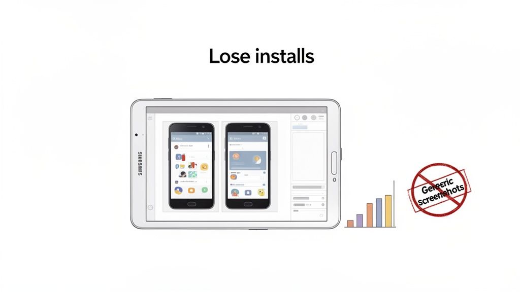
Let's be blunt: just resizing your phone screenshots for tablets is killing your app store installs. Creating high-quality screenshots for an Android tablet is not just a "nice-to-have" item on your ASO checklist. It is a core part of a smart optimization strategy that directly boosts app store growth and conversions.
Why Generic Screenshots Fail on Android Tablets
Stretching your smartphone visuals to fit a tablet screen is a common mistake that signals low effort. It immediately tells a potential user you have not put much thought into their experience.
Tablet users, especially on Android, are not just looking for a bigger version of the phone app. They expect an experience that is more immersive, more productive, or simply makes better use of all that extra screen real estate. When they are greeted with poorly fitted, blurry, or awkwardly cropped images, their perception of your app plummets.
This is not just a design pet peeve; it is a conversion killer. Users see those generic screenshots and rightly assume the app itself is not optimized for their device. They will skip right over you and download from a competitor who actually bothered to show them what they are getting.
The High Stakes of the Tablet Market
By ignoring custom visuals, you are turning your back on a massive and valuable slice of the market. The Android tablet segment is not just a small niche; it commands a whopping 51.7% share of the global tablet market. That is a market valued at over USD 57.52 billion and it is still growing.
With heavy hitters like Samsung shipping millions of devices every quarter, you are talking about billions of potential installs that hinge on getting your visuals right. You can dig into the latest Android tablet market trends, but the takeaway is clear: this is an audience you cannot afford to ignore.
Creating custom visuals for devices like the Samsung Galaxy Tab is not just a best practice. It is a crucial ASO strategy that shows users you have invested in their experience before they even click "Install."
Bridging the Gap with Smart Design
So, how do you create high-converting tablet screenshots without blowing your design budget? The trick is to shift your mindset. You are not just showing your app; you are selling the unique tablet experience.
This means you need to:
- Highlight Unique Features: Show off how your app shines on a bigger screen. Think multi-pane views, slick drag-and-drop actions, or detailed dashboards that are not possible on a phone.
- Use Device-Specific Mockups: Nothing builds trust faster than seeing your UI inside a realistic Samsung Galaxy Tab or another popular Android tablet. It provides immediate context and looks professional.
- Craft Compelling Captions: Write copy that speaks directly to a tablet user. Focus on the benefits and what they can achieve with all that extra space.
The good news is that you do not have to do this all from scratch. Modern tools make this whole process much easier. With the right templates and a bit of automation, you can produce polished, high-converting screenshots that genuinely connect with the Android tablet audience. Let's get into how you can do just that.
Before you can even think about crafting killer visuals that drive downloads, you have to get the basics right. Google Play has its own set of rules for tablet screenshots, and if you ignore them, your beautiful designs will either get rejected outright or look terrible on the store. Getting this stuff locked down from the start will save you a world of headache later.
Do not think of these specs as annoying restrictions. They are the foundation for a professional-looking store page. Google puts these standards in place to guarantee a consistent, quality experience for users, no matter what Android device they are on. Following the rules is your first signal to a potential user that your app is polished and worth their time.
Getting the Core Requirements Right
At its heart, what Google wants is simple: your screenshots need to be clear, correctly sized, and in the right format. This makes sure they load fast and look sharp on everything from a little 7-inch tablet to a big 10-inch screen. Nail these fundamentals, and your creative work has a chance to shine.
Google Play is picky about file types, and for good reason. You have to upload your screenshots as either JPEG or 24-bit PNG (no alpha). Why these two? JPEGs are fantastic for complex images with lots of colors, giving you a great balance between quality and file size. PNGs, on the other hand, are your best friend for images with crisp text and sharp lines, since they do not have the compression artifacts you can get with JPEGs.
You can upload up to eight screenshots for each device type you support, which includes 7-inch and 10-inch tablets. You do not have to use all eight slots, but trust me, you want to provide a solid selection to really show off what your app can do.
If you need a complete rundown on the specs for both major app stores, we have got a detailed guide covering all the app store screenshot requirements.
A Quick Reference for Tablet Specs
To make your life a bit easier, here is a quick-glance table with the essential specs for Android tablet screenshots. Keep this handy, and you will sidestep the most common mistakes.
Google Play Tablet Screenshot Specifications at a Glance
| Requirement | Specification | Pro Tip |
|---|---|---|
| File Format | JPEG or 24-bit PNG (no alpha) | I always use PNG for text-heavy screens to keep everything readable. For anything photographic or with gradients, JPEG is the way to go to keep file sizes small. |
| Aspect Ratio | Must be within a 2:1 ratio | Just stick to standard tablet aspect ratios like 16:10 or 4:3. This prevents the Play Store from awkwardly stretching or cropping your images. |
| Dimensions | Between 320px and 3840px | Aim high here. I usually go for something like 2560x1600 to make sure the images look crisp, even on high-res displays. |
| Maximum Size | No larger than 8MB per image | If you are over the limit, use a compression tool. Just be careful not to crush the quality. A blurry screenshot is worse than no screenshot. |
Meeting these technical rules for every single image can become a real grind, especially when you are juggling different device types and languages. Manually checking dimensions, file types, and sizes for dozens of images is a massive time sink that no dev team needs.
This is where automation can change your workflow entirely. Using a tool with pre-configured templates is, without a doubt, the most efficient way to handle this. For instance, with a platform like ScreenshotWhale, the templates for 7-inch and 10-inch Android tablets are already built to Google's exact specs. You just drop your app's UI into the mockup, and it produces a perfectly formatted, compliant image every time. It completely frees you from the tedious pixel-pushing so you can focus on what actually matters: writing compelling captions and telling a visual story that gets people to hit "Install."
Designing Tablet Screenshots That Actually Convert
Getting past Google Play's technical rules is just the starting line. Now comes the real work: designing screenshots for your Android tablet app that do more than just list features. They need to tell a story, solve a user's problem, and ultimately convince them to tap "Install."
Think of your screenshots as your most powerful marketing asset. They are your first, and often only, chance to show off your app's value in just a few seconds. A great set of screenshots can seal the deal, while a poorly designed one can sink your conversions before a user even bothers to read your description.
Crafting a Compelling Visual Narrative
Let's be realistic: most people browsing the Google Play Store will not swipe through all eight of your screenshots. They will glance at the first two or three and make a snap judgment. This means your opening visuals have to land with an immediate, powerful message about what your app does and why it is better than the next one.
Your first few images should act as the hook. Forget showing a boring login screen or a cluttered dashboard. Use that prime real estate to highlight the single biggest benefit your app delivers.
- First Screenshot: Start with the problem. Hit them with a powerful caption that speaks directly to a pain point they are experiencing.
- Second Screenshot: Present your app's unique solution. This is your chance to showcase your killer feature in action.
- Third Screenshot: Show the outcome. What amazing result will the user get by using your app?
This approach turns your screenshots from a dry feature list into a compelling argument for why your app is a must-have. You can dive deeper into this storytelling method in our guide to creating compelling app store images.
The Power of Captions and Color
The UI is the star of the show, but it is the background, mockups, and especially your captions that make it shine.
Do not just describe what is on the screen with generic labels like "Project Dashboard" or "Edit Photos." Instead, write benefit-driven captions that scream value. A productivity app could easily turn "Project Dashboard" into "Your Entire Workflow on One Screen." That tiny tweak shifts the focus from what the feature is to what the user can do.
Color is just as critical. A vibrant palette that matches your brand can make your screenshots pop in a crowded store. Understanding a bit about strategic branding and design principles is key here. It helps you pick colors that not only look good but also trigger the right emotions.
This panoramic layout is a great example of how to show multiple features in a single, cohesive visual.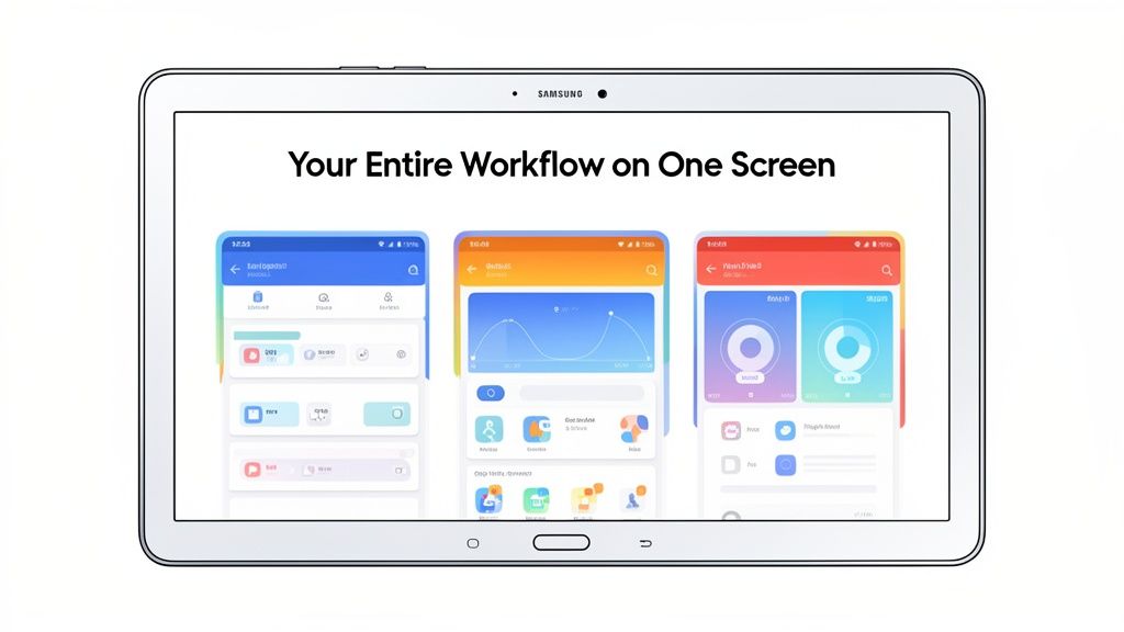
By connecting different UI screens, you can walk the user through a specific workflow or show off powerful multitasking features that are unique to tablets.
Use Realistic Device Mockups to Build Trust
Wrapping your raw UI captures in clean, modern device mockups is not optional anymore. It adds a layer of polish and helps users immediately picture your app on their own device. For Android tablets, this is especially important.
When a user sees your app rendered perfectly inside a familiar device like a Samsung Galaxy Tab, it sends a clear signal: you have built a dedicated, high-quality experience just for them. This builds instant trust and makes them far more likely to install.
With Samsung consistently leading the Android tablet market and shipping millions of Galaxy Tab units every quarter, this detail is more than just aesthetics. Using accurate Galaxy Tab mockups in your ASO strategy is a smart move that helps you connect with a massive chunk of your potential audience.
Embrace the Panoramic Layout
One of the slickest design techniques for tablet screenshots is the panoramic, or connected, layout. This is where you seamlessly blend several screenshots into a single, wide image that users can swipe through, creating a fluid and immersive experience.
This style is perfect for a few things:
- Showcasing a workflow: Guide users step-by-step through creating a project or editing a photo.
- Demonstrating multitasking: Display split-screen views to highlight productivity features.
- Creating a visual splash: A bold, continuous background can make your store listing unforgettable.
This approach works incredibly well on tablets, where the wider screen gives you a bigger canvas to create something truly engaging. It encourages users to keep swiping, drawing them deeper into your app's story.
Your tablet screenshots cannot just be bigger versions of your phone screenshots. That is a missed opportunity. They need to sell a story: the story of why your app is not just better on a tablet, but an entirely different, more powerful experience.
People grab their tablets for a reason. They are settling in for a more immersive gaming session, a deep-dive productivity sprint, or a richer media binge. Your screenshots have to tap directly into that mindset. They are your visual pitch for the premium, large-screen version of your app.
Showcasing Powerful Tablet-Only Functionality
The most convincing tablet screenshots I have seen are the ones that show off features that are flat-out impossible on a cramped phone screen. These are the "aha!" moments that make a user feel like they are getting a truly optimized product, not just a stretched-out afterthought.
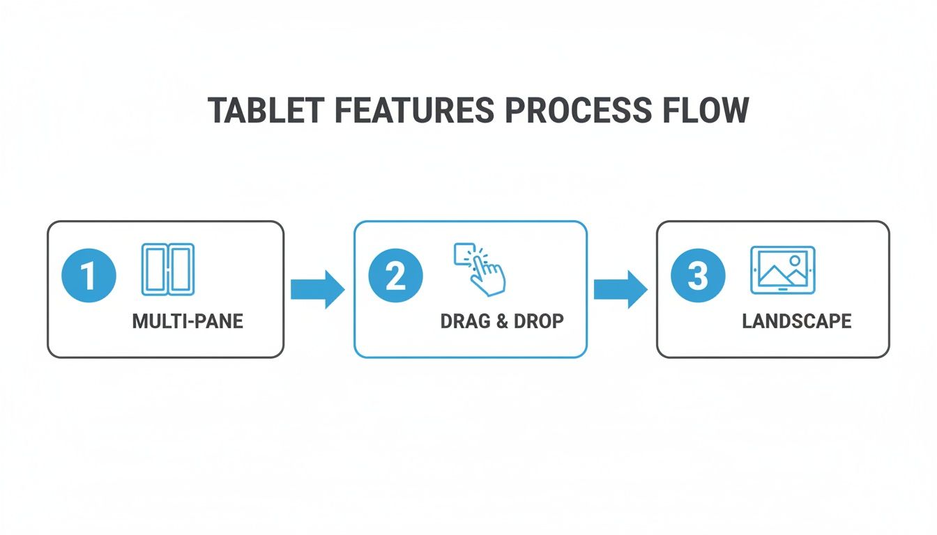
Zero in on these tablet-centric power features:
- Multi-Pane Views: If you have a productivity or news app, show it. Let users see the list of emails or articles on the left while the full content is open on the right. It instantly communicates a more efficient, almost desktop-like workflow.
- Drag-and-Drop Actions: For any app involving organization, like project management, design, or even photo galleries, a screenshot of someone dragging an item from one panel to another is pure gold. It visually screams "easy and powerful."
- Expansive Landscape Interfaces: So many apps truly come alive in landscape mode, especially in creative fields. Show how your app uses that extra width to lay out more tools, give a wider canvas, or present a more cinematic video player.
Take a video editing app, for instance. A killer screenshot would lay out the full timeline, the media library, and the preview window all on one screen. That immediately tells the user they can tackle complex projects without constantly hiding and revealing different menus.
Designing for Clarity and Impact on a Large Screen
Just because you have more real estate does not mean you should build a skyscraper of information on it. That is a classic rookie mistake. The best tablet screenshots feel clean and premium, using negative space and smart typography to their advantage.
It is all about balance. Yes, you have more room for text, but do not write a novel. Keep your captions punchy and focused on the benefit. A larger font can make your key selling point pop, but if you go too big, it just clutters the UI you are trying to show off.
Your goal is to make the app look indispensable on a tablet. Every choice, from the feature you highlight to the font size you pick, has to connect with why that user picked up their tablet in the first place.
Think about the user's state of mind. They are often in a more focused, less hurried mode than when they are on their phone. Your visuals should match that with a polished, easy-to-digest look. Cut the visual noise and let your app’s best features take center stage.
Practical Examples of High-Converting Tablet Screenshots
Alright, let's get concrete. Imagine you have built a note-taking app. Do not just show a single note. Instead, your first screenshot could be a split-screen view. On the left, a clean list of notebooks; on the right, a rich-text note with an embedded image being actively edited. Your caption? Something direct like, "Organize and Create, Side-by-Side."
Or what about a drawing app? A weak screenshot shows a finished piece of art. A strong one shows the art in progress on a massive canvas, with the full, unobstructed toolbar visible on the side. This sells the superior creative workflow. The caption could be "Your Complete Studio, Uncluttered." For a travel app, show a map on one side and a list of attractions on the other, with a caption like "Plan Your Adventure at a Glance."
These examples connect because they do not just show the app; they sell a better, more capable experience. They make the user think, "Wow, I could actually get serious work done with that." When you focus on these tablet-specific strengths, you create visuals that hit home with your target audience, and that is how you drive installs.
Think Globally, Automate Locally
Getting your screenshots for an Android tablet looking sharp is a great start. But if you want to really move the needle on conversions, you have to think beyond your home market. Localization is not just about swapping out text. It is about making your entire store listing feel native to someone in another country.
That might sound like a huge undertaking, especially if you are a small team. Manually creating dozens of screenshot sets for every language you support is a recipe for a production bottleneck. The good news? Modern automation can turn what used to be a week-long headache into a quick, repeatable part of your release cycle.
It's More Than Just Translation
True localization means your visuals speak the language, literally. A user scrolling through Google Play in Japan should see captions in Japanese. Someone in Germany should see them in German. It seems like a small detail, but it builds instant trust and shows you have put in the effort for their experience, which has a real impact on whether they tap that install button.
AI-powered tools have made this incredibly efficient. You can take your perfectly crafted English captions and have them translated into dozens of languages in minutes, not days. This completely removes the soul-crushing copy-paste work and frees up your team to think about strategy instead of spreadsheets.
Think about how you would showcase key tablet features. You would want a clear, simple visual flow that can be understood and adapted for any market.
This kind of visual storytelling, highlighting things like multi-pane views or drag-and-drop, works universally. The core message of a superior tablet experience comes through loud and clear, no matter the language.
Put Your Production on Autopilot
The real magic happens when you pair AI translation with an automated generation pipeline. Let's walk through a real-world scenario: your team is pushing a feature update and all your Google Play assets need a refresh.
Instead of a designer painstakingly updating every screenshot for every language and tablet size, an API can run the whole show. It looks something like this:
- Kick off the process: Your build system makes an API call as soon as a new version is ready.
- Feed it the new stuff: You send over the new UI captures and your primary English captions.
- Let the system work: The service automatically drops the new UI into your branded templates, translates the text for all your target languages, and produces complete sets of ready-to-upload screenshots.
This workflow ensures your store listings are always consistent and up-to-date across the globe, taking a major pain point out of your development cycle. If you want to get into the nitty-gritty of how this works, we have got a whole guide on how to generate app screenshots programmatically.
The goal here is to make localization a seamless part of your release pipeline, not a barrier that slows you down. When it is automated, every user sees a polished, relevant preview of your app, regardless of where they are.
Tap Into Massive Global Growth
There has never been a better time to focus on international markets. As of early 2025, Android holds a 45.77% share of the global tablet market. And get this: the Asia-Pacific region alone makes up over 68% of all tablet shipments. You simply cannot afford to ignore that user base.
Automating your screenshot localization is how you compete in these massive and emerging markets. By combining AI translation with up-to-date device mockups, you are not just saving time; you are building a scalable growth engine. This turns a resource-draining chore into a serious competitive advantage, making sure your app looks its best in every single regional app store.
A Few Common Questions
When you are grinding to get your app ready, the nitty-gritty details of app store assets can feel like a minefield. Getting your tablet screenshots right is a huge part of making a good first impression. Here are some of the questions I hear all the time.
How Many Tablet Screenshots Do I Actually Need?
Google Play gives you eight slots for tablet screenshots, but do not feel pressured to use every single one. The sweet spot is usually around four or five well-crafted images.
Think of the first three as your prime real estate. These are the ones users see instantly, without any swiping. They have to tell a compelling story about your app's core value, and they have to do it fast. Use the remaining slots to dig a little deeper, to show off secondary features, alternative uses, or how slick your app looks in a different orientation.
Can't I Just Reuse My Phone Screenshots?
You can, but it is one of the fastest ways to kill your conversion rate. Uploading phone screenshots directly to your tablet listing is a dead giveaway that you have cut corners. The images end up looking stretched, blurry, and completely unprofessional.
It immediately signals to a potential user that your app probably is not optimized for their device, either. To earn their trust (and their download), you absolutely have to create custom screenshots that showcase the actual tablet experience. Popping them into accurate device mockups is the final touch that makes it all look professional.
What Are the Biggest Mistakes People Make?
Besides the cardinal sin of reusing phone images, a few other common slip-ups can really tank your store listing's performance. Steering clear of these is half the battle.
Here are the ones I see most often:
- Raw UI Dumps: Just slapping a raw capture of your app's screen onto the page looks lazy. Without a device frame, a punchy caption, or any context, it just feels unfinished.
- Hiding the Good Stuff: If your app has awesome tablet-only features like a multi-pane layout or cool drag-and-drop actions, you have to show them off. It is your biggest selling point on this form factor.
- Tiny, Unreadable Text: Your captions are there to sell the benefits, but if the font is too small or cluttered, nobody is going to read them. Keep it bold and brief.
- Ancient-Looking Devices: Putting your modern app inside a mockup of a tablet from five years ago makes your entire product feel dated.
- Forgetting the Rest of the World: If you are targeting international markets, untranslated screenshots are a massive missed opportunity. Localization shows you care about all your users.
A killer tablet screenshot does more than just display a feature; it sells the feeling of a better, more powerful experience on a bigger screen. Your goal is to make your app look indispensable.
Should I Bother with Both Landscape and Portrait Shots?
This one comes down to your app's design. If your app works beautifully in both orientations, then absolutely show both. It proves your app is flexible and lets users imagine themselves using it while kicking back on the couch (landscape) or holding it like a book (portrait).
On the other hand, if your app is built for a single orientation, like a game that only runs in landscape, then pour all your effort into making those screenshots amazing. Do not waste a slot on a portrait view that does not actually exist in the app. Always, always prioritize visuals that reflect the real user experience.
Tired of battling with design software just to get your screenshots looking right? ScreenshotWhale takes the pain out of the process with pro-level templates, realistic device frames, and even AI-powered localization. Start creating tablet screenshots that actually convert. Give it a try today.