How to Create an App Store Preview That Boosts Downloads
Discover how to craft an app store app preview that drives installs. Tips for iOS and Android, design guidance, and ASO secrets.
Think of your app store app preview as your most powerful visual sales pitch. It's a short video trailer or a set of compelling screenshots that shows people exactly what your app does and why they need it. It goes way beyond a simple description to bring your app to life, showing off its features and creating an instant connection.
Why Your App Preview is a Conversion Machine
In a sea of apps, your preview is often the final nudge someone needs to tap "Install." It’s a fast, engaging way to prove your app's value before a user has to commit. You’ve got less than 30 seconds to deliver the ultimate elevator pitch.
This kind of visual storytelling is critical because people make snap judgments. They scan; they don’t read. A killer preview answers their biggest question right away: "How will this make my life better?"
The Power of Showing, Not Telling
We're all wired to process visuals way faster than text. A well-crafted app preview plays right into this by showing your app in action.
Here’s what that really means for you:
- It Builds Instant Trust: A professional video or screenshot set signals that you've invested time and care into your product. It screams quality and reliability.
- It Highlights Key Features: Instead of just writing about a cool feature, you can show users exactly how it works and what it feels like to use it.
- It Creates an Emotional Connection: The right music, smooth motion, and a clear story can make people feel excited, productive, or entertained, lodging your app in their memory.
Consider the Apple App Store, where over 800 million people visit every single week. With search driving over 50% of all installs and nearly 1,200 new apps popping up daily, a preview that grabs attention isn't just nice, it's essential for survival.
A great app preview doesn't just list features; it sells a solution. It frames your app as the answer to a user's problem, making the download feel like the only logical next step.
Fueling Growth and Discovery
Beyond the immediate download, a strong app preview gives your whole App Store Optimization (ASO) strategy a boost. Apple and Google both reward listings that keep users engaged. When someone watches your video or swipes through your screenshots, it sends a strong signal to the algorithm that your page is relevant, which can help you climb the search rankings.
It's a virtuous cycle. A better preview leads to more downloads, which improves your app's rank, which leads to more people finding you organically. Yes, previews take effort, but they're a direct investment in your app's long-term growth. To really make an impact, your video needs to look polished; you can find great video tools tailored for mobile app marketing that get the job done.
And remember, your preview is just one piece of the puzzle. For a look at the complete visual package, check out our guide on creating compelling app store images.
Strategizing Your App Preview for Maximum Conversions
Before you even think about hitting the record button, we need to talk strategy. A killer app preview isn’t just a random screen recording. It's a story, carefully crafted to turn a curious browser into your next loyal user.
It all starts with a storyboard. This is your blueprint, your mini movie script. Your goal is to find your app's absolute core value and then build a visual sequence that hooks the viewer, shows them the magic, and gets them to smash that install button. Skip this step, and you're just throwing spaghetti at the wall, hoping something sticks.
Pinpoint Your Unique Value Proposition
First things first, you have to answer one simple question: What's the single biggest reason someone should download your app? This is your unique value proposition, or UVP. Is it unbelievably fast? Deceptively simple? Does it have one killer feature no one else has?
Everything in your storyboard hangs on this answer. For instance, a photo editing app might hinge its entire preview on its slick, AI-powered background removal. A budgeting app could lead with the fact that it saves users an average of $200 a month.
To nail down your UVP, think about:
- The Pain Point: What specific problem are you solving for your ideal user?
- The "Aha!" Moment: Which feature makes someone's life instantly easier or more fun?
- The Outcome: Don't just show a feature in action. Show the result of that feature.
Map the User Journey Visually
Once you've got your core message locked in, it's time to map out the visual flow. There's a classic storyboard structure that just plain works for app previews because it mirrors how people actually decide things.
You're essentially guiding a user from a quick scan of your App Store page to a confident tap on the "Get" button.
This flow isn't just theory; it shows how at each stage, you're either winning someone over or losing them for good.
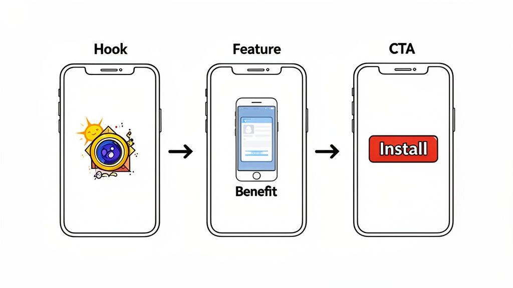
A narrative that consistently performs well breaks down into three acts:
- The Hook (First 3-5 seconds): Don't start with your login screen. Ever. Lead with your most impressive feature or the final, amazing outcome. Show the "after" before you even mention the "before." For a fitness app, that means a dynamic shot of a completed workout summary, not the tedious sign-up process.
- The Core Features (5-20 seconds): Now, show the 2-3 key features that back up your big promise. Keep the pace snappy. Show the user navigating, tapping, and achieving their goal. Make it look effortless and clear.
- The Call to Action (Final 3-5 seconds): You've made your case, now close the deal. End with a clean, branded screen that tells them exactly what to do next. "Download Now" or your app's tagline is all you need.
Think of your storyboard like a short comic strip. Each panel is a key scene from your app, with little notes for the on-screen text and any sound effects or music cues.
Write Captions That Convert
Your captions are the glue holding this whole story together. They give context and drive home the benefits you're showing on screen. The trick is to keep them incredibly short, punchy, and focused on the user's gain.
Instead of a dry, instructional caption like, "Tap here to filter results," go for something that sells the dream: "Find Your Perfect Match in Seconds." One describes a tap; the other describes a win.
A few tips for writing captions that actually work:
- Use powerful action verbs that create a sense of forward motion.
- Stick to a strict 5-7 words maximum per screen. Seriously.
- Frame everything around what the user gets out of it.
- Make sure the text is big and bold enough to be read easily on a tiny phone screen.
By taking the time to storyboard, you shift from just showing your app to selling its story. This isn't just busywork. It's a deliberate, strategic process that ensures every single second of your preview is working to convince users your app is the one they've been waiting for. Get this right, and you’ll see it in your download numbers.
Nailing the Technical Specs for iOS and Android
Getting the technical details right for your app store video isn't just a good idea. It's a hard requirement. Screw up a pixel dimension or upload a file that’s a megabyte too big, and you’re looking at an instant rejection from Apple or Google. That means wasted time and a delayed launch, all over something that was totally preventable.
Think of these specs as the non-negotiable rules of the game. Nail them, and your preview gets approved without a fuss. More importantly, it’ll look crisp and professional to every single person who lands on your app page.
Let’s break down exactly what you need to know to get it right the first time.
Apple App Store Video Preview Rules
Apple is notoriously strict with its ecosystem, and App Previews are no different. Their guidelines are specific, and there's no wiggle room. Honestly, getting these details wrong is one of the fastest ways to get your update bounced back.
Here’s your checklist for what Apple demands:
- Duration: Keep it between 15 and 30 seconds. That short window forces you to get straight to the point.
- File Format: Stick to
.mov,.m4v, or.mp4. No surprises here, just standard video formats. - File Size: Your file has to be under 500 MB. This means your compression game needs to be on point to maintain quality without bloating the file.
- Audio: Audio is optional, but I'd strongly recommend it. Just be absolutely sure you have the rights to any music you use.
- Poster Frame: This is the thumbnail people see before they hit play. You have to pick a frame from your actual video, so choose one that’s compelling and gives a real sense of your app.
A ton of developers overlook the poster frame, and it's a huge mistake. That single image can be the difference between someone tapping 'play' or just scrolling on by. Treat it like a mini ad for your video.
Google Play Store Video Promo Rules
Google gives you a bit more breathing room than Apple, but there are still some key rules to play by. Your promo video on Google Play is just a YouTube link, which simplifies things but introduces its own set of best practices.
Here’s what you need to do for your Google Play video:
- Source: The video has to be on YouTube. You just pop the URL into your Google Play Console.
- Monetization: This is critical. You must disable ads on the video. Nothing kills conversions faster than a competitor's ad playing right before your own app preview.
- Orientation: You can go with landscape or portrait. Landscape is classic, but a well-made portrait video can feel much more native and immersive on a phone.
- Duration: Google doesn't have a hard 30-second cap like Apple. Still, best practice is to keep it under 60 seconds. User attention spans aren't getting any longer.
The Critical Role of Dimensions and Aspect Ratios
Beyond file types and timings, the actual dimensions of your visuals are what make or break the presentation. An app store app preview or screenshot with the wrong aspect ratio will get stretched, cropped, or slapped with ugly black bars. It screams "unprofessional" to potential users.
You have to create assets that perfectly match the screen resolutions of the devices you're targeting. A preview made for an iPhone 15 Pro Max won’t look right on an older iPhone SE. Trying to create and resize all of these by hand is a recipe for mistakes and a massive headache.
This is exactly why getting the specs right is so crucial. For a complete, up-to-date cheat sheet on every screen size for both iOS and Android, check out this in-depth guide on app store screenshot dimensions. Submitting pixel-perfect assets for each device makes your app look polished, builds trust, and ultimately, gets you more downloads.
Design Principles for High-Converting App Screenshots
A plain screen recording just shows what your app does. A well-designed app store app preview shows a potential user what your app can do for them. That's the difference between information and a conversion tool.
Great design turns a simple gallery into a visual argument that convinces people to tap "Get." This is where you have to blend solid visual principles with smart marketing to create something that actually works. Let's break down the core tactics that turn casual viewers into active users.
Frame Your App in Polished Device Mockups
Putting your app's UI inside a realistic device frame is such a simple move, but it instantly makes your product feel more tangible and professional. It's not just a floating screenshot anymore; it's an app on a phone. This helps people immediately picture it on their own device, creating a much stronger connection.
This one tweak adds a layer of polish and context that signals quality and attention to detail. It builds a bit of subconscious trust before a user even reads a single word of your description. For example, using a screenshot editor, you can select the latest iPhone 15 Pro mockup to give your fitness app a current, premium feel, a huge upgrade over a generic, outdated frame.
Use Color and Branding to Capture Attention
The app store is a brutally competitive visual space. You have seconds, if that, to grab someone's eye. A strategic and vibrant color palette is your best weapon to make your previews stand out and reinforce your brand. Don't just pick colors at random; stick to a palette that aligns with your app's icon for a cohesive, professional look.
A few ways to think about color:
- High Contrast: Use bright, bold background colors that make your device mockups and captions pop off the screen. This is a no-brainer for apps in lively categories like gaming or social media.
- Subtle Gradients: A soft gradient background can add a touch of elegance and depth, making your screenshots feel more dynamic than a flat, boring color.
- On-Brand Consistency: Use your primary brand colors across every single screenshot to build recognition. The goal is for users to see that color scheme and immediately think of your app.
The goal is to stop the scroll. In the first three seconds, a user decides whether to stick around or move on. Bold, intentional color choices are your best tool for winning that initial moment of attention.
Write Captions That Sell Benefits
Here’s a hard truth: people don't download apps for their features. They download them for the solutions those features provide. Your captions need to reflect this. Keep them short, punchy, and focused entirely on what the user gets out of it.
Instead of a caption that says "Filter by Category," try something like "Find What You Love, Faster." One describes a button; the other describes a real-world outcome. See the difference? With an editor, you can easily test different benefit-driven captions against each other to see what resonates most with your audience.
Tools like ScreenshotWhale are built to make arranging these elements, mockups, backgrounds, and text, into a clean, effective layout as painless as possible.
The screenshot above shows how combining these elements creates a professional and persuasive visual story. It transforms your preview from a technical manual into a marketing message that directly answers the user’s only real question: "Why should I care?"
Add Social Proof to Build Instant Credibility
If your app has gotten any kind of recognition, you need to show it off. Awards, "App of the Day" features, or positive press mentions are pure gold for building trust. People are far more likely to believe a third party's validation than your own marketing slogans.
It's easy to bake this right into your screenshot designs:
- Add a small award banner or badge in one of the corners.
- Dedicate one of your first screenshots to highlighting a major award.
- Incorporate a short, punchy quote from a well-known publication.
A simple caption like "As Featured in TechCrunch" next to their logo can massively influence a user's decision. It borrows authority and tells people that your app is worth their time. Put these strategies to work, and your app store preview will stop being just a demonstration and become a powerful engine for growth.
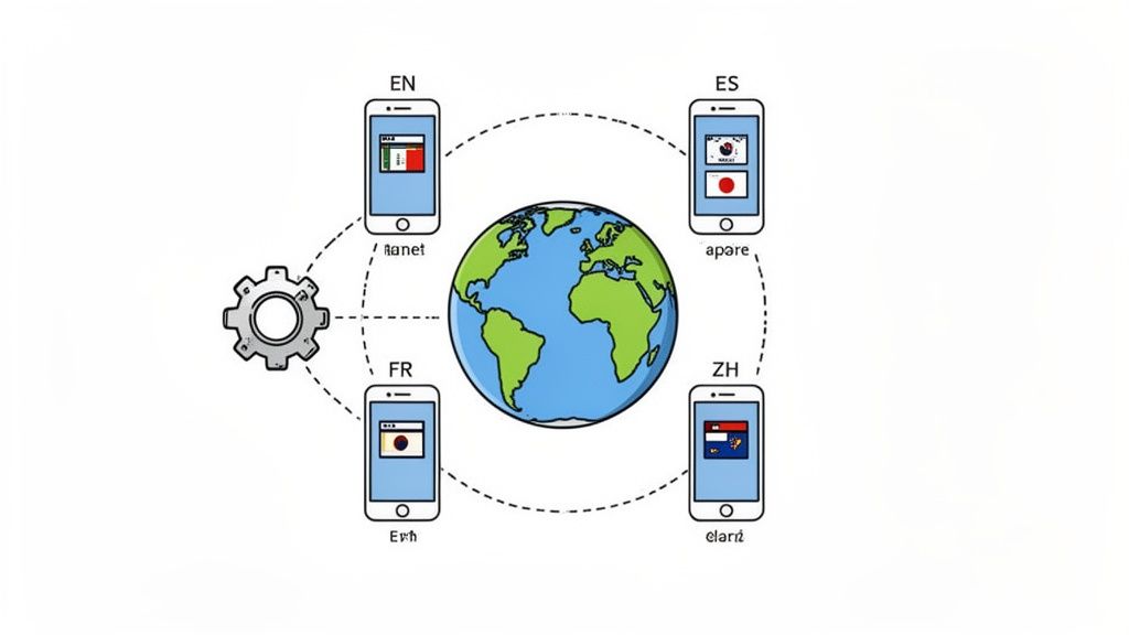
Automation and Localization: Scaling Your Previews for a Global Audience
So you've poured your heart and soul into creating a killer app preview for one language, on one iPhone model. Awesome. Now, try doing that for ten languages across five different iPhones and a few Android devices.
Suddenly, it’s not so awesome anymore. The sheer manual effort is a nightmare. This is where a smart automation and localization strategy stops being a "nice to have" and becomes absolutely essential for global growth. It’s all about working smarter, not harder, to scale your app's presence without burning out your entire team.
Streamline Your Workflow with Templates
The bedrock of any efficient asset pipeline is a solid set of templates. Seriously, stop starting from scratch every single time. A good template locks in your core design decisions. Think of the device mockups, background styles, font sizes, and caption placement.
When a new feature drops, you're not redesigning everything. You just swap out the screen recordings, tweak the text, and you’re done. This simple shift keeps your brand looking sharp and consistent everywhere and slashes your production time.
A platform like ScreenshotWhale really brings this to life. You build your master template once. Then, adapting it for new countries becomes a quick, repeatable task instead of a multi-day headache.
Go Beyond Translation with True Localization
Listen, localization is way more than just running your captions through Google Translate. True localization means adapting your entire visual story to connect with different cultures. A joke or reference that lands perfectly in North America might completely miss the mark in Japan.
You've got to think about:
- Cultural Nuances: Are the icons, examples, or even the scenarios in your preview culturally relevant? If you have a food delivery app, you better be showing popular local dishes, not just burgers and fries.
- Color Psychology: Colors carry different meanings around the world. The last thing you want is for your color palette to send a weird or negative message by accident.
- Formatting: Little things like currencies, dates, and units of measurement matter. Getting them right shows users you actually built the app with them in mind.
This kind of attention to detail is a massive trust signal. It tells international users you see them and you care.
An app that feels local gets downloaded. It's a fact. Users are a staggering 72% more likely to buy something when the information is in their own language. Don't let a language barrier be the reason a potential customer just scrolls past.
Harness AI for Instant Language Adaptation
Trying to manually manage translations for a dozen, let alone dozens, of languages is a recipe for disaster. This is where AI-powered tools feel like magic. Platforms with built-in translation engines can take your English captions and spit out accurate versions for over 100 languages almost instantly.
This kind of automation saves an incredible amount of time you'd otherwise spend copying and pasting, and it practically eliminates the risk of human error. For teams also wanting to automate the creation of the videos themselves, checking out the latest AI video generators can be a huge time saver for producing the base video assets.
Automate the Entire Asset Pipeline with an API
For the ultimate level of efficiency, nothing beats an API. You can hook your design platform directly into your development pipeline, letting you programmatically generate a complete, updated set of screenshots and previews every time you push a new build.
Think about it. You release a minor UI tweak. Instead of kicking off a painful manual process of recapturing and redesigning every single asset, an automated workflow just handles it. Done.
This ensures your app store listing is always an accurate reflection of your latest product version in every single market. This isn't just about saving time. It's about maintaining a polished, professional, and up-to-date storefront for your global audience, which is what actually drives conversions. If you want to dive deeper into the asset creation side, check out our guide on how to generate app screenshots that really work.
Your Final Quality Check Before Publishing
You've made it this far. The storyboarding, designing, and localizing are all done. But before you race to hit that publish button, there's one last, critical step: a meticulous quality check. This is where you catch the small, easy-to-miss errors that can completely undermine all your hard work.
This isn’t just about spotting a typo here and there. It’s a final, top-to-bottom review to make sure every single asset is perfectly aligned with store guidelines, your brand, and what users actually expect to see. Think of it as the final polish that turns a good preview into a great one.
The Essential Pre-Publish Checklist
Running through a checklist might feel a bit tedious, but trust me on this one. Catching a single mistake here can save you from a frustrating app store rejection or, worse, making a poor first impression on thousands of potential users.
- Guideline Compliance: First things first, double-check the latest technical specs for both Apple and Google. Have dimensions, file sizes, or duration limits changed? A quick look at the official docs can prevent an instant rejection before your app even gets reviewed.
- Proofread Everything: Read every single word of your on-screen text out loud. Seriously. It helps you catch awkward phrasing, spelling mistakes, and grammatical errors you'd otherwise skim over. Even one small typo can make your app feel unprofessional.
- Visuals Match Current UI: Does your video and do your screenshots accurately show the latest version of your app? Outdated visuals are not only misleading but are also a fast track to frustrated users and a flood of one-star reviews.
- The "First 3 Seconds" Test: Look at your very first screenshot or play the first three seconds of your video. Does it immediately scream your app’s biggest value prop? If your killer feature is buried, you’ve already lost most of your audience.
- Light and Dark Mode Rendering: How do your previews hold up when a user’s device is in dark mode? Test them. Make sure your text is still legible and your visuals don't get washed out or become jarring. It's a small detail that shows you genuinely care about the user experience.
Verify Every Link and Asset
Finally, do a quick sanity check to confirm that every asset has been uploaded to the correct slot in App Store Connect or the Google Play Console. You'd be surprised how often mismatched previews or incorrect poster frames happen in the final rush to publish.
A final quality check is your last line of defense. It’s the moment you step into your user's shoes and experience your app store listing for the first time. If anything feels off, now is the time to fix it.
Going through this process ensures your app store presence is polished, professional, and ready to convert from the very second it goes live.
Answering Your Top App Preview Questions
Whenever I talk to developers about app previews, the same handful of questions always pop up. Let's get those out of the way so you can start creating with a clear game plan.
Do I Really Need Both Screenshots and a Video?
This is probably the number one question I get. The short answer? Yes, absolutely. It's not an either or situation. Think of them as a one two punch: the video tells a dynamic story and grabs attention, while the screenshots offer scannable proof points for users who just want to skim. Many people still prefer to swipe through static images to quickly grasp what an app does. The video hooks them, and the screenshots seal the deal.
Should My Preview Have Music and a Voiceover?
While not a strict requirement, adding audio can make a world of difference. A simple, upbeat soundtrack instantly makes your preview feel more polished and professional. More importantly, a clear voiceover can explain a complex feature in just a few seconds, something that might be hard to convey with visuals alone. Just make sure you have the proper rights to any music you use. It’s an easy mistake to make.
A classic rookie mistake is using the exact same preview for both the App Store and Google Play. I know it saves time, but the two platforms have different UI conventions and, believe it or not, different user expectations. Crafting a unique video for each shows you respect the ecosystem, and that subtle detail can genuinely influence a user's decision to download.
How Many Previews Should I Upload?
For the Apple App Store, you get up to three video slots for each language you support. My advice is to use all of them. Don't just show the same thing three times. Use each slot to showcase a different angle of your app. Your first video could be a general overview, the second could highlight a killer new feature, and the third could walk through a specific, high value use case.
Over on Google Play, things are simpler: you only get one promotional video, which is linked from YouTube. This raises the stakes for that single video. It has to do all the heavy lifting, acting as your primary sales pitch to showcase your app's absolute best features and benefits in one compelling package.
Ready to create stunning, high-converting previews and screenshots without all the hassle? ScreenshotWhale gives you all the templates, device mockups, and localization tools you need to make your app store page shine. Start creating for free.
Put this into practice on your own listing
Import your live app into an ASO workspace — metadata, keywords, competitors, and store screenshots in one place.
Import my app