High-Converting App Store Previews for iOS and Android
Unlock explosive app growth. Our guide shows you how to create high-converting app store previews and screenshots that skyrocket downloads on iOS and Android.
Your app's product page is its digital storefront, and your app store previews are the most powerful sales tool you have. These visuals, including both screenshots and videos, are often the deciding factor for a user hesitating to tap "Get" or "Install."
They work faster than your description, icon, or title to communicate what your app is all about and build that initial spark of trust. This guide offers actionable insights to create efficient, high converting app store screenshots that boost app store growth.
Why Your App Store Previews Are Your Strongest Asset
Think about the last time you downloaded a new app. You probably glanced at the icon, read the title, and then immediately started swiping through the screenshots and maybe watched the first few seconds of the video. This is how almost everyone operates. We are visual creatures who want a sneak peek of the experience before committing to a download.
High quality app store previews are not just for show. They are a core part of App Store Optimization (ASO), directly hitting your conversion rates and, as a result, your user acquisition costs. When someone lands on your page from a search or an ad, your previews have just seconds to make a compelling case.
The Psychology of Visual Decision Making
It's a wild statistic, but people process images 60,000 times faster than text. This is exactly why a well designed screenshot gallery can instantly communicate your app’s core purpose and its “aha!” moment. You do not have to tell users your app is easy to use, you can show them with a clean, intuitive interface highlighted in your visuals.
Here’s a quick look inside a user’s mind as they scan your previews:
- Does this solve my problem? Your visuals have to immediately connect your app's features to a user's need or desire.
- Is it easy and enjoyable to use? A cluttered or confusing screenshot screams poor user experience, creating instant friction.
- Is this app trustworthy and professional? Polished, on brand previews signal quality and build confidence. A sloppy design can make an otherwise brilliant app feel amateurish.
Take a fitness app, for example. Instead of just showing random screens, a powerful preview strategy tells a story. The first screenshot shows an easy workout setup, the next highlights progress tracking with vibrant charts, and the last showcases a community feature. This little narrative guides the user from their problem (getting fit) to your app's solution in just a few swipes.
Differentiating in a Crowded Marketplace
Your app store previews are your primary defense against the competition. When a user searches for a "meditation app," they’re met with a wall of options. The app with the most engaging, benefit driven visuals will almost always win the click and, ultimately, the download.
Your previews are not just a feature showcase; they are a persuasive visual argument for why your app is the best choice. They turn passive browsers into active users by creating an emotional connection and a sense of excitement.
This is where a dedicated site editor becomes a game changer. For instance, you could use a site editor to design a beautiful, high converting template with bold, vibrant colors and clear captions for a meditation app. You can then instantly generate perfectly formatted screenshots for every single device, ensuring a professional look across both the iOS and Android stores.
We dive deeper into this in our guide on how to generate app screenshots that truly stand out. This kind of efficiency frees you up to focus on the story your visuals tell, and that story is the real key to boosting your app store growth and driving conversions.
Navigating iOS and Google Play Guidelines
Before you even think about designing your app store previews, you have to learn the rules of the game. Apple and Google are both notoriously strict about their technical and content guidelines. If you ignore them, you are signing up for rejections and frustrating delays.
Getting these requirements right from the start is the absolute foundation. A common mistake I see developers make is creating one set of assets and just hoping they’ll work for both stores. That is a recipe for disaster. This approach almost always leads to awkwardly cropped visuals, failed uploads, or a user experience that just feels wrong on one platform or the other.
Key Technical Specifications for App Previews
The first hurdle is always the technical stuff. These are not just friendly suggestions; they are hard requirements for getting your assets live on your product page. Think of them as the blueprint for your visual canvas.
For example, Apple is incredibly specific about using device captured footage, whereas Google Play gives you a bit more creative freedom. The number of videos and screenshots you can upload is also completely different, which directly impacts how you will tell your app's story.
As this graphic shows, high quality previews directly influence the metrics that matter: downloads, conversions, and acquisition costs. Nailing the platform guidelines is not just about avoiding rejection, it is about driving real growth for your app.
App Store vs Google Play Preview Specifications
While the goal is the same, attract users, the paths to get there on iOS and Android have some key differences. A unified strategy is smart, but it has to be flexible enough to account for these platform specific rules.
Here’s a side by side look at the most critical specifications you need to keep on your radar.
| Specification | Apple App Store (iOS) | Google Play Store (Android) |
|---|---|---|
| Video Duration | 15-30 seconds per video. | 30 seconds to 2 minutes. |
| Number of Videos | Up to 3 videos. | 1 promo video (YouTube link). |
| Number of Screenshots | Up to 10 screenshots. | Up to 8 screenshots per device type. |
| Video Format | .MOV, .M4V, or .MP4. | YouTube URL. |
| Aspect Ratio | Varies by device (e.g., 9:16, 16:9). | 16:9 (horizontal) recommended. |
Paying attention to these details is crucial. Apple's 30 second limit forces you to craft a tight, punchy narrative. In contrast, Google's two minute window gives you room for a much more in depth feature demo. For a full breakdown of resolutions and sizes, you can learn more about the specific app store screenshot dimensions for every device out there.
Content Policies and Common Rejection Reasons
Beyond the tech specs, both stores have content policies designed to protect users. If you violate these, your entire submission could get rejected, not just your creative assets.
The most important rule is simply to be honest. Your previews must accurately represent your app's functionality. Faking features that do not exist is a fast track to rejection and, worse, destroying user trust.
Here are a few other common mistakes that get apps flagged:
- Showing personal information: Never display real phone numbers, email addresses, or other sensitive data in your previews. Use placeholder info.
- Including copyrighted material: Using music, logos, or characters you do not have the rights to is an immediate red flag for reviewers.
- Displaying violence or adult content: All your creative needs to be appropriate for your app's age rating.
- Making unverified claims: Avoid puffery like "No. 1 App" or "Best in the World" unless you have official proof to back it up.
Stick to these guidelines, and you will not only create previews that look great and drive conversions but also sail through the review process without a hitch.
Crafting a Compelling Visual Story
Your app store previews are more than just a gallery of features. They are your pitch. They need to tell a story that grabs a potential user, walks them through their problem, and presents your app as the perfect solution. This is how you turn a simple set of images into a powerful conversion machine.
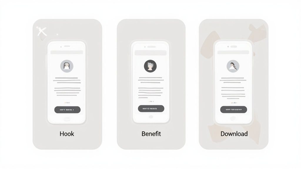
This narrative approach is absolutely critical because users make snap judgments. Your visuals have to build a connection almost instantly, and that does not happen by accident. It requires a plan: a storyboard.
Find Your App’s 'Aha!' Moment
Before you touch a single design tool, you have to pinpoint your app's core value. What’s that one incredible moment a user experiences that makes them go, "Wow, I need this"? That is your 'aha!' moment.
Is it the rush of satisfaction from checking off the final item on a packed to do list? The thrill of seeing a photo transform with the perfect filter? Or the pure relief of snagging a last minute dinner reservation?
Your entire visual story should be built around this central moment. It’s the emotional anchor that makes your app’s benefits feel tangible and desirable, turning an abstract feature into a real world solution.
Once you’ve nailed this down, you can build a narrative around it. Think of it like a mini movie with a clear beginning, middle, and end. To really make an impact, it helps to understand the principles of visual storytelling.
The Three-Act Structure for High-Converting Previews
Every great story follows a simple structure, and your app store previews are no different. By organizing your screenshots or video clips into a three act narrative, you create a logical flow that is easy for users to follow and incredibly persuasive.
Act 1: The Hook (First 3 Seconds)
Your first one or two screenshots, or the initial seconds of your video, must demand attention. This is not the time for your login screen. Instead, show the problem or the ultimate reward. A language learning app could show someone confidently ordering coffee in Paris with a bold caption: "Speak a New Language in 10 Minutes a Day."Act 2: The Core Benefits
This is the heart of your story, where you show your app solving the user's problem. Use the next few screenshots to highlight your best features in action. But remember, focus on benefits, not just functions. Instead of a caption like "Customizable Filters," try "Create Stunning Photos with One Tap." Each screen should build on the last, showing a clear path toward the user's goal.Act 3: The Call to Action
Your final screenshot or video card needs to deliver a clear, compelling reason to download. This is where you summarize the main benefit and use strong, action oriented language. A simple "Download Now" is fine, but something like "Start Your Fitness Journey Today" or "Unlock Your Creativity" connects back to the emotional core of your story, making it much more powerful.
Writing Benefit-Driven Captions
The text you overlay on your screenshots is just as important as the visuals themselves. Keep captions short, punchy, and laser focused on user benefits. Use a large, readable font and vibrant colors that pop against the background while staying true to your brand.
A great way to approach this is to get inside the user's head. They are not asking, "What does this button do?" They are asking, "How does this make my life better?"
For a project management app, this might look like:
- Instead of "Task Assignment Feature," use "Never Miss a Deadline."
- Instead of "Real-Time Chat," use "Collaborate Instantly with Your Team."
These small language shifts reframe the feature as a direct solution to a common pain point, making your app far more appealing. Polishing these details is what separates good previews from great ones. For more ideas on how typography and layout can elevate your story, check out our guide on creating beautiful mobile mock ups.
Producing Previews That Convert
Okay, your storyboard is solid and the narrative is locked in. Now for the fun part: bringing it all to life. This is the production phase, where you will capture the raw footage and stitch it together into a polished preview that actually gets people to tap "Install."
You do not need a Hollywood budget to get incredible results here. Whether you are using simple on device recording or diving into sophisticated editing software, there is a path for every team and budget. The real key is focusing on a smooth, clear, and engaging visual experience that shows your app at its absolute best.
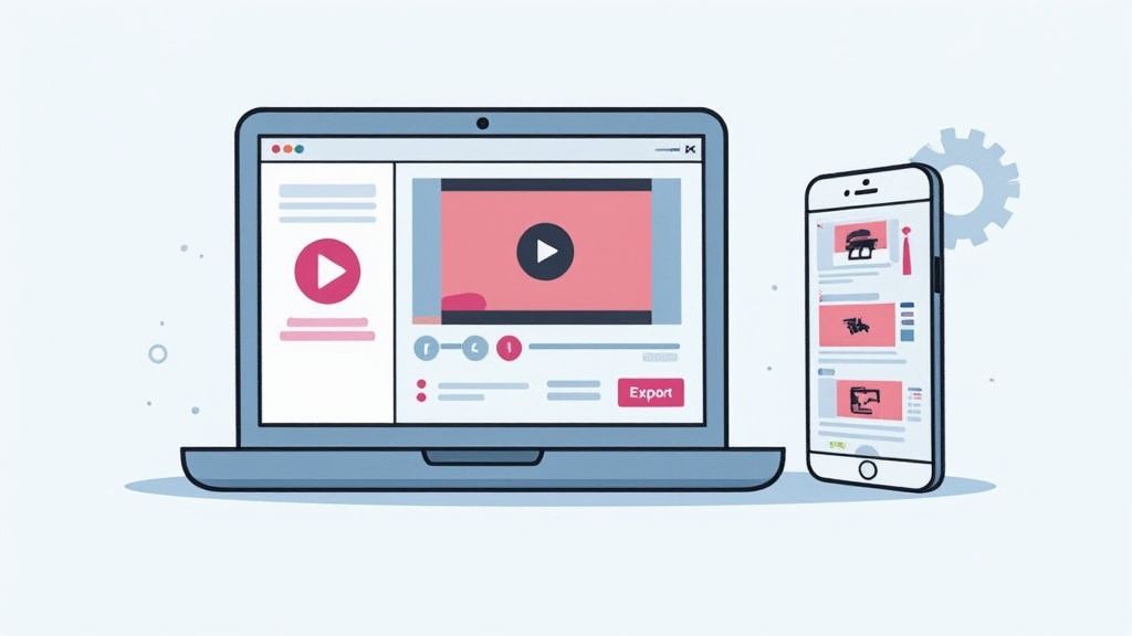
Capturing High-Quality Footage
The foundation of any great preview is clean footage. Jittery recordings or blurry visuals can make even the most beautiful app look unprofessional, so it’s worth taking the time to nail this part.
For a lot of us, the most straightforward method is recording directly on the device. Both iOS and macOS have built in tools that make this a breeze.
- On iOS: The native screen recording feature in the Control Center is perfect. It lets you capture authentic user interactions right from an iPhone or iPad.
- On macOS: QuickTime Player is surprisingly robust. You can connect an iPhone or iPad and capture its screen in excellent quality, which I find gives me more control.
Before you hit record, prep your device. Turn on Do Not Disturb because nothing kills a perfect take like an unexpected notification popping up. Also, make sure your app is populated with compelling, realistic data. You do not want to showcase empty states or "Lorem Ipsum" text. Aim for smooth, deliberate gestures that are easy for a viewer to follow.
Assembling and Editing Your Previews
Once you have your raw footage, it is time to edit it into a cohesive story. This is where you add your benefit driven captions, background music (for videos), and fine tune the pacing to create a dynamic final product.
Professional tools like Final Cut Pro or Adobe Premiere Pro give you the most creative freedom for complex animations and color grading. But honestly, simpler options like CapCut or iMovie are more than capable of producing fantastic results for app store previews.
The goal of editing is not just to trim clips. It is to control the pace and focus the viewer's attention on the most important benefits. Use quick cuts to build excitement and linger on key screens to let important features sink in.
This whole process is a form of visual marketing. To really sharpen your approach, it helps to pull from broader effective video marketing strategies for small businesses. These principles will help you refine your messaging and presentation for maximum impact.
The Power of a Dedicated Site Editor
While traditional video editing and static screenshot design get the job done, they can be a massive time sink, especially when you’re juggling multiple device sizes and localizations. This is where a dedicated tool like ScreenshotWhale becomes a genuine game changer.
Imagine this workflow: instead of creating dozens of individual assets from scratch, you design one master template. This template has your brand's vibrant colors, fonts, and layout baked right in.
Then, you just drag and drop your raw screen captures into professionally designed device mockups, like an iPhone 16 Pro Max or a Google Pixel. The editor automatically handles the sizing, alignment, and formatting for every single required dimension on both the App Store and Google Play.
For a dating app, you could create a template with a warm, inviting color palette. The first frame shows an engaging profile, the second a seamless matching interaction, and the third an exciting conversation starter. With that template set, generating a full set of screenshots for every device takes just a few minutes.
Streamlining Production with Templates
This template based approach is a huge efficiency boost. Instead of wrestling with Photoshop files or video timelines for every minor update, you just swap out a screen capture in your master template and regenerate the entire asset set.
Here are a few of the biggest wins:
- Brand Consistency: Every screenshot and video card shares the same professional design, reinforcing your brand identity.
- Speed and Efficiency: It dramatically cuts down production time, freeing you up to focus on ASO strategy and actually building your app.
- Effortless Localization: With an AI powered engine, you can instantly translate your captions into over 100 languages. This generates fully localized previews for global markets without a single minute of extra design work.
This modern workflow turns app store asset production from a repetitive chore into a strategic advantage. It lets you create high converting visuals for every device and every market with unbelievable speed.
Optimizing and Localizing for Global Growth
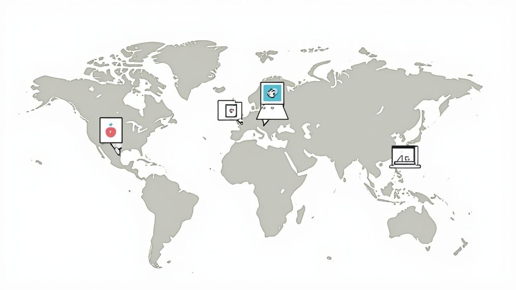
Getting your app launched is a huge milestone, but it is really just the starting line. If you want real, sustainable growth, you have to think globally. Your app store previews are your single most powerful tool for connecting with users in different countries, and sticking with a one size fits all approach will kill your international potential before it even starts.
This is where the pros separate themselves. It is about moving beyond a single, great set of English language previews. You have to understand that what hooks a user in San Francisco might completely miss the mark with someone in Seoul or São Paulo. Cultural cues, language, and even how colors are perceived can make or break your conversion rates.
Unlocking Conversions with A/B Testing
Stop guessing what works. You need to test. A/B testing, known as Product Page Optimization on the App Store and Store Listing Experiments on Google Play, is the only real way to discover what actually drives downloads. It lets you pit different versions of your creative assets against each other to see which one comes out on top.
You can and should test just about every element of your previews.
- Video Thumbnails: Does a poster frame showing a character get more plays than one showing action packed gameplay? That first frame is everything.
- Screenshot Styles: Do panoramic screenshots that create a continuous story outperform individual, feature focused cards?
- Messaging and Captions: Does a direct call to action like "Manage Your Budget" convert better than a benefit focused one like "Reach Your Financial Goals"?
By running these controlled experiments, you swap out assumptions for cold, hard data. This is not a one and done thing; it is an iterative process that helps you constantly sharpen your previews to maximize their impact in every single market.
A Practical Workflow for Visual Localization
Real localization goes way deeper than just translating your captions. It is about adapting your entire visual narrative to feel native to a new market. A user should land on your page and feel like the app was made just for them.
Localization is not just a task you check off at the end of a project; it is a core part of your growth strategy. I have seen teams boost conversion rates by over 25% in certain markets just by adapting their visuals for cultural relevance.
Think about a food delivery app. If you are localizing for Japan, your screenshots better not be filled with pizza and burgers. Showcasing ramen and sushi is a no brainer. In the same way, a social media app would need to change the user profile pictures in its mockups to reflect the local population. These small details build instant trust and rapport.
Streamlining Global Growth with Automation
Now, imagine trying to manually create and manage localized screenshot sets for dozens of languages. It is a logistical nightmare. It’s slow, wildly expensive, and just begging for human error. This is exactly where automation tools become a game changer for any team that is serious about going international.
Using a platform like ScreenshotWhale, you can build an incredibly powerful and efficient workflow. You start by creating a master template that nails your core brand identity. Once that’s locked in, the AI powered internationalization engine can handle the heavy lifting.
Let's say you need to launch your app in 15 new languages. Instead of cracking open a design tool 15 different times, you just run the automation. The editor will:
- Instantly Translate Captions: All your benefit driven text gets translated into each target language with surprising accuracy.
- Adjust Layouts on the Fly: The tool automatically reflows text to handle different character lengths, so you do not get those ugly line breaks or text overflowing its container.
- Generate Full Asset Sets: In just a few minutes, you can have complete, perfectly formatted screenshot sets for every required device size, ready to upload for each new language.
For a fitness app team, this is huge. They can use a vibrant, energetic template designed in the editor. To prep for a launch in Germany, they just select "German." The tool spits out a full set of previews with translated captions like "Erreiche deine Fitnessziele." They can then swap a few images to be more culturally on point and have a complete, localized set ready to go in under an hour.
This kind of process unlocks massive international potential with a fraction of the effort, turning a complex headache into a simple, repeatable win.
Common Questions About App Store Previews
Jumping into the world of app store previews always kicks up a few questions. Getting straight answers is key to sharpening your strategy and steering clear of the common mistakes that can really stall your growth. Here are some of the most frequent questions I hear from developers and marketers.
Can I Update My App Store Previews After Launch?
Yes, you absolutely can, and you should. Anytime you ship a major new feature, overhaul your UI, or even run a seasonal campaign, it’s a perfect opportunity to update your app store previews. Keeping your visuals fresh is not just for looks; it signals to potential users that your app is actively maintained and evolving.
Think of it like remodeling your digital storefront. Regularly updated previews tell both users and the app store algorithms that your app is current and relevant, reflecting your latest and greatest work.
What Happens If My Previews Get Rejected?
A rejection can sting, but it is rarely a dead end. Both Apple and Google will give you a reason, and that’s your first clue for a fix. Usually, it is a straightforward violation of their guidelines.
Some of the most common reasons for rejection I have seen are:
- Showing copyrighted music or imagery you do not have the rights to use.
- Displaying real personal info (like a phone number or email) instead of placeholder data.
- Misrepresenting what your app can do or showing features that are not actually live yet.
Once you know the problem, just correct it in your video or screenshots and resubmit. If you are using a tool like a site editor to generate your assets, this can be a surprisingly quick fix, often just a matter of tweaking a single frame and hitting regenerate.
A rejection is just a learning opportunity. It forces you to get familiar with the platform's rules, which leads to much smoother submissions down the road. Do not get discouraged; see it as a chance to perfect your presentation.
Should I Use a Video or Just Screenshots?
Honestly, the best strategy is to use both. They serve different purposes and appeal to different user behaviors. A video is fantastic for telling a story and showing off dynamic features, like fast paced gameplay or a slick, multi step workflow. It builds an emotional connection by showing your app in action.
But let's be real: many users just want a quick overview. They prefer to swipe through static screenshots to get the gist of your app's value in a few seconds. Screenshots are scannable and let people digest information at their own pace.
A winning approach almost always involves leading with an engaging App Store Preview video, then following it up with a gallery of benefit driven screenshots that hammer home your key message. This one two punch caters to both the patient viewer and the quick scanner, giving you the best shot at earning that install.
Ready to create stunning, high converting visuals for your app in minutes? With ScreenshotWhale, you can use professionally designed templates and a simple drag and drop editor to produce perfect app store previews for every device. Start creating for free today at https://screenshotwhale.com.