A Practical Guide to ASO AB Test Strategy for App Growth
Master the ASO AB test with our end-to-end guide. Learn to design, run, and analyze tests on iOS and Android to boost app conversions and installs.
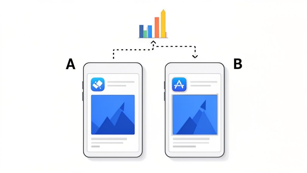
At its heart, an ASO A/B test is a straightforward experiment. You show one version of your app store page (the "control") to one group of users, and a second, slightly different version (the "variant") to another. The goal is to see which one gets more people to tap that install button.
It is all about swapping guesswork for real user data. This is how you make informed decisions that actually move the needle on downloads and boost app store growth.
What an ASO AB Test Is and Why It Drives Growth
This process is the bedrock of serious app store growth. Instead of just thinking you know which icon color or screenshot caption works best, you let your users show you with their actions. Getting this concept right is the first real step toward building a winning App Store Optimization strategy. If you're new to the term, we have a guide that breaks down what https://screenshotwhale.com/blog/aso-stands-for and how it all fits together.
The Power of Incremental Gains
The real magic of ASO testing is not about hitting a home run on your first try. It is about the small, steady improvements that add up over time. Even a tiny lift in your conversion rate from one successful test can mean thousands of extra downloads over the course of a year, especially if your app gets decent traffic.
Don't underestimate the impact of consistent testing. In the cutthroat world of app marketing, companies running 10 or more A/B tests per month see 2.1 times faster growth than those who test less. Redesigning the layout of visual assets has yielded some of the biggest wins, boosting conversion rates by 18% to 40%.
The data sends a clear message: frequent testing is not just a "nice-to-have," it's a growth multiplier. Every test, win or lose, hands you valuable insights that shape your next experiment, your product roadmap, and even your broader marketing strategy.
What Can You Actually Test?
Pretty much every piece of your app store listing is fair game for an A/B test. The key is to isolate one variable at a time so you can be sure what is causing the change in user behavior.
Here is a quick look at the most common and impactful elements you can put to the test.
Key Elements to Test in Your App Store Listing
| Test Element | What to Test | Potential Impact |
|---|---|---|
| App Icon | Colors, characters, styles, borders | Grabs attention in crowded search results and browse lists. A strong icon is your first impression. |
| Screenshots | Layouts, captions, background colors, feature callouts, lifestyle vs. UI-focused | Tells your app's story visually. The right screenshots can dramatically improve understanding and desire. |
| App Preview Video | Thumbnail poster, video vs. static images, video length and content | Can demonstrate your app's value in a dynamic way, but a bad one can hurt conversions. |
| Title & Subtitle | Keywords, value propositions, taglines | Affects both search visibility (ASO) and user appeal. A clear title can make all the difference. |
Each element plays a unique role in convincing a potential user to download your app. By systematically testing them, you can fine-tune your entire conversion funnel for maximum growth.
This is very similar to the principles behind actionable CRO strategies in the web world. And that is where tools like ScreenshotWhale come in. They are built to make this whole process faster, letting you generate high-converting creative variations in minutes so you can get your tests live and learning.
How to Design a Powerful ASO Test Hypothesis
Every good ASO test starts with a solid hypothesis. Without one, you are just guessing, throwing different creatives at the wall and hoping something sticks. That is a surefire way to waste time and end up with muddy, inconclusive results.
A real hypothesis is not just a vague idea like "make the screenshots look better." It is an educated guess that clearly connects a specific change to a measurable outcome. I like to frame it this way: "If we change X, then Y will happen, because of Z."
From Idea to Testable Hypothesis
Let's walk through a real-world example. Say you have a hunch your screenshots feel a bit flat and are not grabbing users' attention. The initial idea might be simple: "Let's use brighter colors."
That is a starting point, but it's not a testable hypothesis. We need to get more specific.
- The Change (X): Swap the sterile, solid-color backgrounds in our screenshots for vibrant, lifestyle images of people actually using the app.
- The Expected Outcome (Y): Increase our conversion rate (installs per product page view).
- The Rationale (Z): We believe potential users will connect more with aspirational lifestyle photos, helping them visualize how our app fits into their own lives.
Now, let's put it all together into a proper hypothesis: "If we replace our screenshots' solid-color backgrounds with vibrant lifestyle photos, then our conversion rate will increase because users will find the visuals more engaging and relatable."
See the difference? Now you have a clear, focused experiment to run. This is a classic ASO A/B test that isolates a single, impactful variable. You are only changing the background, not the captions, the device frames, or the UI in the mockups. That isolation is critical. If you changed the background and the captions and saw a conversion lift, you would have no idea which change actually moved the needle.
Defining Your Key Performance Indicators
Your hypothesis has to be tied to a specific metric, or Key Performance Indicator (KPI). This is how you will know, objectively, if you were right. For most visual asset tests on your product page, the king of all KPIs is the conversion rate (CVR).
The conversion rate is the percentage of people who install your app after landing on your product page. A statistically significant lift here is the holy grail for most ASO tests.
While CVR is usually the main goal, a few other KPIs are worth keeping an eye on:
- Tap-Through Rate (TTR): This is more for pre-tap assets like your app icon. It tells you how many people who see your app in search results or feature placements actually tap to view your page.
- Install Velocity: This is simply the number of installs you get over a set period. A winning test should naturally boost this, but CVR tells you why it's happening.
Nailing down these KPIs before you start ensures your ASO A/B test is built to deliver clear, actionable data that you can actually use to grow your app.
Tools like the ScreenshotWhale editor are built for this kind of rapid iteration. You can generate multiple visual styles in minutes, letting you quickly create the different variations your hypothesis calls for.
An interface like this lets you easily toggle between different device mockups, backgrounds, and layouts. For our hypothesis, you could upload your app's UI, select a vibrant lifestyle background from a library, and generate a full set of high-converting screenshots in under a minute. It is perfect for testing your visual presentation without getting bogged down in tedious design work, so you can spend more time on strategy and analysis.
We Have a Hypothesis. Now Comes the Fun Part: Creating Screenshot Variations
With a solid hypothesis in hand, it is time for the creative work to begin. Designing screenshot variations is about so much more than making things look pretty. Think of it as a strategic exercise in visual storytelling. Your mission? Tell your app's story so effectively that a user feels an undeniable urge to tap "Install."
Every single variation you build is a visual argument for why your app deserves a spot on their phone. This is your chance to test different angles, from bold, punchy captions to slick, panoramic layouts, and see what truly grabs your audience.
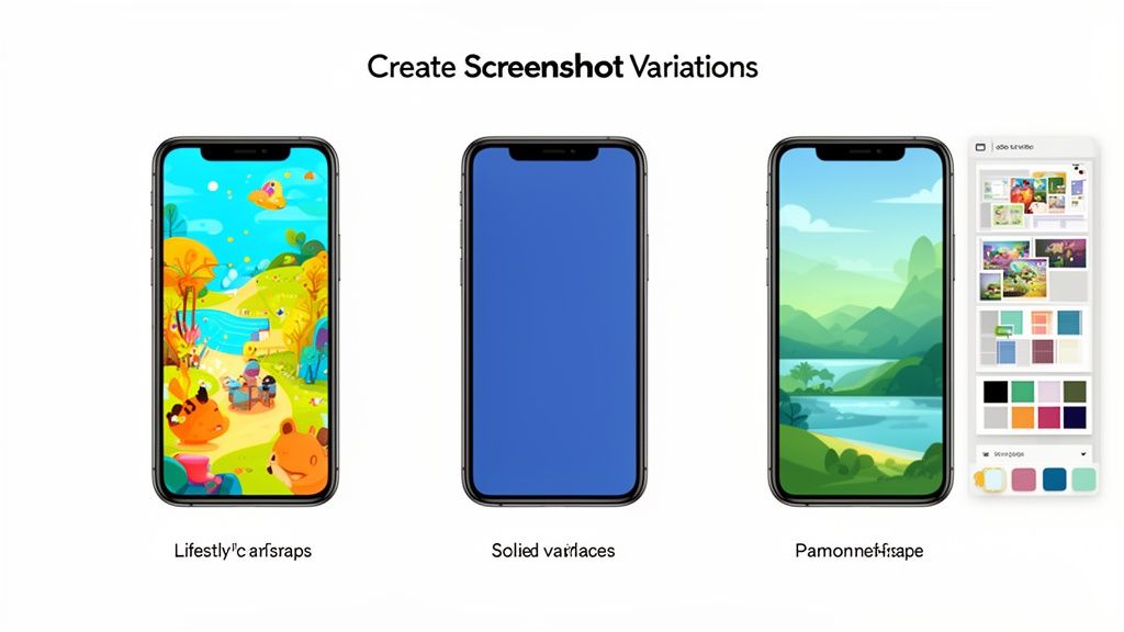
Testing Different Screenshot Layouts
The layout of your screenshots plays a massive role in shaping a user's first impression. Are you guiding them through a linear narrative, or are you showcasing a buffet of features? There are a few styles to play with, each with its own advantages.
- Individual Frames: This is the classic, straightforward approach. Each screenshot stands on its own, which is perfect for shining a spotlight on distinct features one by one. You give each key benefit its own stage.
- Panoramic Layout: This style stitches multiple screenshots together into one seamless, continuous image. As users swipe, they are taken on an immersive journey. It is fantastic for walking someone through a core workflow or telling a cohesive story about your app.
The right choice really boils down to your hypothesis. If you believe a guided tour of your app's main user journey will be more persuasive, the panoramic layout is your best bet. If you think a rapid-fire showcase of powerful, distinct features will win them over, stick with individual frames.
The Power of Captions and Value Props
Your captions are your headlines. They need to be short, sharp, and laser-focused on the benefits. An A/B test is the absolute best way to figure out which messages hit home and drive action.
Try experimenting with a few different angles for your captions:
- Benefit-Oriented: Instead of "Order Groceries," try "Save Time on Groceries." Always frame it around what the user gets.
- Feature-Focused: Sometimes, being direct is best. "Track Your Daily Steps" is clear and leaves no room for confusion.
- Social Proof: Leverage the crowd with captions like, "Join 5 Million Happy Users." It builds instant trust.
The real goal here is to move beyond simply describing what is on the screen. A button is just a button. Your caption needs to articulate the value that button delivers. Nail the synergy between a compelling visual and a powerful caption, and you will see your conversion rates climb. For more ideas, check out our guide on creating an effective app store image.
Making Variation Creation Effortless
Manually creating dozens of screenshot variations is a soul-crushing time-sink. This is exactly where a purpose-built tool like ScreenshotWhale becomes your secret weapon. Picture a drag-and-drop editor where you can instantly drop your app's UI into professionally designed, conversion-optimized templates.
Instead of wrestling with design software for hours, you can just:
- Pick a Template: Grab a layout that aligns with your test hypothesis. For example, choose a vibrant, panoramic template for a storytelling test.
- Customize in Seconds: Upload your UI, tweak the background colors with a single click, and adjust the fonts to match your brand perfectly.
- Generate Variations Instantly: With just a few clicks, you can spin up an entirely new set of high-converting screenshots. Maybe with a different device mockup, a new color palette, or rephrased captions, ready to go for your A/B test.
This kind of speed means you can run more experiments, learn faster, and implement winning designs without getting bogged down in production. Your focus shifts from tedious pixel-pushing to high-impact strategic testing to boost app store conversions.
Testing on-brand visuals that highlight features and benefits is crucial. Recent marketing research shows that the primary objectives of A/B testing programs are to optimize campaigns (56%), enhance user experience (54%), and improve conversion rates (53%), all of which align perfectly with screenshot optimization. You can discover more insights about A/B testing effectiveness from this 2025 marketing research.
By using a tool designed specifically for this job, you are streamlining the most time-intensive part of the ASO A/B test process. This frees you up to concentrate on what really moves the needle: analyzing the results and making data-driven decisions that fuel your app's growth.
Alright, you have got your hypothesis locked in and your creative assets are looking sharp. Now for the fun part: launching the experiment.
But here is where things get platform-specific. Setting up an ASO A/B test on the Google Play Store is a whole different ballgame than doing it on the Apple App Store. The goal is the same, find what converts best, but the tools, rules, and little quirks are unique to each.
Let's walk through the nuts and bolts of launching on both Google Play and Apple so you can get your tests live and start pulling in that sweet, sweet user data.
Setting Up a Google Play Store Listing Experiment
Google gives us a fantastic, built-in tool called Store Listing Experiments. It is powerful, flexible, and lets you test pretty much every part of your product page: icon, screenshots, descriptions, you name it. Best of all, it is integrated right into the Google Play Console.
To kick things off, just head to your app in the Play Console and find the "Store listing experiments" section. When you create a new experiment, you will need to define a few key things.
- Test Goal: You can aim to improve first-time installers or retained installers (users who stick around for at least a day). For most of your visual ASO tests, first-time installers is the metric you will want to watch.
- Variants: You can test up to three different variations against your current live version. This means you can run an A/B/C/D test, which can seriously speed up your learning if your app gets enough traffic.
- Traffic Split: You control what percentage of your store visitors see the test. A 50% split is a common starting point, sending half your traffic to the control and the other half to your variants.
- Assets: This is where you upload your new icon, feature graphic, screenshots, or video. You can also test changes to your short and long descriptions here.
One of the biggest wins for Google Play Experiments is its flexibility. There is no ticking clock, so you can let your test run until it hits statistical significance, which Google calculates for you. I always recommend aiming for at least 90% confidence before you call a winner and roll out the changes.
Launching an Apple Product Page Optimization Test
Over on the iOS side, the native testing tool is called Product Page Optimization (PPO). You'll find it inside App Store Connect, and it lets you test your creative assets: the app icon, screenshots, and app preview videos. A key limitation here is that you cannot test text elements like your app name or subtitle with PPO.
Getting a PPO test up and running has a few specific steps and constraints you need to know about.
First, you will create a "treatment," which is just Apple's lingo for a variant. You can have up to three treatments running against your original product page at once.
Next, you'll upload your new icon, screenshots, or videos for each treatment. From there, you'll decide on your traffic allocation. For example, you might keep 70% of traffic on your original page and send 15% to each of your two new treatments to start.
The big catch with Apple’s PPO is the 90-day time limit. After 90 days, the test automatically stops, period. This means you have to be confident your app gets enough traffic to reach significance within that window. For apps with lower traffic, this makes careful planning absolutely critical.
When it's time to check the results, you'll be looking at the confidence level and the "improvement" (or lift) in conversion rate that Apple provides. They give you a confidence interval, which is super helpful for understanding the potential range of outcomes.
If you're looking to add more power to your optimization stack, we've put together a guide on the best app store optimization tools that work great alongside these native platforms.
Google Play Experiments vs Apple Product Page Optimization
Knowing the core differences between Google's and Apple's testing platforms is essential for a smart ASO strategy. They might seem similar on the surface, but the details matter.
Here is a quick breakdown of how they stack up against each other.
| Feature | Google Play Experiments | Apple Product Page Optimization (PPO) |
|---|---|---|
| Testable Assets | Icon, screenshots, video, feature graphic, descriptions | Icon, screenshots, app preview video |
| Test Duration | No time limit; run until significance is reached | Maximum of 90 days per test |
| Variants Allowed | Up to 3 variants (plus original) | Up to 3 treatments (plus original) |
| Localization | Can run experiments for specific languages | Can run localized tests for different storefronts |
| Reporting | Provides installs and conversion data with confidence levels | Reports impressions, conversions, and improvement with a confidence interval |
Once you get the hang of setting up tests on both platforms, you can create a powerful, continuous cycle of testing and learning. Every ASO A/B test you run, win or lose, gives you valuable insights that will compound over time, driving real, sustained growth for your app.
Alright, the test is done and the data is rolling in. Now comes the fun part: figuring out what it all means. This is where you switch from creative mode to analyst mode, translating numbers into smart decisions that actually move the needle on your app's growth.
The whole point here is to determine if the changes you made really caused a lift, or if it was just random noise. This is where things like statistical significance and confidence intervals become your best friends, making sure you are not just chasing ghosts in the data.
This entire process is a loop. You design, you test, you analyze, and what you learn from the analysis feeds right back into the next design. It never really ends.
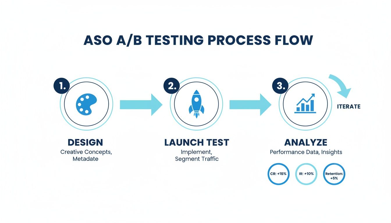
Analysis is not the finish line; it is the bridge to your next great idea. It is all about continuous improvement.
Interpreting Your Test Results
When you pop open your results dashboard, whether in Google Play Experiments or Apple's Product Page Optimization, you will see a few key numbers. The big one is the conversion rate (CVR) lift. This tells you exactly how much better, or worse, your new version performed against the original.
Both platforms also give you a confidence level, usually somewhere between 90% and 95%. Think of this as the platform’s "certainty score." A 95% confidence level means there is only a 5% chance that the results you're seeing are a fluke.
A huge piece of advice: resist the temptation to call a test early. It is so common to see a variant jump out to an early lead, only for the numbers to even out over a full week. Always wait until the platform confirms you have hit statistical significance before making a decision.
Getting this right matters. A shocking 43% of tests fail simply because they do not have a large enough sample size. On the flip side, well-executed visual optimizations, like tweaking screenshots, have been shown to boost mobile conversions by 26%. That is a massive number, especially when you consider that 88% of users will ditch an app after one bad experience. If you want to dive deeper into these kinds of stats, the 2025 findings on gostellar.app are a great resource.
When You Have a Clear Winner
Getting a clear winner is the best possible outcome. This is when one of your variations delivers a statistically significant CVR lift at a high confidence level (think 95% or more).
When that happens, the path forward is pretty clear:
- Roll out the winner. Don't let a great result gather dust. Push the winning creative live to 100% of your audience and start reaping the benefits.
- Document everything. Seriously, write it all down: the original hypothesis, the control and variant designs, the final numbers (lift, confidence), and any other observations. This becomes your team's playbook for future tests.
- Plan the next test. A win is not an endpoint; it's a breadcrumb. Why did it win? Was it the brighter color? The clearer call-to-action in the caption? Use that insight to build your next hypothesis and keep the momentum going.
Handling Inconclusive Results
Sometimes, a test just fizzles out. The results are flat, or the confidence level is too low to be sure. This is not a failure, it is just data. An inconclusive result is still a learning opportunity.
It might be telling you one of a few things:
- Your change was too subtle to make a difference.
- Your hypothesis was off; users just don't care about that particular element.
- The two versions performed so similarly that either one is fine.
Don't sweat it. Document what happened and use it as a reason to be bolder next time. If a tiny caption change did not work, maybe it is time to test a completely new screenshot philosophy or a radically different icon.
Scaling Your Wins with Localization
Once you find a design that converts well in one market, you are sitting on a goldmine. The obvious next step is to take that success global. But true localization is way more than just translating your captions. You have to adapt your winning creative to fit the cultural nuances and visual tastes of each new market.
This is where a tool like ScreenshotWhale can be a game-changer. Once you have a proven, high-performing screenshot template, its internationalization engine lets you duplicate that design across dozens of languages in minutes.
Think about it. You have a layout you know works. Instead of your design team slogging through 20 manual versions for each language, you can generate them all automatically. This is how you scale your ASO AB test wins efficiently, ensuring your app store page is optimized for every single region without burning out your team.
Even after you have nailed down a solid strategy, ASO A/B testing always brings up a few practical questions. Getting these right is often the difference between a successful, data-driven program and a bunch of frustrating, inconclusive experiments.
Let’s get into some of the most common questions I hear from developers and marketers.
How Long Should I Run an ASO AB Test?
The sweet spot is usually somewhere between seven and 14 days. You absolutely want to run a test for at least one full week. This captures user behavior across both weekdays and weekends, which can be surprisingly different.
But the real goal is not just about time, it is about reaching statistical significance. Both Google's and Apple's platforms will let you know when enough data is in to declare a winner with a certain confidence level, like 90% or 95%. Whatever you do, don't stop a test early, even if one version is rocketing ahead. Results can and do fluctuate.
On the flip side, running a test for too long can expose it to outside noise like seasonal trends or marketing campaigns that might muddy the waters.
What Is a Good Conversion Lift to Expect?
Honestly, this varies a lot by app category and how mature your app is. But for a solid screenshot test, a lift of 5% to 25% is a realistic and fantastic outcome. Anything in the double digits is a massive win you should be celebrating.
It is crucial to keep your expectations in check, though. Not every test will be a home run. Many will bring small gains, and some will be totally inconclusive. The magic is in consistency. A bunch of small wins, stacked up over time, is what leads to real, sustainable growth.
Can I Test More Than One Thing at a Time?
This is a big one. For a standard A/B test, you should only ever change one thing at a time. Just the screenshot captions. Just the background color. That is it. This discipline is what allows you to pinpoint the exact reason for any change in performance. If you change both the icon and the screenshots, you'll never know which one actually moved the needle.
Now, some platforms do support multivariate testing, which is designed for testing multiple changes at once. But that is a more advanced game. It is way more complex and demands a ton of traffic to get reliable results. For most teams just getting their feet wet, sticking to single-variable A/B tests is the smartest path to clear, actionable insights.
Key Takeaway: Isolate your variables. The goal of an ASO A/B test is not just to find a winner, but to understand why it won. Testing one change at a time gives you that crucial insight, allowing you to build on your learnings for future experiments.
What Are Common ASO AB Test Mistakes to Avoid?
I have seen a few common mistakes that can completely torpedo your results and waste a ton of time. Just knowing what they are is half the battle.
- No clear hypothesis: If you do not start with a specific, testable "if-then-because" statement, you are just throwing stuff at the wall to see what sticks.
- Ending the test too early: It is tempting, I know. But never, ever stop a test before it hits statistical significance.
- Testing too many things at once: The classic mistake. It just muddies your data and makes it impossible to learn anything concrete.
- Ignoring the outside world: A big holiday, a major marketing push, or a new feature launch can all mess with user behavior and skew your results. Be mindful of context.
- Forgetting to document your learnings: If you do not record what you learned (win or lose), you cannot build on it. You are just starting from scratch every single time.
Ready to create stunning, high-converting screenshot variations for your next ASO test in minutes? With ScreenshotWhale, you can use professionally designed templates and a simple drag-and-drop editor to produce on-brand visuals that drive installs. Start creating for free at https://screenshotwhale.com.