A Complete Guide to ASO for Google Play
Master ASO for Google Play with this complete guide. Learn how to optimize your app's metadata, design high-converting visuals, and drive sustainable growth.
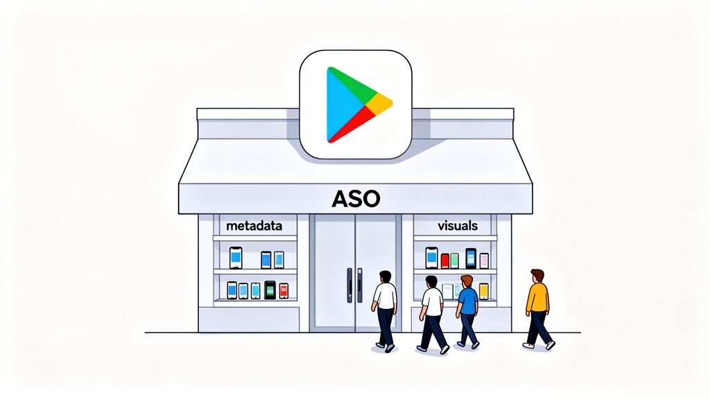
App Store Optimization (ASO) for Google Play is all about getting your app seen and downloaded. It’s the process of fine-tuning all the text and visual pieces of your store listing to climb the search rankings and, just as importantly, convince people to hit that install button. A smart ASO for Google Play strategy is what turns window shoppers into loyal users, directly boosting app store growth.
What ASO for Google Play Really Means for Growth
Picture the Google Play Store as a giant, sprawling mall with over 2.8 million other stores. In that kind of environment, ASO is your secret weapon for making your storefront pop. This isn't just "SEO for apps". It's a specific discipline that has a direct line to how many people find, click on, and download your app.
A solid ASO plan makes sure your app is the one that shows up when someone searches for what you do. Without it, even a groundbreaking app can end up buried, completely invisible to the people it was built for. Having a great product is only half the battle; people have to be able to find it first.
The Google Play Difference
While the core ideas of ASO are the same for both Apple and Google, their algorithms are not. This is a crucial distinction, and ignoring it is a common mistake that will absolutely stunt your growth on Android.
Google, with its search engine DNA, puts a huge emphasis on text relevance across your entire store listing. That long description isn’t just filler for the curious few who read everything. It’s a goldmine of keywords that Google’s algorithm scans to figure out what your app is all about.
A dedicated Google Play strategy is non-negotiable for success. The algorithm uniquely values elements like your long description and user engagement signals, rewarding apps that align with its specific ranking factors.
Your App as a Retail Store
Let’s stick with that mall analogy for a second. Imagine your app is a brand new shop setting up in that massive complex.
- Your Metadata (Title, Descriptions): Think of this as your store's main sign. A clear, catchy sign that includes the right keywords (like "Freshly Roasted Coffee" instead of just "Joe's") tells shoppers exactly what you've got and helps them find you in the first place.
- Your Visual Assets (Icon, Screenshots): This is your window display. Eye catching, professional visuals are what make people stop as they're walking by. They show off your best products and give people a taste of the experience, tempting them to come inside.
Just like a real store, you need both. Great signage gets people to your front door (your app page), but a compelling window display is what convinces them to walk inside (hit "Install"). A winning ASO strategy makes sure these two parts work together perfectly, turning casual browsers into happy customers and driving real, sustainable app store growth.
Writing Text That Actually Converts Clicks to Installs
The text on your app's store page is a direct conversation with two very different audiences: Google's algorithm and your potential users. Think of your app title, short description, and long description as your core sales tools. Each one has a specific job to do. Grabbing attention, showing value, and ultimately, convincing someone to hit that install button.
Getting these text assets right is a fundamental part of ASO for Google Play. Let's break down how to tune each one for the biggest impact on your conversions.
Crafting a High-Impact App Title
When it comes to Google’s ranking algorithm, the app title carries the most weight. You only get 30 characters, so every single one has to count. The game here is to cleverly blend your brand name with a high volume, super relevant keyword people are actually searching for.
For instance, if you have a meditation app named "Serene," a title like "Serene: Guided Meditation" works wonders. It captures people searching for your brand directly, but also snags traffic from users just looking for a meditation app. That simple addition tells Google exactly what your app is about, boosting its odds of showing up in the right searches.
A simple formula that works is:
- Brand Name: Keep your unique identity right at the front.
- Primary Keyword: Tack on a descriptive keyword that nails your app's main function.
This balance makes sure existing fans can find you, while opening the door to a much wider audience who needs what you're offering.
The Short Description: Your 80-Character Hook
The short description is your elevator pitch, plain and simple. It’s the very first bit of descriptive text a user sees, sitting just below your screenshots. You have a mere 80 characters to throw a powerful hook that makes someone stop scrolling and want to learn more.
While Google's algorithm does give the short description a look, its main job is to crank up your conversion rate. Your focus should be on communicating your app's biggest benefit in a way that's impossible to ignore. Answer the user's immediate question: "What's in it for me?"
The short description isn't just a keyword stuffing spot. It's your first and best chance to convince a user your app is the solution they've been looking for. A strong, benefit focused sentence here can make a huge difference in how many people tap to see your full listing.
For your app to get discovered in the first place, you've got to be focused on optimizing for a good click-through rate from search results to your store page. A killer short description is a huge part of winning that click.
Weaving a Story in the Long Description
Let's be honest: very few users are going to read your entire long description. But it's still absolutely critical for solid Google Play ASO. This is where you get to tell a richer story, answer questions users might have, and most importantly, give Google a deep pool of keywords to index.
Google gives you up to 4,000 characters, and its algorithm combs through every word to figure out your app's context and relevance.
To write a long description that actually works, follow these steps:
- Start Strong. The first few lines are everything. They're what's visible before a user has to tap "read more." Put your most powerful value proposition right here.
- Use Strategic Formatting. Nobody wants to read a giant wall of text. Use short paragraphs, bullet points, and maybe even a few tasteful emojis to make the content scannable.
- Weave Keywords in Naturally. You'll want to repeat your most important keywords 3-5 times throughout the description. The trick is to make it sound like a human wrote it, not a robot. Sprinkle in related, long tail keywords to cast a wider net.
- Highlight Features and Benefits. Make a clear list of what your app does (features) and how that helps the user (benefits). This structure makes your value prop incredibly easy to grasp.
- Include Social Proof. Mention any awards, positive press, or big user numbers (like, "Join over 1 million happy users!"). This stuff builds credibility and trust instantly.
By getting your title, short description, and long description to work together, you create a powerful synergy. The text attracts the algorithm for better visibility and persuades users for higher conversions. That’s the foundation of a winning ASO strategy.
Designing Visuals That Stop the Scroll and Drive Action
If your text is how you talk to Google's algorithm, your visuals are your direct, powerful pitch to actual people. Think about how users browse the Play Store. It's an endless scroll. You have mere seconds to make them stop. Your app icon, feature graphic, and screenshots are your first, and frankly, best chance to grab their attention and get them to take a closer look.
These visuals are the unsung heroes of Google Play ASO. They have to command attention in just 7 seconds to have a shot at an install. With millions of apps all screaming for eyeballs, high converting app store screenshots aren't just a nice to have; they're essential. We’ve seen apps in categories like fitness or dating get a 20-30% lift in installs just from A/B testing their screenshots. Why? Because the right visuals tell a compelling story that instantly clicks with what users are looking for.
Your Icon Is Your Brand's Handshake
Long before a user reads your description or even sees a screenshot, they see your app icon. It’s everywhere: search results, category lists, and eventually, right on their home screen. That tiny square carries a massive responsibility. It needs to be instantly recognizable, look sharp and professional, and give a hint about what your app does, all without a single word.
Think of your icon as your brand's digital handshake. A strong, clean icon builds immediate trust. A cluttered or generic one? It can make your entire app feel amateurish, killing your chances before a user even lands on your page.
Creating a Screenshot Story That Sells
Your screenshots are your most powerful conversion tool on the entire product page. Their job isn't just to show off your UI. It's to tell a visual story that sells the benefits of your app. You're guiding the user on a quick journey that proves your app’s value in a way they can grasp at a glance.
A great set of screenshots will always:
- Showcase Key Features First: Lead with your strongest, most compelling features. Most users won't swipe past the first two or three screenshots, so make them count.
- Use Benefit-Driven Captions: Don't just label a feature. Explain what it does for the user. Instead of "Task Manager," try "Organize Your Day in Seconds." See the difference?
- Weave in Social Proof: If you have impressive user numbers or awards, bake them into your visuals. A caption like "Join 1 Million Happy Users" builds instant credibility.
- Maintain Brand Consistency: Stick to your brand's colors, fonts, and overall vibe. This creates a cohesive, professional look that builds trust.
Your screenshots should feel like a mini onboarding experience. They need to answer the user's core question "How will this app make my life better?" and build enough excitement to get them to hit that install button.
The flowchart below illustrates how different text elements build on each other, but the same idea applies to your visuals. Your icon grabs their eye, and the screenshots pull them in with compelling details.
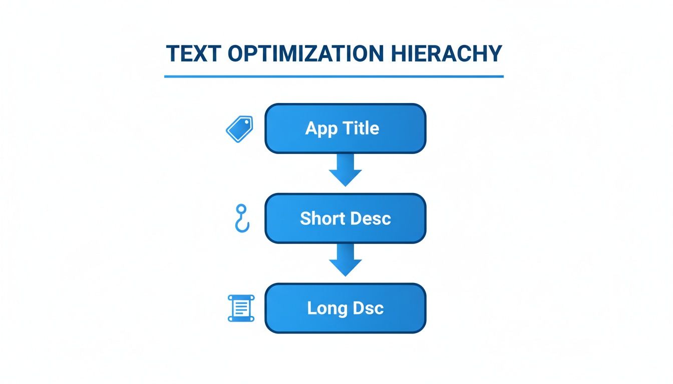
Just like a great title hooks a reader, your icon and first screenshot have to hook the user visually before they'll even consider the finer details.
The Power of Platform-Specific Mockups
One of the most jarring mistakes developers make is using iPhone mockups in their Google Play Store listing. It immediately signals to an Android user that your app is an afterthought, creating a subtle but powerful sense of distrust. You have to use Android specific device mockups, like a Google Pixel or Samsung Galaxy, to make your app feel native and at home.
This is where having the right tools makes a world of difference. For instance, an editor like ScreenshotWhale's has a library of the latest Android device frames ready to go. You can just drag your app screens into these mockups, add vibrant backgrounds, and write punchy captions in a few clicks. This workflow simplifies the whole process of creating efficient and high converting Google Play Store screenshots and guarantees you’re meeting all the technical and stylistic best practices for both Android and iOS stores.
Scaling Your Visuals for a Global Audience
If you're launching your app in multiple countries, localizing your visuals is a huge lever for growth. This is more than just translating text. It's about culturally adapting your screenshots to resonate with different audiences. But manually creating unique screenshot sets for dozens of languages is a nightmare. It's slow, tedious, and expensive.
This is another spot where modern tools can completely change your ASO for Google Play strategy. For example, ScreenshotWhale's AI translation feature can take your English captions and instantly convert them into over 100 languages. The editor then automatically resizes fonts and adjusts layouts to fit the new text perfectly. This lets you generate fully localized screenshot sets for global markets in minutes, not weeks, letting you scale your reach without a massive design team.
For a quick cheatsheet, here are the core specs you need to keep in mind for your visual assets.
Google Play Visual Asset Requirements
Getting the technical details right is non-negotiable. This table provides a quick reference for the specs of your key visual assets to ensure they look great and get approved without a hitch.
| Asset Type | Required Dimensions (pixels) | Format | Key Best Practice |
|---|---|---|---|
| App Icon | 512 x 512 | 32-bit PNG | Keep it simple, recognizable, and text-free. |
| Feature Graphic | 1024 x 500 | JPEG or 24-bit PNG | Make it bold and eye catching; it's your storefront banner. |
| Screenshots | Min 320, Max 3840 (16:9 or 9:16) | JPEG or 24-bit PNG | Focus on benefits, not just features. Use captions. |
| Promo Video | No specific dimensions (YouTube URL) | YouTube Video | Optional, but a short, punchy video can boost conversions. |
Sticking to these guidelines ensures your app looks professional and avoids any submission rejections, letting you focus on the creative strategy that drives installs.
Using Data to Optimize Your Store Listing
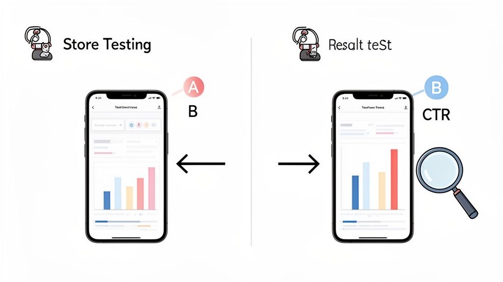
Stop guessing what works and start knowing. The most effective ASO for Google Play strategies are built on solid data, not just gut feelings. This is where Google’s built-in Store Listing Experiments feature becomes your secret weapon, letting you A/B test your creative assets and text to see what actually drives installs.
If you want sustainable growth, you have to adopt a mindset of continuous testing and improvement. Every experiment you run gives you hard evidence, helping you make confident, impactful decisions that directly boost your app's conversion rate over time.
Setting Up Your First Experiment
Getting started with A/B testing in the Google Play Console is way more straightforward than you might think. The real key is to start with a clear, simple hypothesis. A good hypothesis isn't a vague idea. It's a specific, testable statement about a change you think will improve performance.
For instance, a great starting point could be: "Changing our screenshot captions from a list of features to a list of benefits will increase our install rate by 5%." See? It’s specific, measurable, and focuses on just one thing.
A few other strong ideas for your first tests:
- Icon: Test a bold, simplified design against your current, more detailed icon. Which one grabs more attention in a crowded search result?
- Feature Graphic: Compare a graphic that includes text against a purely illustrative design. Which one communicates your app's value proposition faster?
- Screenshots: Pit a set of screenshots with bright, vibrant backgrounds against a version with a clean, minimalist design.
How to Run an Effective A/B Test
Once you’ve got your hypothesis, the process is pretty simple. Inside the Google Play Console, just head over to the Store listing experiments section to get your test set up. You’ll create a "variant" version of whatever you're testing and run it against your current "control" version.
Here’s a quick step by step:
- Choose Your Element: Decide if you're testing your icon, feature graphic, screenshots, or descriptions. The golden rule? Only test one element at a time to get clean, reliable data.
- Create Your Variant: Upload your new creative asset or type in your new text. This is the challenger going up against your current listing.
- Set Your Audience: Google lets you run the experiment on up to 50% of your store listing visitors. For most tests, this 50/50 split is exactly what you want.
- Launch and Wait: Kick off the experiment and let it run. Google recommends giving it at least seven days to gather enough data for a statistically significant result.
A/B testing transforms your ASO strategy from an art into a science. It rips out the guesswork, letting you systematically figure out which visuals and words truly connect with your audience and get them to hit that install button.
Interpreting Your Results for Growth
After your experiment wraps up, the Play Console serves up a report showing which version came out on top. It gives you data on first time installers and retained installers, so you get a clear picture of the impact. The system will even tell you if a variant is "performing better," "performing worse," or if it was a tie.
If your variant wins, congrats! You can now confidently roll that change out to 100% of your audience. If the original wins or the results are inconclusive, that’s still incredibly valuable information. It means your hypothesis was wrong, and you can move on to the next idea without wasting more time.
This cycle of hypothesizing, testing, and analyzing is the engine of data driven ASO. Many powerful tools can also help you track performance and dream up new test ideas. You can learn more about the best app store optimization tools to find platforms that fit your workflow.
Every test, win or lose, teaches you something new about your users and gets you one step closer to a perfectly optimized store listing.
Of course, what you see on your store listing page, the text and the visuals, is only half the story. To really nail ASO for Google Play, you have to look beyond the surface at what Google calls "off page" factors. Think of it like your app's real world reputation. Google is listening, and it cares deeply about user sentiment and technical stability.
A stream of positive ratings and glowing reviews is like a chorus of happy customers telling Google, "This app is great!" On the flip side, a buggy, crash prone app sends the opposite signal, and Google will drop your visibility in a heartbeat.
The Power of Ratings and Reviews
User feedback is your direct line to what people actually think about your app. And high ratings aren't just a vanity metric. They are a fundamental part of ASO that directly influences your conversion rates and, you guessed it, your rank.
Let's be honest, how many of us download an app without checking the reviews first? That average star rating is one of the first things a potential user sees. An app sitting at a 4.7 star rating just feels more credible and trustworthy than one languishing at 3.2. Google's algorithm knows this and rewards apps that consistently make users happy.
A proactive strategy for managing reviews isn't optional, it's essential. Responding to both the good and the bad shows you're listening. It builds loyalty and can even persuade a frustrated user to give you a second chance and bump up their rating.
It’s always a good idea to gently prompt your happy users for a review. You can trigger an in-app request after they’ve had a good experience, like crushing a new level or finishing a key task. But you also need a plan for handling unfair or fake feedback. Dealing with illegitimate reviews is a critical part of maintaining a healthy rating. You can learn more about effective strategies for removing fake Google reviews that could be dragging your app down.
Why Technical Performance is a Ranking Factor
Beyond what users are saying, Google is also looking under the hood at your app's technical health via Android Vitals. This is raw data from real devices that tells Google if your app is a smooth operator or a buggy mess. A high performing app is a non-negotiable part of good Google Play ASO.
Google's algorithm keeps a close eye on a few key metrics:
- Crash Rate: If your app crashes all the time, it creates a terrible user experience. Google will absolutely demote you for it.
- ANR Rate (Application Not Responding): Nobody likes a frozen app. High ANR rates are a massive red flag to the algorithm.
- Slow Load Times: We live in an impatient world. If your app is slow to open or sluggish to respond, you'll be penalized.
- Battery Usage: Apps that are battery hogs get uninstalled. Fast. Excessive "wake locks" are a particular metric Google watches here.
These aren't just numbers on a dashboard. They are direct signals that feed into your ranking. The Google Play algorithm gives significant weight to user engagement and technical performance. Apps with low uninstall rates and minimal crashes get pushed to the top. Android Vitals data confirms that apps exceeding acceptable crash thresholds see their rankings drop in both search and discovery sections.
At the end of the day, it all connects. A stable, fast, and reliable app creates happier users. Happier users lead to better reviews, higher retention rates, and, ultimately, much stronger rankings.
Your ASO strategy doesn't just stop once you hit "publish." That’s just the starting line. For long term growth, you need to keep expanding your footprint, and two of the most powerful ways to do that are through consistent updates and smart localization.
Think of it as maintaining and expanding a physical storefront. You wouldn't just open the doors and walk away, right? You'd keep the shelves stocked, respond to customers, and maybe even open a new branch in another city. It's the same idea here.
The Power of Consistent Updates
Regularly pushing out updates does more than just fix bugs. It sends a powerful signal to Google’s algorithm that your app is active, cared for, and constantly getting better. This isn't just a nice to have. It's a direct ranking factor that builds trust with both the platform and your users.
In the cutthroat world of the Play Store, frequent updates are a strategic must. Just look at the top apps: 38% of the top 1,000 Android apps get an update at least once a week. A staggering 75% of them are updated monthly. You can dig into the full findings on app update frequency to see how the best are playing the game.
Every update is a fresh chance to tweak your store listing. Did you add a new feature? Update your screenshots to show it off. Did you fix a bug that users complained about in the reviews? Mention it in your "What's New" section. Each small change keeps your listing feeling current and relevant.
Going Global with Smart Localization
If you really want to scale, you have to look beyond your home turf. Localization is your ticket to international growth, but it's so much more than just running your description through a translator. True localization is about cultural adaptation.
Localization isn't about making your app understandable in another language. It's about making it feel native. This cultural adaptation builds trust and can dramatically increase conversion rates in new markets.
This means tailoring everything. Your screenshots, your color choices, even the features you highlight. A benefit that resonates in the US might fall flat in Japan. You have to put yourself in the shoes of the local user and show them why your app is for them. Our guide on how to publish an app on Google Play walks through the entire publishing process, giving you a good sense of all the pieces involved.
Now, manually creating unique, localized assets for dozens of languages sounds like a nightmare, right? It used to be a massive resource drain. This is where automation has completely changed the game. Tools like ScreenshotWhale can use AI to translate your text and generate perfectly formatted screenshots for every language you need, all in a matter of minutes. This kind of efficiency makes a global ASO strategy possible even for a one person team.
Got Questions About Google Play ASO?
Diving into any new strategy brings up questions, and mastering ASO for Google Play is no different. Getting clear answers helps you focus your efforts where they count and sidestep common hurdles. Let's tackle some of the most frequent queries developers and marketers have.
Think of this as your quick reference guide to keep your ASO strategy on track and avoid simple, but costly, mistakes.
How Long Does It Take to See ASO Results?
Patience is a virtue in ASO. It's a marathon, not a sprint. After you push changes to your metadata or visuals, it can take anywhere from a few days to several weeks for Google's algorithm to re-index your listing. Only then will you start to see a noticeable impact on your rankings and downloads.
The key here is consistency. A paid ad campaign stops delivering the moment you turn off the budget, but ASO is different. The benefits compound over time. Each positive change builds on the last, creating a foundation for sustainable, long term growth.
What Are the Biggest ASO Mistakes to Avoid?
It’s surprisingly easy for well intentioned efforts to backfire. I've seen some common mistakes sink otherwise solid strategies time and time again:
- Keyword Stuffing: Jamming keywords into your descriptions is a surefire way to create a terrible user experience. Google is smart enough to spot this, and it can hurt your rankings. Write for humans, not bots.
- Generic Visuals: Using low quality, generic screenshots that don’t show off your app's core value is a huge missed opportunity. Your visuals are your number one conversion tool, treat them that way.
- Ignoring Localization: You wouldn't try to sell a product in France with only English packaging, right? Failing to adapt your store listing for global markets means you're leaving a massive audience on the table.
- Neglecting Feedback: Ignoring user reviews and technical issues like app crashes sends powerful negative signals to Google. They want to promote apps that users love and that work well.
Avoiding these pitfalls is just as important as implementing best practices. A single one of these mistakes can undo weeks of hard work, so always approach your ASO strategy with a focus on both quality and user experience.
Should My Screenshots Be Different for iOS and Android?
Yes, a thousand times yes! You should always tailor your visuals for each store. It’s all about meeting user expectations. Android users expect to see UI and device mockups that feel native to their platform, like a Google Pixel or Samsung Galaxy.
Showing iPhone mockups on your Google Play listing just looks lazy and unprofessional. It can seriously damage your credibility and tank your conversion rate. Using device specific templates makes your app look right at home, building trust and encouraging that all important install.
Ready to create stunning, high-converting screenshots for both Google Play and the App Store? With ScreenshotWhale, you can design professional, on-brand visuals in minutes, not hours. Try our powerful editor and AI-powered localization tools to boost your app's growth today at https://screenshotwhale.com.