Master the Feature Graphic Google Play Requires for App Store Growth
Unlock app store growth with our guide to the feature graphic Google Play requires. Learn design secrets and ASO strategies to boost conversions and downloads.
Your Google Play feature graphic is the movie poster for your app. It's a powerful visual hook designed to grab attention and drive installs. It’s often the first major creative asset a user sees, acting as the cover image for your promo video and appearing in key places across the store. An effective feature graphic is crucial for boosting conversions and overall app store growth.
What Is a Feature Graphic and Why It Matters for Growth
Picture the Google Play Store as a sprawling digital mall. Your app icon is the sign above your shop, but the feature graphic is the vibrant window display that makes people stop and look inside. It’s a dedicated marketing space that bridges the gap between a user’s initial curiosity and their final decision to download.
This single image doesn't just sit on your store listing page. Google uses it all over the platform to promote your app. You might see your feature graphic in curated collections, highlighted in search results, or even spotlighted on the Play Store homepage. That exposure makes it a critical piece of your overall app store optimization (ASO) strategy. You can dig deeper into this topic in our complete guide to Google Play ASO.
A Powerful Conversion Tool
A well-designed feature graphic does more than just look pretty. It communicates your app’s core promise in a single, powerful glance. It can instantly tell a user if your app is a fast-paced game, a calming meditation tool, or a serious productivity suite.
This visual storytelling directly influences user behavior and, most importantly, conversions. A compelling graphic can dramatically increase the number of people who tap and watch your promotional video.
Your feature graphic is the primary driver for promo video plays. A strong design can be the difference between a user scrolling past your app and one who is intrigued enough to learn more, directly impacting your conversion rates.
Think of it as a crucial visual marketing tool designed to boost both engagement and downloads. Because it serves as the splash screen for your promo video, Google actually requires you to upload one in the Play Console, even if you don't have a video. That’s how important it is for creating high-converting app store assets for both Android and iOS stores.
Setting the Right First Impression
Ultimately, the feature graphic sets the tone for your brand. It’s your chance to make a professional, high-quality first impression that builds trust before the user even hits the install button.
Here’s a breakdown of why it’s so vital for growth:
- Boosts Video Plays: An engaging design with a clear prompt, like a play button icon, nudges users to watch your promo video.
- Increases Click-Through Rates: When your app gets featured across the store, a standout graphic helps you capture more taps from browsing users.
- Improves Conversion Rates: By clearly communicating your app's value, it helps convince people that your app is worth downloading, turning casual views into solid installs.
- Strengthens Brand Identity: It reinforces your app’s branding, creating a cohesive and memorable visual experience alongside your icon and screenshots.
By treating this graphic as the strategic marketing asset it is, you can turn a simple requirement into one of your most effective tools for standing out in a very crowded marketplace.
Getting the Technical Specs Just Right
Before you jump into the creative part, let's talk about the rules of the road. Getting the technical details right for your feature graphic is the first and most critical step. Nail these, and you'll avoid frustrating upload errors and get your app approved without a hitch.
Think of these specs not as creative limits, but as the blueprint for a sharp, professional store listing that looks great on every Android device, from a small phone to a massive tablet. Consistency here is key to building trust.
The Core Technical Checklist
Google is incredibly specific about the feature graphic requirements, and for good reason. It ensures your image renders perfectly everywhere it appears. Getting these details wrong can lead to a blurry, amateur-looking graphic that actively hurts your downloads.
Here’s a quick-reference table with the must-haves:
Google Play Feature Graphic Technical Checklist
| Specification | Requirement |
|---|---|
| Dimensions | 1024 x 500 pixels (exactly) |
| File Format | JPEG or 24-bit PNG (no transparency/alpha) |
| File Size | Under 8MB |
Getting these basics down is non-negotiable. For a complete rundown of every visual asset on the Play Store, our deep dive into Google Play graphics covers the entire ecosystem.
Don't Forget the Safe Zone
One of the most common pitfalls developers fall into is placing important elements too close to the edges. Depending on where it’s displayed, Google might crop the sides of your feature graphic, chopping off your logo or tagline. This is where the "safe zone" comes in.
Think of it like this: there's an invisible frame around your graphic. The safe zone is the area in the middle where all your critical content (text, logos, and key visuals) needs to live. Keeping everything inside guarantees it will always be visible.
A solid rule of thumb is to leave a buffer of at least 70-80 pixels from all four edges. This simple precaution ensures that no matter how the Play Store crops or displays your graphic, your core message stays intact. When you're in your design tool, set up guides to mark this area before you start. It’s a small step that protects your hard work and makes sure every potential user sees exactly what you want them to see.
Designing Graphics That Actually Convert Users
Alright, let's get past the technical rules and talk about what really moves the needle. A feature graphic isn’t just a box you have to check before publishing; it’s a powerful conversion machine when you design it with purpose.
The goal is to turn a simple image into a powerful argument for why someone should download your app. Every single choice, from your color palette to your font, has to serve that one strategic purpose. You've got just a few seconds to grab a user's attention, show them what your app does, and convince them to tap that install button.
Harnessing Color and Typography
Color is the very first thing the brain notices. In a visually packed place like the Google Play Store, you need neat, appealing imagery with vibrant colors to have any chance of standing out. Think about the feeling you want to create. A fitness app might go for energetic oranges and blues, while a meditation app would probably lean on calming greens and purples.
Typography is just as critical. The text has to be bold, clear, and readable on a small screen in a split second. Stay away from thin, flimsy fonts or anything overly decorative. Keep the message short and punchy, focusing on one key benefit or your unique selling proposition (USP).
- Color Psychology: Pick colors that match your brand and the vibe you want users to feel when they think of your app.
- High Contrast: Make sure your text and important visuals pop against the background. Visibility is everything.
- Readable Fonts: Stick with bold, sans-serif fonts that are easy to scan. Your tagline should be legible at a quick glance.
When you nail both your color strategy and typography, you create a visual hierarchy that pulls the user's eye right where you want it: on your core message.
Embracing a "Less Is More" Approach
One of the biggest mistakes developers make is trying to cram their life story into the feature graphic. A cluttered design just creates confusion, and confused users scroll right on by. Instead, take a breath and embrace a minimalist approach. Give your graphic a single, strong focal point.
What's the one thing you want a potential user to remember about your app? Is it a killer feature, a life-changing benefit, or an emotional outcome? Whatever it is, put that front and center. Use negative space to let your main subject breathe and draw the eye naturally.
The most effective feature graphics communicate a single, compelling idea. By eliminating visual noise and focusing on one core message, you make it easy for users to understand your app's value proposition in an instant.
This idea of clarity applies to every visual on your store page. If you want to learn more about creating a cohesive look, check out our guide on how to create a stunning mockup for a mobile app. A unified design story builds trust and makes your app feel instantly more professional.
Maintaining Brand Consistency and Trust
Your feature graphic doesn't live on an island. It works as a team with your app icon, screenshots, and promo video to tell a single, cohesive brand story. Consistency across all these assets is non-negotiable for building user trust and brand recognition.
Use the same color scheme, fonts, and overall design style that you use inside your app's UI and in your other marketing. When a user sees a consistent visual language, it screams quality and professionalism. It reassures them that the app they see advertised is the same one they'll get after downloading.
Think of it like this:
- Icon: Your brand's signature.
- Feature Graphic: The headline that expands on your brand’s promise.
- Screenshots: The proof showing your app delivering on that promise.
When all three work in harmony, they create a seamless and convincing story that drives downloads. Great design is about more than looking good; it's about driving action. You can learn more about this conversion-focused approach by mastering compelling visuals for high click-through rates, a skill that applies far beyond just the app store. By making every pixel count, you can turn your Google Play feature graphic into one of your biggest growth drivers.
Don't Let These Common Mistakes Kill Your Conversions
Getting the technical specs right is just the starting line. The real challenge is creating a feature graphic that actually convinces people to download your app. I’ve seen countless developers fall into the same traps, crafting graphics that get completely ignored or, even worse, turn potential users away.
Honestly, one of the fastest ways to get better at design is to learn what not to do. Once you see these common pitfalls, you can easily sidestep them and create a professional, high-performing graphic that does its job.
The Curse of Tiny, Unreadable Text
This is probably the most frequent and damaging mistake I see. Developers use text that’s too small, too thin, or has terrible contrast with the background. Remember, people are flying through the Google Play Store on small screens. They aren’t going to stop and squint to figure out what you’re trying to say.
If your tagline is unreadable, it might as well not be there. You’ve just wasted your most valuable piece of marketing real estate.
- The Mistake: A delicate, low-contrast font that gets lost in a busy background.
- The Fix: Go for a bold, sans-serif font. Place it over a solid color or a simple, clean background. Make sure the contrast is high so your message pops right off the screen.
Misleading Imagery and Broken Promises
Your feature graphic has to be an honest preview of your app. Using visuals that hint at features you don't actually have, or showing a UI that looks nothing like the real thing, is a shortcut to angry users and terrible reviews. This doesn't just hurt your conversion rate; it shatters user trust and violates Google’s policies.
Your goal is to set the right expectations. A misleading graphic might trick someone into a download, but they’ll churn the second they realize they've been had. That leads to high uninstall rates, which tanks your store ranking.
Think about it: a simple puzzle game shouldn't use imagery from a hyper-realistic action RPG. It creates a jarring disconnect between what you promise and what you deliver, hurting your brand's credibility on the platform.
Ignoring the Dreaded Safe Zones
Like we talked about, Google can and will crop your feature graphic depending on where it’s displayed. A classic rookie mistake is putting your logo or main tagline right up against the edges. When that happens, your branding gets awkwardly sliced in half, making your app look sloppy and unprofessional.
Imagine your logo cut off, or your key benefit reading "Organize Your Li" instead of "Organize Your Life." It screams a lack of attention to detail.
A Simple Fix:
- In whatever design tool you're using, create guides about 70-80 pixels in from every edge.
- Think of the area inside these guides as your "safe zone."
- Keep all your critical text, logos, and focal points tucked safely inside this zone.
This tiny step ensures your core message stays intact everywhere it appears in the Play Store, preserving your brand and your design's integrity.
Creating a Generic, Forgettable Design
The last mistake is a bit more subtle, but just as harmful: creating a design that is completely forgettable. In an ocean of millions of apps, blending in is the same as being invisible. Using generic stock photos, bland colors, or uninspired layouts does nothing to grab attention or set you apart from the crowd.
Your feature graphic is your chance to show off your app’s personality and unique value. A generic design just suggests your app is probably generic, too. It fails to spark curiosity or create any kind of emotional connection, giving users zero reason to stop scrolling. Go for something bold, memorable, and uniquely you.
Your Step-By-Step Guide to Optimization and Testing
https://www.youtube.com/embed/B6ydLpkhq04
Just creating a great-looking feature graphic is a fantastic start, but the real growth comes from what you do next. A static, "set it and forget it" design is a huge missed opportunity. To actually win in the crowded Google Play store, you need a hands-on workflow for testing, learning, and constantly improving your creative.
This is how you turn your feature graphic from a simple image into a data-driven conversion machine. By systematically testing different elements, you can find out exactly what makes your target audience tick and what drives them to hit "Install." Let's walk through how to build this optimization engine from the ground up.
Building Your Design and Testing Checklist
Before you start messing around with different designs, you need a solid foundation. A repeatable checklist makes sure every new variation is built on strategy, not just a gut feeling. This structured approach helps you create high-quality assets efficiently and sets you up for effective testing.
Follow these steps for a workflow that just works:
Do Your Homework First: Go look at the feature graphics for the top 5-10 apps in your category. What colors are they using? What taglines? Get a feel for their overall style. You're looking for common patterns but also for gaps where you can stand out.
Define Your Core Message: What's the one single thing you want someone to know about your app? Write it down in a short, punchy tagline. This is the anchor for your entire design.
Create Two Distinct Concepts: Come up with two totally different design directions. Maybe one is focused on a character from your game, while the other highlights a killer in-app feature. This gives you a clean A vs. B for your first test.
Polish the Final Assets: Make sure both versions nail the technical specs (1024x500 pixels, either a JPEG or a 24-bit PNG) and respect the safe zones. Double-check that all your text is super legible and the visuals are crystal clear.
This checklist gives you a repeatable framework for producing creative that's actually worth testing.
Harnessing the Power of A/B Testing
Once you have a couple of design variations ready, it's time to let your users tell you which one is better. This is where A/B testing comes in. Google Play has a powerful, built-in tool called Store Listing Experiments that lets you pit different versions of your feature graphic against each other.
Rigorous experimentation is the heart and soul of optimization, and understanding the basics of A/B testing in marketing is non-negotiable. The idea is simple: you show one version of your graphic (Variant A) to 50% of your store visitors and the second version (Variant B) to the other 50%. Google then tracks which one gets more installs.
By running store listing experiments, you replace assumptions with actual data. You might think a blue background is best, but testing could reveal that an orange one boosts conversions by 15%. These small wins really add up over time.
You can test almost anything, but it’s best to change only one major element at a time so you get clean results. Consider testing things like:
- Different Taglines: "Track Your Fitness" vs. "Reach Your Health Goals."
- Color Schemes: A vibrant, high-contrast palette vs. a more muted, professional one.
- Imagery: A screenshot of your UI vs. a lifestyle photo of someone using the app.
This constant cycle of testing and iterating is the real key to unlocking higher conversion rates.
The Critical Role of Localization
If your app is for a global audience, a one-size-fits-all feature graphic is going to hold you back. Localization is so much more than just translating text; it means adapting your visuals and messaging to connect with different cultures.
What works in North America might completely flop in Japan. For example, colors carry different cultural meanings, and any imagery featuring people should reflect the local population. A feature graphic that feels local and culturally aware builds instant trust and can dramatically improve your performance around the world.
This image shows the difference between a graphic with a common mistake (tiny, unreadable text) and one that’s optimized for clarity.
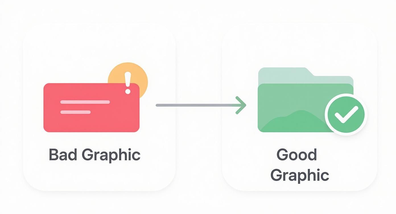
The takeaway here is that legibility and a clear focal point are universal principles that underpin any successful design, no matter the language.
To make this whole process manageable, modern asset creation platforms are a lifesaver. Tools like ScreenshotWhale have built-in AI translation and smart templates, letting you generate and test localized versions of your Google Play feature graphic without the headache. This is how you scale your optimization efforts without drowning your design team in manual work, making sure your app puts its best foot forward in every single market.
Inspiring Feature Graphic Examples from Top Apps
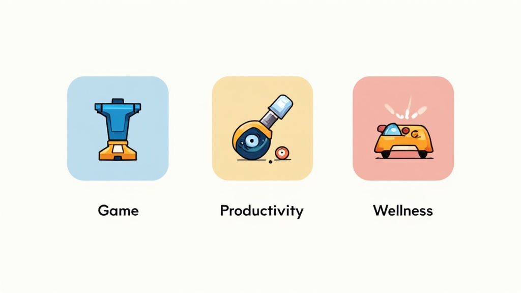
Theory is great, but seeing what actually works in the wild is even better. To make a real impact, you need a feature graphic Google Play visitors simply can't ignore. Let's break down a few high-performing examples and see how they turn a simple image into a powerful conversion tool.
We’ll look at why these designs are so effective, connecting their use of color, composition, and messaging right back to the principles we've covered. Think of it as a visual playbook for your own standout graphic.
Gaming Apps: The Masters of Hype
Gaming apps are absolute pros at generating excitement. Their feature graphics often feel like mini movie posters, packed with action, bursting with color, and featuring iconic characters that fans know and love.
Just look at a title like Clash of Clans or Genshin Impact. Their graphics almost always deliver:
- Dynamic Action Shots: You'll see characters mid-battle or unleashing cool abilities, creating an instant shot of adrenaline.
- Bold Branding: The game's logo is front and center, reinforcing brand recognition and trust.
- Clear Value Prop: The imagery immediately tells you if you're getting into a strategy, adventure, or action game.
They're not just selling a game; they're selling an experience. The goal is to make a user feel the thrill before they even hit download, a killer tactic in a category driven by impulse.
Productivity Apps: Clarity and Calm
Productivity apps take the exact opposite approach. Here, the goal is to communicate efficiency, organization, and a sense of calm. Instead of explosions and action, their feature graphics are all about clean layouts, soothing colors, and a clear look at the app's core benefit.
For an app like Notion or Trello, you'll notice a few common threads:
- Minimalist Design: Lots of white space creates a feeling of order and simplicity, which is exactly what their users are craving.
- Benefit-Driven Taglines: Short, punchy text like "Your Second Brain" or "Organize Anything" cuts right to the chase.
- UI Highlights: They often show off a clean piece of their user interface, promising a smooth, intuitive experience.
The best productivity graphics sell a solution to a problem. They promise to cut through the chaos and bring order to your life, a message that deeply resonates with anyone looking for a tool to get organized.
Wellness and Lifestyle Apps: Evoking Emotion
Wellness apps like Headspace or Calm are all about selling a feeling. Their graphics are designed to evoke tranquility, happiness, and self-improvement. They lean on soft colors, inspirational imagery, and gentle typography to create a serene and inviting first impression.
They don't just show you what the app does; they show you how it will make you feel. This emotional hook is everything in the personal growth and mental health space.
Making that connection is critical, especially when the Google Play Store has roughly 3.95 million active apps, with an average of 1,205 new ones added daily. And with free apps making up 97–98% of all listings, a powerful first impression is non-negotiable. You can find more insights on the current Google Play Store landscape at tekrevol.com.
By studying how these top performers nail their visuals, you can borrow proven strategies to create a feature graphic that truly connects with users and drives real growth.
Common Questions, Answered
Jumping into creative assets for the first time, you're bound to have questions. It's totally normal. Let's clear up some of the most common things people ask about the Google Play feature graphic so you can get yours finalized with confidence.
Is a Feature Graphic Actually Required for Every App?
Yep, no getting around this one. Google considers the feature graphic a mandatory asset for every single app on the Play Store. You won't be able to publish a new app or even push an update without one uploaded in the Google Play Console.
This isn't just a box-ticking exercise. The fact that it's required, even if you don't have a promo video, tells you how important it is to Google's layout and promotional systems.
Can I Change My Feature Graphic After My App Is Live?
Absolutely. You can swap out your feature graphic whenever you want through the Google Play Console. This is a huge advantage and something you should definitely use.
Think about it: you can run A/B tests to see which design gets more taps, roll out special graphics for seasonal campaigns like holidays, or just give your branding a fresh coat of paint. Just upload the new image to your store listing and submit the update for review.
So What Happens If I Don't Have a Promo Video?
Even if you skip the promo video, your feature graphic still pulls a lot of weight. It’s not just a video thumbnail. It shows up all over the Google Play Store, in curated app collections, as a header image on certain devices, and in other promotional spots.
A sharp-looking graphic makes sure your app looks polished and professional, no matter where Google decides to feature it.
A lot of people mistakenly think the feature graphic only exists to be a cover for a video. The reality is that it’s a versatile branding banner that Google uses to make your app pop across the platform. It's a key piece of real estate for grabbing attention and driving clicks.
Why Is My Graphic Getting Cut Off on Some Phones?
This is a classic one. If your graphic looks cropped, it's almost always because you've placed important stuff too close to the edges. The Google Play UI has to adapt to a wild number of different screen sizes, which means the outer borders of your image often get trimmed.
To fix this, you need to think in terms of a "safe zone." Keep all your critical text, logos, and the main focus of your image centered, leaving a buffer of at least 70 pixels from every edge. That way, no matter how it’s displayed, the important parts won't get chopped off.
Ready to create a feature graphic that stops scrollers in their tracks, without spending hours in a design tool?
With ScreenshotWhale, you can generate on-brand screenshots and feature graphics in minutes. Our professionally designed templates and AI-powered tools are built to help you boost conversions and stand out on both the App Store and Google Play. Start creating for free today!