A Guide to Google Play Graphics That Boost Downloads
Master Google Play graphics with this guide. Learn to create high-converting screenshots and promotional assets to boost app store growth and downloads.
Your Google Play graphics are not just decoration; they are the digital storefront for your app. Think of them as the first handshake, the most powerful tool you have to turn casual browsers into loyal users. These visuals, your icon, feature graphic, and screenshots, have mere seconds to communicate your app's true value. They are a make or break part of any solid launch and growth plan.
How Visuals Win Downloads in the Google Play Store
When was the last time you were scrolling through the Google Play Store? What grabbed your attention first? I'm willing to bet it was an app's icon or a striking feature graphic, long before you read a single word of the description.
There is a good reason for that. Our brains are hardwired to process images 60,000 times faster than text. This makes your visual assets the most immediate and gut level form of communication you have.
High quality Google Play graphics do more than just make your listing look pretty. They are a core pillar of your App Store Optimization (ASO) strategy. Together, they tell a compelling story about what it feels like to use your app, highlighting its unique selling points and building trust before a user even thinks about hitting "Install."
The Psychology of a Tap
Every single visual on your store page nudges a user's decision. A polished, clean icon whispers, "This is a professional, well cared for app." A dynamic feature graphic can forge an instant emotional connection, while beautifully designed screenshots cut straight to the chase and answer the user's biggest question: "What will this app do for me?"
Ignoring these assets is like having a messy, uninviting storefront. No matter how great the product is inside, potential customers will just walk right on by.
Your store listing's visuals are not just supplementary content. They are the primary driver of a user's initial impression and their decision to engage further or move on.
The power of visuals in user acquisition has become undeniable. Recent data shows that around 90% of users do not even scroll past the third screenshot when checking out an app's page. This means those first few images are absolutely decisive.
Let us take a quick look at the key players in your visual lineup.
Essential Google Play Graphic Assets at a Glance
This table breaks down the core visual components of your store listing and the specific job each one does to help you win more downloads.
| Asset Type | Primary Purpose | Key Impact Area |
|---|---|---|
| App Icon | To be a memorable brand identifier | Search & Recognition |
| Feature Graphic | To grab immediate attention with a bold statement | First Impression |
| Screenshots | To showcase the user experience and core benefits | Conversion & Trust |
| Promotional Video | To demonstrate the app in a dynamic, engaging way | Engagement & Clarity |
Each of these assets has a distinct role, but they achieve their full potential when they work together to create a cohesive and persuasive narrative.
Core Components of Visual ASO
To really nail your visuals, you have to understand the role each one plays. Getting these right is a huge step toward boosting your store's performance. For a deeper dive, you can explore our complete guide to https://screenshotwhale.com/blog/google-play-aso to see how these pieces fit into a bigger strategy.
- App Icon: This is your app’s face. It is visible everywhere, from search results to a user's home screen. It has to be simple, instantly recognizable, and look good at any size.
- Feature Graphic: Think of this as the giant billboard at the top of your listing. It is your best shot at grabbing attention, often working alongside a promo video to make a big impact.
- Screenshots: This is your visual sales pitch. Screenshots show off your app’s interface, highlight its best features, and tell the story of the user experience.
- Promotional Video: A short, punchy video that shows your app in action. It provides a dynamic glimpse into the value you offer, which static images cannot always capture.
When all these graphics work in concert, they build a powerful, conversion focused story that is hard for users to ignore.
Getting Your Google Play Graphics Right
Getting your Google Play graphics approved should not feel like a lottery. It is easy to think of Google's specifications as a bunch of restrictive rules, but I've found it is better to see them as a blueprint for success. When you follow them, you are not just avoiding rejections; you are making sure your visuals look sharp on every single device out there.
These guidelines cover everything from file types and dimensions to the actual content of your images. Nailing these details is the first step to creating assets that sail through the review process and make your app look great.
Understanding the Technical Rules
First, let us get the foundational stuff out of the way. Google is incredibly specific about these technical rules, and for good reason. They need to ensure a consistent, high quality experience for millions of users on a dizzying array of devices. Trying to skirt these is a surefire way to get an automatic rejection.
- File Formats: For your static images like the app icon, feature graphic, and screenshots, stick to either JPEG or 24-bit PNG (with no alpha transparency). I usually lean towards PNG for anything with sharp lines or text because it just looks crisper.
- Size Limits: Every asset has a file size cap, typically between 1MB to 8MB. This is all about performance. A store page that loads slowly is a page that loses potential users, so keeping your images optimized is key.
These rules are non negotiable. If you try to upload a GIF where a PNG is required or a file that is too big, you will hit an immediate error and delay your whole submission. Trust me, it is not worth the headache.
Key Asset Dimensions and Policies
Beyond file types, each graphic has its own set of rules for dimensions and content. Your app icon, for example, has to be a perfect 512 x 512 pixels. That big, bold feature graphic at the top of your store page? That needs to be 1024 x 500 pixels.
Screenshots are a bit more flexible. You can upload anywhere from two to eight for phones, tablets, and other devices. While the exact dimensions can vary, the most important thing is that they honestly show what it is like to use your app.
Google's content policies are there to protect users. This means your graphics cannot be misleading, do not show features that do not exist, or include things that imply store performance, like a fake "Top 10" badge.
Ignoring these content policies is a much bigger deal than a simple file format mistake and can even get your app suspended. For a complete rundown of the exact sizes for different devices, our guide on app store screenshot dimensions is a great reference for both Google Play and the iOS App Store.
Avoiding Common Submission Pitfalls
I have seen countless developers run into the same handful of problems when submitting their Google Play graphics. Knowing what these common mistakes are can save you a ton of time and frustration.
A classic error is creating visuals that look fantastic on a big design monitor but completely fall apart in the real world. Think tiny, low contrast text crammed into a screenshot. It becomes totally unreadable on a small phone screen. Another one is using unofficial award logos or partner branding without permission, which is a straight up policy violation.
Here are the top pitfalls I see all the time:
- Inaccurate Representation: Your screenshots must reflect the real app. Using slick mockups that look nothing like the actual UI is a fast track to getting flagged for being deceptive.
- Violating Intellectual Property: This should be obvious, but never use copyrighted characters, logos, or brands unless you have explicit permission. This includes everything from movie characters to other company logos.
- Inappropriate Content: Your graphics need to be appropriate for your target audience. Stay far away from any imagery that could be seen as violent, sexually suggestive, or otherwise offensive.
- Poor Readability: Any text you overlay on your feature graphic or screenshots needs to be big, clear, and have enough color contrast to be read at a glance.
By focusing on creating honest, clear, and technically perfect Google Play graphics, you are not just dodging rejections. You are building trust with your users from the very first impression.
Designing Screenshots That Drive Conversions
Think of your app screenshots as your visual sales pitch. They are much more than just pictures of your UI; they are a guided tour and your single best chance to convince someone your app deserves a spot on their phone. While getting the technical specs right gets your graphics on the store, it is thoughtful design that actually gets users to tap "Install."
Effective screenshots tell a story. They do not just show what your app does. They show what your app helps users achieve. This shift from features to benefits is the real secret behind high converting Google Play graphics that lead to genuine app store growth.
Establish a Strong Visual Hierarchy
To create screenshots that convert, you have to guide the user's eye. A strong visual hierarchy is not about cluttering the image; it is about creating a clear path for their attention so they see the most important information first.
Start with a vibrant, on brand background that makes your device mockups pop. From there, use bold, snappy headlines at the top of each screenshot to communicate a key benefit. This combo of color, typography, and smart placement creates an irresistible visual flow.
For instance, a good site editor, like the one in ScreenshotWhale, lets you upload your UI screens, choose a vibrant background color, and then drag and drop a bold title to the top. This makes it easy to experiment with different layouts and font sizes until your core message is impossible to miss.
Write Captions That Sell Benefits
The captions on your screenshots are your sales copy. They need to be short, punchy, and laser focused on the user’s needs. Ditch the dry feature lists and start highlighting the value your app delivers.
Your goal is to answer the user's unspoken question: "What's in it for me?" Frame your features as solutions to their problems.
Take a look at two different approaches for a fitness app:
- Feature-Focused (Weak): "Track Your Workouts"
- Benefit-Focused (Strong): "Reach Your Fitness Goals Faster"
See the difference? The second option connects directly to the user's motivation, making it far more powerful. A solid screenshot tool will let you apply these kinds of captions consistently across all your images.
Choose the Right Screenshot Style
Not all screenshots have to look the same. Different styles serve different purposes, and picking the right one depends entirely on what you want to communicate. Mixing a few styles can create a richer narrative that appeals to a wider audience, whether you're on the Android or iOS stores.
- Feature-Focused: This is the classic approach, using clear callouts and annotations to point out specific functions in your UI. It's perfect for showing off the practical, hands on aspects of your app.
- Narrative Storyboard: This style uses a sequence of screenshots to walk a user through a common workflow or a "day in the life" scenario. It’s a great way to show how your app solves a problem from start to finish.
- Social Proof: Why not incorporate snippets of glowing reviews or user testimonials right into your screenshots? This builds immediate trust and credibility by showing that other people already love what you've built.
Choosing the right approach can feel tricky, so here’s a quick breakdown to help you decide what's best for your app.
Screenshot Design Strategies for Maximum Conversion
| Strategy | Description | Best For |
|---|---|---|
| Feature-Focused | Highlights specific tools and functions with clear labels. | Apps with complex or unique features. |
| Narrative Storyboard | Tells a story across multiple images, showing a user's journey. | Lifestyle, productivity, and goal-oriented apps. |
| Social Proof | Integrates user quotes or star ratings into the visual design. | Building trust and demonstrating popularity. |
By being thoughtful about your style, you can tailor your message to resonate deeply with your target audience and make a much stronger impression.
Build a Cohesive Visual Story
Your screenshots should never feel like a random collection of images. They need to work together to tell a single, cohesive story that guides the user from curiosity to conversion.
Kick things off with your most powerful value proposition in the very first screenshot. That is your hook. Each image that follows should build on that initial promise, showcasing different benefits or walking through a key user journey.
And remember to maintain consistency in your branding. Use the same colors, fonts, and device mockup styles across all your images. This creates a polished, professional look that reinforces brand recognition. A platform with pre designed templates can be a massive help here, ensuring every screenshot is perfectly aligned with your visual identity and optimized for impact. At the end of the day, a well told visual story is what turns passive viewers into active downloaders.
Creating a Winning Feature Graphic and Promo Video
Beyond screenshots, your feature graphic and promo video are the heavyweight attention grabbers on your Google Play listing. Think of the feature graphic as your app's billboard. It is the first big, bold visual users see, and it has a massive impact on whether they stick around or bounce immediately.
A promo video takes this a step further, offering a dynamic preview that can seriously boost conversions. These are not just decorative banners; they are powerful tools that establish your brand and communicate your app's core value in seconds. Get them right, and you create an immediate, positive impression that encourages people to explore the rest of your page.
Designing a High-Impact Feature Graphic
Your feature graphic needs to be both eye catching and informative, a tricky balance to get right. Its main job is to create an emotional connection and summarize what your app is all about in a single glance. Avoid the temptation to clutter it with too much text or complex imagery that is hard to decipher on a small screen.
Instead, aim for a simple, powerful composition. Use vibrant, on brand colors that pop and a single, clear tagline that highlights your app's biggest benefit. The most effective feature graphics often show the app in a real world context or use dynamic visuals to evoke a feeling of excitement or productivity. And of course, your app icon is a crucial part of this visual identity; our guide on how to create app icons can help you make sure it harmonizes perfectly with your graphic.
Your feature graphic should be a visual summary of your app's promise. Make it bold, keep it simple, and ensure your core message is crystal clear.
Using a tool like ScreenshotWhale simplifies this process immensely. You can start with templates, drop in your branding, experiment with taglines, and see exactly how your design will look in a real store listing preview before you even upload it.
The Power of a Promotional Video
If a picture is worth a thousand words, a video is worth a thousand installs. A promo video can boost conversion rates by over 20% by showing your app in action. It is the single most effective way to demonstrate the flow and feel of your user experience in a way static images just cannot match.
The key to a great promo video is keeping it short and impactful. Aim for 15 to 30 seconds, max. User attention spans are notoriously short, so you need to get straight to the point.
- Start with a Hook: The first three seconds are everything. Open with your most exciting feature or a clear statement of the problem your app solves.
- Show, Don't Just Tell: Focus on showcasing the actual user interface in motion. Let people see for themselves how easy and enjoyable your app is to use.
- Design for Sound-Off: A huge number of users will watch your video without sound. Use bold text overlays and dynamic visuals to make sure your message lands, even on mute.
- End with a Clear Call to Action: Finish with a simple but direct instruction like "Download Now" to nudge the user to take the next step.
You do not have to spend a fortune on production, either. It is now possible to create product demo videos automatically, saving a ton of time and resources while still getting a high quality result. By combining a stunning feature graphic with a punchy promo video, you create a powerful one two punch that captures attention and drives real growth.
How to Automate Your Screenshot Workflow
Creating top notch google play graphics is a demanding job, but the real headache starts when you need to scale. Manually resizing, repositioning, and translating every single screenshot for dozens of device sizes and languages is a massive time sink. It is tedious, ridiculously prone to error, and pulls your team away from what they should be doing: building an amazing app.
The good news? This entire grind can be automated. Specialized tools offer a much smarter workflow, turning what could be a multi day design project into a task that takes just a few minutes. This is not just about moving faster; it is about getting perfect brand consistency and professional quality with almost no effort.
Imagine this: you design one perfect screenshot template in a simple site editor. Then, with a single click, you apply that design across every required device size for both the Android and iOS stores. That is the power of an efficient, automated workflow.
The Core of an Automated Workflow
At the heart of this modern approach is a simple idea: "design once, apply everywhere." Instead of wrestling with dozens of individual image files, you build a single, flexible template. This template can then be populated with different UI screens, device frames, and text on the fly.
A typical workflow looks something like this:
- Template Design: You start by creating a master layout in a user friendly editor, setting up your brand’s background, colors, fonts, and device mockups.
- Dynamic Content: Next, you add placeholders for the elements that will change, like the actual screen image and the caption text.
- Automatic Generation: The tool takes your template and instantly generates a full set of screenshots for every device you support, all perfectly formatted and ready to upload.
This infographic breaks down a simple but effective process for creating promo content that grabs attention. It highlights the essential steps: hook the user, show them the value, and give them a clear call to action.
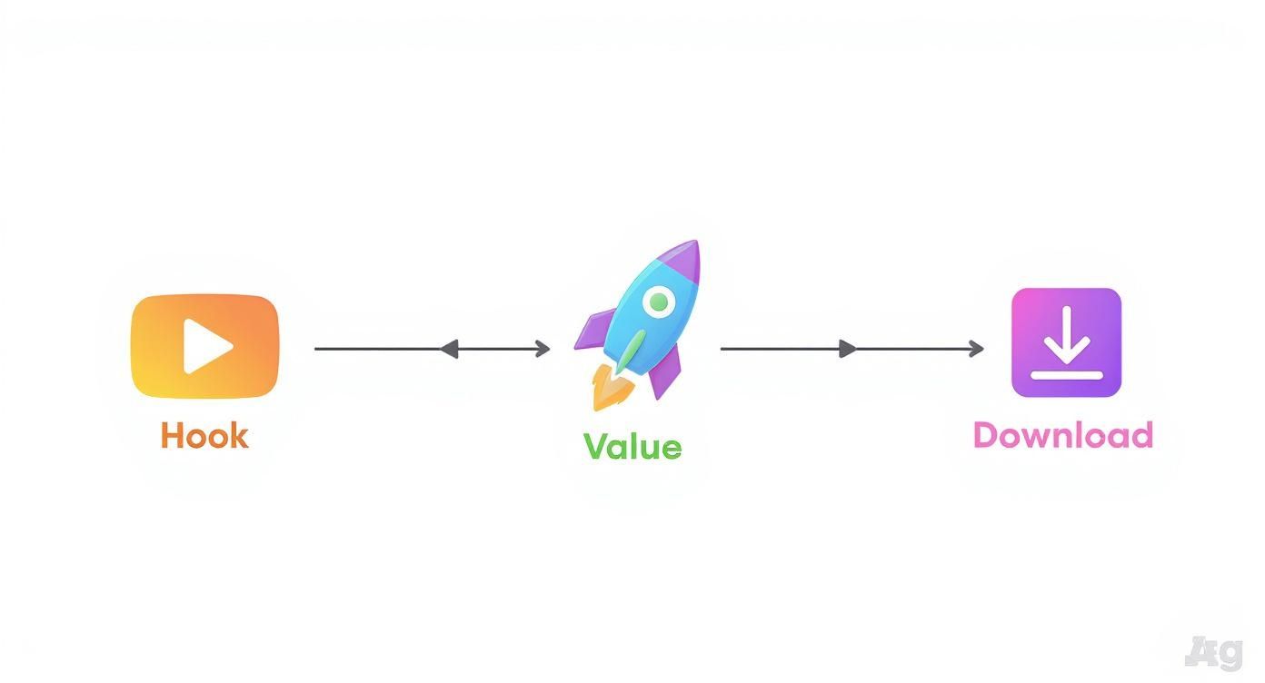
This kind of structured visual story is exactly what guides a user from mild interest to a download decision, a principle that automation helps you scale across all your visual assets.
Streamlining Localization for Global Reach
One of the biggest wins from automation is how ridiculously easy localization becomes. If you have ever tried to localize screenshots manually, you know it is a nightmare of spreadsheets, copy pasting, and endless design revisions. With an automated system, the process is a breeze.
You can just connect a spreadsheet with all your translated captions. The tool then pulls from that data to instantly generate complete, localized screenshot sets for each language. This means you can launch your app in ten different markets with fully native google play graphics in the time it would normally take to handle just one.
By automating localization, you ensure every international user gets an experience that feels made for them. This can dramatically boost your global conversion rates and build a much stronger connection with your audience.
Adopting an automated workflow frees up countless hours, gets rid of mind numbing manual work, and makes sure your store listing always looks polished and professional. For teams exploring more advanced automation, platforms like LunaBloom AI are pushing into AI driven solutions for visual asset creation, offering new ways to make this process even smarter. Ultimately, automation is key to boosting your conversions and overall app store growth.
Common Questions About Google Play Graphics
When you are deep in the weeds of launching or updating an app, the world of store assets can feel like a minefield of tiny details. Get them right, and you are golden. Get them wrong, and you are losing downloads you never even knew you could have.
Let us clear up some of the most common questions developers and marketers run into.
What Are the Most Common Mistakes to Avoid?
The biggest blunders are almost always the small things that add up to a sloppy first impression. A classic mistake is ignoring device specific dimensions, which leads to your beautiful UI getting awkwardly cropped on different phones and tablets. It just screams unprofessional.
Another one I see all the time is cramming way too much text onto a screenshot, or using fonts with poor contrast. If a user has to squint to read your key message, you have already lost them.
But maybe the most costly error is creating generic screenshots that do not tell a story or show off what makes your app special. That, and failing to localize your graphics. If you are not tailoring your visuals for global markets, you are basically ignoring a massive chunk of potential users.
How Often Should I Update My App Screenshots?
At a minimum, you absolutely have to update your screenshots whenever you push a major update with new features or a UI refresh. Your store page needs to be an honest preview of what the user is about to open.
But do not just wait for big updates. Smart teams are constantly testing and refreshing their visuals every 3 to 6 months. This is your chance to A/B test different messages, layouts, and designs to squeeze out every possible conversion. A fresh looking store page signals to users that your app is alive and actively maintained, which builds a ton of trust.
What Is the Main Difference Between Android and iOS Screenshots?
While they both exist to show off your app, the two stores play by different rules. The Google Play Store is generally the more relaxed of the two. It lets you upload up to 8 screenshots across a whole range of devices, phones, tablets, even wearables, with more flexible dimension requirements.
On the other hand, the Apple App Store is famously strict. It has rigid resolution requirements for specific iPhone and iPad models and allows up to 10 screenshots. From a design standpoint, you will also notice a strategic difference. Google Play's layout can work really well with landscape screenshots, whereas the top performing apps on iOS often use a series of portrait shots to tell a compelling vertical story.
Ready to create stunning, high converting visuals for your app in minutes? With ScreenshotWhale, you can use professionally designed templates and a simple drag and drop editor to produce store ready graphics that drive downloads. Start designing your app screenshots today.