Master Google Play Feature Graphic for Play Store Boost
Discover top strategies for creating impactful Google Play feature graphics for growth.
Essential Google Play Feature Graphic Tips
Your Google Play feature graphic serves as the visual allure for your app. It's engineered to captivate attention and boost installs. Typically the first significant visual element users encounter, it plays a pivotal role as the display for your promo video and appears extensively across the store. Crafting an effective feature graphic is vital for increased conversions and substantial app store expansion.
Understanding the Role of a Feature Graphic in App Growth
Visualize the Google Play Store as an expansive digital marketplace. Your app icon acts as the shop's sign, but the feature graphic is the dynamic storefront that lures users to explore further. It serves as essential marketing real estate that connects a user's initial interest to their final download decision.
This image is not confined to your store listing; Google circulates it throughout the platform to boost your app. Your feature graphic might appear in curated lists, search results, or even spotlighted on the Play Store front page. This level of visibility makes it an indispensable part of your app store optimization (ASO) strategy. Dive deeper into this topic with our comprehensive guide on Google Play ASO.
An Impactful Conversion Element
A meticulously designed feature graphic does more than look appealing. It encapsulates your app’s primary message in a single, impactful glance, quickly conveying whether your app is an exhilarating game, a soothing meditation tool, or an efficient productivity device.
This element of visual storytelling directly influences user actions and most significantly, conversion rates. A vibrant graphic can substantially boost the number of viewers who engage with your promotional video.
Your feature graphic is key for driving promo video views. A compelling design can turn a passerby into an engaged user, significantly boosting conversion rates.
Consider it a vital visual marketing tool intended to heighten both interaction and downloads. It serves as the intro screen for your promo video, and Google mandates you upload one in the Play Console, even without a video, signifying its importance in creating high-converting app store assets for both Android and iOS platforms.
Setting a Strong Initial Impression
Ultimately, the feature graphic defines your brand's tone. It's your opportunity to make a remarkable and high-quality first impression that establishes trust well before the user clicks install.
Here's why it's essential for growth:
- Increases Video Views: A captivating design with a conspicuous play button incentivizes users to view your promo video.
- Boosts Click-Through Rates: When your app is featured, a distinctive graphic captures more clicks from browsing users.
- Enhances Conversion Rates: By conveying your app's worth, it persuades users to download, turning casual views into confirmed installs.
- Solidifies Brand Identity: Reinforces your app’s branding, providing a coherent and memorable visual experience with your icon and screenshots.
Treating this graphic as a strategic marketing element helps transform it into one of your most effective methods for standing out in a saturated market.
Nailing the Technical Requirements
Before diving into creativity, let's discuss the guidelines. Correctly addressing the technical requirements for your feature graphic is the primary crucial step. Mastering these will prevent frustrating upload issues and ensure your app gets approved smoothly.
Consider these specs not as constraints but as the foundation for a sharp, professional listing that looks exceptional on all Android devices, from a compact phone to a giant tablet. Consistency here is paramount to fostering trust.
The Essential Technical Guidelines
Google is precise about the feature graphic guidelines for a reason. It ensures your image appears perfectly everywhere. Getting these wrong can result in a blurred, amateur graphic that could negatively impact downloads.
Here's a quick-reference table with the essentials:
Google Play Feature Graphic Technical Requirements
| Specification | Requirement |
|---|---|
| Dimensions | 1024 x 500 pixels (exactly) |
| File Format | JPEG or 24-bit PNG (no transparency/alpha) |
| File Size | Under 8MB |
Mastering these fundamentals is essential. For a complete overview of every visual asset on the Play Store, explore our in-depth guide to Google Play graphics.
Remember the Safe Area
A frequent pitfall developers encounter is placing crucial elements too close to the edges. Depending on its display location, Google might trim the sides of your feature graphic, cutting off your logo or tagline. This is where the "safe zone" becomes crucial.
Imagine an invisible perimeter around your graphic. The safe zone is the central area where all vital content (text, logos, visuals) should reside. Keeping everything inside ensures it remains visible.
A practical guideline is to maintain a buffer of at least 70-80 pixels from all edges. This simple step ensures your key message remains intact regardless of how the Play Store displays or crops your graphic. When designing, set up guides to mark this area before starting. It's a minor step that protects your efforts and ensures users see exactly what you wish to convey.
Creating Graphics That Truly Engage Users
Now, let's move beyond the technical criteria and focus on what genuinely makes a difference. A feature graphic isn’t merely a box you need to check; it’s a potent tool for conversion if crafted with intention.
The objective is to transform a straightforward image into a compelling argument for downloading your app. Every design choice, from color selection to typography, should align with this strategic intent. You have mere seconds to grab attention, demonstrate your app’s function, and convince a user to hit download.
Leverage Color and Typography
Color is the first element the brain observes. In a visually saturated environment like the Google Play Store, you require clean, attractive imagery with dynamic colors to stand out. Consider the atmosphere you aim to create. A fitness app might employ energetic oranges and blues, while a meditation app might lean towards calming greens and purples.
Typography is equally vital. Text must be bold, clear, and easy to read on a small screen almost instantly. Avoid thin, ornate fonts. Keep the message succinct and focused on one primary benefit or unique selling point (USP).
- Color Psychology: Choose colors that align with your brand and evoke the desired emotion you want users to associate with your app.
- High Contrast: Ensure text and crucial visuals stand out against the backdrop. Visibility is key.
- Legible Fonts: Use bold, sans-serif fonts that are quick to read. Your tagline should be comprehensible at a glance.
By perfecting both color strategy and typography, you craft a visual emphasis that directs the user's attention to your main message.
Adopting a "Minimalism is Key" Philosophy
A common mistake developers make is attempting to cram every detail into their feature graphic. Overloaded designs only create confusion, and confused users quickly scroll past. Instead, pause and embrace minimalism. Focus on one strong focal point.
What’s the key point you want potential users to remember about your app? Is it a standout feature, a transformative benefit, or an emotional impact? Whatever it is, spotlight it. Utilize negative space to allow your primary subject to breathe and naturally draw the eye.
The most successful feature graphics convey a single, compelling idea. By eliminating excess and emphasizing one primary message, you make it straightforward for users to grasp your app’s value proposition instantly.
This principle of clarity should extend to all visuals on your store page. To delve further into creating a coherent look, check out our guide on building an attractive mobile app mockup. A unified design story fosters trust and elevates your app’s professionalism.
Ensuring Consistent Branding and Trust
Your feature graphic doesn't stand alone. It collaborates with your app icon, screenshots, and promo video to narrate a cohesive brand story. Uniformity across these assets is essential for fostering user trust and brand recognition.
Utilize the same color schemes, fonts, and overall style in your app’s UI and other marketing assets. When users observe consistent visual language, it communicates quality and professionalism. It assures them that the app advertised matches what they’ll receive upon installation.
Think of it as follows:
- Icon: Your brand’s identifier.
- Feature Graphic: The headline that elaborates on your brand’s promise.
- Screenshots: The evidence showing your app delivering on that promise.
When these elements work synergistically, they present a seamless and persuasive narrative that drives downloads. Exceptional design goes beyond aesthetics; it incites action. Discover more about this conversion-oriented approach by mastering effective visuals for high click-through rates, a skill applicable beyond app stores. By optimizing every pixel, your Google Play feature graphic becomes a major growth driver.
Avoid These Common Pitfalls to Enhance Conversions
Meeting the technical specs is just the beginning. The real test is creating a feature graphic that persuades users to download your app. Many developers fall into recurring traps, designing graphics that fail to attract interest or worse, repel potential users.
Honestly, a quick way to improve design skills is to learn from others' errors. Identifying these pitfalls makes them easy to dodge, allowing you to create a professional, high-performance graphic that delivers.
The Pitfall of Illegible Text
This is one of the most pervasive and detrimental mistakes. Developers often choose text that’s too small, lightweight, or poorly contrasted against the background. Remember, users skim through the Google Play Store on small screens. They aren't going to pause and struggle to read what you’re communicating.
If your tagline is unreadable, it’s irrelevant. You’ve squandered the most valuable marketing space.
- The Mistake: A delicate, low-contrast font lost in a busy backdrop.
- The Solution: Opt for a bold, sans-serif font. Place it over a solid color or simple, tidy background. Ensure high contrast so your message stands out.
Deceptive Imagery and Unrealized Promises
Your feature graphic must offer an honest preview of your app. Utilizing visuals suggesting features you lack or displaying a UI that diverges from reality leads to disgruntled users and negative reviews. This not only harms conversion rates but also destroys user trust and breaches Google’s guidelines.
Your goal is to set accurate expectations. Deceptive graphics may entice downloads, but users will abandon your app as soon as they feel misled. This results in high uninstall rates, damaging your store ranking.
Consider this: a straightforward puzzle game shouldn’t employ visuals from a hyper-realistic action RPG. It creates a disconnect between promise and delivery, jeopardizing your brand’s credibility.
Neglecting Safe Areas
As mentioned, Google can crop your feature graphic based on its display location. A typical beginner error is placing logos or key taglines near the edges, leading to awkward cropping and a sloppy appearance.
Imagine your logo cut off or a tagline reading "Organize Your Li" instead of "Organize Your Life." It signifies a lack of attention to detail.
An Easy Fix:
- In your design software, create guides about 70-80 pixels in from each edge.
- Treat the space within these guides as your "safe zone."
- Keep all crucial text, logos, and focal points within this zone.
This minor adjustment ensures your core message remains consistent across all Play Store appearances, preserving brand and design integrity.
Avoid Creating Generic Designs
The final mistake is subtler but equally damaging: producing a forgettable design. In a sea of apps, blending in is equivalent to invisibility. Generic stock images, dull colors, or uninspired layouts fail to capture attention or differentiate you from the competition.
Your feature graphic is a chance to showcase your app’s character and unique offerings. A generic design implies a generic app, failing to ignite curiosity or form an emotional bond, thus providing users no reason to halt their scrolling. Aim for bold, memorable, and uniquely representative designs.
Your Path to Effective Optimization and Testing
https://www.youtube.com/embed/B6ydLpkhq04
Crafting an aesthetically pleasing feature graphic is a commendable start, but genuine growth arises from subsequent actions. A static, "set it and forget it" approach falls short. Excelling in the crowded Google Play Store requires a dynamic process of testing, learning, and continuously refining your creative.
This is how a feature graphic evolves from simple imagery into a data-driven conversion engine. By systematically testing different elements, you unveil what precisely resonates with your audience and motivates them to click "Install." Let's explore building this optimization mechanism from scratch.
Establishing Your Design and Testing Checklist
Prior to experimenting with diverse designs, establish a solid foundation. A repeatable checklist ensures each new variation is strategically grounded, not randomly conceived. This organized approach aids in producing superior assets efficiently while paving the way for effective testing.
Adopt these steps for a successful workflow:
Conduct Preliminary Research: Analyze feature graphics from the top 5-10 apps in your category. What colors and messages do they employ? Absorb their general style. Identify common themes but also pinpoint opportunities for differentiation.
Define Your Core Message: What single message should users grasp about your app? Craft it as a concise, impactful tagline. This serves as the anchor for your design.
Develop Two Distinct Concepts: Design two divergent directions. Perhaps one focuses on a character from your game, while another highlights a feature. This provides a clear A vs. B for initial testing.
Finalize the Assets: Ensure both variants meet technical specifications (1024x500 pixels, JPEG or 24-bit PNG) and respect safe zones. Verify legibility of all text and clarity of visuals.
This checklist offers a repeatable structure for creating meaningful creative worthy of testing.
Exploit A/B Testing's Potential
With design variations prepared, let users indicate their preference using A/B testing. Google Play's powerful tool, Store Listing Experiments, allows you to compare different feature graphic versions.
Rigorous experimentation underpins optimization, and understanding A/B testing in marketing is essential. The concept is straightforward: display one graphic version (Variant A) to 50% of store visitors and another (Variant B) to the remaining 50%. Google tracks which version garners more installs.
Store listing experiments replace assumptions with actual data. You might assume a blue background is optimal, yet testing might reveal an orange one raises conversions by 15%. These small victories accumulate significantly over time.
Testing can cover various elements, but altering one major component at a time yields clear results. Consider testing:
- Different Taglines: "Track Your Fitness" vs. "Reach Your Health Goals."
- Color Schemes: Bold, contrasting palette vs. muted, professional tones.
- Imagery: UI screenshot vs. lifestyle photo of users engaging the app.
This continuous cycle of testing and refining unlocks enhanced conversion rates.
The Importance of Localization
For global audiences, a one-size-fits-all feature graphic limits your impact. Localization extends beyond text translation; it's about tailoring visuals and messaging to resonate with diverse cultures.
What thrives in North America might not appeal in Japan. Cultural perceptions of colors vary, and imagery featuring people should reflect local demographics. A localized, culturally sensitive graphic builds immediate trust and significantly uplifts your global performance.
This image exemplifies the difference between a graphic with common pitfalls (small, unreadable text) and one optimized for clarity.
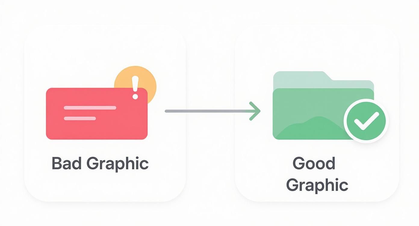
The key takeaway is that legibility and clear focus underpin all successful designs, regardless of language.
Modern asset creation tools simplify this process. Platforms like ScreenshotWhale provide AI translation and smart templates, enabling easy generation and testing of localized Google Play feature graphics. This scalability enhances optimization without overwhelming your design team, ensuring your app makes a positive impression globally.
Inspirational Feature Graphic Examples from Leading Apps
Theory aside, observing successful examples is enlightening. To truly stand out, you need a feature graphic Google Play users can't overlook. Let's examine high-performing examples to see how they transform a simple image into a compelling conversion asset.
We’ll explore why these designs excel, linking their color use, composition, and messaging to the principles discussed. Consider it a visual guide for your standout graphic creation.
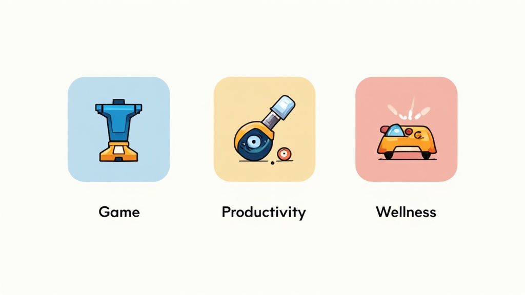
Gaming Apps: Mastering Excitement
Gaming apps excel at generating excitement. Their feature graphics resemble mini movie posters, bursting with action and vivid colors, featuring beloved characters.
Games like Clash of Clans or Genshin Impact showcase:
- Dynamic Action Scenes: Characters in action or displaying abilities, instantly thrilling users.
- Prominent Branding: Game logos featured prominently enhance recognition and trust.
- Clear Value Proposition: Graphics clearly depict whether it's a strategy, adventure, or action game.
They're selling an experience, not just a game. The goal is to make users feel the excitement, motivating downloads, a winning strategy in the impulse-driven category.
Productivity Apps: Embracing Clarity
Productivity apps take a contrasting approach, promoting efficiency, organization, and a sense of calm. Their feature graphics emphasize clean layouts, soothing colors, and transparent showcases of benefits.
Apps like Notion or Trello share common traits:
- Minimalist Design: Ample white space conveys order and simplicity, resonating with users.
- Benefit-Focused Taglines: Concise messages like "Your Second Brain" or "Organize Anything."
- UI Highlights: Often showcasing a clean interface for a seamless experience.
Top productivity graphics promise solutions. They cut through chaos and advocate for order, resonating with users seeking organization tools.
Wellness Apps: Evoking Emotions
Wellness apps like Headspace or Calm prioritize evoking emotions, conveying tranquility, joy, and self-growth through their feature graphics. They employ soft colors, inspirational visuals, and gentle typography for a peaceful first impression.
These graphics illustrate not just functionality, but how users will feel. This emotional connection is paramount in personal development and mental health.
Connecting is crucial, especially when the Google Play Store lists about 3.95 million active apps, with 1,205 new additions daily. With free apps comprising 97–98% of all listings, a commanding first impression is essential. Explore more insights on Google Play Store statistics at tekrevol.com.
By analyzing how top performers excel in visuals, you can adopt effective strategies to craft a distinctive feature graphic that resonates with users and fosters real growth.
Frequently Asked Questions
Diving into creative assets might leave you with questions. Let's clear up common inquiries about Google Play feature graphics so you're ready to finalize with confidence.
Is a Feature Graphic Mandatory for Every App?
Absolutely unavoidable. Google mandates a feature graphic for every app on the Play Store. Without one, you can't launch a new app or update through the Google Play Console.
This requirement isn’t mere administrative formality. Its necessity, even in the absence of a promo video, underscores its significance in Google's layout and promotion framework.
Can I Update My Feature Graphic After Launch?
Definitely. You’re free to update your feature graphic anytime via the Google Play Console, a strategic option you should seize.
Think creatively: run A/B tests to determine which graphic garners more taps, launch seasonal campaigns, or simply refresh your branding. Just upload the new image, update your store listing, and submit for review.
What if I Don't Have a Promo Video?
Even without a promo video, your feature graphic remains impactful. It’s not solely for video thumbnails. It appears throughout the Google Play Store, in curated collections, certain devices' header images, and other promotional areas.
An attractive graphic ensures your app appears polished and professional, regardless of its display location by Google.
A common misconception is that feature graphics only serve as video covers. In reality, it's a versatile branding tool used by Google to enhance app presence across the platform. It's crucial for grabbing attention and driving clicks.
Why Does My Graphic Get Cropped on Some Devices?
This question is frequently asked. If your graphic looks cropped, often it's due to crucial elements being too close to the edges. Google's UI adapts to numerous screen sizes, which may result in edge trimming.
The solution is considering a "safe zone." Center vital text, logos, and focus points, leaving at least 70 pixels buffer from edges. This ensures the graphic remains intact across varied displays.
Ready to craft a feature graphic that immediately halts users without extensive work in design software?
With ScreenshotWhale, create on-brand screenshots and feature graphics swiftly. Our professional templates and AI tools help boost conversions and stand out on both the App Store and Google Play. Start designing for free today!